The Nokia 8 Sirocco is HMD Global's attempt at creating the "ultimate statement of flagship design with the latest screen and camera technology".
Although it's a bold claim to make, HMD admits that the Nokia 8 Sirocco is made "for fans" who have been asking for a premium flagship that actually pushes the boundaries.
It's true to an extent that the Nokia 8 Sirocco ticks all the boxes that the original Nokia 8 missed. The moment I held the phone in my hand, I was impressed.
However, with a fleet of new flagships making their way to the market, it wouldn't be as easy for the phone to compete with rivals. Especially with a price tag of Rs 49,999. But that's a question we can answer in our full review.
Nokia 8 Sirocco is compact and fits well in hand.
Nokia 8 Sirocco availability, price and offers
The Nokia 8 Sirocco will be available at a best buy price of Rs. 49,999.
Available in black, consumers can pre-book their Nokia 8 Sirocco starting April 20 from Nokia's online store, Flipkart.com and select retail outlets. The phone will start selling from April 30.
Airtel customers buying the Nokia 8 Sirocco will get a data benefit of 120GB. While prepaid customers will get 20GB additional data on each of the first 6 recharges of Rs 199 or Rs 349, postpaid customers can avail 20GB per month on the Rs 399 or Rs 499 plans, for 6 months. Airtel customers will also get an extended free subscription to the Airtel TV app till December 31, 2018 and ICICI bank will offer a 5% cashback till May 31, 2018.
Additionally, consumers will get 25% instant discount on domestic hotels at MakeMyTrip.
The Nokia 8 Sirocco will be available at no cost EMI on credit cards and through Bajaj FinServ and Home Credit.
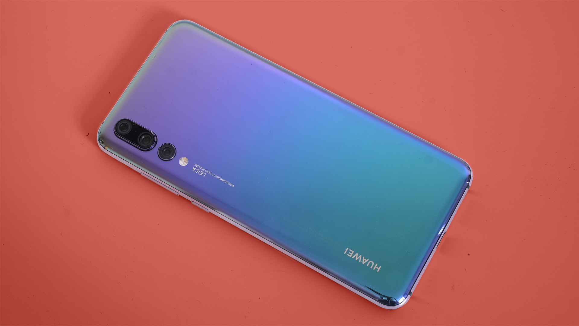
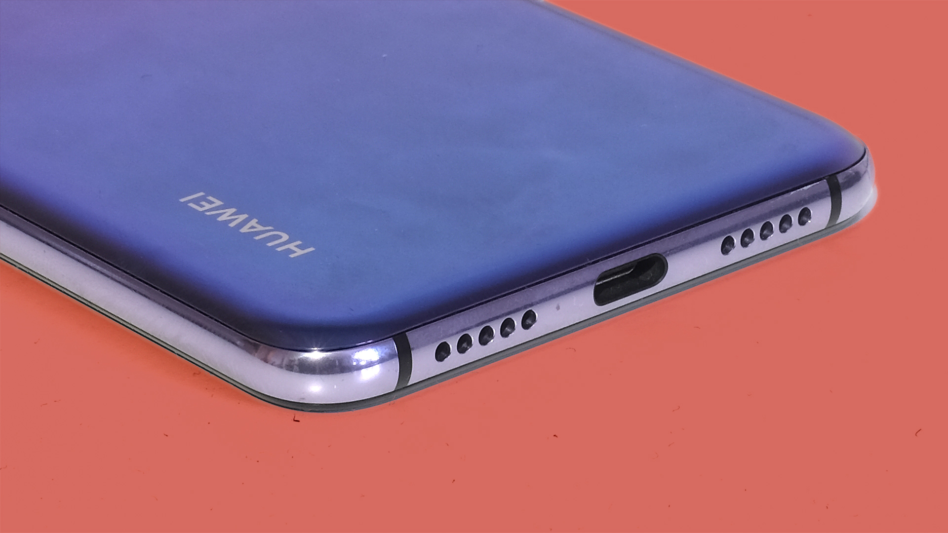
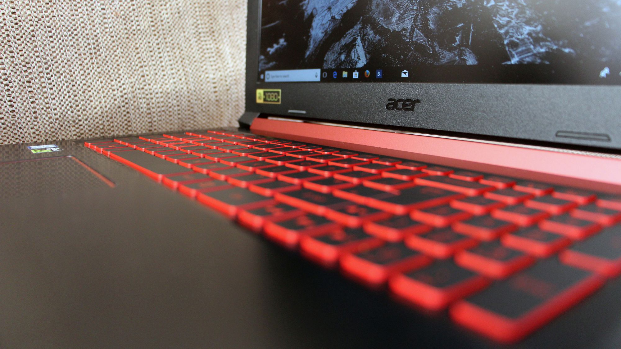
The new Nokia 8 Sirocco is shiny yet solid smartphone
Design and display
With the Nokia 8 Sirocco, the company switches from the blocky design language, in favour of something that looks futuristic and premium. The phone is covered in 95% vacuum moulded Gorilla Glass and has a stainless steel frame at its core.
It has a Blackberry Priv-like curved display that matches the build quality of the Galaxy S8. It's made mostly out of glass and shines, but that also makes it prone to fingerprints and it feels slippery.
The edges of the Nokia 8 Sirocco taper from 7.5mm to 2mm and it was fun finding the discreetly placed SIM tray on its thinnest point. Similarly, the volume buttons and the power key are flush with the edges, which sometimes makes it a little tricky to click.
The phone sits well in your hand, where the curved edges on the back allow it to nestle against your palm. The company purposely used a 5.5-inch display to make the phone compact.
The Nokia 8 Sirocco is a short and wide phone that feels really nice to use with one hand, until you get annoyed with the sharp edges on the sides.
To compliment the svelte design, the company had topped it with IP67 dust/water resistance and wireless charging.
Power, performance and interface
The Nokia 8 Sirocco packs plenty of power under the hood, but it's still not the best we have right now.
It is backed by a Qualcomm Snapdragon 835 SoC with 6GB of RAM, which was flagship-class in 2017, and was also used in the original Nokia 8. While Snapdragon 845-powered phones haven't made it to the market just yet, Nokia may have to contend with criticisms for having an older generation chipset. That said, the practical difference between the 835 and 845 is minor.
Simply put, it might not compete against upcoming flagships on benchmarks, but it has plenty of power to run pretty much anything you throw at it.
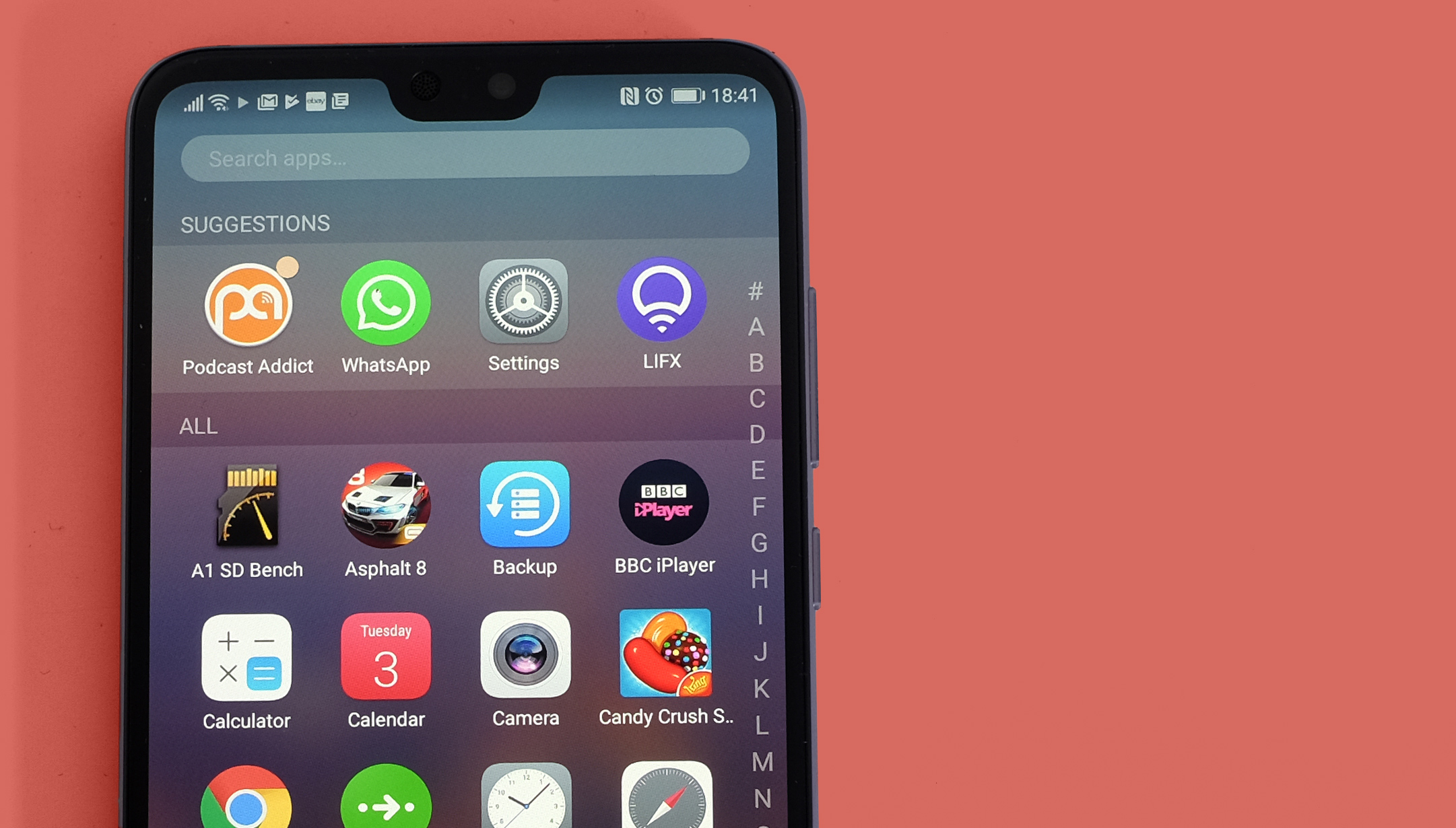
You get the stock Android 8 Oreo on the new Nokia 8 Sirocco
The unit we used was fresh out of the box, so we couldn't spot any performance blemishes initially. But this might change once the phone is put to regular use, full of apps, games and other forms of data.
Still, stock Android Oreo felt smooth as silk during my limited experience with the phone.
It's also enrolled in Google's Android One program, which guarantees the next two big Android updates and three years of security updates.
It is powered by a 3,260mAh non-removable battery that we expect should last a day per charge, but you'll have to wait for our in-depth Nokia 8 Sirocco review to find out exactly how it performs.
There's Qi wireless charging built in too.
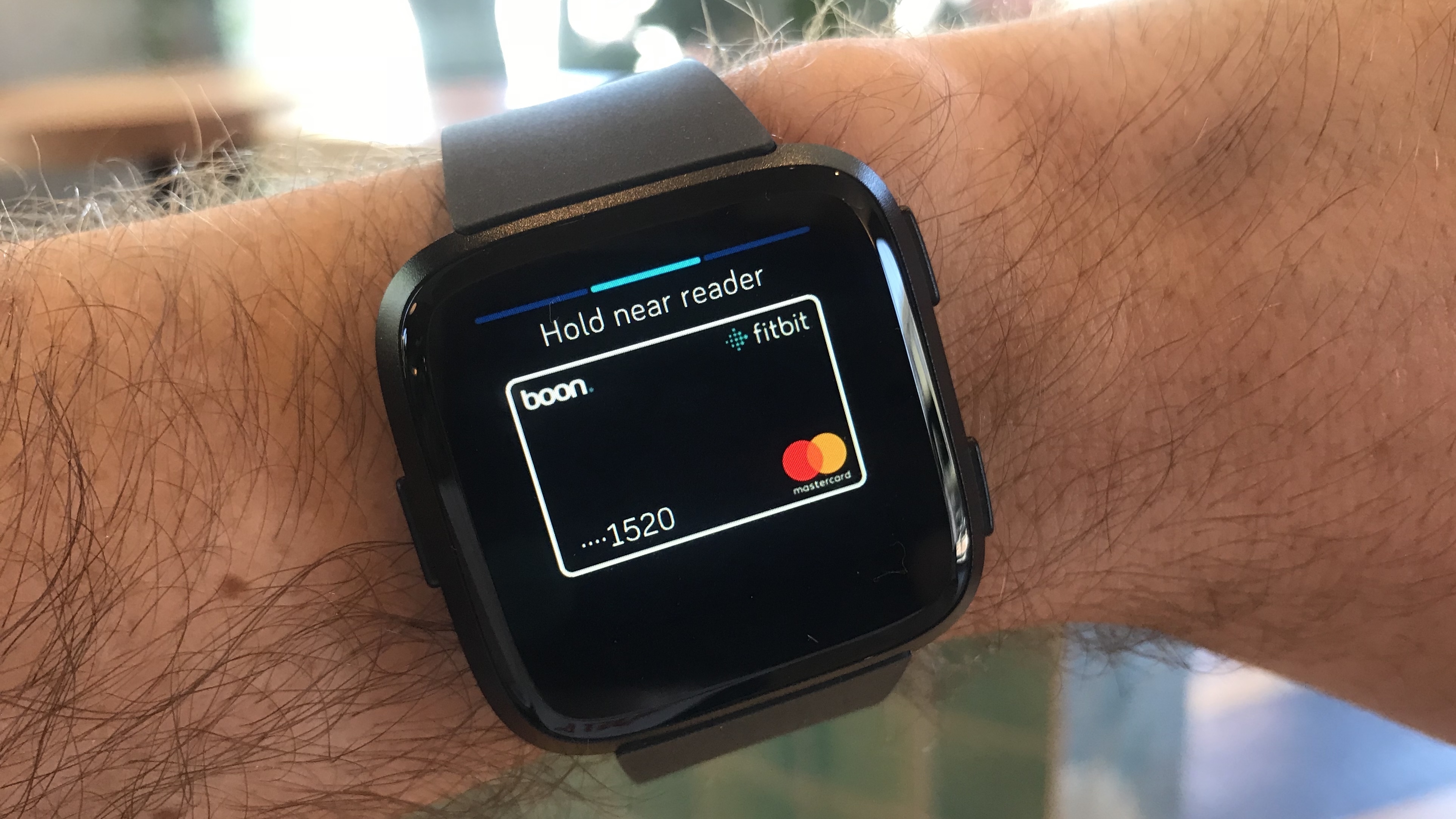
Camera
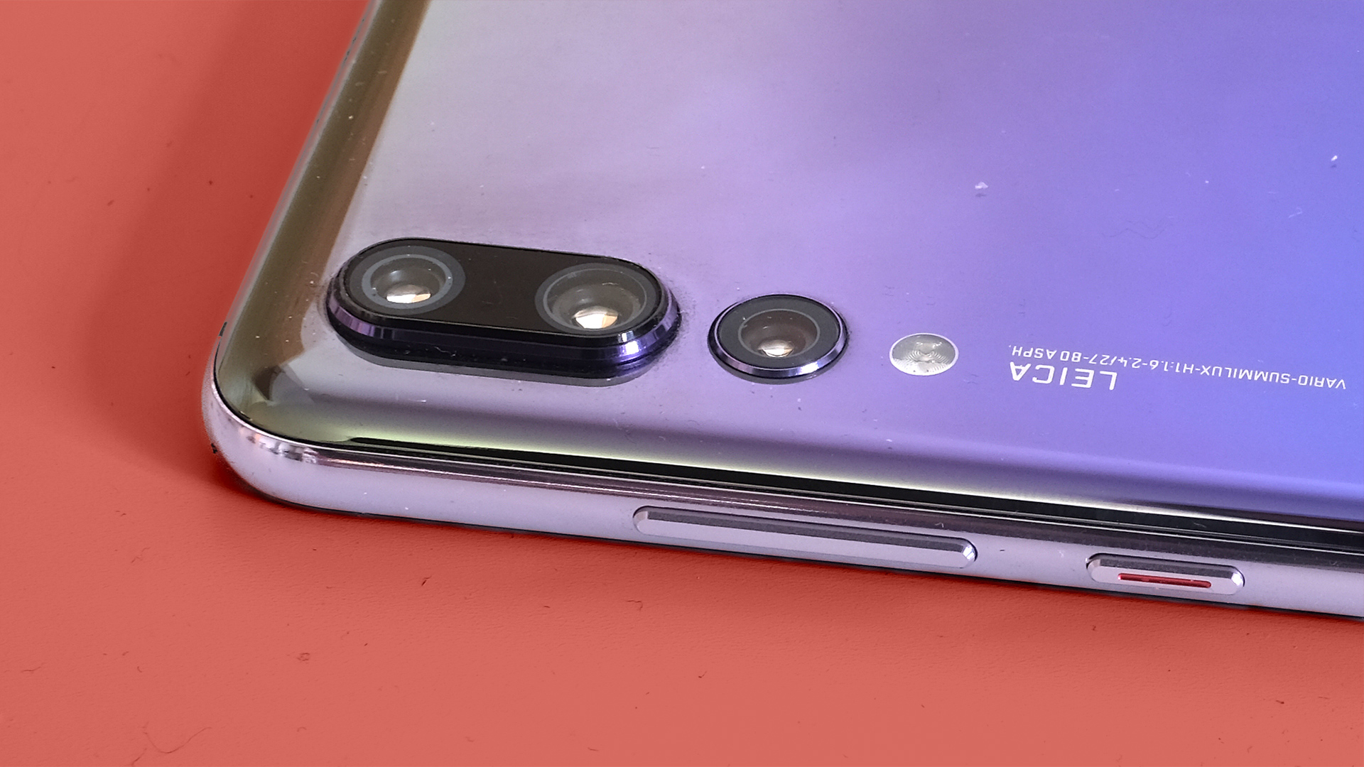
The cameras on the Nokia 8 Sirocco are tuned by Zeiss Optics, an old partner for Nokia phones as far as cameras are concerned.
You get a 12MP main camera sensor alongside a 13MP telephoto lens, which lets you click pictures with blurred backgrounds.
There are two cameras on the back of the Nokia 8 Sirocco
It also features a Live Bokeh mode that allows you to adjust the level of blur you need in the picture.
Unfortunately, the demo area was dark and we didn't get a chance to test it in daylight. We still managed to take some shots that looked really nice on the phone's display, but we'll put it to test in our full review.
Round the front, you get a 5MP camera meant for selfies and video calls.
It supports wireless charging.
Early verdict
The Nokia 8 Sirocco is a noteworthy upgrade over the original model. It's fast, handy, pretty and brings stock Android software, with a guarantee for updates. All of these are good reasons to buy this phone, though we can only confirm that once we've reviewed it.
While the pricing may make it Nokia's least selling phone of the year, if the point of this was to be a full portfolio player on the market, it's goal achieved.
The Asus VivoBook line of laptops spans the entire spectrum of users. From the slim and affordable VivoBook S to the VivoBook Flip that’s even smaller and built for all sorts of contortions and use cases, to the VivoBook Pro, designed to combine portability with power.
Despite the ‘Pro’ name tag, Asus has managed to build a robust laptop (albeit on the heavy side of portability) and price it somewhere more in line with what most users pay for a 2-in-1 laptop. Oh, and did we mention it has GTX 1050 graphics inside? Just in case, you know, you want to distract yourself from work with a few matches of PlayerUnknown’s Battlegrounds (PUBG).
Price and availability
The VivoBook Pro 15 is currently priced at $1,169 on Amazon, mirroring the specifications of the device we received for review. In the UK and Australia, however, things are a bit more complicated. The N580VD model is listed on the Asus website for both countries, but the Australian Asus website only reveals the product isn’t currently available. As for the UK listing on the Asus site, well, it’s missing a purchase button altogether.
As for the US version, the Asus website only lists the specific model we tested, while Amazon adds a 4K upgrade with a smaller SSD and a bonus 1TB for HDD for a couple of hundred dollars more.
At this price, the VivoBook Pro 15 is comfortably below the Dell XPS 15 and Apple’s MacBook Pro with Touch Bar. Surprisingly, a comparable 13-inch MacBook Pro isn’t on the high end of the pricing spectrum at $1,799 (£1,749, AU$2,699), but it lacks a dedicated graphics card. Whereas a similarly-specced 15-inch model goes for $2,699 (about £1,920, AU$3,511). As far as the XP 15 is concerned, you’re looking at $2,174 (£1,814, AU$2,634) for comparable specs to the VivoBook Pro 15.
Design
The light gold finish of the VivoBook Pro 15 easily recognizable and hard to miss. With a 15.6-inch display, the overall footprint of the VivoBook Pro 15 is a bit on the large side. Measuring 15 x 10 x 0.8 inches (380 x 256 x 19.2mm; W x D x H) and with a combination of metal and plastic housing, this laptop dances the line of tradeoffs for portability over durability, weighing 5.05 pounds (2.29kg).
The VivoBook 15 Pro is on the cusp of being too large for easy portability. You’ll undoubtedly notice a difference between the MacBook Pro (3.02 pounds) and VivoBook Pro 15 in your backpack when walking across campus.
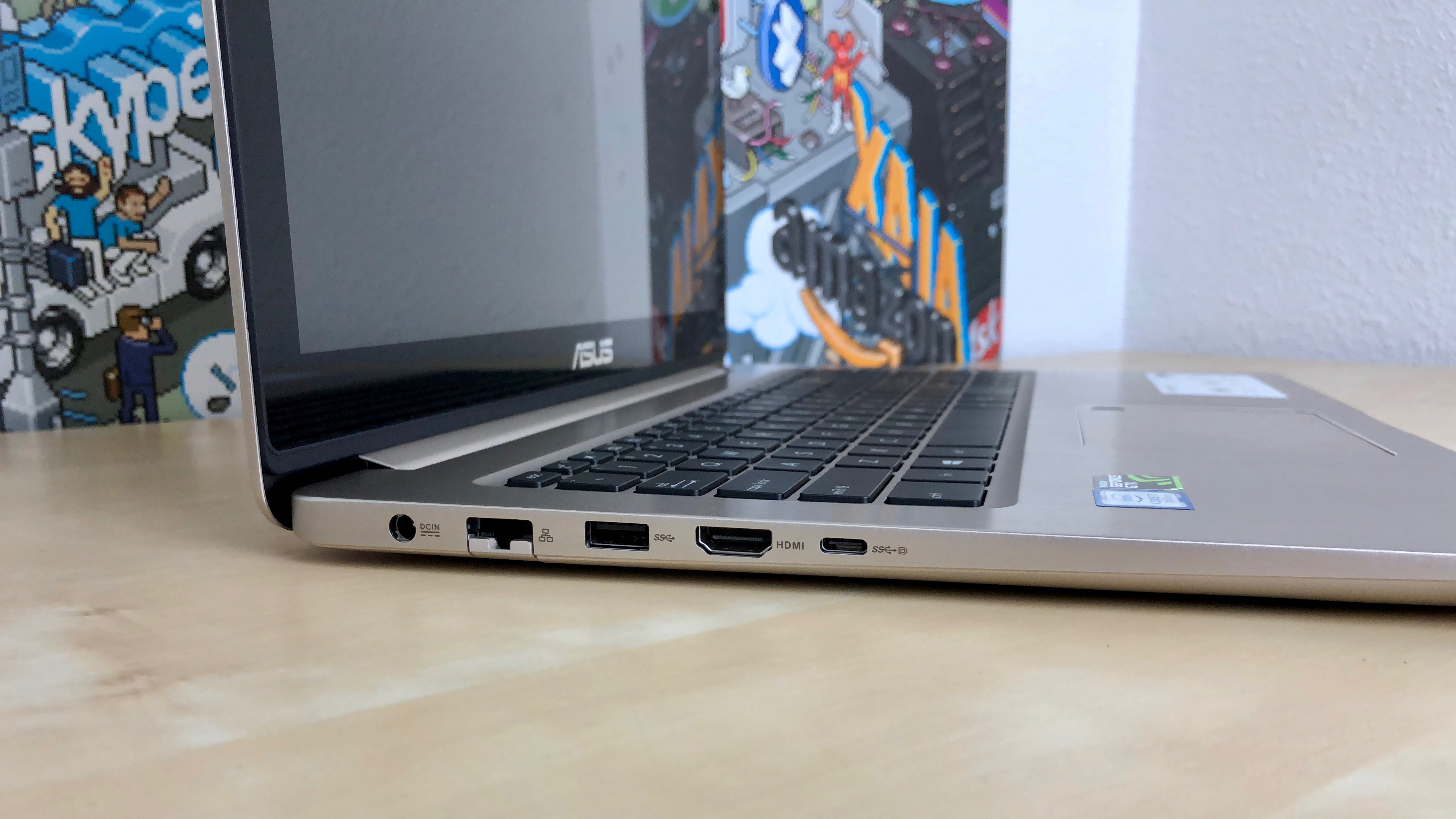
As a laptop that’s labeled for pro users, the VivoBook Pro doesn’t disappoint when it comes to ports. On the left edge is where you’ll find the charging port, an RJ45 Ethernet port, USB 3.1, HDMI and a USB-C 3.1 port. The opposite edge is home to two USB 2.0 ports, an SD Card reader, 3.5mm headphone/microphone jack and two indicator lights.
With more than enough ports to connect external displays, either through HDMI or the USB-C port, along with Ethernet and USB ports for accessories and backup drives, you should be covered no matter your setup.
A nearly full-sized keyboard with chiclet keys is found just below the FHD display. The keys have a slim profile and are responsive. A relatively small number pad is present, but we found the keys a bit too thin to lend themselves to fast key-punching.
Let’s talk touch
Embedded near the top-right corner of the touchpad is a fingerprint sensor used to unlock the laptop. We’ve complained about touchpad with a fingerprint sensor inside the touchpad before, and we’d be remiss if it weren’t mentioned again.
Breaking up the flow of the touchpad is frustrating and not a decent trade-off for the added biometric feature. The sensor gets in the way, for example, when dragging text or a file across the display — there has to be a better way.
While we are talking about the touchpad, let’s address another issue we have with it: there’s not a clear-cut area that’s dedicated to right-clicks. Repeatedly we find ourselves using the touchpad and clicking our way around a website or app, only to randomly — and unintentionally — right-click on something.
To be fair, Asus has a small line on the bottom of the touchpad that splits the left and right side of the touchpad. But that isn’t a definitive guide, with a touch or click in the top-right quarter of the touchpad registering as a left-click most of the time. It’s the other random instances of errant right-clicks that lead to frustration.
With Nvidia’s GTX 1050 and an Intel Core i7 processor powering it, the Vivobook Pro 15 is built for more than spreadsheet creation and the occasional video edit.
This laptop is capable of handling both work and play. And, by play, we naturally mean gaming.
In our benchmarks and real-world use, the Vivobook Pro 15 handles anything we can throw at it with ease.
As you can see from the benchmarks, the VivoBook Pro 15 on Ultra settings may not be the fastest machine on the market, but it’s more than capable, especially when you consider the price.
For some, the 512GB SSD isn’t going to be enough, especially if you’re installing several large games.
If that sounds like something you may end up doing, or you want to future proof your purchase a bit, opting for the previously mentioned 4K model with an extra 1TB HDD is the way to go.
Battery life
With the added performance gains of the GTX 1050, battery life takes a hit on the VivoBook Pro 15.
With a total of 3 hours and 57 minutes in our movie test, you’ll find the battery well enough to get through a movie during a short flight, but don’t expect it to last on a cross-country flight.
The PCMark 8 battery test revealed even lower battery life, with a measly 2 hours and 32 minutes of use. For reference, the XPS 15 ran for 5 hours and 54 minutes in the TechRadar movie test, and a 3 hour and 38 minutes on the PCMark 8 test.
Final verdict
We have to give it to Asus — the VivoBook Pro 15 is a reliable all-around laptop. It’s powerful enough for the casual gamer to play whatever he or she desires, and yet it’s not going to drain your bank account.
That touchpad, though, is finicky and confusing. A touchpad should be straightforward with next to zero learning curve. After a week with this unit, we are still trying to learn how to use it.
Those looking for a laptop that’s priced right and more than powerful enough, the VivoBook Pro 15 is worthy of consideration. Just make sure to buy yourself a mouse — you’ll thank us later.
Update: Should HTC Vive be worried by the latest VR arrival? Be sure to check out our HTC Vive Pro review to find out... or keep reading.
While the HTC Vive Pro offers some upgrades over the original HTC Vive, it's not a perfect headset. Throw in the fact that the HTC Vive Pro price is $799 / £799 (about AU$1,015) and doesn't come with any accessories, and you find yourself with a headset that may be best suited for VR enthusiasts and arcade owners rather than the average person.
That's especially true when you consider the HTC Vive price is now $499 / £499 (about AU$615), bringing it closer to competitor Oculus Rift and much less than the HTC Vive Pro. At a new lower price, the still-excellent HTC Vive is now an even more attractive option.
Original article continues below...
We are in virtual reality's infancy, but the HTC Vive is already very capably showing off what a premium VR experience can look like.
In fact, it's so far ahead of what much of the competition is offering that it can be difficult to describe the experience of using it to someone who hasn't yet tried VR themselves – it's akin to trying to describe moving footage to someone who's spent their whole life staring at pictures, or describing a game to someone who's only ever watched films.
At times it can even be difficult describing the Vive to someone who's only ever used cheaper mobile VR hardware like the Gear VR, Google Daydream View or Google Cardboard.
But the highest compliment we can give to the HTC Vive is just how right it immediately feels, and how easily all your reservations about VR fall away as soon as you start using it – even if you've been a VR naysayer up until now.
Virtual reality is a still-nascent medium and, to that end, has some of the problems all new mediums face when they first start out. The naysayers will claim that there isn't a great library of games out yet – technically not a true statement, but one we hear all the time nonetheless.
They'll say that it's too expensive and the hardware just isn't that good yet, but while it's a somewhat pricey setup, the experience you'll get on the HTC Vive is unrivaled. It's lightyears ahead of Google Cardboard and Samsung Gear VR, miles ahead of PlayStation VR and, until very recently, the Oculus Rift, too.
And, as it turns out, we're not the only ones who think so – developers agree. A 2016 study on Gamasutra reported that 49% of the companies they surveyed were currently developing games for the Vive while only about 43% said they were working on a game for Oculus Rift.
When paired with the proper hardware – a PC with an Intel Core i5-4590K and either a Nvidia GTX 970 or AMD R9 390 GPU – the HTC Vive is an incredible gateway into a new medium, one that is currently dominated by short demos and a growing library of games, but should one day play host to full-length films, television shows and contemporary art.
The positives, in condensed form, include: one-to-one movement tracking; a perfectly natural 110-degree field of view; there's nary a screen tear or dropped frame when you're using the right equipment; movement feels natural; it has best-in-class controllers; and the experiences, the demos and the games available through SteamVR, simply blow the competitors away.
But before we tackle games, let's address what had been up until very recently the elephant in the room: price.
The HTC Vive wasn't cheap at launch or for a long time after, but, on March 19, it got just a shade less expensive. As of now, the system, which includes the headset, the controllers, earbuds and the base stations themselves, sells for $499 / £499 (about AU$615), and that's before you buy a computer with the recommended specs.
The Vive now costs just $100 more than Oculus Rift, putting it within striking distance as far as price. Ultimately the question now is whether you'll find that it's worth the extra cash for a better experience, even though it's not as much cash as it once was.
That's a fair discussion to have, albeit one that we can do almost nothing about right now. New hardware, especially at the cutting edge of a nascent industry, is going to be expensive.
But wait, why is it more expensive? What exactly does it do?
How does the HTC Vive work?
The first time we got our hands on the HTC Vive was at Mobile World Congress 2015, where HTC first made the announcement of its partnership with Valve, and it has been retooled and vastly improved since that original showing.
The consumer version works wonderfully, is vastly easier to setup and feels ready to be shipped to the public which, considering that units are supposed to go out any day now, is a very good thing.
Like other virtual reality headsets, the Vive has the arduous task of completely immersing you in a video game by producing two images simultaneously. However, unlike PlayStation VR and Oculus Rift that use a single camera to track your head and extremities, HTC Vive has two base stations, which sit on the wall attached to the included wall mounts or a high shelf and help map track your movements as you walk around in the 3D world.
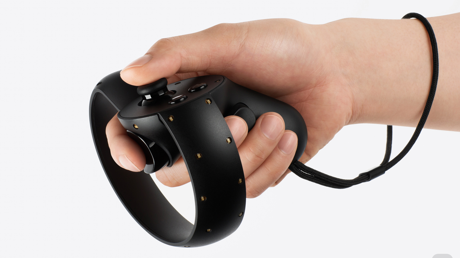
What the stations track are small divots on the top of the two controllers and on the headset itself. There are 72 of these dots speckling the controllers and helmet that help accurately track the Vive.
Inside every box is a Vive headset unit, two controllers, two base stations, earbuds, a cloth to wipe down the lenses, a small hub that sits between the headset and your PC, charging cords for the controllers and power cables for base stations. Also packaged with every unit are three games: Job Simulator, Fantastic Contraption and The Lab. It's everything you're going to need for a great virtual reality experience minus the computer that powers the whole thing.
New to the consumer version is a spectacularly simple setup program that should, for the vast majority of tech enthusiasts, allow you to breeze through the setup process.
Once you're plugged in and the room has been mapped out, you're free to roam around every inch of the digital space. This means digital worlds can be more expansive and more immersive on the Vive than the other two systems and, thankfully, less nausea-inducing, too.
The only limitations you'll encounter once inside your digital world are faint blue walls made up of lines that keep you inside the playzone. These blue lines are superimposed into your game by SteamVR, the software put out by Valve that's running underneath every virtual experience.
It's called "chaperone mode," and its practical application is to prevent you from moving too far outside the area that you've set up for the Vive and potentially stumbling into furniture/plants/animals/etc around your home and hurting yourself.
As for the games themselves, what's there is simply amazing.
In the course of two weeks, I've played 20 or so titles, some of which are much, much better than others. I'll cover them in detail in a moment but, in short, they were mostly fantastic showcases for VR, full of personality and just as varied as you might expect. One minute I was on top of a castle fending off stickman invaders with a bow and arrow, the next I was inside of an arcade cabinet fighting spaceships in three dimensions. I played mini-golf on an impossibly constructed multi-level course and trained to become both a ninja and space pirate.
Some of what I just described is part of Valve's The Lab, a collection of games that the iconic developer put together to introduce players to virtual reality. While I haven't seen every third-party title on the Vive (it's almost impossible considering that about 5-10 new games have been added every day in the past two weeks), the difference between first-party and third-party titles are night and day.
This is something I see changing in the coming weeks, months and years, however, and not something I hold against the system on day one.
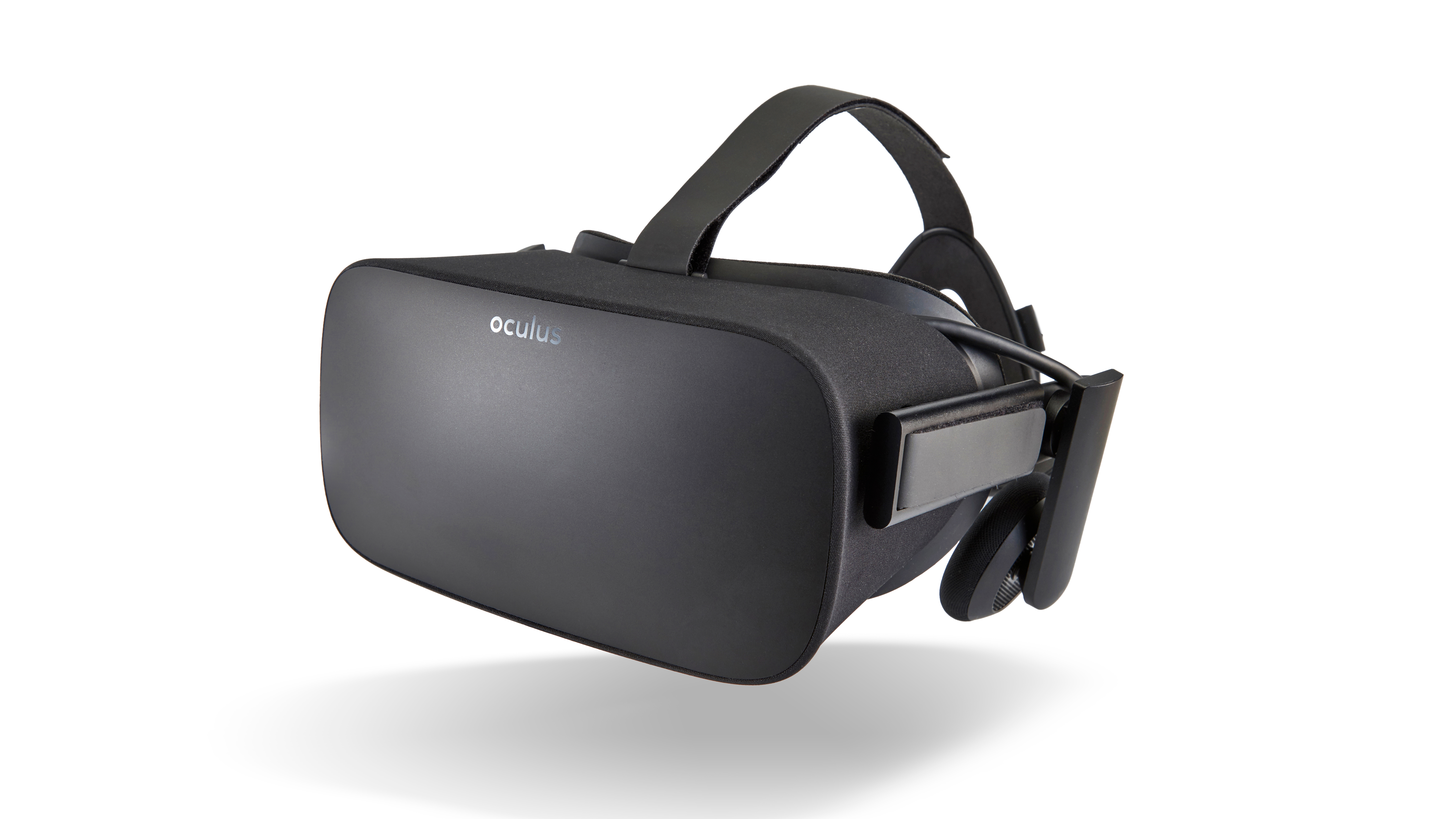
The final iteration of the HTC Vive is best described as a bulbous visor taken straight from the pages of a science fiction novel. It's heavier (and therefore a bit less comfortable) than both the Oculus Rift or PlayStation VR, but the additional weight isn't something you notice once you're fully immersed in Vive's brave new world.
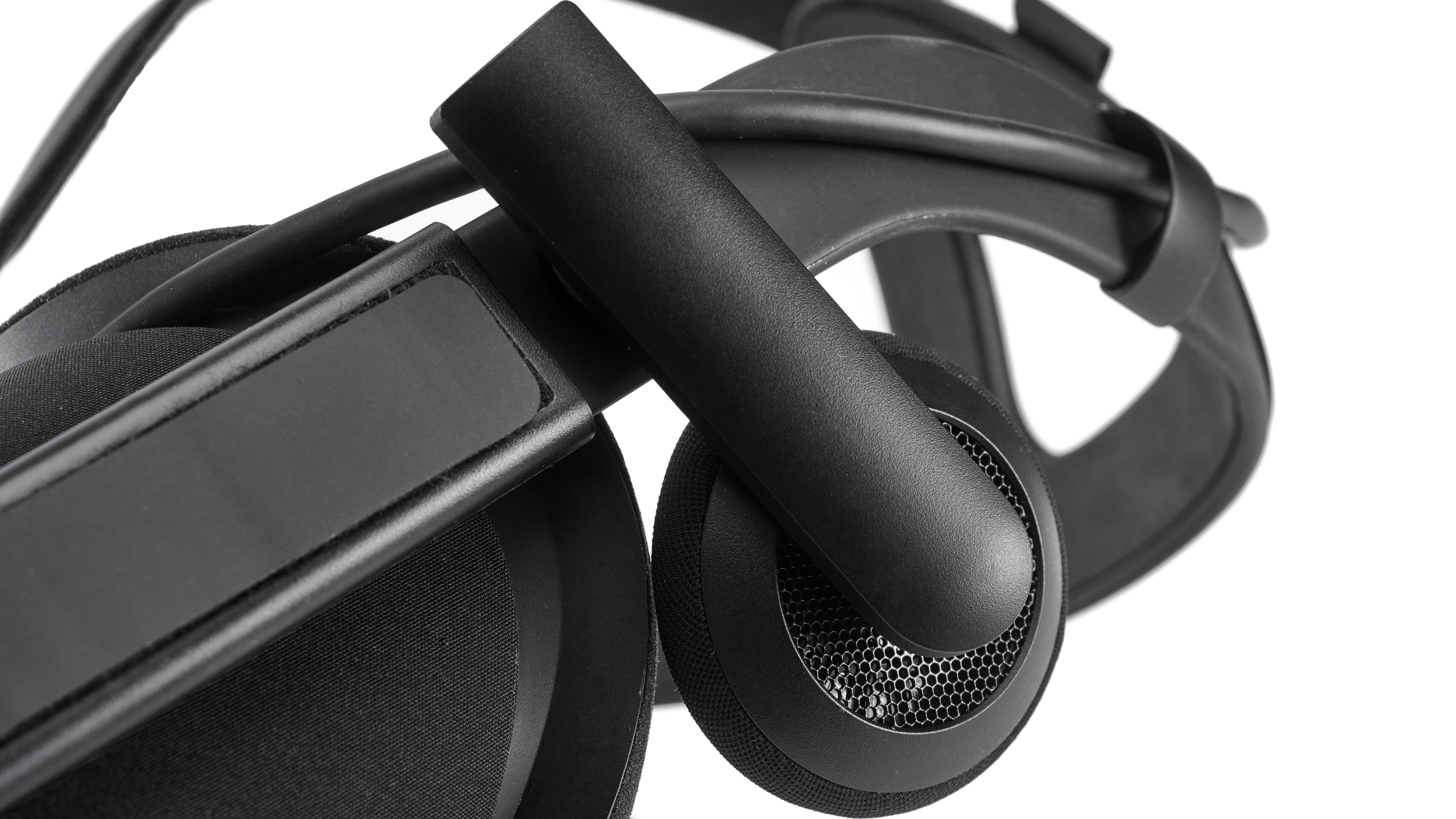
The headset is supported by three velcro straps that wrap around the top and sides of the Vive and meet in the back to form a cradle for your noggin. This cradle keeps the Vive from falling off or slipping too far left or right. And while they do a fair job preventing major malfunctions, the straps are arguably the least user-friendly part of the Vive. Adjusting them while the headset is on is a difficult endeavor, and getting an exact fit takes a bit of trial and error. But, once you finally find a position that feels right, all that's left to do is turn the knob located on the right side of the headset to increase/decrease the focal length of the lens to reduce blurriness.
Three cords go from the top of the headset to a small hub that connects the visor to your computer. I know what you're thinking, and no, there's no way to connect it wirelessly to your PC at this time. Thankfully the cords are at least neatly bundled together which means you only need to avoid one large, 15-foot cable instead of three separate smaller ones. From the small gray hub, you'll need to run one cord to a USB 2.0 port on your computer, another cord to an open HDMI port (something you might struggle with if you use the HDMI port on your PC for your monitor) and one power cable to an open outlet.
Like the Oculus Rift, the HTC Vive allows you to use your own headphones instead of forcing a pair on you. I picked a pair of Creative Sound Blaster H5s due to their padding and excellent sound quality, but the Vive welcomes anything from a pair of high-end Sennheisers to cheap earbuds.
Inside the headset is a 2160 x 1200 OLED screen that runs at 90Hz. For comparison, that's slightly less than the PlayStation VR's 120Hz refresh rate, but because the Vive is running off a more powerful GPU, it's not exactly comparing apples to apples. You can expect a 110-degree field of view, which is one of the largest available on any virtual reality headset and results in a more immersive experience.
The base stations, which are crucial to mapping the playspace and tracking you as you move about the room, should sit on a nearby wall or high shelf in order to do their job to the best of their ability. The latest version of the stations are smaller, wireless and make a dull hum that's almost inaudible unless you're standing right next to them. A minor annoyance I found is that the power cables for the base stations are a bit short, which in the end forced me to re-arrange my living room in order to place the IR cameras closer to an outlet.
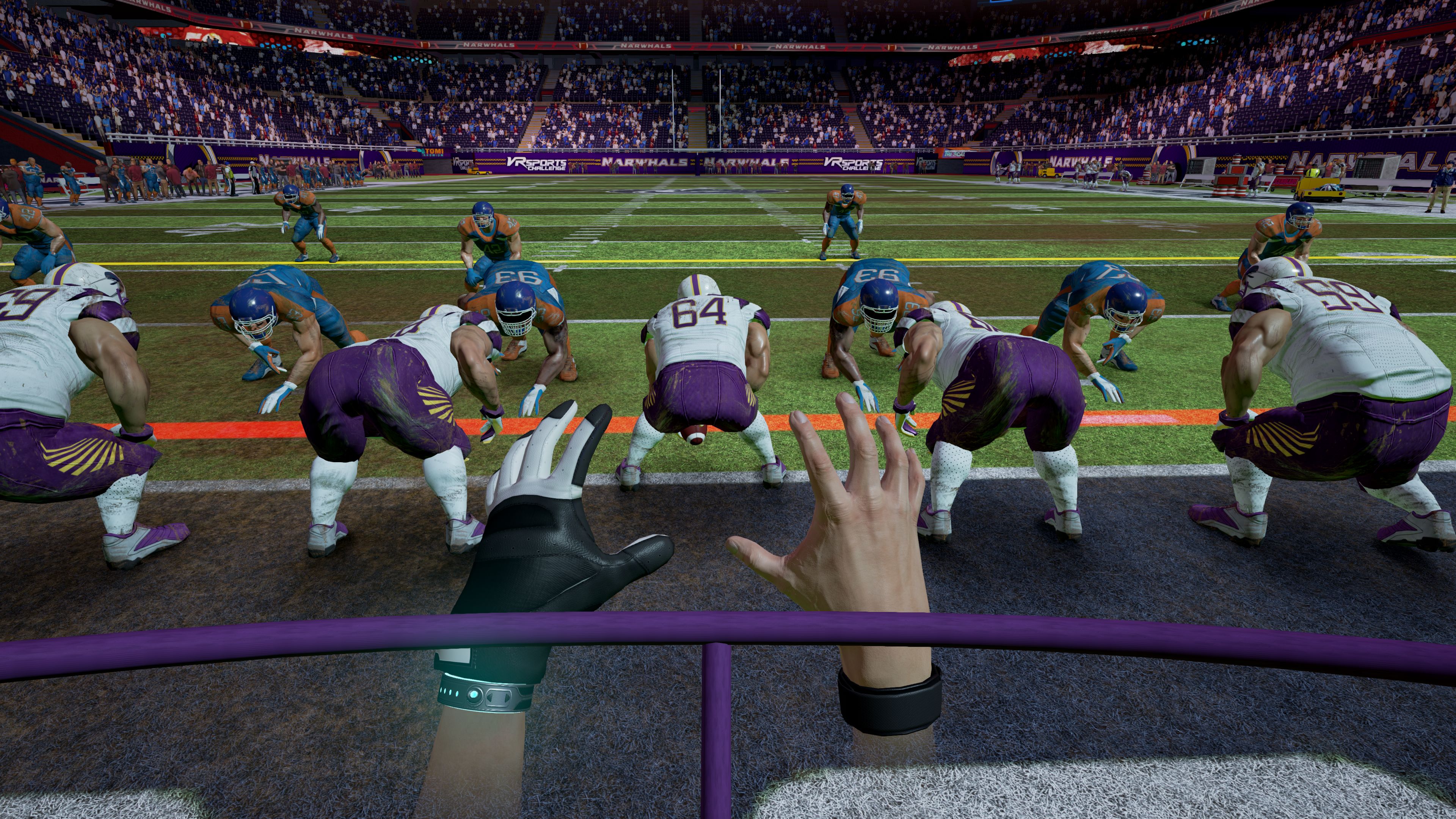
Similarly the controllers are also much more versatile compared to the competition, giving developers many more tools to work with. Each controller has a clickable touchpad and a rear trigger that has two stages to allow for more refined interaction. While they're a bit bigger in stature than the Oculus Touch or PlayStation Move, the Vive's controllers function exponentially better than either.
The main buttons you'll need to familiarize yourself with are start and connect buttons located above and below the touchpad, two side buttons that can be pushed with your ring finger and the palm of your hand and the trigger on the back.
Moving around in-game might take a combination of pressing a trigger and the touch-pad, using a trigger to jump from spot to spot or physically walking from one part of the room to the other, depending on the title. While the Oculus Rift can track a playspace of around 5 x 11 feet and the PlayStation VR can spot you in an area of around 8 x 6 feet, the HTC Vive has a maximum tracking area of 15 x 15 feet. It's a substantial difference and one that takes VR from a sedentary experience to a truly immersive one.
Vive is not only immersive, but also strangely social thanks to an additional window that pops up on your monitor whenever SteamVR is active that shows onlookers exactly what you're seeing in-game. I found this incredibly helpful when guiding my friends through games for the first time or for the times when I wanted my friends to see what I was seeing in VR.
Performance
So far I've used words like "immersive," "amazing" and "best headset on the market, bar none" when describing the HTC Vive. I could rant for pages and pages how much I've enjoyed my time with the headset but, without trying it for yourself, it's tough to fully appreciate just how close to perfect this technology is.
While other systems lag behind your movements or have a noticeable delay, the Vive can intelligently track exactly where you are in the room and what you're doing with your hands. That sounds like it should be a given, but you wouldn't believe how many demos I've tried where the system just couldn't figure out where I was standing or how I was holding my arms.
When you don't get one-to-one tracking, it's an absolute nightmare for your brain, creating a sort of cognitive dissonance that makes you feel both nauseated and unnatural. Now sure, there were one or two points during my two-week odyssey that things didn't go exactly right (I nearly vomited while playing a poorly rendered dungeon crawler), but those times were far fewer here than on Oculus or PlayStation's hardware.
Here's what my living room turned into after I got my Vive.
The games and demos you'll experience on the HTC Vive range in levity, from casual, low-stress romps, to crazy firefights, to a surgeon simulator and even a horror title or two to keep you on your toes. While experiences on PlayStation VR are better kept to the former, the Vive is versatile enough to do either and is probably the only one capable of the latter without causing severe motion sickness.
I counted 49 titles the morning the HTC Vive launched, 19 more than the Oculus Rift launched with last week. Valve won't even provide reviewers with a definitive number on how many titles will appear on Steam over the coming days and weeks because, frankly, that number is prone to doubling or tripling within a week of launch.
With all these games, it's a major boon for the system that switching between games takes seconds. To move from one game to the next, all you need to do is press the system button to pull up the Steam VR interface and then select another title to load up.
Here are a few of the experiences – both demos and games – I've tried over the past two weeks on the HTC Vive to give some context as to what I've experienced:
The Lab: Best described as the Hello World of virtual reality, The Lab is a collection of demos developed by Valve that serve as an introduction to Vive's brave new world. Included in The Lab are four games that put you on a scenic, photorealistic mountainside; in the middle of Aperture's warehouse and arms you with a massive mechanical ballista; on the precipice of a castle; and inside a 3D version of Galaga.
Audio Shield: Audio Shield is a deceivingly simple game. First, pick any audio file from your music library. Then, once the beat starts, block the incoming colored projectiles with the color-coordinated shield in time with the music. It's Dance Central meets 300 in a very weird, but totally enjoyable music mash-up.
Vanishing Realm: Rite of Steel: Vanishing Realm fulfills the quota of one fantasy title needed to release any new system. In it, you're tasked to explore a cave and fight off the magical undead minions that have overrun the joint. Along the way you'll find swords, bows and arrows and wands galore that will help you get the job done.
Water Bears VR: I'm a sucker for a good puzzle game. Water Bears is best described as the virtual reality equivalent of Where's My Water? In it, you'll be asked to direct streams of colored water to similarly colored globes that contain the eponymous aquatic ursines. Direct the water to the right bubbles and the miniature creatures will bust out of their liquid prisons.
While 99% of my experience with the Vive has been an incredible look at the capabilities of virtual reality, there are some parts of the Vive VR experience that aren't as great as you'd hope – for one, there's still that damn wire connecting you to your high-end PC, and it's easy to trip over it when you forget it's there. You can't blame HTC too much for this, as the Vive is streaming two distinct Full HD images without a hint of latency, and the gaming experience needs to preserved above all else.
But even Full HD isn't as clear as you'd want it to be – HTC calls it 'photorealistic', but you'd never struggle to tell the difference between a photo and the real world here.
That's not to say it breaks the immersion when you're in the VR world or even that it's overly grainy or pixelated – it's not. But objects in games aren't always completely clear when you really look at them. Now, that's a different story for local media played inside the headset via a virtual TV set up in a faux-living room but, in reality, I'm not sure putting a 1080p image on an $800 headset is a feature that's worth writing home about.
At this stage at least it's easy to tell the virtual world from the real one and, for some people, that might make the Vive come off as more of a novelty like Nintendo's Wii rather than the ground-breaking innovation that I see it as.
Out of all the questions I've been asked over the past two weeks, the most frequent ones are "what is like to spend a few hours in virtual reality?" and "will it make me sick?"
While I've tried to keep most of this review as objective as possible, there's simply no way to answer these questions with a one-size-fits-all remark. The answer, quite simply, is that your miles may vary. Some of you, even the most hardcore of hardcore gamers might feel like the world has been pulled out under your feet when you step into virtual reality. It's one hundred million times better than what the Virtual Boy offered two decades ago, but I've both watched – and experienced first-hand – a bad reaction to the hardware that comes with a bad demo.
With that said, I'll do my best to answer these questions as specifically as I can with the knowledge I've gleaned over the past few weeks.
Motion sickness and building a tolerance to VR
The first time I tried virtual reality I felt very sick.
For the longest time (which approximately comes out to about two and a half years now) I've avoided virtual reality because of one bad experience early on with the Oculus Rift.
After that, it seemed like no matter what hardware I was using the mere act of putting on a VR visor induced both a nauseating feeling in the pit of my stomach and an overwhelming dread.
I gave up on virtual reality for awhile.
It took two new iterations of Oculus and a complete overhaul of the HTC Vive to bring me back into VR. I can now safely say that a lot of those negative feelings I had in the beginning have been dispelled, and I feel almost as comfortable in the virtual world as I do in the real one.
I achieved this by subjecting myself to the feelings of disassociation, anxiety and paralyzing overwhelmingness that you get when you put on a virtual reality headset on multiple occasions.
So, coming back full circle to the question at hand, will it make you sick?
If you're like me the answer is, at first, it might. Your body isn't used to feeling disconnected to the visual stimuli it's receiving. Even if you game for hours and hours per day, you still are sitting in the real world, periodically removing your gaze from the television screen to look at your cellphone or interact with another human being. In virtual reality, the only thing you ever see is the screen and the objects on it.
The good news is, as long as you're playing games that are designed well and do everything they can to minimize screen jitter, you should start to develop a tolerance quickly.
Extended use: a double-edged sword
Another long-held belief that I gave up after owning the Vive for two weeks is that the maximum amount of time someone can spend in virtual reality is 30 minutes.
Over the course of the past two weeks, I've easily spent two or three hours a day inside the headset. A vast majority of those sessions lasted more than an hour and some tallied closer to two and three. Usually these long hauls involved more than one game – I'd spend 30 minutes play The Lab, before playing Space Pirate Simulator, Ninja Trainer or Water Bears – but, if there were longer experiences available, I could see myself dedicating the same amount of time solely to a single experience.
The first problem with that scenario is that these longform experiences simply don't exist yet. Again, this is something that will be remedied quickly, but it's worth pointing out that should you buy an HTC Vive this week, don't expect to find something like Mirror's Edge or Skyrim ready to play and explore as soon as you start up the system.
The second problem is that, while I enjoyed every second I spent in virtual reality, the transition of coming back to the real world was one that I found especially difficult. Without dramatizing the emotions, I felt as though I wasn't all there when I took off the helmet. The closest feeling I can pick out is the one where you look at yourself in the mirror and don't really understand the person looking back at you.
You'll still be you, but it won't feel like you at first.
Like playing a regular video game on a 2-D screen, you'll still get image burn-in (called the Tetris Effect) but, at least for me, I also had the slight outline of faint blue lines from Chaperone mode hang in the background of my vision long after I've taken off the visor.
These side-effects aren't something that concerns me and I'll keep to my habits of extended use after I'm done writing this review. I've played video games on CRT TVs long enough to know that, while strange, these secondary effects do fade in time without leaving behind permanent damage.
The future of Vive and VR in general
I hope, by this point in the review, I've imparted a modicum of my excitement about the HTC Vive and the experiences it can provide.
What's amazing is that, even though I feel like I've covered the product extensively in the last 3,000 or so words, there are still four or five more features that the HTC Vive is capable of that no one has talked about and no developer has even begun to touch.
In no particular order, they include multiplayer gaming, videos in virtual reality, using the front-facing camera for augmented reality games, integrating the headset with your cellphone to enable texts and calling without taking off the headset, and using the cameras and your headphones' microphone to virtually meet up and chat with other players through SteamVR.
Some of these features may already be implemented and others may be in the works but, at no time in the past two weeks, has Steam stopped me and said, "hey, why don't you start a voice chat in VR with a friend or watch a 360-degree YouTube video."
Maybe the developers didn't want to be intrusive or tell you how to use your new investment. Maybe the headset is just more powerful than developers are creative at this point. Or maybe I've just missed a feature or prompt that fell in between the cracks.
In any event, I view these potential features more with excitement and less with disappointment. I can't wait until Valve finds a way to show off videos made in virtual reality or finds some way to enable multiplayer between two people using HTC Vives.
More games would be great, don't get me wrong, but these are core functions of the headset that – as of right now – are completely going unused or are being used in very minimal ways. (The front-facing camera, for example, can be turned on and off to see how close you are to objects should you feel the Chaperone isn't quite right.)
In addition to the weight and cost of the headset, these are all areas of improvement or new features that I see HTC and Valve working on over the course of the next two years before the announcement of the Vive's inevitable sequel.
I hate to be the bearer of bad news but, until you try it for yourself at a friend's house or in your own living room, you can't possibly predict how much you'll enjoy the HTC Vive. (But, if I had to guess, I'd say the answer will be "a lot.")
If you want a free estimate, however, answer the following questions as honestly as you can: How much time will I dedicate to a technology that requires me to re-arrange my living room every time I want to use it and, more importantly, how much do I trust that developers will continue to support the Vive down the road?
One of those factors is entirely out of your hands. The other requires a fair bit of honesty with yourself. If you don't plan on digging deep into the software and buying loads of interesting demos and near-complete, but not quite retail-ready games, then the Vive isn't for you.
However, if you have a positive response for both questions, then it's a safe bet you'll enjoy this truly astounding piece of kit.
At the heart of this experience is excellent hardware and software. A 110-degree field of view means that games will feel more natural, and a larger area to walk around in will keep you from feeling restrained or claustrophobic in your new virtual environment.
This is coupled with two absolutely superb controllers that are shipping with the headset. And sitting just below everything else is Steam, the trusty marketplace of PC gaming that has supplied millions of gamers with software for the past decade. The infrastructure of this platform is as solid here as it's like to get.
Admittedly, this level of perfection isn't without a price, though one that has been recently lowered. You'll need to plonk down $499 /£499 (about AU$615), which is less expensive than the $800 / £689 / €899 you originally had to pay.
But the costs don't stop there. If you want the minimum recommended specs, it'll cost you another few hundred for the Nvidia GTX 970 or AMD 290 (and potentially a whole new PC to house it), which isn't cheap. Then you'll need a space big enough to fully enjoy your new escape from reality which, if you live in a place like San Francisco, London or New York, can be the most expensive part. Of course you can enjoy most games in smaller spaces, but in doing so you're freely giving away the Vive's biggest advantage: virtual space.
We liked
Nearly everything. The Vive remains the best virtual reality headset on the market, bar none. The fact that it allows for room-scale virtual reality should sell it alone, but the fact that it does so in a way that's more believable and fluid than other headsets handle seated play puts the nail in the coffin.
Add to that the two incredibly intuitive controllers that ship with the unit itself on day one, and a library of games that seems to be growing in size at an uncontrollable rate and you have a wildly compelling package at any price.
We disliked
While the HTC Vive used to be prohibitively expensive at $800 / £689 / €899, that has come down significantly. But the question is: is it too little, too late, considering Oculus Rift has had a much lower price for much longer?
Neither HTC nor Oculus release sales figures, so we can't know how many units are actually sold. But HTC Vive is essentially playing catch up with its new lower price, rather than setting the trend.
It's also important to remember that experiences vary based on the hardware you're using. If games run lag-free on a friend's computer, but run like a terrible molasses seizure on yours, don't blame the headset.
While it's not necessarily a negative, the onus now is on developers to leverage the technology and push VR forward. Valve and HTC have enabled a realm of new experiences possible but, what scares me, is that all this technology may fall victim to novelty that will wear off, turning an expensive headset into nothing more than a companion for the Wii that sits in our closets collecting dust.
Final verdict
Putting fears of abandonment aside, HTC created something amazing with the Vive, and that's been refined in the final consumer iteration of the hardware.
It's more immersive than the competition thanks to the ability to walk around in the space, and the reduction of wires from the base stations and controllers is hugely welcome. Gaming using this, even with short demos and incomplete games, feels like the future, and I can't wait to try a dozens more titles using the headset.
Many will wish the resolution was a tad better, that the price was a lower or that the headset fitted them better, but will appreciate that it's too early in the VR game for expectations of perfection. It's a balancing act between performance, size, resolution and price, and HTC seems like it's exactly where it needs to be to deliver on all fronts.
Pure and simple, the HTC Vive is awesome. Virtual reality is amazing. It's the beginning of a new format that isn't constrained to a 16 x 9 or 21 x 9 screen. In many ways, the HTC Vive and the Oculus Rift are similar to the watching the first step on the moon or the train coming out of the screen. They're pure, objective proof that entertainment isn't done evolving.
FreeVPN Free VPN Proxy is a Chrome extension which provides a free unlimited bandwidth proxy to – the developer claims – 'unblock any website'.
The add-on offers a small but widely spread network, with locations in Canada, Germany, Netherlands, Singapore, United Kingdom and United States. That might not be enough to unblock any website, but it's still more choice than you'll see with some of the competition.
There's no special setup required. You don't have to register, hand over your email address or any other personal details, and there's no login required. All you have to do is choose your server from a list, click Connect when you're ready, Disconnect when you're done; it couldn't be much easier.
The developer's website also offers VPN apps for Windows, Mac, Android and iOS, and we'll talk a little more about those later, but for this review we're going to focus on the Chrome extension.
Privacy
FreeVPN Free VPN Proxy works by redirecting your internet traffic through an HTTPS connection, preventing local snoopers from intercepting your data when you connect to public Wi-Fi hotspots or other potentially insecure networks.
This doesn't guarantee your anonymity, of course, because your traffic is being redirected through a server chosen by the developer. Could this be logging your online activities?
The extension's Chrome store page claims that 'no log is saved from any users'. That's an encouraging start, but we would normally try to verify this by checking a provider's privacy policy, and Free VPN Proxy doesn't have one, at least as far as we could see.
This isn't unusual with proxy apps and extensions, but it's still worth trying to find out more about the developer, in terms of discovering how competent and trustworthy the company might be. We headed off to FreeVPN Free VPN Proxy's website, www.freevpn.pw, to try and find out more, but were quickly disappointed.
The site was very basic: little more than a single web page with descriptions of individual VPN apps. It included links to install the Android app and Chrome extension outside of the app store, a very bad idea in terms of security. And rather than HTTPS download links pointing to the same domain (www.freevpn.pw/freevpn.apk), the site uses HTTP links pointing to bare IP addresses referring to a separate website (http://1*4.1*5.2*4.37/dl/freevpn.apk), leaving us with no idea what we might be downloading, or from where.
The confusion continued when we tried to find out who was behind the site. Although the website was www.freevpn.pw, the copyright and email message points to Tigervpns (not TigerVPN, an entirely legitimate commercial VPN service from Slovakia). A caption refers to Tigervpns (UK), and a Tigervpns Ltd Facebook page refers to FreeVPN Free VPN Proxy as a new service it has built. But there's no mention of anything else the company does, and the two company domains – tigervpns.com and tigervpn.co – don't host any website.
Having a developer that is part of a UK limited company sounds reassuring, but we wanted to find out more. Browsing Companies House revealed that Tigervpns Ltd is registered as a UK company, but the director and shareholder is named as Jiazeng Wang from Shanghai, China, and as we write Companies House lists it as 'non-trading' and apparently based at an accommodation address.
Maybe there is a good reason for this. Perhaps the developer wanted to do something with the company and just never got around to it. But it's also possible that the company is being used to make it appear that the VPN has a UK business behind it, rather than being the product of an individual from China.
Searching for references to Tigervpns.com revealed that the developer is also behind the Chrome extension Free VPN Proxy by HideMe (not to be confused with Hide.me, an entirely legitimate commercial VPN provider).
HideMe claims to have a website at www.hideme.io. This was dead during testing, but checking Archive.org showed that in 2017 HideMe was saying it had 'invented a new VPN protocol that works great in regions where traditional VPNs are blocked.' Mysteriously, the firm doesn’t seem to explain what this is, or why it doesn’t mention it in the app store pages, or why it isn’t boasting about this breakthrough on security news websites.
Put all this together and the upshot is that we seem to have someone in China setting up a UK company, apparently doing nothing with it, but using its name and UK origin to push VPN products under multiple brands, sometimes with very implausible claims.
There's no attempt to explain this to users, no website with a detailed back story, and no obvious reason why this service is being given away for free. None of that proves anything malicious is happening, but it suggests to us that this isn't a developer who in any way deserves your trust.
Installing FreeVPN Free VPN Proxy for Chrome works much like any other extension: tap Add To Chrome, wait a few seconds and a new icon appears on the address bar.
Tapping the icon brings up a simple box with a flag top-left indicating the current server location, a Connect button and a link to the freevpn.pw website.
We clicked Connect and watched as – nothing happened. There was no error message, no change in the interface at all. Browsing the Chrome store reviews showed many other users saying the same thing, and some offering very bad advice on how to fix the problem (turn off web protection in your antivirus, disable your ad blocker).
We disabled all our extensions anyway, and that did make a difference. Clicking Connect now appeared to make a connection, although the browser complained that it couldn't access any sites.
Further testing showed the problem was with the default Canada server, which seemed to be dead. It wasn't the only one: we were also unable to access the Netherlands and United Kingdom servers. The only available locations were Germany, Singapore and United States.
Browsing from the working servers produced inconsistent results. Most websites displayed correctly, but some were incomplete or not formatted correctly, and a few didn't display at all. Where there were problems, hitting Ctrl+R to refresh the page would usually fix the issue, though, indicating an intermittent fault like a connection quality problem rather than anything more fundamental.
Running performance checks on SpeedTest.net and Fast.com pointed to similar issues, with speeds varying from 200Kbps up to 50Mbps over very short periods, and with some tests occasionally timing out altogether.
This didn't stop us carrying out many common tasks, and for example we were able to stream HD video without issue, as apparently the player could buffer enough data during the high performance periods to make up for any speed drops. But overall, FreeVPN caused a significant number of browsing issues, and it's not something we would want to use long-term.
Running our website unblocking tests showed that the proxy allowed us to access protected YouTube and Comedy Central content while connected to the US server, but Netflix spotted what we were doing and refused to stream content.
We would normally test whether the service gave us access to BBC iPlayer, but as we weren't able to connect to the UK server, this wasn't possible.
To round off the review we ran our regular leak tests. All the servers we could access correctly allocated us IP addresses in the promised locations, and there were no DNS or WebRTC leaks that might give snoopers any clues to our real identity.
Final verdict
This is an unimpressive proxy app from a developer who gives no reason to trust him, and plenty of reasons why you shouldn't. If you're even slightly concerned about privacy or anonymity, use something else.
Update: Oculus Rift's second anniversary celebration may be short lived as the HTC Vive Pro has launched. We've had proper time to test out the high-res headset, so be sure to check out our HTC Vive Pro review to get all the nitty-gritty details.
While the HTC Vive Pro offers some improvements over the original HTC Vive, its price is a big hurdle to overcome, especially when you consider it doesn't include any accessories.
Because of this, the HTC Vive Pro may be best suited for VR enthusiasts and arcade owners, leaving room for the less expensive HTC Vive and Oculus Rift to continue to grow. We'll see how things shake out, but Oculus Rift is certainly enjoying some momentum especially considering it beat out the HTC Vive in the March 2018 Steam hardware survey for the second month in a row.
Original article continues below...
Oculus Rift is already celebrating its second birthday. It was one of the biggest launches of 2016 and yet, by most accounts, it was still early days.
The years since have provided an opportunity for the headset to stretch its wings a bit – a number of high-profile games have launched on the hardware, and it's received motion controllers in the form of Oculus Touch.
To make matters even better, the Oculus Rift price also received a permanent cut: $399 / £399 (around AU$640) for the headset, two sensors and the Touch Controllers.
That was a far-cry from the Rift's closest competitor, the HTC Vive, which was a fair amount more expensive than Rift. However, even the HTC Vive price has been slashed to $499 / £499 (around AU$615), bringing it closer to Rift, though still pricier.
The Oculus Rift price drop could be interpreted in a number of ways. In one sense, it could point to the fact that Oculus Rift sales have been less than what Facebook expected them to be – and the price drop is an attempt to drum up those figures. Another perfectly fine interpretation is that Facebook desperately wants this hardware in customers' hands – even if that means selling it at a loss.
Recent data would seem to suggest Oculus Rift is catching up with HTC Vive, though the numbers are by no means definitive.
But you're not here for speculation, right? You're here because you're interested in reading about one of the world's coolest, most bleeding-edge technologies: VR. Now, after two years with the Oculus Rift, the HTC Vive and PlayStation VR, can we finally say 'virtual reality is here to stay'?
OK, before we dive too deep into the virtues of VR, let's take a moment to talk about the two most important aspects to consider before deciding to buy a Rift of your own: price and the minimum PC requirements.
If you've been following the virtual reality scene you probably know this already, but the Oculus Rift requires a wired connection to a PC in order to have enough power to drive two 1080 x 1200 resolution images to each lens inside the headset. It can't just be any old run-of-the-mill PC, either – you're going to need a top of the line gaming PC to enjoy everything the Rift has to offer.
Originally, the minimum specs put out by Oculus called for an Intel Core i5 4590 or equivalent processor, 8GB of RAM and an NVIDIA GTX 970 or AMD Radeon 290 video card. Most of the hardcore gaming community might already have these components on hand, but if you're a casual gamer or currently more of a PC layman, these parts will be the first of two costly investments you need to pay for upfront.
Recently, however, that minimum spec has been brought down to an Intel i3-6100, instead of the more expensive Intel i5-4590, and GPUs can now start from the Nvidia GTX 960 from the recommended 970.
That change brings down the cost of the system required to play VR games to around $499 by Oculus's estimates, and says that it's teaming up with Cyberpower to bring pre-made rigs like that to the public.
The other expenditure is the Oculus Rift itself, duh.
When paired with the proper hardware, the Oculus Rift is far superior to PlayStation VR, and light years ahead of Google Cardboard and Samsung Gear VR, both of which only rely on the power of your cell phone to gaze into the plane of virtual reality. It's not quite as immersive or as capable as the HTC Vive, but I'll touch on that point more in a bit.
So, what exactly are you buying? What does the Oculus Rift do?
How the Oculus Rift works
I've tried my best to explain virtual reality in words and, on multiple occasions, have completely and utterly failed. At best all I can do is paint a half-cocked image in hopes to inspire you to go out and find a friend or coworker with an Oculus Rift of their own who'd be kind enough to let you give it a whirl. Here goes nothing.
Imagine standing on the ledge of a 100-story building. Imagine looking down at the street below you. Imagine the tightening of your stomach and the sense of dread that you might, at any second, fall to your demise.
Now imagine taking one step forward.
You're falling and the world is whipping before you. You're petrified. But you also feel alive. The second right before you hit the ground is the worst – your brain is actually prepared for the moment by dumping adrenaline into your system as a mild painkiller.
But while all this is happening, you haven't actually moved. You've been sitting in a chair in your own home, staring into a screen. Your biometrics have changed, but, geographically speaking, you're exactly where you were 10 minutes ago.
This is what it's like to use virtual reality, to get the experience of being somewhere else in a different time, a different place, sometimes as far as an alien world, all without ever leaving your home.
This product is the fruit of a four-year research project that launched on Kickstarter, made $2 million, then was purchased by one of the most powerful tech companies in the world, Facebook. The Oculus Rift shipping these days is the first commercially available unit – the fourth evolution of the headset that started back in 2012 with Developer Kit 1.
The latest iteration of the headset is significantly better than any of the previous development kits. It's easier to setup thanks to an intuitive program that you're prompted to download when you plug it in, and it takes less technical knowhow to install games and troubleshoot when things go awry.
Like other virtual reality headsets, the Oculus RIft has the arduous task of completely immersing you in a video game by producing two images simultaneously. It does this by hooking into the back of your graphics card's HDMI port and using a camera to track your head movement. You can either sit or stand while wearing the headset, whichever you find more comfortable. But, unlike the HTC Vive, you won't be able to use the hardware inside the box to actually walk around at all (what we commonly refer to as "room-scale VR").
What you'll get inside every Oculus Rift box, however, is the headset itself, two Oculus Sensors, two Touch controllers, seven free VR apps, including Lucky's Tale and Robo Recall, and all the cables you need to hook up your headset.
Once you've plugged the headset into the HDMI port on your GPU, the two USB cables from the headset and sensor to two USB 3.0 ports on your PC and the Xbox One controller adapter into a USB 2.0 port on your PC, you're ready to start the short and simple setup process, which only takes about 10 minutes.
What you'll find when you're done is a library of about 100 titles that are longer than anything found on the HTC Vive. I've played a good deal of them, and while some were better than others, there weren't any that I felt were a waste of time or money. I'll cover them in more detail on the next page but, in the broadest of strokes, the Rift is a fun gaming system, even if it's not number one right now.
It's almost scary how far the Oculus Rift has come in such a short period of time.
The headset we tested just a few years ago felt rough, cheap and borderline shoddy. It didn't track well and trying to get lag-free gameplay – even on a powerhouse gaming rig – was just short of impossible.
The final consumer version of the headset on the other hand is an elegant, sleek and, dare I say, stylish black brick you stick on your face. You may not look great wearing it, but the actual hardware can't be faulted for aesthetics.
When you first hold it, it's not weighty – in fact, it almost has a hollow feel, like all the weight has been put into the chassis and there's nothing but glass and thin film inside. Put it on, however, and those expectations of fluffy weightlessness will all go away.
When you're sitting down, the visor portion will weigh heavy on the front of your head. It's not something you notice immediately, but something you'll feel in your neck the longer you're immersed in your new virtual world. Thankfully, it doesn't necessarily dig in thanks to dense foam, but when it's tightened to the proper point, it's a snug fit. There are foam cushions on the back portion of the strap, too, so the back of your head rests in a cushy cradle.
The straps are a bit on the rigid side. They're made from bendable plastic that has some give, but overall holds its shape. There's Velcro located on each strap that you use to adjust the position of the headset on your face.
These straps are absolutely vital as the Rift needs to be positioned properly on your face, otherwise the focus in the VR experience is off. This will happen if the headset is hanging a little loose or isn't centered, creating a blurred effect. Too tight, and while the headset is secure and the focus generally spot on, it tends to be uncomfortable. When this happened, it never got to the point where I needed to take the headset off to escape the discomfort, but it ached slightly, and left a headset-shaped impression on my face.
The opposite problem isn't good, either. When it's too loose, gaps allow light to come through from underneath the faceplate. Light will peek through and games will suddenly lose some of their immersiveness when you can see your hands working on the Xbox controller.
But sight is just one of the senses that needs to be transformed to feel fully immersed in virtual reality. The other, as you might guess, is hearing.
To address this, Oculus includes a pair of small ear pads that sit flush on the side of the headset. They can be rotated to sit directly on top of the ear, or flipped up when someone needs your attention back in the real world. I find, for the most part, that the headphones provided with the Rift work well. They offer 3D surround sound and have enough clarity to clearly hear all the in-game audio cues.
The only real problem I had with the headphones is that they randomly disconnect from time to time. I'll be in the middle of a game when, all of a sudden, the sound completely cuts out.
However, like the HTC Vive, the Oculus Rift allows you to use your own headphones instead of forcing a pair on you. I picked a pair of Creative Sound Blaster H5s due to their padding and excellent sound quality, and using an external pair of cans eliminated any issues I had with the sound cutting out. You can plug the headphones into your computer's audio jack or, if you're sitting too far from your PC, straight into the 3.5mm jack on the Xbox One controller.
The other benefit of using your own pair of headphones, especially one with a volume slider on the side or in the cord, is that it makes it easier to manage the volume when it's too loud or too soft. (Though, admittedly, it's almost always the former.)
However, Oculus recently introduced a third option into the mix – Oculus Earphones. These in-ear earbuds replace the on-ear pads that shipped with the original system and promise VR-compatible drivers for more immersive experiences and better noise isolation for only $49.
Another piece of the puzzle here is the Xbox One controller. Now, there's nothing inherently wrong with Microsoft's excellent gamepad – as far as controllers go, it's probably the best.
That said, virtual reality is no place for a standard controller. There are a few titles that feel natural with a controller – Lucky's Tale and Pinball FX VR are two that pop to mind – but that leaves about three dozen games that desperately need Touch controllers to be truly enjoyable.
With the Xbox One controller, games in first-person that use the left thumbstick to move create a sort of cognitive dissonance: it feels like you're moving, but your body is just sitting there, creating a sinking feeling in your stomach. The Rift isn't anywhere close to Nintendo's Virtual Boy system that caused seizures back in the '90s, but expect to get varying degrees of nausea while trying out the different titles.
The last important part is the long strand of cables connecting the headset to the PC. It comes out the rear of the headset and curves over your back or shoulder, so you can then hide it behind your chair. When you're sitting or standing, the cord doesn't get in the way, but if you're attempting to go for complete Matrix-style immersion, it's something you can constantly feel.
Performance and content library
OK, so far everything we've talked about applies to every Oculus Rift setup out there. Here's where we start to venture into "your miles may vary" territory.
What I've found, using a properly spec'd PC, is that performance is rock-solid. I never noticed a screen tear or a dropped frame in any of the games I played. That speaks volumes about the kind of quality control Oculus is exerting on the games that come to its svelte storefront, and again how far this hardware has come in four short years.
Tracking, done through the included Oculus Sensor, is fairly sturdy, too. You're able to turn your body more than 180 degrees and it will still recognize what you're doing. The sensor sits about 10 inches above your desk and can be tilted up or down, depending on what position you're currently in.
Take off the headset and the visor shuts off. Pick it up and put it on, and the screen will light back up. The external and internal sensors are pretty smart, thankfully, meaning you won't need to manually switch the headset on when you want to use it.
What the sensor can't track, at least when you're not holding the Touch controllers, are your hands. And that's a deal breaker.
I can't tell you how many times I wish the Rift shipped with Touch Controllers while playing games on the headset. Using a controller to move a bumper in air hockey simply feels unnatural. Making them an optional upgrade for the many thousands who already pre-ordered and own an Oculus Rift is a major faux pas.
There's a level of intuition that comes from using your hands. You know how to throw a ball, how to climb a rock wall and shake hands in real life. Translating the most basic of movements to a controller is imperfect at best and convoluted at worst, especially if you're someone who doesn't frequently use an Xbox One controller.
Moreover, because every game seems to be shoehorned to work with a controller, it feels like you could take almost any game on the Oculus storefront and port it over to an Xbox One without actually losing anything.
And while some of those games are really fun, immersive experiences, some of them – even the first-party titles – are plain gimmicky. Like looking into a 2016 version of our childhood Viewfinder, animated images will run up to you, roar in your face or threaten you to elicit a psychological response. It's a shallow parlor trick, similar to watching the first movies in 3D.
This is made up for, somewhat, by the huge selection of well thought out titles. All the games you've been drooling over are here: EVE Valkyrie, Elite Dangerous and ADR1FT are all available on the store, with plenty more to come sooner rather than later. Even more exciting, though, are that there are plenty of games that work with the Rift that aren't on the store, including family-favorite Minecraft.
Oculus sorts games by how much motion there is in the game, and how likely it is to make your stomach churn. There are three set levels: comfortable, moderate and intense. Comfortable games barely require moving your head and, if you do, you do so slowly. Moderate steps it up a notch. You'll either need to move more quickly or be faced with more moving objects. Finally, intense games will probably be the ones that do you in. These stick you on the side of a mountain or floating around haphazardly in space; they're more visceral of experiences, but ones that are more likely to provoke anxiety and induce nausea, too.
As this is a new medium, pricing for said games is all over the place. Some games are appropriately priced in the $4.99-$9.99 space, while others come in at $40 or $50 (about £35.37, AU$66.57) for what are essentially extended demos. As of right now there's also no way to try any of the games before you buy them, which means you'll need to make a leap of faith when purchasing.
Speaking of payment, Oculus will prompt you to enter your credit card information as soon as you have your system setup, but will allow you to skip past it if you're not quite ready to hand over your digits sight unseen.
Switching between one game/movie/app and the next is a relatively painless process. Simply press the jewel button on the center of the Xbox controller, select "exit" and you'll be returned to the home screen – in this case, a swanky living room replete with a fireplace, a couch and high-res pillows that throws a standard Xbox-looking interface in the middle of the room. (I'm pointing out the ridiculous nature of having a domestic-looking home screen here, obviously, but the interface that you use to peruse the storefront is actually very well designed.)
While you're able to buy games without ever leaving the confines of the luxurious home screen, some titles require you to take off the headset to complete the installation. And, yes, in practice it's just as annoying as it sounds.
Out of all the questions I've been asked over the past two weeks as I tested out the Rift, the most frequent ones are, "What is it like to spend a few hours in virtual reality?" and "Will it make me sick?"
Well, for starters, I should probably point out that even though games, movies and images are in high-resolution, you'd never struggle to tell the difference between what you're seeing on the Oculus Rift and what you're used to seeing in the real world.
That's not to say it breaks the immersion when you're in a VR world or even that it's overly grainy or pixelated – it's not. But objects in games aren't always completely clear when you really look at them. Now, that's a different story for local media played inside the headset via a virtual TV set up in a faux-living room, but in reality, I'm not sure putting a 1080p image on a $600 headset is a feature worth writing home about.
At this stage, at least, it's easy to tell the virtual world from the real one. For some people, that might make the Rift come off as more of a novelty, like Nintendo's Wii, rather than the ground-breaking innovation that all those critics I mentioned at the beginning see it as.
As for the question about feeling sick while using virtual reality?
The short and sweet answer is yes, it probably will make you sick. Some of you, even the most hardcore of hardcore who play games for seven or eight hours a day, might feel like the world has been pulled out under your feet when you step into virtual reality.
Motion sickness and building a tolerance to VR
According to Oculus, if you want to stay in virtual reality for more than a few minutes, you're going to need to build a tolerance.
The first time I tried VR, I felt very sick. Only by subjecting myself to the feelings of disassociation, anxiety and paralyzing overwhelmingness that can be experienced when you put on a virtual reality headset over multiple occasions could I finally overcome this feeling and start to actually enjoy VR.
Your body isn't used to feeling disconnected to the visual stimuli it's receiving. Even if you game for hours and hours per day, you still are sitting in the real world, periodically removing your gaze from the television to look at your cellphone or interact with another human being. In virtual reality, the only things you see are the screen and the objects on it, yet you can't physically interact with them. This leads to the feeling of disconnection and resulting nausea.
However, once you get your space legs, there are still two big problems you have to face.
The first is that no matter what position you are in, as long as your arms and hands aren't represented in-game, you're forever going to feel a pang of disassociation whenever you look down at your body.
The second problem is that, while I enjoyed every second I spent in virtual reality, the transition of coming back to the real world was one that I found especially difficult. Without dramatizing the emotions, I felt as though I wasn't all there when I took off the helmet. The closest feeling I can pick out is the one where you look at yourself in the mirror and don't really understand the person looking back at you.
You're still you, but it doesn't feel like you at first.
As disconcerting as they may sound, these side-effects don't actually concern me based on previous experience, and I'll keep to my habits of extended use after I'm done writing this review. I've played video games on CRT TVs long enough to know that, while strange, these secondary effects do fade in time without leaving behind permanent damage.
The future of the Oculus Rift and VR in general
Even though you've spent the last few minutes reading the 4,000 words or so I've written detailing how games work, what virtual reality is like and what you can expect from the Oculus Rift when the company finally ships yours – seriously people, if you're still waiting, cancel your order and go to the store to buy one – there's still more to talk about.
Oculus has amazing plans for the Rift. It could very well be the next evolution of Facebook. We might one day hold meetings in virtual reality. I mean, it has a microphone built-in, so there's absolutely nothing stopping Oculus from enabling such a feature next week. (Actually, Facebook's Mark Zuckerberg showed off this exact functionality at October's Oculus Connect developer conference. Check it out!)
You might one day use it as a therapeutic tool, letting the hardware transport you to a beach where you can meditate. There are plans to use it as a gateway to music festivals, like South by Southwest and Coachella, as well as live concerts and sports games.
There are even porn companies that are shooting 360-degree videos that you can watch on devices like the Oculus Rift. (If you're into that kind of stuff, we have a great article about it written by my colleagues, Michelle Fitzsimmons and James Peckham.)
I guess what I'm trying to say is that there's a lot of potential here, and once we learn how to tap into it better by becoming native VR users, it's only going to get better.
I'm still not convinced the Oculus RIft is the all-encompassing "future of entertainment" that others have labeled it as, but I'm optimistic that it might earn that title in the coming weeks, months and years.
I've tried to avoid the direct comparison as long as I could, but at this point in the review, I just need to come out and say it: Oculus is a smart, if at times somewhat gimmicky, introduction to virtual reality ... but it's not the best headset on the market.
Even though it pioneered the space, invested millions in developers and development and has a partnership with one of the foremost companies in the world, Oculus can't hold a candle to the HTC Vive, a system with sensors capable of room-scale VR that allow you walk around to naturally explore your virtual space in there.
But, if you're deadset on Oculus, the Rift has similar technology if you're willing to pay a bit extra. An additional Oculus Sensor will give you the ability to get up off of your chair and use your legs as well as your arms and developers will use the new technology to create a slew of more interesting and immersive titles. The Touch Controllers, as we've said in their own dedicated review, are nothing short of fantastic. They feel great in the hand, and improve gameplay tenfold.
That said, even though it's not the absolute best headset on the market, the story of Oculus is and always will be an awe-inspiring one. Oculus has stuck to its vision, even when those early prototypes were questionable and the demos nearly too laggy to bear. In myriad ways, it was wrought from pure imagination, created an entirely new industry from scratch and built out a platform that could one day fulfill the promises sci-fi films and novels made us when they showed us the Holodeck in its various forms for the first time.
The consumer-ready Rift is a lovely piece of hardware. But it's more than just a pretty headset: Oculus has built a whole ecosystem for its baby, from the sound of the built-in headphones to the games to the proprietary Touch Controllers.
As soon as you put on the Rift, you are transported to a whole new world. Touch Controllers, though limited in some ways, will bring the rest of your body along for the ride.
The problem, of course, is everything that's not the Rift, its promises or its current set of games. The price of the whole package is going to be prohibitive for what you're getting, and it will likely keep many from jumping to Rift right away.
We liked
The Oculus Rift is an immersive window into dozens of new worlds, and one day it will play host to hundreds, maybe thousands, of such experiences. The games that are there now are absolutely great. Some might induce a bit of nausea for first-time VR adventurers – I'm looking in your direction, ADR1FT – but some will offer an untold amount of happiness.
Seen simply as a game console, the Rift has a lot to offer. Gameplay is fun in short bursts, and the headset is comfortable to wear, even if it hugs you a little too tight sometimes. What Oculus completely understands, however, is that the Rift is more than just a gaming headset. There's already ways to watch 360-degree movies through Facebook, Vimeo and Twitch, and it's not hard to imagine a future where the Oculus Store is brimming with media content.
We disliked
Similar to that used car you've had your eye on, everything on the Oculus Rift comes with a caveat. It's immersive virtual reality … but you need to buy a costly gaming rig in order to enjoy it.
Not to beat the proverbial horse here, but only a small handful of gamers will get to own the Oculus Rift – not because others don't want to, but because it's just out of their price range. Remember, that's after you buy a gaming rig that costs at least $500 to run the Rift.
Finally, while it's not necessarily a negative, the onus now is on developers to leverage the technology and push VR forward.
Oculus has created a realm of new possibilities, but what scares me is that all this technology may fall victim to novelty that will wear off in time should developers decide that designing AAA titles in virtual reality isn't worth their time, effort and money. Without more interesting, eye-catching content, the Oculus Rift is fated for a one-way trip to the cabinet, where it will take up permanent residence next to the Wii and PlayStation Vita.
Final verdict
If it didn't have any competition, the Oculus Rift would be an easy recommendation. Virtual reality is a magical experience, and something that I think everyone who loves technology needs to try at some point.
I see huge potential for Oculus down the road – just imagine how cool it will be to see places like the Louvre or the Pyramids at Giza in real time in first-person. As it stands, though, virtual reality is a nascent medium and therefore suffers from many of the same problems others faced when they were starting out.
The first films weren't Gladiator or The Shawshank Redemption. Art didn't begin with DaVinci or Tiziano. The first songs ever crafted weren't Johann Sebastian Bach sonatas. Similarly, I think Lucky's Tale isn't the end-all, be-all of virtual reality.
One day, Oculus (or one of its competitors) will be a must-own piece of technology – it could very easily be the next personal computer – but right now it feels more like a novelty than a tried-and-true necessity. The games are immersive, but not likely to hold you for hours on end. The entertainment is quirky and fun, but also ephemeral.
If you can live with that, the Oculus Rift will make for a fun experiment, one that will only improve over time. But, if you have reservations about committing the monetary resources for the headset and (what I'd consider) the requisite Touch Controllers, it's probably best to hold off on virtual reality for just a few more months until the novelty wears off.
Beyerdynamic makes loads of equipment for both audiophiles and audio professionals, and some of it comes at a high price. But, the Beyerdynamic DT 240 Pro headphones find a sweet spot offering professional audio and a high standard in design for a lower price point.
The DT 240 Pro headphones cost $99 (£89, AU$139), making them more affordable than heaps of other studio monitor headphones. This price puts them in close competition with some of Audio-Technica’s cans, like the widely praised ATH-M40X or the wireless ATH-SR5BT, which can be found on sale in the same ballpark as the DT 240 Pro.
They do a good job of presenting a well-managed balance of build quality and sonic performance, and they match that with versatility, as a portable set of headphones useful while on the go or in a studio.
Design:
Our first impression of the DT 240 Pro headphones was that they are small. The box they come in is low-profile, and Beyerdynamic manages that by putting small earphones on c-shaped arms (or “yokes”, as Beyerdynamic and some others in the headphone biz call them) that can pivot 90-degrees to lay flat against your chest or the table. The result is a pair of studio monitor headphones that have a bit more portability to offer than a lot of their bigger counterparts.
The small size doesn’t scream cheap, though. The headband and ear pads are covered in a smooth and soft leatherette that’s more than a little satisfying to our fingertips and ears. Notched metal sliders and aluminum yokes offer a clear sense of durability. The headband itself is also reinforced with metal, and though some of the plastic parts creak when flexing the headphones, the whole package feels robust, with a wide range of flexibility.
That robustness is especially important, since these headphones could find themselves in a backpack. We threw them in ours occasionally, and they didn’t get bent out of shape.
The DT 240 Pro’s headband spreads out the minimal weight of the headphones well across the top of our head, and it offers a good balance of clamping force. It’s enough to hold the headphones on while shaking our head after recording a bad guitar solo we know we’re going to delete, but it’s not so much we’re going to get a headache from the pressure.
Comfortable though the headband is, the ear cups sadly didn’t get the memo. The ear pads are super soft, but not very thick. But, worse than that, these over-the-ear headphones show how big some normal ears can get. Ours couldn’t fit entirely in the opening of the ear pads, and that left them scrunched, feeling pained after a while. Smaller ears can fit, but it’s not just people with Dumbo ears that need to heed this note: if you have medium-sized ears and aren’t used to on-ear headphones, these may not be comfortable after extensive use.
Beyond the sizing, the closed design can get a little warm and sweaty. Even though we tested these in a week that saw frost cover the ground and our cars transmission groaning at the cold, our ears could get subtly clammy inside the DT 240 Pro.
The included cable is a nice touch that lends to the versatility of the DT 240 Pro. It’s a 1.5-meter cable with a coil that lets it stretch to 3 meters. One side ends in a 2.5mm plug that can go into either the left- or right-side headphone, leaving it to user preference. The other side ends in a sturdy 3.5mm gold-plated plug that can screw into an included 1/4-inch adapter.
Performance:
Beyerdynamic shines in performance with the DT 240 Pro. As studio monitor headphones, the sound produced is not very colorful, but that’s exactly as it should be. All the sound comes through clean and incredibly well balanced.
The bass is easy to pick up on without being thumpy, though with a subtle punch at higher volumes. From the bass on up to the high end, all the sounds mesh clearly, with the DT 240 Pros not boosting one register over the other. We could distinguish between the guitar, the baritone guitar, and the bass guitar on The Fearless Flyers’ “Ace of Aces” –and, when Joe Dart is on the bass, you want to be sure your headphones are letting it come through clear.
We toyed around with the DT 240 Pros in a recording environment, and our acoustic guitar came through perfectly crisp from the lowest note to the highest. A whole range of piano notes played together felt balanced, as the headphones maintained the clarity of each note.
The lack of added color may not appeal to some listeners, and we actually felt a little disappointed while listening to songs we’ve grown accustomed to with other headphones. Fortunately, applying a custom EQ in listening software quickly makes up for that. We bumped up the bass below 320Hz and the treble above 6KHz, and that gave back the dirty oomph we love in Of Montreal’s “Dour Percentage.” As studio monitor headphones, this lack of built-in color is exactly what you want, though.
Though the DT 240 Pros are closed headphones, they only offer a small amount of noise isolation. With nothing playing, it’s easy to hear surrounding noises. Fortunately, in spite of their size, these headphones can turn way up. While you won’t always want to dial up to 11 just so you don’t hear outside noises, it can be handy to have the option to drown out otherwise loud and obnoxious sounds with more pleasant jams.
Verdict:
Beyerdynamic has made a highly versatile pair of studio monitor headphones with the DT 420 Pro headset. The removable cord, small size and flat-folding hinges make them more portable than a lot of other monitor headphones. The build quality is also commendable. Plastic doesn’t inspire confidence, but rears its face in fewer places than we’d normally expect from a sub-$100 pair of headphones. We have our gripes with the fit for our ears, but your mileage may vary.
When considering the solid build quality, it’s all the more impressive that Beyerdynamic offers great sound quality as well at the affordable price of the DT 240 Pros. While listening, we really couldn’t find anything to fault these headphones for sound-wise other than simply being studio monitor headphones, which can naturally leave some music feeling a little dry without custom EQ settings.
Though people with big ears may want to seek out something that’s more truly over-ear, these are a great pick for people with smaller or insensitive ears or for professionals needing a portable set of studio monitor headphones as a counterpart to their primary pair.
Bose has always impressed us with its Bluetooth speakers. Both the Bose SoundLink Mini II and its spiritual successor, the SoundLink Revolve, impressed with excellent sound that is wonderfully balanced and expansive. But, for those looking for more volume and better battery life, there’s the larger Bose SoundLink Revolve+.
After spending several weeks with the speaker, we came away impressed with its build and sound quality. While it's certainly not the cheapest Bluetooth speaker at $300 (£280, AU$430), it’s well worth the extra $100 over the smaller Revolve if you’re looking for slightly better sound quality and better battery life.
All that said, though, while we liked the speaker, we can’t help but feel that the Bose SoundLink Revolve+ is a bit expensive for what you get: The competition - the UE Blast and JBL Link 20 smart speakers - both have voice assistant chops while the SoundLink Revolve doesn't. If you don’t care about its lack of a voice assistant, the Bose SoundLInk Revolve+ is an excellent speaker at home and on the go, but if you like your speakers with a bit of intellect, you'll have to look elsewhere.
Design
The design of the Bose SoundLink Revolve+ is nearly identical to the smaller Bose SoundLink revolve. Both feature aluminum chassis with rubberized bases and buttons. The only difference is that the SoundLink+ gains a handy handle for taking on the go. Although it looks like it will weigh a ton, the speaker is surprisingly light for its size, making it easy to take with you to a party.
On top of the speaker you’ll find all of the controls for power, pairing, volume, aux switch, and multifunction button that works to control playback as well as activating the voice assistant on your phone. The buttons are easy to press and the multifunction button is slightly raised, making it easy to use by feel. There’s also a mic that’s great at picking up your voice for calling.
On the back of the speaker you’ll find the microUSB port and 3.5mm aux port for legacy devices. We’re disappointed that Bose didn’t choose to update the speaker with USB type-C as most devices today have moved to the new connector which supports fast charging and the lack of one means that the SoundLink Revolve+ takes ages to fully charge if you run it dry.
On the bottom you’ll find a standard tripod mount and you’ll also notice four metal contacts for using with the charging dock, which is sold separately. The dock makes it easy to dock when at home and really should be included with the speaker, seeing as the older Bose SoundLink Mini II ships with one.
Performance
If you read our Bose SoundLink Revolve review, you’ll already know that we’re big fans of its sound.
The good news is that the bigger SoundLink Revolve+ improves on the sound quality of the smaller Revolve in just about every way, though the tonal balance is identical between the two. The overall balance is slightly warm, which make the Bose very forgiving with compressed music from streaming services.
The biggest difference between the two is that the bigger Revolve+ gets much louder and throws and even more expansive soundstage. While music still plays in mono, there’s a sense of air around individual instruments and vocals.
Bass is controlled and provides good impact. Like with its smaller sibling, you can increase the bass response by placing the speaker next to a wall. However, the Revolve+ does a better job of rendering bass in the center of the room than the smaller Revolve, which is unsurprising since the speaker is much bigger.
Battery life is rated at 16-hours and we saw around 10 to 12 hours listening to medium to high volume. If you listen at a more reasonable volume, you should be able to hit Bose’s 16-hour rating. But if you’re planning on bumping some tunes at a friend's house party, you may want to bring its charger.
Verdict
The Bose SoundLink Revolve+ is a great speaker, albeit expensive and a bit dated compared to the competition. It may not have a smart assistant built in for voice controls, but for those who don’t care about that, the Revolve+ is a pleasure to use, especially if you pair it with the dock ... which, unfortunately, is sold separately. (Yes, the user experience and sound quality are so good we can overlook its missing features.)
However, if you’re looking for a connected speaker, the JBL Link 20 is an excellent value that packs Google Assistant into a portable weatherproof speaker. If you don’t plan to take your speaker outside, the Sonos One is a better value at $200 and comes with Amazon's Alexa smart assistant on-board (Google Assistant is coming to the Sonos One some time this year, too).
If you're looking for a brilliant-sounding-but-basic Bluetooth speaker, look no further.
Smart switches are a dime a dozen. Most of them work perfectly well, but there’s not much to distinguish one from another.
Thankfully, however, some of the newer switches offer more than just smart control at a reasonable price. Like, for example, the new iDevices Switch, which isn’t just a smart switch, but also monitors your energy and boasts a built-in light as well.
Are those key features enough to make the switch worth buying? And is the built in night-light really enough to make it a better choice than other smart switches?
We put the iDevices Switch to the test to find out.
Design and setup
As usual, the first thing you’ll notice about the iDevices Switch when you open the box is its design - which is good considering it’s a pretty nice-looking switch.
And while you might not see a massive difference right away, there are a few ways in which this switch sets itself apart from other smart switches: For starters, instead of the outlet being on the front of the switch, it’s on the side, with the manual power switch being located on the other side. For some situations, that may not be the most practical design - but, for others, it’ll work perfectly.
Another major difference between this switch and others is the fact that on the front, you’ll find an LED light strip. This is perhaps the biggest differentiator between iDevices and other smart switches as it means that there are two things to control within the Home or iDevices apps. Not only will you be able to control the power switch, but you’ll also be able to control the color and brightness of the light on the front - making it an excellent night light.
We set the device up in the bathroom connected to the electric toothbrush charger, not because we wanted to control when the toothbrush would charge, but because a night light in the bathroom eliminates the need to turn the bathroom light on late at night when you go to the bathroom. It worked perfectly in that regard - offering just enough light to be able to see, but not enough to be painful late at night.
Setting up the switches was an absolute breeze through the Home app on an iPhone. Simply plug the switch in and open up the Home app, then scan the included HomeKit code, and you should be good to go.
Once the switch was set up, we were told that it required an update - which could only be installed through the iDevices app. iDevices’ app also allows for things like improved automation and scheduling, as well as energy monitoring, so it might be worth downloading anyway.
In general, we liked the fact that it has a light on the front, and the fact that the light is customizable and controllable. While the power outlet is located on the side may not work for all, it’ll work better for some situations.
App and day-to-day use
As mentioned, the Home app may tell you to download the iDevices app - but thankfully, the iDevices app isn’t all that bad. Sure, you may prefer to use the Home app as a one-stop-shop for all of your Home control, but the iDevices app does allow you to control other Home-connected devices (like Philips Hue bulbs), plus it offers automation and scheduling without the need for an iPad, HomePod, or Apple TV.
Overall, the app is also pretty well-designed and easy to navigate. The main interface is divided up by room, and from there you’ll be able to control each device within the rooms. There, you’ll also set up schedules - which are largely limited to turning the devices on or off at specific times.
There’s also the fact that the switch can monitor energy usage, and you’ll be able to see that energy usage by tapping on the switch in its app. The app will show things like average energy consumption per day, week, month, and year, and it’ll tell you how long the switch is used and an estimate of how much that energy costs, too.
The app is one of the Switch's strongest suits honestly, and you may even prefer to use it over the Home app. That being said, if you're tied into the Apple ecosystem, it’s nice to be able to control all your HomeKit devices from one app - and if you end up deciding that you want to stick with the Home app instead, you can delete the iDevices app and rest assured that you’ll still be able to control your switch.
Smart home compatibility
As the name suggests, the iDevices Switch is largely built for those that are plugged into the Apple ecosystem and who use HomeKit but, if instead you have an Android phone, you’ll still be able to use the switch: iDevices has an Android app, too.
Of course, the integration is largely limited to the app on Android - the device doesn’t “Work with Nest,” and it won’t connect to your Samsung SmartThings hub or Google Home system. It does, however, work with Alexa - so if you have Amazon Echo speakers you want to use, you’ll be able to use your switch with them.
While the iDevices Switch is best-suited to those that use an iPhone and HomeKit if you really like the concept of a light built-in to a smart switch and don’t mind using the dedicated app, or you use an Amazon Echo regularly, then it’ll work fine on Android too.
Verdict
The iDevices Switch is well-designed, easy to use within the Apple HomeKit ecosystem, and works great. The best thing about it? It’s pretty inexpensive too, especially given the fact that it offers energy monitoring: While the likes of the Eve Energy Elgato monitoring switch come in at $50 or more (£44.95, AU$84.95), the iDevices Switch comes in at only $30. That makes it perhaps the best smart switch for the money, especially given its extra features.
Of course, there are some downsides - namely, that the switch only really works well within the Apple ecosystem.
Sure, it’ll work with Alexa, and you can piece together Android compatibility, but if you want to use the switch to its full potential with the rest of your smart home devices, then using it with Apple products is probably the best way to go.
Editor's note: The iDevices Switch is currently only available in the U.S. however we will update this review once it becomes available in other territories.
Fitbit’s latest wearable device, the Versa, is positioned by the San Francisco-based health tech firm as a smartwatch, with a completely new, lighter design, more personalization options, and with a battery life of over four days.
It’s not so long ago that Fitbit released its flagship wearable, the Fitbit Ionic, and the quick turnaround on this new device is probably because the company has said that the Versa merely “builds on the success” of its slightly older and more feature-rich sibling.
However, in a bid to make it more attractive to those not looking to spend £300/$300/AU$450 on a smartwatch, the Versa comes with a price point that much easier on the wallet by removing some of what made the Ionic more of a premium purchase, such as GPS.
To ensure it’s still desirable, though, Fitbit has added some fresh tools, such as more customizable clock face options and female ovulation tracking (which, admittedly, won't arrive until after launch).
Fitbit Versa price and availability
The Fitbit versa costs £199.99 / $199.95 / AU$299.95
It's the cheaper alternative to its bigger brother, the Fitbit Ionic
Available for pre-order now with global release coming mid-April
The Fitbit Versa is a cheaper alternative to the company’s flagship Ionic smartwatch, which was its most expensive wearable to date when it was released in late 2017.
Priced at £199.99 / $199.95 / AU$299.95, it is a replacement of the Fitbit Blaze running watch but still costs more than the Samsung Gear Fit 2 Pro for instance, though significantly less than the Apple Watch 3.
The Fitbit Versa is available for pre-order now in silver, black or rose gold as well as several watch strap color combinations, with global retail availability coming sometime in mid-April.
The Fitbit Versa undercuts the Ionic but still isn't cheap
Design and display
New, more accessible ‘squircle’ design
Brilliantly bright and clear display
Lightweight and comfortable
For the Versa, Fitbit hasn’t just updated the design of one of its previous or existing wearables; it’s given it a completely fresh look and perhaps one that seems more Apple Watch-esque than any of the company's previous devices.
It boasts what Fitbit is calling a ‘Squircle’ watch face design, that is, a square face with rounded edges - in case you needed that spelling out.
Despite its silly design name, the Versa is a much more handsome and friendly-looking watch than many of the firm’s previous devices, especially the Ionic, which we have to admit we weren’t the biggest fans of.
In comparison, the Versa is pretty nondescript and thus harmless looking, ensuring your eyes are left to concentrate more on what’s happening on the display than around it.
The Versa’s anodized aluminum case and slightly tapered and angled design is said to make it the firm’s lightest smartwatch yet
The Versa isn’t only aesthetically pleasing, but probably one of the most comfortable smartwatches Fitbit has made thanks to its lighter weight.
Fitbit claims the Versa is one of its lightest smartwatches yet due to its ultra-thin, anodized aluminum case and slightly tapered and angled design that has been built to fit small or large wrists.
However, this lightweight material does make it feel a little cheap, something to keep in mind if you’re wanting the Versa to be more of a lifestyle watch as opposed to just a fitness friend.
The Versa sports a wake-up/back button on the left-hand side and two smaller pause/finish workout buttons on the right
On the left-hand side the Versa sports one main wake-up/back button, while on the right there are two smaller pause and finish workout buttons. These are easy enough to press and proved to work perfectly while using the Versa for both focused exercise and day-to-day wear.
The traditional watch-style clasp is super easy to fasten and release, while retaining a good grip during intense workouts; something we prefer to those modern button-style straps some smartwatches and activity trackers have these days.
As with the Ionic, these straps are also interchangeable with many different colored metal, fabric or silicon versions in case you want to change up the watch style entirely.
The Versa’s strap is comfortable and also interchangeable with many different colored metal, fabric or silicon versions
As for the Versa’s display, it’s a vibrant, colorful touchscreen with a brightness up to 1,000 nits. This means that even in direct sunlight or underwater it’s easily visible, even when not turned up to the maximum brightness capacity.
Touch commands also seem to be much improved over the Ionic, which seemed to suffer a little from latency. Now commands seem to be fluid and uninterrupted.
Fitness features
All major workout types covered with dedicated tracking modes
Swim tracking works perfectly underwater
Run detect feature accurately detects when you’ve paused for a rest
Perhaps in an attempt to stay relevant in the age of the Apple Watch 3, Fitbit has ensured the Versa is brimming with fitness features, just like it did with the Fitbit Ionic, with the only major omission being GPS.
Tracking your workout on the Versa is really straightforward and works in the exact same way as on the Ionic.
Whether it’s running, cycling, swimming or HIIT that you want to track, there’s a dedicated option for this on the watch’s Exercise app, accessible as the first option in the main menu carousel. This consists of: Run, Bike, Swim, Treadmill, Weights, Interval Timer, and Workout.
To track your run, for example, you’d simply select the Running tab from the Exercise option by swiping left from the home screen, then tap go and off you go.
There are many dedicated workout options on the Versa’s Exercise app
During the exercise, the watch will display a selection of your vitals, which will differ depending on what exercise you’re tracking. For example, the running option will display distance and time, whereas the swimming option will display the lengths and meters swam alongside the time, and then the general workout option will show heart rate the calories burned.
Many other tracking variables can also be seen, such as the current time and time taken, by swiping left or right on the main display during the exercise tracking.
The Versa gives you a workout summary of your performance as soon as you’ve done your exercise
Once you’ve ended your exercise by telling the Versa you’re done, you’ll get a workout summary. These little summaries are a great touch, giving you the lowdown on your performance as soon as you’ve finished.
In our running session for instance, the Versa workout summary told us what our maximum heart rate had been in beats per minute (BPM), alongside our average BPM during the whole exercise, the time it took to complete the workout and the distance traveled.
As with the display during exercise, this summary changes depending on the exercise you do. After a HIIT class, in which we’d chosen the standard 'workout' option, we were told how many calories we’d burned as opposed to distance traveled and time taken.
This is all viewable in the app, too, after you’ve synced your watch to your smartphone, alongside all the other variables, side by side with any previous workouts you’ve done.
Another impressive tracking capability for a wearable at this price point is the swim tracking. We say impressive because in order to do this, Fitbit obviously had to make the Versa completely waterproof (to 50 meters), which not only means you can get it wet, but you can use it to track your water activities with a dedicated swimming mode.
It works swimmingly (sorry) as well. It accurately tracks your laps in a pool for instance, recognizing when you’ve reached the other side and kicked off to start your next lap.
What really took us by surprise was that the Versa was able to offer clear and concise on-screen information with its brightly-lit display as we swam. It isn’t easy to swipe between the different tracking variables during this mode though, as you can imagine, as the display doesn’t recognize finger taps so well underwater.
The Versa’s Run Detect feature means it automatically pauses your workout if you stop for a short break
Thanks to the device’s Run Detect feature, which was also seen on the Ionic, the Versa is clever enough to know when you’re taking a break, and automatically stops and starts tracking a run, swim or cycle by sensing the status of your movement.
The other good news here is that this feature doesn’t come into play if you don’t want it. Choose a standard 'workout' exercise from the list before beginning circuit training, for example, and it tracks your heart rate continuously, until you tell it to stop.
It works really well, meaning you can get on with the workout without checking the watch all the time and making sure it’s recording your movements accurately.
Last but not least is sleep. While this tracking function isn’t exactly a fitness feature, it still works in a similar way. However, it’s not something you activate in the menu. If you wear the Versa to bed, it will automatically track your sleep by recognizing your inactivity, stillness and decreased heart rate.
A summary of your sleep pattern will then be offered within the app after waking up, displaying how long you were asleep for in total, with this time split into REM (rapid eye movement), light and deep sleep.
This analysis is provided in an easy to understand and insightful way, pitting your results against an ideal target 'benchmark' of someone the same sex and age as you.
Performance and battery life
Performance is generally nippy
Battery lasts for around 3-4 days on a single charge
Versa charger is proprietary and comes with a clip-in dock
Fitbit claims the Versa’s battery life is not quite as impressive as its bigger, more expensive sibling the Ionic, cited at four days instead of the Ionic’s five. After using the watch for a good two weeks on and off, we were rather impressed that its stamina matched up pretty well with Fitbit’s claims.
The Versa has a pretty decent battery life of 3-4 days
Obviously the total number of days you’ll get out of the Fitbit Versa is completely dependent on how many workouts you track throughout the week, if you keep it on at night for sleep tracking, and if you have the brightness setting set to low or high.
After a full charge and using it for a full 24 hours, including two intense workouts and sleep, it was at a rather impressive 70% capacity. After three full days, it was just over 10% before finally dwindling to zero halfway through the fourth day.
As for actual device charging, Fitbit doesn't opt for juicing its wearables via traditional micro USB - so if you are travelling then the special Fitbit charger will need to make its way into your suitcase.
It’s also worth noting the Versa’s proprietary charger comes with a clip-in dock (included), which makes it much easier to charge compared to the magnetic pin on the Ionic.
Interface
Clean, clear and well laid out interface
Customizable watch faces
Contactless payments are fiddly
When Versa hits the shop shelves, it will come with Fitbit’s latest OS 2.0, including a new personalized dashboard that provides a more simplified and intuitive view of your health and fitness data.
This includes 'Stats at a glance', which allows you to see your daily and weekly health and fitness stats, historical activity, heart rate, and exercise summaries from your wrist by simply swiping up on the main display.
Generally, on-screen icons are displayed beautifully and in a clean way so as not to confuse you, too. However, one of our favorite features in the Versa software is that Fitbit has given the watch more customization options than ever before.
The new ‘stats at a glance’ feature shows you your last workout data by simply swiping up from the main menu
This, Fitbit said, is something it has realized its customers really want, so made it a bigger focus in the development of the Versa.
You can customize your own watch faces to make the Versa look how you want it to, something we saw a bit of in the Fitbit Ionic, but this time around there’s hundreds more different designs to choose from.
You can also purchase third-party clock faces, some of which are customizable right down to the text color and arrangement of data.
The Versa’s digital clock display is completely customizable through the Fitbit app
Debuted on the Ionic, the Fitbit Pay platform is available to use on the Versa, too, meaning you can use the watch to buy stuff without your phone or wallet, and it works with major credit card companies like AMEX, MasterCard and Visa.
We tried the feature in different stores and while it didn’t work in one for some unknown reason, it did in the other four.
The feature worked reasonably well but it is a little fiddly. It requires you to input a 4-digit PIN before bringing up the contactless payment screen, and because the number keys on this tiny screen are so small, you’ve got to be really careful not to press four buttons at once.
Fitbit Pay allows you to make contactless payments from the Versa, but it’s not compatible with many UK banks just yet
At the moment, the contactless payment feature doesn’t work with many banks in the UK yet, either, so we wouldn’t advise this being one of the main reasons why you buy the Versa.
So far the compatible list includes just Danske Bank and Starling Bank, so pretty limited. Fitbit has said it’s working to rectify this, though, so it could change soon.
The Fitbit Versa also supports smartphone notifications, letting you see calendar alerts, texts and calls on screen, as well as notifications from other supported apps.
App
Compatible with iOS, Android and Windows devices
Impressively detailed and intuitive app
The Fitbit platform remains mostly unchanged from our review of the Ionic, and it’s still just as impressive as it was then. It's clear, simple to understand and everything is easy to navigate. The Versa syncs via Bluetooth and it is a much faster and slicker experience than competitors like Withings (now Nokia Health).
We tested the Versa with the iOS app for iPhone, but it is available on Android and Windows Phone, too, which we are yet to test. On the app home screen, you’ll find five main tabs within the Fitbit app: Dashboard, Account, Challenges, Guidance/Notifications, and Friends.
The Fitbit app platform remains mostly unchanged from our review of the Ionic, and it’s still just as impressive and easy to use
Dashboard is the main one, which presents all the data collected for each day - from food and water intake (if entered), to the number of steps taken - in tile form, making it easy to customize the order of what you want to see.
Each measured metric has a circular bar above it that moves in a clockwise direction as you get close to a set goal, meaning it's easy to see if you need to move more. Tapping on each of these metrics will also present data in more detail.
The main Fitbit app dashboard presents all the data collected for each day, from food and water intake to the number of steps taken
The other notable tab is the Account option, which can be found at the top right in the app and is where you can change goals, setup another Fitbit tracker, or access other settings like adding a custom heart-rate zone.
There is also a link to see which compatible apps there are within Fitbit, such as MyFitnessPal, which is great for tracking diet. And settings - such as the Versa’s clock face, silent alarms, main goal, and so forth - can also be accessed here.
Verdict
While its feature set isn’t quite on par with that of the Fitbit Ionic, the Versa feels very much the same watch in a different, lighter and friendlier design.
It also brings a clear, bright and beautiful screen, a new and improved heart rate sensor that will apparently be updated with even smarter functionality via a firmware update later in the year, smart notifications, contactless payment capabilities and all the features Fitbit users will have come to know and love.
But what makes it really special is that you can pick up some really great, intuitive fitness tracking features for just under £200/$200/AU$300. Something we cannot fault, and also something many of Fitbit’s competitors can’t compete with.
Who's this for?
The Fitbit Versa could be for anyone interested in fitness but looking for a smarter piece of wristwear
With the Versa, Fitbit has basically looked to bring the rich feature set as seen in its Ionic smartwatch but bundled in a more everyday 'lifestyle' kind of way, making it a watch for those that are into fitness but not necessarily fanatical about it.
The more friendly, nondescript design, Fitbit Pay support and lower price point further reinforce this.
So, the Versa is not exactly just an exercise pal, but an everyday smartwatch with added fitness functionality for those looking for smartphone connectivity features such as notification support as well as being conscious about their health.
Should you buy it?
What made the Fitbit Ionic tricky to recommend was that for such as high price point, there were so many great options out there for smart wristwear that offered better value.
However, as the Versa is almost identical to the Ionic in terms of features (apart from in-built GPS and a five-day battery life), it’s completely changed the game, as you can now get your hands on some great, in-depth smartwatch and fitness tracking features that all sync with the really well-designed Fitbit app for significantly less than before.
It’s basically a great option for those that really wanted the Ionic but thought it was just that bit too pricey (and close to the RRP of many other slightly more premium devices such as the Apple Watch 3) to justify it.
First reviewed: April 2018
The competition
Here we're going to run you through some of the alternative watches you may want to buy instead of the Fitbit Versa.
Apple Watch 3
The Apple Watch 3 is a true smartwatch, and even offers LTE, so you can use most of its features without a phone.
It's more stylish than the Fitbit Versa too, and while it's a real smartwatch its fitness features aren't lacking - in fact it has GPS, which the Versa doesn't. But of course the Apple Watch 3 is also a lot more expensive.
If you’re a little bit more into your fitness, especially running, the more expensive Fitbit Versa might be a good alternative to consider as it offers more dedicated fitness features such as in-built GPS tracking – meaning you don’t need to take your phone out with you when you go for a jog.
However, it’s not quite as pretty as the Versa, so its design might not be one for you if you plan to use it outside working out.
Samsung has a lot of experience making smartwatches now and the Gear Fit 2 is arguably a decent alternative wearable device for dedicated fitness tracking, especially if you’re not looking to break the bank.
Because it’s not really a full on smartwatch, it retails at a much cheaper price than the Versa. We gave it four stars when we first reviewed it citing an intuitive interface, great AMOLED display and good activity tracking features as the key highlights.
There are some issues such as a lack of apps - something the Versa suffers from too - but that's something that's improving all of the time.
Sony’s Compact line offers something different to most other high-end phones, as they fit high-end hardware into a small frame.
If you want top specs and a phone that won’t stretch your fingers or your pocket lining, the Sony Xperia XZ2 Compact is one of your best options, as you don’t see hardware this impressive in other phones with 5-inch screens.
It becomes a bit of a tougher sell if you want a phone with a design that matches its premium cost, though. The Sony Xperia XZ2 Compact doesn’t feel or look as expensive as it is.
Its camera and chipset will smoke those of just about any other phone this size, but unless you go pixel-peeping at its photos or notice the milliseconds it shaves off app loads, you can get a similar experience for under half the price.
Sony Xperia XZ2 Compact price and availability
Costs £549 (around $600/AU$1,000) SIM-free
Launching between April and June
The Sony Xperia XZ2 Compact is one of Sony’s top phones for 2018. It was announced at the MWC conference in February 2018, alongside its big brother the Sony Xperia XZ2.
It's set to hit stores during quarter two (April-June) and costs what used to be the standard price for a high-end phone, before the ceiling rose to accommodate mobiles like the iPhone X and Samsung Galaxy S9 Plus. You’ll pay £549 (around $600/AU$1,000) SIM-free.
There aren't many direct rivals for the XZ2 Compact. No other big phone brand makes Android phones this small with top-end components. It’s just not done, giving it an amazing edge for those who still just don’t like big phones.
Key features
Compact build with high-end specs
Strong 19MP camera
The Sony Xperia XZ2 Compact shares many features with the larger, more expensive Xperia XZ2. It’s what makes this small phone so unusual.
These features include Qualcomm’s top-end Snapdragon 845 chipset, a 19MP camera, 64GB of storage and a screen capable of playing HDR video. That’s the kind of footage you might watch on a high-end TV.
You simply don’t get this sort of hardware in other phones this small. Your closest option from Samsung is the Galaxy S9, which is a little wider and a lot longer.
This combination of top-quality internals and a small frame is exactly what some are after. The issue is you won’t necessarily appreciate the quality of the Sony Xperia XZ2 Compact unless you look deeper.
On the surface this phone is in danger of being interpreted as a cheap and friendly Android. And it is certainly not cheap.
Phones like the Moto G5S actually feel more high-end than the Sony Xperia XZ2 Compact, which is quite alarming. However, even that budget favorite has a significantly larger footprint than this one.
This is a great phone for the right buyer, particularly as Sony has made real improvements to the camera performance this year. Well, aside from the front camera, which is surprisingly unremarkable. However, you do have to care, a lot, about its small, cuddly frame.
Design
Tubby and rounded rather than blocky
Plastic back doesn’t feel that expensive
Fingerprint reader yes, headphone jack no
Most phone-makers try to make their handsets as thin as they can. The design goal of the Sony Xperia XZ2 Compact is not about thinness. A small footprint is at least 50% of the appeal here.
The Sony Xperia XZ2 Compact has the silhouette of a phone with a 4.5-inch screen. Its actual display measures five inches across, but this is only because it has a 'longer' 18:9 aspect display, like so many recent phones.
Screen shape aside, using the Sony Xperia XZ2 Compact is a pleasant callback to years past, when we didn’t have to stretch our thumbs, like a baby in a pram reaching for a cookie, just to tap certain parts of the screen. This has been the key appeal of Sony’s Compact phones since the series began in 2013.
The Sony Xperia XZ2 Compact’s design is different to the Xperia XZ1 Compact, though. It’s no longer a rectangular brick, using much smoother curves across its back for a palm-hugging feel.
It’s oddly similar to the style of the very first Motorola Moto G, an instantly lovable budget classic. The obvious issue: that was a much cheaper phone.
The Sony Xperia XZ2 Compact has a plastic rear, which does not give it an immediately impressive feel. It’s also very chunky at 12.1mm thick. Few people handed this phone would assume it's as expensive as £549/$600.
Its sides are aluminum, but the feel is defined by the smooth, plastic curves.
Phones are status objects. There’s a certain swallowing of consumer pride necessary here. However, to an extent this has always been the case with Xperia Compact phones. They aren’t for show-offs.
Considering its thickness, it is disappointing the Sony Xperia XZ2 Compact does not have a headphone jack. You have to use wireless headphones or an annoying little adaptor (included) that plugs into the USB-C socket on the bottom. It’s as clear a sign as any that phones with 3.5mm sockets are headed for extinction.
Claims it frees up space seem spurious in a phone this thick.
The Sony Xperia XZ2 Compact does have water resistance, though. It’s IP68 certified, meaning it can be dropped in water without damage.
There’s also a fingerprint scanner on the back, which has moved from Sony’s traditional side position in the Xperia XZ1 Compact. A rear scanner is more convenient, but the position is rather low. You need to move your finger down to reach it.
This, and the Sony Xperia XZ2 Compact’s chunkiness, are costs of the phone’s ultra-small footprint.
Chalking up a gadget’s value is a big part of our job. That the Sony Xperia XZ2 Compact is more expensive than it seems matters. However, it also trades on being different and earns back some credit with sheer likability. We don’t miss the days when many phones were as small as this, but it’s here for people who do.
Screen
18:9 screen cuts down wasted space
Ultra-saturated color
Very bright
The Sony Xperia XZ2 Compact’s display is another aspect changed for this year. It’s an 18:9 aspect screen, leaving smaller screen-less borders at its top and bottom.
It is also a much higher-spec display than the XZ1 Compact’s. That phone has a 720p resolution. This is a wide Full HD screen, with a resolution of 1080 x 2160. It’s very sharp, with density of 483 pixels per inch.
The Sony Xperia XZ2 Compact also has the spec bragging points of the larger Xperia XZ2. It supports HDR, and Sony’s X-Reality engine upscales standard dynamic range content to HDR too.
Sure enough the screen has extremely vibrant color, excellent maximum brightness and great contrast for an LCD, although when tilted there is some visible greying of blacks.
If you find the out-of-the-box color too vibrant, or not vivid enough, you can change it too. The standard mode is a great balance of saturation and accuracy, but the Xperia XZ2 Compact also has a relaxed-looking sRGB mode and a Super Vivid one, dripping in color.
Such tech does seem wasted on such a small display, though. Watching Netflix or a long YouTube video is going to be more fun on a poorer-quality 6-inch screen than a high-end 5-inch one like this. Especially as standard 16:9 content leaves the extreme left and right parts of the screen unused, effectively reverting to a 4.5-inch-ish display size.
Let’s get real: all the tech in the world can’t make the Sony Xperia XZ2 Compact’s small screen seem like a mini cinema. But, to be fair to Sony, it’s the best 18:9 screen around at this size.
Star rating update: This review was originally published with a star rating of 3.5. This was an error and has been updated to 4 stars.
Battery life
Acceptable stamina
Supports fast charging
But there’s no fast charger in the box
The Sony Xperia XZ2 Compact has a 2,870mAh battery, just a little larger than the 2,700mAh cell of the XZ1 Compact.
It sounds like a fairly big battery for a phone this small. It doesn’t hold up that well in our standard video test, though. We play a 90-minute video at maximum brightness and see how much the battery drains.
The Sony Xperia XZ2 Compact loses 26%. This is a lot worse than the 17% lost by the XZ1 Compact.
This phone’s higher-resolution screen seems to be quite the power sucker.
Day-to-day use provides better results. We’ve found it fairly easy to get through the day without charge running out before bed time. By 11pm it tends to have around 15% battery left, following plenty of WhatsApp and a few hours of podcast streaming sprinkled through the day.
Despite the fairly good battery capacity to size ratio, the Sony Xperia XZ2 Compact is not a phone that will last many of you through two days. It’s an every-day charger.
While the phone supports fast charging, you don’t get a fast charger in the box. It’s a standard 5V, 1.5A plug, which isn’t fast by any standard. Considering the relatively high price, this is disappointing.
There’s also no wireless charging. The Sony Xperia XZ2 supports Qi, but this phone does not.
Camera
High resolution rear camera with decent night shooting
4K HDR video capture
Just okay selfie camera
The Sony Xperia XZ2 Compact has a rear 19MP camera, the same resolution as the Xperia XZ1 Compact.
Some improvements have been made, though, and this phone is a far better camera than Sony flagships of a couple of years ago.
Standard procedure for older Sony top models was to use ultra-high resolution 23MP cameras, far too high resolution for their sensor size. In an attempt to patch this up, Sony used quite nasty image processing that left finely-knit natural textures looking scratchy and ugly.
Down at pixel level the Sony Xperia XZ2 Compact’s images still look obviously processed, with a clear attempt to bring out fine detail like the far-away branches of trees.
However, the result no longer deserved a “yeuuugh” response of disgust. And day-lit shots have loads of detail.
Sony has, more recently, also improved its Auto HDR algorithms, used to balance out bright skies and the foreground without blowing-out highlights. Is it a star? Not quite. We still saw numerous instances of general overexposure and a few blown highlights. However, performance is more consistent than previous years.
A few classic Sony traits remain, though. The Sony Xperia XZ2 Compact tends to overemphasize greens, making your nature shots look a little 'candied'. And purple tinges to textures are common, particularly in brown and near-black tones.
The Sony Xperia XZ2 Compact still lacks proper optical image stabilization too. Instead it uses a gyro-based system that times the exposure to when your hands are at their stillest.
This isn’t the best night shooter around, but it is one of the best among phones without optical image stabilization. Detail retrieval in dimly lit conditions is surprisingly good, with a fair amount of fine detail visible even at ISO 800. This is the sort of sensitivity the Sony Xperia XZ2 Compact might use for a street-lit night scene.
At higher sensitivities, image quality predictably falls apart more noticeably. Like previous Xperia phones, the Sony Xperia XZ2 Compact does its best to make very dark scenes look bright, commonly using ISO settings of up to 3200 in the Intelligent Auto mode.
Shooting like this you only get an outline rendering of a scene, as the noise reduction goes into overdrive, smoothing out the image in a much more aggressive manner.
However, in all conditions the Sony Xperia XZ2 Compact avoids the ugly look of some older top-end Xperias. It’s pretty good.
If there’s one thing for Sony to improve other than incorporating true optical stabilization, it is exposure metering. In certain day-lit scenes the Xperia XZ2 Compact ups the exposure a little too much, making photos look washed-out.
This effect can be fixed by altering the mid-tone levels in post-processing, but who wants to do that?
Sony has cut down the number of extra modes in its app. You get a manual mode, a selection of creative filters and panorama. The mountain of modes seen in older models, including adding AR dinosaurs to your pics, has disappeared. It’s for the best.
There is a separate 3D-scanning app, though, called 3D Creator. This lets you make 3D models of your face, your friends’ faces and objects, by slowly moving around them with the camera. It’s mostly for fun, but you can make these models into 'Live' wallpapers that turn as you flick between home screens.
You can shoot video at up to 4K resolution with HDR and software stabilization. There’s a little video judder with everything turned on. And for the smoothest results you’ll want to shoot at 1080p, 60 frames per second.
There’s also 960fps super slow motion. It tends to make all but the fastest motion look boring, but is a great feature.
Around the front, the selfie camera is surprisingly basic. It has a 5MP sensor that can’t capture anything like the facial detail of the best, sharpest front cameras around. However, it does have a very wide-angle lens, which makes taking group selfies with friends very easy. No selfie stick required.
Camera samples
Interface and reliability
Runs Android Oreo overlaid with Sony's interface
Lots of pre-installed apps
Taking a photo stops audio
The Sony Xperia XZ2 Compact runs Android 8.0 Oreo with a custom Sony interface on top.
Sony’s used to be one of the less invasive UIs, but these days it’s quite different from standard Android. Google’s interface has a scrolling vertical apps menu. This one uses pages you flick through with left and right swipes.
Like previous versions of the Sony UI, you can re-skin this one with themes. Quite a lot of these cost money, but a handful are included.
Sony has also loaded up the XZ2 Compact with a handful of slightly bloat-like apps. There’s a folder's worth of Amazon apps, including Prime Video and Amazon Shopping. Kobo reader is pre-installed. It’s an alternative to the Amazon Kindle store.
The AVG virus protection suite is installed too, and it’ll try to upsell you a paid version of the service when you run it.
That’s just the third-party selection. Sony itself offers Lounge (an app packed with promotional offers) and two support apps. Xperia Assist is a help wizard dressed up as a digital assistant, Support a more conventional digital manual.
There are also Sony media apps, common to every Sony phone.
As the apps menu uses folders, the extent of these additional apps is not too apparent when you actually use the phone. General performance is excellent too.
The Sony Xperia XZ2 Compact feels fast and responsive. Only one thing annoys. When you take a photo with the camera, any audio playing seems to stop, and doesn’t re-start automatically. That’s just about the only issue we’ve encountered.
Movies, music and gaming
Decent speaker
Great gaming performance
But no small screen phone is that great for games
The Sony Xperia XZ2 Compact is as good a movies and games machine as a 5-inch phone can be. Let’s break it down.
First, it has a good amount of storage. There’s 64GB, leaving you with tens of gigabytes to fill with games and non-streamed films. A microSD slot in the SIM tray lets you add cards of up to 400GB.
The Snapdragon 845 chipset is extremely powerful too. While even mid-range chipsets perform well with 1080 x 2160 screens like this, the Sony Xperia XZ2 Compact gets rid of any slight frame rate hitches in high-end games.
Asphalt 8 runs extremely well.
For a small phone the Sony Xperia XZ2 Compact also has fairly good speakers. There’s a front-facing driver right at the bottom of the screen’s glass, and the earpiece works as a speaker too. It doesn’t just output tinny treble either.
Compared to most other small phones, the Sony Xperia XZ2 Compact has thicker mids. This makes podcasts sound better. The speakers are not bass masters, though. Sound is decent, not exceptional.
The limits of gaming and movie-watching come down to the screen size. If you play games all the time or stream video on the way to work, it’s worth considering a bigger phone like the Samsung Galaxy A8. But that phone is 5mm wider and almost 15mm longer.
This highlights the odd contradiction of the Sony Xperia XZ2 Compact. In many ways it’s a phone for demanding phone users, but its main appeal also limits how enjoyable things like gaming and movie-watching are.
Performance and benchmarks
Excellent benchmark performance
Snapdragon 845 is a top performer
Gigabit internet ready
The Sony Xperia XZ2 Compact has a Snapdragon 845 chipset. It has eight Kryo cores, in the standard arrangement. Four are performance cores, four are lower-clocked for everyday use.
It’s so powerful you have to wonder whether it’s slightly wasted on a phone with just an extra-long Full HD screen.
It scores 8,371 in Geekbench 4, comparable with the Samsung Galaxy S9. Many more phones are expected to use this chipset in 2018, including the HTC U12 and LG G7.
The Sony Xperia XZ2 Compact has 4GB of RAM. It’s fast dual-channel DDR4 according to our benchmarks. Not that anyone pays attention to RAM speed at the moment.
The Snapdragon 845 also has a 1.2Gbps modem. This is handy if you live in an area with incredibly fast 4G mobile internet. But in most places it doesn’t mean a great deal.
Verdict
The Sony Xperia XZ2 Compact is a solid step forward from the XZ1 Compact in several respects. It has more storage, a higher screen resolution and some camera improvements.
It’s the classic Compact blueprint, updated for 2018.
That said, it's far from perfect, with a cheap feel, disappointing front-facing camera and lack of headphone jack holding it back.
Who's this for?
The Sony Xperia XZ2 Compact is for people who want a small phone that is still powerful. Small and punchy it is, although make sure you are ready for its chunky build.
Should you buy it?
How much do you care about having a small phone? If that’s your primary concern the Sony Xperia XZ2 Compact is the most tech-packed option out there. However, you do take a hit with the impressiveness of the build.
The Sony Xperia XZ2 Compact isn’t a phone we’d immediately recommend to everyone. High-powered specs and a small screen are an odd combo and it doesn’t look or feel that expensive.
However, like previous Compacts, it’s a refreshing phone that offers something different. It is quite the pocket rocket.
Not sold on Sony's latest Compact? Check out these three alternatives.
iPhone 8
Apple phones tend to exist on a plane of their own, but the iPhone 8 is a legitimate 'small' phone, with a 4.7-inch screen. The Sony is a couple of millimeters narrower still, though, because while it has a higher inch count, its display aspect is also wider/longer.
The iPhone is a lot slimmer and feels more expensive in-hand though. It’s also around $100/£100/AU$100 more expensive.
The Pixel 2 sounds like it is similar to the Xperia XZ2 Compact on paper. Five-inch screen, high-end specs? Yep.
However, as the Google phone’s display is a 16:9 shape, it’s still a little wider, if also a lot less thick. The Pixel 2 wins for camera flexibility and overall image quality. It’s lighter and seems more expensive in person too. However, if less width matters most, the Sony clinches it.
What was the last phone in the series like? The Xperia XZ1 Compact does not have an 18:9 screen, so there is more space above and below the screen. Screen area is lesser too, with a 4.6-inch diagonal, and resolution much lower at 720p.
The older phone is thinner, but as it has a block-like shape, you don’t notice this benefit much. However, the screen is less of a battery sap.
Squarespare is an interesting website builder with an approach and a feature set which immediately stands out from the competition.
The Squarespace website doesn't hit you with lengthy feature lists and densely packed comparison tables, for instance. Instead, it follows a 'show, don't tell' approach, presenting a host of templates and design ideas to help you understand what's possible. And this turns out to make a lot of sense, because Squarespace has some of the most gorgeous templates around (browse them here.)
This doesn't mean Squarespace is short on power. Once we found the Features Index we realized the service had plenty to boast about: intelligent image optimizations, comprehensive social media integration, performance boosting CDN support, image and video galleries, free fonts, interactive chart controls, a powerful blogging platform, professional web store, the list goes on…
If you're on a budget then you can find cheaper products elsewhere. For example, the Wix eCommerce plan gives you plenty of features and a capable web store for £10.10 ($14.10) a month. Still, if you need its power and functionality then Squarespace could have a lot of appeal.
The Personal plan doesn't include the store, but otherwise supports all the core features, throws in a free domain, and is priced at £10 ($14) a month, paid annually.
The Business plan gives you the basic store and full customization of CSS and JavaScript for £15 ($21) a month paid annually.
Commerce plans ramp up store management features with support for customer accounts, inventory control, customer analytics, abandoned cart recovery and a whole lot more. Prices range from £20 ($28) to £30 ($42) a month, depending on what you need.
A 14-day free trial is available with no payment details required.
Getting started
Building your first Squarespace site begins with choosing a template. There were 91 on offer when we checked, and you can filter them by type, keyword, or just browse them all.
All templates can be previewed in full before making a decision. There's no need to spend an age agonizing over this, though – unlike some website builders, if you decide you don't like the template later, you're free to switch to something else.
Select your favorite design and Squarespace prompts you to create an account by entering your name and email address.
We filled in the form, our template opened in the Squarespace editor, and within seconds a couple of emails arrived offering useful advice and links to tutorials and other support resources. Even a total novice should be ready to start exploring the service in no time.
Editor
The Squarespace editor is just about as minimalist and lightweight as we've ever seen. There's no toolbar, no bulky palette of icons, just a large and active preview of your website (click links and they work as normal), and a tiny left-hand menu with six simple options: Pages, Design, Commerce, Analytics, Settings and Help.
There are many more options available, but they're only revealed when you hover your mouse over the page or its individual elements. This can be confusing for the first few minutes, as it's not immediately obvious how to carry out even the most basic of editing tasks. But as you explore and begin to master the fundamentals, the approach begins to make more sense.
Your chosen template will probably come with multiple pages, but you can add others with predefined layouts: Gallery, Project, Album, Blog, Events, Products, and a regular blank page which enables starting from scratch.
To add a widget to a page (or a 'content block', as Squarespace calls it), for example, you must hover the mouse over the page, tap Edit > Add, and browse what's on offer.
Squarespace offers all the features you'd expect, including buttons, text, images, galleries, video, audio, forms, maps, layout controls and more.
Unusual extras include interactive pie, line and bar charts, a text block with Markdown support, plus a native Calendar (not hosted elsewhere) which displays upcoming events by date. There’s also a tag cloud which can work with tags from a blog, gallery, album or products page.
Social media blocks allow integrating content from Twitter, Instagram, Flickr, SoundCloud and any RSS feed, while other block-based integrations include Acuity, Bandsintown, OpenTable, Zola, and Amazon.
You're also able to integrate Squarespace with Facebook, Google+, LinkedIn, Pinterest, Reddit, Snapchat, IMDB, Dropbox, Vine, Spotify, Yelp, Github and more. In some cases this just means displaying an icon or share button, but others allow for importing content, or publishing content directly from your Squarespace site (write a blog post and automatically post it on Facebook).
There's no space here to begin to cover the details, but you can find out more on your favorite services at the Squarespace support site.
The editor doesn't give you much control over layout. Content blocks can be dragged into approved areas only, and you can't precisely reposition them later. We still managed to produce some good-looking sites which displayed well in mobile, tablet and desktop views, though, and that's enough to earn a thumbs up from us.
Media
Squarespace provides a good level of media support with some unusual options and extras.
The image control can work as a lightbox with an optional clickthrough URL, and also enables displaying an overlaid or overlapping caption. You're able to use your own images, or search the Getty image library and licence any pictures you like for $10 (£7) each.
A Video control embeds movies from YouTube, Vimeo, Animoto or Wistia. You're able to set a custom thumbnail, an option we've rarely seen before, and again you can add a caption directly from the control.
Gallery formats include a slideshow, carousel and grid which support up to 250 videos and images per gallery. These have some functional customizations – slideshows can be automated or include Next and Previous controls, for instance – but you don't get much control over their visual style.
A built-in audio player supports playing a single MP3 file which you can either upload, or host elsewhere and point to its URL. Welcome extra touches include an option to display a download link, and the ability to create podcasts by generating Apple Podcast-compatible tags for your site's RSS feed.
Squarespace's various web service integrations give you more possibilities. A SoundCloud block enables users to navigate a complete playlist, for instance, while you can have Squarespace always display your latest content from Flickr, Instagram and other sites. Alternatively, you can set up the control to search for public images using a specific hashtag, perhaps finding all pictures relating to your company, wedding or any major event.
Put it all together and we suspect there's more than enough media handling power for most users. And even if you need something more, an Embed Code block may allow integrations with other services, and the Squarespace Business plan provides Code Blocks to insert custom HTML and scripts.
Blogging
Squarespace comes with an excellent blogging platform which is absolutely stuffed with features, yet also has such a straightforward interface that you'll be using it right away.
The process starts when you add a blog page to your site. Squarespace opens a blank page, and tapping Add Post allows you to start writing.
Unlike some of the competition, the blog editor doesn't limit the controls you can use in a post. You're able to add images, videos, maps, galleries, anything you can use within a regular web page.
The main writing area keeps options to a minimum. Once you've finished you can add tags or categories, enable or disable comments for the post, save it as a draft, publish it immediately or schedule publication for later.
Need more? Just explore the tabs. You can define an author for your article, add a thumbnail image, choose an excerpt to be shown on the List page, or give the article a custom URL. A Location tab allows for setting and displaying a location for the article on a Google map, and the Social tab tells Squarespace to automatically post your content to your chosen social network.
Squarespace comes with its own well-designed comments system. Users can by default enter comments, adjust how they're displayed, and report, like or reply to anything that attracts their attention. It's a far more capable setup than you'll get with the typical website builder blog, although if you're unhappy you can opt to integrate Disqus comments instead.
Creating a web store is usually the most complicated area of any website builder, but once again Squarespace's simple interface saves the day. Add a page, choose the Products page type, and you can be building your product catalogue in seconds.
You're able to add physical products, digital downloads (the customer receives a secure link to the file which expires 24 hours after the first download) and services. That's a big improvement on many competitors, who often reserve digital product support for high-end plans.
All products can be assigned a name, text description and multiple images, as well as given tags and categories to help keep them organized. An Additional Info section supports all the same blocks as the main page editor, allowing you to use videos, maps, galleries and any other content you like.
There's extensive support for adding options (size, color) and related variants (small, medium, large). This is a little more complex to set up than other systems we've seen, but it's also far more powerful. The service doesn't blindly assume that all combinations of variants are available, for instance – if a medium-sized product is available in red and blue, but the large version is only red and green, you can set that up in a few seconds.
Other product catalogue highlights include the ability to specify weight and dimensions (useful for calculating shipping costs), and the possibility to create a custom form which people will fill in when they purchase. You can also push the product description to your social media accounts when you put it online.
Squarespace only supports a few payment providers – PayPal, Stripe, Apple Pay on compatible devices – but they're easy to set up. Once you're taking orders, Squarespace charges a 3% transaction fee for users on the Website Basic plan, and no fee at all if you're on one of the Commerce plans.
We don't have space here to begin to cover Squarespace' ecommerce abilities in the way they deserve, but there's plenty to explore. A single example: the Squarespace Commerce plans allow customers to create accounts where they can securely save shipping addresses, payment methods, order information and more, speeding up the checkout process and perhaps encouraging repeat visits. Check out the support site for more.
Support
Squarespace support is easily accessible by clicking Help on the main editor menu. Well, it’s easy if you're at that screen, rather than the blog, the web store or anywhere else the menu isn't visible. That makes it more of a hassle, although as the support site is publicly accessible (you don't have to log in to view it) you can bookmark it in your browser and call it up from anywhere.
The support pages are nicely designed and crammed with useful tools: FAQs, guides, video tutorials, and a host of articles neatly organized into key topics. You can check out individual sections – just the videos, say – to find out what they have to offer, browse all the documents in a tree, or run keyword searches to find the document you need.
The articles go well beyond the feeble 'How to insert an image' texts we've seen elsewhere. Well written articles such as 'Formatting your images for display on the web' cover a far wider range of topics, and provide genuinely useful help and advice.
Not good enough? No problem. Squarespace has live chat available Monday to Friday, 4am to 8pm EST, and email support is available 24/7 with a claimed response time of 'well under an hour'. In our experience it can take a little longer, but the support team are knowledgeable and can help you solve most issues.
Final verdict
Squarespace's quirky editor and restrictive layouts mean it takes time to master, but the gorgeous templates, powerful features and excellent support won us over. A must-see for anyone who needs more than the basics for website building.
The Fujifilm X-H1 is the new flagship X Series mirrorless camera, sitting above both the X-T2 and X-Pro2 in the range. As you'd expect for a camera aimed at serious enthusiast photographers, pros and videographers alike, the X-H1 features a comprehensive specification, including in-body image stabilization – a first for a Fujifilm camera,.
That said, it shares a lot of tech with its siblings, so the question is whether the X-H1 offers enough new features to differentiate it from the rest of the Fujifilm X Series range. Let's take a closer look...
Features
In-body image stabilization is a first for an X Series camera
Cinema 4K at 24p
Same 24.3MP APS-C X-Trans III CMOS sensor as X-T2
The Fujifilm X-H1 uses the company's 24.3MP APS-C X-Trans III CMOS sensor, which we first saw back in 2016 in the X-Pro2, and which has since found its way into the likes of the X-T2, X-T20 and X100F. It's a sensor that's certainly impressed us in the past, but the relatively modest ISO range of 200-12,800 (expandable to 100-51,200) looks a little conservative compared to some potential rivals; the Nikon D500, for instance, has an extended sensitivity range that hits an ISO equivalent of 1,640,000.
If Fujifilm's engineers may have taken it easy in the sensor department, they've been busy elsewhere on the X-H1, and the big news is the arrival of in-body image stabilization (IBIS for short). While we've seen sensor-shift anti-shake technology on mirrorless cameras from Sony, Panasonic and Olympus, Fujifilm users have had to make do with the limited lineup of optical stabilized Fujinon lenses.
This all changes with the X-H1, with the new in-camera 5-axis system offering up to 5.5 stops of compensation with any lens not equipped with Fujifilm's OIS technology, which is great news if you've got a bag full of Fujifilm's lovely fast prime lenses. And you're not missing out if you want to pair an OIS lens with the X-H1 either, as the camera's IBIS will work in tandem with the OIS to provide a 3-axis system.
That's not all, as Fujifilm has also equipped the shutter with suspension for absorbing the shocks that can be generated when using the mechanical shutter, which should help reduce the risk of any additional camera shake.
While Fujifilm doesn't want the X-H1 to be seen as quite the hybrid video camera the Panasonic Lumix GH5 is considered to be, it has improved the camera's video recording capabilities over the X-T2. As well as offering 4K recording (3840 x 2160) at 30p, the X-H1 also offers DCI 4K (4096 x 2160) at up to 24p, while it also has the edge over the X-T2 when capturing Full HD footage, being capable of shooting at up to 120p compared to the X-T2's 60p.
Fujifilm has also doubled the bit rate on the X-H1 over the X-T2, increasing it from 100Mbps to 200Mbps, while it also offers a 400% dynamic range setting (approximately 12 stops) and an F-log shooting mode. There's also a new ETERNA film simulation setting which Fujifilm reckons is ideal for shooting movies; this simulates the look of cinematic film, creating understated colors and rich shadow tones.
The rear display can also be pulled outwards and away from the body when the camera is tilted on its side
The X-H1 gets a bigger electronic viewfinder than the X-T2, with the 2.36 million-dot OLED display in the X-T2 replaced by a 3.69 million-dot OLED unit, although the magnification is down a touch, from 0.77x to 0.75x.
As we first saw on the X-T2, the X-H1 has a 3.0-inch rear display with a double-jointed articulated movement which means the screen can also be pulled outwards and away from the body when the camera is tilted on its side. One noticeable change from the X-T2 is the arrival of touchscreen functionality.
In terms of connectivity, the X-H1 gets Bluetooth on top of Wi-Fi and NFC, and once you've paired the camera with your smartphone or tablet and downloaded the accompanying Fujifilm Camera Remote app you'll be able to easily transfer your images and share them on social media
As you'd expect for a camera aimed at serious enthusiasts and pros, the X-H1 is both dust-proof and water-resistant, while it's also designed to operate in temperatures as low as -10C. It's similar to the X-T2 in these respects, but to underline the X-H1's pro credentials the magnesium alloy used for the shell is 25% thicker than that used in the X-T2, and it sports a high-quality scratch-resistant coating.
The design of the X-H1 is a fusion of the X-T2 and the medium-format GFX 50S, with the most notable feature taken from the latter camera being the pronounced handgrip. This gives a much more satisfactory grip than the X-T2, especially if you're going to be shooting over long periods.
Another feature borrowed from the GFX 50S is the 1.28-inch LCD on the top of the camera. This displays all key shooting information, but it does come at the expense of the dedicated exposure compensation dial on the X-T2; instead there's a little exposure comp button next to the shutter release, and, just as we found when shooting with the GFX 50S, it's a tad awkward to use this in conjunction with the rear command dial.
Current X Series users, though, should feel right at home with the controls of the X-H1, with dedicated dials for ISO and shutter speed (both featuring locking buttons to prevent accidental movement), along with switches for drive modes and metering.
As we've come to expect with an X Series camera, the X-H1 is highly customizable, with the segments of the four-way control pad on the rear, as well as the dedicated function buttons, all capable of being assigned different functions via the menu.
As we've seen on recent X Series cameras, the X-H1 benefits from a small focus lever, while there's now a dedicated AF-On button on the rear of the camera for back-button focusing, a technique many photographers swear by – although if we're being hypercritical its positioning could do with shifting about 5mm to the right so the thumb falls more naturally on it.
Thanks to the re-designed shutter mechanism with improved damping, anyone who's shot with the X-T2 (or other X Series cameras) will instantly notice how much quieter the shutter is when triggered. The new feather-touch shutter button can take a little getting used to, as it's incredibly sensitive, but once you've got to grips with the hair trigger on the X-H1 you'll find it a welcome addition.
Autofocus
Tweaked version of the AF system used in the X-T2
91-point phase-detect AF system
5 AF-C custom settings to help focus tracking
The Fujifilm X-H1 uses the same hybrid autofocus system (featuring both phase- and contrast-detection AF) as the X-T2, but Fujifilm has tinkered with the AF algorithm to enhance the performance further, while it's also improved the sensitivity of the phase-detection AF; it's now sensitive down to light levels as low as -1EV, compared to -0.5EV on the X-T2, and this is complemented by the -3EV sensitivity of the contrast-detection system.
Furthermore, if you use or are planning to use teleconverters with moderately slow lenses, such as the XF100-400mm f/4.5-5.6 R LM OIS WR, the good news is that the minimum aperture has been expanded from f/8 to f/11 on the X-H1, allowing phase-detection autofocus to be used at slow apertures.
The autofocus system in the X-H1, then, offers 91 phase-detect AF points arranged to provide decent coverage across the frame
The autofocus system in the X-H1, then, offers 91 phase-detect AF points arranged to provide decent coverage across the frame, while it's possible to have a total of 325 AF points at your disposal thanks to the contrast-detect AF points coming into play. However, it's only possible to access all 325 points in Single focus mode – switch to Continuous (AF-C), and while the contrast-detect points support AF acquisition, they aren't selectable.
As on the X-T2 there are five AF-C presets to choose from depending on how your subject is moving in the frame, how fast it's moving, and where in the frame you want the camera to place bias for focusing. These three parameters are called Tracking Sensitivity (how long the camera waits before switching focus), Speed Tracking Sensitivity (determines how sensitive the tracking system is to changes in subject speed) and Zone Area Switching (whether bias is to the centre, auto or front), and as well as the five presets there's also a custom setting allowing you to refine the three variables yourself.
For static subjects, the autofocus is very quick and precise. Fujifilm X-H1 with 16-55mm f/2.8, 1/1100 sec at f/2.8, ISO200
The AF system performs very well for static subjects, with focusing both quiet and quick (we tested the X-H1 with Fujifilm's 16-55mm f/2.8 standard zoom). Switch to continuous AF and the tracking system is still very competent – we found that it could happily track fairly predictable subjects, although it will struggle when movement becomes a bit more tricky to judge.
There's still room for improvement – the X-H1's AF system doesn't quite have the sophistication of the 693-point AF system in the (albeit slightly pricer) Sony Alpha A7 III, or the excellent 153-point AF system in the Nikon D500.
As Fujifilm's flagship camera you'd expect the X-H1 to offer some performance advantages over cameras further down the range, but perhaps a little disappointingly the X-H1 shares the same burst shooting speeds as the X-T2.
With the mechanical shutter selected both cameras are capable of shooting at 8fps, and, with a SDHC UHS-II card installed, can capture 31 compressed raw files at this rate. Compare that to the Nikon D500, which is capable of shooting 200 compressed raw files at 10fps (admittedly with an XQD card), and the X-H1 looks a little pedestrian.
The X-H1 can shoot at a faster rate of 14fps if you opt to use the electronic shutter (for 27 raw files), while should you add the optional VPB-XH1 battery grip to the mix the burst rate increases to a fast 11fps with the mechanical shutter.
The viewfinder is excellent. Raise the camera to your eye and the display is large and bright
The viewfinder is excellent. Raise the camera to your eye and the display is large and bright, while the clarity and color rendition don't disappoint; in low-light conditions things get a little noisy, as the screen is artificially lightened, but you can still easily frame your subject, albeit at the expense of the increased grain. We'd suggest though that you opt for the optional 'Boost' mode under Power Management in the menu of the X-H1, as this sees the refresh rate increase to 100fps – it's worth the sacrifice of the extra power used by the battery.
Fujifilm has stuck with its TTL 256-zone metering system for the X-H1 – it's a system that's been used in the majority of X Series cameras, and it's a consistent performer. In high-contrast scenes it does tend to underexpose the shot to preserve highlight detail, though, and there will be occasions when you have to dial in a touch of exposure compensation to rectify this.
The X-H1 uses Fujifilm's NP-W126S Li-ion battery – that's the same battery as the X-T2, which is good news if you're planning to have both cameras in your kit bag, but the X-T2 has the slightly better battery life of 340 shots, compared to 310 shots for the X-H1.
This can be attributed to a number things, including the fact that the larger viewfinder and in-body stabilization are likely to drain the power of the X-H1 a little more. We'd recommend getting the VPB-XH1 battery grip, as you can pack in an extra two batteries (in addition to the one in the body), while handling is also improved for portrait-format shooting.
Image quality
Uses one of the best APS-C sensors out there
Very good dynamic range
Film Simulation modes are excellent
With the Fujifilm X-H1 using the same 24.3MP X-Trans III CMOS sensor as other X Series cameras, image quality doesn't disappoint. As we've found in the past, this is one of the best APS-C sensors out there: it does an excellent job of resolving detail, while the colors recorded are hard to fault.
While it's a little disappointing to see the fairly conservative ISO range compared to some rivals, the X-H1 makes up for this with how well it handles noise. Images shot at the lower end of the sensitivity range display are exceptionally clean – you'll have to look really closely for signs of luminance (grain-like) noise in flat, blocked-color areas.
It's only when you hit ISO3200 that luminance noise starts to become a bit of an issue, while at ISO6400 and ISO12,800 you'll start to see colors become a little less saturated, and chroma (color) noise becomes more pronounced.
While many manufacturers furnish their cameras with their own JPEG picture styles, Fujifilm’s Film Simulation modes easily have to be the most successful, and the X-H1 features with 16 of them, including the new ETERNA mode that's intended for video shooters. These modes can produce some lovely results – we particularly enjoyed Arcos for mono images – and in some instances you may be more than happy with the processed JPEGs straight from the camera, rather than tinkering with a raw file.
Dynamic range doesn't disappoint, and you have plenty of flexibility to recover detail in raw files during post-processing. We found it possible to pull back a good amount of highlight and shadow detail once the files had been opened in Lightroom.
There's no question that the X-H1 is Fujifilm's most advanced X Series camera to date, thanks to a range of new and refined features. These include the arrival of IBIS, a brilliant high-resolution EVF, advanced 4K video capture, touchscreen control, and an all-round tougher build.
It's perhaps that last point, however, which prevents X-H1 from capturing our imagination in quite the same way as many previous X Series cameras, particularly the X-T2. The X-H1's considerably bulkier build will certainly appeal to some, while it should help it to balance better with larger and longer lenses, but its size means it loses some of that X Series DNA that's made cameras like the X-T2 a firm favorite.
Also, with this camera aimed at serious enthusiasts and professionals it would have been nice to see Fujifilm make more of an effort to put clear blue water between the X-H1 and the X-T2 in terms of performance. As it is, apart from some tweaks to the AF you're not gaining much, if anything with the X-H1.
And then there's the price: at £1,699 / $1,899 / AU$3,399 (you'll only be able to get the X-H1 with the VPB-XH1 grip in Australia), Fujifilm is pitting the X-H1 against some very tough competition, including the likes of the Nikon D500 and full-frame Sony Alpha A7 III.
In short, then, the X-H1 is sure to appeal to X Series shooters who've been crying out for in-body image stabilization, but it doesn't have quite the same broad appeal as the X-T2. The Fujifilm X-H1 is a very good camera, but not quite a great one.
VPN shopping can feel like a horribly complicated process. There are lots of options to consider, and you'll often find yourself scrolling through lengthy comparison tables to find a plan that works for you.
KeepSolid's VPN Unlimited does things differently. It even offers VPN for businesses. The website doesn't overwhelm you with features or technicalities, at least initially, instead focusing on the key benefits of speed and privacy.
Browse the site and you'll find a few details, but they're mostly focused on the key basics. The service offers 400+ servers in 70+ locations across 45+ countries, for instance. It supports five simultaneous connections, and has software for a huge range of platforms. That means not just the usual Windows, Mac, iOS and Android: there's also a Windows Phone app, a Linux client, and browser extensions for Firefox and Chrome.
There's torrent support on five servers only: Canada, France, Luxembourg, Romania, and a single location in the US.
The product structure is simple. There are three main plans with identical features, which only vary by how they're billed. The Economy plan is $9.99 (£8) for a single month, the Professional plan is $4.17 (£3.35) per month over a year, and the Infinity plan gives you lifetime coverage for a one-off $149.99 (£120). At the time of writing, that's described as a 'time limited offer' with a regular price of $499.99 or £400 but don't expect it to disappear anytime.
VPN Unlimited does have some optional extras. You can get a static IP or your own personal VPN server from $21.99 (£18) a month with lifetime offers available, depending on territories. If the five-connection limit is too restrictive, paying $0.99 (£0.80) a month gets you one extra device, and $5.99 (£4.80) adds 10 devices.
The Family plan gives access for up to five users and 25 devices from only $8.33 (£6.65) a month, an amazing deal if you've three or more people to cover. Keep in mind that while VPN providers typically allow up to five devices to be connected at one time, most of them specifically say these can only belong to the same person. The Family plan allows for covering individuals, each of whom gets their own account, login and device support.
Sounds tempting? Then, good news: KeepSolid provides a 7-day free trial to get you started, and also a 7-day money-back guarantee for a little extra security after you’ve subscribed.
Privacy
KeepSolid's privacy policy explains that there's no logging of your specific online activities, such as the websites you visit or the files you download.
There is some session logging, including the date of every connection session and the total bandwidth used. That's not ideal, but it's not unusual, either.
The company says clients may ask you if they can collect data on program use. The privacy policy states this may "include your KeepSolid ID; the connection attempt time; the connection type; the encryption type; the device type, etc."
Recording basic stats on program operations is common. There's a problem here with the inclusion of your ID, which means the data is no longer anonymous. The suggestion that the client "may ask" for permission indicates that you'll have a chance to opt out, but this may not happen by default, so it'll be important to check any settings.
While browsing the small print, we noticed a small plus point in KeepSolid's fair usage policy. Most companies use these to scare you with vague warnings about not using the service "too much", but KeepSolid actually puts a figure on what "too much" might be: 900GB a month. Even if you pass that limit, the worst that might happen is your speeds might be limited. That seems very fair to us, and even if you disagree, it's good to have a company which spells out what its policies really mean.
KeepSolid supports a wide range of payment methods, including cards, Bitcoin, Amazon and more. Even better, if you opt for PayPal then you get a further 5% discount off the total, for example cutting the cost of the Professional plan to $3.96 (£3.15) a month.
We handed over our cash, and moments later an email arrived thanking us for the "early purchase" of the VPN, and saying that "as agreed" the company was extending our subscription by 10%. We hadn't noticed any mention of a contract extension, but free stuff is always welcome and we weren't about to complain.
KeepSolid's website and welcome email doesn’t point you to any setup guides, but it's not difficult to figure out the process for yourself. Click the Downloads link, choose a platform – iOS, Android, Mac, Windows, Linux, Windows Phone, Apple TV and a catch-all Chrome and Firefox extension – and follow the instructions.
It's always interesting to see how clients are doing on their individual app stores. KeepSolid was performing generally very well when we checked, with three stars for the Mac app, but around four stars for everything else, and all clients have been updated within the last six months.
Whatever you choose, setup seems relatively easy. We grabbed a copy of the Windows client, downloading and installing it within a few seconds.
The interface is bulkier than most clients, and doesn't make the best use of space. The opening screen displays your location on a world map, for instance, but you can't pan around it, zoom in/out, or click a location to connect. It's just a static image.
A separate Servers tab displays all available locations along with their workload, and includes a Search box to help you find a particular city. It's easy enough to use, but again takes more space than most clients to give you fewer features. You can't browse by continent, for instance, there's no way to change the sort order, and there's no Favorites scheme to highlight your most commonly-used servers.
Poke around the client for a while and you'll notice a second group of settings, bizarrely tucked away in the Account section. Here you can change your protocol from OpenVPN to 'KeepSold Wise TCP' or 'KeepSolid Wise UDP', which appear to be enhanced versions of OpenVPN with extra security. We would have liked the ability to decide whether the regular OpenVPN selection used UDP (for speed) or TCP (for reliability), but that's not an option here.
There are no other significant settings or features. You can't control whether the client reconnects when it launches. There's no kill switch to prevent your identity leaking if the connection drops. There's no IPv6 leak protection, and no way to modify program behavior, for example, to display notifications or not.
We had some issues with connecting and switching between servers. If you click on any server in the list, ever, KeepSolid connects to it immediately without asking for confirmation. We found it easy to do this by accident, and it seems to us that the standard Windows behavior – single click to select an item, double click to perform an action on it – would be more intuitive. But if you're happy with the single click approach then it's certainly easy to use, and the lack of "do you really want to connect?" confirmation messages may be an advantage.
We didn't have any concerns about KeepSolid's performance, which our tests* showed was excellent everywhere. Local UK servers managed 36-44Mbps download speeds. Nearby European countries – France, Netherlands, Germany – regularly reached 40Mbps. Stockholm couldn't quite match up with an average in the low 30Mbps, but it was never lower than 28Mbps.
Connecting to the US made surprisingly little difference, with the New York server averaging around 40Mbps. Even Australia delivered speeds of 5Mbps, enough for us to stream basic HD video without difficulty.
Unfortunately, despite the triumph of the speed tests, the review ended with a problem. Both ipleak.net and dnsleak.com showed a potential DNS leak. This may not apply on all systems and platforms, but if you trial the service we would recommend checking it out for yourself.
Final verdict
KeepSolid offers great performance for a low price, and clients that run on almost everything. The DNS leak and the lack of a kill switch are going to be a problem for many, but if your needs are simple – unblocking websites, say – it could still be a good choice.
*Our testing included evaluating general performance (browsing, streaming video). We also used speedtest.net to measure latency, upload and download speeds, and then tested immediately again with the VPN turned off, to check for any difference (over several rounds of testing). We then compared these results to other VPN services we've reviewed. Of course, do note that VPN performance is difficult to measure as there are so many variables.
If network size is top of your VPN priorities then Private Internet Access (commonly known as PIA) will appeal immediately, its 3,000+ servers in 28 countries leaving many competitors trailing in its digital wake.
The service offers plenty of features. There's support for five devices, PPTP, OpenVPN and L2TP/IPSec protocols, a SOCKS5 proxy and P2P support, as well as built-in blocking of ads, trackers and known malicious websites.
Despite all this functionality, the prices are very low. The baseline product costs $6.95 (£4.95) per month, and this falls to $3.33 (£2.37) a month on the yearly plan, or an impressively cheap $2.91 (£2.07) a month over a bi-annual one.
Payment options include Bitcoin and many popular gift cards (another interesting way to pay anonymously), as well as credit cards, PayPal and others.
There's no free account or trial, but Private Internet Access does offer a 7-day refund. This doesn't seem to have any sneaky restrictions, and it even allows users to claim multiple refunds if there's a gap of at least three months between requests. (Other providers typically allow only one refund per person, ever.)
Privacy
Private Internet Access has a surprisingly short privacy policy, with the usual jargon-packed paragraphs replaced by clearly written and very brief sections: what we collect, how we use it, and what, if anything, we share.
Unfortunately, almost everything in the policy relates to website issues. The VPN is covered in a single sentence, added almost as an afterthought: "PrivateInternetAccess.com does not collect or log any traffic or use of its Virtual Private Network (‘VPN’) or Proxy."
Does this mean the company is trying to hide something? No, it provides plenty of details on its logging policy, they're just buried deep in the Support section.
The 'Do you log the traffic of your users?' article explains that Private Internet Access "does not keep any logs, of any kind, period." It explains that logs which might otherwise be maintained are redirected to the null device rather than being written to the hard drive, which means they simply disappear.
The article also includes this paragraph, which explicitly states that it doesn't log session data or your online activities:
"We can unequivocally state that our company has not and still does not maintain metadata logs regarding when a subscriber accesses the VPN service, how long a subscriber's use was, and what IP address a subscriber originated from. Moreover, the encryption system does not allow us to view and thus log what IP addresses a subscriber is visiting or has visited."
If you've checked out VPN provider policies before, you'll know that these kind of claims can't always be trusted. But you don't have to entirely take Private Internet Access at its word, because another page points users to public court documents demonstrating the point. These record a subpoena served on Private Internet Access but show that the only data provided was the general location of the server IPs. Absolutely no user-related data was given up.
We browsed the terms of service page, looking for any other issues, but most of the conditions were very standard. "We'll do our best, but sometimes the service might not work." "We record basic personal details (email, payment info) but don't share them." "Please don't use our service to do illegal stuff." You know the drill.
There is a clause which offers some scope for throttling or perhaps closing someone's account if they're hogging too much bandwidth. But it's reasonable for a VPN to allow the possibility of this, and just because the company can do it, doesn't mean it ever has.
After signing up with Private Internet Access, an email arrived with links to its many clients. These cover Windows, Mac, Android, iOS and Linux, and there's a Chrome extension available too.
We downloaded the Windows client. It proved quick and easy to set up, even displaying each installation step as it happened, making it easier to troubleshoot any setup issues.
The client interface is basic, with server selection happening mostly from the system tray. This is very simple, as all you have to do is right-click the system tray icon and choose the location you need. But it also means you miss out on the server detail and selection options you'll often see elsewhere. There are no server load figures, or ping times, no way to sort the server list, no favorites system or anything else.
The real standout feature here is the Settings dialog, which provides exceptionally detailed low-level control of the VPN connection.
You're able to choose OpenVPN UDP or TCP protocols, for instance. There are options to set both local and remote ports, and to request port forwarding.
Experts can set custom encryption, authentication and handshake options, stretching from no encryption and ECC-521 right up to AES-256 and RSA-4096. You get protection against both DNS and IPv6 leaks. A bonus PIA MACE feature blocks ads, trackers and known malicious sites while you're connected. And the Windows client also includes a kill switch which disables your internet if the VPN disconnects, reducing the chance of identity leaks.
Beginners aren't quite as well served. The client makes little effort to explain what most of these settings do, and the support website isn’t much more help. The company really needs to provide proper documentation on the clients, rather than just hoping users will understand the fine details already.
Our performance tests* returned excellent results just about everywhere. UK to UK connections managed a speedy 38-40Mbps. Nearby European countries – France, Germany, Netherlands, Sweden – ranged from 28-38Mbps. Switching to the US made little difference, as we still achieved downloads of around 35-40Mbps.
Even turning to the most distant Asia servers didn't apply any real brakes to the service. Singapore gave us download speeds of more than 30Mbps, Japan managed 28Mbps, South Korea 20Mbps – that's five to 10 times faster than many competitors. We reached out to Australia, and still achieved 18Mbps, probably enough to stream top-quality 4K video.
Private Internet Access might not be the ideal VPN to unblock streaming sites, unfortunately. We connected to a UK server and tried accessing BBC iPlayer, but were blocked by the site.
The service ended on a better note by effortlessly passing our privacy tests, correctly allocating IP addresses in the locations we expected and blocking all privacy leaks.
Final verdict
Fast, cheap, and with a host of technical tweaks, Private Internet Access is a great VPN choice for experienced users. Take half a point off the score if you're a beginner, though – the bulky Chromium-based clients aren't the best, and the website doesn't explain them in much detail.
*Our testing included evaluating general performance (browsing, streaming video). We also used speedtest.net to measure latency, upload and download speeds, and then tested immediately again with the VPN turned off, to check for any difference (over several rounds of testing). We then compared these results to other VPN services we've reviewed. Of course, do note that VPN performance is difficult to measure as there are so many variables.
The Huawei P20 Pro is one of a growing number of mega-phones. We’re not talking about the speakers that protesters chant into, but very expensive phones that incorporate new tech, for those willing to pay big for it.
Top rivals in this class include the Samsung Galaxy S9 Plus and iPhone X. Huawei may be the least powerful brand of the three, but the cost is lower too.
For the Huawei P20 Pro’s price you could only get a 64GB iPhone 8 Plus, not an iPhone X. There are some quirks to the Huawei design and software to get used to in return.
However, the remarkable work done on the camera makes this the most versatile phone photo-shooter out there, regardless of price.
Huawei P20 Pro price and availability
Costs £799 (around $1,110, AU$1,450)
Launching April 6 in the UK
Not coming to the US
The Huawei P20 Pro is on sale in the UK from April 6 at a cost of £799 (around $1,110, AU$1,450), however it’s not set to be sold in the US and there’s no confirmation yet of Australian availability.
Key features
40MP rear camera with 3x optical zoom
Kirin 970 CPU with AI smarts
Big 4,000mAh battery
If you’re interested in the Huawei P20 Pro, there’s a good chance it’s because of the camera array. There are three cameras on the back, one 40MP main sensor, a 20MP black and white one and a 3x zoom 8MP camera.
You can shoot at 3x without digital zoom, and even get good results at 5x. The real star here is low light performance, though. Standard night shooting just about matches the best, but a dedicated night mode lets you take low light shots with dynamic range to rival an APS-C DSLR.
The Huawei P20 Pro also has a very high-resolution 24MP front camera for detailed selfies and reliable face unlocking.
Other parts of the phone are a little more conventional. We get the Kirin 970 CPU used in the Huawei Mate 10, 6GB of RAM and 128GB of storage.
Like other recent higher-end Huawei phones, the P20 Pro makes quite an impact with its highly reflective glass finish. And it has a much larger battery than most, 4,000mAh, without any obvious added bulk to the shell.
Huawei has clearly tried very hard with this phone. The result is a mobile more interesting than the Samsung Galaxy S9 or S9 Plus, particularly if you’ll make full use of the camera’s high-end features.
Design
Eye-catching glass and metal design
Manageable size for a 6.1-inch phone
No headphone jack
‘Shiny’ is the word that sums up the Huawei P20 Pro's design best. Yes, it’s big. Yes, it has a notch. But sheer reflective spangliness makes this phone stand out.
It’s two big plates of rounded-off Gorilla Glass with a filling of metal finishing off its sides. This metal is aluminium, but it has a polished rather than anodized finish, and looks more like steel.
For the most part you’ll probably see the black and blue versions of the Huawei P20 Pro sold in the UK, but there's also the more eye-catching gradient version. Purple at the top turns smoothly to a greenish-turquoise at the bottom, the sort of finish you see more often on a supercar than a phone.
This will be a bit of an audience-divider. If you find it a bit much, the other finishes are lower key. All are highly reflective, though. The Huawei P20 Pro is also a little prone to fingerprint smudges and the slightly raised camera housing picks up dust fairly quickly.
The Huawei P20 Pro has a larger battery than its peers, but you can’t tell from its feel. This phone is actually slimmer and lighter than the Samsung Galaxy S9 Plus at just 7.8mm thick.
However, the Samsung does a slightly better job of appearing to be 'all screen' front-on, because the Huawei's screen does not curve around at the sides. Only the glass does, and just the last millimeter or so at that.
The Huawei P20 Pro - along with the standard Huawei P20 - is also the first Huawei phone with a notch, the display cut-out made famous by the iPhone X. Apple’s excuse for the notch is it is required for all the tech used for the phone’s face unlock feature: a normal camera, an IR camera, a dot projector, proximity sensor and more.
Huawei doesn’t have quite as good an excuse, as there’s just a high-res camera and speaker on the Huawei P20 Pro’s front. However, the notch is smaller. Notches may end up being a Crocs-grade "what were we thinking" move in hindsight, but they seem to be in fashion right now.
You’ll most likely forget it’s there after a couple of days, particularly as when watching standard 16:9 video there are black bars where the notch sits anyway.
Huawei has also followed another trend, as the Huawei P20 Pro does not have a headphone jack. You get a USB-C to 3.5mm adaptor in the box, or you can use wireless headphones. We would, obviously, prefer a real jack.
The phone is water resistant to IP67, meaning it can handle submersion in one meter of fresh water for 30 minutes. But don’t start dunking it for fun.
There’s a fingerprint scanner below the Huawei P20 Pro’s display and, like those of every recent higher-end Huawei, it’s extremely fast. It takes you to the home screen in a heartbeat.
Its face unlock is exceptionally fast too. Rather than using clever IR techniques like the iPhone X, the Huawei P20 Pro simply reads the high-resolution feed from its front camera to recognize your face.
It works, in our experience, every time. And even holds up well in lower light. This does suggest it is built for speed rather than security, though.
You don’t even need to press the power button to make Face Unlock work. While there’s no proximity sensor to tell when your face is in front of the screen, the Huawei P20 Pro’s gyroscope senses when the phone has been picked up, or taken out of your pocket. It then immediately starts scanning for your face.
As Huawei’s phones still don’t have the innate desirability of a Samsung or Apple, raw outer hardware was never going to be the top selling point of the Huawei P20 Pro. However, Huawei has done well here. The phone feels and looks expensive, and about as slim and light as we could hope for given its screen size.
Screen
6.1-inch AMOLED display
1080 x 2244 resolution
Customisable screen character
Like most other high-end Huawei phones, the P20 Pro does not have the highest display resolution in its class. This is a 1080 x 2244 AMOLED screen.
The numbers sound unusual, but this is really just a Full HD screen stretched out to an 18.7:9 aspect ratio. That’s right, it’s even 'wider' (or longer) than most other 18:9 screen phones.
Pixel density of 408ppi isn’t even close to the Samsung Galaxy S9 Plus’s 529ppi. The only time you’re likely to notice though is when using a phone-based VR headset. And if that fad isn’t dead, it is at least dormant.
Okay, if you look close you can see slight evidence of the PenTile fizz that affects Samsung OLEDs that don’t have insane pixel density. This is caused by Samsung OLED’s pixels sharing sub-pixels, reducing perceived resolution a bit.
The Huawei P20 Pro’s display quality is excellent though. Blacks are perfect, there’s minimal blue cast when the phone is tilted, which affects some less advanced OLED displays.
You also have a choice of color profiles. Standard color looks a little more saturated than old industry standard sRGB, but offers a fairly natural, relaxed look. Vivid color deepens tones a little, with a slight subtlety trade-off.
Like other Huawei phones, you can also tune the color temperature to your liking, although the default setting is pleasant.
The Huawei P20 Pro also has a few more unusual tweaks. Its display can change the color temperature on the fly to suit ambient light conditions and the top part of the screen can be blacked out to completely hide the notch. This looks particularly neat as this little area can still be used for notification icons when blacked out.
Battery life
Fast 1 hour 24 minute charging
1.5-2 day battery
Matches Mate 10 Pro for stamina
The Huawei P20 Pro has a 4,000mAh battery. This is a solid 500mAh larger than the Samsung Galaxy S9 Plus’s.
Its stamina is excellent. You can abuse this phone with hours of audio streaming and good chunks of YouTube streaming and it’ll still last a full day. We’ve found it quite easy to finish the day with 40% charge.
The Huawei P20 Pro also performs extremely well in our standard video playback test, where we play a 90-minute video at maximum brightness. It only loses 9% in this test, which is exceptional.
That’s the same result as the Mate 10 Pro, which is no great surprise as they have similar basic hardware and the same battery capacity.
We did have a suspicion the Huawei P20 Pro has an undefeatable automatic brightness algorithm going on in the background, though. The phone’s screen is clear in bright conditions but didn’t look searing indoors even with the backlight set to max.
To test further we re-ran the test with a 100W LED bulb shining just over the screen to try and kick the display up a gear.
Sure enough, the test took 13% off the Huawei P20 Pro's battery that time. However, battery life is great whatever way you try to skew things.
It charges fast too. The supplied fast charger takes 1 hour 24 minutes to get the Huawei P20 Pro from completely flat to 100%. It takes 45 minutes to get from 0% to 80%.
There’s one missing part. The Huawei P20 Pro does not support wireless charging.
Many of you won’t care, particularly when even the latest standards don’t get close to the speeds of the plugged-in charger. However, the Samsung Galaxy S9 and iPhone X both offer this feature.
Camera
Great 3x optical zoom
Excellent low light Night mode
Clever, if aggressive, AI scene modes
The Huawei P20 Pro has three cameras arranged across its back. Here’s where things get really interesting.
Our main camera has an ultra-high resolution 40MP sensor. It is backed up by a 20MP black and white sensor that helps with processing, including decreasing image noise and improving dynamic range.
The third camera has a 3x 'zoom' lens and an 8MP sensor, letting you zoom into a scene without using digital zoom.
It is a fantastic, ultra-flexible setup, and one that raises many questions. Can you really shoot 40MP photos? How much more detail do they have? And has low light performance been sacrificed for resolution?
Thankfully, most of these have satisfying answers.
As standard the Huawei P20 Pro shoots 10MP photos. You can shoot 40MP ones if you like, and even 76.2MB DNG RAW files when using the Pro mode.
Huawei’s JPEG handling is so good that when you zoom to 100% in a 10MP photo it actually appears far sharper than a corresponding 40MP one. However, look deeper, to the point where the 10MP photo devolves to blocky pixels and you’ll see far more detail in the 40MP files.
At pixel level these images aren’t ultra-sharp, but there’s real additional image data here.
However, you’re actually better off going with the way Huawei intends you to use the P20 Pro's camera, shooting 10MP shots and using the zoom. Despite having lower resolution, the 3x zoom camera can take some great pics and renders more detail than a crop of the RAW or 40MP JPEG files can provide.
You can also shoot at 5x zoom, which Huawei calls Hybrid Zoom. This uses far more intense processing than the 3x zoom and doesn’t uncover more true detail. But it does make far-away text clearer and uses smart upscaling to make the photos look right rather than blurred like a simple digital zoom.
Huawei loves smart camera processing, and this has also resulted in something called AIS. This is Huawei’s software version of optical image stabilization (OIS), using smarts to get rid of the need for mechanical stabilization.
What this means is the camera never seems to slow its exposure beyond 1/16 of a second, using processing and the black and white secondary sensor to improve image quality. Judging by our hand-wobbling tests, though, the 3x zoom camera does have OIS, because a zoom lens effectively amplifies any shakiness in your hand.
The Huawei P20 Pro uses relatively high ISO sensitivity at night, but the resulting images are still comparable with the best, including the iPhone X. Huawei’s processing and AIS really seems to work, although the Galaxy S series greater (although decreasing) reliance on OIS can still result in better photos in low light.
This all changes when you use the Huawei P20 Pro’s Night mode, though. It’s nestled fairly deep in the camera app but is one of the phone’s most impressive features.
It merges a barrage of images over 3-6 seconds. Previous Huawei phones had a similar mode, but this one is designed to be used handheld, which is an amazing feat of AI image processing. And it works.
Using night mode, you can get ultra-dark shots with dynamic range and detail far in excess of any LG, Sony, Apple or HTC phone. To really test it, we put it up against an APS-C sensor FujiFilm X-T10 on a tripod. It needed an exposure of around 15 seconds to shoot at ISO 200.
The dynamic range results of the Huawei P20 Pro shot and the FujiFilm X-T10’s are comparable, which is nuts. Of course, the FujiFilm image has radically more detail, making the Huawei image look extremely soft as soon as you zoom in a little, but it is a remarkable achievement nevertheless.
It can handle the kind of scenes that make other phones curl up and cry.
The Huawei P20 Pro's camera is an interesting jigsaw puzzle of technology. But are its actual, normal images any good?
For the most part they are great. Its 10MP images are sharp and detailed, low on noise. The phone handles exposure and dynamic range optimization very well, although at times it can be a little too obsessed with retaining every square inch of highlight, making some parts of a photo look a little dull.
Thanks to the large main sensor and relatively wide f/1.8 Leica lens, natural bokeh (background blur) is lovely and very pronounced. While there’s a great virtual wide aperture mode, you don’t need to use it to isolate near subjects.
The one part we don’t always like is the workings of the AI scene selection. The Huawei P20 Pro constantly analyses the camera feed, to see what you’re taking a photo of. It’ll recognize food images and nature shots with great speed and accuracy.
However, what it does to these pics isn’t always welcome. It turbo charges color too often, resulting in near-toxic levels of color saturation in some shots. When this is the photographic equivalent of face smoothing it’d be nice to have some control over its level.
You can switch it off entirely, though, which might be an idea if you end up with fields that look as though they’ve been laced with neon.
The camera app is not as tasteful or well-designed as Samsung’s or Apple’s either. Its big rounded font seems inspired by the interfaces of Nikon cameras, but they make the app seem less polished, less 'professional'.
Camera samples
Video
The Huawei P20 Pro can shoot video up to 4K resolution, but for handheld footage you may want to stick to 1080p. At 4K res there’s no image stabilisation, which makes footage look juddery and amateurish.
At 1080p, though, the software stabilisation is extremely effective. You can run along the road with the Huawei P20 Pro in your hands and the footage will still look pretty smooth.
You lose the stabilisation when the frame rate is upped to 60fps at 1080p, so you do need to think about whether you need stability or another strand of image quality.
There’s slo-mo shooting too, up to 960fps (32x speed). However, at 960fps and 240fps you can only shoot at 720p, the same cap as the Galaxy S9’s 960fps mode. These videos don’t look super-detailed so won’t come across well on a large screen.
Selfies
The Huawei P20 Pro’s front camera has specs worth bragging about too. It uses a very high-resolution 24MP sensor.
This resolution isn’t all that obvious in the shots it takes, though. The Pixel 2 still takes clearer selfies with cleaner looking fine detail.
However, like the rear camera it holds up well in low light, making us wonder if there’s some automatic pixel-binning going on. This is where sensor pixels are combined to increase low light performance at the expense of detail.
Interface and reliability
Android 8.1 with EMUI 8.1
Customisable via themes
Great day-to-day performance
The Huawei P20 Pro runs Android 8.1 with the Huawei EMUI 8.1 interface on top. If you’ve used a higher-end Huawei phone in the last year or so, you’ll know what to expect.
When first turned on, the Huawei P20 Pro does not have an apps menu. It uses an iOS-like arrangement where all your apps end up on the home screens, for you to organise into folders.
Some like this, many don’t. However, you can bring back the more conventional vertical-scrolling apps menu following a trip to the Settings menu. This is how we use the Huawei P20 Pro, with the apps menu in place.
A slim alphabet nav bar to the far right of the screen lets you quick-flick through an epic app collection. And there’s a row of frequently, or recently, used apps right at the top of this app screen.
The odd Huawei quirk remains. A lock screen that cycles through a library of stock style images is in place as standard and the settings menu is different to that of standard Android.
This phone also supports themes. A Themes app offers scores of the things made by Huawei fans, and the Huawei P20 Pro has 12 pre-installed ones made by Huawei.
The quality and tastefulness of these themes, even Huawei’s ones, varies hugely. But it does let you alter the phone’s look much more than a Pixel 2.
EMUI’s performance in the Huawei P20 Pro is excellent. It feels extremely fast and responsive, and app load times are much shorter than those of a mid-range phone.
There are quite a few pre-installed apps, though. These aren’t the slightly offensive third-party bundle-ins you see in some phones, just basic utilities Huawei thinks will prove useful.
There’s a weather app, a torch, a translator, a phone manager, a file manager and Mirror, which lets you zoom into the selfie camera’s view. You could use it to check your makeup or see how terrible your eye bags look on the way to work.
The Huawei P20 Pro also has a Smart Controller app that uses the IR transmitter on the phone’s top edge. This mimics the signals sent by old school home entertainment remotes, letting it function as a universal remote.
Unlike a Logitech Harmony remote, you can’t programme in macros that fire off a chain of commands with a single press. But it is a neat extra that may go unnoticed. The other big names stopped using IR blasters years ago.
Movies, music and gaming
Good speaker with dual drivers
Doesn’t support Netflix HD streaming
Screen is great for games and movies
You might imagine the Huawei P20 Pro’s notch would be an annoyance for games, but it isn’t. When the phone recognises a game or app that won’t play well with the notch, it automatically blacks out the notch area, removing it from play.
It’s not as simple as doing this for all third-party apps, though. Spotify keeps the notch in place, but Candy Crush Saga and Asphalt 8 do not. This is pretty clever, although we have seen some reports of it causing interface issues with the odd app.
As you’d hope, high-end games run very well on the phone, with no obvious performance dips in the titles we tried. The Huawei P20 Pro may not have the most powerful GPU in the phone world, but it has a lot of pep for one with a display only a little more pixel-packed than 1080p.
The Huawei P20 Pro has its own video and music apps. These are basic players that let you watch, or listen to, content on your phone.
Unfortunately, the phone does not currently support Full HD streaming through Netflix, though. It’s limited to 540p. While this still looks good, could pass for 720p, and will save your data allowance a further beating, this is likely to disappoint many.
The Huawei P20 Pro does have good speakers, though. A driver on the bottom edge of the phone delivers the bulk of the sound, and a front earpiece speaker is used to play additional higher-frequency sound to stop it sounding lopsided when held in front of your face.
This is a meaty-sounding speaker array with good bass for a phone and unusually solid separation of the parts of a mix. It’s not at the level of the Razer Phone, but does make podcasts and YouTube videos enjoyable.
At maximum volume the treble becomes a little brittle and harsh with certain content, though, showing how hard Huawei pushes the phone’s micro drivers.
Performance and benchmarks
Less power than other flagships
Uses the same chipset as the Mate 10 Pro
The Huawei P20 Pro does not have a brand new chipset. It uses the same Kirin 970 CPU as the Huawei Mate 10 Pro, released in late 2017.
This chipset has eight cores. Four are Cortex-A73s, designed for high-performance tasks, the other four are Cortex-A53s, for everyday use.
This puts it behind the Snapdragon 845 used in some variants of the Samsung Galaxy S9 Plus, which has semi-custom ‘Kryo’ cores based on the Cortex-A75 and Cortex-A55 designs. These newer rival cores are more efficient, offering greater power at the same clock speed.
The Huawei P20 Pro also has a lesser graphics chipset than the Galaxy S9 Plus. It’s a 12-core Mali G72 here, where the Exynos and Snapdragon versions of the Samsung use either an 18-core Mali G72 or the excellent Adreno 630.
But does that play out in benchmarks?
In Geekbench 4 the Huawei P20 Pro scores 6,775 points (1,918 per core). This is a lot lower than the roughly 9,000 points of the Galaxy S9 (Snapdragon 845) or the 10,000-ish points of the iPhone X.
However, we also need to consider screen resolution in this. The Huawei P20 Pro doesn’t have as many pixels to render as either of those phones, reducing CPU and GPU strain in many situations.
Another interesting point for the real tech nerds is that the P20 Pro does not appear to use dual-channel RAM. Its copy speeds are those of 'conventional' DDR4.
Its internal storage is pretty quick, though. Read speeds of 501MB/s match some lower-mid-range SSDs and write speeds of 190MB/s aren’t bad either.
Verdict
The P20 Pro is something of a coup from Huawei. After banging on about AI for six months, this phone’s camera proves it’s not all marketing talk. It results in the best handheld ultra low light photos you can get from a phone.
Samsung offers a sharper screen, better brand cred and more power. However, we actually appreciate the Huawei P20 Pro’s slightly better battery life and improved camera flexibility more most of the time.
It's a top-end phone with a price to match, yet has everything needed in a world-class handset, including a very capable camera, plenty of power, great battery life and an impressive build.
Who's this for?
This phone is for those who want new and exciting tech but can’t quite stomach the price of the iPhone X or Samsung Galaxy S9 Plus.
It’s not cheap, far from it, but is still more affordable than those phones. The Huawei P20 Pro is also more interesting than Samsung’s latest, which is a big win for Huawei.
Should you buy it?
If you want the best handheld low light image quality you can get in a phone matched with near-unbeatable battery life in a phone of this size, the Huawei P20 Pro is absolutely worth a buy.
You just need to be willing to trade away some brand prestige and a little software gloss here and there.
There are lots of other high-end options, including the following three phones:
Samsung Galaxy S9 Plus
The S9 family was not a high point for Samsung. These phones are fantastic, no doubt about that, but seem a little too similar to those of the year before.
The Galaxy S9 Plus is slightly more expensive than the P20 Pro, has a more powerful chipset and a sharper screen. It can also take better low light photos if you don’t use the P20 Pro’s dedicated night mode.
Switch that on and the Huawei wins by quite a margin, though. The Huawei also has somewhat better battery life.
At around £200/$200 more than the Huawei P20 Pro, the iPhone X is significantly pricier. What else do you expect from Apple?
The iPhone software feels more polished and the phone’s chipset is a lot more powerful. However, its camera has less powerful optical zoom and its night images aren’t even close to those of the P20 Pro’s night mode.
The Mate 10 Pro arrived a few months earlier and has the same chipset, similar battery life and similar software. If you’re not fussed about the P20 Pro’s new camera tricks this phone gets you a comparable day-to-day experience for less money.
However, by using a more conventional camera array you also miss out on the most fun and interesting parts of the P20 Pro.
The EOS M50 is Canon's latest mirrorless camera, extending its M-series range from three to four. While it has a similar silhouette to the flagship EOS M5, the M50 sits further down the range, slotting in between the entry-level EOS M100 and the more mid-range EOS M6, and is designed to appeal to those looking to upgrade from a smartphone or basic compact camera.
The EOS M50 borrows some features and ideas from existing models, but it also has a few innovations of its own – so is this Canon's most well-rounded mirrorless camera yet?
Features
First Canon camera to get the DIGIC 8 processor
4K video capture
Improved Dual Pixel CMOS AF system
The EOS M50 features a 24.1MP APS-C CMOS sensor, with a sensitivity range running from ISO100-25,600, which can be expanded to 51,200. Canon says this is the same sensor as in the EOS M5, M6 and M100, and that the slight difference in the number of effective pixels is due to the presence of a new image processor: the M50 is the first Canon camera – DSLR, compact or mirrorless – to feature the company's latest DIGIC 8 image processor.
The arrival of the new processor means the camera is capable of shooting 4K movie footage (up to 24fps) – something that's been lacking in a lot of recent Canon cameras. It also enables the M50 to shoot 4K timelapse footage, and allows users to pull stills from 4K footage, with the files equivalent to 8MP.
That's the good news. The bad news is that footage when captured in 4K doesn't use the entire breadth of the sensor – there's a 1.6x crop. That's going to be a little restrictive for one market Canon is directing the EOS M50 at: vloggers.
The standard 15-45mm lens is equivalent to 24-72mm thanks to the 1.6x crop factor of the APS-C sensor, but then apply a further 1.6x crop for 4K video capture and it becomes equivalent to 38.4-115.2mm – great for tight portraits, but not great for filming at arms length or in a confined space. There is the option to use Canon's EF-M 11-22mm f/4-5.6 IS STM lens, but even at its widest setting, when shooting 4K you'll only have an equivalent field of view of 28mm.
If that's a bit of a let-down, Canon's Dual Pixel CMOS AF system shouldn't be. It's a system that's always impressed when we've tested it on other models, and the arrival of the DIGIC 8 processor has enabled Canon to improve AF performance further.
Those improvements include greater coverage of the frame, while there are now 143 AF points at your disposal (the top-of-the range EOS M5 has 49 points). There's also Eye AF, which as the name suggests can lock onto a subject's eyes – useful for portraits, and handy for selfies or vlogging (provided you're not shooting 4K).
On the rear of the EOS M50 is a vari-angle touchscreen display that's hinged at the side of the body and can be pulled outwards to face a subject, while it can also be angled through a wide arc of positions to suit pretty much any shooting angle. There's also a built-in electronic viewfinder, with a 2.36 million-dot resolution that appears to equal that of the pricier EOS M5.
The M50 has a wealth of connectivity options, with Wi-Fi, NFC and Bluetooth Low Energy all present. The latter enables a low-power, constant connection to be maintained between the camera and a smart device for seamless transfer of images.
Another first for a Canon camera is the move to the CR3 14-bit raw file format, while there's also a new C-RAW option, which creates full-resolution raw files while saving approximately 30% to 40% on the size of standard raw files.
The EOS M50 borrows many styling cues from the EOS M5, primarily the central positioning of the electronic viewfinder (EVF). There’s also a small built-in flash tucked away in the raised hump where the EVF sits.
With the chassis constructed from strong polycarbonate, the M50 weighs only a little less than the EOS M5, and as with some of Canon's entry-level DSLRs the exterior finish has quite a plasticky feel. The build quality is very good though, while the leatherette-effect textured handgrip is nicely proportioned for the camera.
While the M5 is focused more towards the enthusiast photographer, with a host of body-mounted controls, the more beginner-friendly EOS M50 is a little more sparse in this respect.
Rather than three dials on the top of the camera, the M50 just has a single mode dial (even the dedicated exposure compensation dial seen on the EOS M6 has disappeared), making it feel very accessible for the new user.
The EOS M50 also gets Canon's overhauled graphical user interface, which we first saw on the EOS Rebel T7i
The controls have also been streamlined on the rear of the camera. There's no rear scroll wheel; instead there's a four-way control pad and a couple of other dedicated controls, including AF, but most of the M50's shooting settings are accessed via either the 'Q' (for quick menu) button or the touchscreen.
The EOS M50 also gets Canon's overhauled graphical user interface, which we first saw on the EOS Rebel T7i / EOS 800D. Designed to help new users, the interface explains settings, and what effect different adjustments will have on the final shot. It's possible to disable this feature in the menu if you wish, and stick with Canon's more traditional menu system.
Autofocus
Brisk AF performance
Improved focusing coverage
Touch and drag AF works well
Canon got a bit of stick for the autofocus performance of its original EOS M mirrorless camera, but things have come a long way since.
The uprated Dual Pixel CMOS AF system in the EOS M50 performs very well indeed. Focusing is brisk, while there's also the option to touch and drag the AF point with your thumb on the rear display while you have the camera raised to your eye; this makes quick AF area selection straightforward, while you don't have to use the entire screen real estate either – if you want, you can set this function to fill half or a quarter of the display in the menu.
Canon EOS M50 with 15-45mm f/3.5-6.3, 1/800 sec at f/6.3, ISO160
The M50 delivers a pretty sound performances when it comes to AF tracking too. As long as you're not trying to track something that's moving very fast or erratically, the Dual Pixel CMOS AF system will do a solid job of following your subject provided it's pretty prominent in the frame.
Thanks to the new DIGIC 8 image processor the EOS M50 can shoot at up to 10fps in Single AF mode, and should you want to track your subject using Continuous AF this drops to a still very strong 7.4fps. The new camera actually performs better than the EOS M5 in this respect.
The electronic viewfinder on the M50 is also very good: the refresh rate delivers a smooth display, while the decent magnification means it doesn't feel too cramped. As we've found on other Canon cameras, from compacts to DSLRs, the touchscreen interface on the rear display works well. It's very responsive, and swiping to scroll through images is a breeze, while tapping to adjust the AF point works a treat.
The built-in Image Stabilization (IS) system on the supplied 15-45mm lens works well (Canon doesn't use in-body IS systems), although we'd recommend setting the camera to auto ISO or increasing the ISO manually in low light to reduce the risk of camera shake – the f/6.3 maximum aperture at the long end of the zoom is a stop slower than a lot of rivals, which means there's an increased risk of camera shake as longer shutter speeds will be required to obtain a good exposure.
The battery life of the EOS M50 is a little disappointing. It's just 235 shots, so you're probably going to want to get a second battery if you're planning on shooting for extended periods.
Image quality
Images display very good detail
Noise nicely controlled
Good dynamic range enables recovery of detail
The 24.2MP APS-C sensor at the heart of the EOS M50 delivers clean and crisp images. You should have no issues producing decent-quality A3+ prints from the images you capture, while you should be able to get away with some pretty serious cropping if needed thanks to the densely populated sensor.
The sensor also delivers very good low-light performance, with noise well controlled even at higher ISO settings. Raw files hold up very well even at ISO6400, with minimal luminance (grain-like) noise and hardly a sign of any chroma (color) noise.
The EOS M50 also puts in a solid performance when it comes to dynamic range. While not quite offering the same latitude as more advanced cameras when you're processing raw files, for the price it puts in one of the best performances going, enabling you to recover a good amount of otherwise-lost detail.
In many ways the Canon EOS M50 is a better-specced camera than the EOS M5, with faster burst shooting, an improved AF system, and 4K video capture (more on that in a moment). The vari-angle screen also offers that bit more in the way of flexibility over the EOS M5's tilt-angle mechanism.
The relative lack of body-mounted controls may be a bit of a disappointment for more experienced users, but for the M50's target market of novice users it does make the camera feel very accessible, and the touchscreen interface is one of the best around.
We've been waiting a while to see 4K video capture make it onto EOS cameras other than Canon's high-end models, and while it's great to finally see it on the EOS M50, we can't help but feel short-changed, as the 1.6x crop factor means its effectiveness with the 15-45mm kit lens is rather compromised. The alternative is to use another lens, but with Canon's EF-M range of lenses still pretty limited, and rivals offering superior 4K capture, there are better solutions out there.
The finish could also be a bit nicer, with the plasticky exterior not matching up to rivals, while the battery life is going to be pretty limiting without a spare.
If you're looking for a mirrorless camera that offers great image quality, is easy to use and has a decent autofocus system, the EOS M50 is an excellent choice. If, however, you're looking for a more rounded camera with a greater breadth of features and system support, there are better options out there.
To label Corel PaintShop Pro 2018 Ultimate a more affordable alternative to Adobe Photoshop would be doing it a disservice – the two are quite different.
While Photoshop is the industry standard photo editor, and the tool you'll want if you're a professional photographer or graphic designer, PaintShop Pro is far more accessible to hobbyist creatives.
That's not just in terms of price, either (PaintShop Pro is available for a fraction of the cost of Photoshop, with no subscription fee), but also overall design. Photoshop is more powerful, but takes months to master; you can be using PaintShop Pro like an expert in days.
The difference is clear from the very beginning. PaintShop Pro offers a choice of interfaces, with a simplified option for new users and a more advanced one with more tools on show for anyone who's already familiar with the fundamentals of photo editing software.
PaintShop Pro 2018 Ultimate offers a choice of interface designs and an array of canvas presets
The full interface is quite busy, but you’ll soon find your way around – particularly if you take advantage of the Learning Center options on the left and Quick Tips presented on startup.
There are also comprehensive help files to guide new users, including video tutorials, which are a welcome touch. If you're not sure how to achieve a particular task, assistance is only a couple of clicks away.
Photo editing
To get started, either open an existing image file or create document from scratch. PaintShop Pro’s selection of brushes and other creative tools make it a good choice for amateur artists (more on that later). You can set a custom canvas size, or take your pick from a huge choice of paper sizes, cards and envelopes, plus sizes optimized for presentations and web use. We were particularly pleased to see profiles designed specifically for social media sites, including Facebook, Twitter, Pinterest and even Google+.
Once you're in, you'll find all the usual photo-editing tools. The Warp Brush is helpful for correcting lens distortions (or slimming body proportions, if used judiciously), and there are the usual clone, red-eye and eraser tools for making other adjustments on the canvas.
PaintShop Pro 2018 Ultimate's Time Machine tool not only applies a range of customizable vintage filters to your photos, it also tells you exactly how the various effects were originally achieved
PaintShop Pro also provides a good selection of automatic photo effects and enhancements, plus some fun extras like the Time Machine. This doesn’t just offer a selection of highly customizable vintage filters, it also tells you how the looks were original achieved using chemical film processing, and when they originated.
Of all the standard tools, crop is particularly impressive. It's essentially a simple tool, but has various thoughtful additions that really help make this everyday task easier and more effective. It offers various options to help you improve your photos' composition, including golden ratio, golden spiral and rule of thirds overlays. The tool lets you export the cropped area as a new image; you specify a print size; and it’s possible to adjust the angle while cropping. They're all relatively minor features, but they combine to make photo editing simpler and more accessible.
Realistic art media
PaintShop Pro 2018 Ultimate incorporates Painter Essentials 5 – a comprehensive toolkit designed to mimic traditional materials. These tools are labelled Art Media can be used on their own or over an existing image as an Art Media Layer.
There are options for both dry (pencils and pastels) and wet (paint) layers, and they can be applied to blank canvas (with a texture of your choice) or over the top of a photo as an Art Media Layer.
PaintShop Pro 2018 Ultimate's Art Media tools replicate traditional artistic materials, and can be applied over the top of photographs as an Art Media Layer
It’s not immediately obvious, but rather than the regular brush tool, select the Art Media button at the bottom of the tool palette.
Take your pick from various paints, pastels, chalk, marker pens and more, customize them with the tools menu and apply them with a few deft strokes. It’s all pleasingly tactile, and works particularly well with a stylus.
There’s even a virtual palette where you can paint different colors, blend them with a palette knife, and then pick one of the resulting colors to paint with. Alternatively, you can blend media together on the canvas, or choose not to 'wash' your brush in between colors.
Although this latest version of PaintShop Pro is faster than the previous iteration, it can be quite demanding – particularly when using Art Media. If you have a low-powered notebook, you’ll want to look for something less resource-hungry.
Ultimate features
In addition to Art Media, the Ultimate version of PaintShop Pro 2018 also includes intelligent photo adjustments, enabling you to make multiple changes to a photograph with a single click (including 'beautifying' options for portrait photos) and raw image processing for handling images straight from your camera – individually or in batches.
It’s a comprehensive package, and the relatively slow performance of the art media tools on our test PC is our only real complaint. PaintShop Pro 2018 Ultimate is otherwise a superb photo editing and digital painting application that's easy to master and, perhaps most impressively, fun.
This box of surveillance tricks from Trendnet includes everything you need to set up a multi-room security system that’ll cover the inside and outside of your office. Ethernet cabling, fixing screws, a mouse and two network cameras are all included, and you can add two more cameras to the four-way NVR (network video recorder) when you’re ready to upgrade.
Thanks to the plug-and-play nature of PoE (Power over Ethernet), this one-box solution is fully operational as soon as you connect all of the cables. So all you need is a Wi-Fi network and a monitor to complete the installation and start your surveillance, recording in 720p resolution onto the 1TB hard drive.
We should point out that the cameras are cabled, but you can monitor and manipulate the NVR wirelessly over the internet from your smartphone or computer. On the face of it, this product seems easy and inexpensive enough, but it’s not the most user-friendly solution around.
Design
The average NVR surveillance system is rarely a thing of beauty, but Trendnet’s TV-NVR104K looks neat enough with its trim white casing and matching ice white cameras. The square-shaped NVR houses a 1TB SATA hard drive in a plastic unit small enough to fit on a shelf, or mount on the wall. Being a wired solution, there’s a fair amount of cabling attached to rear panel.
The NVR has no LCD display of its own, so you need to connect it via HDMI (included) or VGA (not included) to a monitor to view its onscreen menu. A mouse is included to operate its interface.
The two bundled bullet cameras are wrapped in a waterproof steel housing that feels robust enough to survive years of bad weather. Their metal ball and socket joints allow (stiff) movement and they are hollow to let the Ethernet cable pass through, and thus ensure they are fairly tamperproof too.
A cluster of IR LEDs surround the 1.3MP camera lens, giving the cameras a clear view in darkness, and a motion sensor at the bottom means you can set up motion alerts and recording via the NVR.
Features
The TV-NVR104K offers a lot of security features for an all-in price of £300 (around $420 or AU$545). Four video channels is enough to cover most small to medium-sized business premises, and while there are only two cameras in the box, this leaves you free to choose from a very long list of ONVIF-compatible models from any brand. You might, for instance, prefer a couple of dome cameras for the other two locations.
Because the bundled cameras are waterproof and capable of motion sensing and night vision, you can be quite flexible in how you choose to configure your system. You could set a schedule to record only at night, for example, or only when motion is detected, which will give you a lot more recording time. If you prefer to record everything, all the time, Trendnet says there is room for nine days of four-channel footage at 720p and medium VBR (variable bitrate).
The cameras use 1.3MP sensors, which is a little limiting, and they cannot capture 1080p resolution. The NVR is also limited to 720p resolution, which will be enough for some, but it’ll look soft and disappointing on a 4K monitor. You can zoom in using the mouse, and set up areas of sensitivity, so that the camera only looks for motion within those zones.
While the cameras do not have speakers or microphones, the NVR has a mono audio in and out channel if you want to connect your own.
Using the mouse and on-screen menu, you can access the recordings via a calendar-style spreadsheet, which makes it easy to see which minutes actually contain video with motion. You can also access these recordings remotely via Trendnet’s companion app for Android and iOS, or a PC’s web browser.
Setup
Thanks to PoE and with no Wi-Fi settings to worry about, setting up the TV-NVR104K from the box is very easy, and with all of the cables and mounting brackets included, installation takes just minutes.
But having got set up, fine tuning your settings and preferences takes rather longer because the on-screen interface is rudimentary. All of your options are here, but the software is worlds away from the polished Nest and Netatmo menu systems. You navigate the convoluted menu system via a mouse, which you’ll also find in the box, and the first thing you have to do is set your eight-character password.
We advise that the second thing you do is to locate the option within settings that disables it, because if you don’t, you’ll have to retype it every single time you play back a camera, or change a setting.
Updating the firmware isn’t as simple as clicking ‘yes’. You have to download the ZIP file onto a USB stick via a computer and upload it. And if you want to access the NVR via your laptop, you can’t just log in to the Trendnet website and see it. Instead you have to port forward to the IP address of the NVR in your router and use the public/WAN IP address to view it via Internet Explorer or Safari.
At least the Trendnet IPView app is able to locate and access the cameras without too much typing on your part. And once programmed, the app does make it very easy to watch one, two, or four video feeds on one screen, and save stills or videos onto your smartphone.
Performance
We should also mention the fan noise, because the NVR runs continuously and makes an audible and slightly annoying hum, even when not recording.
The image quality is limited by the camera’s small sensor size and the NVR can only handle 720p resolution video anyway, so the TV-NVR104K was never going to win an Oscar for best picture. With the IR LEDs in action, it is good enough to capture usable video in both light and dark conditions, but in low light – and also when you zoom in – image quality takes a big hit.
Using Ethernet cables instead of Wi-Fi might limit your installation options slightly, but it does make this system more reliable than the wireless alternative. The NVR recorded faultlessly onto its HDD during the test. That said, we had some problems linking the Trendnet IPView app and streaming video to a smartphone. More often than not, the connection dropped, or failed to record. But that perhaps says more about the nature of streaming video over Wi-Fi than this particular product.
Final verdict
The TV-NVR104K makes multi-room surveillance both easy and affordable, and by including PoE and everything you need for installation, you can have it up and running in minutes. It’s not the most user-friendly interface, and image quality is limited to 720p, but for a four-channel indoor/outdoor solution, Trendnet gets the value to performance ratio about right.
The Apple Watch 3 (or Apple Watch Series 3 if you're being particular) isn't just an evolution of the Watch 2 ... it's a direct replacement that's come curiously early, as Apple looks to keep momentum for its wearable.
[Update: Earlier in 2018, we used the Apple Watch 3 for a week full of different exercises including running, swimming and HIIT workouts. Read about how we got on here, and for more details head to the fitness section of this full review.]
The Watch 3 is available in two forms – one with cellular connectivity onboard, and one with just GPS. For both, there's an all-new chipset inside as well as some key new features on offer here.
As the replacement for the Apple Watch 2, this device is the flag-bearer for fitness and longevity, with run and cycle tracking on board and a water-resistant casing for swimming, plus the same heart rate monitor on the underside.
Like the still-on-sale original Apple Watch, the Watch 3 is running the new WatchOS 4, which is a significant and useful upgrade. However, despite the improvements to the software this latest Watch is rather expensive, and it's landing in a world of increasingly impressive fitness-focused watches with smart capabilities.
Apple has been touting its place as the number one watch manufacturer in the world – so does the Apple Watch 3 offer enough to ensure it holds on to the top spot?
Watch our video review of the Apple Watch 3 below.
Apple Watch 3 price and release date
Launched September 22
Starts at £329 / $329 / AU$459
There are two variants of the Apple Watch 3, one with LTE / cellular capabilities and one with just GPS onboard.
The former costs £399 / $399 / AU$559 or £429 / $429 / AU$599 (for the 38mm and 42mm bands respectively), while the latter is a more affordable £329 / $329 / AU$459 or £359 / $359 / AU499.
Compare that to the new price of the Apple Watch Series 1, which is £249 / $249 / AU$359 (38mm) or £279 / $279 / AU$399 (42mm), and you can see that you're going to need to really use the upgraded features on the latest model to make it a worthwhile purchase.
The design of the Apple Watch 3 (top) and 2 (bottom) is virtually identical
One welcome thing to note price-wise is that the GPS-only model has a much lower launch price than the Apple Watch 2 (which is now off-sale), yet brings an upgraded chipset and altimeter to the mix.
It’s not a massive upgrade, but is great considering it's cheaper yet better than the previous model.
The Apple Watch 3 was launched on September 22 2017, and should be the most current model for at least a year, if not longer.
Do we need LTE?
Connects pretty well, can be a touch patchy
Extra cost to stream your data from the Watch
The biggest thing about this new Apple Watch is that it’s got its own cellular connection inside, so it can work independently of your phone.
Does that mean you can buy one without owning an iPhone? Sadly not… not by a long way. In reality it means that you can receive phone calls and some app notifications when your phone is at home, but otherwise it’s totally dependent on your handset.
In terms of notifications, if the app you want to use hasn't been upgraded to work in 'standalone mode' (as in, doesn't need a phone connection to function) then you won’t get updates and notifications even if the LTE connection is enabled.
The call quality from such a small device is really rather impressive – we conducted a phone chat with someone while running, and both the voice quality out of the speaker and the sensitivity of the microphone were excellent.
It meant we could run pretty much normally and still hold a conversation without having to hold the Watch 3 to our head. In fact, it was so loud you’ll need to move quickly to stop people listening in.
It's less useful when driving - the ambient noise makes it harder to hear what's being said - but it'll do in a pinch and save you from illegally grabbing your phone.
We would question whether you really need the functionality – not least because you have to pay extra for it.
It’s particularly galling that you need to spend between $5-$10 / £5 per month to have your data - that you’re already paying for - pumped to your device.
If adding data to the Watch was free and just naturally extended to the wrist, it would be fine, but the added cost makes it hard to recommend the LTE version for this reason.
40 million songs on the wrist
One relatively recent upgrade is the addition of music streaming, something that was announced at launch but curiously wasn't there at launch.
This feature - if you've paid all the money to have the LTE-enabled variant of the Watch 3 and are paying out extra cash each month to have the data - is actually quite a good addition.
You're getting two things with the new Apple Music streaming capabilities: Apple Music directly, and Beats Radio. These are both accessed the most simply through Siri - you can tap through the Watch to get there, but it's very fiddly.
The easiest way is to ask Siri on the go to play the kind of music you want - whether that's by genre, a playlist you've already created but not synchronised, or just a certain song.
It's not perfect - especially when outside and walking or running - but when it works it's a dream, a futuristic scenario where you command almost any song in the world via a chat with your wrist.
You definitely need to be embedded in the Apple Music system for this to work well - you can't browse playlists on the wrist, for example, and just asking Siri to 'Play some running music' results in some odd choices. However, a running playlist you've already created can be accessed in a second.
Well, we say in a second... far too often Siri would have a problem connecting and would tell us to 'Hold on... I'll tap you when I'm ready'. And then not connect for ages, forcing a retry.
The whole Apple Music streaming setup is brilliant when it works, when you ask for some music you'll enjoy and it plays something you enjoy.
It's a little too glitchy at times to fully feel like you're constantly connected to so many songs - and you'll generally have your phone with you, which is a far better way to access songs, but it's a nice feature and one that will only improve.
Despite the Apple Music streaming capabilities, we still can’t really see a good reason to recommend the LTE variant of the Apple Watch 3, as the notion of not needing your phone to go running was taken care of by adding GPS to the watch with the second-generation model.
Do we want another time when we're always connected? Isn't a workout a time to switch off? And are you willing the pay the much-larger price premium to have the capability to listen to music or use apps away from the phone?
With that in mind you should only consider the Apple Watch 3 LTE variant if you’re worried about not being contactable when out exercising, or inexplicably leave your phone in places.
Design and screen
Almost identical design to previous models
Screen is still vivid and bright
The design of the Apple Watch has become pretty iconic, in the way that people just know you’re wearing the iTimepiece. When you see a footballer wearing a Fitbit you'll have to peer to see which model it is, but with the Apple Watch it's instant recognition.
Unlike the iPhone, we don't see the need to upgrade the design that much with a watch, and Apple's done pretty well to keep the chassis almost identical given that it's now packing in a new chipset and cellular connectivity in the two sizes of device (38mm and 42mm).
It's done so by integrating the antenna into the screen, which is an innovative way of saving space... although the Watch couldn't have stood to be made any chunkier, such is its square, curved design.
There has been a slight upgrade in the manufacturing process though, as clicking the Digital Crown or the power button feels firmer than on the Apple Watch 2.
This is subtle, but it's something we've noticed every time we've used the Watch 3. Apart from that, the only key difference is on the Digital Crown, which now sports a red dot to signify it's the new model.
The screen is still as clear and bright as ever
It's nothing major, but we did get a question about it when wearing the Watch, showing that people are interested when a new Watch appears.
It’s elegant and light, and while some have yearned for a circular display, the 1.65-inch display (on the 42mm version) is certainly the optimal size and shape for displaying more data – and as mentioned, Apple has brute-forced acceptance of its watch design into the market.
The screen itself, which uses OLED technology, has always been one of the most attractive on the market. It’s clear, vivid and bright, and we never had an issue with not being able to see it when out and about.
Well, that’s not entirely true – the screen does switch itself off to preserve battery when needed, and that means you have to flick your wrist to see the display.
While this is far from ideal, Apple has tuned the algorithm to such an extent that even a tiny little flick will fire up the display – and while this isn’t always as accurate when running, for example, it’s a lot, lot better than we saw with the first version of the Apple Watch.
Faster dual-core processor
WatchOS 4 is a great upgrade
If you've used an Apple Watch in any way before, there won't be a lot that's alien to you on the new Watch 3. The process for using it is exactly the same, apart from a couple of key differences.
Firstly, the dock (summoned by pressing the power button once) is finally a useful feature. When the original Watch launched, pressing this button just opened a menu of contacts who you could scribble rude messages to. It was pointless.
Now, it's a scrollable dock of your latest apps, as Apple has managed to tweak the software to enable them to stay in a kind of stasis and not destroy your battery life.
Flicking through the dock is a pleasant experience, and much nicer when you're working out and quickly want to jump to the music player to change tracks.
While Apple is touting the speed of the Watch, there's still an element of delay in the process that can irk – it's subtle, but when trying to get back to the main Watch face it can take a couple of incorrect clicks of the Digital Crown before you get there, when you expect it to act instantly like a home button.
You'll also be subject to a spinning icon when trying to enter some apps - we can't see why, with the faster processor, the Timer app won't load instantly, for example.
The LTE connection brings with it a new 'connected' watchface
The rest of the interface is very similar to before – it's quite hard to hit the right app in the main 'spread' of apps, although you can zoom in for more accuracy.
Increasingly we found ourselves using Siri for the task by simply holding the Digital Crown to get something to start. However, some apps didn't want to open this way (or, in the case of Strava, claimed to not be installed properly despite being part of the app list to choose from), so there's still a little bit of work to do there.
The 'app spread' can be quite hard to prod
Siri's new ability to talk is useful when driving, for instance. If you want the Watch to do something like skip a track or look for something to play, not taking your eyes off the road is a must, and having that vocal feedback is really necessary.
However, at other times you don't always want the back-chat – it's bad enough talking to your Watch in public already, let alone suffering the embarrassment of being told 'Hmmm, I didn't quite catch that' or the fairly regular times when Siri would hang and not connect to the server.
Scrolling through menus is easy with a finger or the Digital Crown
It feels like we’re still saying the same things about Siri as on the iPhone years ago – if the commands aren’t accurately heard and flawlessly handled, people will lose interest. And when we ask to start a run, only to be told that Siri will get back to us when it’s ready, it makes us not want to use it.
Apple has said Siri’s speaking capability is borne of the new processor inside, which is powerful and fast enough to offer voice response. Did we notice a real speed upgrade? Not really, but it is more rapid than the base model Apple Watch Series 1.
The operating system is better than before, as mentioned. Things like Breathe, where the watch will poke you to spend some time deeply inhaling to de-stress, do offer real benefits if you make the time to use them.
The Taptic Engine inside the device, which can create distinct vibrating patterns depending on what it’s trying to tell you, feels incredibly intelligent compared to something that just buzzes to say ‘hey, there’s a thing to tell you about’.
Siri will talk to you out of the side speaker
The distinctions are subtle yet noticeable, and once you get your head around the difference between a tap for an iMessage and a notification that you’ve run a mile it's easy to know whether it’s worth checking your wrist.
And of all the new upgrades, our favorite is the Torch / Flashlight (depending on your country), which makes the screen bright white and is perfect for that moment when you’re looking under the bed in the dark and need a bit more illumination to know if that really is a sock or something the cat dragged in.
However, there are still some limitations that we didn’t expect with something as powerful as the Apple Watch 3. For starters, opening many apps will still see a swirling app icon in the middle of the screen as it loads – why does it take a second or two to boot up the Timer app?
And changing anything on the Watch still requires you to go into the app on your iPhone, with minimal settings or app alterations available from the device.
Apps are probably still the biggest bugbear of the Watch, to be honest. Some still didn’t work when loaded and needed re-installing, and of all the apps we’ve got on the device (as they were already on the phone) we barely used any.
They’re still mostly novelty – yes, it’s fun to order a pizza from your wrist, or interesting to check how much money you’ve got left in a budget, but each time you feel a bit lazy for not doing it ‘properly’ on your phone.
We found the Watch 3 far better if apps were uninstalled then added one by one to prove their use - for instance, titles like RunGo, which can work independently and tell you about runs in new places is a great addition.
As a fitness tracker, the Apple Watch 3 is one of the best
The fitness side of the Apple Watch 3 is arguably now the most important of the wearable range, and that's clear in the way Apple is positioning the device.
From improved heart rate monitoring to being able to take calls when out running, every featured is centered around the fact that you can live a better, healthier lifestyle with this device.
The heart rate monitoring is more advanced than ever - it's no longer just counting your beats per minute, but recording your daily resting heart rate, your workout ranges, pulse while walking, all to give you a chart of whether it's improving or not.
The thing is that, while this information is interesting, it's not given in a way that offers insights into what you're doing. One can extrapolate that a lowering resting heart rate is indicative of an improved level of fitness, but this isn't overt from Apple.
Doing this won't make you fitter, but you will feel like more of a fool
Apps will be able to take advantage of this information, but it would be nice to see Apple giving insights into this - heart rate variability is also tracked, for instance, and this is a really neat metric to show tiredness.
However, Apple just shows it as a number on the Watch 3, and that's something that certain users might like explained a little better.
One of the best things about the Apple Watch 3 is that it's got 16GB internal storage (for the LTE version, 8GB with just GPS), which means you can fill it with your tracks from your phone.
The Watch 3 will naturally sync tracks that you play regularly from the phone, which is nice when you fancy listening to some music and haven't bothered to sync anything over recently (or don't have the LTE version of the Watch or a data connection for streaming).
However, this only works if you have an Apple Music subscription or regularly listen to songs stored on the phone - any other streaming service isn't supported.
Being able to listen to music on the go this way is great for a run, and being able to switch tracks while running is ace, thanks to just a flip to the left showing the music screen.
However, be warned: syncing the music takes AGES, so you'll need to prepare the effort ahead of time. The Watch 3 needs to be charging, and it's best done overnight - this isn't something do just before you head out the door on a whim to take on a workout.
The music quality is strong though and if you're a signed up, regular Apple Music user, this is a strong reason to buy the Apple Watch. You can buy the older model to store tunes onboard but you'll only be able to stream songs on the go with the LTE capabilities of the Apple Watch 3.
Playing music is simple, but requires Bluetooth headphones and a long syncing time
Another upgrade with the new watchOS 4 platform is 'daily inspiration', helping motivate you to achieve your goals when you wake up.
You'll be welcomed with an update on how you did the day before, and given information as you go through the day on how you're getting on. This is done using intelligence from the Watch 3, with it noticing when you're most active and prodding you at the right time.
This can be really helpful, inspiring you to take a little longer on the walk to work to just hit the required level of exercise (denoted by closing a ring), but it can also be infuriating if you're someone who gets obsessed with hitting your levels.
For instance, we were told at 8.30 in the evening that we still needed 100 calories to hit our target, and the Watch 3 suggested a 'brisk 30 minute walk' as a way to do this.
Given we'd just come back from a hard training session up and down hills, this seemed a bit of an unfair suggestion - sure, we'd missed our calorie goal (due to be sedentary in the office) but this extra work wasn't motivating.
(Admittedly, we went and ran around the roads until we'd closed the ring, but that's just an obsession).
Running with the Apple Watch 3
With the addition of GPS (in the Apple Watch 2) and Apple Music streaming on the new Watch, you could make an excellent case for the Apple Watch 3 being one of the best running watches on the market.
The inbuilt Workouts app has been upgraded time and again and is now a much more usable way to track your runs.
While it’s still essentially just the same sea of numbers on your wrist when running, it’s now much easier to get into a run with a single tap or set up a target - be that distance, time or calorie burn.
When on the run we found the heart rate monitor to be more accurate than before, sometimes even outstripping the chest strap in terms of monitoring our beats per minute correctly.
It wasn’t infallible, with some runs instantly hitting a really high heart rate for no reason, so we’d still be tempted to use a chest strap to get a properly accurate heart rate, but overall it’s a good tracker if you’re thinking of doing one or two easier runs a week.
It's easy to set a target for your runs
The accuracy of the GPS is as good as anything we’ve seen - Apple still refuses to let you see if the GPS has locked before you start a run though, which irks.
While we get that such a thing can get in the way of just getting out and running, it can have an effect on the distance you’ve run and when you like to be exact, that’s annoying.
But much of the time the Apple Watch 3 tracked precisely as well as a dedicated running watch - we benchmarked it against the Garmin Forerunner 735XT and 935, and in both cases we were pleased with the results, with both offering very similar distances at the end of the run and pinging at the same point when we completed each mile.
Battery life, as explained elsewhere in this review, is excellent, and we enjoyed being able to truly drop the phone and still listen to music on the go. We do with Apple would put a dedicated podcast app on the Apple Watch to save your favorite shows on there (ideal for a long run) but that’s the only bugbear.
Actually, that’s not true - the data from the inbuilt Apple Workouts app is still locked inside, meaning you can't share it with something like Strava.
There's no reason that won't change, but until you can unlock your runs from Apple's Workout app (or the standalone apps improve in quality) it won't be considered a quality running watch...because we all know it doesn't count unless it goes on Strava.
Swim tracking
The Apple Watch 3 follows in the footsteps of the 2 by allowing you to get the thing wet and dunk it in the water to track your swims.
It's 5ATM resistant, so you'll be able to thrash around in the pool with it – and it's a decent device to do so with.
However, if you're a keen swimmer, the basic swimming workout Watch app probably isn't for you. As far as we could tell in our disgustingly splashy attempts, there's very little that can be done here beyond just tracking how many lengths you've completed in the pool while stroking around.
That's on top of the usual metrics - heart rate, calories burned, distance etc - although you'll probably need a dedicated swimming heart rate chest strap to track your pulse accurately as we've found wrist-based option notoriously inaccurate in the pool.
What it doesn't do is offer more advanced features like drills or SWOLF measurement, which some swimmers will look for, and info like pace splits are best seen in the Workouts app after the swim, once synchronised with the phone.
But while the interface is simplistic, the accuracy is pretty high, and the Watch is able to tell when you're swimming and resting accurately through the accelerometer.
Third-party apps were more impressive though – we tried Swim.com as an alternative to the main workout option, and found it to be perfect for the swimmer who's just above novice. You can set drill distances and use a rest timer, with the Watch 3 pinging you through a vibration when it's time to get going again.
Heart rate data comes with graphs on the phone
The accuracy within this app was almost perfect, and the way it quickly transitioned between resting and swimming made us feel we would be confident getting fitter at swimming and using this app / Watch 3 combo to track our progress.
WatchOS 4 also offers the ability, as mentioned, to join together activities when you're working out. This means that if you're a triathlete doing brick sessions of swimming, running and cycling you don't need to keep restarting the app – and outdoor swimming tracking on offer here too, using the onboard GPS.
The heart rate monitor on the back of the phone won't work when you're in the water, so presumably the only way to get that data is to use a dedicated strap during the workout... but if you're that serious about swimming then you either want something a little more advanced than what Apple is offering, or you'll know which belt to get.
HIIT workouts and gym friendliness
The Apple Watch 3 also packs other fitness capabilities now - namely the ability to track your high intensity interval training (HIIT) workouts.
This doesn't really differ much from the 'other' workout option that was there before, except the calorie burn is going to be more accurate.
It's nice to have this different mode - for nothing else, to be able to see what you've done in a workout - but it's mostly just for a calorie burn.
The Apple Watch 3 can monitor a large number of workouts from the wrist, and can also connect to enabled gym equipment too - that's a nice touch and means you're able to use it as a heart rate monitor for your cross-stepping or rowing efforts.
We recently tested this feature out as it's been rolled out to gyms across the world now, and it's pretty neat. You just tap the Watch to the machine and it's instantly connected, with the heart rate coming from the Apple Watch and into the machine.
Conversely, the gym equipment (currently just things like elliptical machines, steppers and treadmills) will supply the distance, elevation and other related info to the Watch, allowing you to monitor your workouts exactly in the Health app.
You can even tap the Watch to the machine midway through a workout, and it'll catch up - meaning you won't have lost the data.
This is something that very few other smartwatches can offer - another draw into the Apple ecosystem.
Connected to a phone, will cruise past two days off charge
Decent run time for a smartwatch
We wanted to approach this battery test in a couple of ways: firstly, using the Watch 3 as it would be without LTE, and then throwing the cellular connection in there to see the difference.
If you're going for the non-LTE version of the Apple Watch 3, you're going to get stellar battery life. We tried this just connected to a phone, but not using the device for any dedicated exercise.
Music playback does drop battery life
We easily cruised past two days off-charge, with the end only coming around 50-plus hours in. It shows that, once again, Apple has underplayed the battery life of its device in order to let you perform a variety of functions with it without it experiencing cripplingly bad performance.
In LTE mode, where it'll flick in and out of using the phone's connection and its own, the battery life is still going to last over 24 hours, even with runs, workouts and motion tracking running all day.
Battery life during exercise
If you're going for a run with your phone strapped to your arm, battery life is equally as good, with only 4% dropped in an hour's running. Using the GPS from the iPhone 8 Plus showed that the Watch 3 can just become a dumb screen and still show you your workout stats, without much of a loss in accuracy.
It was impressive running on its own steam, too. For our next test we connected the Watch 3 to an LTE network and went for a 75-minute run. During that time we received tweets and conducted a short phone call of a couple of minutes, and Watch 3 dropped from 100% to 77%, which again is a great result for a multi-faceted device.
Extrapolating from that, if you were able to complete a marathon in four hours the Apple Watch 3 would easily be able to continue tracking you (and offer heart rate data too).
Apple's goal is to keep the exercise tracking going for anyone who's going to complete a marathon in around five hours, and that's still present and correct here.
The rear-mounted heart rate monitor is a touch better on the Watch 3
Intriguingly, conducting the same test without LTE showed a similar result: a 70-minute run with GPS dropping the watch to 79% battery life, and this was in slightly more tree-covered surroundings.
It seems the Apple Watch 3 is decent at slowing down certain connections when needed, no matter whether you’re using mobile data or not.
In short, we’re very impressed with the battery life of the Apple Watch 3 given that it’s a smartwatch performing myriad functions. Having a device that can last over two days removes the stress of having to charge every day to the point where it’s almost annoying.
Not having to remember to charge every day, however, meant we sometimes forgot to plug in at all, and ended up a little too close to empty for comfort, sometimes straying into battery-saver territory, where the screen will only show the time when a button is pressed.
It seems a bit churlish to moan about a watch lasting more than one day, but until Apple can get the Watch to last a week between charges it’ll be hard to do anything other than stick it on the charger every night just to be safe.
The Apple Watch 3 is, once again, the best smartwatch on the market. That's in terms of out-and-out functionality and raw power, the sheer amount of things you can do with it.
There are the inherent drawbacks, with the cost and the fact that you're locked to the iOS ecosystem the biggest for some people. But these are precisely the things Apple has designed the Watch for, so it depends whether you're on board with that ethos.
There's a lot to love on this watch, even if a lot of those things are the same things we enjoyed on previous devices. We're getting used to the square design after a couple of years (and it does allow more screen to be seen), with the curved sides melding nicely with the OLED screen.
Owning an Apple Watch is another reason to buy the next iPhone – so it's hard to argue against the logic, just whether or not it's worth the cash.
The display is clear and bright, and with WatchOS 4 Apple has really cracked smartwatch interaction. Well, perhaps that's overstating things a touch – the method of navigating apps is still a fumbly nightmare at times – but the use of the power button to jump between apps is a real boon.
The fitness side of things has also been improved once again, with support for more workouts.
Apple has made a big deal about users being able to track High Intensity Interval Training on this device, and while we can't see a huge amount of difference between this and just monitoring exercise generally, it's good that we can label the workout so it's easier to recognise when browsing through our history.
Tracking heart rate on the go is a much-improved experience
The greatest strength of the Apple Watch is the fact it's getting better at nudging and prodding you to get a little bit more active during the day, learning your habits to let you know if you're going to fall behind your goals.
It's more nuanced than ever at this, and one of the things we’re looking forward to checking out further is the nudges it gives you to get exercising more – once you’ve worn the Watch for a month or two it’ll nudge you to try and beat your monthly activity to help push you forward.
Humans need positive feedback sometimes – it’s time for our wrist-based robotic overlords to step up.
Who's it for?
Connectivity is the name of the game here
You'll have noticed that we've been talking a lot about the Apple Watch in general here – many of the things we like about the Apple Watch 3 are down to the upgraded software, rather than anything specific hardware-wise.
The improved power inside is supposed to have made the new Apple Watch snappier, and while we had few issues with the speed there didn't seem to be anything particularly magnificent about it.
Siri being able to speak out loud didn't really impress that much – there aren't a lot of times when you want to talk to your wrist and have it speak back to you, as you can either read the screen, or you're out in public.
The Apple Watch 3 is best for the fitness enthusiast, that's for sure. The longer battery life, improved screen and GPS / water-resistant capabilities are all perfect for the person who needs a workout companion, where the original and cheaper Apple Watch lacks in all these areas.
However, said fitness fan has to not want to do advanced things with their fitness stats, as the Apple Watch still has all its data locked down.
You can use other apps – Swim.com and Strava, for instance – but these are basic at best and we constantly felt that someone who really took their workouts seriously would be frustrated with the lack of data freedom with the Apple Watch 3.
So the new Apple Watch is for the person who's comfortable working out, and who likes to keep track of what they're doing but doesn't have aspirations to really push things further.
However, for the intermediate fitness fan, the Apple Watch 3 does it all - heart rate, music playback (and streaming) and GPS tracking in one neat, attractive package.
Should I buy it?
Toy Story characters feature in a new watch face
Now, here's where the buying advice gets tricky. We've not spoken about LTE connectivity until now, as that's the biggest choice you'll need to make if you're thinking of picking up the new Apple Watch.
The cellular connectivity is, well, fine. Yes, you can make a call on a run or on a lake without your phone present; and yes, you can get updates when you've left your phone in the car or at work or listen to music.
But we really didn't find the calling ability when working out that useful, nor were there many times when we were without a phone.
It felt very much like a luxury feature, not something that was necessary. It almost became something to be sad about, another time that was previously a period of blissful, relaxed disconnection now tethered back to the real world.
And then there's the price: the LTE-connected Apple Watch 3 is a lot more expensive than the non-connected version, and you need to pay extra on top to have your data fed to another device by your provider.
With that in mind, we'd fully recommend the non-LTE Apple Watch 3 as the smartwatch of choice, and that's the one we're giving the score to - knock half a star off for the more expensive version.
We really doubt you'll miss LTE connections and you're saving a decent chunk of cash – plus you still get the battery life, power, screen and fitness abilities that you don't get on the original and cheaper Apple Watch.
It's a smart move from Apple to remove the Watch 2 from sale, as otherwise we'd have a very hard time recommending this upgrade.
So if you want the best smartwatch on the market, go for the Apple Watch 3 – but only get LTE if you want to leave your phone at home when working out but really feel the need to stay connected.
First reviewed: September 2017
The competition
Don't think the Apple Watch 3 is for you? Here are three devices we've tried that are similar and may take your fancy.
Ticwatch E
It's unlikely you've heard of the Ticwatch E before, but this is one of our favorite watches running Android Wear (now renamed Wear OS) software and it's much cheaper than if you were to buy an Apple Watch 3 outright.
You won't be able to get the LTE features that one version of the Watch 3 offers, but it comes with a lot of the same features.
There's a premium design, a round watch face, built-in GPS and an accurate heart rate sensor. That's a great deal considering the much lower price than the Watch 3, so if you like the look of the watch above be sure to check it out.
Fitbit's latest smartwatch is here and it's called the Fitbit Versa. It's a touch smaller than the Fitbit Ionic that launched around the same time as the Apple Watch 3, but we prefer this newer one as it's a touch smaller and cheaper than Apple's wearable.
This won't feel as premium on your wrist, but if you want a fitness focused watch this could suit as it comes with tracking for activities like swimming, running and a variety of other exercises.
There's no GPS or LTE here, so it doesn't compete in the same arena as the Apple Watch 3 but you may prefer this if you're looking to spend less money on your next smartwatch.
Who saw this one coming? If you think the Apple Watch 3 is too expensive, the Apple Watch Series 1 could be better suited for you.
It was released in 2016, so it won't support watchOS software updates for as long as the Watch 3 will be but it's much cheaper from most retailers including Apple itself.
You won't be able to swim with this watch, the battery life isn't as long and there's no LTE features here, but if those things don't matter much to you we'd recommend the Series 1 as a good alternative to the Apple Watch 3.
The Acer Nitro 5 is a mid-range gaming laptop that’s aiming to sate the majority of gamers.
The 15.6in screen size should be enough for most players, and its GTX 1050 graphics chip is designed to deliver smooth gaming on the panel’s 1080p resolution.
The Acer costs $999 (£950, AU$1,639) and also serves up a high-end Intel processor and an SSD – but it’s also surrounded by plenty of competition.
Price and Availability
The UK and US models of this machine are a little different when it comes to components.
In the UK, there are three models. We’ve reviewed the NH.Q2REK.002. The NH.Q2QEK.002 upgrades the graphics to a GTX 1050 Ti and doubles the SSD, and it costs £1,113. The NH.Q2REK.003 drops the SSD and keeps the basic GTX 1050 – at £799, it’s the cheapest model.
American buyers can choose from dozens of versions. Prices range from $749 to $1,099, and components are more varied: some machines have Core i5 processors, others have GTX 1050 Ti graphics, and some even have AMD Radeon RX 550 graphics chips and AMD FX processors – those are available in the cheaper models.
Australians also have a good selection of models - and prices - to choose from. For example, a Nitro 5 with Intel Core i7 processor, 8GB RAM and 128GB SSD costs AU$1,499. Upping the RAM to 16GB and 256GB SSD comes with a price tag of AU$1,799.
Design
No matter which model you go for, you’re getting Acer’s familiar Nitro design. The hinge is finished with a smart burnt orange tone, and the keyboard is lit with red LEDs that match the trackpad.
The keyboard is surrounded by discreet angled sections, and the lid has a normal logo. When it comes to ornamentation, that’s it – this laptop looks pleasingly subtle, and fits in with many rivals.
One such machine is the Dell Inspiron 15 7000 Gaming, which has a similar mix of darker metal with red accents – along with a higher price of £1,349 in the UK and $950 in the US. The Acer’s other big rival is the Lenovo Legion Y520, which looks more extravagant. The Lenovo now costs £899 in the UK and $967 in the US.
The Acer’s rivals offer similar aesthetics, but they’re both easier to carry around. The Nitro 5 tips the scales at 2.7kg, and it’s 27mm thick – but the Dell and Lenovo machines are slimmer and lighter.
The Nitro doesn’t have brilliant build quality, despite being a little larger than both competitors. The wrist-rest has too much flex, and the base moves just as much. The screen is sturdier, but it’s not a clean bill of health.
The keyboard and trackpad aren’t perfect, either. The keyboard has a slimmed-down numberpad and a fine layout, and the base is solid. The function keys are small, but the red backlighting can’t be adjusted for brightness.
The keys have a middling amount of travel and a quiet, consistent action – they’re rapid and reassuring. That’s great for typing, but it’s not ideal for gaming, where frantic action requires more travel and a firmer response. The Dell machine suffered similarly, while the Lenovo offered more movement and is better for gaming.
The trackpad is too soft: the two buttons push down too far into a spongy base. If you’re a serious gamer, attach a USB mouse.
The Acer’s borders serve up a single USB 3 port and a USB 3.1 type-C connection, but the other two USB ports use the slower 2.0 standard. There’s an HDMI output and a card reader, but only one audio jack. The Dell and Lenovo machines are both better in this regard.
The Acer Nitro 5’s gaming power comes from an Nvidia GeForce GTX 1050. It’s a mid-range chip, but its Pascal architecture, 1,354MHz clock speed and 4GB of dedicated memory means it’s able to play most games at good quality settings on this machine’s 1080p screen.
The Nitro 5 ran through Total War’s Ultra settings with an average of 34fps, which is nicely playable. It ran through Middle Earth with an average of 25fps, which is more sluggish, but that’s one of the most demanding games on the market – and its Low result of 63fps is more encouraging.
The Nitro 5 will play every game on the market at 1080p, and you’ll only have to do minor graphical tweaking to get the toughest titles running. However, both rival machines are a little quicker.
The Lenovo had a GTX 1050 Ti, which was four frames faster in Total War: Warhammer and around 1,000 points quicker in 3D Mark Fire Strike. The Dell machine, with its GTX 1060 Max-Q card, was three frames faster in Total War and further ahead in the 3D Mark tests.
The Core i7-7700HQ is a familiar bit of silicon – as it’s found in virtually every high-end laptop at the moment, and even in many mainstream models.
It’s got four Hyper-Threaded cores, which is ample for gaming and general computing, and its stock speed of 2.8GHz can dynamically improve to 3.8GHz using Turbo boost.
In the Nitro 5 it’s paired with 8GB of memory and a 128GB SSD, but neither of these is impressive: the 8GB of memory is installed in a slower single-channel configuration, and the SSD’s read and write speeds of 259MB/s and 264MB/s are underwhelming. That pace is better than a hard disk, but it’s a long way behind today’s best SSDs – even at the budget end of the market.
The solid processor but underwhelming peripheral components saw the Acer score 631 points in the Cinebench test: more than 100 points beyond the Dell and its Core i5, but a similar distance behind the Lenovo machine and its better storage and memory.
The Acer Nitro 5 won’t bottleneck games and it won’t be slow when handling day-to-day tasks, but we can’t help but think that it could have been faster.
The Nitro 5 is cool and quiet during easy tasks, and during a gaming test it only produced minor fan noise – if you’re wearing a headset, you just won’t notice it. During this test the GPU ran at a good 63°C, and none of the machine’s surfaces became too hot – air is ejected from a vent at the rear.
The noise increased a little during a full-system test, but it’s still absolutely fine – with no heat making it to the outside and no clock speed issues.
Battery life is good, too. The Acer Nitro 5’s PC Mark 8 lifespan of 2hrs 50mins is better than the Lenovo, and its movie lifespan of around four hours is twice as good. The Dell offered similar longevity in that latter test.
Screen and speakers
The 1080p resolution is absolutely fine for smooth gaming with a GTX 1050, and the IPS technology is good too – this type of screens tends to offer the best balance between rapid response and high-quality colours.
The Acer Nitro 5’s brightness level of 285cd/m2 is great, and its black level of 0.29cd/m2 is fine for this class of laptop. The contrast level of 979:1 is good, too, and ensures a good range of colours across the entire range – great for gaming.
The Nitro 5’s screen isn’t as capable with colors, though. Its average Delta E of 5.37 is disappointing, and its color temperature of 7,224K is too cool. The screen only rendered 55.8% of the sRGB gamut.
It’s better than the insipid Lenovo, and the contrast means that games will look decent – but those underwhelming colours mean that games won’t pop like they do on the best notebook screens. It’s not ruinous, and you’ll have to spend four figures to get anything better.
The speakers are underwhelming, with a tinny top-end and a lack of bass, but that’s hardly a surprise. Use a headset.
We liked
The GTX 1050 is a capable mid-range graphics card that’ll handle most of today’s top titles at 1080p, and it’ll blitz through esports games. The processor is quick, and those core components are paired with a solid battery.
The Nitro 5 also looks good, has reasonable screen quality too, and the keyboard and trackpad are fine for day-to-day computing.
We disliked
It’s hard to swallow the Acer Nitro 5’s price. Its two closest rivals have beefier graphics cards inside similar designs and for comparable prices. Dell’s website also offers a Core i5 machine for less cash or a more powerful CPU and GPU for only a little more – and in that system you get better memory and a larger SSD.
The single-channel memory and slow SSD are a bit galling, too, and the build quality, keyboard and trackpad are nothing special.
Verdict
The Acer Nitro 5’s core components are fine for gaming and general-purpose use, and the Nitro also delivers solid battery life, reasonable screen contrast and decent design.
However, cut-back components elsewhere and rivals that offer better value mean that it’s tricky to recommend this deeply average notebook.