Quantcast
Channel: RSSMix.com Mix ID 8167895
Viewing all 18947 articles
Browse latest View live

Windows 10

$
0
0

Once upon a time, a new version of Windows would release about as often as the US switches presidents. It was exciting to see updates because of how infrequent and dramatic they would be. That all changed when Microsoft unveiled Windows 10 to the public almost four years ago, in September 2014.

After that initial unveiling, Windows 10 would take over not only as Microsoft’s only operating system, but as an ongoing project that would receive three major overhauls in the following years. These include the celebratory Anniversary Update in July 2016 as well as the creative-centered Creators Update of April 2017 and Fall Creators Update of October 2017 – that’s not to mention Redstone 4, rumored to be the Spring Creators Update scheduled for next month.

The next major overhaul to Windows 10 is likely to be Windows 10 Redstone 4, or the Spring Creators Update (even if Microsoft won’t admit it), and will likely include long-anticipated features like Windows 10 S Mode and Timeline. At the time of this writing, Redstone 4 is being publicly tested alongside Redstone 5, the anticipated follow up that features Microsoft’s cool new sets feature. Windows 10 Redstone 4 will likely release on April 10, if reports are to be believed.

Meanwhile, Windows 10 keeps evolving into a more versatile operating system, with features and platform support that extends far beyond the traditional PC and its users. Windows 10 on ARM, for instance, is gaining a lot of ground. On the hardware front, we could see a plethora of modes integrated into Windows 10 that adapts the OS based on whether you’re playing games, trying to save battery, or even a child.

In the meantime, if you’re upgrading from an older operating system, Windows 10 Home will currently set you back a cool $119 (£119, AU$199), while Windows 10 Pro costs $199 (£219, AU$339). 

After first diving deeper into the major beats of the Windows 10 Fall Creators Update, now let’s determine for ourselves if it’s worth the price.
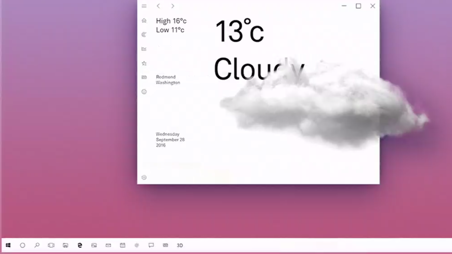
What’s new in the Fall Creators Update?

To be frank, anyone with fear of missing out should have already updated to the Windows 10 Fall Creators Update. 

Yet, in spite of that belief, Intel might suggest otherwise, at least for the time being. With the Meltdown and Spectre processor vulnerabilities overtaking much of the conversation in consumer technology, the Santa Clara chipmaker has warned against opting into automatic Windows 10 updates because of the risk it currently poses to everyday users.

What you stand to gain from the latest major version update of Windows 10 starts with ‘Quiet Hours,’ a do-not-disturb feature that was recently revamped to allow for more in-depth personalization of when notifications should be turned off. The feature also turns on automatically for users sporting build 17074 or newer playing full-screen games or duplicating their displays.

Also highlighted in the Windows 10 Fall Creators Update are a slew of enhancements for tablet and 2-in-1 laptop users wielding styluses. You can now, for instance, doodle from directly within PDF files or Word docs themselves, complemented by a new ‘Find My Pen’ feature that tracks where your stylus last touched the screen. That’s made better (looking) by visual improvements made possible by the Fluent Design system, which aims to modernize select facets of the UI.

However, more meaningful changes, like a more combative approach to ransomware, are appreciated as well. Specifically, the Fall Creators Update makes room for a ‘Controlled Folder Access’ toggle, letting you preclude unauthorized apps from getting their hands on your files.

Eye Control, too, has made its way into the Windows 10 Fall Creators Update, as has a Mixed Reality Viewer. Without the necessity to purchase one of the company’s affordable Windows Mixed Reality headsets – also compatible with the OS – you can now integrate 3D objects virtually into your home or workspace using your webcam or USB camera.

And, iterating on the Paint 3D software introduced in the spring Creators Update, Fall Creators Update users can take the 3D models they’ve created and integrate them into outside applications, such as the suite of Office 365 programs. Thanks to AirDrop-inspired Near Share, you can also go as far as to share them with other PCs in your area.

On a less productive note, the Windows 10 Fall Creators Update hones in on the fact that, according to Redmond’s sources, more people now watch games than actually play them, though 200 million people are still playing them on Windows 10. In the Fall Creators Update, Mixer, Microsoft’s answer to Twitch and YouTube Gaming, will be even faster.

There are plenty of non-gamers that will certainly enjoy the new ‘Memories’ and ‘Stories’ portion of the Windows 10 Photos app. With these new features in tow, you can modify images like never before by adding to them 3D effects, transitions, Ink and even video.

So what’s next for Windows 10? Well, for starters, Windows 10 S– the lightweight alternative to Windows 10 Home and Pro announced last year alongside the student-focused Surface Laptop– may soon be getting a name change. That’s according to Microsoft watchdogs at Neowin and Thurrott whose sources claim that Windows 10 S will soon be known as Windows 10 S Mode.

In turn, being a ‘mode’ rather than a full and separate release, Windows 10 Home and Pro users will have to unlock access to the x86 and x64 programs excluded from Windows 10 S Mode. While it will allegedly cost nothing to unlock a Windows 10 Home license moving from Windows 10 S Mode, those looking to get the most out of Windows 10 Pro will have to shell out $49.

Night Light

Getting the smallest – but perhaps most welcome – change out of the way, Microsoft’s answer to Night Shift on macOS Sierra is an effective and welcome feature for people that tend to use computers at all hours of the night. 

What’s even better than competing solutions is how you can adjust the tone of the color change in addition to the standard setting of whether the mode kicks in at sunset local time or activates within set hours.
Paint 3D

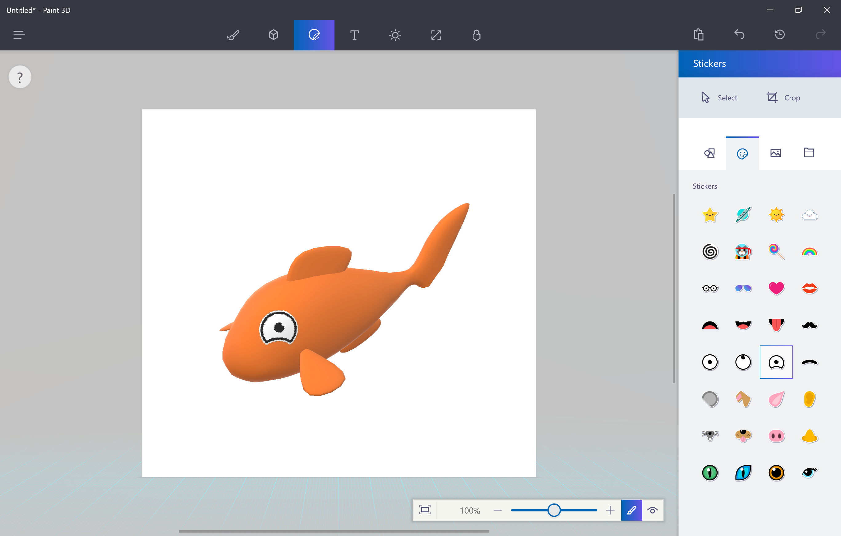
The coolest-sounding feature of the major Windows 10 changes in the Creators Update doesn’t disappoint. When seeing it firsthand, creating three dimensional pieces of art truly is as simple as Microsoft demonstrated it on stage at the update’s reveal event.

Then again, it’s clear that this app has the capacity to allow for quite a bit of complexity in what can be created, too. Most of that simplicity comes down to how intuitively the app communicates three dimensions in a two-dimensional space. Clever, minimalist use of sliders and other toggles allow you to shift your creation’s position(s) on either axis.

Of course, a wide selection of pre-loaded creation templates – like goldfish – will help newcomers out immensely. Naturally, it wouldn’t be Paint without the ability to freehand in 3D, and thus comes the desire to share those custom creations. That’s where Remix.com, Microsoft’s online portal for sharing these Paint 3D projects, comes into play.

The way in which Paint 3D communicates how to create in a new dimension so easily for the average user, yet offers the depth to please them as they increase in skill, could do a lot of good for the 3D printing scene, as well as VR and so many other fields further down the road. 

Granted, this is by no means a professional-grade 3D modeling app – this is purely meant for the vast majority of Windows 10 users. (Though, you can export anything created in Paint 3D as 3D-ready FBX or 3MF files for 3D printers.)

Regardless, we’re already impressed with what Paint 3D can do, and only hope it grows from here. Oh, and don’t worry, the old Paint remains untouched.
Gaming

Microsoft has been beating the drum of the PC gaming renaissance since the debut of Windows 10, but has ramped up the tempo with the past few major updates. In keeping with the crescendo, the Creators Update will likely have the biggest impact on gamers of any gaming-focused Windows 10 improvements to date.

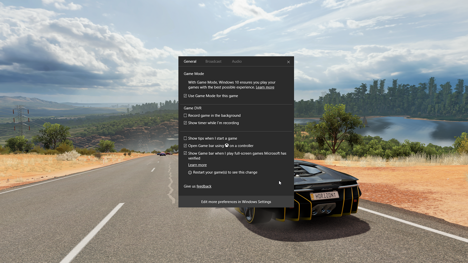
The most exciting, but least proven, feature to come in this update is Game Mode, a new toggle that’s now part of the Windows 10 Game Bar (which too has seen some upgrades, but more on that in a moment). Game Mode tells your system to re-allocate CPU and GPU hardware resources to prioritize the gaming application at hand when it’s the active, full-screen application in use. 

The results, as Microsoft claims, are steadier frame rates than before, notably with games that particularly tax a given system’s resources.

We’ve already covered how Windows 10 Game Mode works in great detail. Though, Microsoft already warns that Game Mode brings the most benefit to systems that aren’t absolutely optimized for gaming.

Microsoft is also looking to seriously up the reach of, and community around, games played on Windows 10 by purchasing a streaming platform: Beam. In reality an acquisition made by the firm recently, Beam was a PC game streaming and broadcasting platform similar to that of Twitch, replete with its own streaming network via web browser, converted into a baked-in Game Bar feature. Microsoft has since renamed this streaming platform as Mixer.

Mixer’s major claim to fame here, though, is that it maintains sub-second latency from the broadcaster’s executions in-game to those moments being displayed to your PC screen via stream. In other words, for broadcasters, this reduction in the time between what you’re doing in-game and your viewers seeing it makes interacting either way that much more interesting.

And that’s not to mention how dead simple Microsoft has made it to stream to Mixer from Windows 10.

Like Game Mode, Mixer is, again, a function of the Game Bar. Upon pressing that dedicated broadcasting button on the Game Bar, and then just a few clicks and toggles after that, you’re broadcasting to Mixer viewers worldwide. That’s after creating a Mixer account, as well as an Xbox Live account if you haven’t already, of course.

However, there’s an issue with this. While we’ve seen firsthand how simple it is to get streaming using Mixer, and broadcasters know how complex this can be, you can only broadcast to Mixer. Of course, this makes sense, but aren’t the type of people that would benefit most from super-simple streaming more interested in broadcasting to Facebook or somewhere else their friends are more likely to be?

A Microsoft engineer seemed to think this was a good point when we made it to him just after demonstrating Mixer for us recently – so, hey, maybe that dream will come true.

Ultimately, Microsoft has just made gaming a much bigger consideration of the Windows 10 environment. It even has its own section in the Windows 10 Settings pane: ‘Gaming’.

The new set of, well, settings allows you to tweak how the Game Bar is summoned or whether it’s on at all, as well as customize keyboard shortcuts to activate its various functions. There are also toggles for Game DVR, like changing save location, enabling background recording, and setting frame rate and video quality among others.

Rounding out the Gaming settings are broadcasting controls like audio quality, volumes, which camera to use and more – the Game Mode setting is just an activation toggle.

First reviewed: July 2015

Gabe Carey has also contributed to this review

While making things in 3D or blowing them up is a jolly good time. There’s so much more going on in Windows 10, especially with what Edge has become in the Creators Update in tandem with Microsoft’s release of a Books section to the Windows Store. But, let’s start with some minor improvements to Microsoft’s voice assistant.

Cortana

The new changes to Cortana are less about using the service directly and more about how it can simplify how you use your PC. If you’re using Outlook or Office 365 as your email client, Cortana can read those messages and create reminders for you based on the language of your emails that contain commitments to deadlines and other promises.

Apparently, Cortana is also key in holding onto whatever apps and documents you had open, and where you were in those apps and documents, if you return to your PC within 30 minutes of locking it. But, that’s not really all that exciting, as your computer generally already does this, unless you have it set to sign you out every time the device locks.

However, Cortana’s ability to do this even after rebooting is far more impressive (at least on paper), since any caching is generally wiped upon reboot. In this early version of the Creators Update, we weren’t able to to reproduce this feature, so hopefully it will be ready come the update’s April 11 roll out.
Edge

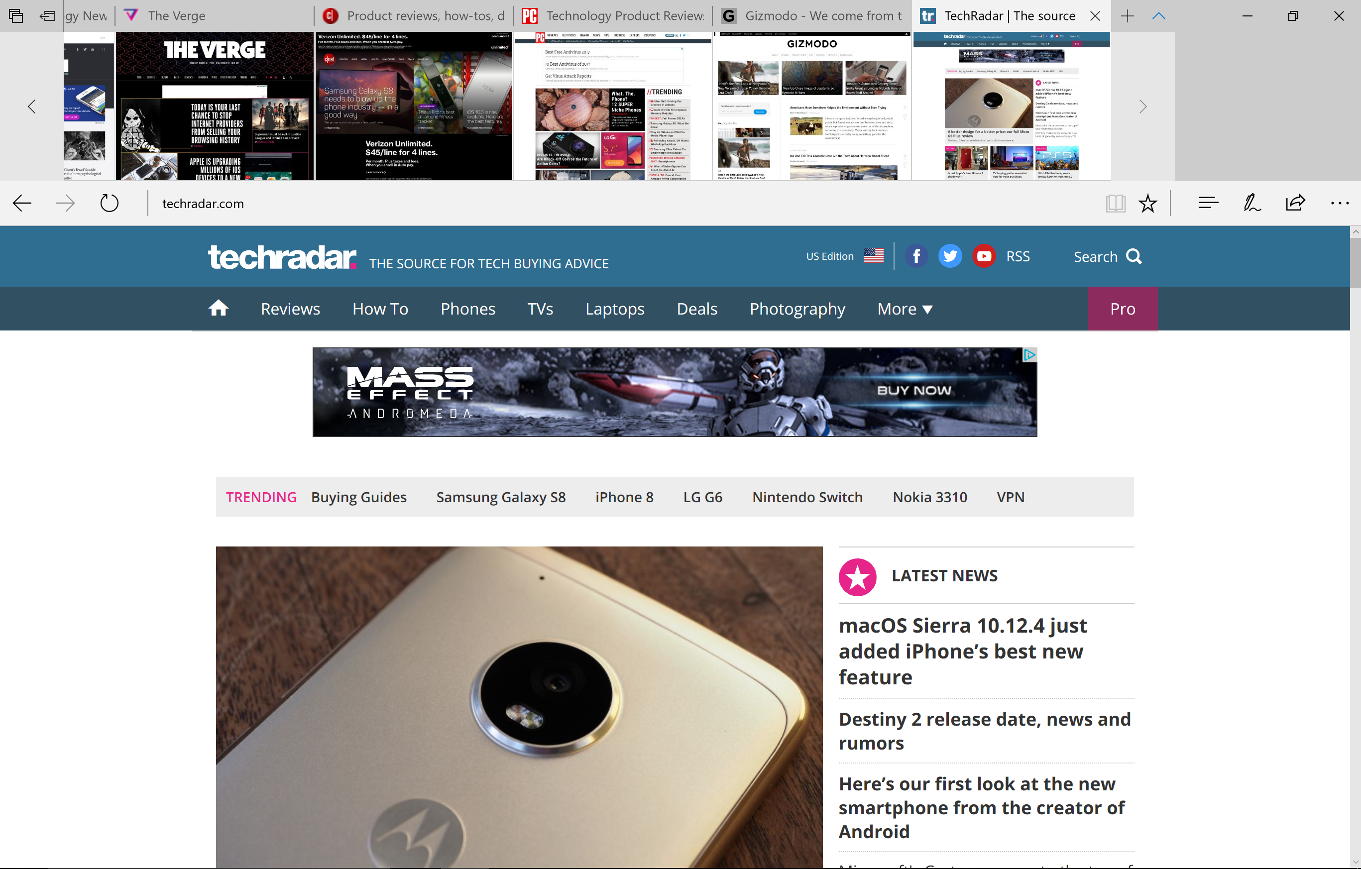
There’s no denying that Microsoft is funneling a lot of energy into making its new Edge browser competitive with that of today’s king, Google Chrome. Most of the changes this time around focus on things that Microsoft has noticed its competitors lack. For starters, the way tabs are handled in Edge has been vastly improved.

Tab preview has existed in Edge for a long time, but in a singular fashion. Now, a downward arrow next to the “new tab” button produces a preview of every open tab. Of course, these are just tiny thumbnails captured when you first accessed the web page – they’re not dynamic and do not update.

Even better, you can now take a set of tabs and stow them away for later access with a new, dedicated button. Once you do that, you can view those tabs in addition to any other sets you’ve “set aside,” with the option to restore those sets of tabs, add them to your Favorites or share them via email or OneNote. You can also delete sets of saved tabs or individual ones.
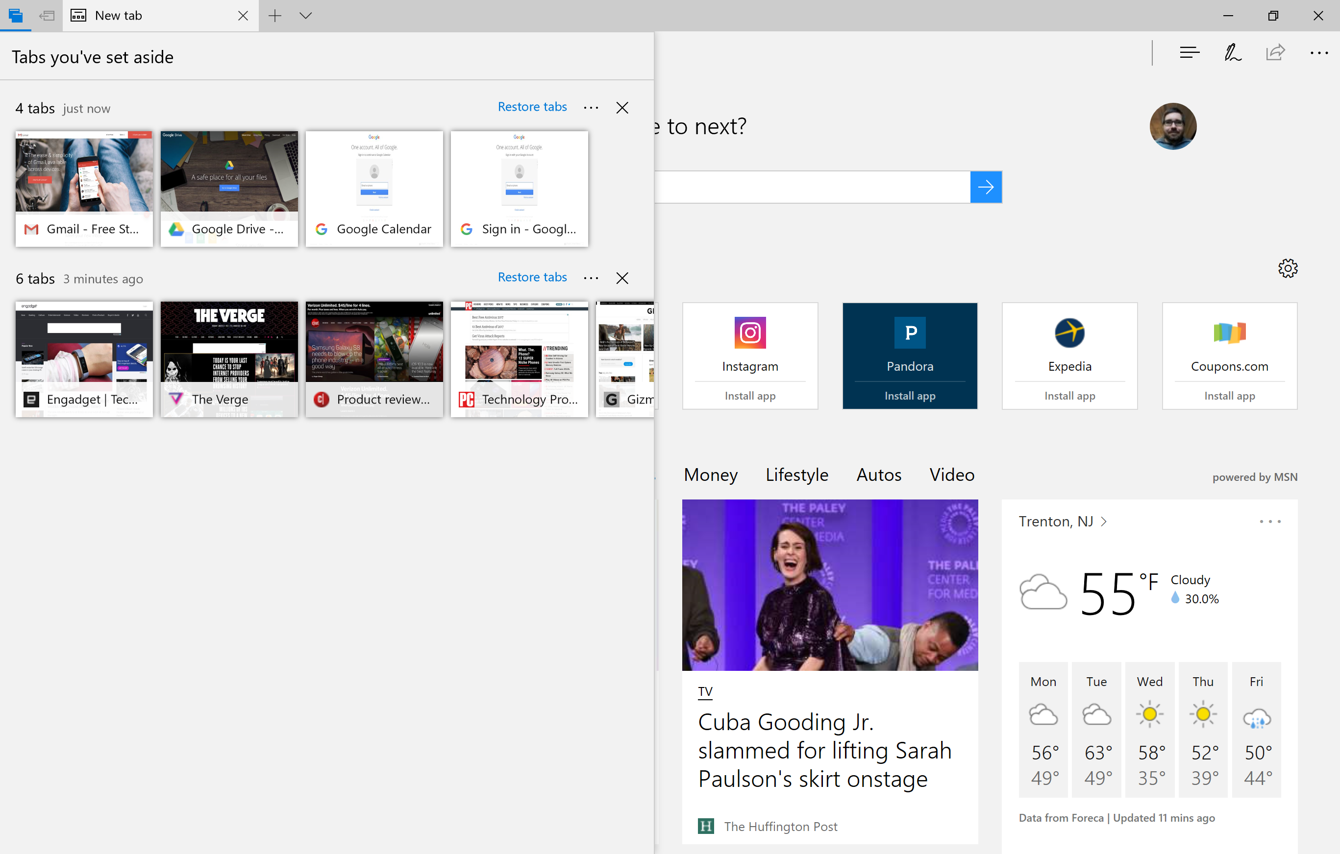
However, mind that restoring them brings back the cached version of those tabs from when you last accessed them, so you’ll need to refresh the pages. If you’re going to do this anyway, this is a step Microsoft should eliminate. 

Another bummer is that you cannot name your saved sets of tabs. While you see them in the same preview format that’s available above the navigation bar, it would make sense to be able to name them according to web workflow, like “Work” and, say, “Gaming Broadcast Setup.” If organization is what you’re going for, you gotta’ have a label maker, so to speak.

At any rate, the new tab management tools are certainly helpful, especially for people who browse tabs with their mouse, rather than with keyboard shortcuts, but we’re dubious of whether they’re compelling enough to pull folks away from Chrome. That said, it all works fluidly. Plus, those tabs are saved even after closing Edge.

Also, the new sharing design language is a welcome change that makes as much sense in the desktop environment as it does on mobile. In other words, it’s basically the Windows 10 Mobile, window-based sharing format come to Windows 10 proper.
Books

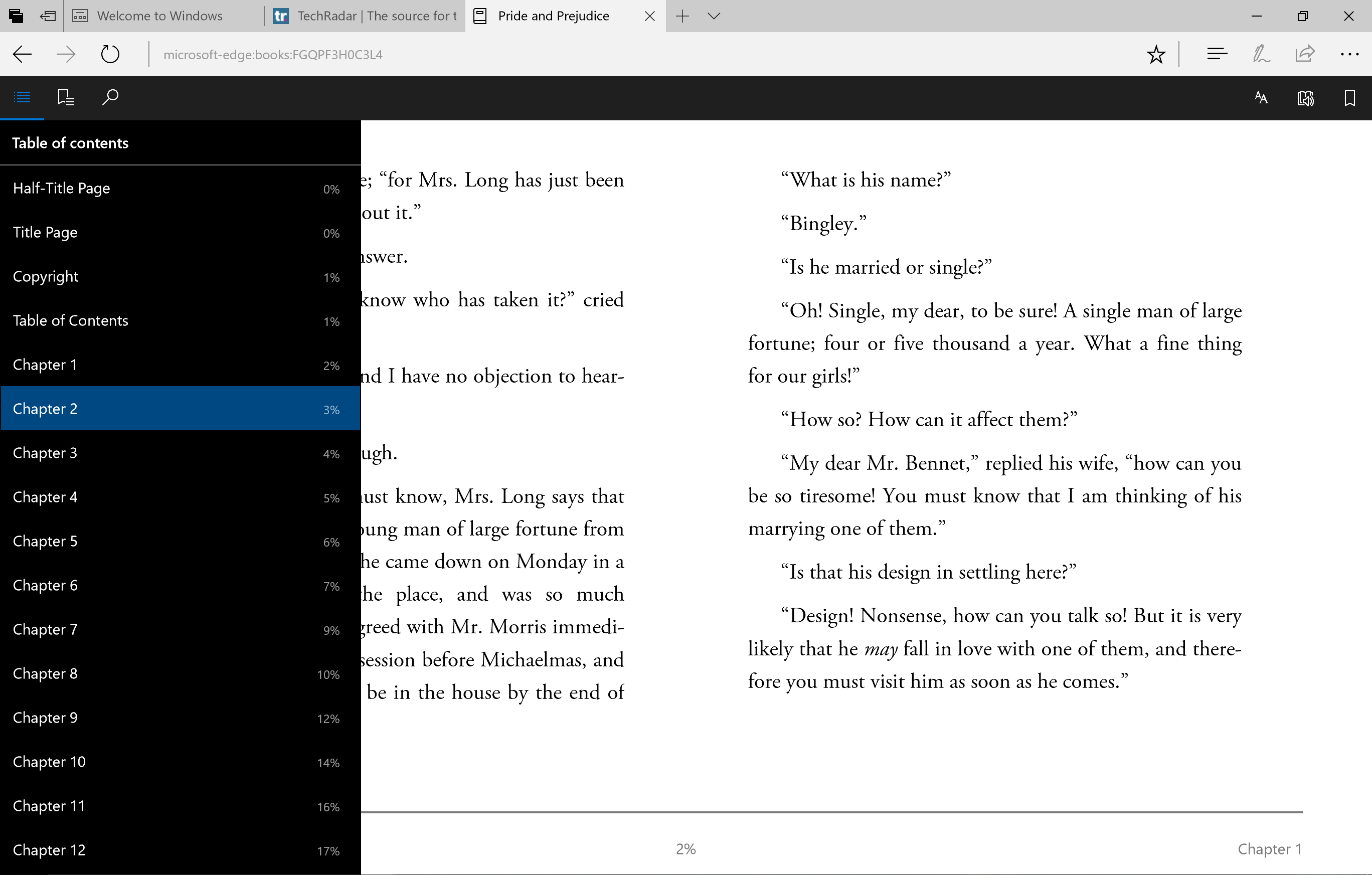
As you may already know, the Creators Update turns Edge into a full-fledged e-reader, supporting the EPUB file format. This update comes in conjunction with Microsoft launching a Books section in the Windows Store. The pricing and selection for which is comparable to rivals, replete with a collection of free literary classics as well as staff recommendations.

And, the link between buying them and having them available for reading in Edge is practically instant, with Edge even offering a link back to the Windows Store to buy more books. The reader itself is quite robust, with tables of contents, bookmarking, search, text controls and even a text-to-speech read aloud function. And, the controls are silky smooth to boot.

Having turned Edge into a fully-fledged e-reader tool is admirable, but you have to wonder how many users will benefit from or take advantage of this feature. If people aren’t using e-readers like Kindles, aren’t they using tablets like an iPad or Android tablet? Since there are so few Windows tablets around, we doubt many will see this as a useful addition, it being a niche that’s long been filled.

Now, if Microsoft were to expand PDF support for Edge to enable file editing and more, we’d be much more excited about Edge’s expanding file compatibility.

While the changes to Edge and an all-new Books store in Windows 10 are pretty huge, almost equally as massive is how Microsoft have vastly broadened how Windows Ink can be used within the OS, primarily via the Photos app. Less massive are the other changes to its Photos and Movies & TV apps.

Windows Ink

Being able to ink over web pages in Microsoft Edge isn’t anything new, but being able to do so across other file types, like images in Photos, documents in Word, and even videos (with the Photos app, oddly), is a welcome addition. Of course, you can share these doodled-up files with friends using Windows 10, too. The Snapchat crowd ought to get a load out of this.

Microsoft has even expanded Windows Ink to its Maps tool. Now, you can doodle on maps and share them with friends to draw out plans. More interestingly, Windows Ink and Maps work in tandem to let you draw out either a straight line or contiguous path, producing the real-world distance of that line, no matter how long. Neat, but also useful for folks that actually enjoy the outdoors and exercise.

Scribbling all over, well, practically anything, feels unsurprisingly natural and responsive, and frankly feels like Windows Ink starting to realize its potential. However, we’re still left wondering whether these tools will meaningfully change how we, say, share photos and videos with friends or inked-up documents with coworkers. 

At the moment, each iteration of Windows Ink controls in these basic apps – Photos, Movies & TV, Maps, etc – is simply littered with basic drawing, pointer and color controls; save for Maps. Perhaps that’s enough to get more people using their touch PCs to their full capacity.

Photos and Movies & TV

In addition to what Windows Ink allows you to do with images opened in this app, Photos now automatically attaches searchable tags to all of your photos according to when and where they were shot, as well as the people within them and notable landmarks or items you’ve got on film. While no less a welcome feature, does that sound familiar at all?

The Movies & TV app has been upgraded to support 360-degree video, but more importantly now supports picture-in-picture mode for Windows 10. Finally adopting one of the most exciting additions to macOS Sierra, Microsoft calls this “mini mode,” with a dedicated button to jump between orientations. The switching is super snappy in our brief testing, but a little janky as it repositions the video, with pixelation and exposed splotches of gray.

While not the most riveting of changes in any OS update, those found in the Creators Update are surprisingly substantial and are actually relevant to your use of the software. That’s particularly the case for the new “Fresh start” function, but more on that in a moment.

Security and privacy

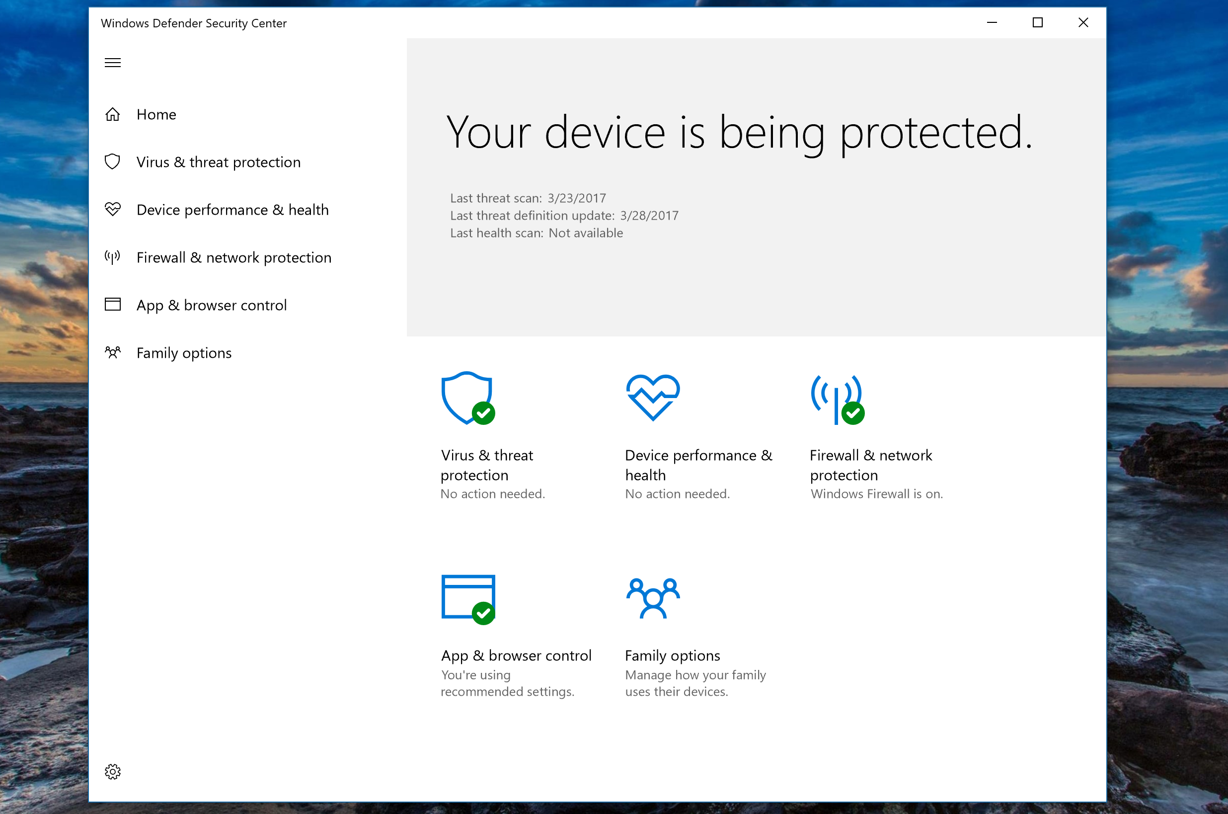
Microsoft has vastly improved its security and privacy measures for Windows 10 in the Creators Update, namely with a new Windows Defender Security Center. This new app takes in all of the functions of the original Windows Defender -- virus scanning and the like -- and couples them with new features.

One of the most interesting of which is the Device Health Advisor, which, while not yet entirely functional in our early test software, is expected to provide information on key system functions and their status through a scanning tool not dissimilar from Windows Defender itself.

All this considered, probably the most useful tool in the new suite is “Fresh start.” This tool allows you to reinstall a clean version of Windows 10 on your PC, maintaining your personal files but deleting any third party apps that came pre-installed on your device or installed thereafter. If you just bought a Windows 10 PC from a big name vendor that’s loaded with bloatware, this is the tool for you, and something Microsoft should be commended for finally taking a stand on.
Another oft-teased feature is “Dynamic lock,” which allows the PC to automatically lock when the webcam detects that the user has walked away from the device. However, this feature was too not available for testing with this early software, so we’ll have to test it out in full come April 11.

For the IT folks, Windows Defender Advanced Threat Protection (ATP) portal will now link to Office 365 ATP, so that IT managers can follow threats all the way from the source (for example, an email) to the problems it’s caused on a system or worse.

As for privacy, Microsoft wasn’t joking about the lengths it went to for improving transparency. For a start, the new setup experience is far friendlier and fully voice-acted for clarity. The voice-over clearly describes the purpose of each function as it relates to privacy, and the design no longer buries options with loads of jargon-filled text.

However, don’t expect Microsoft’s stance on the data that Windows 10 collects to change much, although it claims to have reduced the amount of basic, anonymized information that it gathers. For now, at least Microsoft has simplified its messaging on what data it collects (and at times shares) in two categories, not three: “Basic” and “Full”.

[Editor's Note:the following pages between here and our verdict are largely for readers that have not yet used Windows 10. Welcome, potential newbies!]

In basic use, Windows 10 is not a million miles from Windows 7. You've still got the Start menu, even though it's fundamentally changed (more on that shortly). Key functions are all accessed from the task bar, which has a flat, functional feel. The design language feels refined – window borders are smaller, for example. Anniversary Update adds a new dark mode that switches the interface and all your Store apps to a darker interface, if you prefer that in a dimly lit (or indeed unlit) room.

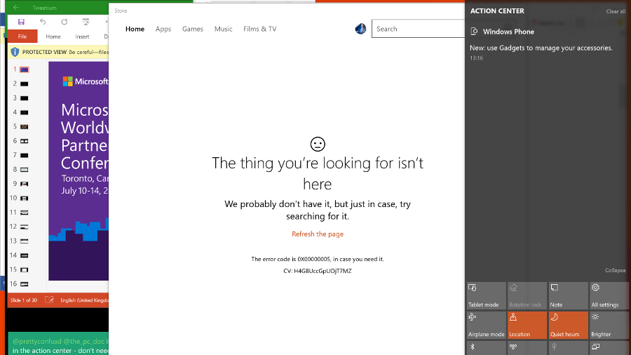
The key controls that Windows 8 put on the short-lived charms bar and the familiar pop-up notifications are combined in a new Action Center pane that you open by swiping in from the right or clicking a notification icon. In Anniversary Update, this moves to the right of the clock and shows the number of unread alerts.

Key settings are at the bottom of the Action Pane: Wi-Fi, Bluetooth, Airplane Mode, Tablet mode, a new Note feature for opening the built-in version of OneNote, and a link to the full Settings app. If you have a tablet you'll see the option to lock rotation. There's also a version of the Windows Phone Quiet Hours for blocking notifications, although you have to turn it on by hand rather than setting the times.

In the Settings app you can select which of these Quick Actions appear in the Action Center, as well as which apps can send you notifications. When notifications appear, you can swipe them away with touch, flick them with the mouse or just click the X to close, one at a time or for the whole group. Tap or click the down arrow to see more detail. There's a Clear All option, too.

In Anniversary Update, the number of notifications from a single app is capped – that includes Edge, which can give you alerts from websites you have open; instead of being able to send unlimited updates, each app is limited to the three most recent ones. If you connect an Android or Windows 10 Mobile phone to your PC you'll also get notifications from your phone apps here.
Phone notifications

Right click on a notification group and you can make it high priority or turn it off (this isn't available for all notification groups, but you can always open the notification area in Settings to tweak things there). Notifications get richer; apps can use images, add buttons or let you reply to a message directly – messages from the new Skype app have notifications in the Action Center that let you reply, as do text messages that are synced from your phone.

The task bar

Microsoft keeps tweaking the look of the task bar slightly. The Windows button is always there (and you can still right click on it for the power user menu of shortcuts from Windows 8), plus you can shrink or hide the Search box next to it. Pinned icons get a subtle coloured bar beneath them when the app is open that shows a second bar at the side if the app has multiple windows (with a shaded overlay for the current app that also shows multiple windows).

The notification area (which you might still know as the system tray) still expands into a pop-up window if there are more icons that will fit on the task bar, and you can still drag most – but not all – of the icons into the order you want. The icons for the touch keyboard and the new Ink Workspace are fixed next to the clock (although you can turn them off, you can't move them). You can still hover your mouse in the far right corner for a quick look at the empty desktop (Aero Peek), or click in the far right corner to minimize all your windows, but that's now to the right of the Action Center button.
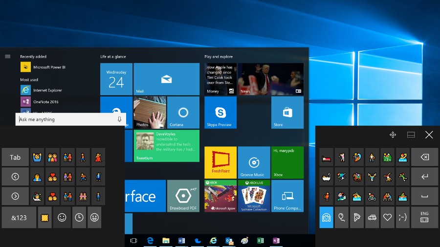
Touch emoji

The touch keyboard has new emoji. Six of those celebrate the Windows Insider ninja cat character, many of them are redesigned to match emoji on other platforms more closely and there's a new skin color button that lets you change the skin tone for many of the icons with faces – so you can pick from six shades including Simpsons yellow. You still have to hunt for the emoji you want though – we'd like to see the Windows Mobile keyboard show up here, which suggests emoji along with other auto-correct suggestions.

Clicking the clock opens the new clock and calendar pane with any alternate clocks you have set, and a monthly calendar. In anniversary update the latter shows your agenda for each day as you click through (taken from the Calendar app, so it's worth connecting that to your accounts even if you don't use the app itself).
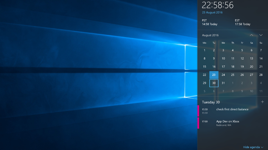
Clock agenda

Also new in Anniversary Update is a handy extra on the volume control – plug in headphones or speakers or connect a Bluetooth audio device and you get a pop-up menu for choosing which audio output you want. Annoyingly, Microsoft is still blocking Store apps from showing up in the Volume Mixer, so you can choose different volumes for IE and Windows Media Player, but not for Groove and Edge.
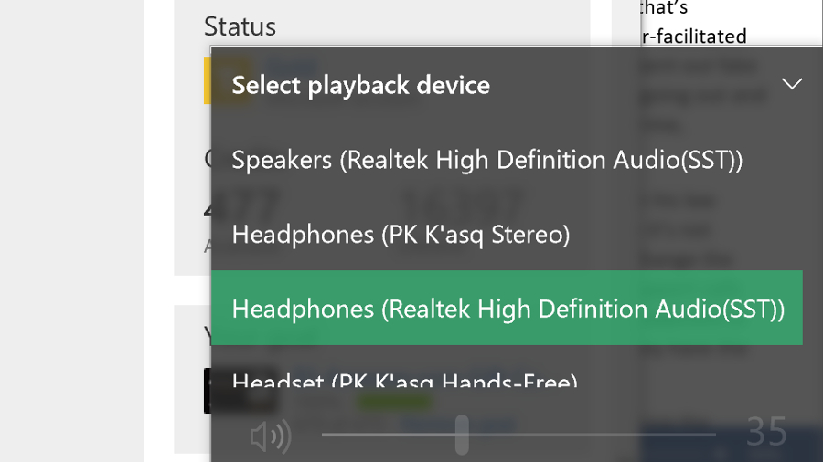
Swap audio

The Start menu

Windows 10 combines the live tiles of Windows 8 and the familiar Start menu into a new, re-sizable menu. You can pin tiles for your favorite apps to see at-a-glance information like upcoming meetings, weather forecasts, news stories, sports results and messages from Twitter, Facebook and email. Tiles animate to show new content and you can group and name them the way you could in Windows 8. How useful you find them depends on which apps you like enough to pin.
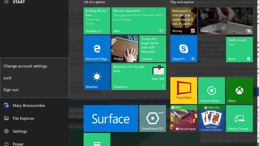
Start hamburger

The rest of the Start menu is a scrolling list of apps and controls. Anniversary Update divides this into two: on the left is the increasingly ubiquitous hamburger menu that you can expand for a reminder that the tiny icons are (in turn) a fly-out menu letting you change your account settings, lock the PC or sign out, along with icons for File Explorer and Settings and another menu with the power options. Annoyingly, expanding this section hides the rest of the apps list, so you can't leave it expanded.

Right click on the Explorer icon for a jump-list with pinned and frequently used folders. If you dig into Settings, you can add extra folders, but only from a standard list.
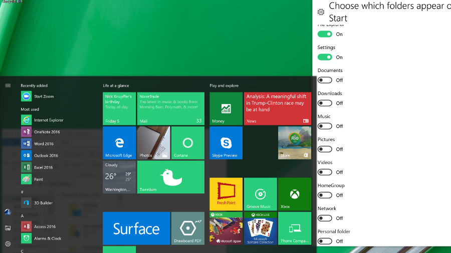
Add to start

The scrolling lists of apps have been slightly rearranged in Anniversary Update; at the top is a Recently Added section that appears when you have new apps. Below that is a list of Most Used apps, followed by a Suggested apps section that you can turn off (but that also hides the tips on the mobile-style Lock screen). All of that pushes down the alphabetical list of what you have installed so you may not see many of them without scrolling.

You can search from the Start menu by starting to type – that gives you the same result as tapping in Cortana's search box next to it.

Cortana

Microsoft's virtual assistant, Cortana, still powers the search box on the Windows 10 task bar – where you can type or speak – and in Anniversary Update you can no longer turn her off (though you can turn off personalization if you don't want her to remember things for you). But Cortana goes a long way beyond search, so you probably want to keep her around.

Searching with Cortana is fast and accurate. It finds your files, it finds your folders. It has become quite brilliant. Say, for example, that you type LinkedIn into the menu: you'll be given the option to open the site in your default browser (even if it's Chrome), or you can search for LinkedIn in Bing.
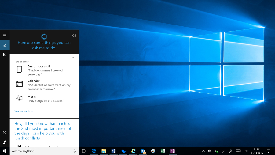
Cortana

Depending on what you search for, different types of results are prioritized – so the first result might be a setting, an app, a document or a web search. You can also pick the category to search: apps, documents (including OneNote and files on OneDrive that you're not syncing), folders, music, videos, photos or settings.

Type in a sum or a currency conversion and Cortana does the maths for you. Type in the name of a city or a celebrity and you get a nib of relevant information – that all comes from the answers you get for those kind of searches on Bing, but if there's a match in your documents for the same term you'll see that first. The only annoyance is that you can't pin the search results open – if you need to open a couple of documents from the results, you have to run the search twice.

Type in commands like 'remind me' to set quick alarms and appointments. And in Anniversary Update, you can use that to remember useful information like your passport number, or anything else you want to jot down. Ask Cortana 'what is my passport number' later and you'll see it pop up. Type 'send a text' to write an SMS on your PC and send it from a phone you have the Cortana app installed on. You can also ask her to sing you a song or tell you a joke (they're usually terrible jokes).

Cortana uses the news interests you set up on Bing as well as your search history to show you news stories and refine search suggestions – these, your reminders, accounts Cortana can get information from (ranging from Xbox Live and Office 365 to Uber and LinkedIn) and other information about your interests are stored in the Cortana Notebook.
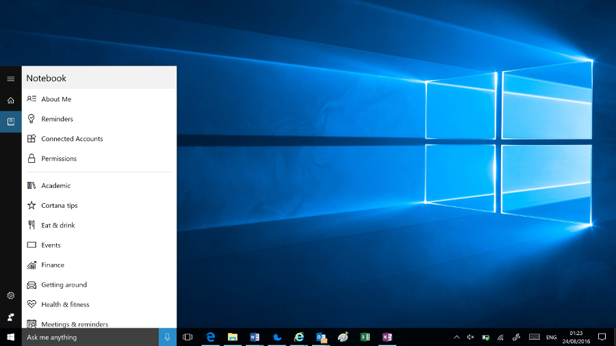
Cortana notebook

You can customize settings for different areas of interest, from Academic Topics to Getting Around, Music, Food and Drink or Weather, or turn off topics you don't want. Reminders and interests sync across every device you use Cortana with, so you can set a reminder on your phone and see it on your PC, or vice versa.

You can also change Cortana's settings to turn voice control on or off, choose what Cortana can index to learn more about you, and clear the history that makes searches more accurate.

If you just tap or click without typing anything, Cortana shows you upcoming appointments, Windows tips, news, weather, how many steps you've walked (courtesy of Microsoft Health), along with any activities from your email that look like trips and flights Cortana could track for you. You also get suggestions for other things Cortana can do like keeping a note of when you usually have lunch and warning you if a meeting would clash with that.

With Anniversary Update, Cortana also makes an appearance on the Lock screen, showing upcoming appointments. Initially, that might sound like more of a mobile or tablet feature, giving you a quick overview of your day when you first pick up your device. But if you often leave your PC on and let it lock, seeing a quick glimpse of your calendar from across the room is very handy, and you can use Cortana on the Lock screen to ask questions, set reminders and control the music you're playing.

Annoyingly though, if you turn off Suggested apps in the Start screen, where they take up a lot of space, you also lose Cortana suggestions on the Lock screen, and you can't use the frequently updated Windows Spotlight images – you have to pick one or more images on your PC to be your Lock screen background.

We'd like to see Cortana do a lot more – there are apps like a network speed test built into Bing that it would be great to see inside Cortana – but this is evolving to be a really useful tool that gives you a quick way to do things you'd normally open an app for. Get into the habit and you'll find you keep turning to Cortana – Microsoft's digital assistant could evolve into a whole new way to use your computer. And if you don't like any of that, it's still a great way to search your PC.
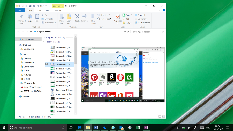
File Explorer

File Explorer enhancements

File Explorer has been given a little bit of a makeover, and in Anniversary Update it gets a new icon. You now have a Quick Access area to which you can pin and unpin any folders you want to regularly access. In the 'home' screen of File Explorer you can also see Frequent Folders and Recent Files. It's much more helpful now.

You can pin things permanently to Quick Access by right clicking them and selecting Add to Quick access.

There are a lot more file operations that you can access on the ribbon at the top of the window without the need to use the right click menu.

The old Windows 8 Share logo is now used for file sharing from all apps. You can choose to email a file straight from the File Explorer window or add it to a ZIP file.
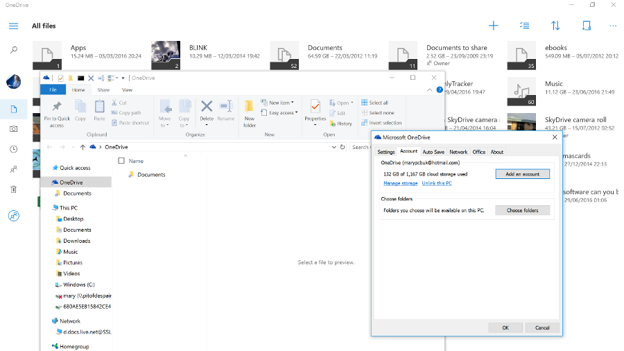
OneDrive not integrated

Microsoft OneDrive gets a section in File Explorer, but that's only a shortcut to files and folders you've chosen to sync. You no longer see placeholders for files that are only in the cloud – a feature that confused some users but also made your whole cloud drive available at any time. To see your files in the cloud now, you have to go online and use the OneDrive Store app.

Settings

In Windows 8, this was annoyingly basic and many options were still in the Control Panel. Control Panel is still there in Windows 10, and if you're a technical user, you will come across it from time to time. But the majority of users will never see it.
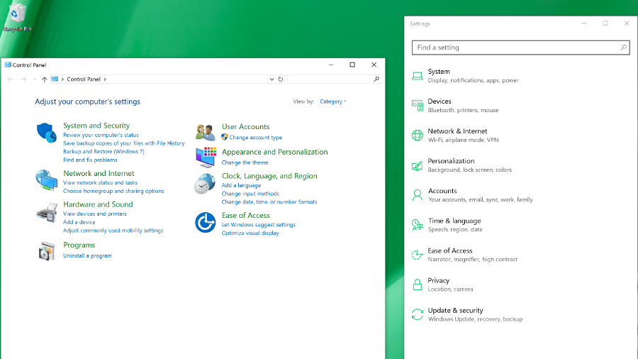
Settings

Settings is now a far more comprehensive solution and is much more logically arranged. There are still a few things you'll need the Control Panel for – to reset a network adapter, for example – but they're few and far between.

You've been able to search the Control Panel from the Start menu since Windows Vista – with the Settings app in Windows 10, what you get from that search is a clean, clear interface where you can easily see what it is you need to change.

Microsoft is still keen to get developers to build new mobile-style apps for Windows 10 that are more secure, don't get to do things that affect performance and battery life, can be uninstalled with a single click, and can potentially run on multiple devices. The hope is that developers will write their apps for the Universal Windows Platform and they'll work across PC, Windows 10 on smartphones, and Xbox, too – essentially on every screen size.

There are tools to help developers convert Android and iOS apps, and even desktop PC apps. Businesses can deploy apps from their own versions of the Windows Store. This is all handled from the Business Store Portal, which will manage software licences, centralized payment info and more.

Universal Apps and the new Windows Store

Universal apps are the latest version of what Microsoft was calling Metro, Modern and Store apps in Windows 8. Apps written for Windows 8 will still run, but with the Charms bar and the touch gestures for opening app controls gone, Microsoft has crammed in a rather awkward menu bar of app commands for any apps that haven't been rewritten for Windows 10. Apps that have been rewritten tend to use the hamburger menu, which gets annoying on a desktop PC where there is plenty of space on-screen for navigation but the hamburger menu keeps hiding the options.

Windows 10 is slowly getting more apps: there's a new Amazon app, there's a good VLC app and if you buy a wireless security camera like the Ring you'll find an app here for it. But the Store is still smaller than the iOS and Android equivalents.
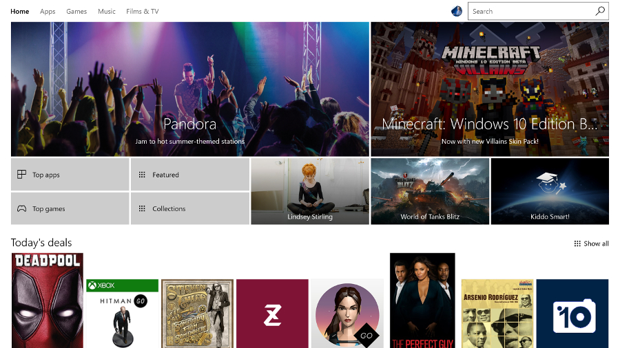
Windows Store

In Anniversary Update, the Store gets yet another redesign, full of top picks, featured apps, lists and collections. It feels like there are almost as many ways to look through the apps as there are interesting apps to look for.
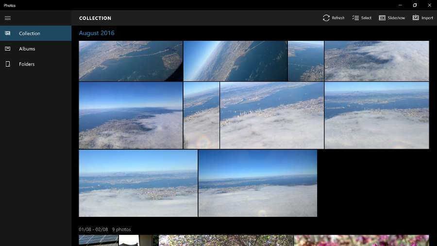
Photos OneDrive

Built-in Windows 10 apps

However, the operating system's built-in apps are still improving, and Anniversary Update adds some extras. The new Photos app shows you all the pictures on your PC and in your OneDrive account, with some handy editing tools. It's fast, responsive and easy to use.
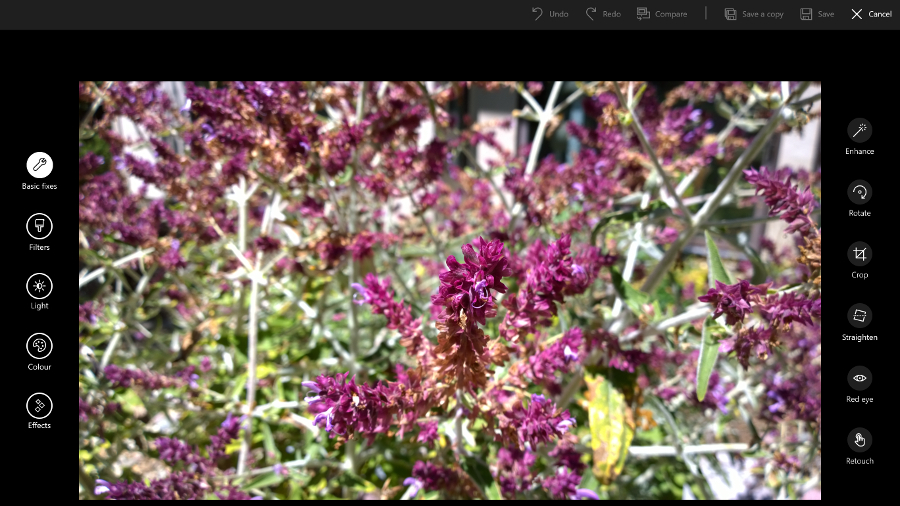
Photos edit

The Mail and Calendar apps don't match Outlook – either the desktop or the smartphone versions – but they're perfectly functional and competent apps.
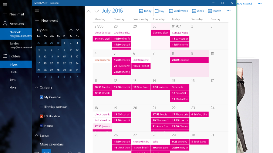
Calendar

With social media integration gone (Twitter and Facebook wouldn't play along and other social networks don't seem interested), the People app is reduced to a basic address book. You can't even select multiple contacts to delete or link them together (you can only link contacts one by one).

Mail

Sport and News stay useful, even if they still feel a little superfluous. They start quickly but you may use them most as live tiles in the Start menu. While diehard sports fans may not get enough information from the Sport app, News is a decent aggregator of stories (the page covering local news sources is especially good). The Money app is handy if you track shares or want to follow the market. You can still get the Reader app from the Store, but it's no longer installed by default.

Maps continues to improve. In Anniversary Update you can see multiple maps and locations on different tabs, view traffic, accidents and traffic cameras – and even draw routes on a map with your finger or a pen, then measure the distance or get directions (which is far easier than right clicking and dragging pushpins to get the route you want).
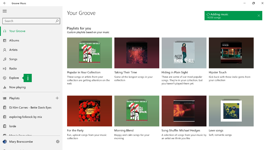
Groove

The Groove Music app (named for the music subscription service you might once have known as Xbox Music) certainly pushes the Groove Music Pass subscription in the new Explore section – but it also works well with music on your PC or OneDrive (it can be slow to index music on a network drive).

Groove has come on leaps and bounds since earlier versions of the app. It finally has a thumbnail media player control that pops up when you hover over the Groove icon in the task bar when there's music playing. In Anniversary Update we particularly like the Your Groove playlists that automatically create various playlists of your tracks – long tracks, tracks that are getting played a lot on the Groove service, tracks you haven't listened to in a while, tracks to help you cope with Monday mornings… they change frequently but you can save them for later.
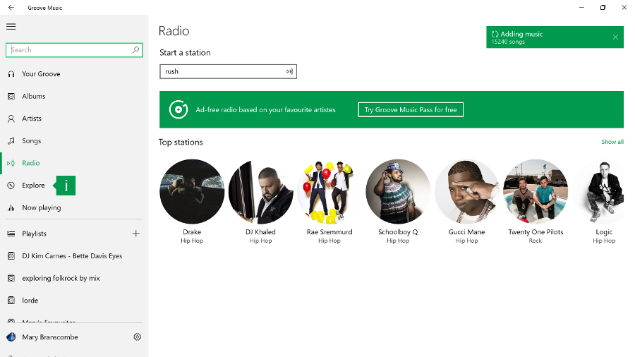
Groove 2

You can't create your own smart playlists though – something even the Zune Player had and Windows Media Player can do (let alone iTunes) – and if you want to use a favorite artist as the seed for a playlist that streams as a 'radio channel' you need a Groove Pass. Even so, Groove is definitely worth trying for playing your music, if not for managing it.

Another app that's dramatically improved is Skype Preview, which is automatically installed in Anniversary Update and replaces the separate Skype Video and Messaging apps (but you can keep the desktop Skype app too).
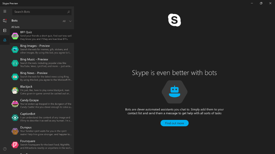
Skype Preview

If you tried an earlier version of this, don't despair; it now has an excellent set of features and is fast and responsive. It also has the dialler that was missing in early versions, along with video calls and chat (both of which can be one to one or group conversations).

It's very well integrated into Windows 10 – you can reply to chat messages straight from the Action Center notification and you don't need to have the app running to receive calls. You can also try out Skype bots; the Foursquare and IFTTT bots look interesting but these are all still fairly basic.

Windows 7 was such a great version of Windows. Aside from the fact that it trumped Vista with its resource efficiency, general robustness and modest system requirements, it also brought us something else: Aero Snap.

Snap and virtual desktops

The ability to snap windows to the sides of your screen might seem a minor thing, but it's something many Windows users do every day. Apple has obviously realised that Mac users employ third-party extensions to get the same effect; the company introduced window snapping in OS X El Capitan.
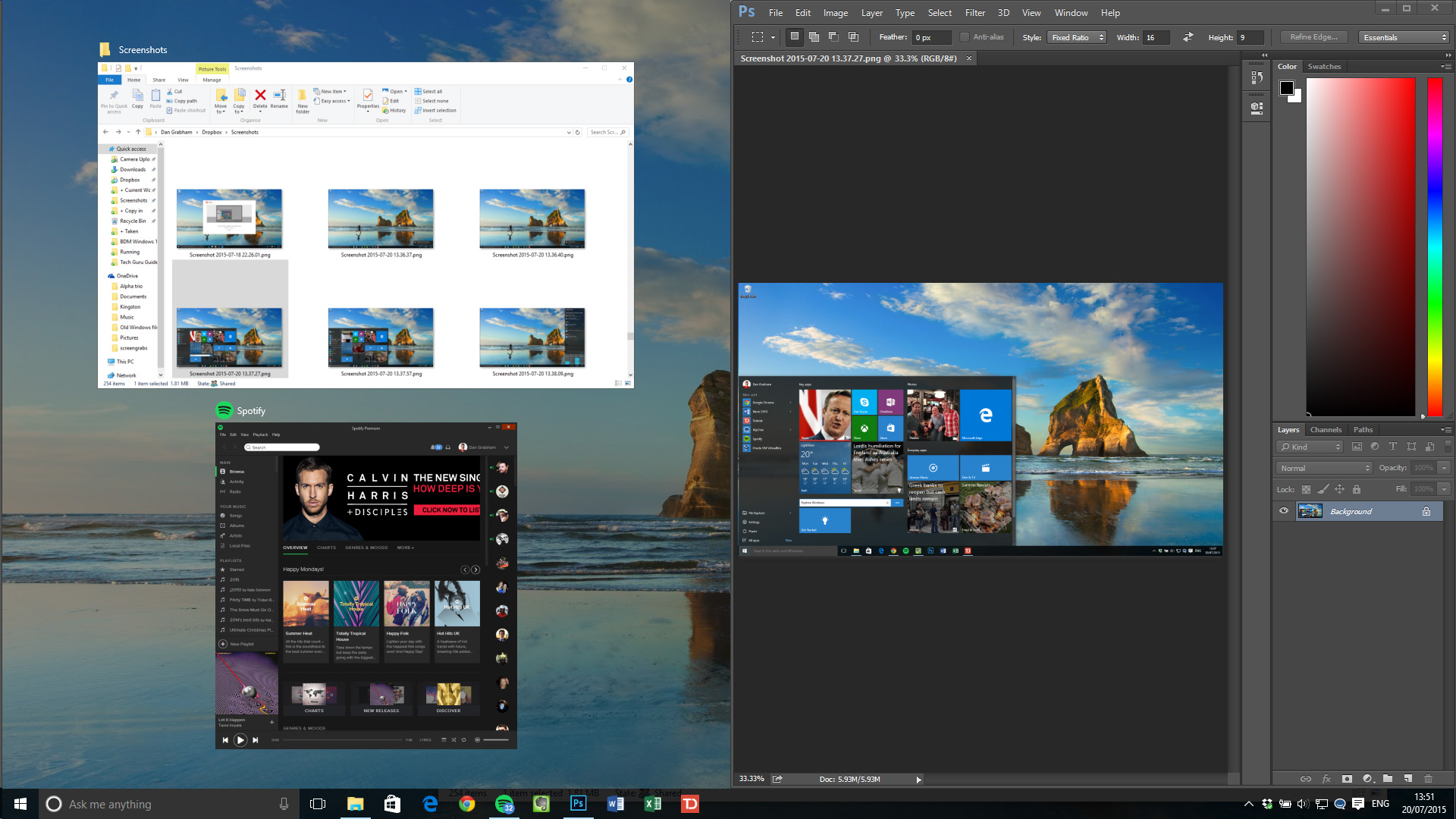
Aero Snap

Windows 8 added the option to resize both snapped windows at once, but coupled it with modern apps that had to stay in a separate window entirely. Windows 10 put modern apps on the desktop along with everything else but originally dropped the linked resizing. That's now back in the finger-friendly Tablet Mode that only shows two windows, and on the desktop as well, so if you want to snap windows to be a third and two-thirds of the screen, it's easy.

Tablet Mode is Microsoft's nod to Windows 8, and to people who buy the many tablet PCs it believes will be sold over the coming years. As does Intel – it's putting a lot of weight behind 2-in-1 PCs with detachable keyboards.

Originally named Continuum (although that moniker now covers a range of features including the way Windows Mobile phones can use a big screen and keyboard), Windows 10's Tablet Mode is clever because it's automatic. Detach the keyboard and the desktop prepares itself for touch – the Start menu becomes the Start screen and apps appear full-screen. That was one thing Windows 8 got right; a screen of apps is a better launcher for touch-enabled devices when you don't have a keyboard.

The Taskbar has also changed to be more touch-friendly – the icons are more spaced out, while the pinned app icons don't appear at all, you just cycle through them in Task View. You can choose what icons to show in the system tray. The Start icon is now joined by a back button, so you can cycle back to previous apps – even if you were in the Start menu before.

If you want, you can toggle between Tablet Mode and non-Tablet yourself via the settings at the bottom of the Action Center. This could be useful if, say, you have a touchscreen laptop and want to put it into Tablet Mode for a presentation.
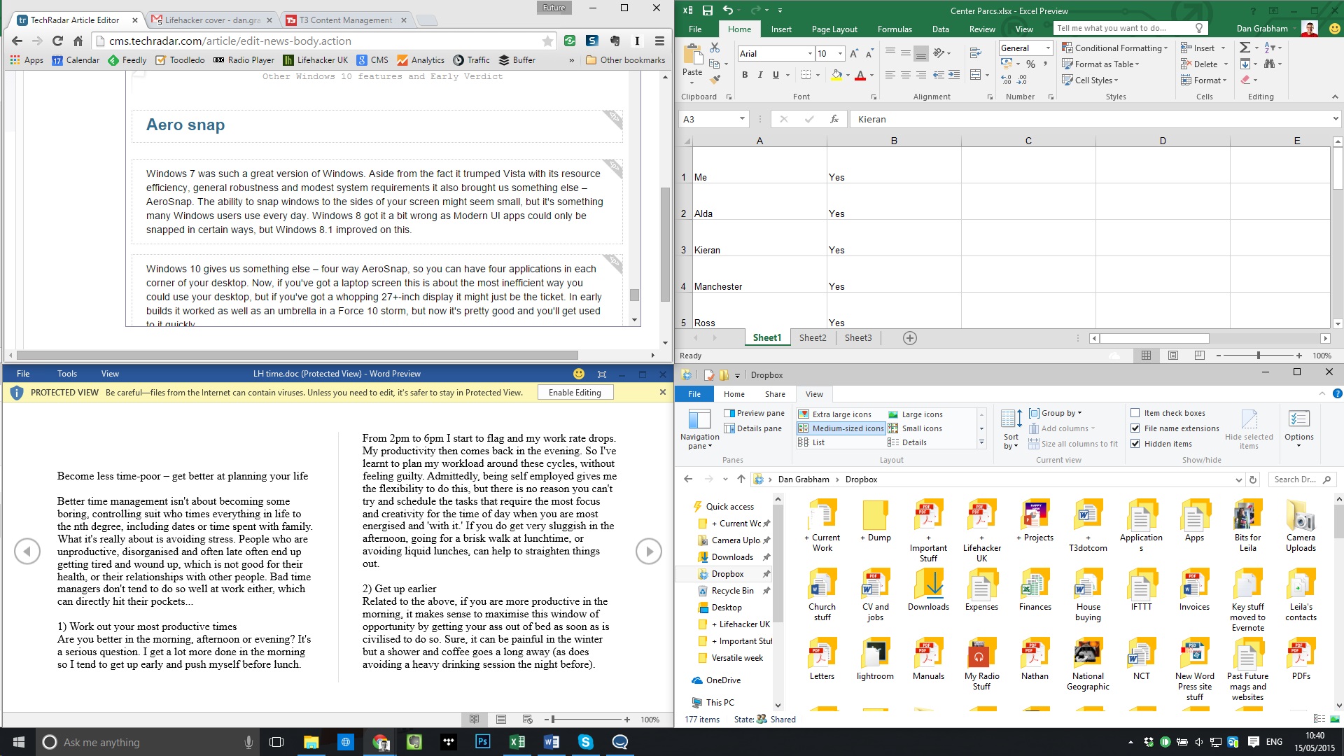
Aero Snap four-way

Windows 10 also added four-way Aero Snap, so you can have four applications in each corner of your desktop. Now, if you've got a laptop screen this is about the most inefficient way you could use your desktop, but if you've got a whopping 27+-inch display it might be just the ticket.

The alternative is the virtual desktops in Windows 10, where you can spread apps out over multiple, separate desktops and swap between them.

Task View

Alt-Tab has been the way to see what apps are running for decades, but few users are familiar with it. Over the years Microsoft has added other ways to switch between open apps, like the 3D Windows Flip view in Windows Vista and the left swipe in Windows 8.1.

Windows 10 uses both Alt-Tab and Windows-Tab for a thumbnail view of running apps, but there's also a new full-screen Task View, and a permanent icon on the taskbar for it, next to the Cortana search bar (although you can turn it off).

It takes you to an app overview where you can use the mouse to select the app you want. It's pretty clever, and in any mode of Windows 10 there is always an icon for it on the taskbar.

But there is something else Task View can do – multiple desktops. Go into Task View and there's an icon in the bottom-right that enables you to add another desktop, so you can have one screen for your email, perhaps, and another for your Photoshop work. This is a nice new feature for Windows, although it has been on the Mac for years – since OS X 10.5 Leopard introduced 'Spaces' in 2009.

Apps can be open in more than one desktop, but you can't switch into windows that are on another desktop; things are kept nicely separate. Alt-Tab only works within the desktop you're in. The only way to switch desktops is to go into Task View and select another open desktop. From here you can also close desktops using the X icon that appears when you hover over each desktop icon.

In Anniversary Update, you can have an app you need all the time show up on all your desktops – either the whole app, or just a window from it (like the chat you're in, for example).

Other enhancements

More and more PCs that come with Windows 10 include biometric security hardware that enables you to use a fingerprint, face scan or iris scan to log into Windows and apps, websites and networks. This is called Windows Hello (the secure storage of your credentials used to have a different name, Windows Passport, but in Anniversary Update, it all has the same name).

Windows also asks you to set up a PIN to use instead of your password. This makes it easier to log into Windows when you don't have a keyboard – it's all part of making Windows a more phone-like experience – but it also means your credentials are stored more securely in the TPM (PINs go into this secure hardware, passwords don't).
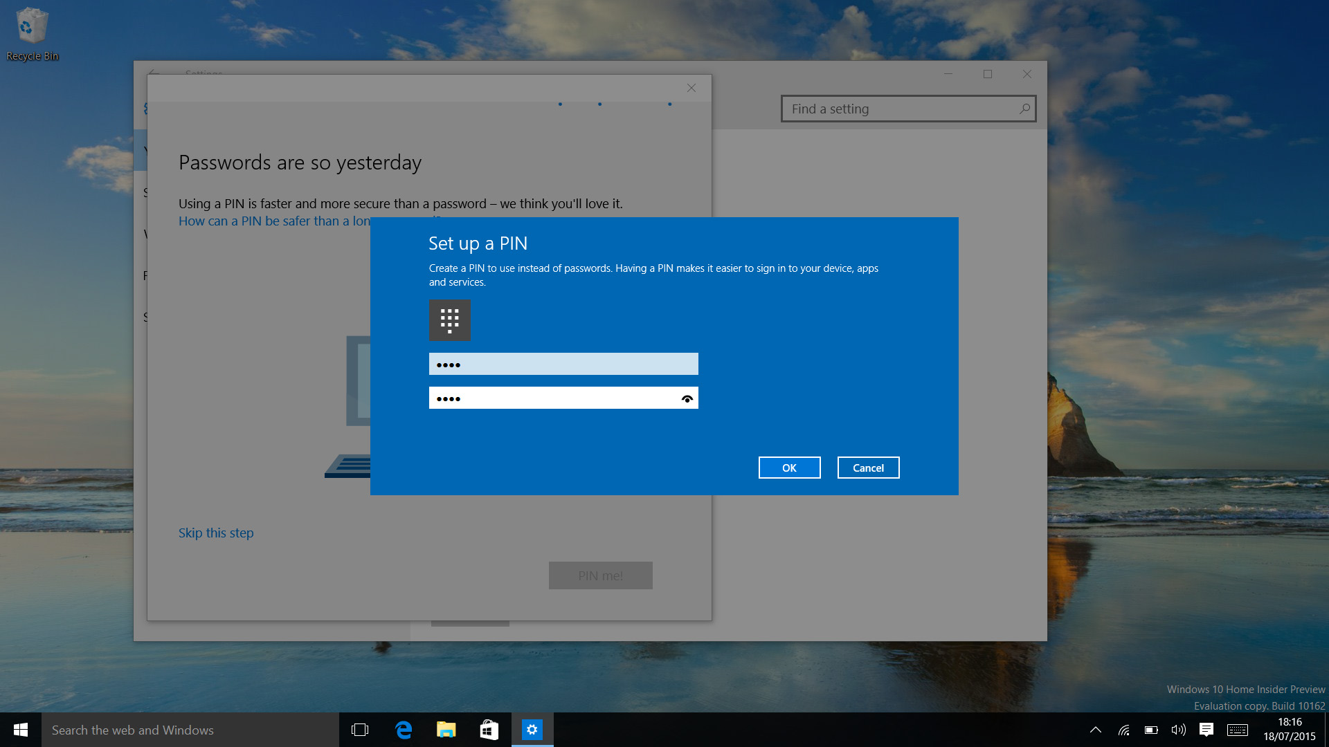
Windows PIN

Surprisingly, it turns out Windows Hello wasn't already using the same hardware-protected secure area that the business security features like Credential Guard use in the release version of Windows 10 – but with Anniversary Update, your biometric data is stored in there too.

In Anniversary Update, Hello supports the latest standard, FIDO 2. This is what lets you use Hello biometrics instead of passwords in apps and in the Edge browser, but it only works for apps and sites that explicitly support it – and so far that's just the Store app, where you can buy apps with your face quite happily.

If you don't have biometrics on your PC, Anniversary Update will let you use a phone with a fingerprint or iris scanner, or a USB device, or even a wearable like a smartwatch to sign in securely, but there aren't many devices that support FIDO 2 yet to make that work.

Windows Defender will now automatically run quick scans even if you have other antivirus software, which is good, but it comes with an annoying new notification in the Action Center to tell you that it has run and not found any problems. You can't turn that off without turning off a lot of other notifications as well.
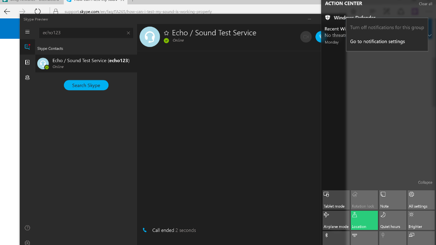
Windows Defender notify

The useful but controversial Wi-Fi Sense feature for sharing wireless connections with your friends is gone – not because of the controversy (it doesn't leak your Wi-Fi passwords) but because it wasn't used enough to be worth continuing.

The long-promised enterprise data protection to let admins control what apps and documents you can use, and where you can save files, has finally showed up as Windows Information Protection – and the businesses who want it will already have the management tools like Intune that it needs. Similarly, Anniversary Update includes the agent for the new Windows Defender Advanced Threat Protection, but businesses will need to subscribe to the service to use it.

We still like the updated Snipping Tool which lets you set a delay so that you can screenshot those pesky menus you couldn't keep open before.

Power users appreciated the way Windows 10 updated the Command Prompt window – small beer, you might say, but you're now able to properly select text, and copy and paste in and out. Ctrl-V really will work. Text also re-flows as the window is resized.

And in Anniversary Update, the Windows Subsystem for Linux means you can run real Linux applications, in particular the Bash shell; handy for developers and web admins. If you use Hyper-V to run virtual machines, you can now run Hyper-V inside a virtual machine, so you can run another virtual machine inside that one (and so on, until you run out of resources).

High DPI PCs with multiple screens get some improvements in Anniversary Update, with the promise of a more comprehensive overhaul in future. Especially if you dock a high DPI device like a Surface Pro 4, you can find some applications displaying at the wrong resolution on different screens.

Windows can't fix all the problems for older apps, and we still found that some apps display icons that are too tiny to be easy to use, but there are definite improvements in Anniversary Update – applications that use WPF will scale properly and updates are coming for PowerPoint and Skype for Business (that only fix the problem on Anniversary Update).

Notepad getting high DPI support is nice for Notepad users, but more importantly it means the improvements are in this release ready for other app developers to use.

Unlike Windows 8, it's been easy to follow along with the Windows 10 journey and see how the OS has developed, from an early work in progress, through the release version and the major updates. With the latest Creators Update, Windows 10 sees more new features at once than ever and improvements to several existing tools. There are few situations in which we wouldn't unequivocally recommend Windows 10 – but remember that you now have to pay to upgrade.

Another key idea behind Windows 10 is also sound: that it should be available on as many devices as possible. That's why there's Xbox One and HoloLens and the Internet of Things version that works on a Raspberry Pi come in; Microsoft is embracing the way PCs have moved away from the traditional idea of what a PC is.

We liked

Windows 10 performance continues to impress, as does its reliability, and Microsoft has carried on evolving the interface, which now satisfies both the Windows 7 faithful and the few Windows 8.1 fans.

Core features like search (through Cortana) are absolutely rock solid. The Settings app (a disappointment even in Windows 8.1) remains a worthy replacement for the Control Panel. It's testament to the newfound strength of Settings that, while the Control Panel is still present, you'll hardly ever go to it.

Under the covers, security is improved even more now with Creators Update, and with Windows Hello and biometric support, we're on the verge of ditching passwords (if more websites and apps join in). Transparency has also seen a huge boost here, with a brand new out-of-the-box experience.

The Windows Ink and gaming improvements this year are perhaps the most important to those respective ends of Windows 10 yet, and Paint 3D brings a whole new kind of creation tool to the masses.

We disliked

Even in introducing some new features, Microsoft has done so in an incomplete way, as mentioned in our impressions of Edge. We’re still not sold on switching over. The new tab management experience is welcome, but feels a little incomplete. Meanwhile, the e-reader upgrades are massive, but feel as if they’re serving a niche that’s long been filled.

Also, while we appreciate the improvements to transparency, it still doesn’t change the fact that Microsoft is collecting lots of data about your use of its software.

Finally, we’re bummed that some key upgrades, like the major Cortana improvements, aren’t functional in time for this review.

Final verdict

Ultimately, something for everyone in Windows 10 Creators Update, from Night Light to improvements to gaming and Windows Ink, as well as a new e-reader in Edge and a Paint 3D app.

That said, it still has its share of irritations, and there are some people who are so comfortable on Windows 7 (or even 8.1) that they won't want to upgrade until those OS’s get long in the tooth (or they replace the older peripherals for which hardware makers haven't put out device drivers).

Microsoft remains committed to the idea of universal apps, which now run on Xbox One (and HoloLens, for the few people who have access to it) as well as on Windows Mobile, and Store apps in general (which, confusingly, might not).

The quality of these remains mixed: Mail and Calendar are competent but a long way behind the versions on Windows Mobile with Outlook, Groove is shaping up to be an excellent media player (although you need to pay for a Groove Pass or put your music on OneDrive to make the most of it) and the Skype is at last fully usable. Edge has also graduated into a viable state. And not only have desktop apps not been pushed aside, Microsoft is working on making them look better on high DPI, multi-screen systems.

But mostly, the Creators Update solidifies the success Windows 10 has shown itself to be over the last year. Installation is simple, performance is generally excellent, security is improved (with more options for businesses) – and the most compelling thing about Windows 10 is that it just works. There's not really a learning curve as there was with Windows 8 or 8.1. Even if people don't get to grips with features like the taskbar search or Task View, it won't actually take anything away from their core experience of the OS. Pretty much everything that most people will need is in the Start menu or Action Center.

Plus, knowing that there’s even more to come after the Creators Update instills some good faith that Windows 10 will continue to improve.
Dell XPS 13

$
0
0

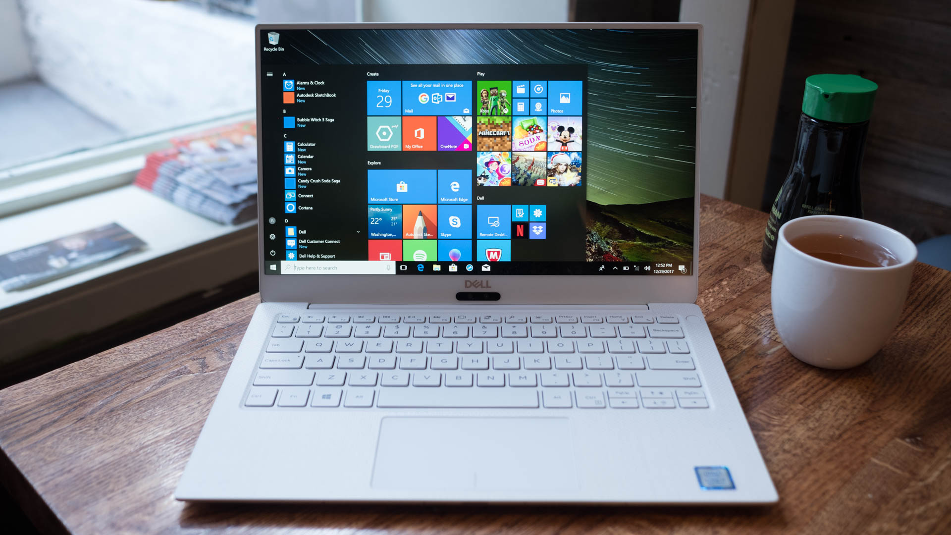
Enlightened. Empowered. Refined. If we had to use three words to describe the 2018 Dell XPS in all its Alpine White glory, it would be those. On paper, this is the kind of laptop you expect to appear inconspicuous and plain. Rocking a quad-core processor, three USB-C ports and even a microSD card port, it’s beefier than it appears. It’s also light, weighing just 2.67 pounds (1.21kg), so not only does it weigh less than Apple’s MacBook Pro, it’s more powerful and costs less, as well.

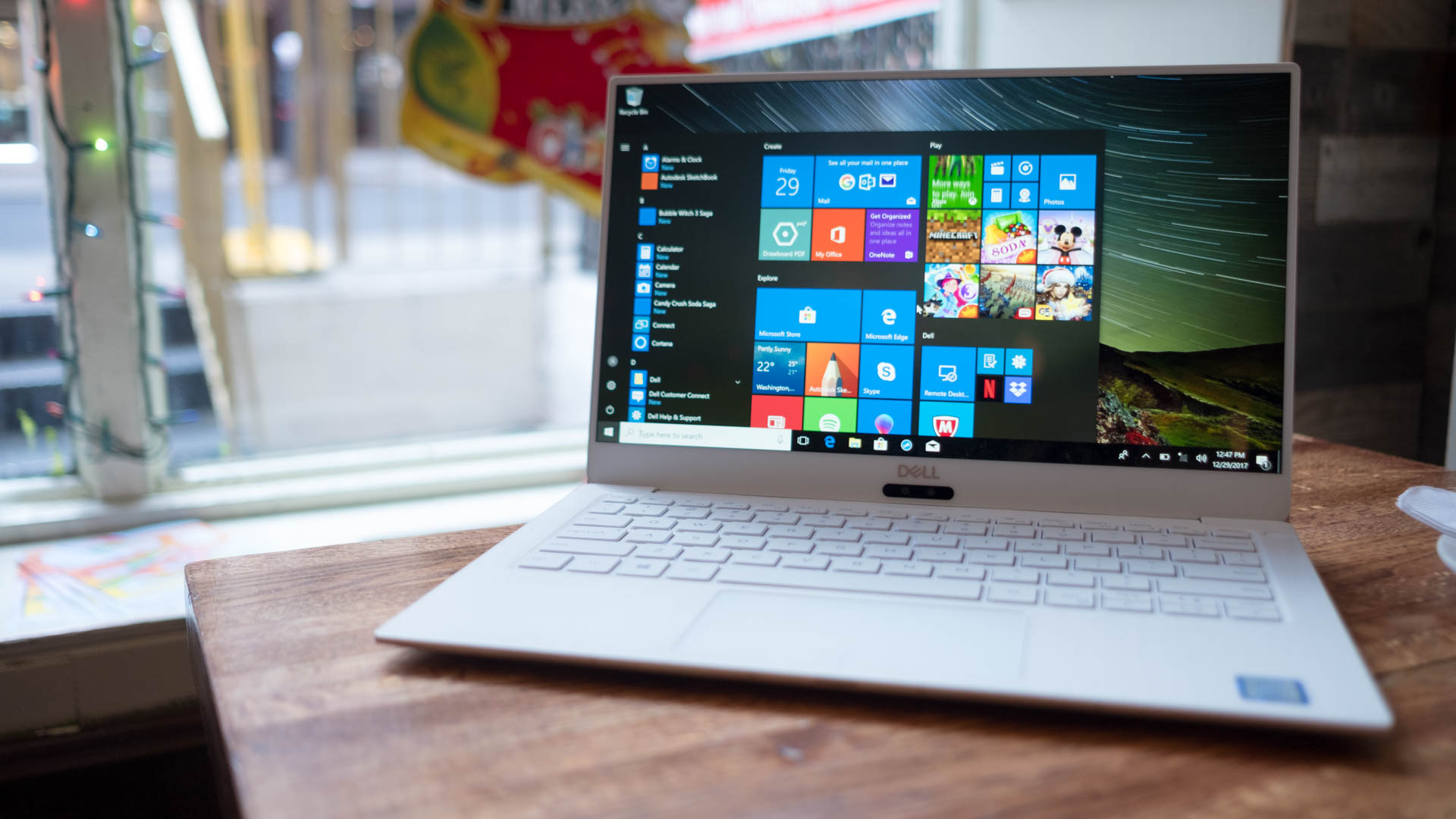
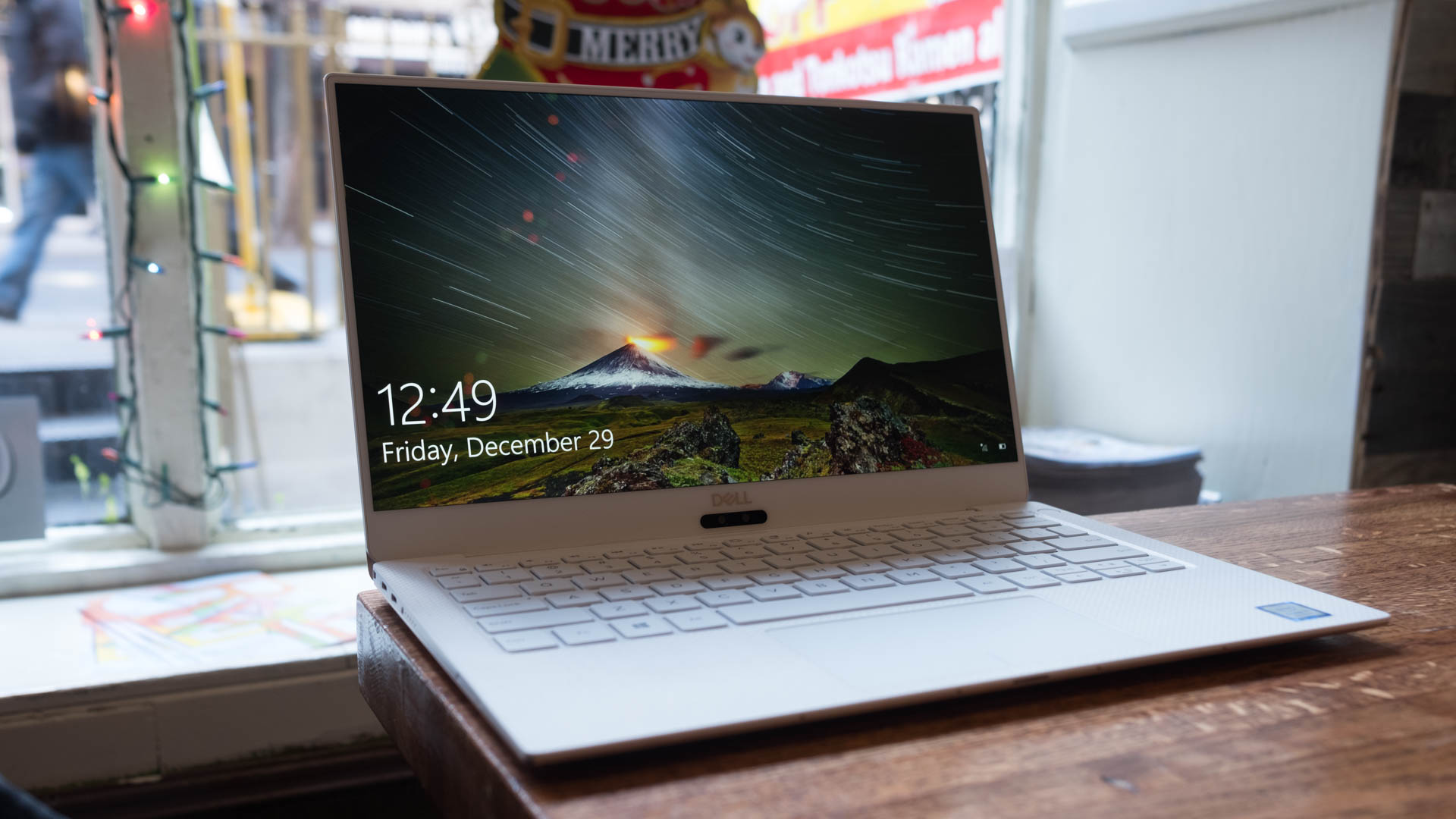
At the same time, it features a strikingly more contemporary look. You can just look at all the recent flagship smartphone releases, and you’ll know that bezel-less displays are in style – and Dell has seen it too. The next-generation InfinityEdge display found on the Dell XPS 13 has edges so narrow you’ll forget they’re even there – it’s simply futuristic. As long as you can look past the awkward camera location, it’s quite possibly the best laptop you can buy today, a sentiment that’s echoed across the internet.

All told, we’re intensely impressed by the new XPS 13, thanks in part to that dazzling new color option. In fact, we’re so impressed by Dell’s design revisions that it’s once again earned TechRadar’s Best in Class award for laptops. That said, if you want in on the deepest revision on the XPS 13 design in years, you’re going to have to pay up – more so than in the past.

Dell XPS 13 2018

Price and availability

It’s a little more expensive than it was previously, but the Dell XPS 13 makes up for the higher price tag by noticeably boosting the performance and design.

Thankfully, this time even the least expensive edition comes rocking a quad-core processor, namely a 1.6GHz (up to 3.4GHz with Turbo Boost) Intel Core i5-8250U. It’ll set you back $999 (£1,269, about AU$2,190), but you’ll also be in for a 1080p non-touch display, 4GB of RAM and 128GB of SSD storage.

Like most laptops in 2018, there is the choice to buy a high-end configuration, complete with the specs that you need for your daily duties. If you need a faster processor, there are two models featuring a 1.8GHz Intel Core i7-8550U (4GHz with Turbo Boost) to choose from.

In total, the Dell XPS 13 we reviewed here would set you back $2,349 (£1,899, about AU$3,004), which is a lofty sum to pay for the average user. It does, however, come with a 4K display, 1TB of storage space and 16GB of RAM. While we enjoyed the display on its own, other accounts have stated that it looks worse than the base model’s 1080p screen because of its lower color accuracy and contrast.

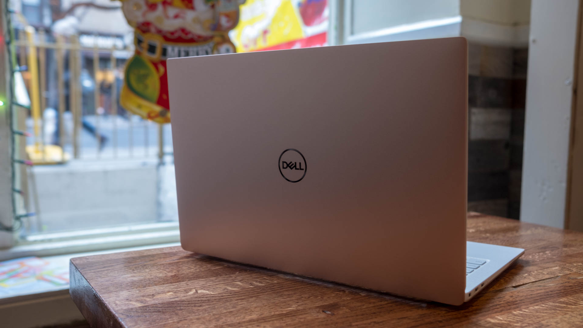
Another issue is the fact that the Rose Gold on Alpine White version of the Dell XPS 13 is a bit pricier than its standard, silver-on-black model in the US, by adding an extra $50 regardless of configuration. Worse yet, this edition is only available in the US at the time of writing.

All configurations for the new Dell XPS 13 include three USB-C ports (two of which are Thunderbolt 3), a microSD card reader and a 3.5mm audio jack.

For anyone keeping track, the only flagship laptop that can price match the new XPS 13 is the Google Pixelbook. The most recent MacBook Pro and the 13.5-inch Surface Book 2 are each more expensive to start for similar or inferior hardware configurations. 

Dell XPS 13 2018

Design

This year is the first time that Dell as noticeably changed the XPS 13 design since it earned the top spot in our rankings. To start, it’s actually lighter and thinner than the 2017 model that launched just a few months ago.

Dell slimmed down the XPS 13 chassis to be 30% thinner at just 0.3 inches (3.4mm) at its narrowest point and a touch lighter at merely 2.67 pounds (1.21kg).

Now, the most notable of changes to the XPS 13 design is bound to be the brand new Rose Gold on Alpine White color option.

While almost every laptop maker has a rose gold color option these days, Dell took it to the next level with an all-new set of materials for the complementary-colored keyboard deck. 

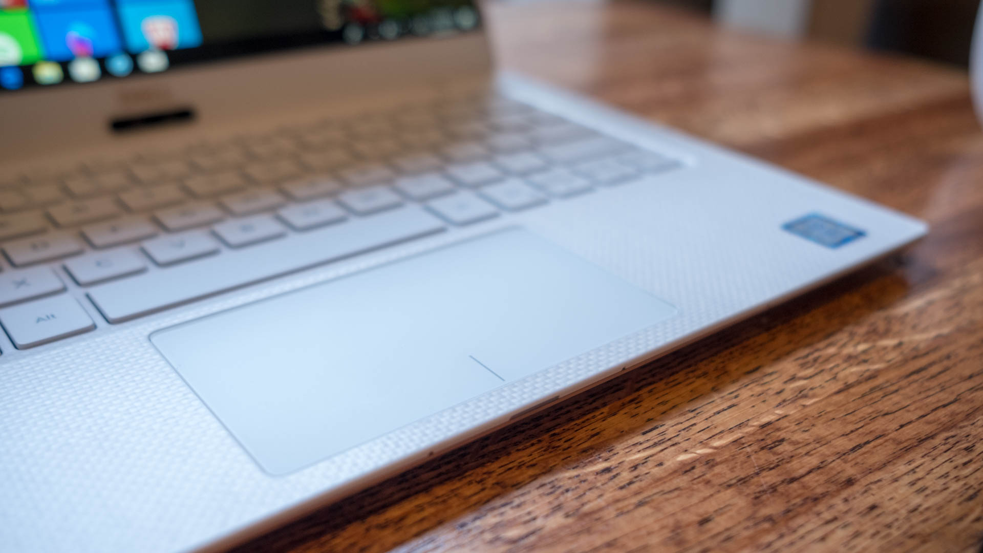
Dell is particularly proud that the new keyboard deck houses a crystalline silica material that has the white color literally woven into it like a fabric, in nine composite layers.

This is the first time woven glass fiber has been, well, woven into a laptop. Plus, the base has a titanium oxide coating which gives it a pearlescent sheen, not to mention stronger stain-resistance than most.

Sadly, the same can’t be said for the plastic that borders the edges of the laptop’s display. Over the past few weeks of use, we’ve found that this softer plastic has grown a little gray compared to the plastic that borders the edge of base.

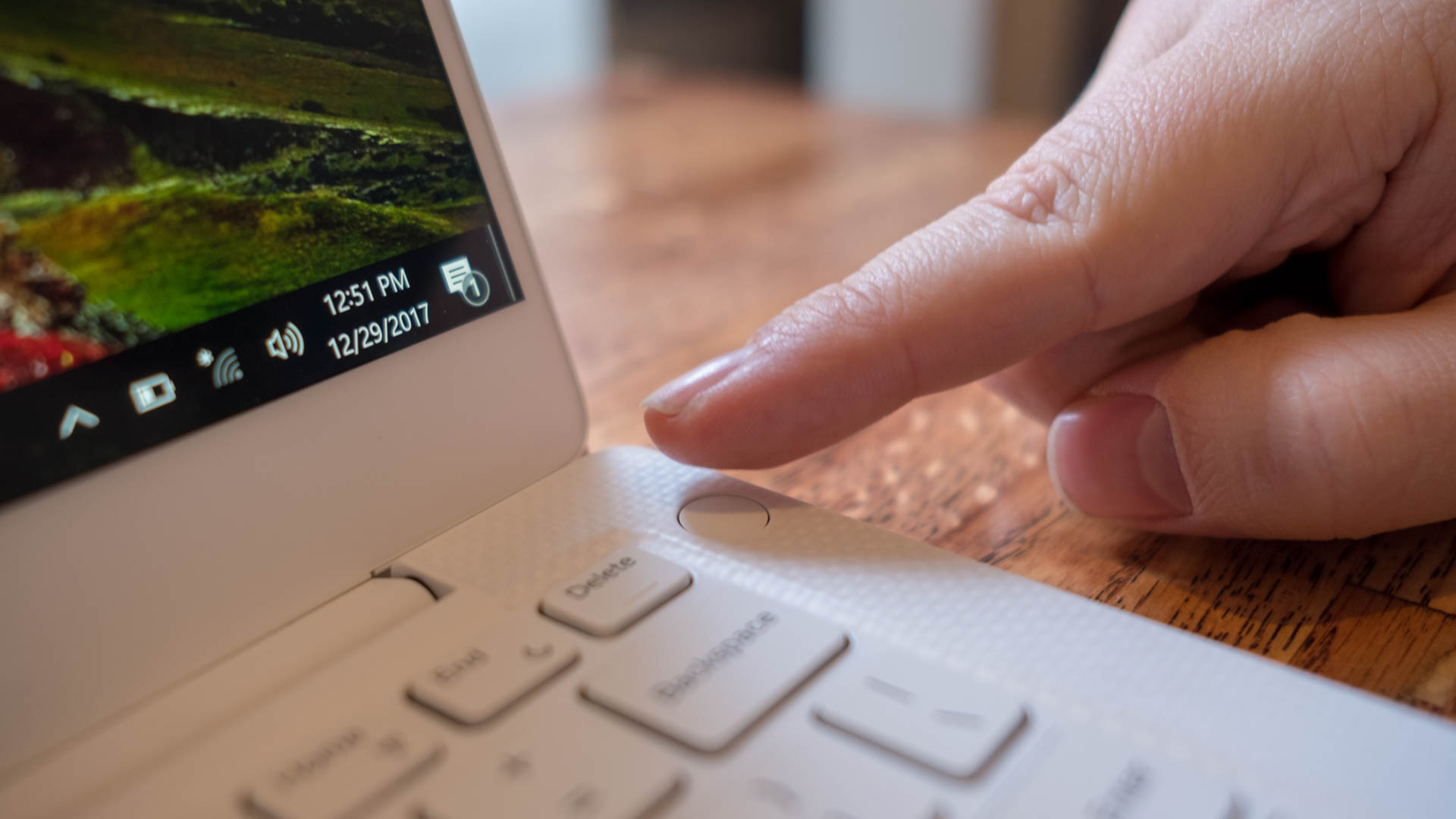
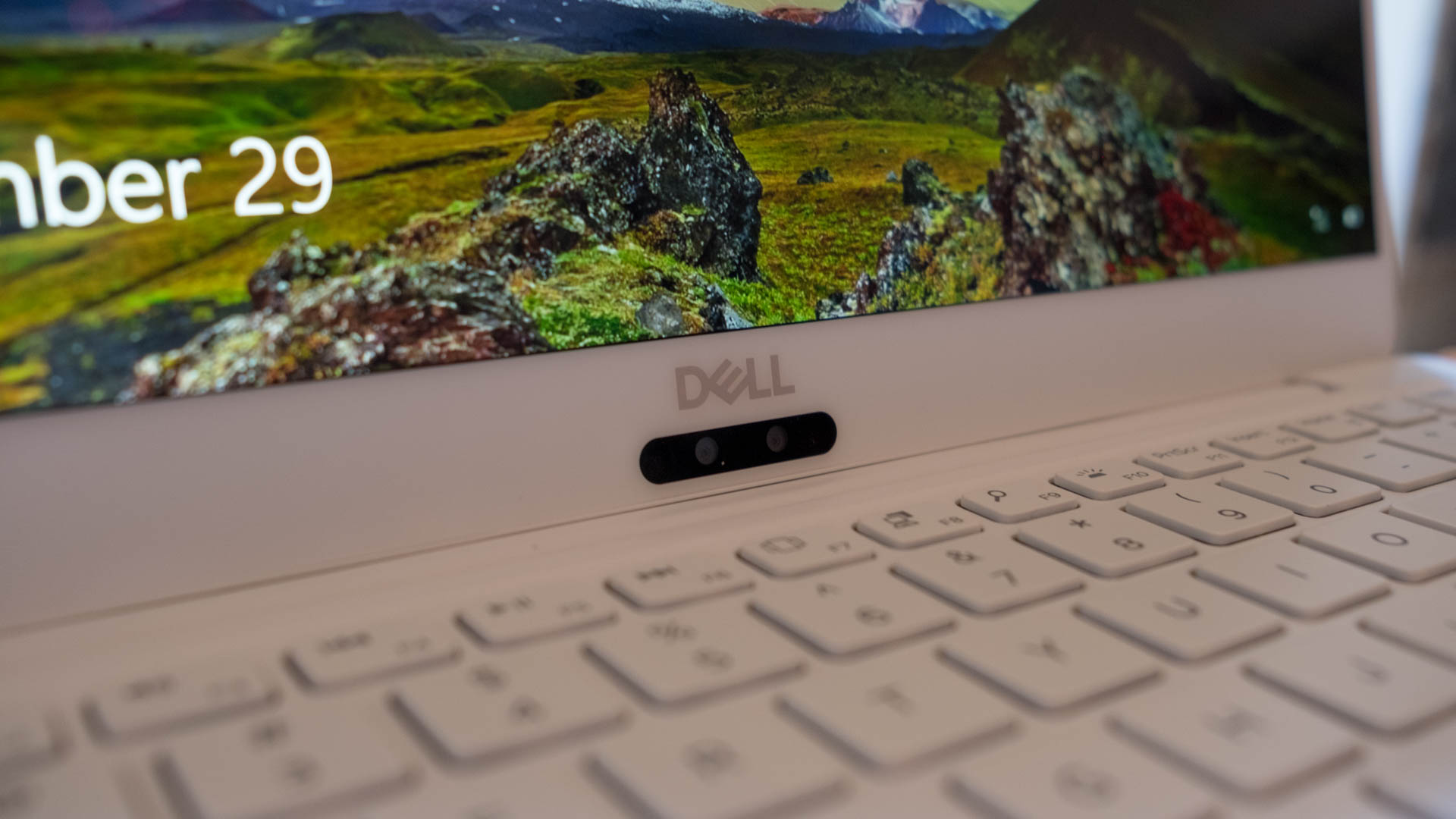
Of course, this XPS 13 model also marks the turning point on what might be its biggest bugbear: the webcam placement. Better yet, the new IR lens works well for speedy logins using Windows Hello, the biometric security system that uses your webcam to sign you in. However, the red flashing of the infrared lights is a little intense.

Dell XPS 13 2018

That said, the 720p webcam produces about as sharp of visual as that of the latest MacBook Pro, but isn’t a 60 frames-per-second lens like that on the Pixelbook. The Surface Book 2 beats them all with a 1080p camera.

The webcam comes equipped with four microphones – placed within the lip of the base of the laptop – for stronger video chatting input as well as far-field communication for yelling at Cortana from across the room. These mics pick up clearer voice audio over video chats than some of its competitors.

However, they won’t be challenging  the likes of Google Home and Amazon Echo anytime soon. While the microphones can pick up our ‘Hey, Cortana’ commands from a few feet away in front of the laptop, trying them from behind the laptop at the same distance is a bust.

dell xps 13 2018

Display

Another major improvement upon this year’s design is the display. The screen is now available with an optional 4K Ultra HD (3,840 x 2,160) resolution beneath a glossy, IGZO touchscreen. That’s sharper than any of the previously mentioned, competing laptops.

The touchscreen is coated in a 0.65% anti-reflective coating that aims to offset the downfalls of all touchscreens and screen glare.

We haven’t noticed much difference while using the laptop for the past few weeks, but the brightness scaling of the device is fantastic enough to call out. Putting the screen at even 10% brightness doesn’t detract from our ability to write and read on this laptop.

With a 1,500:1 contrast ratio and 100% sRGB color profile, blacks look as if the backlight shuts off in those spots during darker scenes in videos and photos and colors pop with vibrancy. Meanwhile, the display responds snappily and fluidly to touch gestures.

First reviewed January 2018

Gabe Carey has also contributed to this review

With the latest Intel processors, it should go without saying that the Dell XPS 13 for 2018 is the most powerful one yet. Naturally, what we see here are mightily impressive numbers from the latest XPS 13, beating its young predecessor’s numbers in every test.

Why is that when this model uses the exact same processor as the 2017 model we tested recently? We chalk it up to improved thermals.

In releasing this XPS 13, Dell is touting its use of Gore thermal insulation for stronger heat dissipation. That, combined with the more up-to-date quad-core processing that the 8th-generation Intel chips bring, results is far better performance in tests like Geekbench over that of the 2017 MacBook Pro.

However, not even the 13.5-inch Surface Book 2 seems able to compete with the XPS 13 on core computing benchmarks, likely thanks to these thermal advantages. Of course, the Surface Book 2 wins on visual tests with its Nvidia GTX 1050 graphics.

Dell’s new power management software also helps the XPS 13, with a ‘dynamic power mode’ that automatically delivers maximum power when needed, while carefully monitoring system heat. As proof, the system never grows too hot to handle (literally) under load.

Of course, you’re not going to be able to play games on the XPS 13 beyond the odd casual or indie hit, but this laptop will be more than ready for photo editing, especially with its microSD card slot. Expect to be able to churn through spreadsheets with this laptop as well, thanks to that 16GB of speedy memory.

Dell XPS 13 2018

Battery life

These battery test scores are most impressive for a laptop with a 4K display, but again are well under Dell’s projections – wholly unsurprising. We can only imagine the numbers we might see on an FHD model, considering the previous lasted longer than 10 hours in one test.

Of course, these numbers aren’t as high as we’ve seen on the new MacBook Pro much less the Pixelbook and Surface Book 2 (though, the latter has not one, but two batteries inside). However, all three of those devices are far better optimized for the operating system they run.

Regardless, expect the XPS 13 to last you on most flights within the continental US and western Europe as well as across Australia.

Dell XPS 13 2018

Keyboard and trackpad

Dell has largely kept one of the best qualities about its laptops in tact: the inputs. Rest assured that the keyboard and touchpad have been untouched in their look and feel.

Travel on the keyboard isn’t the deepest we’ve seen on Ultrabooks, but the feedback is plenty forceful. That said, we wish Dell didn’t have the ‘Page Up’ and ‘Page Down’ keys directly above the arrow keys. It’s been far too easy to jump up or down the page farther than we wanted when trying to move between words in a document.

The glass-coated touchpad is just as wide as it can be given the 11-inch XPS 13 frame, and our fingers glide smoothly along its surface. Clicking feels oddly more satisfying on this laptop than most others in its class, perhaps save for Apple.

Dell XPS 13 2018

We liked

We sincerely appreciate the new centered IR webcam, as it’s a sign that Dell is working on solving the common complaints of the webcam location on previous models. It’s also a simply better solution, thanks to support for logging in to Windows 10 using facial recognition. The brand new design and color option, as well as the gorgeous, optional 4K display and powerful processor are all heartily welcomed changes, too.

We disliked

Of course, the centered webcam position is a fine step in the right direction, but it’s still not quite in the ideal place for video chats. Yes, you’re investing in a laptop for a few years at least, but this problem exists right now. Plus, we’re bummed that the more affordable, entry-level configuration isn’t available for this new, better design.

Final verdict

It’s official: Dell has undoubtedly done it again. In directly addressing the concerns of users, Dell has refined its XPS 13 laptop further than perhaps ever before. So much so that we’re inclined to give this laptop our Best in Class award all over again.

Moving the webcam position, adding facial login and a four-mic array, giving Intel’s chips more headroom to perform even better and adding a 4K screen have all evolved the XPS into an even more formidable flagship laptop. Sure, we’d like a top-mounted webcam and to pay less to start for this latest model with a Core i3 processor, but what Dell has put on offer here is well worth the increased price.

With all of the improvements made to the XPS 13 for this year, the rest of the laptop world now has a lofty benchmark to measure itself against for 2018, as Dell has once again set the bar high – very high.

Apple MacBook

$
0
0

Ever since the original MacBook was announced nearly 12 years ago, it was positioned as an affordable alternative to Apple’s MacBook Air and MacBook Pro laptop PCs. That’s no longer the case today, as the MacBook has since turned into a 12-inch, ultra-premium laptop.

To begin, it features a Retina display, which puts its price point at slightly more than the Air and around the same as the cheapest MacBook Pro. This means that the MacBook, according to Steve Jobs, has so many pixels that they are imperceptible by the human eye from more than 12 inches away.

Future iterations of the MacBook may vary wildly from what is available today, as one patent recently filed by Apple suggests a spill-resistant keyboard in the works. Another rumor suggests we may get a dual-screen MacBook with a touch-screen OLED keyboard. There are also some reports that Apple is playing around with the idea of a cheaper 13-inch Retina MacBook starting at around the same price as the $999 (£949 or AU$1,499) MacBook Air. There have also been reports that Apple is going to work co-processors into some of their future Macs. However, this is all speculation, so we’ll just have to wait and see. 

As we sit, awaiting the advent of Apple’s next laptop, the 12-inch MacBook you see here is as good as they come. Light, thin and inalterable, it’s a classic Apple product shrouded in a beautiful exterior that’s sure to draw jealous looks. Yet, as luxury often does, the MacBook comes with a cost.

Price and availability

You can easily snag the MacBook we’ve reviewed here off the shelf of your local Apple Store (or Amazon) for $1,299 (£1,249, AU$1,899). That price fetches you everything found under our hot pink spec sheet, including a 7th-generation Intel Core m3 processor. 

It’s worth mentioning that this isn’t the latest CPU to come out of Intel, with the company’s 8th-generation chips having launched last year. Instead, you’ll have to wait for the MacBook 2018 to find out what’s next for Apple’s smallest laptop currently available for sale.

For the time being, should your lavish taste necessitate a more powerful 12-inch MacBook, there are higher tiers to choose from.

One version of the MacBook, for instance, comes with an Intel Core i5-7Y54 and 512GB of SSD space instead of the base model’s 256GB. It’s still fanless, so we wouldn’t bank on speeds quite as fast as the cheapest MacBook Pro, but does come to a grand total of $1,599 (£1,549, AU$2,349).

Should you be interested in getting the top-of-the-line MacBook experience, you’ll be looking at a price tag of $1,949 (£1,864, $2,909) for an Intel Core i7-7Y75 processor and 16GB of RAM, along with the same 512GB of storage brandished by the previously mentioned configuration.

Simultaneously, Google’s flagship Chromebook, the Google Pixelbook, starts at $999 (£999, about AU$1,295) with a beefier Core i5 Y-series processor with the same RAM, but half as much SSD storage.

On the Windows side, one of the most technically comparable laptops is the Acer Swift 7, an Ultrabook seemingly handcrafted to go toe-to-toe with the MacBook. This one starts at $1,099 or £999 (about AU$1,449) for a similar Core i5 Y-series processor with matching storage and RAM as well as a Full HD, 13.3-inch display. 

Design

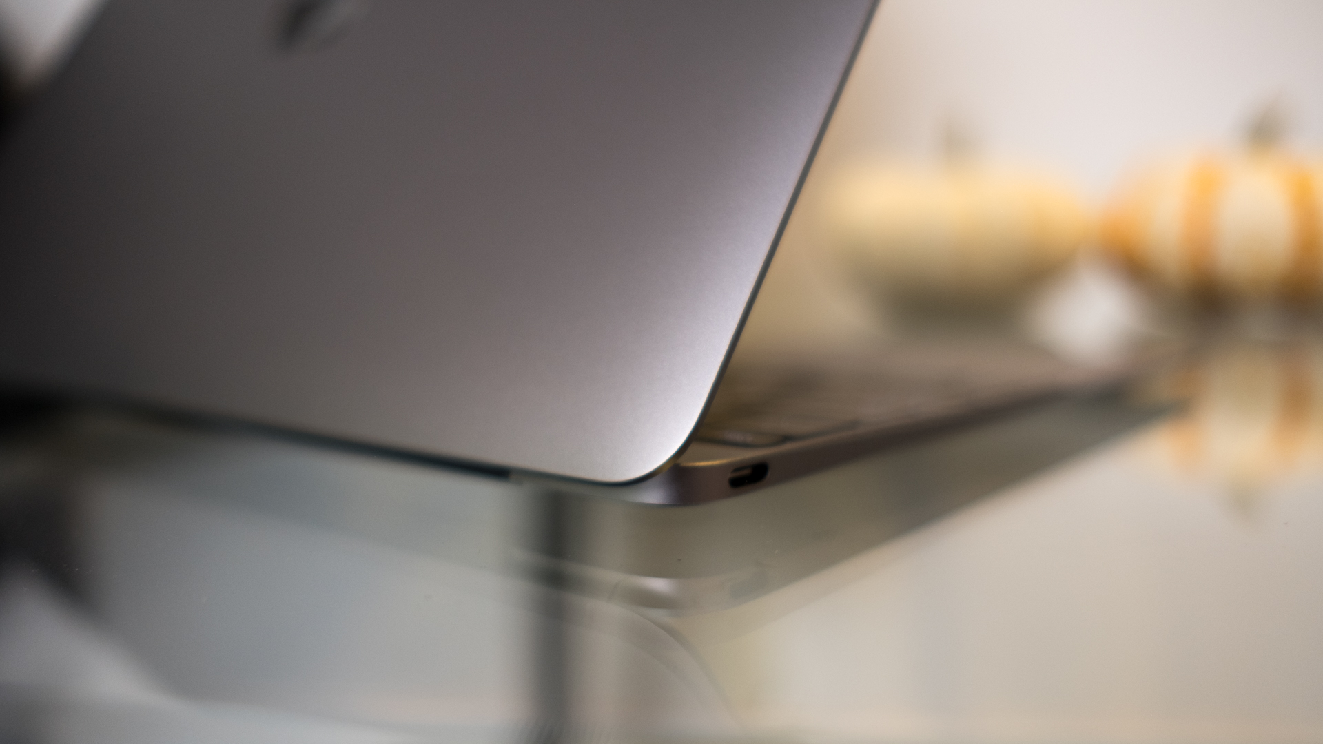
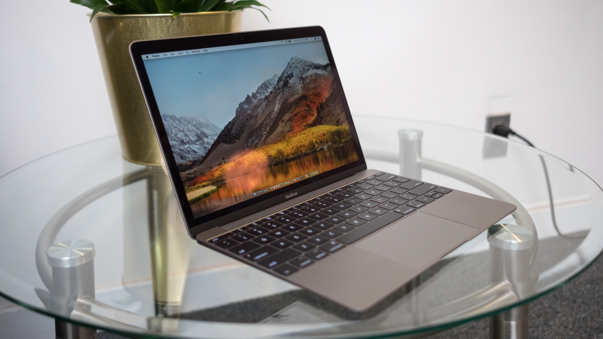
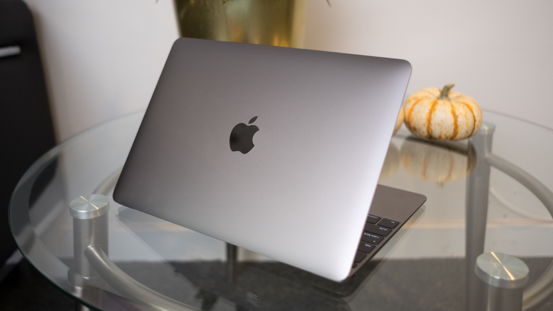
Frankly, not much of anything has changed about the look and feel of the 12-inch MacBook frame, which isn’t entirely a bad thing. Available in space gray, silver, gold and rose gold, the brushed aluminum feels just as cool (literally) and sublime as it has on Apple laptops for years.

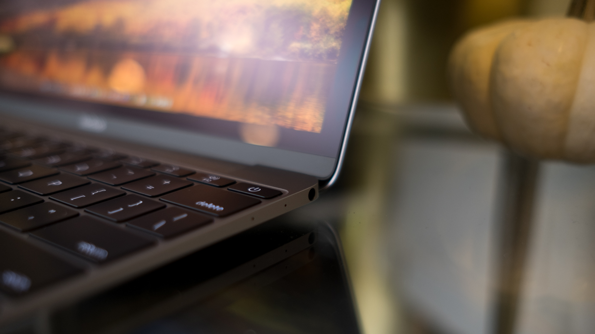
Again, the laptop’s thinness and feathery weight continues to impress to the point that its dimensions are a hallmark aspect of the device. 

That said, an even more narrow screen bezel or just one more USB-C port would be blessings upon the design at this point.

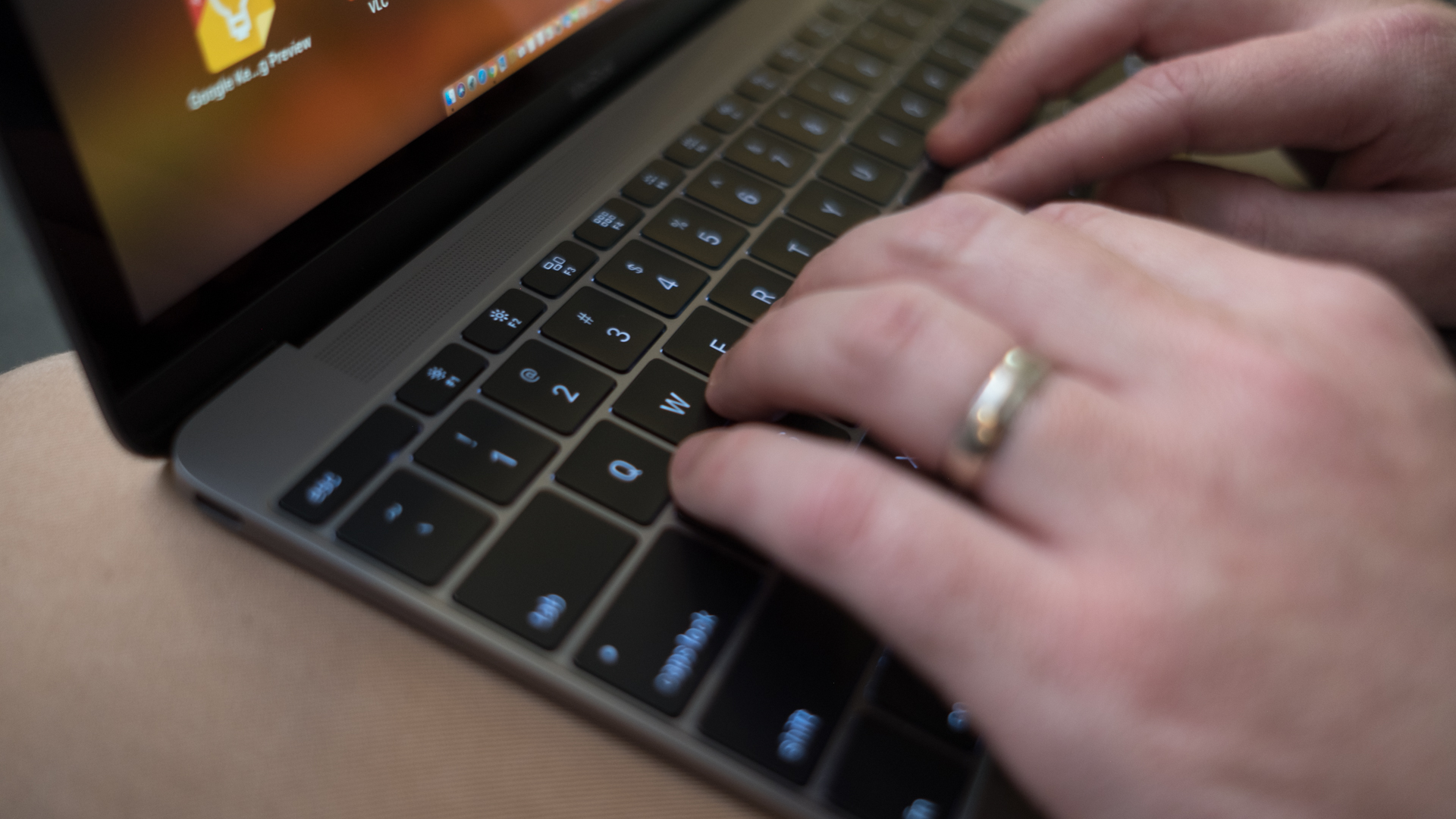
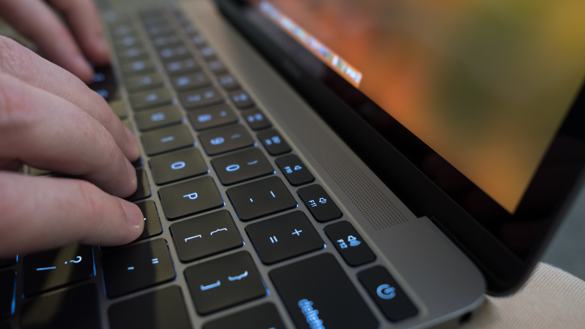
One major improvement upon the 12-inch MacBooks of yesteryear is the refined butterfly switches that comprise the new backlit keyboard. Travel doesn’t feel any deeper, which isn’t great, but feedback is much stronger and more forceful, improving the quality drastically.

The wide, glass-coated trackpad remains unchanged from last year, meaning it’s just as pleasant to use as it’s always been. Apple’s touch interface technology both through hardware and software remains nearly unmatched.

We say ‘nearly’ because Google may have well caught up to Apple with its Pixelbook. Seriously, the keyboard and trackpad on that thing are ones to be imitated.

Display and sound

We all know that Apple has prided itself on its displays for years, and with good reason. The 12-inch MacBook’s screen remains unchanged since the dawn of the product in 2015, which is just fine. Editing photos and doing graphically intense design work looks simply superb on the Retina display, but it’s not the sharpest in its class any longer.

Also, the 16:10 aspect ratio is just off-kilter enough to be annoying sometimes, like when watching movies or editing images that are formatted to 16:9 in fullscreen mode.

As for how the laptop sounds, the four stereo speakers toward its hinge can definitely pump out some loud tunes. But, like all laptops with mere millimeters to work with for audio chambers, the sound comes through tinny and thin, with some channels in songs just getting lost outright.

That said, you’re not going to find much better sound elsewhere out of a laptop anywhere near this thin. Thank heaven this is a product Apple has yet to cut the headphone jack from.

Gabe Carey has also contributed to this review

While the 12-inch MacBook still makes use of an M- or Y-series Intel processor, we’ve already come to know that this means little to the average user. It’s capable enough even if that user is doing some photo editing with the laptop in question – though, video editing might be pushing it.

During our time with Apple’s latest, we experienced nothing in the way of chugging or slowdown with more than 20 Google Chrome tabs open at some points. Bear in mind that those tabs were generating everything from streaming music to text editors, spreadsheets and even live chat.

Because we’re stacking the MacBook up against a laptop that runs Chrome OS and one that released early in the year, before we adopted the Geekbench 4 test, straight comparisons in the numbers would be a fool’s errand. 

What these numbers should tell you is that this laptop is more than capable of handling basic tasks and even some advanced ones, like Java-based graphical map generation.

That said, don’t be surprised to see this laptop get spanked by those equipped with full-fat, mobile U-series Intel processors. 

When you stack those stark differences with the arguably minimal gains in weight and thinness that those laptops present, it’s hard not to question the price of such an admittedly gorgeous device.

Battery life

All that said, the 2017 MacBook continues to beat most of its rivals in pure longevity, reporting a battery life score in our original TechRadar Battery Life Test of 8 hours and 4 minutes. That’s nearly a half-hour longer than the Pixelbook and several hours longer than the Swift 7.

Of course, that’s unsurprisingly far below Apple’s battery life claims of up to 10 hours wireless web browsing or up to 12 hours iTunes movie playback. Regardless, it’s well beyond what most Ultrabooks of this year have reported in our test, which sets screen brightness and audio volume to 50%, as well all other back lights and radios off save for Wi-Fi.

We liked

This year’s MacBook sees vast improvements to the keyboard, especially in feedback strength, making typing on it far more delightful and accurate. 

The sheer thinness and lightness of the device is still an impressive feat, and the gains in processor speed are welcome no matter how modest they may be in real-world use.

We disliked

Frankly, the price of this laptop should be at least 100 bills less regardless of currency, and a marquee performance feature of this laptop – 16GB of RAM capacity – simply costs too much.

Plus, the lack of ports and the middling 480p webcam just can’t be ignored any longer for a laptop that costs this much.

Final verdict

To be honest, given its exorbitant price for what’s on offer hardware-wise, we’re a bit annoyed that we like the 2017 12-inch MacBook as much as we do. Simply put, the laptop is rather easily out-classed in terms of pricing by many rivals in terms of brass tacks components, from storage capacity to ports to screen sharpness.

However, the feel of using this laptop on a daily basis is where it manages to hold its ground in the competition. Apple’s latest MacBook design has proven to be inimitable over the past couple years, delivering an experience that’s both performant and lightweight in ways that most other laptops can’t. 

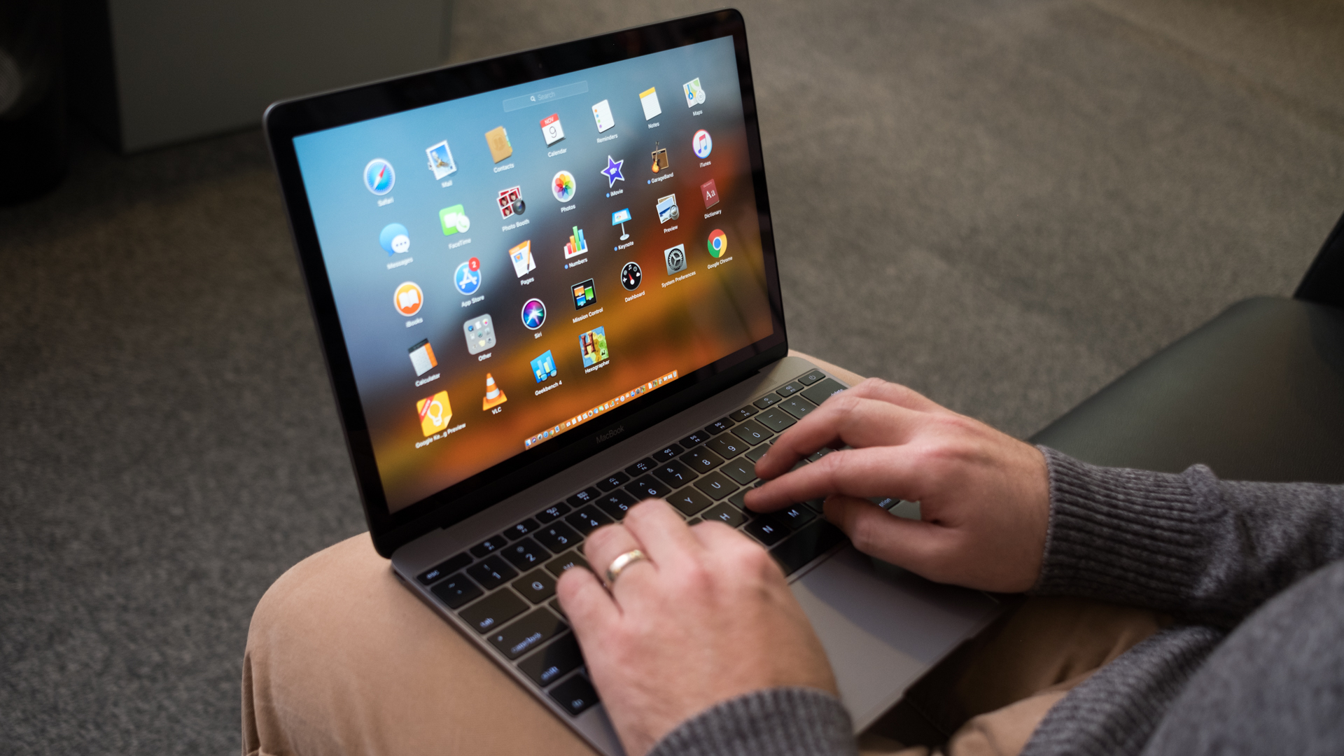
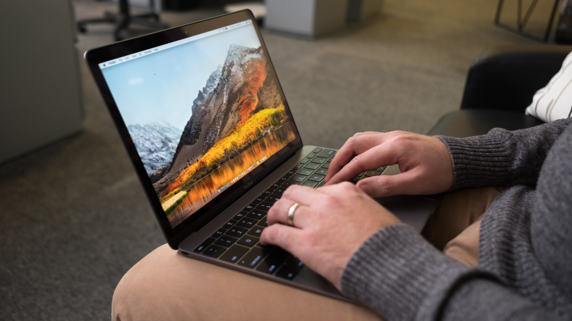
Simply working on something or browsing the web from the couch with our legs crossed feels better on this laptop than it does most others we’ve tested. Throwing this MacBook into a backpack – and perhaps even forgetting the charger – feels as if nothing is in there. Yet, what comes out is a laptop that wakes up instantly and won’t slow down short of gaming or intense graphical editing work. 

If you can get past a price tag that’s high even for Mac fans, then prepare to enjoy what’s surprisingly the best MacBook in years – Pro or otherwise.

MacBook Air

$
0
0

As it stands today, the MacBook Air is a bit outdated. It features the same design the MacBook Air has had since 2010, two years after its initial conception. It also has an older processor and lower screen resolution than those used by its contemporaries, like the 12-inch MacBook and the 13-inch MacBook Pro. However, in 2018, the MacBook Air is the most affordable way to experience macOS 10.13 High Sierra on a laptop.

However, that could all be changing. Regardless of the site’s admittedly shaky reputation, an analyst from DigiTimes has leaked that a 13-inch Retina MacBook is on the way that would challenge the existing MacBook Air’s price point. Just a week prior to that report coming in, KGI Securities analyst Ming-Chi Kuo reported that a more affordable MacBook Air is set to release in the second quarter of 2018 – which is rapidly approaching.

That said, the MacBook Air we’ve reviewed here is still your best option for now. Although it’s in dire need of a re-tooling, let it be known that it’ll get you by as-is for the time being. For future reference, keep your peeled to this page, as we keep it updated with the most recent pricing information and availability details related to the MacBook Air as we know it.

Price and availability

While the model sent to us was a maxed out MacBook Air with the highest specs you could get at the time of its original writing, it currently comes in a wide range of different configurations. 

It still starts at the comparatively humble amount of $999 (£949, AU$1,499), but now you’re looking at a 1.8GHz Intel Core i5 processor, 8GB of RAM and 128GB of SSD space for that price.

Should you be interested in stepping its game up, you can upgrade the processor to a 2.2GHz Intel Core i7 CPU and 512GB of storage for a pretty penny more. For that, you’re looking at a price tag of $1,549 (£1,384, AU$2,339). 

That’s a higher asking cost than an up to date MacBook Pro for a frankly older set of components (the MacBook Air uses a 5th-generation Intel processor as opposed to the MacBook Pro’s 7th-gen chip), but it might tempt those who crave lots of storage and a longer battery life. 

13-inch MacBook Air (2015)

Design

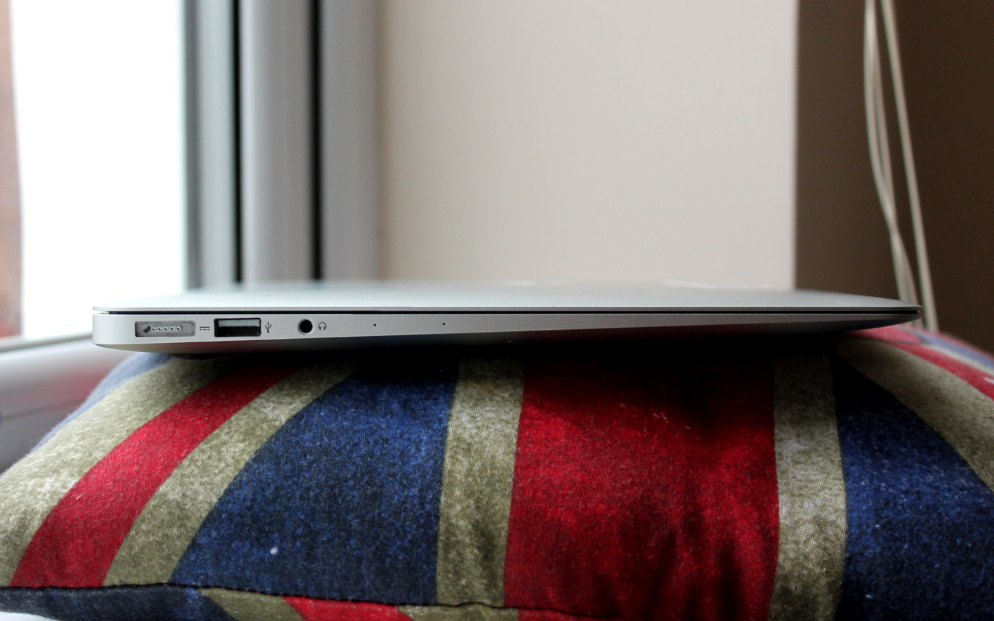
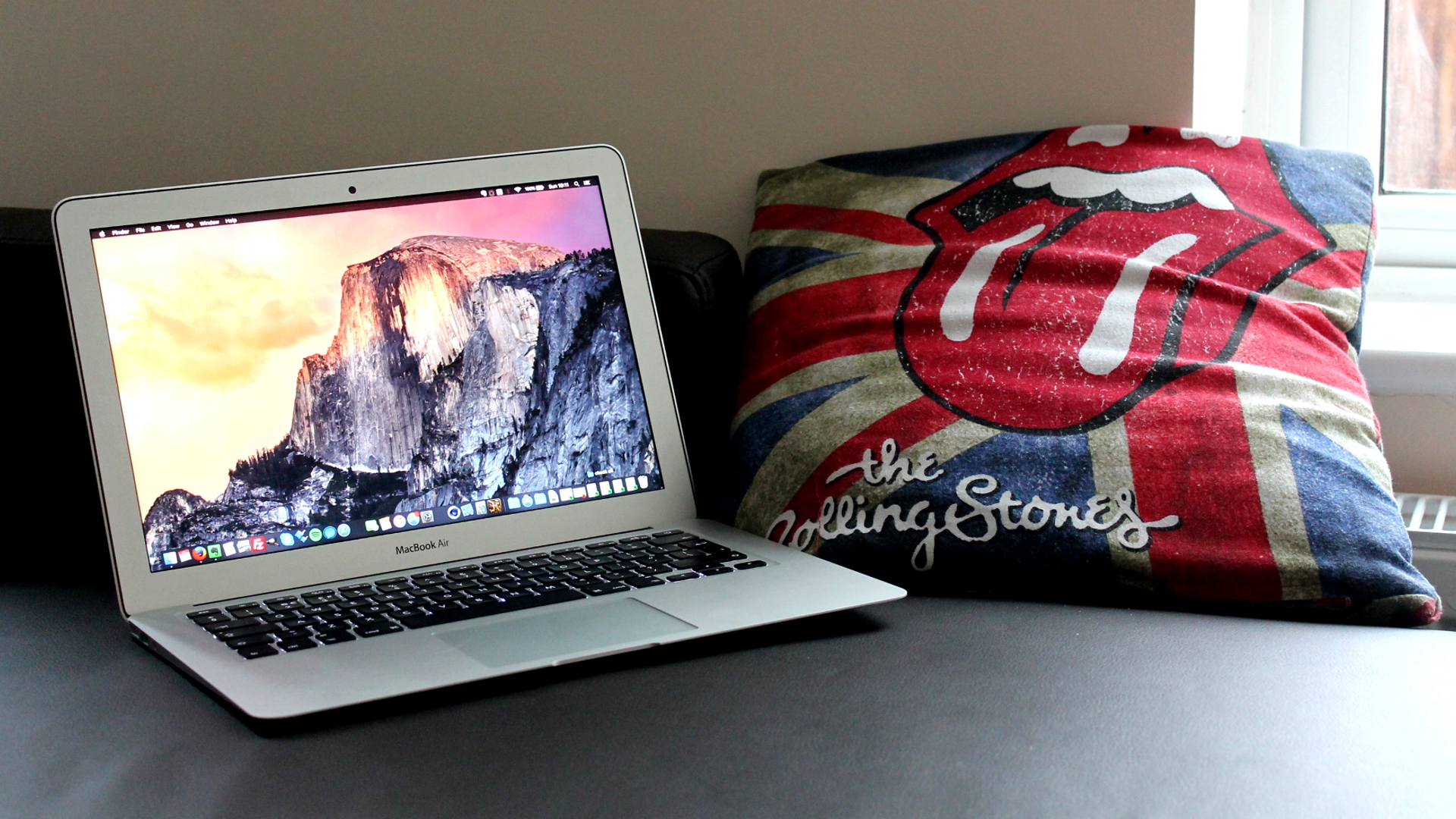
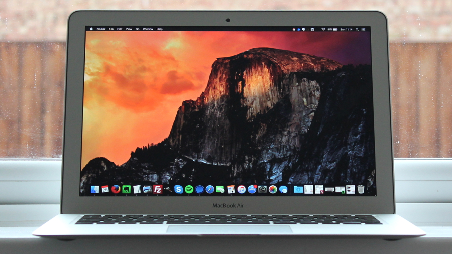
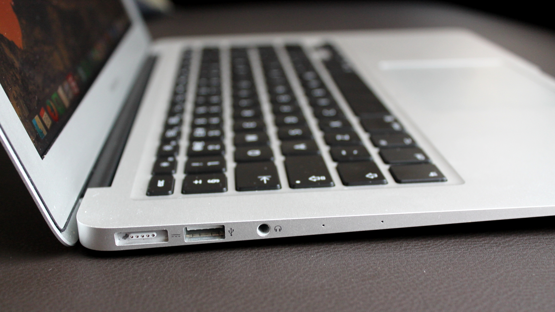
By and large, the MacBook Air generally looks the same as it has since 2010, and there don’t appear to be any changes in tow, either. That’s a shame, particularly because we’re now seeing virtually bezel-less laptops with smaller footprints and high resolution screens that dismally put the MacBook Air in its place. 

Forget the Dell XPS 13's physics-defying InfinityEdge display, which is lightyears ahead – even Apple's 13-inch MacBook Pro with Retina, once seen as slightly tubby compared to the Air, has a smaller footprint and takes up slightly less space on your lap.

13-inch MacBook Air (2015)

Yet, the old ‘if it ain't broke’ mantra applies – at least to a point. The MacBook Air's aluminum unibody design, which supports the main enclosure and the display, is as durable as ever. Its lid can be easily raised with a single hand and doesn't droop in any position, and you have to press really hard to detect flex on the machine's base or lid.

It's also easy to clean with a damp cloth. If there's one drawback, it's that the aluminum body can scratch easily to leave permanent black marks, so you should consider buying a sleeve if you're going to sling it into a bag for transportation.

Gabe Carey has also contributed to this review

The 13-inch MacBook Air is more interesting than the 11-inch model due to housing flash storage twice as fast as its predecessor – or so Apple claims. It's available in two configurations starting at £849 ($999, AUS$1,399) for a 1.8GHz (Turbo Boost to 2.9GHz) Core i5 CPU, 128GB of flash memory and 8GB of RAM.

We reviewed the top-spec early 2015 model, starting at £999 ($1,199/AUS$1,699) and netting you a 1.6GHz (Turbo Boost to 2.7GHz) CPU, 4GB of RAM and 256GB of flash memory. Our unit had been further configured to ship with 8GB of RAM which, at the time added £80 (around $124, or AUS$170) to the total cost.

That price makes the 13-inch MacBook Air more expensive than the entry-level 13-inch MacBook Pro with Retina (early 2015), which also starts at £999 ($1,199/AUS$1,699). Price is no longer a differentiator, so which one you go for depends on a few factors that will be explored in this review.

Apple 13-inch MacBook Air (early 2015)

Spec sheet

  • CPU: 1.6GHz dual-core Intel Core i5 (Turbo Boost up to 2.7GHz) with 3MB shared L3 cache
  • Graphics: Intel HD Graphics 6000
  • RAM: 8GB 1600MHz DDR3
  • Screen: 13.3-inch, LED-backlit glossy widescreen display (1440 x 900)
  • Storage: 256GB PCIe-based flash storage (configurable to 512GB flash storage)
  • Optical Drive: Not included
  • Ports: Two USB 3.0 ports (up to 5Gbps); Thunderbolt 2 port (up to 20Gbps); MagSafe 2 power port; SDXC card slot
  • Connectivity: 802.11ac Wi-Fi networking; IEEE 802.11a/b/g/n compatible; Bluetooth 4.0 wireless technology
  • Camera: 720p FaceTime HD camera
  • Weight: 1.35kg (2.96 pounds)
  • Size: 32.5 x 22.7 x 1.7 cm (W x D x H)

One advantage of the MacBook Air versus the 12-inch MacBook is its wider selection of ports. On the left-hand side is a MagSafe 2 connector for power, one USB 3.0 port and a headphone jack. On the right is a Thunderbolt 2 port, another USB 3.0 port and a full-sized SDcard slot. The 13-inch Retina MacBook Pro doubles the number of Thunderbolt ports compared to the Air, and adds HDMI.

Ports right

macOS Sierra is the version currently shipping with Apple's 13-inch MacBook Air. It doesn’t divert too much from the visual style of its predecessor, OS X 10.11 El Capitan, but it does introduce a range of new features such as Siri, Continuity between your Mac and iOS devices and Apple Pay for expediting online purchases.

Sierra has since been succeeded by macOS 10.13 High Sierra, though it doesn’t come with it out of the box – you have to download and install it yourself, for free. There aren’t many significant improvements by way of macOS High Sierra, save for better security, VR support down the road and refinements to the Photos app. 

That said, given that you don’t have to pay for it, macOS High Sierra is probably worth the 4.8GB hit to your data cap for the also-new Apple File System (APFS) alone. The new 64-bit file system brings native encryption and faster metadata operations to the table, making the MacBook Air quicker to use as a result.

Bundled software

For now, macOS Sierra ships with Apple's own iWork and iLife apps, including a modernized look for Garageband.

Photos app

These inlcude:

  • Movie
  • Garageband
  • Pages
  • Numbers
  • Keynote
  • Safari
  • Mail
  • Messages
  • FaceTime

Yosemite

In addition to:

  • Calendar
  • Contacts
  • Notes
  • App Store
  • iTunes
  • iBooks
  • Maps
  • Photo Booth
  • Time Machine
  • Spotlight

Manufactured on the 14nm fabrication process, the 13-inch MacBook Air's Broadwell CPU is a die shrink of Intel's 22nm Haswell chip. It means better battery life versus last year's MacBook Air models, although the gains aren't on the same scale as the switch from Ivy Bridge to Haswell. Still, battery life was staggering, clocking up more than 13 hours when looping a 1080p video over Wi-Fi.

Apple 13-inch MacBook Air (early 2015)

Benchmarks

  • Cinebench R15 Single Core: 103cb cb; Multi Core: 255 cb
  • Cinebench R15 OpenGL: 24.91fps
  • Geek bench 3 Single Core: 2,873; Multi Core: 5,768
  • Xbench (CPU and disk): 469.55
  • NovaBench (Overall): 634; Graphics: 42
  • Unigine Heaven 4.0 (Medium); FPS: 14.4; Overall: 438
  • Blackmagic Disk Speed test: Write average: 612.4 Mbps; Read average: 1302.4 Mbps
  • Battery, streaming 1080p video via Wi-Fi: 13 hours and 24 minutes

Broadwell brings performance gains too, even if they're nothing to shout about. The MacBook Air scored 5,768 on Geekbench 3's Multi Core CPU test, representing a 9% gain over the 13-inch Air from 2014. However, it proved 20% slower than the 2.7GHz Core i5 chip in the 13-inch MacBook Pro with Retina, which is to be expected considering that machine's faster clock speed.

Apple's claim that the 2015 Air's storage is twice as fast as the 2014 version stands up. The MacBook averaged write speeds of 612.4 Mbps, and average read speeds of 1,243 Mbps, which gives the MacBook Air MacBook Pro-level storage speeds for the first time.

13-inch MacBook Air (2015) keyboard

The MacBook Pro with Retina's Iris Graphics 6100 proved 38% faster than the MacBook Air's HD Graphics 6000 in Unigine Heaven 4.0's benchmark. That said, Intel's decision to allocate die space to graphics on the CPU has been paying off for some time, and the MacBook Air is capable of playing a wide selection of games on low-medium settings with the resolution dialled down - especially when installed on a Windows partition using Boot Camp.

The MacBook Air cranked out a smooth 60FPS played at 1440 x 900 with the graphics on medium, while Skyrim managed the high 50s played at the same res with the graphics on low. If your intention is to play games, you'll want to invest in a decent headset as the MacBook Air's speakers are tinny and unsatisfying. Apple managed to squeeze an impressive amount of low and mid-range tones into the 12-inch MacBook's speakers, but it's yet to use the same technology in the Air.

Apple 13-inch MacBook Air (early 2015)

If the MacBook Air's consistency of design can grow stale over time, this reviewer is happy for the keyboard to remain unchanged. Its slightly convex keys are the best I've used yet on a computer, and that includes the new MacBook, Lenovo's ThinkPad notebooks and Logitech's well-regarded Mac keyboards. Even the MacBook Pro with Retina's keys, which are hardly uncomfortable, feel stiff in comparison. The keyboard is also backlit and easy to clean.

The MacBook Air's trackpad is just as impressive, providing a smooth gliding action that makes executing OS X's trackpad commands a breeze. It's just a shame that Apple didn't carry over the 13-inch MacBook Pro with Retina's Force Touch Trackpad – it's once again regular two-button clicking action for owners of Apple's slimmer machine.

dd

Apple's decision to put a 480p camera in the 12-inch MacBook was a poor one, and thankfully it hasn't followed suited with the MacBook Air. At 720p it's up to the task of Skype and Google Hangout sessions, producing sufficiently clear and defined images.

We

The 2015 edition of the MacBook Air, in short, remains a fantastic laptop held back by a shortage of noteworthy changes. This lack of substantial improvements is disappointing to say the least, but it’s gratifying nevertheless to see Apple continue to support one of its most iconic products. Over a decade later, the MacBook Air may still very well be the best version of the MacBook to date.

We liked

Not only does the MacBook Air boast favorable performance given the age of its guts, but the fact that it can go over 13 hours without charging is virtually unprecedented. In fact, there isn’t any modern MacBook that comes close. We’re equally proud of the legacy ports on deck, complemented by SSD speeds that bring double the trouble.

We disliked

Its battery life may be the only way the MacBook Air has deviated from the norm. In terms of design, it hardly differs from the MacBook Air we’ve known since 2010. This reluctance to change will surely have some Apple users turning their heads to Windows, while those too loyal to make the switch will gladly shell out a couple hundred bucks more on a 12-inch MacBook.

Final verdict

Much faster storage and a better performing processor/graphics combo make the 2015 13-inch MacBook Air a technically better machine than its predecessor. But, unless you really need those gains, it's not worth the upgrade. That's particularly so in the absence of any new features – such as the Retina MacBook Pro's Force Touch Trackpad.

Elsewhere, it's business as usual: while the MacBook Pro with Retina is faster than the Air and packs more features, Apple's lighter machine is no slouch. And, while the Retina model is chunkier than the Air, it's not a great deal heavier and has a smaller footprint. With both machines residing in the same price bracket, the deciding factor is more likely to be how prepared you are to put up with the MacBook Air's outdated display.

MacBook Pro with Touch Bar (13-inch, Mid-2017)

$
0
0

Complete with all the bells and whistles you’d expect from a professional grade Apple laptop, the MacBook Pro is here, though it might not be just what you remember. Nearly two years ago, Apple released a redesign of its flagship laptop that would forever change our perception of Apple. It’s thin, at just over half an inch thick, and it also harnesses the power of Thunderbolt 3, a single port that’s capable of supporting pretty much everything that came before. 

Still, this laptop is controversial, as some of these innovations bring compromise. Rather than being able to use your old USB, HDMI and SD accessories natively, you now have to shell out for an adapter. And, depending on the MacBook Pro you choose, you might be in for a narrow OLED display where the function keys used to be. The main attraction of the MacBook Pro 2016, this ‘Touch Bar,’ remains both a selling point and one of contention.

And, this Touch Bar may soon extend to the entire lower segment of the next MacBook Pro, as Apple is toying around with the idea of an OLED touch screen keyboard.

Luxurious, but by no means ostentatious, the MacBook Pro comes at a premium. Like most of Apple’s products, it’s built to impress in the looks department. It doesn’t do anything too groundbreaking this time, at least not in the way that Apple’s recent patents suggest of its future spill-proof and crumb-resistant MacBooks will. It’s also not as affordable as Apple is positioning the purported 13-inch MacBook with Retina display to be.

However, the MacBook Pro of today is a laptop largely successfully geared toward professionals, which is far more than can be said for the other members of Apple’s MacBook family.

Price and availability

At $1,299 (£1,249, AU$1,899), you can fetch yourself a MacBook Pro minus the Touch Bar you would otherwise find in the configuration we were sent for review. Bear in mind that, as enticing as the cheapest MacBook Pro might seem, it has only 128GB of solid-state storage inside, making it tough to recommend for users who plan on using it as their main computer.

Of course, that MacBook Pro configuration lacks another key element: the OLED Touch Bar that replaces the function keys on the low-end models. If the Touch Bar, along with Touch ID verification, is on your must-have features list, you can expect to shell out no less than $1,799 (£1,749, AU$2,699). That’s a lot more than the presumably forthcoming entry-level MacBook is going to be.

Now, while you could simply fetch more storage than the base configuration for another couple hundred bills, the unit we reviewed is a supercharged beast. That’s due in part to the fact that it sports four Thunderbolt 3 ports, double that of the non-Touch Bar models, all of which can be used to charge the device. Moreover, the processor speed has been bumped from 2.3GHz to 3.1Ghz as well. 

For $100 less in the US, however, you can get a Dell XPS 13 with double the RAM and storage of the $1,799 MacBook Pro we’ve reviewed here and with a more capable Intel Core i7 CPU at that – not to mention a sharper 3,100 x 1,800 touchscreen as well as both Thunderbolt 3 and an SD card reader.

Similarly, the Surface Laptop, which can be configured with a stronger Core i7 CPU and equally capacious storage and RAM for a full 200 clams less, albeit with a slightly lower-resolution 2,256 x 1,504 touchscreen and only two legacy ports.

Bearing all this in mind, it doesn’t take a genius to see that you’re paying for the logo etched opposite your display, paired with a fantastic trackpad and a familiar operating system to boot. Nevertheless, you can save a wad of cash by trading in your old MacBook Pro to Apple itself for up to $2,500, if you’re residing in the states.

Design

Luckily, Apple’s pedigree does wonders for maintaining the MacBook Pro’s shining reputation as an absolutely beautiful and sensible computing device. That said, not much – if anything – has changed about the MacBook Pro design year over year, and that’s A-OK.

Still available in Apple’s standard space gray or silver colors (no rose gold yet), the MacBook Pro’s unibody aluminum shell is as gorgeous as ever, giving off a subdued shine through the anodization.

In terms of form factor, Apple maintains its achievement of cramming a 13-inch screen into an 11-inch frame a la the Dell XPS 13, but this laptop’s bezels are still a bit larger. Speaking of screens, Apple’s Retina display is as sharp and color-rich as ever, even more so with its new, professional-grade P3 color gamut.

However, it’s far from the sharpest out there, even among its strongest rivals, making its “Retina” claims tougher than ever to swallow. For instance, the XPS 13 can be configured with a 3,200 x 1,800 QHD touchscreen, easily outclassing the MacBook Pro in terms of pure sharpness.

This is a hugely important point for creative professionals working with media files that are high-resolution or require such a resolution to resolve minute details upon zooming in on a media file.

At any rate, the MacBook Pro is uniformly thinner than the XPS 13 by a hair, which starts from 0.6 inches and tapers off at 0.33 inches. The Surface Laptop, meanwhile, is marginally thinner than both at just 0.57 inches.

This is the thinnest and lightest MacBook Pro yet, and for that it feels right at home in our backpack – that is, assuming we don’t forget it’s even there. (Trust us, it has happened during this review, and it was horrifying.)

That Apple managed to craft a laptop this thin and still maintain top-firing stereo speakers, with deep and rich sound no less, should be commended when most other laptop makers just go for down-firing speakers. Instead, where speakers would normally go on an Ultrabook, Apple has placed intake fans that draw cool air in and spit it out the back just beneath the hinge.

Sure, the laptop heats up still right around that area, but said heat is far away from the more sensitive parts of your lap and far less dramatic than with previous models.

As for how Apple managed to make the MacBook Pro this thin, a key culprit is the laptop’s new keyboard with Apple’s 2nd generation butterfly mechanism, introduced in last year’s model. The improved actuation device doesn’t make the keys sit any more flush with the keyboard deck than they already were last year, but rather vastly improves the tactile feel of typing.

Feedback is much more forceful this time around, though the key travel doesn’t feel as if it’s changed much, which is the point ultimately. The keys are large enough so as not to miss given the lack of travel, though we’re not fans of the Escape key being relegated to the Touch Bar – something we’ve accidentally pressed more than once – and the tight positioning of the up and down arrow keys.

Also, we find typing on this keyboard to be louder than on Apple’s older MacBook keyboards, but perhaps that’s due to adjusting to the learning curve.
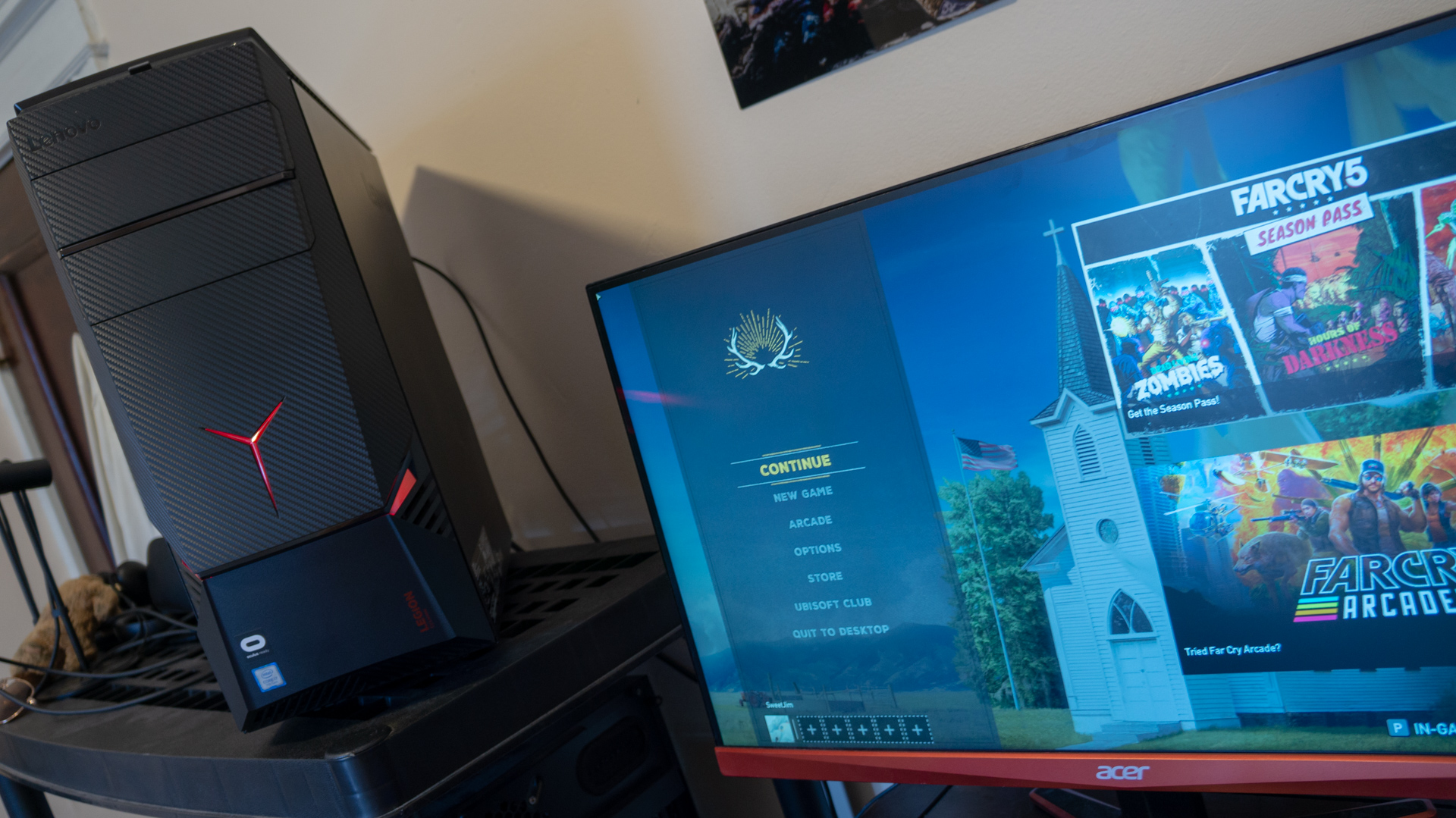
A mixed takeaway from the keyboard aside, the new-and-enlarged Force Touch trackpad was a welcome improvement last year and we’re just as happy to have it this time around. Its large size and strong palm rejection help immensely with multi-touch gestures and, more importantly, navigating the operating system the easier way, i.e. with your index finger moving the cursor and your thumb clicking the buttons.
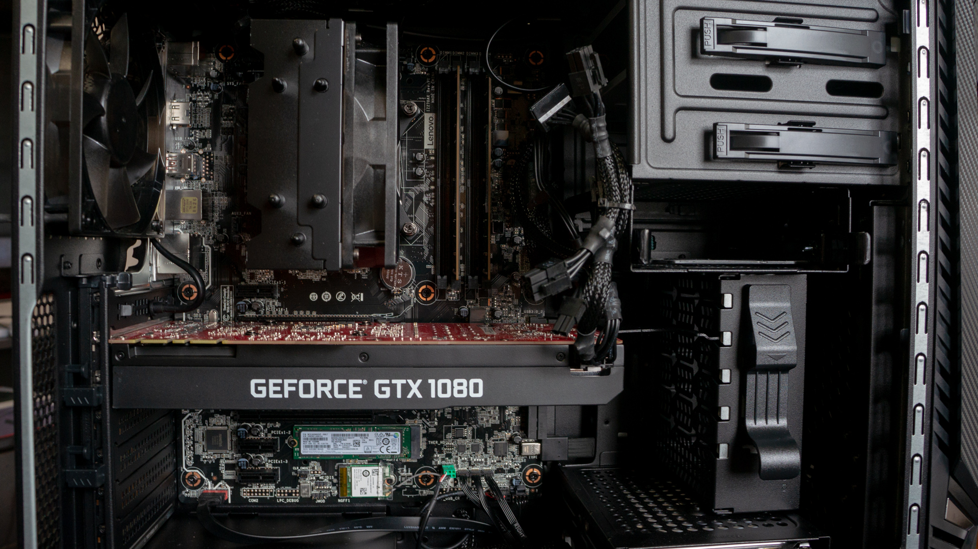
Speaking of which, Force Touch returns to the trackpad, naturally, and it’s frankly remarkable. The vibration motors beneath the glass tracking surface vibrate so as to recreate the feeling of a mouse click, and, if Apple didn’t make such a stink about, it we’d be none the wiser. This is Apple’s “it just works” philosophy realized once again.

Touch Bar and Touch ID

While many have been quick to dismiss the Touch Bar since its introduction in last year’s MacBook Pro model, we’ve come down on it with a bit more understanding. You see, while we admittedly didn’t naturally come to use the Touch Bar much at all during the course of this review, its presence and potential are nevertheless noted.

While still relegated to supporting core macOS functions and a few, major third party apps (like Adobe Suite), the Touch Bar is incredibly fast at adapting to the task at hand. The strongest example of this is simply the Touch Bar’s built-in spell checker, which is constantly suggesting words no matter how fast of a typist you are. 

It’s almost like having the iPhone’s autocorrect function on your MacBook.

We’ve seen tech like this attempted before, but in no way this robust and quick. The OLED touch display is incredibly responsive, and its matte coating does well to shrug off glare from strong light sources – just don’t expect much in direct sunlight. All said, we’re impressed by the technological achievement that the Touch Bar is, but still believe it requires wider third party support to become a must-have feature.

Though, having Siri as a button for easy, constant access is a major plus, given the wide control it has over macOS in comparison to other digital assistants.

The second piece of the Touch Bar offering is, of course, Touch ID. While this is the second go around for the technology, we’re nevertheless happy that biometric login is finally available on an Apple laptop. The tool works just like it does on iPhone, and it’s just as quick.

That said, we’ve found Windows 10’s iris-scanning Windows Hello tech to be faster and require nearly zero effort. (To achieve this level of immediacy with a Mac, you’d need an Apple Watch with the Auto Unlock feature activated.) Regardless, being able to securely log into the laptop, and pay for things through Safari via Apple Pay, are both features we’d be clamoring for if they weren’t there.

First reviewed August 2017

  • The mid-2017 MacBook Pro is just one of the best Macs you can buy

Gabe Carey has also contributed to this review

It shouldn’t come as any surprise that the latest MacBook Pro is rather powerful. With the latest Intel processors inside and some of fastest flash storage available in a laptop, we wouldn’t expect anything less.

During our time with the device, not once have we hit any sort of lock-up, stuttering or freezing. We’ve yet to bear witness to the so-called “beach ball of death” either.

Granted, this is during our normal workload of 10-plus Google Chrome browser tabs as well as the Slack chat app – both of which are known for their considerable demands on system resources. We also find work in Photoshop to be silky smooth, too.

It should also come as no surprise that this MacBook won’t compare well on paper to rivals we’ve reviewed, as the XPS 13 we’ve tested has a stronger processor inside. In the case of the Surface Laptop, straight performance comparisons are even harder to make, given we couldn’t run any of our standard benchmarks on it short of our battery test.

Regardless, expect a similar level of performance between the three devices, given that they all make use of the latest Intel processors and super speedy SSDs. Not to mention that this MacBook Pro houses RAM clocked at 2,133MHz to its rivals’ 1,866MHz, helping shore up some differences.

We wouldn’t worry about that Touch Bar and Touch ID module hogging any system resources either, as both are powered by an ARM-based T1 coprocessor – the very same found in Apple’s own Series 2 Apple Watch. This keeps 100% of the Intel chip’s power devoted to core computing.

Though you may be hesitant to pick up a laptop labeled ‘Pro’ without discrete graphics equipped, recent developments to the open-source Vulkan API are providing new opportunities for this MacBook Pro to flourish without the mention of Nvidia or AMD. Paired with Apple’s Metal 2 graphics framework, the MoltenVK implementation can deliver up to a 50% frame rate increase to Dota 2 running in macOS. 

Still, it’s disappointing only the purchase of a 15-inch MacBook Pro will net you the more powerful, quad-core ‘HQ’ series processors. The 13-inch model we reviewed here will probably be limited to a dual-core chip for the foreseeable future.

Battery life

However, we can’t say the Touch Bar – and the coprocessor beneath it – doesn’t impact battery life. This MacBook Pro lasted for 6 hours and 37 minutes through our in-house battery test, looping 1080p video at 50% brightness and volume – with all backlighting and radios (but Wi-Fi) disabled – until it dies.

That’s nearly an hour short of how long last year’s 13-inch MacBook Pro without the Touch Bar ran on the very same test: 7 hours and 24 minutes. (Not mention well short of both the XPS 13 and Surface Laptop.) Plus, last year’s model was actually conducted at 75% screen brightness. 

Between that fact and that the Kaby Lake Intel Core processor inside this year’s laptop is generally believed to be more power efficient, we’re left wondering why the two results aren’t at least closer. Both of these points are rather strong tells that the Touch Bar’s nearly always-on display and its coprocessor have a measurable impact on battery life.

This is before even mentioning that the Touch Bar seems takes up a bit of space beneath the hood that would normally be occupied by battery cells. While we haven’t gotten inside the thing, why else would the model sans Touch Bar house a 54.5-watt-hour battery whereas the model with the Touch Bar included packs a smaller, 49.2Wh power pack?

Surely, you’d want more battery to power two screens and two processors if you could manage it.

Regardless, the newest MacBook Pro is still going to last you on most US flights and perhaps even flights across the Atlantic into western Europe. That should be also good enough to get most through a work day – either way, it’s still short of Apple’s 10-hour claim.

We liked

Getting a hold of a brand new MacBook Pro never gets old. There’s a reason why countless vendors have ripped Apple’s designs over the years: because they’re that good. The Force Touch trackpad should be lauded as an engineering marvel, while the newer keyboard is surprisingly easy to use and vastly improved over the first go at the butterfly hinge. Finally, Touch ID on a MacBook Pro works nearly as fast as it does on an iPhone, and it’s a no-brainer feature at this point.

We disliked

Our most chief concern with the MacBook Pro is what it offers for the price in comparison to rivals running Windows 10. It’s almost painfully easy to configure a more powerful, longer-lasting and more pixel-dense Windows laptop at online checkout for the same price or even less. Also, despite its merit as another engineering feat, we find the Touch Bar lacking in convenience and necessity for the hit that battery life takes to accommodate the extra hardware.

Final verdict

When it comes to Apple products, especially laptops, there are some whom will never be swayed one way or the other. Either they’re vehemently for or against the MacBook, and will defend either position by any means necessary, whether that be with their money or yet another Mac vs PC Reddit thread.

However, for the scant few of you that might be on the fence (whether you’re coming from a Windows laptop or debating whether to upgrade your MacBook Pro), consider what you’re getting for the price in comparison to rivals. But, also consider the inimitable features that a MacBook Pro affords, like deeper iPhone integration than you can get anywhere else and some of the best keyboards and trackpads we’ve tested, to name a few.

The new MacBook Pro is a marked improvement over the previous generation, upping the processing power and RAM speed as well as improving the keyboard among other features. However, Apple sticking to its guns on things like Thunderbolt 3 ditching the SD card slot and display resolution only stand to hurt it in straight comparisons. 

All told, the newest MacBook Pro will not disappoint both incumbent fans and those jumping the fence – just apply due diligence before clicking the ‘buy’ button.

Lenovo Legion Y920 Tower

$
0
0

Lenovo is pressing onward with its Legion lineup of gaming machines with the latest Legion Y920T gaming tower. This is the next step for the Y9xx series, as it makes incremental improvements on the IdeaCentre Y900 of 2016 and and the Y900 of 2017

While its predecessors were gaming and VR-ready, the Legion Y920T is more ready than ever before. It’s packed to the gills, with a Intel Core i7 CPU, a Nvidia GTX 1080 graphics card, a PCIe SSD and 7,200RPM HDD and 16GB of RAM, but all that power comes at a $2,249 (£2,299, about AU$2,930) price. However, as with many pre-builts, it comes packed with a touch more pre-installed software than we’d like to see. 

Let’s dig in and see how Lenovo’s top-of-the-line gaming rig stacks up against the competition.

Lenovo Legion Y920 Tower review

Pricing and availability

The Legion Y920T is a powerhouse. The Nvidia GTX 1080 and overclockable Intel Core i7-7700K all but ensure that. But, the top-spec build costs $2,249 (£2,299, about AU$2,930). 

A slightly lower-spec version is available U.S. with half the SSD and HDD storage and a GTX 1070 8GB for a more palatable $1,799. Sadly, this model doesn’t appear to be sold by Lenovo in the UK or Australia.

Lenovo’s current price for the model we tested is an exact match for the $2,249 (around £1,700, AU$2,800) Alienware Aurora R6, which has the same Intel Core i7-7700K CPU, an equivalent 16GB of DDR4-2400 RAM and 256GB+2TB storage setup, but a more powerful Nvidia GTX 1080 Ti 11GB. That’s not great news for Lenovo, because we really liked that one.

Priced a bit above the Legion, the Corsair One Elite comes in at $2,999 (£2,799) for a build with a new Core i7-8700K (hexa-core with 12MB cache), 16GB of RAM, a 512GB SSD and 2TB HDD and a beefier GTX 1080Ti 11GB (AU$3,799 for a Kaby Lake model). But, the Corsair One Elite comes with a compact design that doesn’t quite compare with the utility offered by Lenovo’s rig.

Design

The design of the Legion Y920T is nearly identical to the earlier IdeaCentre 900 models. It keeps the aggressive eyes and the jagged looking carbon fiber finish. It’s fully committed to the gamer aesthetic, but thankfully not overcommitted. 

The RBG lighting of the two front eyes and the front Y logo is customizable, which means it can be made as subtle or obnoxious as desired. Sadly, the rear fan stays red, ruining any lighting scheme with shifting colors or that doesn’t involve red.

The build of the case feels great, with nothing feeling loose or like it’s made of weak materials. The side panel is a bit cloudy, which is too bad, because Lenovo’s internal layout of the system is clean. Most of the cables are fairly well hidden, so the powerful GTX 1080 can stand out. The reddish PCB of the graphics card at least will match the red aesthetic forced by the rear fan. Lenovo uses a nice matte black metal inside that feels sturdy.

Lenovo also has a handy solution for opening the case. Undoing the locking mechanism on the back and pressing the large button on top opens up the side panel without any need for screws or a screwdriver. 

The case’s airflow seems to get the job done, as we never noticed hot spots even during benchmarking. The included fans work, pushing that air out through the back. They can get noisy at times, with the blower-style GTX 1080 appearing to be the main culprit behind the loudest racket. Nothing ever sounds faulty, but there are some curious coffee-maker-like sounds. 

The Legion Y920T is a big boy. It ships in a huge box, and it, itself is a huge box, measuring 34 liters in volume. It won’t sit subtly on or beside a desk. And, with its size, comes weight. Hefting around a 34.4 pound case from LAN party to LAN party won’t be a blast, but the handle on top does help.

Lenovo Legion Y920 Tower review

Upgradability

Lenovo claims that this rig is easy to upgrade, and the tool-less panel is a good start. But, from the looks of it, some upgrades will be harder than others.

Our rig has two empty RAM slots that will be easy to fill. There’s enough room to get a bigger CPU cooler, though some heat sinks near the CPU may get in the way. The top of the case is a bit busy, so a radiator seems out of the question.

A second PCIe 16x slot is available below the graphics card, making a SLI upgrade feasible. However, actually swapping out the current graphics card is a tad more tricky than it should be. It’s held in with a bracket system, and a special cable extends one DisplayPort through the case to provide a front panel HDMI port. It can be undone, but it’s not quite as plug-and-play as other setups.

While 2TB of HDD storage is a substantial amount, getting more room for games is important, and perhaps adding in some more solid state storage to make up for the lack of it would be nice. However, the motherboard doesn’t provide very easy access to the SATA ports, as they’re mostly blocked by the graphics card. 

Perhaps worst of all is the Z270 chipset. The i7-7700K is no slouch, and still boasts great single-core performance and some nice overclocking headroom, but the Legion Y920T’s Z270 motherboard means there’s no simple upgrade to the already available Coffee Lake CPUs.

Lenovo Legion Y920 Tower review


Performance

There’s no doubt about it, the Legion Y920T gets the job done, and it does it quick. It boots in a flash, like blink and you’ll miss it.  The fast CPU, RAM and SSD all combine for smooth, zippy performance while browsing the web, watching videos and booting up programs. It’s going to struggle with nothing but the most demanding applications. 

As a gaming computer, it holds its own. It performs well in benchmarks (below), and it earns its keep running Middle Earth: Shadow of War, PUBG and Rainbow Six: Siege on a 1440p 144Hz monitor with mostly Ultra settings. Results vary somewhat, but it consistently spits out highly playable frame rates in the ballpark of 70 to 100. 

Even the brand new Far Cry 5 runs at a smooth, stutter-free 70fps most of the time at 1440p on maxed out settings and averaging 73FPS in a benchmark. 

Thermal throttling never appears to be an issue during our time playing, as the frames stay consistent over hours-long sessions.

The benchmarks show some interesting results, as the power on offer by CPU of this rig seems gets a small leg up on the Alienware Aurora R7 and Corsair One Elite in few places, despite those two having some beefier internals and liquid-cooling.

While the 1080 Ti in those two computers handily beats the Legion Y920T in GPU-intensive benchmarks, the CPU fairs well against the competition. Its i7-7700K helps it beat the Corsair One Elite’s i7-8700K and even the Aurora R6’s i7-7700K in GeekBench’s single-core performance and Cinebench’s graphics test, also topping the R6 in GeekBench’s multi-core test.

Lenovo Legion Y920 Tower review

Virtual ready

One of the key changes to the Legion Y920T compared to its predecessors is how it makes VR more convenient. It’s already a mess of cables getting the Oculus Rift running. So many USB ports are needed, and the headset has to plug into an HDMI port while the computer is plugged into a monitor that might also need an HDMI port. If some or all those ports are behind the computer, it can be a real hassle.

The Legion Y920T solves all of that with no fuss. There are multiple USB ports at the front of the case, and a solitary HDMI port wired through a  DisplayPort plug on the video card, so everything an Oculus gamer needs to plug in can go right into the front of the case, even if they have a three sensors to set up. 

Lenovo Legion Y920 Tower review

Final verdict

Gamers might fear that pre-built PCs are all expensive with cheap – and, often proprietary – parts slapped into a box, installed with Windows, and called good enough when they’re nothing better than a noob could assemble. That’s not the case here.

Lenovo has done a fair job putting together the Legion Y920T. The build quality is sturdy with a touch of sex appeal, and the components inside perform highly. For VR, Lenovo has solved some of the tedious parts of setting up. 

While it’s possible to build a similarly spec’d computer for a bit cheaper, we still have to consider the difficulty of finding high-end graphics cards at proper retail pricing. Going the DIY route also requires building a well balanced machine with thoughtful cable management, good airflow and the lack of a warranty should you make a mistake. 

The extra amount we’d have to spend on the pre-built Lenovo seems easily worth it. However, we’re likely to hop on over to Dell for the GTX 1080 Ti in the Alienware rig and get even more frames for our dollar.

Samsung Notebook 9 (15-inch)

$
0
0

Laptops like the 2018 15-inch Samsung Notebook 9 make for interesting reviews, because this is one of those devices with nagging flaws that are arguably outweighed by immense benefits.

For instance, the 15-inch Notebook 9 is an incredible performer with a long-lasting battery – perhaps the most we’ve ever seen – that’s held back by a squishy keyboard and a relatively small amount of storage – neither of which you often find on most laptops of this price.

The result is a laptop that’s so amazing in some areas that it might be just the right laptop for a specific person: one that prioritizes lasting power and performance above all else … and can get used to a squishy keyboard.

Samsung Notebook 9

Price and availability

Configured as you see to the right, the Samsung Notebook 9 15 is priced at $1,499 (about £1,069, AU$1,959). However, a starting model with half as much memory and lacking the Nvidia MX150 graphics costs a cool $1,299 (about £929, AU$1,699).

Both models come housing Full HD (1080p) displays, as well as Thunderbolt 3 ports and fingerprint sensors for secure Windows Hello login via Windows 10. And, the only color option available for both models is the silvery Light Titan. So, not much has changed since last year save for graphics and processing power.

While it lacks the Touch Bar and super-sharp Retina display, this laptop far out-prices the $2,399 (£1,719, AU$3,129) 15-inch MacBook Pro for more computational power. Having said that, the MacBook Pro’s AMD Radeon Pro 555 graphics might outclass the Nvidia MX150 chip by a hair.

Starting at $999 (about £719, AU$1,299) the brand-new Dell XPS 15 handily outshines the Samsung Notebook 9 when it comes to value, putting forth half as much RAM but far stronger Nvidia GTX 1050 graphics and a 128GB SSD- plus-1TB HDD combo storage solution behind an FHD display. So, where does that leave the Notebook 9? 

Design

 Seeing as how the Notebook 9 relies quite a bit on its stylings and features to prop up its pricing, it’s good that the Notebook 9 is quite stylish and packed with features. Compared to last  year, though, there isn’t much at all different about the Notebook 9 design.

That turns out to be a rather good thing, as we’ve always appreciated Samsung’s approach to laptop design. Flat where it needs to be and only with a small amount of curves, the Notebook 9 exudes subtle luxury through its silvery aluminum frame.

The laptop weighs just under three pounds and is merely 0.61 inches thick, making it one of the most portable 15-inch laptops we’ve ever tested. That said, there is one element of the chassis we’d have wished were a little tighter.

Samsung Notebook 9

The keyboard, while spacious and deep in travel, is awfully squishy feeling when it comes to feedback. While it’s certainly not the crisp, punchy experience we’re used to on laptops in this price range, it doesn’t impact your time using it – just anticipate a learning curve. It’s up to you whether some of the laptop’s other major benefits outweigh this flaw.

Also, we found the keyboard backlighting to be awfully faint, not appearing much brighter than a glow-in-the-dark sticker and similar in hue. At the very least, the keys are well-spaced and leave room for a fantastic fingerprint sensor and touchpad.

The touchpad on this laptop is coated in glass like before and offers up supreme palm rejection in that it not once triggered mouse movements while typing. Meanwhile, the fingerprint sensor is snappy to set up and speedy in action – all laptops should feature this standard.

Samsung Notebook 9

Display and audio

Unsurprisingly, Samsung’s FHD display in use here is fantastic, offering excellent color reproduction through its LED panel. Reds absolutely pop while blacks all but disappear into the screen’s bonding.

However, the laptop display’s true brightness potential is hidden behind an Outdoor Mode within the Samsung Settings app. This increases the screen’s maximum brightness of 350 nits by another 150 nits.

At any rate, this display is first-rate, which should come as no surprise given its maker – just turn on that Outdoor Mode when watching Netflix, and you’ll be fine. Take solace in knowing, then, that this settings app also features a blue light reduction mode when those 500 nits get to be too much.

As for the audio, we’re sad to say that it sounds about as thin and tinny as you’d expect from tiny, down-firing speakers. This is one place worth looking at for Samsung in terms of improving the 2019 model.

Running off of an 8th-generation Intel Kaby Lake Core i7 processor and Nvidia MX150 graphics, it’s not a surprise that the Samsung Notebook 9 absolutely aced our benchmarks. What’s more surprising is the massive amount of battery life that this laptop is good for.

During our benchmark tests, the Notebook 9 proved that it’s able to handle just about any computing task you throw at it within the scope of the average user. Without a 4K display, don’t expect to edit 4K media on this machine, but it should render 1080p video and image files without issue.

The laptop’s graphical performance is awfully impressive, and indicates you should be able to get some casual, basic gaming out of this device and fantastic video playback.

That said, we were a bit disappointed by the storage on offer. If a professional or prosumer were to pick up this laptop, they’d fill up that 256GB SSD in no time. Especially for the price, Samsung should offer at least 512GB or a hybrid solution – Apple might not, but Dell sure does.

Samsung Notebook 9

Battery life

In spite of our qualms with the Notebook 9, we’re in awe of one key advantage of Samsung’s latest 15-inch laptop: insane battery life. This might well be the longest-lasting laptop we’ve tested yet, crushing both of our benchmarks and outlasting the most power-packed laptops we’ve seen.

At nearly 8 hours in our PCMark 8 battery test and more than 12 and a half hours in our local video rundown test, the Notebook 9 handily outclasses the Dell XPS 15 of last year, though we can’t speak for the 15-inch MacBook Pro.

How did the laptop achieve these numbers? Well, Samsung boosted the battery capacity of its 15-inch laptop by nearly 10Wh to 75Wh this time around. At the same time, sporting just a 1080p display while adding more battery only saw net gains in battery life.

If your needs focus more on general performance and reliability, then the Notebook 9 might be an excellent choice, knowing how long it can last you on a charge. Those figures, not even accounting for Windows 10 Battery Saver Mode and tuning brightness below 50%, would see you through cross-country, and even intercontinental, flights.

Samsung Notebook 9

Features and software

While guilty of slapping McAfee antivirus software onto this laptop at launch, Samsung at least developed some fantastic settings control software for its unique features. For instance, this Samsung Settings app can send the laptop into a silent mode that turns on power saving features to reduce fan noise.

Better yet, this is where you activate Outdoor Mode, which boosts the screen brightness to 500 nits rather than 350. You can also toggle maximum performance modes as well as additional battery saver modes that could see you gain even more hours of longevity.

The software even features an HDR mode that makes colors pop more in photos and videos, though to our untrained eyes it seems to just make scenes darker and colors a bit more pronounced. You can finally control keyboard backlighting from here – but, you can’t make it any stronger or a nicer color.

At any rate, the Samsung Settings app is one of the most useful pieces of software we’ve seen pre-loaded onto a laptop in a long time.

Samsung Notebook 9

Final verdict

In spite of a keyboard that isn’t quite punchy enough for our tastes and dimly backlit, and some lackluster audio performance as well as a small amount of storage, we found that the 15-inch Samsung Notebook 9’s benefits far outweigh its flaws.

You will absolutely be hard-pressed to find a laptop that performs this well, and which also lasts this long. Sure, that’s thanks in large part to a 1080p display in a time when high-resolution options are all but required, but depending on your specific needs this could be an incredible laptop for you.

In the name of immense battery life and versatility in performance, not to mention all the ports we could ever need in a laptop, we can easily recommend the Samsung Notebook 9 to most students and general users. You can expect to go far with this laptop – and for longer between charges.

Samsung Notebook 9 (2017)

$
0
0

Editor's Note:What follows in this review is our impressions of the 2017 Samsung Notebook 9 (15-inch) model. For our thoughts on the latest version, read our Samsung Notebook 9 review for 2018.

Last summer, the Samsung surprised us with its Notebook 9 Pro, a 2-in-1 laptop that will be lauded for years to come for not only its versatile design, but for its long-lasting battery and flattering looks as well. 

This year, that same Seoul-based tech conglomerate has come out with a version of its award-winning Samsung Notebook 9 Pro for fans of traditional laptop form factors:  the Samsung Notebook 9. 

Usually when we see non-’pro’ variants come out of our favorite notebooks hit the shelves, it means only one thing: a model that’s been knocked down, performance-wise, for the sake of economic viability.

That’s not the case with the Samsung Notebook 9, a – dare we say – Ultrabook that retains the joys of the Samsung Notebook 9 Pro while taking away its ability to transform into tablet mode. Unfortunately, however, it is bafflingly more expensive than its professional grade counterpart.

Price and availability

For $1,399 (about £989, AU$1,725), the Samsung Notebook 9 can be yours. As it’s being sold in only one configuration, and one that’s available uniquely to the US at that, what you see is what you get from this laptop. 

Then again, that isn’t necessarily a bad thing considering the sheer value packed into the Samsung Notebook 9’s all-aluminum body. That ostensibly lofty price tag nets you everything you see in the spec sheet to the right.

That’s pricier than the previous-generation Samsung Notebook 9, and confusingly enough, it costs more than the Samsung Notebook 9 Pro, too.

That’s right, at $1,299 (about £1,000, AU$1,720), the similarly-specced 15-inch Samsung Notebook 9 Pro – touchscreen, 360-degree convertible display and all – is cheaper than the Samsung Notebook 9, though there are some key design differences between the two laptops we’ll get to momentarily that may very well justify the $100 premium. 

Otherwise, the Samsung Notebook 9 falls somewhere between the Lenovo Yoga 720 (15-inch) and Dell XPS 15 in terms of pricing. 

Whereas the former comes equipped with an Intel Core i7-7700HQ, Nvidia GeForce GTX 1050 graphics, 8GB of RAM, 256GB of SSD space and a 1080p screen for $1,199 (£1,299, AU$2,699), you can fetch the latter for $2,174 (£1,814, AU$2,634), armed with an Intel Core i7-7700HQ paired with Nvidia GeForce GTX 1050 graphics, 16GB of RAM, a 512GB SSD and a 4K screen.

Design

Despite its inevitable comparisons to the Samsung Notebook 9 Pro, the vanilla Samsung Notebook 9 is a remarkably designed laptop. The moment you power it on, you’ll notice how bright, vivid and downright gorgeous the display is, not to mention how minuscule the bezels are. 

It might not have the Ultra HD fixings that the XPS 15 does, but there’s an HDR-like (high dynamic range) quality to the Samsung Notebook 9’s screen that shouldn’t go ignored. That’s no coincidence either, seeing as Samsung’s own marketing materials suggest a ‘Video HDR’ feature is fully supported by the Notebook 9.

It’s not entirely clear what specifically ‘Video HDR’ does, but it sits inside the pre-installed Samsung Settings app, alongside three other ‘Quick Settings’ and a number of deeper advanced settings. Unlike other Windows 10 laptops we’ve reviewed in the past, Samsung lets you configure ‘Auto Booting’, ‘USB charging in sleep Mode’, ‘Outdoor Mode’ and more within its own proprietary control center – very handy.

From the looks of it, the Video HDR feature applies an automatic boost in contrast to the Samsung Notebook 9’s display rather than offering compatibility with the canonical ‘Stream HDR Video’ setting found on every Windows 10 computer. Although it’s not true HDR, it’s still a nice touch.

Screen quirks aside, the Samsung Notebook 9 is par for the course in other areas. The keyboard is comfortable, but it’s nothing out of the ordinary. In other words, the fact that it has more travel than the MacBook Pro used to write this review is more of a knock against Apple than a compliment towards Samsung – if you catch our drift.

In regards to its primary competition, namely the Dell XPS 15 and Lenovo Yoga 720, the Samsung Notebook 9’s inputs hardly feel any different.

At its best, this laptop bears a keyboard that feels natural to the touch and a trackpad that just so happens to be not as awful as they generally, normally are (i.e., it isn’t super loud when you press down to click stuff). At its worst, the trackpad is maybe a hair too small. That said, the default sensitivity is high enough that you won’t need a mouse.

There is a fingerprint reader for use with the Windows Hello login authenticator too, which works about as well as expected. It’s no more or less consistent than other fingerprint readers we’ve used.

Light on weight, heavy on ports

Contrary to other 15-inch laptops in its class, the Samsung Notebook 9 is anything but unwieldy. In fact, weighing only 2.73 pounds (1.24kg), it manages to be significantly lighter than the 3.79-pounds (1.7kg) Samsung Notebook 9 Pro without compromising on specs. Specs which, mind you, comprise a perfect blend of ports both old and new. 

These include a pair of USB 3.0 ports, a single USB 2.0 port, a headphone jack, a microSD card slot, HDMI out and, perhaps best of all, a Thunderbolt 3 USB Type-C port. So, whether you’re living in the past or preparing for the future, you ought not to be disappointed with the connection lineup.

It might have discrete Nvidia graphics, but we wouldn’t go in expecting too much from the Samsung Notebook 9’s pixel-pushing performance. It’s not a gaming laptop, nor is it advertised as being such.

On the other hand, the Samsung Notebook 9 is a commendable choice for nearly everything else. 

That 2GB of GDDR5 video memory boasted by the onboard GeForce 940MX chip goes a long way when you’re talking about graphics-intensive photo or video editing. 

So, while it was a chore to play Dragon Ball FighterZ on the Samsung Notebook 9 at medium settings, you’re bound to find success with productivity tasks.

What’s more, since it utilizes Nvidia Optimus graphics switching tech, the Samsung Notebook 9 should theoretically have a lengthy battery life in addition to a boatload of power. 

After putting this theory to the test, we can confirm the credibility of these claims, too. 

Battery life

What it lacks in other areas of our benchmark testing, the Samsung Notebook 9 more than makes up for with its phenomenal battery life. At 4 hours and 51 minutes, according to the PCMark 8 battery life test, the Samsung Notebook 9 performed markedly better than the 3 hours and 38 minutes persevered by the Dell XPS 15 and even the 4 hours and 35 minutes of the Lenovo Yoga 720.

In our own in-house battery test, wherein we loop the hit film Guardians of the Galaxy in VLC Player until the system dies, the Samsung Notebook 9 blew us away, lasting a whole nine hours and 23 minutes before reaching a temporary demise.

We liked

The Samsung Notebook 9 doesn’t have the best graphics for gaming, as you can tell by its lackluster 3DMark scores (1,418 in Sky Diver as opposed to the Dell XPS 15’s 15,373). Even though it’s an Intel Core i7, it doesn’t have the best processor either, as it’s a ‘U’-series i7 rather than an ‘HQ’-series. 

What it does have is a thin and light design that won’t strain your back, a beautiful screen, a formidable keyboard and a trackpad that we surprisingly don’t hate. It supports fast-charging and a wide range of other features that you’ll only find on Samsung notebooks through a built-in app that also took us by surprise – oh, and that battery life can’t be beat. 

We disliked

The pricing is admittedly a little weird. It doesn’t make sense that the non-hybrid Samsung Notebook 9 would cost more than the Samsung Notebook 9 Pro that doubles as a tablet, especially when the only internal difference between the two products seems to be that the Pro leverages a comparable grade of AMD graphics in place of Nvidia.

Other than that, the only complaint we have is that the heavily advertised ‘HDR Video’ function doesn’t give you permission to tick that elusive ‘Stream HDR Video’ option in the Windows 10 video playback settings; it’s only applicable to the integrated Samsung Settings app automatically pinned to your taskbar when you log in to your computer for the first time. For that reason, we’re hesitant to call this HDR at all.

Final verdict

The Samsung Notebook 9 is an anomaly, in that it seems like it was priced erroneously and yet it’s still somehow worth the cost of entry. It doesn’t have the fanciest internal components, but it’s powerful enough to get the job done, whatever that job may be, plus it has the advantage of featherlight portability.

Furthermore, it should be a crime to mention the Samsung Notebook 9 without applauding its battery life in the same breath. It doesn’t come close to the apparently immortal MacBook Air, yet it knocks its immediate rivals out of the water. This is a laptop that’s built for enduring long projects on the fly, without the concern for misplaced chargers, and therefore worthy of our ‘Recommended’ award.


Samsung Q9FN QLED TV (65Q9FN)

$
0
0

After an underwhelming debut, Samsung’s QLED technology really needed to bounce back in style. It didn't surprise us in the least, then, to discover Samsung threw the kitchen sink in with its new Q9FN QLED Series of TVs. 

As well as being even brighter and more colorful than last year’s equivalent model, Samsung's 2018 flagship screens use a completely different lighting system to combat its predecessor’s contrast problems: Full Array Local Dimming rather than edge-lit LED lighting. The FALD panel works in tandem with Samsung QLED Quantum Dots to produce a picture that's brighter and more colorful than near any we've seen come from the South Korean manufacturer. 

This means they can be driven harder without losing the plot/aging too fast, resulting in more brightness and a wider color range - or, at least, more color volume -  than any other type of consumer TV technology to date.

Do those features alone make Samsung Q9FN the best TV on the market? No, but throw in technology like HDR10+ and Q HDR EliteMax – what Samsung bills as its maximum High Dynamic Range experience that’s exclusive to the Q9FN – and there's very little doubt in our mind that this is Samsung's best TV ever.

Price and release date

Samsung's 65-inch Q9FN TV is known by different names depending on where you live. In the US, it's call the Samsung QN65Q9FN QLED TV, while in the UK you'll see it listed as the Samsung QE65Q9FN. 

Don't let a few letters mess you up - you're in the right spot if you're looking for buying advice on Samsung's flagship TV.

Regarding price, the Samsung Q9FN QLED TV is going to be expensive at any size. The 65-inch 4K TV starts things off at $3,800 (about £2,720, AU$4,835) - and is available from March 25 onward.

The 75-inch Q9FN isn’t available to order just yet. But last year’s Q9F is currently on sale for $7,000 (about £5,000, AU$8,900), and that’s after a sizable discount. Sadly, there's no cheaper 55-inch Q9FN size with a more tempting price.

The next step down, the Samsung Q8FN, by comparison, is $2999 (about £2,200, $AU4,000). If it helps, Samsung’s ‘No Gap Wall Mount’ comes included with the costlier Q9FN. That’s a separate purchase on other models.

Design

At first glance the 65Q9FN doesn’t necessarily look like a flagship TV - it’s unusually chunky by modern standards, and although the frame directly round the screen is more on-trend, it’s rather understated with its dark coloring and muted finish. Its single bar-style stand is also more about minimalism than showing off. 

The longer you live with it, though, the more the 65Q9FN’s design grows on you. Especially when you figure out that there’s actually a very good reason for its overtly minimalist approach in the shape of a new Ambient Mode.

This lets you replace the usual empty black screen you’re faced with when you’re not watching the TV with one of a pre-loaded set of digitised artworks, or one of your own photos. You could even take a photograph of your paintwork or wallpaper and have that appear on the screen, so that the only part of the TV that stands out when seen from the front is that ultra-slender frame.

If you’re worried about huge electricity bills, fear not: the Ambient Mode is designed to consume a bare minimum of electricity. Though you can also increase the screen brightness if the picture’s impact matters more to you than your electricity consumption.

Of course, all this Ambient Mode cleverness would be considerably less effective if the TV had spools of cabling spewing out of it. To get round this, Samsung uses an external connection box that connects to the screen by just a single, thin cable. In fact, Samsung has squeezed the screen’s power into the connection box this year too, so now there really is just one cable going into the screen. 

This has meant that the external connection box has had to grow hugely compared with last year’s version. But I guess it can just sit in your kit rack alongside your 4K Blu-ray player and games console.

Design TL;DR: While the 65Q9FN’s basic chassis is nothing to write home about, its anti-cabling measures and unique Ambient Mode certainly are. 

Smart TV features

While the 65Q9FN’s Smart TV system is  based closely around the Eden platform Samsung has been busy refining for the past couple of years, expect a few tasty new morsels that add to the experience without taking anything away. 

For starters there’s now compatibility with Samsung's SmartThings platform, which provides an onscreen hub for monitoring and even controlling other smart devices (fridges, washing machines, lights etc) on your network. 

There’s also much better integration of the TV listings and live broadcasting into the TV’s content searching features: There are now hour-by-hour show recommendations, for instance, as well as TV shows getting much more prominence in the content browsing menus.

Samsung has delivered enhanced interactivity with your smartphones and tablets too, as well as some seriously cool new gaming related features. 

Already up and running is an Auto Game mode which can detect when you’re playing a console or PC game and automatically switch the screen into its fast-responding Game picture mode. This mode can even tell if you’re using your console to play a game or a video app, and adjust itself accordingly.

Due to roll out later in the year is a Variable Refresh Rate feature that will allow the TV to continually adjust its frame rate to match that being output by whatever game you’re playing. This will remove the issue of screen ‘tearing’ associated with games running at different frame rates to your screen, as well as apparently reducing input lag (the time the screen takes to render images) to a remarkably low 7ms. 

Even using the Game Mode in its current incarnation delivers a superbly low input lag measurement of around 15ms on average. Even if you choose to engage a new Game Motion Plus option (which helpfully lets you retain some of the TV’s motion processing while gaming), the input lag only creeps up to a still-very-respectable 34ms. 

The two layer presentation of the Eden 2.0 homescreen continues to be effective. The Apple TV-like way the top layer provides direct content links associated with the app you’ve got selected on the bottom layer proves a great way to provide quick access to lots of content without taking over too much screen real estate. 

Samsung continues to impress, too, with the quantity of apps it offers. The 4K and HDR versions of Netflix, Amazon Prime and YouTube are present and correct, for starters, plus UK owners get the catch up apps for all four of the country’s main terrestrial TV broadcasters. 

It’s worth adding, finally, that Samsung’s voice recognition and control functionality continues to be extremely impressive and helpful - even if rivals are this year look set to catch up.

Smart TV TL;DR: A slick, easy to use and helpfully customizable interface belies the impressive sophistication and comprehensiveness of Samsung’s latest smart TV engine.  

HD/SDR Performance

The 65Q9FN looks nothing short of sensational with the HD/SDR content most people still have to spend most of their time watching.

Samsung’s upscaling processing does a terrifically convincing job of converting HD to the screen’s native 4K screen, adding detail without introducing new noise or exaggerating any nasties that might be contained in the source. 

It also goes beyond most upscaling engines in the accuracy with which it calculates the color tones of all those millions of extra pixels it’s generating. This ensures the upscaling process doesn’t create any plasticky skin tones, and underlines the sense that your HD source has miraculously turned into 4K.

Try and resist the temptation to turn the sharpness setting too high, though. Creep much above the setting’s 20-25 level and the image can start to look noisy. 

Screens capable of handling HDR well usually handle the much more limited demands of SDR pretty much effortlessly - and the 65Q9FN is no exception. 

Stunningly rich black levels share screen space with beautifully rich, balanced and finely graded colours, and the screen’s light controls are precise enough to deliver beautiful levels of detail and finesse at almost all luminance levels.

We say ‘almost’ as we did feel the need to increase the brightness or gamma setting by a point or two to stop the darkest parts of the picture from starting to look a little hollow.

While AV aficionados will likely want to stick to watching SDR content at its native brightness and colour values, the 65Q9FN does carry an HDR+ mode designed to convert SDR to HDR. And actually, either because of improvements in the upgrading algorithms or the improvements made to the TV’s core picture quality (or both), HDR+ yields much more engaging results than it has on any previous Samsung TVs. 

It still tends to be a little more aggressive than we’d like, but colors look more balanced than with previous iterations, skin tones look less ‘peaky’, there’s no longer a yellowy undertone to everything, and noise in dark scenes is less exaggerated. As a result, I can easily imagine many people who buy a 65Q9FN deciding to make better use the HDR+ option to give themselves a near constant ‘HDR’ experience.

HD/SDR performance TL;DR: Aside from having to take care with a couple of settings, the 65Q9FN’s SDR/HD performance is pretty much flawless.

4K/HDR Performance 

The 65Q9FN’s combination of extreme brightness, wide color response, peerless color ‘volume’ and (thanks to its new backlight engine) outstanding contrast helps it deliver HDR pictures that can only be described as jaw dropping. 

While watching the most extreme HDR movies we can find - predominantly Warner Brothers titles mastered to 4000-nit brightness peaks - the 65Q9FN reminded us emphatically of the importance of brightness to the HDR experience: Samsung’s new star delivers such extreme images with a level of dynamism and intensity we just haven’t seen before, unlocking more of HDR’s stunning potential than any other TV.

It’s not just that the 65Q9FN’s pictures are bright, though. It’s also the way the screen's new direct lighting and local dimming can deliver its competition-crushing levels of peak brightness without compromising dark parts of the picture. 

There’s none of the light/dark compromise usually seen with LCD TVs. Nor, even more excitingly, is there any of the backlight ‘striping’ or haloing around stand-out bright objects that you’d normally expect to see on an LCD TV when watching contrast-rich HDR images. 

The difference in this key respect between the 65Q9FN and last year’s equivalent model is night and day, leaving me in no doubt of the benefits of using direct lighting with lots of dimming zones if you’re really serious about doing HDR on an LED TV. 

In fact, the backlight management of Samsung’s new flagship TV is so outstanding that contrast-rich scenes look almost OLED like in their black level uniformity - except, of course, that the bright parts of such scenes look far brighter on the Samsung than they can on any current OLED.

Even Sony’s outstanding ZD9 LCD TVs aren’t able to keep backlight blooming down to the tiny amounts the 65Q9FN suffers with.

It’s not just black levels and backlight clouding that benefit from the QE65Q9FN’s backlight prowess, either. Colors also look richer, more solid and more consistent, since they’re not being ‘bleached’ by unwanted surplus backlighting whenever they appear in close proximity to a particularly bright image element. 

Also on the colour front, we were struck when watching very bright HDR content by the way the 65Q9FN can retain the intensity of the lightest colors. This is presumably because (unlike OLED TVs) QLED technology doesn’t have to work with white sub-pixels.

Samsung’s screen has seemingly no trouble at all getting stunning levels of both finesse and visceral impact from the wider colour spectrums almost always found alongside HDR on today’s cutting edge sources. 

There’s nothing forced about the boldness of the 65Q9FN’s colour performance, though. On the contrary, for the overwhelming majority of the time you simply feel like you’re actually seeing HDR looking more like it was originally designed to look. 

The Q9FN’s extreme brightness and seemingly ultra-smart tone-mapping processing also means that it does a better job than any other HDR TV to date of avoiding the clipping problem seen to some extent on almost all rival TVs. In other words, it retains detail in even the very brightest image areas, rather than ‘flaring out’.

Add this achievement to the image’s remarkable color finesse and light control and you’ve got arguably the most pristine, detailed 4K images we’ve seen from a consumer TV to date. 

4K/HDR TL;DR: A few smallish (and potentially fixable via future firmware updates) concerns do nothing to alter the fact that the Q9FN delivers the best looking 4K HDR pictures we’ve seen on a consumer television. 

A note on HDR10+ and some potential weak spots

We felt we should add a quick word here on HDR10+. 

Unfortunately, at the time of writing only Amazon Video offers support for this new higher quality HDR platform - and it won’t let you switch between watching HDR10+ and non-HDR10+ streams of the same shows. So that means we couldn’t do any direct HDR10+ vs HDR10/Dolby Vision comparisons. 

What we can say is that all the HDR Amazon streams we played on the Q9FN looked fantastic - the best we’ve seen, in fact. 

But without being able to compare against the same content in other formats on the same screen, it’s impossible to be sure how much of the extra Amazon picture quality is down to the TV’s inherent picture talents, and how much is down to HDR10+’s extra layer of scene-by-scene picture data. 

That said, apart from the HDR10+ dilemma and even with a TV as ground-breakingly talented as the Q9FN there’s still a little room for improvement. As with SDR images, for instance, very dark areas can look slightly short of detail unless you marginally increase the set’s brightness or gamma.  

Motion suffers with shimmering edge noise using the Auto motion processing setting, and while you can improve things via some judicious tinkering with the Custom motion options, I didn’t feel motion ever looked quite as natural as it can on the Sony XF9005 Series TVs.

While the 65Q9FN provides a slight viewing angle improvement over 2017’s models, color saturations reduce and you start to see more pronounced backlight blooming around bright objects if you watch from horizontal angles of more than around 30 degrees. This blooming also becomes more exaggerated if you watch from a vertical viewing angle of more than around 15 degrees. Something to bear in mind if you’re thinking of mounting your next TV on a wall above your eyeline.

Sound

Although the 65Q9FN’s audio is not as stand-out awesome as its pictures, it’s still the best sound we’ve heard from a Samsung TV for years. 

It’s powerful enough, for starters, to combine pretty extreme volumes and a wide dynamic range without sounding muffled or distorted. It also manages to project its sound away from the TV’s bodywork, creating a three-dimensional audio space that has depth, width and height. 

Dialogue sounds clear and locked to the screen, where it should be, and you can hear plenty of subtle detailing - despite the fact that the set’s pretty much invisible speakers also deliver more bass than most built in TV sound systems. 

Well worth a mention here, too, is Samsung’s new Smart Sound feature. This analyses the incoming sound and automatically adjusts the quality of the sound to suit the type of content you’re watching. For instance, it will adopt a stadium-style sound tone if you’re watching sports, or a movie-friendly tone if you’re watching a film. The system also equalizes sound levels across different inputs.

Gimmicky though it sounds on paper, Smart Sound turns out to be an unexpectedly brilliant feature, making everything you watch sound palpably better without you needing to touch any sound adjustment menus. 

Our only complaint about the 65Q9FN’s audio is that very shrill tones can cause a momentary buzz from the TV’s chassis. When this is the worst you can come up with on a flat TV’s sound performance, though, you know you’re generally in pretty positive territory!

Sound TL;DR: The 65Q9FN sounds impressively powerful, well rounded and dynamic - and its new Smart Sound feature is a revelation. 

Verdict

Aside from not supporting Dolby Vision, with the Q9FN Samsung has taken on board pretty much all the criticisms levelled at its 2017 QLED debutantes. 

It’s introduced direct lighting with local dimming. It’s remembered that contrast and black level performance is at least as important to your viewing experience as brightness. And it’s remembered that live TV is still a big part of most households’ day to day viewing, however popular streaming may have become. 

The Q9FN also makes the QLED color performance even more spectacular than it was before, and introduces a variety of features that make it uniquely accomplished as a gaming monitor. The result is the all-round most spectacular TV we’ve ever tested. Rumors of LED TVs demise, it seems, have been greatly exaggerated.

Devolo dLAN 1200 triple+ Starter Kit

$
0
0

If you want to extend the network in your home or office, but don’t fancy running cables or using Wi-Fi, the only practical solution is powerline networking. By using existing power lines as data conduits, you can avoid the challenging requirements of running Cat5/6 cabling, and yet achieve many of the same benefits.

One of the top hardware makers in this sector is German-based Devolo, which launched its first powerline equipment way back in 2003.

There are cheaper brands and some serious competitors, but for those willing to pay a little extra, the Devolo powerline products are exceptionally well made and come with a three-year warranty.

The company sent us its latest dLAN 1200 triple+ Starter Kit – which retails at £120 (around $170) – and we were curious as to where Devolo had taken this networking technology with this fresh offering.

Devolo dLAN 1200 triple+ Starter Kit

Design

While not unique to Devolo, the standout feature of the dLAN 1200 triple+ Starter Kit isn’t the lovely finish on the products or even the internal functionality. It’s something super-simple: pass-through power.

And that’s a desirable feature because using mains power to distribute a network requires devices to be inserted into wall plugs, not just placed on a gang-switch or similar power extensions.

Both components in this package have pass-through power allowing for the easiest possible installation that doesn’t require any additional power sockets to be available.

Devolo dLAN 1200 triple+ Starter Kit

But actually, that’s just one of the many features that make this technology remarkably easy for even inexperienced networkers to roll out.

The dLAN 1200 Starter Kit comes with two HomePlug compliant modules, the router connected MT2642 and the client end MT2887.

Quite why they’re not the same size, we’re unsure. But the MT2887 is a good bit larger than its brother, being 142mm high, 70mm wide and 41mm deep.

That’s a substantial structure sitting proud in a power socket, although Devolo did at least put the power pins at the bottom end, avoiding potential problems with the floor when it comes to sockets which are situated very low on the wall.

A design decision we are less enamored with is the fact that the Ethernet port is on the top of both devices. On one hand, this makes the connector easy to access, but we feel it would be much neater situated either on the side or underneath – although we can understand why the company might not want to place the ports there.

Along with the adapters the box includes two Ethernet cables, allowing you to get at least one client device connected right from the off.

Installation is as simple as it gets. The single Ethernet ported MT2642 should ideally go in the power socket that the router normally uses. Using through-power, you then plug the router’s power cord into it, and cable to one of its LAN ports.

And the MT2887 can then be placed anywhere within the same electrical wiring system, and any of the three Ethernet ports on that can be connected to a computer, games console, or whatever hardware needs networking.

Devolo dLAN 1200 triple+ Starter Kit

The three port configuration is the ‘triple+’ part of this solution referred to in the name, and all MT2887 modules come with this localized Ethernet switch.

Establishing a connection is easy, as there are flexible slots on the devices which act as pairing buttons. Once pressed, you have two minutes to repeat that action on the client end.

Indicator lights on the devices should confirm a successful connection, and then you’re done. It is that straightforward.

This pairing exercise establishes 128-AES encryption between the devices, so it’s reasonably secure from other powerline devices on a shared power system.

At the client end, each of the three ports can be used to connect a different device, and they’ll all have direct access to each other and the greater network.

For those wishing to expand the network with extra locations, additional MT2887 modules can be bought and synced with the same client end adapter.

Obviously, the more devices you use at the same time over your powerlines, the smaller performance slice each will get, but this is a flexible technology that is easy to redeploy should you move location or alter your networking plan.

Devolo dLAN 1200 triple+ Starter Kit

Ramping up range

Devolo loves its branding terms, and this kit is designated as ‘Range+’.

In theory, Range+ uses the earth wire (for those electrical systems with earth) to negate interference and deliver a higher usable bandwidth over an extended range.

The limit of powerline equipment is 400m, but Range+ hopes to give you more speed as you get further out than previous powerline 1200 implementations.

We’re unsure of how many people have those sort of scale issues, but this equipment should address these issues if you have them, and make for better connections for those with shorter runs.

But Range+ has a basic requirement that isn’t guaranteed to be met by older wiring schemes, found mostly in Europe. Also, at this time Devolo sells UK and EU versions of this kit, as the company doesn’t offer its products in the US.

The inclusion of Range+ technology does naturally invite the question of what sort of performance should be expected here, assuming you have modern wiring of good quality.

Devolo dLAN 1200 triple+ Starter Kit

Performance

It’s tempting to simply take Devolo’s 1200 triple+ specification at face value, or benchmark between two locations in a house (or office) and use that as a definitive evaluation of performance.

The problem is your mileage will vary, as they say, because powerline technology is dependent on the quality of the wiring, the distance over the circuit, as well as the effect of other equipment attached and potentially a million other factors.

Those 1200 theoretical megabits are whittled down to somewhere between a quarter and half of that level in real-world scenarios.

If you want to see the best possible speed, then you can place the adapters in adjacent double sockets – as pointless an exercise as that is.

Going from a socket in one room to another in a different room on the same floor, the best speed we achieved was 553 megabit/s, or about 70MB/s. However, a file transfer over that link crested at about half that value, in the 30-35MB/s range.

That’s about a third of what you’d expect from running an Ethernet cable with a Gigabit connection. But the performance is consistent, which is more than you can say for Wi-Fi. And it’s easily fast enough to watch a 4K video stream or play an online game.

The only problem that Devolo has is that there seems little scope to make this technology even better – until some bright spark comes up with an entirely new approach.

We’ve not seen dLAN 1600 or 2000 products yet, and we’re unlikely to do so at any time in the near future.

Final verdict

If better powerline gear exists for affordable money, we’d love to see it. The headline performance isn’t comparable with Gigabit Ethernet, but that’s the trade-off for not punching holes through your home or office to run cables.

There are cheaper powerline solutions out there, but they lack the polish that Devolo puts on its products.

eUKhost

$
0
0

Founded in 2001, eUKhost is a popular UK-based web hosting service which now manages 150,000 domains for more than 35,000 customers.

The company has a vast product range which covers just about everything you're likely to need: shared hosting, VPS, dedicated servers, cloud products, managed WordPress, reseller accounts and more.

Prices are mostly low, with basic shared hosting starting from £3.33 ($4.66) per month paid every 6 months. This restricts you to 2GB of drive space and 10 MySQL databases, but otherwise you get unlimited bandwidth, email accounts and subdomains, and there's even a free domain thrown in.

The Advanced plan gives you 20GB storage and unlimited databases for a monthly £6.66 ($9.30).

Windows hosting is available, and unusually there's no big price premium. For example, the Intermediate Windows plan comes with 50GB storage, unlimited bandwidth and support for hosting three domains, but still costs only £4.99 ($6.99) a month.

It's a similar story across the range, with VPS plans starting from £12.99 ($18.20) a month, budget dedicated servers starting at £69.99 ($97.99), and Windows is again available for little or no extra cost.

Unusual options include Business Web Hosting with a 100% uptime SLA, priced at £16.99 ($18.20) per month. We've seen other hosts make similar claims, but eUKhost seems more confident than most: it promises that if you have even a minute of downtime in a calendar month caused by a network or hardware failure, you'll be compensated with one month of hosting for free.

Splash out on hosting add-ons and the bill could begin to mount. Some companies throw in a website builder, for instance, but eUKhost charges an annual £20 ($28). Dedicated IPs are more reasonably priced at £33.60 ($47) a year, though (GoDaddy charges £59.88 or $84 for the sake of comparison), and overall eUKhost is better value than most.

A 30-day money-back guarantee is on hand if you find the service doesn't work for you, though it has all the usual hosting restrictions (it doesn't cover domain registrations, and won’t apply to dedicated servers.) We saw nothing out of the ordinary or surprising, but if you're concerned, browse the small print yourself before you buy.

Account setup

Accessing eUKhost's website during the review proved more difficult than we expected, with the site displaying a prove-you're-a-human-style Captcha at the start of every session. This only took two clicks to dismiss, but it left us wondering what was going on, and whether – if this was some over-eager DDoS protection – any websites eUKhost hosted might have the same problem.

Once we reached the website we found a wide range of products and plans. These were all presented in a clear and consistent way, and it's relatively easy to compare plans and choose whatever product is right for you.

Billing options allow you to pay six-monthly, or every one or two years. There are no discounts for choosing a longer period, but then there are no issues with cancellation, either: close your account at any time and you'll be refunded for unused months.

During checkout you're prompted to enter plenty of personal information: name, email address, physical address and phone number. We selected a basic shared hosting plan, filled in the form and chose PayPal for payment (other options include card or bank transfer).

We expected to be redirected to PayPal immediately, but instead the eUKhost site just displayed a "Thank you for your order" message. We had to click a link to view a VAT invoice the site had generated, click a button to open PayPal and pay as usual, and then be told that the company would get back to us when it had processed our payment (75 minutes later, in our case). This wasn't difficult, but it's not as smooth as we would have expected, either.

Once eUKhost had activated our account, a welcome email arrived with all the core details we needed: website IP address, cPanel URL and credentials, eUKhost DNS servers and links to various support resources. It was finally time to get online.

eUKhost

Creating a site

Logging into our web space took us to an up-to-date installation of cPanel (the release was just three days old), giving us plenty of site building options.

The excellent Softaculous enables one-click installation of WordPress, Joomla, Drupal, Magento, PrestaShop and many other popular apps.

You could use cPanel's File Manager or FTP tools to manually upload the files for a static website.

eUKhost

If you're not quite ready to build a site just yet, cPanel's Site Publisher provides a handful of single-page ‘About Me’ and ‘Coming Soon’-type templates. They're basic in the extreme, but are an easy way to create some placeholder text for anyone who visits your domain.

Alternatively, experts can manage MySQL databases, play around in phpMyAdmin, create email accounts and do whatever else is necessary to get their site up and running.

We noticed one odd issue. The Select PHP Version applet displayed a 'User - not in CageFS' error whenever we launched it, and wasn't able to even display, let alone change, our PHP version. The MultiPHP Manager applet worked as an alternative, allowing us to choose between PHP 5.6 or 7.2, but we've almost never seen errors while using a standard cPanel function, and the problem left us wondering what other issues might be present.

eUKhost

Performance

eUKhost offers what looks like a high level of support, with live chat, telephone, email, a web knowledgebase and a customer forum available for all users.

We tried out the live chat, were connected to an operator in under a minute, and tested him with a question about the 'User - not in CageFS' error we'd just encountered. He requested our account name, reported that he could change versions from his end, and asked for a screenshot.

After about 15 minutes of discussion, he suggested the MultiPHP Manager workaround, but didn't offer any explanation for the CageFS error or indicate whether the issue might affect other areas of cPanel. That wasn't a bad performance – we were able to switch PHP versions, after all – but we would have preferred the error to be fixed (or at least addressed), too.

The customer forums weren't quite as effective. Okay, in actual fact they were rubbish, with very few questions and answers posted, and many of those were almost entirely irrelevant. (Example: the second message on the Web Designing, Scripting and Development forum was a 10-month-old question 'What is Google Lens?').

We switched back to the support team, this time using the toll-free 0800 phone number. The support line was just one voice menu away, our call was answered on the second ring, and a helpful agent dealt with our (more straightforward, this time) product question.

eUKhost also provides a searchable knowledgebase containing hundreds of articles organized into various categories.

The knowledgebase displays summaries of a few articles from each category, but these didn't seem very well chosen. Would you expect the top article in the Cloud Hosting section to be titled ‘I'm in the cloud, do I still need to back up my servers?’ And can you really believe that ‘How to add Skype Share button for your WordPress website’ is the most popular or important CMS Hosting article? Because we can't.

Searching on keywords gave us occasional successes, but many more failures. Search results were poorly organized, articles didn't clearly highlight the products they were describing (Linux hosting, Windows, website builder, something else), content was often basic and sometimes out of date. That's not good news, but with responsive live chat and phone support on hand, these website failings aren't as important as they might have been.

We completed our review with some basic performance tests. Our server was located in the UK, as promised, with a very reasonable 30ms response time for UK visitors and 100-150ms from the US. eUKhost's claimed 99.5% minimum uptime on budgets plans may be an issue – that could translate to more than three hours of downtime per month – but otherwise the service delivered the performance we would expect from a budget shared hosting plan.

Final verdict

This is good value hosting for simple personal projects, but our user-related cPanel error and support's failure to deal with it left us unsure about using eUKhost for more critical websites. Take a look, anyway, but test carefully before you buy.

Huawei P20 Pro review

$
0
0

Every year, we see phone manufacturers marketing their new phones as “re-defining” what their phones are capable of. Almost all the time, it’s just marketing fluff but every once in a while, you genuinely get a product that actually takes the phone experience to new level. 

With the P20 Pro, Huawei is promising smartphone photography on a completely new level. The triple camera setup on the back that features a 40MP RGB sensor, and that makes the P20 Pro most versatile phone photo-shooter out there, regardless of price.

But competition is strong and Huawei's top rivals include the Samsung Galaxy S9 Plus and iPhone X both of which are two of the best phones currently available.

Huawei P20 Pro price and availability

The Huawei P20 Pro will be on sale in the UAE and Saudi towards the end of April with pre-orders likely to start on the 17th. We'll find more details on the exact release date and the pricing in the Middle East in the next couple of weeks and will update this article accordingly.

In the UK, the P20 Pro is priced at £799 (around AED 4,100), however, Huawei generally prices its handsets more favorably in the Middle East. We expect the pricing to be in the range of AED/SAR 2,799-2,999. That number is purely an educated guess from our side and not something shared by Huawei.

Key features

  • 40MP rear camera with 3x optical zoom
  • FullView Display
  • Kirin 970 processor with AI smarts

Triple Camera setup

The Huawei P20 Pro is the first smartphone with three cameras on the back. Huawei was among the first to introduce dual cameras in partnership with Leica and that partnership continues with the P20 Pro.

The primary RGB camera is an astonishing 40MP sensor- something we haven’t seen since Nokia’s PureView days. The Black & White sensor is 20 MP while the third lens is fixed at 3X optical zoom levels and has an 8MP sensor.

FullView Display

Huawei choses a notched design for its new flagship  which certainly gives the phone a lot of screen space. The notch is smaller than the iPhone X but not as small as  the Essential Phone

Interestingly, Huawei gives you the option to hide the notch which makes the P20 Pro’s screen look more like a regular traditional phone. 

AI Smarts

Huawei introduced it’s AI technology with the Kirin 970 chipset that debuted alongside the Huawei Mate 10 series late last year. 

The P20 Pro utilizes the same chipset but Huawei adds more AI chops to the camera for better recognition of objects and scenes- upto 19 different categories.

Design

  • Eye-catching glass and metal design
  • No headphone jack

The P20 is quite a departure from any of the previous P series of phones from Huawei. Instead of a metal back, Huawei has switched to glass which definitely makes the phone feel more premium but the disadvantage of glass is that it also breaks more easily.

There's a metal frame around the phone that keeps the two glass panes together. Huawei has done well to blend the glass and metal together without any sharp edges. 

However, the P20 Pro is a very slippery device which means that most people will add a case to it. That’s a bit of  shame because it's quite a good looking phone as well. 

We received the black version of the phone for review which is our second favorite color of this phone. The top spot goes to "twilight" which is a mix of blue and purple and is stunning. You’ll have to wait a bit to get that in the Middle East as it won’t be available at launch and will follow at a later date.

The back of the phone has the three camera sensors placed in a vertical formation. Interestingly, the top two cameras stick out more than the third one giving the P20 a bit of a camera bump. Keeping in mind that Huawei has placed a 40MP sensor there, we are absolutely fine with this design direction.

At 180g, the P20 Pro feels a bit weighty in your hands, however, Huawei has kept the phone impressively thin at 7.88mm. Although the phone is slimmer and lighter than the Galaxy S9 Plus, it is still a large phones that will require both your hands to use it.

Huawei has stuck to it's usual layout of buttons and slots. The volume buttons and the power key are on the right side while the left side holds the dual SIM tray. The bottom of the phone has a USB Type-C connector with a bottom firing speaking.

Huawei has removed the 3.5mm jack from the phone which will be a let down to some users, however a dongle is included in the box.

Moving to the front, you have a notched display on top- more on that later. Interestingly, Huawei has placed the fingerprint sensor on the front of phone below the display. 

We’re not quite sure why Huawei didn’t move the fingerprint sensor to the back of the phone as that seems to be the trend with phones that have shrinking bezels. Like other recent higher-end Huawei phones, the sensor extremely fast. It takes you to the home screen in a heartbeat.

Another method of unlocking is face unlock which too, is exceptionally fast. Rather than using clever IR techniques like the iPhone X, the Huawei P20 Pro simply reads the high-resolution feed from its 24MP front camera to recognize your face.

The phone is water resistant to IP67, meaning it can handle submersion in one meter of fresh water for 30 minutes. But don’t start dunking it for fun.

Display

  • 6.1-inch AMOLED display
  • 1080 x 2244 FullHD+ resolution
  • Screen brightness isn't the best

The P20 Pro features a 6.1-inch OLED screen with an 1080 x 2244 FHD+ resolution. That number sound unusual, but this is really just a Full HD screen stretched out to an 18.7:9 aspect ratio. 

The P20 Pro has a pixel density of 408ppi which is noticeably lower than the S9 Plus's 529ppi. That being said, the display quality is excellent. Blacks are perfect, there’s minimal blue cast when the phone is tilted, which affects some less advanced OLED displays.

The Huawei P20 Pro is also the first Huawei phone with a notch, the display cut-out made famous by the iPhone X. Apple’s excuse for the notch is that it was required for all the tech used for the phone’s face unlock feature: a normal camera, an IR camera, a dot projector, proximity sensor and more.

Huawei doesn’t have quite as good an excuse, as there’s just a high-res camera and speaker on the Huawei P20 Pro’s front. However, the notch is smaller and whether you like it or not, it's going to be a big part of smartphone displays this year. Even Google has embraced it and is building support for notched displays with the upcoming Android P. 

The way Huawei has implemented the notch though, is clever. You can chose to use the phone with a notched display where certain apps (like Google Maps) spill over to the notch or you can chose to turn the notch off that basically creates a black strip on the two sides creating an 18:9 display. 

With the notch hidden, Huawei still moves the notifications above the screen so you don’t lose any screen space. Keep in mind that there are some apps that need to be optimized though. For example, Instagram gets cut off when the notch is hidden. 

Screen space is, in fact, something Huawei has worked quite a lot to maximize. Besides the notch on the top, you can also hide the standard Android navigation bar on the bottom.

You can then use the fingerprint sensor work as a multi-function home key. This gives your content a lot of space and is great for everything from emails to your instagram feed.

Where the screen struggles is in the bright sun. Even with full brightness, there were days when the Dubai sun proved to be a bit much for the P20’s screen making it a bit difficult to read what was on the screen.

The Huawei P20 Pro features a few unusual tweaks. Its display can change the color temperature on the fly to suit ambient light conditions and the top part of the screen can be blacked out to completely hide the notch. This looks particularly neat as this little area can still be used for notification icons when blacked out.

You also have a choice of color profiles. Standard color looks a little more saturated than old industry standard sRGB, but offers a fairly natural, relaxed look. Vivid color deepens tones a little, with a slight subtlety trade-off.

Like other Huawei phones, you can also tune the color temperature to your liking, although the default setting is pleasant.

Battery life

  • Fast 1 hour 24 minute charging
  • 1.5-2 day battery
  • Matches Mate 10 Pro for stamina

The Huawei P20 Pro features a massive 4,000mAh battery that combined with the battery optimizations that Huawei has built into EMUI, you can expect incredibly good battery life on the P20 Pro.

Most phones take a couple of days to settle in with battery life while initially setting up the device, downloading your data and syncing apps. You’re also using the device a lot more these first couple of days. But the P20 Pro isn’t like most other phones.

Following the launch event in Paris and getting the device, we pushed the P20 Pro for the next couple of days by not only doing all the above, but also taking tons on pictures and videos and having dual SIMs active at the same time. And the P20 Pro lasted till the end of each day. Most phone give up by 5PM under such conditions.

Battery life only improved once we got back to Dubai, disabled the secondary SIM and went about with normal usage. We were ending up with 40-50% battery remaining by the end of each day. Someone with more casual usage should easily be able to get two days out of it.

The Huawei P20 Pro also performs extremely well in our standard video playback test, where we play a 90-minute video at maximum brightness. It lost only 9% in this test, which is exceptional.

That’s the same result as the Mate 10 Pro, which is no great surprise as they have similar basic hardware and the same battery capacity.

It charges fast too. The supplied fast charger takes 1 hour 24 minutes to get the Huawei P20 Pro from completely flat to 100%. It takes 45 minutes to get from 0% to 80%.

The only area the P20 Pro is lacking when it comes to power and battery is the lack of support for wireless charging. Charging pads are becoming more popular by the day and both the Galaxy S9 and the iPhone X support wireless charging. We would have liked to see Huawei add this feature to the P20 Pro- especially considering that it has a glass back.

Camera

  • Great 3x optical zoom
  • Excellent low light Night mode
  • Clever, if aggressive, AI scene modes

The highlighting feature of the Huawei P20 Pro is a triple camera setup. It’s the first of it’s kind that we’ve seen on a phone and includes Huawei’s standard set of a monochrome and a color sensor, as well as a telephoto lens fixed at 3X optical zoom.

The first sensor on top is the 8MP telephoto lens with an f/2.4 aperture while the one below it is the primary 40MP RGB sensor with an f/1.8 aperture. Finally, the last sensor is a 20MP monochrome sensor with f/1.6 aperture. All of these sensors are helped with multiple auto-focus technologies that Huawei has built on the P20.

As standard the Huawei P20 Pro shoots 10MP photos but you can shoot 40MP ones if you like, and even 76.2MB DNG RAW files when using the Pro mode.

Huawei’s JPEG handling is so good that when you zoom to 100% in a 10MP photo it actually appears far sharper than a corresponding 40MP one. However, look deeper, to the point where the 10MP photo devolves to blocky pixels and you’ll see far more detail in the 40MP files.

At pixel level these images aren’t ultra-sharp, but there’s real additional image data here.

However, you’re actually better off going with the way Huawei intends you to use the P20 Pro's camera, shooting 10MP shots and using the zoom. Despite having lower resolution, the 3x zoom camera can take some great pics and renders more detail than a crop of the RAW or 40MP JPEG files can provide.

You can also shoot at 5x zoom, which Huawei calls Hybrid Zoom. This uses far more intense processing than the 3x zoom and doesn’t uncover more true detail. But it does make far-away text clearer and uses smart upscaling to make the photos look right rather than blurred like a simple digital zoom.

Watch what happened when we took the Huawei P20 Pro at the top of the world's tallest tower- the Burj Khalifa. 

Huawei loves smart camera processing, and this has also resulted in something called AIS. This is Huawei’s software version of optical image stabilization (OIS), using smarts to get rid of the need for mechanical stabilization.

What this means is the camera never seems to slow its exposure beyond 1/16 of a second, using processing and the black and white secondary sensor to improve image quality. Judging by our hand-wobbling tests, though, the 3x zoom camera does have OIS, because a zoom lens effectively amplifies any shakiness in your hand.

The Huawei P20 Pro uses relatively high ISO sensitivity at night, but the resulting images are still comparable with the best, including the iPhone X. Huawei’s processing and AIS really seems to work, although the Galaxy S series greater (although decreasing) reliance on OIS can still result in less shaky photos in low light.

This all changes when you use the Huawei P20 Pro’s Night mode, though. It’s nestled fairly deep in the camera app but is one of the phone’s most impressive features.

It merges a barrage of images over 3-6 seconds. Previous Huawei phones had a similar mode, but this one is designed to be used handheld, which is an amazing feat of AI image processing. And it works.

Using night mode, you can get ultra-dark shots with dynamic range and detail far in excess of any LG, Sony, Apple or HTC phone. It can handle the kind of scenes that make other phones curl up and cry.

The Huawei P20 Pro's camera is an interesting jigsaw puzzle of technology. But are its actual, normal images any good?

For the most part they are great. Its 10MP images are sharp and detailed, low on noise. The phone handles exposure and dynamic range optimization very well, although at times it can be a little too obsessed with retaining every square inch of highlight, making some parts of a photo look a little dull.

Thanks to the large main sensor and relatively wide f/1.8 Leica lens, natural bokeh (background blur) is lovely and very pronounced. While there’s a great virtual wide aperture mode, you don’t need to use it to isolate near subjects.

The one part we don’t always like is the workings of the AI scene selection. The Huawei P20 Pro constantly analyses the camera feed, to see what you’re taking a photo of. It’ll recognize food images and nature shots with great speed and accuracy.

However, what it does to these pics isn’t always welcome. It turbo charges color too often, resulting in near-toxic levels of color saturation in some shots. When this is the photographic equivalent of face smoothing it’d be nice to have some control over its level.

You can switch it off entirely, though, which might be an idea if you end up with fields that look as though they’ve been laced with neon.

Camera Samples

Video

The Huawei P20 Pro can shoot video up to 4K resolution, but for handheld footage you may want to stick to 1080p. At 4K res there’s no image stabilisation, which makes footage look juddery and amateurish.

At 1080p, though, the software stabilisation is extremely effective. You can run along the road with the Huawei P20 Pro in your hands and the footage will still look pretty smooth.

You lose the stabilisation when the frame rate is upped to 60fps at 1080p, so you do need to think about whether you need stability or another strand of image quality.

There’s slo-mo shooting too, up to 960fps (32x speed). However, at 960fps and 240fps you can only shoot at 720p, the same cap as the Galaxy S9’s 960fps mode. These videos don’t look super-detailed so won’t come across well on a large screen.

Selfies

The Huawei P20 Pro’s front camera has specs worth bragging about too. It uses a very high-resolution 24MP sensor. This resolution isn’t all that obvious in the shots it takes, though. 

However, like the rear camera it holds up well in low light, making us wonder if there’s some automatic pixel-binning going on. This is where sensor pixels are combined to increase low light performance at the expense of detail.

Interface and reliability

  • Android 8.1 with EMUI 8.1
  • Looks more like iOS than Android
  • Great day-to-day performance

Huawei has installed the latest version of Android released by Google which is Android Oreo 8.1 on the P20 Pro. Our review sample came with a pre-production features March 2018 security updates.

Huawei’s custom overlay on top of Android is Emotion UI (EMUI) and you find version 8.1 on the P20 Pro. It's not just a simple skin but rather a comprehensive set of apps meant to replace many built-in Google apps.

Huawei has it's own versions of apps for email, calendar, music and video playback, and, a photo gallery. There's even a separate app store called Huawei App Gallery. Until last year, Huawei had it's own SMS app as well but the partnership with Google has now changed that to Google's messaging app with RCS support.

The best way to describe is that Huawei thought of an iOS user contemplating moving to Android and designed EMUI to make the switch as comfortable as possible. 

For example, the sharing pane on the P20 Pro looks more like iOS than Android. Even the default launcher is initially configured to not have an app drawer but rather have all apps on home screens like iOS.

Because it’s so different to the stock Android UI and it will have its share of admirers and critics. That being said, the UI is very fast an fluid and you’ll barely notice any stuttering when moving through long lists or switching apps. It's also customizable through themes.

New to EMUI 8.1 is the data transfer tool that lets you easily move from an iOS or Android phone. 

Music, movies and gaming

  • Good speaker with dual drivers
  • Doesn’t support Netflix HD streaming
  • Screen is great for games and movies

You might imagine the Huawei P20 Pro’s notch would be an annoyance for games, but it isn’t. When the phone recognises a game or app that won’t play well with the notch, it automatically blacks out the notch area, removing it from play.

It’s not as simple as doing this for all third-party apps, though. Spotify keeps the notch in place, but Candy Crush Saga and Asphalt 8 do not. This is pretty clever, although we have seen some reports of it causing interface issues with the odd app, such as Instagram that we mentioned earlier.

As you’d hope, high-end games run very well on the phone, with no obvious performance dips in the titles we tried. The Huawei P20 Pro may not have the most powerful GPU in the phone world, but it has a lot of pep for one with a display only a little more pixel-packed than 1080p.

The Huawei P20 Pro has its own video and music apps. These are basic players that let you watch, or listen to, content on your phone.

Unfortunately, the phone does not currently support Full HD streaming through Netflix, though. It’s limited to 540p. While this still looks good, could pass for 720p, and will save your data allowance a further beating, this is likely to disappoint many.

The Huawei P20 Pro does have good speakers, though. A driver on the bottom edge of the phone delivers the bulk of the sound, and a front earpiece speaker is used to play additional higher-frequency sound to stop it sounding lopsided when held in front of your face.

This is a meaty-sounding speaker array with good bass for a phone and unusually solid separation of the parts of a mix. At maximum volume the treble becomes a little brittle and harsh with certain content, though, showing how hard Huawei pushes the phone’s micro drivers.

Performance and specs

  • Less power than 2018 flagships
  • Uses the same chipset as the Mate 10 Pro

The P20 Pro packs the Kirin 970 flagship processor from Huawei owned HiSilicon that was released with the Mate 10 Pro. This chipset has eight cores. Four are Cortex-A73s, designed for high-performance tasks, the other four are Cortex-A53s, for everyday use. 

This puts it behind the Samsung Galaxy S9 Plus, which has semi-custom ‘Kryo’ cores based on the Cortex-A75 and Cortex-A55 designs. These newer rival cores are more efficient, offering greater power at the same clock speed.

The Huawei P20 Pro also has a lesser graphics chipset than the Galaxy S9 Plus. It’s a 12-core Mali G72 here, where the Exynos and Snapdragon versions of the Samsung use either an 18-core Mali G72 or the excellent Adreno 630.

But does that play out in benchmarks? Running Geekbench 4 on the P20 Pro, the phone achieved an average multi-core score of 6717 which is a bit below what we've seen from new SoCs by Samsung and Qualcomm.

However, we also need to consider screen resolution in this. The Huawei P20 Pro doesn’t have as many pixels to render as either of those phones, reducing CPU and GPU strain in many situations. Thus, the phone feels and works as fast any flagship phone of today.

You also get a rather comfortable storage size of 128GB on the P20 Pro which is pretty quick. Read speeds of 501MB/s match some lower-mid-range SSDs and write speeds of 190MB/s aren’t bad either.

Do keep in mind that there ins't any expandable MicroSD slot on the phone. Having said that, we think that 128GB should be sufficient for most people, even if you're taking lots of videos.

Verdict

The P20 Pro is one of those phones that delivers on its promise. The triple camera setup makes it the best phone to take photos with- whatever, the lighting condition is. 

There are areas that Huawei could improve upon such as a higher-res screen, wireless charging and improvements to EMUI but none of them stops us from recommending this phone to someone interested in the Galaxy S9 Plus or the iPhone X.

It has everything needed in a world-class handset, including a very capable camera, plenty of power, great battery life and an impressive build.

Who’s it for?

This phone is for those who want new and exciting tech but can’t quite stomach the price of the iPhone X or Samsung Galaxy S9 Plus. 

While the P20 Pro is not cheap, it is still more affordable than those two phones. The Huawei P20 Pro is also more interesting than Samsung’s latest, which is a big win for Huawei.

Should I buy it?

If you want the best camera on the phone, matched with near-unbeatable battery life in a phone of this size, the Huawei P20 Pro is absolutely worth a buy. It is also priced lower than competing handsets mentioned below.

There are lots of other high-end options, including the following three phones:

Samsung Galaxy S9 Plus

The S9 family was not a high point for Samsung. These phones are fantastic, no doubt about that, but seem a little too similar to those of the year before.

The Galaxy S9 Plus is more expensive than the P20 Pro, has a more powerful chipset and a sharper screen. It can arguably take better low light photos if you don’t use the P20 Pro’s dedicated night mode. 

Switch that on and the Huawei wins by quite a margin, though. The Huawei also has somewhat better battery life.

iPhone X

At around AED 1,000 more than the Huawei P20 Pro, the iPhone X is significantly pricier. What else do you expect from Apple?

The iPhone software feels more polished and the phone’s chipset is a lot more powerful. However, its camera has less powerful optical zoom and its night images aren’t even close to those of the P20 Pro’s night mode.

Huawei Mate 10 Pro

The Mate 10 Pro arrived a few months earlier and has the same chipset, similar battery life and similar software. If you’re not fussed about the P20 Pro’s new camera tricks this phone gets you a comparable day-to-day experience for less money.

However, by using a more conventional camera array you also miss out on the most fun and interesting parts of the P20 Pro.

Read our full Huawei Mate 10 Pro review

First reviewed: April 2018

HyperX Pulsefire Surge RGB

$
0
0

If you’re looking for a well-performing mouse that won’t break the bank, you won’t find anything much better than the HyperX Pulsefire Surge RGB

Like a lot of PC hardware manufacturers, HyperX – which made a name for itself by manufacturing affordable RAM – has moved to PC peripherals. And, with products like the HyperX Pulsefire Surge RGB, it’s not hard to see why HyperX is killing the PC peripheral game. 

Available for $69 (about £50, AU$90), the Pulsefire Surge RGB is an affordable, well-performing gaming mouse– especially when you consider the Pixart 3389 sensor and 50 million clicks rated Omron switches. Not to mention the expertly-implemented 360-degree RGB lighting. It’s a wonder to be seen.

This mouse is a perfect fit if you’re a heavy FPS player, and will even be a great fit for day-to-day computing – as it will easily blend into any office set up as soon as you turn down the lights.

Design

When you first take the Pulsefire Surge RGB out of the box, it doesn’t look like much. It has a plastic build that’s very light to hold, and the bottom of the mouse has this almost-early-2000s look to it. But that all changes the second you plug it in.

If there is one word to describe the lighting on this mouse, it would have to be luminous. By default, the Pulsefire Surge RGB starts with a wave effect that shows what the RGB lighting is capable of. 

Sure, it’s relegated to a 360-degree ring around the edge of the peripheral and the HyperX logo, but it’s enough. This writer has never used a mouse with more beautiful RGB lighting.

Aside from the lighting, the Pulsefire Surge RGB has a very smooth and subdued black design that would blend in on any desk. And, while it is a very lightweight mouse – which may put some people off – it does feel very good in the hand, thanks to the lack of superfluous buttons and switches. 

The only thing that’s missing is a customizable weight system. But seeing how it only costs 70 bucks, and everything else – from the lighting to the programmable buttons – is customizable, it’s really not a very big deal. You just might want to look elsewhere if you prefer a pointing device with a bit of heft to it. 

The only extra buttons are a DPI switch behind the scroll wheel, which conveniently switches between sensitivity options (that you can program in HyperX’s NGenuity software) and a forward and back button. Not only do all of these buttons have a very pleasing tactile feel to them, they also don’t add much to the mouse’s profile and contribute to, rather detract from, the mouse’s subdued aesthetic.

HyperX Pulsefire Surge RGB review

Performance

However, looks aren’t everything, especially for a gaming mouse. So, how does it perform? Well, in a word, beautifully. Everything about this mouse seems like it’s tailored for maximum performance. Whether it's the Pixart 3389 sensor or the Omron switches, HyperX has trimmed all the fat and delivered exactly where it counts.

The Pixart 3389 sensor is capable of a maximum sensitivity of 16,000 counts-per-inch (CPI), which is important when you’re playing ultra-competitive shooters like Overwatch. And, in the test matches we played, we could tell that this sensor is capable of great things. Even switching between heroes wasn’t a big deal, as the customizable on-the-fly DPI switching meant that switching from Widowmaker to Reinhardt felt natural, without having to readjust.

And, then there’s the buttons. They’re simply amazing. You’d expect the 50M click rated Omron switches on the left and right mouse buttons to feel great, and they absolutely do. However, HyperX nails what so many other mice fall short on: the side buttons. 

Far too often other mice will have either stiff or squishy side buttons, but on the Pulsefire Surge RGB’s they’re clicky, tactile and responsive. You won’t hit them on accident, and you won’t have to start lifting weights to click them effectively either. They’re perfect. 

For its price, you’re going to be hard-pressed to find a gaming mouse that performs as admirably as the Pulsefire Surge RGB. It’s a bargain in every sense of the word.

HyperX Pulsefire Surge RGB review

Final verdict

It’s not often that a mid-range mouse comes along that checks all of the right boxes, but the HyperX Pulsefire Surge RGB absolutely does. Sure, it lacks some of the extra features that some more expensive mice boast – but everything it does, it does right. Especially at its asking price of $69 (about £50, AU$90), it would be extraordinarily difficult to find a better mouse.

It might not have some of the extra buttons and customizable weight settings, but the fantastic switches, sensor and brilliant RGB lighting more than make up for any missing features. The HyperX Pulsefire Surge RGB more than deserves a spot on your desk, and it won’t even hurt your wallet when you go out and buy it.

BLU Vivo One Plus

$
0
0
The BLU Vivo One Plus comes with a 6-inch 720x1440 screen, 1.3-GHz quad-core chip, 2GB of RAM, 16GB of storage (expandable via microSD) and a massive 4000 mAh battery. Snapping photos is covered by two 13-megapixel units (one on the front and one on the back) with LED flashes.
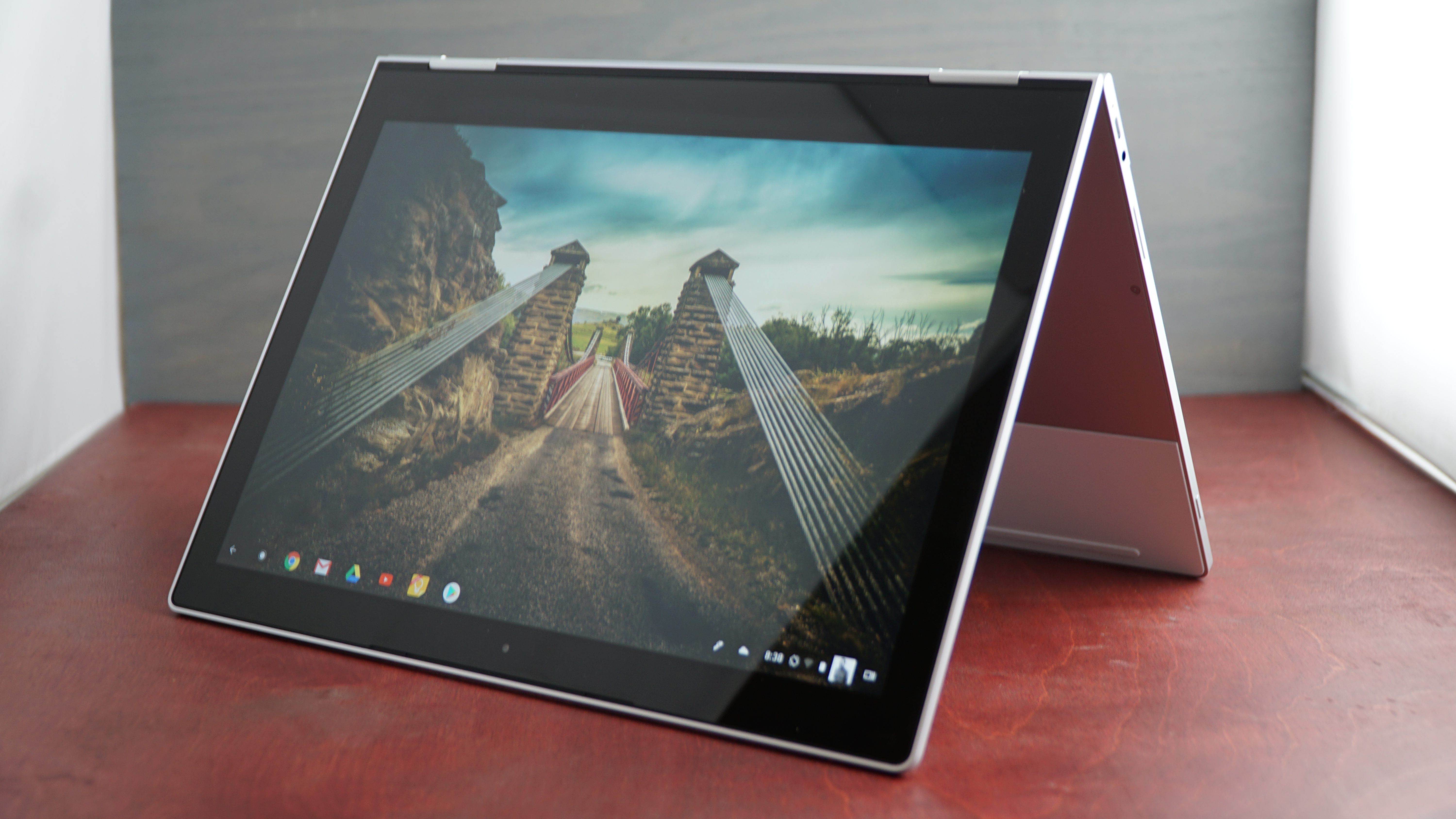
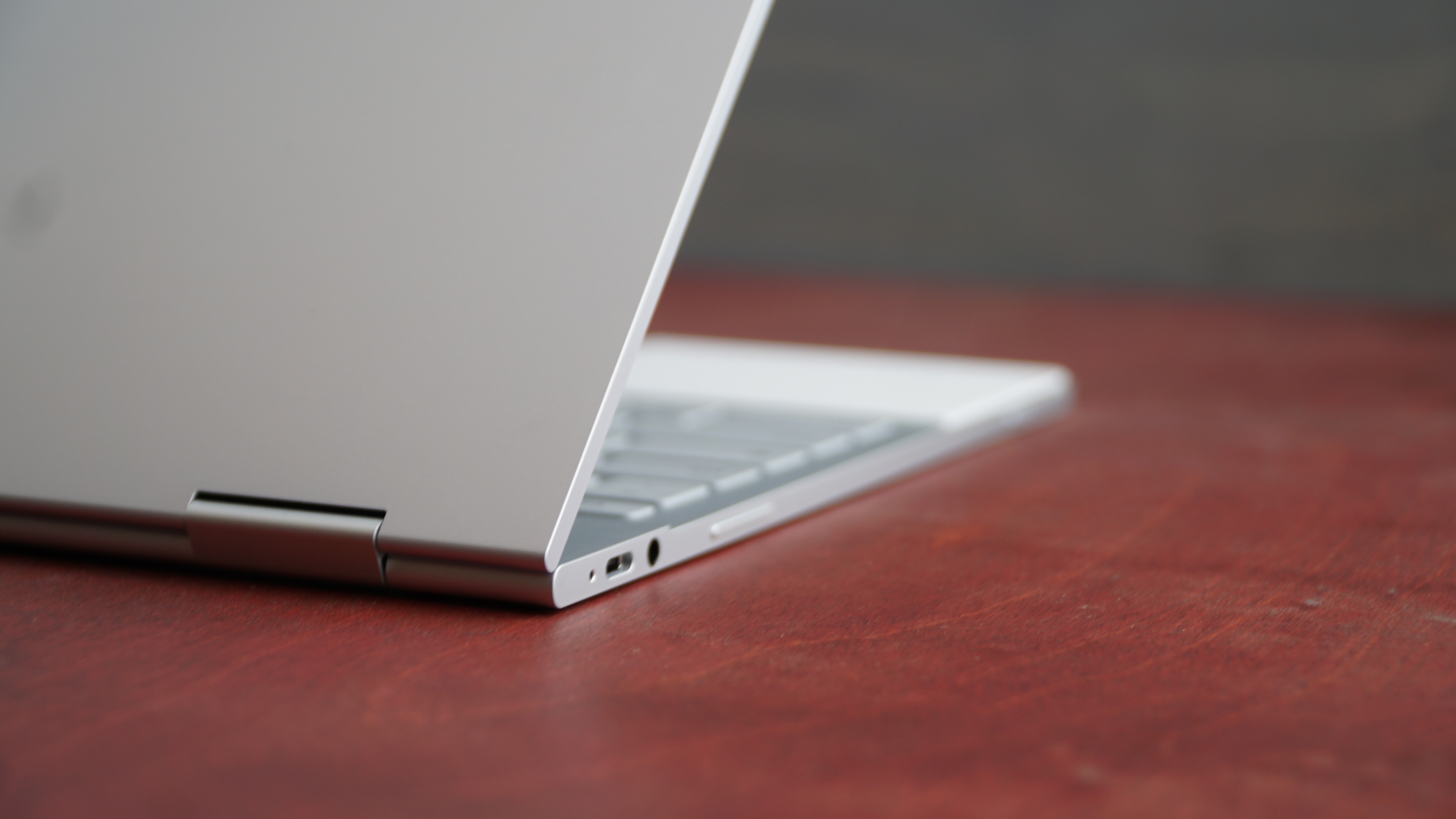
Google Pixelbook – recension

$
0
0

Med ord om att det nu är möjligt att ladda ned tidiga versioner av Google Fuchsia och installera för privat bruk, är vi inte förvånade om det finns ett återuppstått intresse i Google Pixelbook – en hybrid i både funktion och fysik. Googles senaste flaggskepp inom bärbara datorer har mycket att erbjuda, vilket företagets snarlikt prissatta Chromebook Pixel-serie aldrig kunde göra. 

Mer specifikt ger denna 2-i-1-laptop användare ett smakprov av Android, samtidigt som den behåller funktionerna och designen från det omtyckta Chrome OS. Google Pixelbook packar ned en hel del modernitet i en mogen, konvertibel formfaktor, och om ryktena stämmer så kan den till och med få ett dark mode-läge som grädde på moset. 

Google Pixelbook använder en stylus som lindrar mycket av smärtan du kan förvänta dig av att använda Android-applikationer på en bärbar dator, men tyvärr säljs den separat. Samtidigt utgör det faktum att du kan vända maskinen 360 grader in och ut en annan övertygande orsak till att köpa Google Pixelbook för sin växande mängd användningsområden. 

Det kanske är en Chromebook-möter-Nexus vid första anblick, men dess specifikationer är klart överlägsna. Med en 2,400 x 1,600 pixelskärm och 7:e generationens Intel Core i-processorer är Google Pixelbook ingenting att skratta åt. Särskilt inte med tanke på den blygsamma prislappen som skickar Apples jämförbara enheter till skamvrån. 

Pris och tillgänglighet 

Vi ska inte ens försöka att sticka under stolen med det: Google Pixelbook är en extremt dyr Chromebook. Den börjar på drygt 10 000 kronor och når taket på runt 17 000 kronor – utan att ens räkna in Pixelbook Pen (som ligger på runt tusenlappen), även om Google generöst nog har inkluderat en pennhållare för de som behöver förvara sina pennor.  

För det priset får du också 7:e generationens Kaby Lake Intel Core i5-processorer på båda ingångsmodellerna – 128GB-modellen och 25GB-modellen (som kostar runt 12 000 kronor) med 8GB RAM. Värstingmodellen kommer dock med 512GB lagringsutrymme och en Core i7-processor med 16GB RAM. Alla dessa processorer tillhör Intels Y-serie chip (låg kraft, låg värme), vilket betyder att Pixelbook-modeller är fläktlösa. 

Men låt oss nu prata om hur Pixelbook står sig mot detta års Samsung Chromebook Pro och Asus Chromebook Flip– två laptops som designades i nära samarbete med Google för att rivstarta firmans Android app-push på Chrome OS. Båda dessa laptops har märkbart lägre prissättning, där Samsung och Asus för närvarande säljer sina diton för ungefär 5 000 kronor respektive 4 5000 kronor.

De är dock klart sämre prestandamässigt och har samma, 6:e generationens Intel Core m3-processorer som är skapade för låg kraft, och därmed låg värme, vilket tillåter den att utnyttja den fläktlösa chassidesignen. Med det sagt är de båda vackra Chromebooks i sin egen rätt, även om de erbjuder betydligt mindre minne och lagringsutrymme. 

Sammanfattningsvis är dessa två Chromebooks en bättre affär för vad Chromebook-plattformen är idag, men Pixelbook handlar inte om vad som är bättre idag – det handlar om framtiden. Google Pixelbook är till Chromebooks av framtiden vad Microsofts Surface-serie var till 2-i-1 Windows 10-enheter som följde det. 

Design

Pixelbook är verkligen ett vackert resultat av åratal av arbete från Googles sida i att förfina en enhetlig design över all sin hårdvara. Men Pixelbook kan också ses som en sorts mognadsprocess för Googles Chromebook-designfilosofi.

Detta är, utan tvekan, Googles mest attraktiva och genomtänkta datorenhet hittills. Varje designelement har uppnått stil och substans i lika stor utsträckning – från den aluminiumborstade ramen till handledsstödet och undersidan i gummi. 

De som inte har köpt en laptop senaste åren kanske behöver vänja sig vid att bara ha två USB-C 3.1-portar. Men den är åtminstone redo för framtiden. På tal om det är webbkameran också redo för en ökad videofokuserad framtid, med 720p-upplösning och 60 bildrutor per sekund. 

Tyvärr kan inte detsamma sägas om ljudprestandan. Likt andra tunna bärbara datorer har Google tryckt in högtalarna under tangentbordet, och resultatet är ett fruktansvärt burkigt ljud. Som tur är finns det en 3,5mm-hörlursingång som låter dig ansluta Pixelbook till externa högtalare eller ett par hörlurar. 

På plussidan är styrplattan i glas en fröjd att använda. Den följer rörelser otroligt bra och noggrant med både enskilda och flera touchrörelser. Dock märkte vi att styrplattan inte tycker om när vi vilar vår tumme mot den för att klicka medan vi använder pekfingret – en vanlig företeelse, men inte undertecknads personliga preferens.  

Pixelbook-tangentbordet är bland det bästa vi någonsin har testat. Det bakgrundsbelysta tangentbordets tangenter är väl fördelade, och tryckkänsligheten på 0,8 mm är förtjusande med kraftfull feedback. Vi uppskattar också det subtila, djupt tillfredsställande klickljudet som tangenterna ger ifrån sig – det skiljer sig från alla bärbara datorers tangentbord vi har testat, och nu kommer vi att förvänta oss det överallt. 

'Pixeln' i Googles bärbara dator förtjänar sitt namn när det kommer till 3:2 Pixelbook-skärmen. Med 235 pixlar-per-tum (ppi) och noggrann färgreproduktion är denna skärm bland de bättre som finns, Chromebook eller inte, som Surface Pro (267 ppi) och 13-tumsmodellen av MacBook Pro (227 ppi).

Panelen fungerar bra för filmer och bilder, och inte minst bildredigering. 400 nits ljusstyrka hjälper avsevärt till i detta avseende, men det är fortfarande en glansig skärm, och en sådan står sig inte jättebra mot direkt solljus. Hur som helst är skärmen också väldigt exakt vid beröring, speciellt under Pixelbook Pen-användning.

Pixelbook Pen och Google Assistant

Först och främst – det är verkligen synd att Pixelbook Pen inte är inkluderad i priset, då den otvivelaktigt är viktig för upplevelsen. Däremot håller vi inte med om att pennan inte är värd priset – för det är den till 100 % – förutsatt att du har råd. 

Pixelbook Pen fungerar utmärkt som en stylus och den erbjuder stor tryckrespons samt lutningsstöd, vilket gör det till en fröjd att rita på skärmen. Skärmens snabba respons hjälper det digitala bläcket att följa pennans rörelser noggrant, till den grad att någon fördröjning är omöjlig att se. 

På Pixelbook Pen finns en ensam knapp som mer eller mindre är en Google Assistant-knapp, men den verkar också integrera några av de nya Google Lens-teknologierna som finns i smartphones som bland annat Google Pixel 2. Trycker man på knappen samtidigt som man ritar förvandlas bläcket till en tjock blå färg, men den ritar dock inte ut någonting.  

Istället skickas allt som fångats inom det blå bläcket till Google Assistant för analys, vilket i sin tur presenterar vad som helst och allt som Googles servrar mäktar med om vad du cirklade in. Cirkla in en bild av en noshörning, så kommer Google Assistant att ta fram en Wikipedia-sida om djuret. Google's kunskapsdiagram är så avancerat att vi cirklade in en bild av Office Space's Ron Livingston, och Google Assistant spottade tillbaka hans karaktärs namn, Peter Gibbons, före den berättade mer om skådespelaren. 

Detta kommer att vara ett otroligt kraftfullt verktyg för studenter, men vanliga användare kommer också att dra fördel. 

Ett annat plus gällande Pixelbook Pen är att den har öppnat upp Google Keep för att stödja input från pennan, till och med från låsskärmen, vilket gör antecknande mycket enklare. Det finns till och med appar som kan transkribera Pixelbook Pen's klotter till traditionell text.  

En enorm nackdel med Pixelbook Pen är att den inte går att fästa i laptopen på något sätt, inte ens via magneter (som på Surface Pro). Denna designmiss gör det mycket enklare att tappa bort pennan som kostade dig så mycket pengar. Dessutom körs den på AAA-batterier – en uppladdningsbar lösning hade varit mycket mer värd prislappen.  

Angående Google Assistant kan den tjänsten nås via antingen en dedikerad tangentbordsknapp eller via röststyrning (om du inte investerar i en Pixelbook Pen). Däremot fungerar bara den sistnämnda funktionen när laptopen är inloggad – att väcka Pixelbook med ett "Hej, Google"-kommando är tydligen under arbete, enligt våra källor. 

Generellt är Google Assistant precis lika hjälpsam som på smartphones, och renderas på exakt samma sätt, med ett OS-nivåliknande chattarkiv samt röstrespons. 

Att säga att Google Pixelbook är en stark spelare kommer inte att överraska någon, men det är exakt så. Ärligt talat skulle vi inte acceptera något mindre från en så dyr Chromebook, särskilt med tanke på hur lättviktigt operativsystemet Chrome är.

Laptopen hanterar hela vår arbetsbelastning via Chrome-webbläsaren – från Google-dokument och kalkylblad till Slack-chatt och nu även Lightroom-fotoredigering – med nästan inga problem. Det är imponerande med tanke på hur traditionellt RAM-hungrig webbläsaren är, men i Chrome OS verkar det vara mycket mer utrymme i det avseendet än med exempelvis Windows 10 eller macOS.

Pixelbook överträffar Samsungs och Asus' senaste premium-Chromebooks på webbläsare, men det spelar ingen roll. Uppriktigt sagt kommer du inte att se mycket av en prestandamässig skillnad mellan de tre i verklig användning – kanske ett bevis för hur bra Chrome OS fungerar med mindre kraftfull hårdvara.

Batterilivslängd

Vad gäller hur länge den här Chromebooken orkar hålla igång – förvänta dig mindre siffror än vad du brukar se på ännu mindre kraftiga Chromebooks. Google lovar upp till 10 timmars användning på en enda laddning – ett nummer som uppnåddes baserat på "en blandning av standby-läge, webbsurfning och annan användning", enligt produktsidan för Pixelbook.

I vårt TechRadar-batteritest, som ser enheten konstant spela en lokalt lagrad 1080p-film på 50 % ljusstyrka och volym med bakgrundsbelysningen på tangentbordet och Bluetooth avstängt, klarade Pixelbook att hålla igång i 7 timmar och 40 minuter. Det är imponerande i sig, men Samsung Chromebook Pro varade 8 timmar och 43 minuter på samma test, medan Asus Chromebook Flip varade hela 10 timmar och 46 minuter.

Det beror på att båda enheterna kör Intel Core m3-processorer med lägre effekt, som förbrukar batterilivslängden långsammare, samt Chromebook Flips lägre upplösningsdisplay. Hur som helst förväntar vi oss att Pixelbook ska klara sig lite längre på en laddning under verklig användning – och den klarade sig längre än Surface Pro och MacBook Pro (13 tum) med 50 minuter och över en timme. För att inte tala om att bara 15 minuter laddning (via strömuttag) ger upp till 2 timmars användning tack vare USB C-snabbladdning.

Fullfjädrad Android på Chromebook

Den kanske största funktionen i Pixelbook är stödet för Android-appar och Google Play-butiken, för att inte tala om det nya lanseringsgränssnittet för att komma åt dessa appar. Du hörde rätt – efter flera offentliga försök genom ingen annan än Samsung och Asus, har vi äntligen fått den utlovade Chromebook-datorn som kan köra Android-appar.

Resultatet är uppriktigt sagt imponerande, och ett bevis på Androids stora mångsidighet. Varje Android-app som vi har laddat ned, från Sonic the Hedgehog till VLC-videospelaren, fungerar utan problem och ser vacker ut under den pixeltäta skärmen. Självklart finns det vissa kompatibilitetsproblem i det att vissa konfigurationsfönster renderas som om de befann sig i en smartphone, men det är mer beroende på apputvecklaren än på Google.

Det här är massorna av lokalt lagringsutrymme börjar ge betydligt större mening än vad de någonsin gjorde på tidigare Chromebook Pixel-modeller: Du behöver en plats för att lagra alla dessa appar och filerna de ska interagera med.

Naturligt nog behövde Google ett nytt gränssnitt för att komma åt alla dessa appar, och det är här nya Chrome launcher kommer in. Den finns tillgänglig via en nyckel som har ersatt det som annars skulle vara "Caps Lock" och via en cirkulär knapp på den aktivitetfältslika "hyllan". Verktyget gör det möjligt att söka igenom alla installerade appar samt öppna appar med en knackning på skärmen.

(Oroa dig inte, "Caps Lock"-funktionen kan nås genom att hålla "Alt"-tangenten och trycka på startknappen.)

I slutändan gör denna nivå av Android-appsupport Chrome OS vidöppen, vilket effektivt eliminerar dess beroende av Chrome-webbutiken för appliknande upplevelser. Det flyttar operativsystemet mycket närmare i förmåga och mångsidighet än Windows 10 och MacOS, vilket gör den tidigare så tjocka linjen mycket, mycket tunnare. 

Men viktigast av allt – vi är nu äntligen på den punkten där det inte finns några kompromisser för nästan vem som helst att byta från en Windows- eller Mac-maskin till en Chromebook, tack vare Android. Den möjligheten börjar med Pixelbook.

Vi tyckte om

Pixelbook är förmodligen den mest vackra Chromebook-datorn hittills, och otvivelaktigt den mest mångsidiga. Vi är enorma fans av den livfulla, responsiva skärmen samt den smarta styrplattan och det sublima tangentbordet. Dessutom gör de gummilagda segmenten av ramen det mycket enklare att använda Pixelbook i surfplattaläget. Till sist uppgraderar Android-appstödet Chrome OS till nya nivåer. 

Vi tyckte inte om

Det här är inte bara en dyr Chromebook, det är en dyr bärbar dator – punkt – speciellt med tanke på den mindre kraftfulla processorn inuti jämfört med liknande prissatta konkurrenter i Windows och Mac-läger. Vi upplever det också som ett problem att Pixelbook-pennan säljs separat med tanke på hur viktig den är för upplevelsen och hur lätt den är att tappa bort. Ljudet tar också ett djupdyk i form av tunnhet och lätthet. För priset hade vi gärna sett ett biometriskt inloggningsalternativ, som alla avancerade bärbara datorer erbjuder idag.

Slutgiltigt omdöme

Medan vi har jämfört Google Pixelbook mot konkurrerande premium-Chromebooks för vad som ska vara uppenbara skäl, kunde vi lika enkelt ha ställt den mot Surface Pro eller till och med MacBook Pro. Det borde bevisa hur imponerade vi är av Pixelbook, och hur långt Google har tagit Chromebook-plattformen sedan starten.

Google Pixelbook är den första Chromebook-datorn som är värd att övervägas tillsammans med de mest avancerade Windows- och Mac-bärbara datorerna och 2-i-1-enheterna. Bara det borde berätta allt du behöver veta om Pixelbook: Det här är den bästa Chromebook-datorn hittills, utan tvekan.

Med det sagt är det definitivt inte den Chromebook-datorn du troligen är van vid. Om du väntade dig en prisvänlig laptop som Chromebook-namnet har blivit synonymt med, finns det gott om andra ställen att leta på. Om du vill komma in på grundnivån av vad som mycket väl kan vara Chromebooks framtid i premiumutrymmet, titta inte längre – du kommer inte bli besviken.


Google Home

$
0
0

I have always maintained that AI platforms become slightly dumber in India. Yet, if we were to compare the level of intelligence these platforms are capable of, the Google Assistant would almost always come out shining, just ahead of Amazon’s Alexa and followed by Microsoft’s Cortana.

Yeah, let's not even talk about Siri here.

In India, smart assistants are still learning. If these were real people, the Indian versions of these assistants would be the equivalent of school children, while global/US versions feel more intelligent, like college kids. It's a long way to adulthood either way.

And on that note, let's talk about the Google Home. A smart home product, that, like the Amazon Echo, has been talked about in some detail. So much so that you may even be expecting the one speaker to rule them all here.

Alas! Amazon couldn't do it and neither can Google. I'll skip over the bits about design here since my global colleagues have written about it already.

Using the Google Home in India

Like the Echo before it, the Home is very much an early adopter’s product in India. The primary difference is that unlike other such products, it's not big riddled and gives you the full experience of what you can expect.

That said, there's work to be done as far as app support etc. are concerned. The Home plays music from Play Music only right now. So, when you ask for a song, it will search through Google's catalogues and find the best match. Often, that isn't close to being right. A tad too often to be honest.

I asked the Home to play ‘New York, New York’ by Frank Sinatra. It played ‘One For My Baby’ by the same artist. Google’s My Activity page shows what the Home heard: “Play up the road by Frank Sinatra”. So, it found the closest match.

The My Activity page also tells me that I asked it to “play tennis” once. I surely didn't. However, it was up to the task when I asked it to “play some Michael Buble” or “play Havana”. The margin for error here is the same as the Echo, and having used the Echo for just over six odd months now, I'm pretty accustomed to it.

In hindsight, the Echo started off similarly, before getting used to my accent and pronunciation. And it still misses at times. I'm hoping Google's AI copes better and learns faster. 

What I don't like though is how often the Home just doesn't register a command. I've had to modulate my voice quite often with the Home. That's especially frustrating when you wake up in the middle of the night and ask for something.

The Home just sat there often, while I screamed - “Hey Google”, “Ok, Google”, “Oii! Google” and more. To be clear, only the first two commands would and should have woken the speaker up. The Home seems to go into a slumber at times and refuses to wake up.

When it does listen, I can ask for reminders to be set, jokes to be told, time, travel info and more. Pretty much anything that the Google Assistant can do, the Home can do, too. 

Smart Home

I had a lone Philips Hue Ambiance bulb to test the Home with. The Hue’s smart home Bridge needs to be set up before the Google Home can control it. The Home and Hue Bridge have to be on the same WiFi network for this to work.

You can toggle the intensity of the Hue Ambiance or turn it on/off using the Home. Once set up, you can control it from anywhere using the Google Assistant, as long as you're connected. I had the Home and Echo dot placed side-by-side on the same network, and the lag time between command and activity are the same on both.

Setting up the Hue is obscenely easy. The Home app by Google has a "Home Control" section. You head over here, tap on the "+" icon and add devices. Done. The Home asks for your Philips Hue account and automatically connects the Hue Bridge you set up earlier.

The Hue Ambiance is rather limited in what it can do, but the Home can control the full suite of things other Hue bulbs can do.

Controlling smart homes though is a niche utility in India, to say the least. The Hue Ambiance, which is the cheapest in Philips' portfolio, is priced at just over Rs 2,000 here. Other Hue bulbs often touch upwards of Rs 10,000. If you're already invested in IoT products, the Home might be a good idea.

What remains to be seen is whether the ecosystem develops around this. Google boasts extensive support for smart home products, though most of the brands aren't doing business in India just yet. Like Amazon, the company will have to push for these brands to start selling here.

App support

Amazon boasts over 10,000 skills for Alexa in India, so Google needs to catch up. That said, the Assistant already has a bunch of usable skills in the country.

Yet, the Home lacks app support. It has support for Gaana and Saavn at the moment and Google says it wants to add more. However, apps like Uber and all others need to be added.

The brightside is that support for Google Cast covers a lot of your media requirements. Apps like Pocket Casts, Wynk and some others can stream to the Home directly via Google Cast.

Audio Quality

The Home and Echo aren't meant to be audio products. Yet, if you do buy a speaker, the audio experience is worth noting. What I can confirm here is that the Home sounds decidedly better than the Echo. Michael Buble's baritone voice sounds better and more detailed on the Home when compared to the Echo. The music experience, in general, is richer too.

As a standalone speaker, the Home is more versatile than the Echo. It's loud enough to fill a room or two - though that would really depend on the size of your rooms. I have 10x10 rooms in my house, which are well served.

That said, don’t go expecting UE Boom/Wonderboom-level audio quality.

Summing up

It's been just four days with the Home, so I can't quite pass a weighty verdict yet. But, as I said before, the Google Home is an early adopter's product. If you're buying this, you're either gifting it to a geek or a geek yourself.

It doesn't have real usage that will change your life. It's not a product you NEED, it's a product you really, really want. For those who do buy it, the novelty will wear off in a few weeks, after which we'll have to wait till India catches up with the global standards in smart homes.

If Google is to sell this to the general public, it will have to have offline stores to show the Home. It’s an experiential product. One that you want only after you’ve...umm...spoken to it.

Price and offers

The Google Home is priced at Rs 9,999 in India, while the Home Mini will sell for Rs 4,499. Both products are available on Flipkart and retail stores like Croma, Reliance Digital, Vijay Sales and more.

Google is also bundling a JioFi router and “streaming music subscriptions” with the Home. If you buy the product at Reliance Digital stores, you will get a JioFi router with 100GB 4G data, while Croma outlets will bundle the Philips Hue with the Home and Home Mini.

ExpressVPN

$
0
0
  • Since this review was last updated in October 2017, Express has doubled the number of servers available to more than 2,000. It has also introduced split tunneling, a host of browser extensions and open sourced a number of tools including leak testing ones.

ExpressVPN is a large British Virgin Islands-based provider of VPN services. The company's products start off a little more expensive than most, from $12.95 (£10.35) for a one-off month option, although it drops to $6.67 (£4.71) for the standard yearly plan (which comes with three extra months).

There are plenty of services which can beat that, but ExpressVPN gives you a lot for your money. We’re talking more than 1,000 servers across 145 locations in 94 countries, P2P support, and easy setup with custom clients for Windows, Mac, iOS, Android, even Linux. You also get a lot of genuinely helpful web-based tutorials and troubleshooting guides, and 24/7 email and live chat support if you have problems.

There's no free plan or trial, but you're able to try the full service for up to 30 days with no sneaky small print restrictions on bandwidth or sessions, and if you still want a refund you can just email and ask. We tried this and there were no questions at all, just a quick acknowledgement the next day, and a full PayPal refund three days later.

If you like the service, ExpressVPN also has a simple referral scheme which can help reduce costs. Get a friend to sign up and provide your email address during the order process, and you both get a free month.

Privacy

ExpressVPN's privacy policy is unusual for a lot of reasons. Fortunately, they're all good reasons: it's clear, it's detailed, it covers many different areas and tells you just about everything you want to know.

Take logging, for example. While other providers can be vague and leave you guessing, ExpressVPN gets straight to the point:

"We do not collect logs of your activity, including no logging of browsing history, traffic destination, data content, or DNS queries. We also never store connection logs, meaning no logs of your IP address, your outgoing VPN IP address, connection timestamp, or session duration."

There is a little session logging, with your connection dates, choice of server and total amount of data transferred all being recorded. ExpressVPN doesn't collect your connection times or IP addresses, though, so this can't be used to identify you.

ExpressVPN's clients have a telemetry feature which may "collect anonymized analytics data used for network diagnostics." That may be a concern for some, but ExpressVPN takes the time to explain exactly what can be sent, who it's sent to, and points out that you can stop sharing this data at any time by toggling a client setting.

The rest of ExpressVPN's small print was very, very standard. The company stores basic information about you, but doesn't share it with anyone else, and the website uses cookies and third-party analytics, but then so does almost everybody else. It's all very normal and we saw no reason for any privacy concerns.

Performance

ExpressVPN’s signup procedure is carried out almost entirely on a single page, where all the key details are clearly displayed.

The first step is to choose from the one, six or twelve-month plans. The company shows both the monthly and total amounts and the billing frequency, so you shouldn't have any unpleasant surprises later.

Registration is kept to a minimum in terms of requested details, with the company asking for your email address only.

A good selection of payment options includes card, PayPal, Bitcoin, and many others via Paymentwall.

After handing over our cash, the ExpressVPN website generated and displayed a secure password for us. That's a smart move as it hopefully reduces the chance that users will enter the same credentials that they use elsewhere. But if you like to keep control, no problem, there's also an option to enter a password of your own.

The next page displayed a link to download the Windows client for our laptop, and offered links for other devices.

You can install ExpressVPN's clients on as many devices as you like. This is a little more complicated than usual as the firm asks you to enter a 23-character 'activation code' allocated to your account. You only have to do this once, though, and then you're able to connect up to three devices to the service at one time.

If you've got problems with any of this, links point you to some helpful support pages. We checked out the article on ‘how many devices can be connected to ExpressVPN simultaneously’ and found it clear and straightforward, with useful examples and helpful links to other details you need to know.

We downloaded and launched the Windows client. The setup program prompted for the activation code we'd just been given on the website, gave us a couple of simple configuration options, and then installed in a few seconds.

A quick check of ExpressVPN's files showed the package grabbed a little more hard drive space than usual at around 60MB. But the service scores where it matters, with its two background processes only taking around 40MB RAM (we've seen CyberGhost, for example, grab as much as 200MB RAM).

It can be interesting to see how often a VPN client is updated, as this gives you some idea of how much time and effect has gone into the app. Very few providers give you any clear idea of this, but ExpressVPN has a 'What's New' page which spells it out. In the first half of 2017 the app had 10 releases, for example, more than you might expect from many specialist developers.

The ExpressVPN desktop client is all about simplicity. Launch it, the nearest location is automatically selected, one click on the Connect button is enough to get you protected, and clicking it again turns the VPN off.

The Choose Location button enables browsing locations by continent, country or individual server, as well as providing a simple favorites system.

The location lists don't have any details on server load, but a separate Speed Test window can benchmark the servers, giving their download speed in Kbps as well as simple latencies. This takes two or three minutes as ExpressVPN insists on testing every server, unfortunately: the client really should allow for benchmarking only the countries or servers you select. Still, this more thorough approach has its benefits, giving you measurements of download speeds as well as the basic ping times you'll get elsewhere.

The client's Settings dialog doesn't contain many options, but there are a couple that stand out from the crowd.

You're able to choose your preferred protocol from options including OpenVPN via UDP, OpenVPN via TCP, L2TP - IPSEC, PPTP or SSTP. Alternatively, accept the default Automatic setting and the client will decide itself.

The client also provides a Network Lock feature, a kill switch which stops all network traffic if the connection drops. You can enable and disable this, and there's an option to allow access to network devices such as printers or network shares.

ExpressVPN achieved solid results in our performance tests*. UK-UK connections were fast and reliable at 31-36Mbps; near European connections were less consistent but still very acceptable at 14-35Mbps.

There was little change in UK-US traffic with downloads averaging 15-25Mbps, and connecting to even the most distant Asian server still gave us 3-7Mbps, maybe enough for basic video streaming.

ExpressVPN completed the positive picture by doing well in our leak tests, with its DNS protection ensuring our identity was protected at all times.

Final verdict

ExpressVPN costs more than most VPNs, but then it also gives you more locations, better performance, and a real focus on your web privacy. If you value service quality more than price, this is a VPN you need to try.

*Our testing included evaluating general performance (browsing, streaming video). We also used speedtest.net to measure latency, upload and download speeds, and then tested immediately again with the VPN turned off, to check for any difference (over several rounds of testing). We then compared these results to other VPN services we've reviewed. Of course, do note that VPN performance is difficult to measure as there are so many variables.

Amplifi HD

$
0
0

Amplifi HD is a new addition to the growing list of mesh Wi-Fi routers, which use additional Wi-Fi repeaters to help spread a wireless network throughout the home.

This type of router is becoming increasingly popular as it’s an easy to set up, and effective, method for ensuring that all the devices in your home can access the internet.

Well-known names such as Google (with Google Wifi), and Netgear (with the Netgear Orbi) have released mesh routers to critical acclaim, so how does a relatively unknown brand stack up against these stalwarts? We plugged it in to our home network to see how it does.

Amplifi HD review

Price and availability

The AmpliFi Mesh Wi-Fi system can be bought as a bundle, and includes a router base station and two wireless ‘super mesh points’ called ‘MeshPointHD’ for extending the Wi-Fi coverage, and costs $311.99 (£360, around AU$380). You can also buy the parts separately from the Amplifi website, with the router itself costing $133.99 (£150, around AU$180).

This is a more palatable price, though of course without the mesh points, you’re missing out on quite a bit of functionality. The MeshPointHDs can also be bought separately, and cost $108.99 (around £80, AU$140). If you don’t have a huge house, then buying the router and a single mesh point separately will be more cost effective.

However, for most people, the complete bundle will be the one to go for, which means it’s one of the more expensive mesh routers out there. Google Wifi, which we really like, costs less, with a price tag of 299 (about AU$389) for a set of three Wi-Fi units. In the UK, Google Wifi comes with a two unit set costing £229, with additional units costing $129 (£129, around AU$167), which means it will cost around the same price as the AmpliFi Mesh Wi-Fi with a main router and two mesh points.

However, the AmpliFi Mesh Wi-Fi system is cheaper than the Netgear Orbi, which costs $399 (£399, AU$749), though it only comes with two units (a router and a 'Satellite'). So to get a third unit, you’d need to pay an additional $249 or £249 (about AU$329) – making it a fair bit more expensive.

If you’re in the UK, then there’s also BT Whole Home Wi-Fi, which has had a drastic price cut to just £199.99, and offers three units.

Amplifi HD review

Design

In an increasingly crowded market, you need to stand out from the pack, and the Amplifi HD achieves that thanks to a stylish look that combines a minimalist design with some genuinely useful features.

From the box to the design of the router, there’s an obvious Apple influence here. The box it comes in has a number of tabs and fold out parts that certainly bring to mind the fancy packages of Apple products, and it feels like Ubiquiti, the company behind the Amplifi HD, really want to show that this is no ordinary router.

The main router unit is a white cube that can sit in the palm of your hand, with a round LCD display at the front, and the ports at the back. Again, the influence is clear, and it’s little surprise to learn that Robert Pera, the CEO of Ubiquiti, used to work at a certain fruit-themed company.

Considering the minimalist design, it’s good to see that the router still comes with plenty of ports, with four Gigabit Ethernet connections for wired devices, and another Ethernet port to connect to your modem. There’s also a USB port for sharing printers and storage devices across your network, and a USB-C power port.

Amplifi HD review

It’s easily one of the better looking routers we’ve seen, and that’s saying something when the likes of Google and Netgear have been upping their games lately when it comes to stylish networking devices. 

It’s definitely a gadget that you wouldn’t mind having out on display, rather than hiding it away like you’d want to with more ugly routers, which helps improve wireless strength, as it won’t have to battle through cupboard doors and other obstacles. When plugged in, the screen lights up, and a subtle white light along the bottom edge of the unit begins to glow. 

Overall, it looks very nice.

Unlike some wireless mesh systems, like Google Wifi, the three units that make up the Amplifi HD system don’t all look the same, with the two MeshPointHDs signal boosters having quite a different, yet still quite striking, design to the main router. 

Amplifi HD review

The MeshPointHD

They are both long white oblongs that plug directly into a power socket. The main body of the MeshPointHD is actually attached to the power supply via a magnetic ball. This allows you to angle the body to help improve Wi-Fi coverage. 

Amplifi HD review

On the whole, the design of the MeshPointHD isn't quite as successful as the one for the main router. They are quite large, and don’t match the understated design of the router. We can see the usefulness of the articulated magnetic joints to maneuver the antenna, but if they were small, cute squares like the router, the whole system would be more attractive.

Amplifi HD review

Despite our reservations over the MeshPointHDs, the design of the Amplifi HD, especially the router, is very impressive, and if you’re an Apple fan, you’ll likely approve of the Cupertino-esque aesthetics.

Performance

On plugging in the Amplifi HD, the screen lights up and asks you to download the Amplifi app for either iOS or Android devices. You can also use the touch screen on the front for more options. The app makes setting up pretty easy, with an animated video taking you through the process of connecting up the router.

Amplifi HD review

The app quickly found the Amplifi router and took us through the steps needed to configure the device. The well-presented app, along with the touchscreen display on the router itself, made this one of the most straightforward router installations we’ve ever experienced, and will certainly appeal to anyone who doesn’t like having to mess around with any settings.

Once set up, we were able to test out the main Amplifi HD router, and even without the MeshPointHDs installed, we found it had a impressive range, reaching the third story of our building with a decent signal strength.

When testing the internet speeds, we got 74.6 Mbps download speeds in the same room as the Amplifi router (which was pretty much the maximum speed of our connection). One floor up, the speed dropped slightly to 74.1 Mbps, and on the top floor of the three-storey building we got download speeds of 68.3 Mbps. 

This is pretty decent performance for such a small router with no external antennae, and shows how you don’t necessarily have to have a big bulky router in the vein of the Linksys WRT32X to get good coverage.

This impressive performance also means you may not need the MeshPointHDs signal boosters unless you have a very large house.

Adding the MeshPointHDs signal boosters was, again, pretty easy. All we needed to do was plug them in to a power socket, wait a few minutes and they would appear in the Amplifi app. 

Amplifi HD review

Part of the Amplifi app

From there you can see the signal strength, as well as notes about whether or not the MeshPointHD is installed in an optimal place to boost the Wi-Fi signal. However, we did find we needed to plug it in to a few different places ourselves to get good results. 

Once we did, we saw the speeds at the top floor of the house (where the MeshPointHD was installed) climbing to 74.4Mbps, pretty much the same speed as when we were in the same room as the main Amplifi router.

So, the performance of the Amplifi HD is more than good enough to quickly set up and then just leave it to do its thing, competently providing internet to all corners of your house, either from the main router or via the MeshPointHD. 

If you do want to tweak the settings, however, then the Amplifi app does an excellent job of providing you with advanced networking tools, such as port forwarding and guest network access, in an easy-to-use interface that we’ve come to expect from this router.

We liked

The design, the app, the whole experience is very nice, and it’s one of the simplest routers we’ve ever set up. For a relatively unknown brand, the Amplifi HD certainly gives its more established rivals a run for their money.

It’s also a very good performer, offering brains as well as beauty.

We disliked

While most of the design is fantastic, we’re not too sold on the MeshPointHD designs, as they look a little ungainly compared to the rest of the setup.

The price is also pretty high as well – there are much cheaper alternatives out there.

Final verdict

The Amplifi HD is an excellent wireless router with range extenders that will look good in almost anyone’s house thanks to an excellent design that Apple’s own Jony Ive would surely approve of.

It’s incredibly easy to set up, and it works brilliantly as well. If you have a large house, then the two MeshPointHD extenders will help ensure it is covered by your Wi-Fi network.

However, it is expensive, and may be over kill for smaller buildings. If you’re not too fussed about what your router looks like, and don’t mind fiddling around with more complex interfaces, then there are cheaper alternatives out there.

But from a design and usability point of view, the Amplifi HD is an excellent router to rival Google Wi-Fi and Netgear Orbi.

Asus Chromebook Flip C101PA

$
0
0

What it lacks in size, the Asus Chromebook Flip C101PA makes up for in names. It’s a mouthful, but at 1.9 pounds and under 11 inches in width, this Chromebook is not a bagful. That, plus its 12-hour, go-go battery are the C101PA’s best qualities.

Unfortunately, there’s not much else to get excited about. Though a convertible, and relatively cheap, a finicky touchscreen makes the C101PA not a particularly great tablet, and a cramped keyboard makes it not a particularly great laptop. The C101PA has an identity problem. 

That said, it’s not without a market. The C101PA is a fine backup device, and a better-than-decent media ‘tabtop’ that isn’t afraid of trains and/or tiny dorm rooms.

Asus Chromebook Flip C101PA

Price and availability

Its crossfit body and coupon-clipped, $269 (£289, about AU$349) price are what the C101PA puts at the top of its resume. 

The rest of this laptop's specs, however, are fairly standard for a budget Chromebook: 4GB of memory, 16GB of storage and a barely-HD screen.

Decidedly non-standard is the C101PA’s processor. Rather than the Intel Celeron or Core i3 that’s ubiquitous in these laptops, the C101PA runs on a Rockchip OP1. A little research yields some clues as to why Asus went with the “rock”: the OP1 is very mobile-friendly – a better fit perhaps for the tablet-style C101PA.

The C101PA’s closest competitor, the $249 (£170, AU$320) Acer Chromebook R11 shares its convertibility, as well as its small, barely-HD screen and 4GB of memory.

Where the R11 differs from the C101PA is in its storage (32GB local) and processor (budget-standard Intel Celeron). It’s also, of course, a tad cheaper.

The conventional – it’s just a laptop – $199 (about £229, AU$499) HP Chromebook 14 is older, larger and sharper (14-inch HD screen) than the C101PA, though the two are similarly kitted out on the storage and memory front. HP’s device also runs on – you guessed it – an Intel Celeron processor.

Design and display

With its silver finish and black bezel and keys, the C101PA is clearly MacBook inspired. That’s not a criticism necessarily – kudos to Asus for making a little Chromebook that looks just as stylish as Apple’s flagship laptop.

As expected for a device that’s part tablet and needs finger-gripping room, the C101PA gives up much of its screen’s real estate to the previously-mentioned black bezel. Additional tactility is provided by the screen and back panel’s stiff construction.

All this finger-friendly space has the unfortunate effect of making the C101PA’s small 10.1 inch screen appear even smaller. The bezel doesn’t just frame the screen, it swallows it up.

The C101PA’s full-flex hinge allows the Chromebook to execute its namesake: it flips smoothly, though not effortlessly, into tablet mode, and without any NASA-level mechanics, locks or funky twists.

Asus Chromebook Flip C101PA

Because the C101PA simply rotates on its hinge, the keyboard in tablet mode awkwardly faces south, directly at your lap, table, or, most likely, hand. Manipulating the C101PA as a tablet feels like playing a saxophone – you’re going to get a fingerful of keys whenever you pick it up. It’s disconcerting but not disastrous – the keys turn off in tablet mode – though we wonder what effect this saxophone setup will have on the C101PA’s long term keyboard health.

Also awkward is the C101PA’s supposed touchscreen. Finger scrolls and flicks work fine, but icon pressing, particularly small ones like a tab’s ‘X’ or browser’s ‘back’ arrow, is too often an exercise in futility. Be prepared for frustrated screen jabbing.

At least its touchy touchscreen is clear and colorful with wide viewing angles – those essentials-for-a-tablet Asus got right.

Asus Chromebook Flip C101PA

Keyboard and touchpad

The C101PA’s touchpad isn’t given a lot of space, but it makes do. It swipes and scrolls as well as any device and has a springy, tactile ‘click’ that works all over the touchpad. 

This well-engineered usability helps the touchpad feel larger than it is. 

The same can’t be said for the C101PA’s keys: they’re small and feel as much. Neither their actuations nor the well in which they sit are particularly firm.

The real estate they’re given is also sparse: your hands practically end up on top of each other as you type. An enterprise or school-ready device the C101PA is not.

Apparently, going with the Rockchip was the right move for Asus, as the C101PA scored fairly well (for a budget device) on our benchmarks.

The C101PA outperformed its Celeron-run rivals on both our Mozilla Kraken and Octane tests. 

While the C101PA’s scores aren’t impressive when put up against something like the Google Pixelbook, it’s not really a fair comparison. Asus’s little Chromebook is a quarter the price of Google’s top-of-the-liner. 

Our day to day usage backed up the benchmark scores: the C101PA ran cool with multiple tabs open and Spotify pumping music in the background.

This Asus machine does what Chromebooks are expected to do (and nothing more): provide a solid device for light media and Internet browsing.

Asus Chromebook Flip C101PA

Battery life

Inside this pup of a Chromebook is one beast of a battery. This laptop turns out a half day’s worth of cordless action, outlasting the R11’s battery by three hours, and the HP Chromebook 14’s by six and a half. The battery inside is easily the highlight of this Chromebook.

Its all-day battery is essential to the C101PA’s usability, and not because it’s a convertible. This Chromebook hates to be tethered.

The placement of its power port near the front, rather than back of the device’s base effectively knocks six inches off the power cord’s length. Furthermore, its front plug forces you to play some positioning games with the C101PA while charging it, as the power cord will try to snake underneath the device’s base.

Asus Chromebook Flip C101PA

Final verdict

All told, the C101PA is certainly affordable, it just isn’t as affordable as some of its competitors. Acer’s Chromebook R11 accomplishes the same tablet feats as the C101PA, but for a bit less. The HP Chromebook 14 has similar internals to Asus’s Chromebook, and while HP’s device isn't convertible, it is cheaper. When other devices do what the C101PA does, but for cheaper, it’s hard to see the value.

That isn’t to say the C101PA isn’t without great features: it’s light, it runs smoothly and it has one hell of a battery. But, it doesn’t have a sharp screen. It doesn’t have a comfortable keyboard. It doesn’t have a precise touchscreen. These are the sorts of faults that can relegate a device to ‘backup’ or ‘my kid’s first computer’ or ‘the thing on my nightstand I use to google celebrities.’ The C101PA is a backup Googler.

And, that’s not necessarily a bad thing. If you’re in the market for a secondary device, or a primary one that easily fits into a nightstand drawer, then check out the C101PA.

Huawei P20 review

$
0
0

When we first heard that the follow-up to the well-received Huawei P10 would be called the P20, we were excited. Surely skipping numbers P11 through P19 meant the new phone would be a huge jump forward - perhaps even twice as good - as its predecessor?

Well, despite a stunning new design and a snazzy AI-enhanced camera, our hands on with the new P20 left us cold. Now that we’ve had more time with it, and its bigger and pricier sibling the Huawei P20 Pro, our initial assessment has proved mostly correct.

Don’t get us wrong, the Huawei P20 is a great phone in its own right, but it hasn’t moved far enough from the P10 to be a properly enticing buy for 2018 - especially when all the features we wanted have been implemented on the Pro and left off the spec sheet for the smaller phone.

Huawei P20 price and availability

  • Out now in the UK for £599
  • Not coming to the US
  • Australian availability is to be confirmed

All of this is moot for people in the US, where Huawei phones seem to be rapidly disappearing as a result of losing key vendor deals and potentially being shut out of government contracts. Somewhat unsurprisingly in that climate, Huawei has confirmed the P20 won’t be making an appearance in the Land of the Free.

It is, however, available in the UK at £599 SIM-free, and we’d anticipate an Australian launch too, probably at around AU$1,000.

That puts it on par with the LG V30, and makes it cheaper than the Sony Xperia XZ2, Samsung Galaxy S9 and Google Pixel 2 XL. However, the slightly larger, more powerful Mate 10 Pro is now cheaper since its launch - food for thought right there.

Looks Leica Huawei

  • AI-enhanced camera
  • Strong specs
  • Gorgeous glass-backed gradient design

Launching at the Grand Palais in Paris, the Huawei P20 got off to a glamorous start. The big sell for the phone was the AI-assisted dual camera on the rear. Photography has been the main focus (pun intended) of the product line, with the continuation of the successful Leica partnership into the latest phone.

The P20 boasts two Leica Summilux lenses on the back, as well as a neural processing unit on the Kirin chipset, which provides the AI capability to the camera app. Huawei claims the AI function of the camera helps you become a better photographer, with suggestions and automatic mode-switching based on what the phone thinks you’re trying to portray.

If that sounds a bit scary - and scariness is something Huawei should be hyper-aware of with its US reputation hanging in the balance - it’s really not. It mostly just means when you’re taking photos of a cat, the phone says “Hey! Cat!” and optimises the settings to get the best possible shot.

The camera also includes improved low light capabilities, including an AI-infused version of Super Night Mode that allows you to take amazing night shots without the need for a tripod or supernaturally still hands.

The P20 includes flagship-level hardware: alongside that octa-core Kirin chipset is 4GB of RAM and a super-generous 128GB of storage. The whole package is encased in a glass-backed, super-stylish handset in a choice of gradient finishes or, if you prefer, more ordinary colours. Boo.

50 shades of gradient

  • 149.1 x 70.8 x 7.7 mm, 165g
  • Notched screen
  • No headphone jack

There’s no denying the P20 is an eye-catching phone. The very first time we took it out on the London Underground, a group of teenagers asked us what it was, and declared it a 'serious phone' (this is, we presume, a good thing).

We usually only get comments from strangers when we’re carrying a OnePlus (which is treated a bit like a Nerd Club Membership Card), so clearly Huawei has done a good job on the design. Our review unit has the Pink Gold design, although realistically the gradient on that colourway is pretty subtle.

The hardened glass back of the handset has an opalescent pink finish that gives it a gorgeous mother-of-pearl look, and while not everyone will appreciate either the pink or the (slight) gradient, a lot of people would love a phone that looks like they found it on the beach.

That said, since it’s so smooth, the back does make this phone a slippery fish. You might want to put it in a grippy case if you don’t want it sliding off tables.

The back panel is also unusual in that the Huawei logo and various bits of bumf that manufacturers have to include (logos, model numbers, that kind of thing) is written in landscape orientation, as is the Leica logo and camera info.

This has the effect of making the back look like a traditional landscape-oriented camera, with the lenses on the right replacing the viewfinder. The only thing missing is a Sony-style hardware shutter button, which would have ideally been included on the left. You can use the volume keys as shutter buttons, though.

The dual camera lenses (no third camera on this one - that’s sadly reserved for the P20 Pro) are combined in a single oval enclosure which protrudes a millimetre or so. Flipping over to the front, you’ll find the selfie camera at top centre, as per the ‘notch’ trend of this year (more on that below).

The black bezels around the screen are decently slim, though the bottom strip is still fairly sizeable due to housing the fingerprint pad (it’s not pressable, sadly).

The phone comes with a screen protector pre-applied, which is a little annoying as you can clearly see its edges around the fingerprint pad and feel them when you swipe down from the top, but if you were going to put a protector on anyway, it’s probably better than having a self-applied one full of bubbles and dust.

The rounded metal edges of the P20 have a light pink finish to them on our unit, with the SIM tray on the top left, volume rocker and power key on the right, and two sets of drilled holes (only one is a speaker) plus the centred USB-C port on the bottom edge. That’s right, no headphone jack. Sorry.

Schrödinger's notch

  • 5.8 inches, 1080 x 2244, 428ppi
  • 18.7:9 aspect ratio
  • TFT LCD

The FHD+ display on the Huawei P20 really does it proud. At 5.8 inches, it’s a good compromise between a smaller phone and a phablet, while not feeling large in the hand because of the slim bezels and the notch.

Before anyone gets up in arms about it, the notch on the P20 is probably the least annoying we’ve seen. Huawei has smartly included a software option that blacks out the rest of the screen on either side, effectively removing the notch.

So whether you’d prefer the extra screen space or a more uniform look, this phone has you covered - and you might find you don’t make the choice you expected. This phone actually converted us from a notch-naysayer: we just needed the option to turn it on and off until we worked out which we prefer. Whichever way you lean, it’s good to have options.

Which brings us to colour and light. The P20 has lots of options for customising the display to your liking: you can turn on ‘natural tone’ which adjusts colour temperature based on your environment; switch between Normal and Vivid colour; choose Default, Warm or Cold colours; turn on the Eye Comfort mode (for better sleep), and so on.

The brightness slider goes from what we’d call ‘ridiculously dark’ to ‘pretty bright’, or you can let the phone select its own brightness based on where you are. You can also bump the resolution down to save battery if you want to.

All of that said, we found the default settings looked great out of the box, so we didn’t feel the need to do much fiddling with the settings.

The included wallpapers harmonise nicely with the colour scheme of the phone and show off the P20’s colour reproduction to the full: shades, tones and shadows all appear crisp and vivid. Icons almost jump off the screen.

The 18.7:9 aspect ratio is a strange choice, but gives a tall display with plenty of room for content whether you have the notch on or off. You will find, however, that you need to manually switch quite a few apps into fullscreen mode at first, because they’re not always designed for such a long display.

The phone warns you that this might cause problems, but we didn’t experience any - apps just restarted in the correct ratio and stayed that way. If you choose not to go fullscreen, the black bar stays at the bottom to fill the rest of the space.

Battery life

  • 3,400mAh
  • All-day battery life
  • Fast charging, no wireless

After using this phone as our only handset - that means calls, copious outdated memes in the family WhatsApp group, a narcissistic level of social media usage, work, play, news, and everything else you might use a top-end smartphone for - we never got to bedtime (midnight onwards) with much less than half battery.

In other words, you can comfortably use the P20 all day and night without worrying that it’ll run out on you.

However, it does drain fairly fast when used for video: we ran our standard battery test - a fullscreen HD video on max brightness with accounts syncing in the background - and after 90 minutes, the P20 had lost 30% of its charge.

By comparison, the Galaxy S9 lost 17%, the Pixel 2 lost 14%, and the iPhone X lost a paltry 10%. Not a great result for the P20.

It means you’re looking at more of a day of battery life on a single charge if video watching is part of your daily routine, but 24 hours tends to be the going rate for most smartphones these days.

Luckily, if you do need to conserve battery, you’ve got lots of options. Head into Display settings and you can lower the resolution to ‘just’ HD, or put it on automatic to save power without thinking about it.

Automatic brightness should also save you a few percent. And then there’s Power-Saving Mode and Ultra Power-Saving Mode, which will extend your P20’s uptime by literal days (a full charge would give you four days’ use in Ultra mode, although it does essentially turn the phone into a Nokia 3310).

As per all Huawei devices, you’ll start getting irritating notifications almost immediately about ‘battery-draining apps’. According to EMUI, this seems to be virtually all of them - you can turn the notifications off in Settings > Battery > Cog > Power-intensive prompt if you find them annoying.

The phone comes with Huawei’s USB-C fast charger in the box, so powering up again doesn’t take long. There’s no wireless charging on this one though, so that’s one point to its competitor, the Galaxy S9.

Camera

  • Dual Leica cameras, 12MP RGB (f/1.8) and 20MP B&W (f/1.6)
  • 24MP f/2.0 selfie camera
  • Useful AI image stabilisation

The latest product of Huawei’s partnership with camera legends Leica, the P20 is unsurprisingly a camera-led handset. However, while the Huawei P20 Pro includes a triple rear camera, the P20 has to make do with ‘just’ two on the back and one on the front.

What sets the P20 camera apart from the not-too-dissimilar Huawei P10 is the addition of AI, which interprets what you’re doing and tries to assist. It’s sort of like the Microsoft Word paperclip for photography - except less annoying. Well, mostly.

The camera app has the typical Huawei raft of modes, but what’s different here is that the phone will switch between them based on what it thinks you’re trying to accomplish.

For instance, if you aim the camera at a cat, it’ll switch on Cat Mode (we’re not making this up) and automatically apply settings that should get a better shot of a fast-moving fluffy thing.

In our tests, the phone correctly identified cats and dogs every time - even a black cat hiding under a bed! - but it perhaps needs a bird mode, as our parakeet was labelled a cat, and if she could read she’d be very offended.

The design of the camera app could be better - the horrible fake leather texture behind the shutter button is unnecessary and reminds us of TouchWiz circa 2013.

Scrolling left and right to see other modes seems a bit inefficient too, although you can scroll to the end and tap ‘More’ to see them all on a panel.

Aperture, Night Mode, Portrait Mode, Photo, Video and Pro mode are all on the scroll bar, and then there’s a whole load more including Slow-Mo, HDR, Panorama and Light Painting on the More menu.

Not all of the available modes can be manually enabled - Cat and Dog mode, Greenery (for plants), Flowers (yep, separate to Greenery…), Close-Up and other similar AI-enhanced settings can only be switched on automatically.

That’s probably a good thing, as we found they never failed to activate when required (although Close-Up likes to jump in and SUPERZOOM things too much at times), and it’s not necessary to clutter up the menu with them all.

The P20 camera launches quickly, and twinned with the double-tap volume key shortcut, it’s hard to miss a shot.

It also snaps instantly - we didn’t experience any shutter lag on this handset, although lower light photos did bring up the familiar old Huawei 'sharpening the photo, please steady your device' box.

That said, one of the big improvements to the Huawei camera app is the addition of AI to Super Night Mode, which takes spectacular pictures of night-time skylines and other dark scenes.

This has long been a favourite mode on Huawei phones, and the new version means you no longer need a tripod to get the shot. Because it’s a longer exposure mode and holding a phone dead still for 30 seconds to a minute is impossible, previously handheld Super Night Mode photos would come out blurry.

It’s not perfect, but the AI-assisted new Super Night Mode has significantly increased the chances that you’ll get a great result with just your hands.

If the phone detects that you’re holding it, it only counts 4 seconds of exposure before finalising the photo. If the phone is in a more stable position, like sitting on a ledge, it counts 18 seconds. The results are a little surreal, but undoubtedly beautiful.

On Auto mode, pictures taken with the main P20 camera come out beautifully. Indoors, outdoors, at night - even without the third camera of the Huawei P20 Pro, this is a very impressive shooter that rivals the top camera phones on the market. Night-time and low light photos are particularly good, and consistently came out sharper and less grainy in our tests than on the Pixel 2 XL.

The 2x hybrid zoom often self-activates when taking a close-up of something, and true to the marketing, it does offer a zoomed shot without losing quality. It can be a bit jarring to be trying to line up a shot and have it suddenly zoom itself in, though.

That said, the AI enhancements generally do make for a better photo. When we aimed the camera at people, it switched into Portrait mode, and the shots came out really well. The bokeh effect is noticeable and adds a professional vibe, even to a silly snap we took of our friends in a harshly-lit ice cream parlour at midnight.

The pet modes didn’t seem to make much difference either way, but food and plants genuinely did look better with their respective modes turned on.

On the selfie side, we were similarly impressed. The front-facing camera offers a very generous 24MP at f/2.0, and while there are lots of modes again, none of them feel like awkwardly shoehorned in Snapchat clones (looking at you, Samsung).

For selfies, you’ll want Portrait mode, which is where you’ll find the option to turn bokeh on and off, as well as a Beauty mode slider ranging from ‘first thing in the morning’ to ‘if I had a professional makeup artist’.

Beauty level 3 and bokeh on results in a flattering but realistic photo that looks like it was shot on an SLR. However, you can’t tap to focus - the camera focuses on the face whether you like it or not.

This can be annoying when you’re trying to take a photo of something else using the front-facing camera - a baby bird on our shoulder in our case - and it insists on focusing on a face even if it’s someone in the background.

There’s plenty to play with on the video side, too. Rather than OIS or EIS, the P20 calls its image stabilisation AIS - which gives us Artificial Intelligence/Image Stabilisation, but we’ll forgive that.

In other words, the included AI smarts cut down the hand shake in your videos, and in our tests it worked well.

You can shoot in 4K at 30fps on the main camera, and there’s also 720p super-slow-mo at 960fps for those artistic endeavours. The front-facing camera can shoot up to 1080p.

Camera samples

Own-brand Oreo

  • EMUI 8.1, based on Android 8.1 Oreo
  • Some bloatware
  • Fast-acting face unlock

Huawei software doesn’t have the best reputation, but it’s fair to say it’s improved a lot over the last few iterations. EMUI, which is what Huawei calls its ‘Emotion’ overlay for Android, now looks more like stock than ever, with a few extras.

You’ll get some uninvited Huawei apps, including AppGallery (like a Huawei-endorsed Play Store), Huawei Health, HiCare, and Themes for changing the look of your phone. None of these are particularly irritating, or worse than what you’d get from other manufacturers. However, a lot of them can’t be uninstalled, which is vexing, even given 128GB to play with.

The P20 comes with EMUI version 8.1, which is based on Android 8.1 Oreo. There are some subtle differences: for instance, when you first turn the phone on, you’ll find you don’t have an app menu (‘drawer’ in Android parlance).

This means your icons all have to be on home screens, iPhone-style. To turn the app drawer on, go into Settings > Display > Home screen style and choose Drawer.

Annoyingly, you still don’t get the invisible swipe-up app drawer you normally would with Oreo: instead it brings back the old centre-mounted app key.

Not a huge deal, just mildly annoying for Android fans, and a bit of muscle memory adjustment if you’re coming from another Oreo phone.

The app icons on a lot of the Huawei themes are a bit ugly, but there are some stock-ish options that you quickly get used to, and some of the themes really make the most of the screen - the Pearl and Rainbow options harmonise especially well with the Pink Gold handset.

Out of the box, the navigation keys are all software: there’s no Back and Apps on either side of that black strip. Which means you effectively have two home keys -- one software, one hardware - right above one another.

However, you can go into Settings > System > Navigation and change that, allowing home key gestures that effectively bring back the hardware nav keys. You can also add an odd ‘navigation dock’ blob to the screen instead, but we didn’t find that particularly useful or intuitive.

Since it’s 2018, the P20 also includes Face Unlock. We found it quick and effective, and it recognised us both with and without makeup and glasses.

Movies, music and gaming

  • Loads of screen space with or without the notch
  • No headphone jack
  • Only one speaker

Despite the two sets of drilled holes on the bottom end, the P20 only has one speaker - the set on the right.

Cover that with a finger (or the heel of your hand accidentally when holding the phone) and you’re getting tinny, quiet sound.

You also don’t get a 3.5mm headphone jack, so you’re stuck with either Bluetooth headphones or USB-C ones - no charging and listening to stuff at the same time, then.

The speaker is fine - it goes decently loud but is fairly directional and sounds a little thin at the top end of the volume range. Similarly, the earphones included in the box are okay, but not special.

The first time we used Netflix on the P20, it rebooted, which wasn’t a great start. It also struggled with the Amazon and Kindle apps at first, and both had to be reinstalled before they worked properly.

Netflix, thankfully, worked the second time without a reinstall, and has been fine since - but it’s worth being aware that you might have some issues.

Fullscreen videos look colourful and captivating on the P20’s screen, and while it can’t compete with the higher-res OLEDs on the top end of the market, the slim bezels and extra-tall 18.9:7 aspect ratio still offer an excellent viewing experience.

Gaming fans should find plenty to like about the P20. The Kirin 970 chipset is very capable of handling intensive games, and that display makes for a really immersive experience.

We didn’t run into any problems with lag, overheating or crashes in our gaming sessions, and vertical games like Super Mario Run looked especially good with the extra height - like they’d swallowed a power-up mushroom.

Strong, but not the strongest

  • Huawei Kirin 970 (4 x 2.36GHz, 4 x 1.8GHz)
  • 4GB of RAM
  • 128GB of storage

Huawei’s kitted the P20 out with its own Kirin 970 octa-core chipset, as previously seen on the Huawei Mate 10, plus 4GB of RAM.

While this isn’t enough to rival the top-end phones - including Huawei’s own P20 Pro, which offers 6GB of RAM - it’ll handle most smartphone tasks with ease.

We found the P20 very smooth to use, in spite of some very intensive use and app switching. It felt a bit warm at times, but that’s as bad as it got.

On the benchmark side, an average of three Geekbench 4 scores gave a single-core result of 1,885 and a multi-core result of 6,681.

That falls between the Huawei P20 Pro at 6,775 and the Pixel 2 at 6,260. Meanwhile, the Samsung Galaxy S9 was up in the 9,000s and the iPhone X was over 10k, so it’s fair to say that while the P20 performs consistently with some competing phones and will be a solid performer for a good while to come, it doesn’t touch the top performers on the market.

You don’t get a microSD card slot with the Huawei P20, but that’s not surprising given that it only comes in one storage size: 128GB. That should be enough for almost everyone.

Verdict

The Huawei P20 is not quite the Huawei P10 successor we wanted, and it’s not worthy of being called the P20. If not the P11, then perhaps the P12.

There are plenty of high points though, with a gorgeous screen, great performance, good stamina and that superb camera - but for every high on the P20, the Huawei P20 Pro has it beaten.

The P20 Pro is £200 (about $280, AU$365) more, but you do get 2GB more RAM, water resistance, an OLED screen, a bigger battery and a whole extra camera - well, you’re pretty much adding on another phone.

As with the Samsung Galaxy S9 and the Galaxy S9 Plus, the P20’s biggest competition is its far superior stablemate. So unless you get a great deal on the P20, or you’re happy with ‘good but not great,’ we’d recommend springing for the big guns if your budget allows.

Who’s this for?

Android users who are into their photography but are less concerned about fancy extras like waterproofing and wireless charging.

If you want a more affordable flagship that looks good and takes great photos, the P20 might be the phone for you.

Should you buy it?

If you really don’t want to spend the extra for the P20 Pro, and it won’t bug you forever that there’s a better version of your phone out there, then quite possibly yes.

But even if the Pro didn’t exist, the P20 would have very stiff competition in the form of the Galaxy S9 and Pixel 2.

There are lots of alternatives to the Huawei P20, such as the following three:

Huawei P20 Pro

Sadly for the P20, its Huawei sibling leaves it in the dust. The P20 Pro will cost you an extra £200 (about $280, AU$365), which is a big chunk of change, but it does make a significant difference to the specs. You get a bigger screen, OLED, an extra 2GB of RAM, a bigger battery, water resistance and of course that third rear-facing camera.

If you can spare the money, it’s hard to recommend the lower-end phone when this exists.

Read our full Huawei P20 Pro review

Samsung Galaxy S9

Samsung’s all-rounder flagship is top of the competitor list for just about any phone this year, and the P20 is no different. The S9 offers an AMOLED screen the same size as the P20’s LCD, better pixel density, more storage options, a headphone jack, water resistance and wireless charging. But it loses out on selfie camera resolution and battery size, and it’s a fair bit pricier too.

Read our full Samsung Galaxy S9 review

Google Pixel 2

Huawei is aiming the P20 squarely at photography lovers, and that’s exactly where Google pitched its Pixel 2. If you’re choosing between the two, the Pixel has a smaller screen but it’s AMOLED vs the P20’s LCD.

The battery is considerably smaller at 2,700mAh, the selfie camera is much lower res, and in our experience the P20 takes even better low light photos, but you do get pure Android and a golden ticket to the latest upgrades with the Pixel.

Read our full Google Pixel 2 review

First reviewed: April 2018

Viewing all 18947 articles
Browse latest View live