Quantcast
Channel: RSSMix.com Mix ID 8167895
Viewing all 18947 articles
Browse latest View live

Huawei P20 Pro

$
0
0

Huawei has been teasing us with the camera prowess of the P20 Pro for a few weeks now. Add to that a brilliant design, a disappearing notch and speedy performance, the P20 Pro is certainly looking to shake the phone market.

It was announced alongside the Huawei P20, which might not make it to the Middle East, but features higher specs that include a three camera set up on the back. We're sure that is set to be a big part of the marketing for the new handset.

Following the launch event. we've managed to get some time to play with the device and here are our initial impressions. Watch our first impressions video below.

Huawei P20 Pro release date and price

The Huawei P20 Pro will be on sale in the UAE and Saudi towards the end of April. We'll find more details on the release date and the pricing in the Middle East in the next couple of weeks and will update this article accordingly.

In Europe, the P20 Pro is priced at 799 Euros, however, Huawei generally prices its handsets more favorably in the Middle East. We expect the pricing to be in the range of AED/SAR 2,799. That number is purely an educated guess from our side and not something Huawei has said.

Design and display

If you were looking for a completely redesigned phone, the Huawei P20 is probably it. The reason Huawei chose to name this model the P20 and not the P11 is because how different the phone looks compared to its predecessor. It is, with doubt, the best-looking and best-built phone Huawei has ever made.

Unlike the Huawei P10 Plus, the P20 Pro features a glass back that sits comfortably in the hand. But like most glass phones, the unit is slippery and we recommend putting a case on it to avoid any accidentals. Also new to the P series is the IP67 waterproofing which will keep the phone safe during rain or an accentual dunk.

The P20 Pro has rounded edges on the rear and sits nicely in your palm. There are metal edges to the device, but even these are rounded, and don’t poke into your hand.

The power button sits on the right-hand edge and the back of the phone is plain, apart from the branding emblazoned down the edge and the three cameras at the top of the handset. The cameras do have a bit of a bump and aren't flat against the surface.

Huawei has removed the headphone jack from the P20 Pro so if you're looking to use a wired headset, make sure it has a Type-C connector. Alternatively, a 3.5mm dongle is included in the box.

Color options are black and midnight blue for the standard design and those will be the only ones available in the Middle East at launch. Huawei does make two more colors with a 'gradient' finish- twilight and pink gold which show a spectrum of colors depending on what angle you're looking at the device from, and the lighting.

We particularly liked the twilight version, as it looks different to anything we’ve seen on a phone before. Thankfully, twilight is expected to be available in the Middle East a couple of months after the P20 hits retail shelves.

The P20 Pro has a massive 6.1-inch 18:9 aspect ratio OLED display with a Full HD+ resolution. It doesn’t look as stunning as the Samsung Galaxy S9 display, but it’s still quite the looker, and grabs your eye immediately when it’s turned on.

At the top of the screen is the notch, which houses the front-facing camera and speaker. If you want, you can hide the notch by replacing the screen on either side of it with an on-screen black bezel on which the time and your notifications are displayed. 

You lose a little in terms of overall screen size, but you may prefer the cleaner look and we like the fact that Huawei gives you that option as not everyone is a fan of the notch.

Performance and specs

Inside the Huawei P20 Pro there’s a Kirin 970 chipset. We saw this perform well in last year's Huawei Mate 10 Pro, and based on our initial usage of the P20 Pro, it looks like it will be able to keep pace with the other flagship phones announced this year.

That chipset includes a neural processing unit, which Huawei is putting a big focus on for both the P20 and P20 Pro, as it's at the heart of the artificial intelligence features inside the new phones.

A lot of the AI improvements here are within the camera, allowing it, for example, to automatically detect the type of scene you’re shooting.

The phone felt snappy in our limited tests, but we can’t currently comment on how fast it’ll work for day to day usage.

There’s only one version of the P20 Pro around the world, and it comes with a huge 6GB of RAM working away behind the scenes and 128GB of storage, so you should have plenty of space for all your media and apps.

The phone features a dual SIM tray allowing you to use multiple SIM cards on the P20 Plus but there is no MicroSD slot for the version releasing in the Middle East.

Android 8.1 Oreo software is on board here, but it looks different to what you’ll see on other phones as it comes in the form of Huawei’s own Emotion UI 8.1. This is one area where Huawei needs to put in some work- or rather, cut down on some of the UI customizations as it's a look that not everyone will love.

Nevertheless, EMUI adds a few extra features such as Huawei Share that allows you to transfer data between your phone and PC quickly and easily.

The P20 Pro is equipped with a 4,000mAh battery, which should perform well considering the phone has a well-optimized chipset, so we’ll be sure to push it to its limits when it’s time for our full review.

Huawei's Super Charge fast-charging technology is packed in here too, so you should be able to charge your phone up speedily as with previous Huawei handsets.

Camera

Huawei is putting a lot of its eggs into the camera-shaped basket with the P20 Pro. The Leica partnership is continuing, so the setup here is built in collaboration with that company, and it's the first time we’ve seen three cameras on the rear of a phone.

Why would you need three cameras you may well ask? Huawei has built numerous cameras with both a color and black and white sensor working in tandem to get photos with improved depth and definition. With the P20 Pro Huawei has added a telephoto lens letting you shoot pictures at 3x zoom with no loss of image quality.

The RGB (that’s color) lens is a whopping 40MP this time around, and that works alongside a 20MP monochrome sensor. For your normal, average automatic mode picture it’ll combine the images from the two lenses.

Above the RGB lens, which sits in the middle of the array, is the 8MP telephoto sensor. This allows for up to 5x lossless zoom, and while we’ve seen similar lenses on previous handsets from different companies, in our limited testing the P20 Pro's take seemed impressive.

The above gallery shows some of the pictures we've taken with the P20 Pro in Paris. However, we haven't had as much opportunity to play around with it yet and thus, we'll dig into the other camera improvements during our full review.

We played around with the zoom feature, which is easy to access within the camera app, and we were unable to see a quality difference in zoomed shots compared to wide-angle ones on the phone screen. There’s also a huge 24MP selfie shooter on the front of the phone. On the video side, the P20 Pro is capable of shooting at 960fps like the Galaxy S9.

Early verdict

The Huawei P20 Pro is quite a departure from the P10 model from last year and seems worthy of the jump in the model numbering. The big focus is on camera improvements but the new design language also makes it the best-looking phone from Huawei yet.

The camera is the star here though, and if you want one of the best shooters on an Android phone the P20 Pro may well be the phone to go for – we’ll have to do some further testing first to find out what it can really achieve.


Xiaomi Redmi 5

$
0
0

Xiaomi, with the launch of Redmi 5, seems to have struck a final nail on the smartphone-price coffin. The company has been dominating the  space for smartphones priced anywhere between Rs 6,000 to Rs 16,000. When the Redmi 5A was launched, it took over the entry-level segment, and within a few months it was followed by the Redmi Note 5 and the Note 5 Pro that knocked out phones priced between 10-15K. 

We were not quite done talking about the Redmi Note 5, and Xiaomi went ahead and delivered the Redmi 5 to replace the Redmi 4 in the 7-10K price segment. It is the company's solution for users looking for a compact yet balanced handset that also offers logical value proposition.

My experience with Redmi was more or less similar to all the other Redmi phones I have used prior to this. The major difference overall here was the size and the battery. I had written about my three days experience with the Redmi 5 earlier, and most of the things I mentioned there remain.

Xiaomi has updated the Redmi 5 with some in-trend elements like the 18:9 display and minimal bezels. But the question I had before writing the review were mostly about the new upgrades on the phone. 

Do these feature make the experience better? Is this a phone I wanted to see after the Redmi 4? And most importantly, is this a phone worth recommending because it's actually good, or just because there is a lack of competition?

The answer to all these questions are in the review. Read on. 

Xiaomi Redmi 5 price and availability

  • The Redmi 5 launch prices start from Rs 7,999

The price starts at Rs 7,999 for the phone with a 2GB RAM and 16GB storage, the 3GB/32GB variant costs Rs 8,999, and you'll be set back by Rs 10,999 for the top-of-the-line 4GB/64GB variant. You can buy the phone on Amazon India, mi.com and Mi Home.  

Xiaomi Redmi 5 is already up for sale in blue, pink, gold, black and a lake blue colour. 

As a part of an introductory offer, Xiaomi has partnered with Jio for an instant cash back of Rs 2,200 (on the first recharge) along with 100GB of 4G data (on recharges of Rs 198 and Rs 299). Redmi 5 buyers will also get up to 90% discount on first Kindle e-books.

The Redmi 5 has a Redmi Note 5-like design

Design and display

  • Metal unibody feels solid
  • 5.7-inch HD+, 18:9 aspect ratio display

The Redmi 5, like its siblings, has an iterative design that makes it look exactly like a smaller Redmi Note 5. Well, that's not the first time I am saying this for a Redmi phone - the Redmi 4 resembled the Note 4. 

The Redmi 5 has a good design and build quality for its price, but it doesn’t differentiate it from the design language that’s being followed for the last two years. 

It's a good thing that the design on the Redmi 5 doesn’t look like a cheaper replica of a popular flagship, but it still fails excite us. 

It is a solid phone, offers a great in-hand feel and can be used comfortably with just one hand, but it looks dull if you put it next to the Honor 9 Lite.

I bring up the Honor 9 Lite because it's a perfect example of great design for its price. I am not saying Xiaomi should come up with a blingy phone, but my intention here is emphasise on the fact that consumers want phones that look different.

Despite sharing looks with its predecessor, the phone has some minor alterations. It is taller, wider, heavier and more sleek than the Redmi 4. The back looks a lot like the Redmi Note 5, with the camera housed right above the fingerprint sensor and not placed in the top left corner.

The dual grill at the bottom is for the loudspeaker and the primary microphone

From the front, the phone looks exactly like the Note 5, which means more screen space and less bezels. This also means that the physical navigation keys have been replaced by the on-screen ones this time. 

Like previous Redmi phones, it has rounded corners, a flat back with curved sides. However, the curves aren’t as well pronounced as we have seen in the past.

The front gets a full score in terms of looks, but Xiaomi should consider bringing in newer elements to the next phone. 

The display is one of the highlights.

We all must thank the Mi Mix for setting an example for the future phones with its bezel-less design. Forget flagships, even entry level phones have minimal bezels and an 18:9 display these days. 

Exactly a year ago, the Redmi Note 4 was launched with a 5.5-inch display and the Redmi 4 had a smaller one. Thanks to the new display trend, now even the Redmi 5 has a bigger 5.7-inch display than the Note 4.

The Redmi 5 does not retain the smaller display size, but it still has a decent HD+ (720p) panel like its predecessor. Colours look vibrant but a slight blue tinge makes its presence felt. Sunlight visibility remains sub-optimal, but auto-brightness makes up for it. Overall, it’s a colourful display with cool tones, a wide colour gamut and decent viewing angles.

For games and media consumption, this is one of the best displays found on a phone at this price point.

Battery life

  • 3,300mAh battery easily lasts a day

The 3300mAh battery in the Redmi 5 lasted around 7 hours and 15 minutes on PC Mark battery test. While the PC Mark scores are impressive, the Redmi 5 easily survives a day without asking for a recharge. 

If you check your social media accounts often, watch tons of videos or play intensive games, the phone may require a juice-up before the day ends.

While some might complain about the 720p display, it plays a huge role in maximising the battery life on the phone. To be sure that the HD display helped, I tested the phone in three real life scenarios with full brightness -

  • 24 minutes of internet browsing consumed 2% of battery.
  • 22 minutes of video streaming consumed 3% of battery.
  • 22 minutes of gaming consumed 2% of battery. (Played Badland)

Note that the unit I tested was new and battery life on phones tend to deplete over time.

Since, there's no fast charging support on the phone, the 5V/2A charger takes close to 2 hours 10 minutes to charge from 0 to 100%. 

It has multiple battery saving modes to boost the battery life and it is actually very effective. It boosts the battery life when required and also improves standby time.

A 12MP rear camera

Camera

  • 12MP primary camera
  • Good performance in well-lit conditions

The Redmi 5 has a 12MP primary camera with f/2.2 aperture and a 5MP front camera. 

The hardware looks similar to the one on Redmi Note 5, and the results are also fairly similar. Since the Redmi 5 carries an affordable price tag, results were pretty convincing in well-lit conditions. Pictures look detailed and had enough sharpness, but the dynamic range isn’t up to the standards of the Redmi Note 5 as the Snapdragon 625 comes in to produce better results.

There only area where the camera struggles is under bright sunlight, where sometimes it produces uneven exposure. Also, you need to have a steady pair of hands to get a clear shot, especially when the HDR mode is on.

On the positive side, autofocus is quick and there isn't any visible shutter lag under most conditions.

I expected it to struggle under low light, and it turned out to be true. The camera reduces details in low light, and pictures have noise. Also, pictures lose sharpness and colours look faded under dim light.

Front camera is a 5MP shooter with LED flashlight. The day-light selfies look good, but they aren’t as sharp as they look on the phone’s display. 

Camera samples

Software and UI

  • Android 7.0 Nougat based MIUI 9.0
  • Feature-rich

Like its elder siblings, the Redmi 5 too disappoints with its year old Android OS that comes with no certainty of getting updated to Oreo. But it tries its best to make up for it with the MIUI 9.0, Xiaomi’s own custom UI with some neat set of features. 

So, if you have been using a Xiaomi phone (except for Mi A1) before this, you will feel at home with some extra features added on top of existing ones. Some useful improvements include split-screen, notification shade, Mi Drop, and more. There are some more features like the App Vault, an improved Mi Video app, some India-specific customisations like the IRCTC card in the Messages app and festival cards. 

Being a stock Android person myself, I found it a little cluttered to use at times. The most irritating element is the missing app drawer. I agree not every user wants it, but some do. So it would be great if Xiaomi can put an option to enable or disable it from the settings.

Performance wise, we didn't encounter any kind of lag or bug and our experience remained smooth throughout. The transitions are smooth and efficient memory management keeps it seamless. 

Performance and specs 

  • Snapdragon 450 processor performs well throughout a day
  • 2GB/3GB/4GB RAM and 16GB/32GB/64GB internal storage

The Redmi 5 has Qualcomm Snapdragon 450 chipset, which is an upgrade over Snapdragon 435 used on Redmi 4. The phone I tested was a 3GB RAM variant with 32GB storage. 

Qualcomm claims the Snapdragon 450 is about 25% more powerful than its predecessor. This implies both processing power and graphics performance. The CPU of the SD450 is clocked at 1.8 GHz while it is 1.4 GHz for the SD 435.

The new chipset is built on 14nm manufacturing process, which ramps up the thermals of the SD 450 resulting in a more consistent performance and lesser throttling.

In real world usage, the phone impressed us. The performance was matchable to the Snapdragon 625 in tasks like opening and closing of apps, switching between them, or even running intensive games.

I installed the new mobile version of Tekken and Modern Combat FPS to test the device's gaming performance. Surprisingly, the phone didn't struggle to run either of the games. 

During gameplay, Tekken felt fluid, there was no visible latency or frame-drops. It only lagged when there was a transition between the gameplay and the story. But it's not enough to create a hue and cry over. 

Even with the Modern Combat 5, the online multiplayer experience is praiseworthy, but it did struggle after a certain amount of time. For the first 15 minutes, there was no sign of lag or heating, but eventually, we could feel a slight heat around the camera.

Without a doubt, I can say it is the fastest phone in its segment. It is well optimised, feels snappy, unlocks quickly and has not shown any lag till now. But yes, it's no flagship so don't expect it to retain the speed for two years.

Verdict 

The Redmi 5 is proof that Xiaomi has raised the standards for its budget phones. It ticks all the right boxes, offers great value for money, but it’s just the 18:9 display and Snapdragon 450 that excites us. 

Sure, having a repetitive design and an older version of Android is an issue for every user, but with a phone like Honor 9 Lite priced similarly, all of this does matter. 

At Rs 8,999, the 3GB RAM variant is easily recommendable. Increasing the budget by Rs 1,000 can get you a Redmi Note 5 with a bigger battery, display and a more powerful chipset. But if you are planning for the 4GB RAM variant, at Rs 10,999 you can consider the Honor 9 Lite. It has a stunning design and much better cameras.

Google Apps for Work (G Suite) 2016 review

$
0
0

[Editor's Note: What immediately follows is a rundown of the latest developments and features Google has added to Apps for Work (G Suite) since this review was first written.]

March 2018

  • Jamboard files that you own now appear in Google Drive, allowing you to more easily work with them and share them with other folks.
  • Google Sites introduced the ability to create a custom ‘favicon’, which is the small icon that appears on the far left of the browser tab (and alongside the site’s bookmark).
  • Google Docs, Sheets and Slides now have an Activity Dashboard which lets you see who has viewed a file and when, so you can keep folks up-to-date if they’ve missed something.
  • Google Drive had its ‘Shared with Me’ section rejigged to be better organized, and to display users who have shared files with you, to make it easier to find older files.
  • It was announced that G Suite will get full integration with Dropbox later this year, meaning that you’ll be able to create and edit Google Docs, Sheets and Slides files within Dropbox.

February 2018

  • Jamboard got some new features including AutoDraw, which allows the user to sketch an outline on the screen, detects what it is, and replaces it with a relevant image of the object.
  • Google added the capability for users to be able to email all members of a Team Drive at just the click of a menu option, for added collaborative convenience.
  • Google Drive users can now comment directly on more file formats stored in their drive, including PDFs and Microsoft Office files – without having to convert them to Google Docs files.
  • A new Hangouts Meet room kit has been introduced suitable for larger rooms. It’s built around the Logitech PTZ Pro 2 and is capable of dealing with meetings of up to 20 people.
  • Google boasted about the progress of its cloud business during Alphabet’s earnings announcement, with the revelation that G Suite now has four million paying customers.

January 2018

  • Google Sites now allows you to publish your site to a specific audience only, meaning it’s possible to choose who can view content rather than allowing everyone online to do so.
  • Jamboard has become a ‘core’ G Suite service, meaning that it’s listed as such in the admin console, and it’s covered with the same level of tech support as other core services.
  • Google’s Drive desktop sync client for Mac and PC has been given a slight reprieve – Google announced the service will now shut down on May 12, rather than March 12.
  • Hangouts Meet received a major boon for tablet users, as it is now usable on Android and iOS slates.
  • Google further tweaked the menus for Docs and Slides, making it easier to find certain things and achieve certain tasks (like adding a page break in Docs).

December 2017

  • Auto-provisioning was enabled for 8 more third-party apps for G Suite Business/Enterprise customers, including: AWS, Evernote, GoToMeeting, Sugar, Zendesk and Office 365.
  • Google made life easier for admins by giving G Suite’s apps settings page, which lists core apps, a much more streamlined look and feel.
  • If the Device Policy app detects that an Android device has violated a company security policy, it will now disable all non-critical apps (i.e. those not needed for the device to function).
  • And for iOS devices, Google Mobile Management now allows admins to stop employees from syncing corporate data on jailbroken iOS hardware.
  • Google tuned up the menus in Docs and Slides, renaming certain tools and menu options to make them easier to find, and for better consistency across these two apps.
  • G Suite has new templates in four fresh categories in Google Docs, Sheets and Slides, including templates for HR, project management, freelancer engagement and sales.

November 2017

  • Google Sites was improved with the ability to create and easily manage site-wide page footers in a single place.
  • The Jamboard app for mobile devices was enhanced to enable users to create and edit objects in jams on their smartphones.
  • Google Docs and Slides now has a bigger font catalogue which supports 62 languages, and that includes non-Latin scripts like Cyrillic, with more on the way.
  • Google Docs, Sheets and Slides now allows users to (optionally) copy across comments and suggestions when they are duplicating a document, spreadsheet or presentation.
  • Google released a new kit for Hangouts Meet which contains all the hardware you need to hold high-quality video meetings using Google’s videoconferencing software.

October 2017

  • Add-ons for Gmail were launched, which let users access certain features of popular apps right from within their inbox, including the likes of Asana, QuickBooks and Trello.
  • Google Calendar on the web benefited from a redesign to make it look more like the mobile app, and some new features including the ability to manage multiple calendars side-by-side.
  • Google made it easier to compare and contrast different G Suite editions, and the firm also made it simpler for users to switch their subscription between these different editions.
  • A new version of the Google Contacts app emerged on Android, which introduced action buttons under a contact’s photo to start a chat or make a call, among other new features.
  • Hangouts Meet now allows G Suite Enterprise customers to use a dial-in phone number to join a meeting (audio-only) when out and about, if they don’t have an internet connection.

September 2017

  • Drive File Stream is now available to all G Suite customers, a desktop app which allows for easy and convenient access to all your Google Drive files on demand.
  • Google improved the Jamboard app to make it easier to use on your mobile device, and to allow users to present a jam to a meeting directly from their phone.
  • Google Sheets users have gained the ability to customize their headers and footers, and to choose from a range of predefined options (such as page numbers, dates and so forth).
  • Google Slides got some nifty tweaks including a new range of add-ons, plus integration with Google Keep, allowing you to drag notes directly from the latter into the former.
  • Gmail’s Email Log Search feature in the Admin console now allows admins to track the delivery of emails sent by users in their domain, and see the current status of those messages.
  • Google’s Jamboard finally went on sale in the UK (after being available in the US and Canada) with an asking price of £3,999.

August 2017

  • Google made its Contacts app available to a wider range of devices – basically to all hardware running Android 5.0 or better (including Samsung, LG and Motorola devices).
  • Google’s collaborative whiteboard, Jamboard, is now on sale in Canada for CA$6,949 (as opposed to just the US). With any luck it will come to the UK soon, as well.
  • Google boosted the collaborative powers of Docs, Slides and Sheets with the introduction of a new system that clarifies which version of a document collaborators are working on.
  • Following the introduction of anti-phishing security measures in the Gmail app for Android, those same capabilities that warn of suspicious links have arrived in the iOS app.
  • Google has made data loss prevention (DLP) functionality available for content stored in Team Drives (this feature came to Google Drive back at the start of this year).

July 2017

  • Google has tweaked the default apps which appear in its app launcher, so it will highlight more useful apps off the bat, such as Gmail, Google Drive and Docs.
  • Google Drive has been tweaked so employees can share files stored in Google’s cloud with folks who don’t have a Google account, providing admin permissions allow this.
  • Google’s Jamboard (collaborative digital whiteboard) now allows for duplicating objects, offers easier object selection, and boasts a new keyboard that supports ‘glide typing’.
  • G Suite benefited from the introduction of a new recruiting app: Hire lets employers keep tabs on potential candidates and allows for scheduling interviews and the like.
  • Hangouts Meet now offers a live chat function, so meeting participants can send messages or links in real-time, with a chat history available for the duration of the meeting.

June 2017

  • Google announced the imminent launch of a Backup and Sync app which automatically backs up files and photos from a PC onto Google Drive. The enterprise version will follow later in 2017.
  • G Suite admins benefited from the introduction of automatic provisioning for six new apps: Asana, Dialpad, Freshdesk, Lucidchart, RingCentral, and Smartsheet.
  • Google has extended the ability of G Suite admins to restrict certain users from creating Team Drives, and this functionality will be available indefinitely (instead of expiring in 2018).
  • Gmail admins received the ability to notify internal mail senders with an informative warning when a message gets quarantined due to an issue with compliance policies.
  • Google Vault was graced with a number of new features to make retrieving data a more accurate process, including detailed metadata for files exported from Google Drive.

May 2017

  • Google’s Jamboard, the massive collaborative digital whiteboard, went on sale in the US on May 23. You need a G Suite plan to use the 55-inch board which costs $5,000 (£4,100).
  • The Quick Access feature, which attempts to intelligently highlight the files you might need before you’ve even searched for them, arrived for Google Drive on the web.
  • Smart Reply – Google’s nifty system which automatically suggests quick responses to emails, in order to save you the effort – is coming to Gmail for Android and iOS.
  • Google added pre-integrated single sign-on support for 9 more third-party apps, including Asana, Dialpad, Evernote Business, Expensify, Keeper, Pagerduty and Trello.
  • Gmail on Android received a boost in security with the introduction of anti-phishing checks to warn users when they click on a suspicious link in a message.

April 2017

  • New settings were introduced in the admin console to allow for better management of users’ offline access to Google Docs, Sheets and Slides files.
  • Google Sites was improved with the introduction of the ability to add a logo to your site, which the app will intelligently scan for colours, and offer to use them across your theme.
  • For those firms that use Google+, which became part of G Suite last autumn, admins now have access to improved enterprise-focused reporting on adoption and engagement.
  • Google Cloud Search is now available as an iOS app (it was already on Android). The app offers a machine intelligence-powered, unified search experience across G Suite.
  • Google began the rollout of a refreshed Google Accounts login page, which has a new look and feel that’s designed to be consistent across phones, tablets and PCs.

March 2017

  • Gmail on the desktop has been improved so that when you receive a message with a video attachment, you’ll be able to preview the clip from right inside your inbox.
  • As part of an effort to better integrate G Suite with Salesforce, Google made it possible to export a Salesforce Opportunity List View directly to Sheets in order to bulk edit data.
  • Google announced that Jamboard, its giant digital whiteboard – billed as the ‘ultimate freeform collaboration experience’ for G Suite users – will be out in May costing $5,000.
  • Google launched a fresh app, Meet by Google Hangouts, a videoconferencing solution for businesses that allows for video calls with up to 30 group members.
  • G Suite saw the addition of the Google Keep app, an Evernote-style note-taking effort which you can now access from a sidebar panel in Google Docs.

February 2017

  • Google clarified that Hangouts users won’t be able to make video/audio calls in Firefox 52 due to plugins being disabled for security reasons, but it’s actively working on a solution.
  • Google Drive users can now view password-protected Microsoft Office documents in Drive, in read-only form – and this works for Gmail attachments, too.
  • Sheets (and its mobile apps) now supports the ability to rotate text within a cell, plus Google introduced new border styles and improved accounting number formatting.
  • Google also changed Sheets on the web so users can link to specific cell ranges, so for example it’s now possible to create a linked table of contents for your spreadsheet.
  • Want to insert videos directly from Google Drive into Google Slides presentations? You can now do exactly that, with a number of options to pick from such as autoplay.
  • Google Cloud Search was brought to G Suite, offering bolstered search functionality across the productivity suite, and machine intelligence-powered recommendations.

January 2017

  • Google added enterprise-grade controls and visibility to G Suite, including improved data control with Data Loss Prevention measures, and more scope for analytics.
  • It became easier to create documents and the like from templates, as the latter can now be accessed directly from Google Drive (rather than having to go into the G suite apps).
  • The mobile apps for both Google Docs and Sheets got a number of new features, including the ability to insert headers/footers, plus improved manipulation of images.
  • On the security front, Google made the decision to block JavaScript (JS) file attachments in Gmail (alongside the already barred EXE, BAT and MSC attachments).
  • Google made it easier to create group chats for teams in Hangouts, allowing for the easy creation and naming of ‘placeholder’ group chats which can be swiftly shared.

 December 2016

  • Basic Mobile Management was introduced to G Suite, which lets admins implement basic security on iOS devices with no need for the user to install an MDM profile.
  • Google Sheets received some tuning, including a new setting to keep a limit on iterative calculations, and some interface improvements were made with the Android app.
  • Gmail has been improved to make ‘bounce’ messages – the notifications users receive when an email fails to be delivered – more easily understandable and informative.
  • Google bolstered the Explore feature (introduced in September) by making it dead easy to insert citations as footnotes in Docs, Sheets and Slides.
  • Finally, this past month, we discovered that G Suite is only half as popular as Microsoft’s Office 365, at least according to one survey of European enterprises.

November 2016

  • The mobile apps for Google Docs, Sheets, and Slides had a ‘trash view’ introduced whereby you can now see and restore previously deleted files.
  • Google opened up applications for the Early Adopter Program for the Team Drives feature in Google Drive, a new and more robust way of sharing files between teams.
  • Slides was tweaked to enable users to be able to save in the OpenDocument Presentation (ODP) file format for compatibility with the likes of LibreOffice and OpenOffice.
  • G Suite has introduced custom templates for Docs, Sheets, Slides, and Forms, so you can set up your own specifically tailored templates for colleagues to use as needed.
  • The overhauled Google Sites has been rolled out to all G Suite users, boasting a refreshed design, six new themes, and the ability to track performance with Google Analytics.
  • Google pushed out a new Gmail app for iOS with major changes including an improved design, better search functionality, and an ‘undo send’ option to retract email mistakes.

October 2016

  • It was announced that the Google Drive desktop app won’t be supported by Google for Windows XP, Vista or Server 2003 as of the start of next year, January 1, 2017.
  • The voice features of Docs got a serious boost, with the introduction of new commands to format text, and do things such as inserting links and comments.
  • Google teamed up with Slack so users of the team-focused messaging solution can directly import files from Google Drive, or create new documents from within Slack.
  • Google also announced that those using aged versions of the Google Drive desktop app should note that support for versions 1.27 or older will be discontinued in February 2017.
  • Google Docs now lets you include page numbers in the table of contents you can create for a document.
  • Google introduced integrated search functionality for Gmail, Calendar, Groups, and Drive on the web, meaning that search results will be pulled from across all of these.

September 2016

  • Google has renamed Apps for Work as G Suite, which the company says better reflects the software's mission in terms of putting the emphasis on real-time collaboration.
  • Docs, Sheets and Slides witnessed the introduction of a new Explore feature consisting of intelligent assistants that help you craft better documents.
  • A new Quick Access capability was brought to Google Drive. It uses machine learning to automatically surface files it thinks you'll need next based on your usage patterns.
  • Google rolled out a new offer for users of its productivity suite, with a free 60-day trial of Chrome device management which is good for up to 10 devices.
  • Google Drive made searching easier with the introduction of natural language processing, meaning that you can phrase your search in everyday conversational terms.
  • Google announced a partnership with Box whereby the latter will be integrated with Google Docs, allowing users to edit documents directly from Box's cloud storage.

August 2016

  • A new Google Hangouts Chrome extension was pushed out allowing for multiple chat windows to be incorporated into one, and making more chat content readily visible.
  • Google introduced a 'Cast…' function in the main menu of Chrome, and this can be used to share the contents of a browser tab – or the whole desktop – into a Hangout session.
  • Forms received a new feature which allows the insertion of images into surveys, so you can now do things like have a multiple choice question with pictures for answers.
  • The Android apps for Google Docs, Sheets, and Slides were improved to make it easier to create tables and better looking charts.
  • A couple of security tweaks were applied to Gmail, the most important of which is that the webmail service will now issue a warning about a link if it leads to a known malware site.
  • Inbox got integration with Trello and GitHub, so Trello users will receive a summary of what's new with projects, and GitHub denizens will get a summary of code changes.
  • Google Drive's preview feature was improved to make viewing previews of stored files a slicker experience, with a cleaner UI and better zoom functionality.

July 2016

  • Google introduced a new scheme to help train employees on its productivity suite, with the system designed to act like a 'virtual coach' to help users learn when IT staff aren't around.
  • Google tweaked the Admin app for Android to let delegated admins (and not just super admins) use the software to access functions while out and about.
  • Google gave the Admin console some attention in terms of two-step verification, allowing admins to view the real-time status of where each user is in the 2SV enrolment process.
  • Apps for Work is apparently being muscled out by Microsoft's Office 365, at least if sentiment from Redmond's Worldwide Partner Conference is on the money.
  • Google launched the new Quizzes feature in the Forms app, designed to allow teachers to easily create and mark assessments for students.

June 2016

  • Google Springboard was announced, a search tool (currently being tested) that can be used to quickly find things across Google Apps, plus it makes proactive recommendations.
  • Google Sites got revamped with a new preview version boasting a simple drag-and-drop design which is more intuitive, and support for real-time collaboration was introduced.
  • A 'new and notable' section was introduced to the Google Apps Marketplace, in order to highlight the best third-party apps available to businesses.
  • The Android and iOS apps for Google Docs and Sheets gained the ability to edit content in Print layout view, and to edit existing conditional formatting rules in Sheets.
  • Google tweaked Docs, Sheets and Slides so notifications of comments made not only arrive via email, but you can also get a notification on your Android device or web browser.

May 2016

  • Google announced its new Spaces messaging app designed for small groups – but there's no news as yet on when (or indeed whether) it will come to Apps for Work.
  • At Google I/O new APIs were introduced for Sheets, giving developers a "new level of access" to some of the most popular features in the app.
  • New APIs were also brought to Slides allowing developers to easily push data from other third-party apps into Slides for maximum convenience.
  • Google revealed that Android apps will be available for Chromebooks, and this opens up more productivity possibilities including using the Android version of Microsoft Word.
  • Google integrated its BigQuery service with Google Drive, allowing users to query files directly from Drive, and save query results from the BigQuery UI directly to Google Sheets.
  • Google Slides benefited from a new Q&A feature that lets audience members submit questions to the speaker directly from their mobile devices during a presentation.
  • The Synergyse service was fully integrated with Google Apps, a virtual assistant that helps train users in the various apps and was previously a Chrome extension.
  • Google Drive and Evernote were integrated, allowing Evernote users to seamlessly access any file on Drive.

April 2016

  • Google Apps for Work received two new certifications: ISO 27017 for cloud security and ISO 27018 for privacy.
  • A new 'Find a Time' feature arrived in Google Calendar for Android, allowing mobile users to find convenient times for meetings when they're on the go.
  • Google's scheme of providing Apps for free to medium-sized firms who want to migrate over but are locked into an Enterprise Agreement was extended until the end of 2016.
  • Reminders pitched up in the web version of Google Calendar, and said reminders will sync across browsers and mobile devices.

March 2016

  • The Google Admin app received bolstered mobile device management capabilities, allowing for admins to handle security breaches even when they're out and about.
  • Research into the most-used business apps on the web ranked Google Apps for Work in fourth place – behind Office 365, Salesforce.com and Box.
  • Google launched its #maketime website, which aims to help you prioritise how you spend time during work hours, and highlight how Google Apps for Work can save you time.
  • Google expanded support for its Identity Platform to cover logins for far more third-party apps in the Google Apps Marketplace, including Office 365 and Facebook at Work.
  • A whole bunch of new templates were added to Google Docs, Sheets and Slides.

February 2016

  • Gmail's existing Data Loss Prevention features got a boost with the addition of OCR for scanning attachments and additional predefined content detectors.
  • Google also gave Gmail the ability to flag email accounts that it deems 'insecure'.
  • Google Docs was enhanced with voice typing, allowing users to dictate to their word processor, and also access editing and formatting commands.
  • Google Forms gained support for add-ons and the ability to edit Apps Scripts, plus work and education-related templates were introduced to the home screen.
  • The Gmail for Android app received support for rich text formatting, and an option for one-tap instant RSVPs was introduced.

January 2016

  • Instant comments were introduced to Google Docs, allowing users to click a simple icon to add an immediate comment to a document.
  • The ability to add comments arrived in the Sheets and Slides apps for both Android and iOS.
  • Google further bolstered the Sheets Android app with the ability to open and edit CSV and TSV files, along with additional files supported for import and export.
  • Google Calendar for Android and iOS apps was graced with smart suggestions that pop up suggested event titles, places and people.
  • Search became more powerful across Google's productivity suite, so when users search from Docs, Sheets, and Slides home screens, they get results from across all three apps.
  • Google rejigged device management in the Admin console, categorising the various settings to make everything easier to find.

Now move on to Page 2 for our full review and detailed look at what Google Apps for Work offers, including an evaluation of features, pricing, and ease-of-use.

Darren Allan contributed to this article

For decades, the gold standard of office productivity software has been Microsoft Office– it inherited IBM's status as the technology nobody got fired for buying. But while Office is undoubtedly powerful, many of its users don't use many of its features. So why pay for things your organisation doesn't use?

That's the rationale behind Google Apps for Work, or G Suite as it is now known. Where Office tries to do everything imaginable, Google's suite is much more basic. That said, it's much more powerful than it was when the package debuted in 2006, but the emphasis on simplicity and speed remains.

Apps and pricing

Google Apps for Work (G Suite) is organised into four categories spanning eleven products. Under Communicate you'll find Gmail, Hangouts and Calendar; under Store there's Google Drive; under Collaborate there's Docs, Sheets, Forms, Slides and Sites; and under Manage there's Admin and Vault. That final one is designed to archive corporate email in organisations that have to retain data for regulatory compliance.

And as ever, the pricing is refreshingly simple. The base product is £3.30 ($5.66) per user per month, and the Premium version is £6.60 ($11.32) per user per month. If your organisation is an educational establishment, Google also has a version for you: Google Apps for Education is free.

While we're on the subject of free apps, you can of course get Gmail, Docs, Sheets and other Google apps for free – so why spend money? The short answer is that the paid-for version gives you more storage, management, and the ability to use your own domain – so emails come from @yourcompany.com instead of @gmail.com.

Users on the base version of G Suite get 30GB of storage, which is twice the amount of the free products, and users on the Premium version get unlimited storage, while you also get improved admin controls and the Vault email archive. Both the base and premium versions come with HD videoconferencing via Hangouts and 24/7 phone, chat and email support.

Slides

Slides, Google's presentation module, covers the basics well enough

How does it compare to Office?

Google's main rival here is of course Microsoft, and Redmond's Office 365 comes with a number of price tags attached depending on which version you want and how many users you're planning on giving it to.

Microsoft has cut the price of Office 365 to make it more competitive, and it now comes in four tiers: Office 365 Business Essentials, which is £3.10 per user per month; Office 365 Business, which is £7 per user per month; Office 365 Business Premium, which is £7.80 per user per month; and Office 365 Enterprise E3, which is £14.70 per user per month. The first three plans are limited to a maximum of 300 users per year.

The most basic version of Office 365 offers web-based versions of Office apps, 1TB of storage per user plus a 50GB email inbox, unlimited online meetings and HD videoconferencing, plus business-focused social networking for collaborating across departments.

The next step up, Business, offers full Office apps for desktop, laptop, tablet and smartphone along with 1TB of storage, but not the extra 50GB email inboxes. If you want that and the desktop/mobile apps too, you'll need Office 365 Business Premium. As with Google there's 24-hour web support and phone support for "critical issues".

One deal-breaker here might be compliance: Microsoft's compliance tools are limited to the Enterprise product, which is twice the price of Google Apps for Work Premium.

Setup

The sign-up process takes mere seconds and once you've created your account you'll be taken to the Admin Console. This has eight key options: users, company profile, billing, reports, apps, device management, security and support.

It's possible to add users in two ways – manually, or by uploading a CSV file containing multiple user details. Once you've done that you can then specify which apps they can use, so for example you might want to let users access email but not Google Hangouts. You can also disable unwanted apps globally.

One of the most interesting sections here is Mobile Device Management, which enables you to mandate passwords and Google Sync on user devices, to encrypt data, configure Wi-Fi and to enable or disable automatic syncing and the device's camera.

You can also remotely wipe devices either manually or automatically if they haven't been synchronised for a specified period.

Sheets

Sheets is Google's equivalent of Excel

The Admin Console also contains some additional tools: group creation, third-party apps, domain management and settings for other free Google services such as Google Analytics, AdWords, Google+ and Google App Engine.

The optional Vault, which doubles the per-user price from £3.30 ($5.66) per month to £6.60 ($11.32), is designed for organisations that need to retain email and chat data and other digital information for regulatory compliance.

You can set data retention options globally or based on particular dates, groups or search terms, search the archive using the familiar Google search field, and you can audit the data and export it for further analysis. It doesn't store all communications, however – any chats marked off the record aren't stored.

If you're not sure whether you require Vault or if it isn't currently necessary, it's possible to upgrade to the with-Vault version from within your Google Apps for Work (G Suite) Admin Console.

Create: Docs, Sheets, Slides and Sites

Google's apps come in two forms – cross-platform, browser-based apps and mobile apps for iOS and Android. Microsoft's mobile OS isn't supported beyond Google Sync for mail, contacts and calendars.

It's worth noting that the browser apps only use local storage if you're using the Chrome browser or Chrome OS, although the standalone Google Drive desktop app keeps everything in sync if you prefer a different web browser (and of course Gmail is widely supported by desktop email software and mobile email apps). The features available offline differ from product to product and platform to platform.

Docs, Sheets and Slides are Google's equivalents of Word, Excel and PowerPoint, although a more accurate comparison would be to Apple's most recent iWork apps – the emphasis is on simplicity and ease of use rather than power features.

That's particularly apparent in Slides, which also appears to prize simplicity over making presentations that don't look absolutely awful.

We wouldn't want to craft a massive, complicated manuscript in Docs, but then that isn't what Docs is designed to do. It's a fast and user-friendly way to create everyday documents and to share them with colleagues and clients. The companion Drawing app adds functions such as WordArt-style text effects, simple image creation, diagrams and flow charts.

It's a similar story with Sheets, which covers the most common Excel functions (including pivot tables) but doesn't have the power of Microsoft's offering. It is improving, though, and now that it supports Google's App Script add-ons it's possible to automate workflows and develop custom apps – although it's still way behind Microsoft here.

There are two additional apps for creating content: Forms, which as the name suggests is for creating and completing online forms, and Sites, which can be used to create shared pages on the intranet or public internet. Sites is a template-driven affair and while it won't give professional web designers any nightmares, it's an effective way to publish web content without any knowledge of web content creation.

Docs

Docs is a fast and user-friendly way to create documents, and share them with no fuss

Collaboration and compatibility

Online collaboration has been baked into Google Apps from the outset, and sharing documents with colleagues or clients is effortless. The Revision History panel tracks changes and there's a separate panel for comments, which can be notified via email as well as in the app.

Sharing is a one-button affair, with options including public, anyone with the correct link, anyone within the organisation, or sharing only with a specified group of people. These options only apply to unpublished documents, however – anything published via the Publish to the Web option, which makes an online copy of the current document, is publicly available.

In addition to the obligatory Microsoft Office formats, Google Apps also supports documents including Open Document Format, Rich Text Format, PDF, plaintext and zipped HTML. Spreadsheets can be saved as CSV and tab-delimited files, and presentations can be output in SVG and PNG formats.

The big selling point here is importing rather than exporting, however – it's useful to be able to bring non-Google documents into G Suite and make them editable and collaborative.

Google Apps also includes Google's Hangouts service, which you can make available for text, voice and video calls with anybody or limit conversations to just those people who are members of the same organisation. Hangouts can be shared with up to 15 people and used for video chat, presentation sharing or screen sharing.

We liked

Google Apps for Work (G Suite) is very competitively priced and easy to administer. While the various apps aren't quite as fully featured as power users might like, they're more than adequate for most everyday office work.

We disliked

The apps may be too simple for some organisations, and not everybody loves Google's software interface – although it's much better than it used to be. You also might not be comfortable with the thought that your company's communications are being scanned by Google.

Final verdict

Rather than be all things to all men and women, Google's suite is content to cover the basics and to cover them well. It's fast, lightweight and works on a wide range of devices, and it's both easy to use and easy to administer.

If Google's apps cover the features your users will need every day, it's a very compelling product for SMEs – and with 30 days to put it through its paces without providing any billing details, it's a product you can test risk-free.

Microsoft Office 365

$
0
0

[Editor's Note:What immediately follows is a rundown of the latest developments and features Microsoft has added to Office 365 since this review was last updated.]

March 2018

  • Microsoft introduced new data types for Excel, allowing the spreadsheet program to recognize rich data types beyond numbers and text, starting with stocks and geography.
  • The online version of Excel also got some neat features from the desktop software, including the ability to insert Pivot Tables and images from local storage.
  • A new personalized search experience which provides tailored results based on your work patterns is now being rolled out to all Office 365 subscribers.
  • Microsoft Teams celebrated the anniversary of its launch a year ago, and the software giant revealed that over 200,000 companies worldwide now use the Slack challenger.
  • Microsoft also introduced enterprise-grade calling features in Teams (such as call delegation), and revealed that Cortana integration is planned for the future.

February 2018

  • In the face of GDPR, Microsoft 365 is gaining powers to help protect sensitive data, including a Compliance Manager for Office 365 Business and Enterprise users in public clouds.
  • Resume Assistant arrived in Office 365, allowing Word users to leverage the power of LinkedIn in order to craft a better CV.
  • Microsoft Planner gained some new features including a Schedule View which makes it easier to plan ahead, along with Group and Filter options to help with meeting deadlines.
  • Not strictly Office 365 news, but it emerged that Microsoft is making Office 2019 a Windows 10-only affair– showing the firm is still pushing folks towards its subscription offering.
  • Office 365 Education received a new learning tool, Dictation in Office, which allows students to write using their voice across Word, PowerPoint, Outlook Desktop, OneNote for Windows 10, and Word/OneNote Online.

January 2018

  • Microsoft Teams saw some extensive work, including the ability to use interactive cards pulled from third-party apps directly in conversations as easily as you might drop in a GIF.
  • Microsoft made an important move for iOS and Mac users, with the introduction of seamless co-authoring across Word, PowerPoint, and Excel.
  • Mac for Office 365 subscribers got another new feature: AutoSave in Word, Excel, and PowerPoint, facilitating automatic saving for files stored in the cloud (OneDrive and SharePoint).
  • Yammer users benefited from improvements to the mobile app which allow them to post announcements to groups, as well as adding animated GIFs, and more besides.
  • OneDrive for Business users received the ability to easily restore files to any point in the last 30 days, a feature which will hopefully be coming to consumer accounts soon.

December 2017

  • Outlook’s mobile app got smarter with the arrival of Cortana’s ‘time to leave’ feature which lets the user know when to depart for a meeting, taking into account things like traffic jams.
  • Microsoft Word received a new feature which uses machine learning to identify commonly-used acronyms across an organization, and automatically surfaces definitions for them.
  • Excel was bolstered with a preview of Insights in the spreadsheet app, which automatically highlights patterns and trends in data using AI (the firm is currently on a big drive with AI).
  • OneDrive and SharePoint were graced with the ability to automatically pull out searchable text from images (like receipts) for Office 365 commercial subscribers.
  • Microsoft rolled out its Whiteboard Preview app which the company describes as a ‘freeform digital canvas’ where people can collaborate creatively.

November 2017

  • It’s worth noting that Office Android apps have arrived for Chromebooks which are capable of running software from Google’s Play store.
  • Resume Assistant was announced for Microsoft Word, a feature which helps Office 365 users put together a sparkling resume/CV with personalized insights drawn from LinkedIn.
  • Three new apps arrived for Office 365 Business Premium, as well as Microsoft 365 Business, namely: Microsoft Connections, Microsoft Listings and Microsoft Invoicing.
  • Microsoft 365 Business – which comprises of Office 365, Windows 10 plus various security and MDM features – moved out of testing this month, and into general availability, 

October 2017

  • Microsoft powered up Word’s translation tools, allowing for the translation of entire documents across some 60 languages.
  • Microsoft brought premium Outlook.com features to Office 365 Home and Personal subscribers, including an inbox storage capacity of 50GB, and no more adverts.
  • Microsoft announced that Office 365 now has 28 million consumer subscribers (up from 24 million this time last year), and 120 million commercial users (up from 85 million).
  • Microsoft To-Do, the company’s task management app, began rolling out across the Office 365 user base.
  • Outlook for iOS and Android got some smart new features including the ability to sync shared calendars to your phone, and added capabilities for managing events.
  • Microsoft ended support for Office 2007 and Outlook 2007, meaning no more security patches, with the company pushing for users to upgrade to either to Office 365 or 2016.

September 2017

  • Microsoft revealed that Office 2019 will be out next year, so the company will continue to cater for those who don’t want (or aren’t ready) to move to the cloud with Office 365.
  • Skype for Business has reached the end of the road, with Microsoft set to roll the service into Microsoft Teams– with audio conferencing capabilities already in preview.
  • The Office.com website has been redesigned, and Office 365 app launcher simplified to help users open the apps they need swiftly, and to easily switch between them.
  • Microsoft kicked off a new program called ‘Windows Insider Lab for Enterprise’ which allows IT pros to try out Office 365 and other services for free, with a view to upgrading.
  • Microsoft Teams was improved by the rollout of guest access for Office 365 commercial and education subscribers, allowing guests to join a team and subsequent meetings.

August 2017

  • Microsoft brought co-authoring to Excel, along with an auto-save function for Word, Excel or PowerPoint files being worked on in OneDrive or SharePoint Online.
  • Security firm Barracuda has warned about an ongoing series of phishing attacks aiming to steal the login credentials of Office 365 users. As ever, be cautious about links in emails.
  • Microsoft released a new preview of Office for Windows PCs introducing in-line chat functionality to Word, Excel and PowerPoint, along with new ink effects.
  • A redesigned Outlook.com began rolling out in beta this month, with a number of touches to make your inbox smarter, and the webmail service more responsive in general.
  • Microsoft added new features for Office 365 users to the OneDrive app for iOS, including the ability to take folders offline for access, and scan multiple pages into a single PDF.

July 2017

  • With its latest quarterly financial results, Microsoft announced that Office 365 revenue surpassed traditional Office licenses for the first time ever.
  • The Outlook apps for iOS and Android have benefited from a redesigned navigation and conversation experience, and new intelligent search capabilities are promised soon.
  • Three new apps are coming to Office 365 Business Premium: Microsoft Connections (email marketing), Microsoft Listings (managing online listings) and Microsoft Invoicing.
  • Microsoft 365 was revealed, a new offering which combines Office 365 and Windows 10 in a single streamlined package, with additional security and management features.
  • Microsoft launched Workplace Analytics as an add-on for Office 365 enterprise customers, a system which uses behavioural metrics in an attempt to boost employee productivity.

June 2017

  • Microsoft Teams got new classroom experiences, allowing Office 365 for Education customers to benefit from virtual classroom environments with rich chat capabilities.
  • Office 365 Advanced Threat Protection received improved reporting on malicious emails which have been blocked, and a new Safe Links policy was introduced.
  • Microsoft Forms, a web tool for creating surveys, is rolling out for commercial customers, entering public preview for these users (previously it was only available to education customers).
  • Microsoft Stream was introduced for Office 365 commercial customers, an intelligent video service which allows users to share videos and benefit from speech-to-text transcription.
  • Microsoft pushed out iOS and Android apps for Microsoft Planner, allowing Office 365 users to update their plans while they’re on the move.

May 2017

April 2017

  • Microsoft used another tactic to push folks towards Office 365, announcing that those with a standalone version of Office will eventually lose access to OneDrive and Skype for Business.
  • It was confirmed that Windows will have twice-yearly major updates to align with Office 365 ProPlus’ update schedule, with said upgrades coming in September and March.
  • Outlook Customer Manager, which is designed to make it easy for SMBs to track and manage customer relationships, is now rolling out worldwide.
  • The PowerPoint app for iPad was improved with the introduction of Designer, which gives you quick and easy ideas for designing and laying out slides.
  • Microsoft revealed that Wunderlist – which is available as an add-on to Office 365 subscribers using Outlook 2013/2016, and on the web – will be replaced by To-Do.

March 2017

February 2017

  • Microsoft has updated Visio Pro for Office 365 with a database reverse engineering tool that allows you to easily create a visual representation directly from source data.
  • Office 365 benefited from the introduction of a security analytics tool which rates your current security configuration, and makes suggestions on possible improvements.
  • The Office team announced that the OneNote REST API now supports application-level permissions.
  • Excel got new features based on Power Query technology, including support for the percentage data type, along with a new OLE DB connector.
  • Microsoft released Office Training Roadmaps which help businesses keep track of training programmes for the various productivity apps.

January 2017

  • Office 365 Advanced Threat Protection got several new features for tighter email security, namely URL Detonation and Dynamic Delivery.
  • Microsoft graced Office 365 with a new Setup section on the navigation menu, which provides convenient and easy access to all setup-related settings in one location.
  • Office 365 was crowned king of all productivity apps by Okta, outdoing second-place Salesforce.com by a factor of 1.3 to 1 as 2016 came to a close.
  • Microsoft brought in a raft of new courses from LinkedIn Learning to the Office Training Centre, with over 20 offerings on working with Word and PowerPoint.
  • StaffHub, a nifty new app which allows for the management of shifts for deskless workers, became available for Office 365 users with a K1, E1, E3 or E5 plan.

December 2016

  • A new OneDrive for Business admin centre began rolling out to release customers, with general availability promised for early 2017.
  • Microsoft laid out its grand vision of how the firm intends to integrate Teams (its Slack rival) with Microsoft Planner so working across the two is a seamless affair.
  • Microsoft made the Accessibility Checker more easily found across all Office 365 apps, and introduced automated alternate text descriptions in Word and PowerPoint.
  • An official guide on the ‘preferred deployment practices’ for Office 365 ProPlus was released, including advice on preparing the ground, and maintenance afterwards.
  • New statistics emerged from data protection firm Bitglass showing that Office 365 is twice as popular as Google’s G Suite.

November 2016

  • Office 365 users got the benefit of real-time co-authoring in PowerPoint, as well as in the Word app.
  • Office Lens received a couple of new features, including the full integration of Immersive Reader, and a new tool called Frame Guide to help the visually impaired.
  • Outlook Customer Manager arrived in Office 365, enabling businesses to track and manage – and hopefully grow – their customer relationships.
  • Microsoft reintroduced Access, its heavyweight database software, to Office 365 Business and Business Premium customers.
  • Microsoft officially took the wraps off Teams, the firm’s Slack rival that leverages the whole gamut of Office 365’s apps and services.

October 2016

  • Excel 2016 got new features based on Power Query tech, including an improved web connector and enhanced Query Editor, as well as Query Parameters support.
  • Microsoft introduced the ability to create (and collaborate on) Office documents from within a Yammer group.
  • In an earnings report, Microsoft announced Office 365 user numbers: 85 million active commercial users, and 24 million consumers.
  • A batch of new apps were revealed for Office, including an app for invoicing, and tracking expenses, along with one for keeping tabs on your business’ web presence.

September 2016

If you want to see older news and developments pertaining to Office 365, then check out the Archives page at the end of this review.

Otherwise, now move on to Page 2 for our full review and detailed look at what Office 365 offers, and how it can help you become more productive.

Darren Allan contributed to this article

It's been a long time since Office just meant Word, Outlook, Excel and PowerPoint (plus Access - remember that?). In fact, there's a confusingly wide range of tools and services under the Office umbrella.

In the last few years, Office 365 has established itself as the definitive business cloud service bringing together those familiar productivity services, plus an ongoing range of new features.

Apps

There are personal and business versions of Office 365 – home users get the latest version of the Office desktop and mobile applications plus email with Outlook.com and extra cloud storage with OneDrive, along with free Skype minutes every month. If you want to edit documents in Office on your iPad, or using the mobile Office apps on a Windows 10 PC, you need an Office 365 subscription.

Office 365 Personal is for a single user and allows one download of Office. Office 365 Home Premium costs $99.99 per year (£79.99, AU$119.99) for Word, Excel, PowerPoint, Outlook, OneNote, Access and Publisher.

That's good value if you share it with the family; up to five people in the same household can have their own installations of Office on their PC or Mac at the same time (for the Office programs that run on a Mac).

When the next version of Office comes out, you'll get it on the same subscription, and you'll get new features as they become available. If you're at college or university (or you teach at one) you're eligible for Office 365 University on a four-year subscription for $79.99 (£60, AU$99) that you can use on up to two PCs or Macs.

Office 365 for business

Microsoft offers three tiers for businesses with less than 300 seats. Office 365 Business Essentials allows you to use online Office apps only (no desktop applications) plus 1TB of online storage per user and a 50GB Outlook inbox with email, calendar and contacts for £3.10 ($5, AU$5.50) per month per user on an annual contract.

Licence

Office 365 Business offers Word, Excel, PowerPoint, OneNote, Outlook, Access, Publisher and Lync, with a subscription licence for each user to run them on up to five PCs or Macs at once. You still get the online storage but no email services. Office 365 Business Premium combines Office 365 Business and Business Essentials; all the applications, plus email and storage.

Download Office

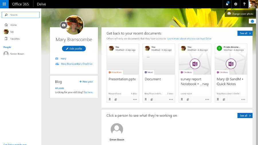
Enterprise business users get a full collaboration service with Exchange email, SharePoint document storage, Skype for Business unified communications, OneDrive for Business storage sync and sharing, Yammer enterprise social networking, Delve for tracking what your colleagues are working on, and Groups for ad hoc collaboration.

All that, alongside an increasing list of new services like GigJam (for sharing just parts of documents so you can have the right information available in a meeting) and Planner (a simple planning tool for groups), plus a subscription to the Office 2016 desktop and mobile applications, which includes early access to new features.

Delve

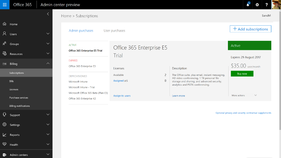
There are several different plans, depending on what mix of services you need. The E5 plan, for example, includes rights management services for encrypting documents and choosing who can see them and how long they're available for, Delve Analytics for tracking how people are spending their time, Power BI for graphical data analysis and business intelligence, and the Office 365 video portal for publishing video inside your company.

In the year since Office 2016 was released, Microsoft has continued to add new features to both the Office 365 service (which you expect in a cloud service) and the Office 2016 applications (which you might not), as well as the mobile versions of the apps for iOS, Android and Windows, new apps like Sway for 'digital storytelling' (that's somewhere between making a mobile app and designing a website), and the Office Online web apps.

That includes new admin features like the new look portal, customising sign-in pages, improved encryption controls, self-service password reset, plus a deal to use Wix to build websites after SharePoint public websites were removed.

New features arriving

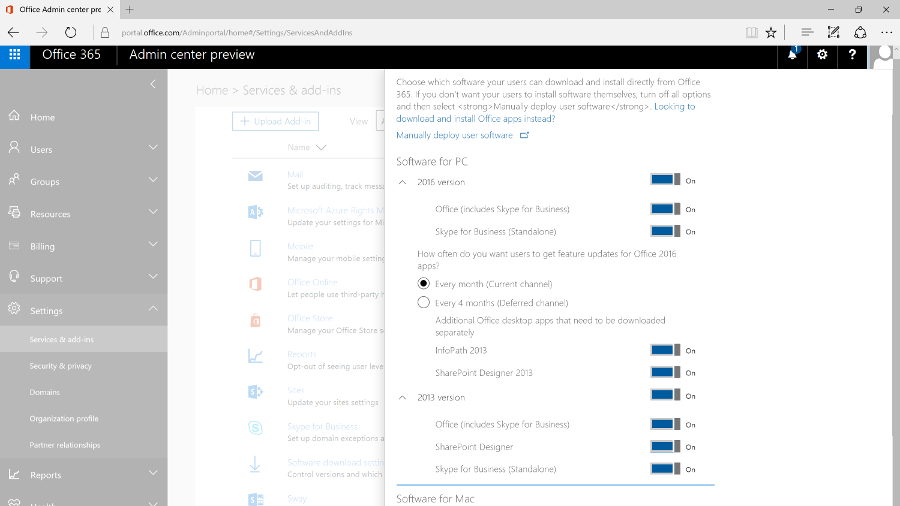
The Office Online apps get regular updates, including new features plus integration with other cloud services like Skype and Dropbox – Word and PowerPoint now have the Format Painter for transferring formatting from one section to another, and Excel Online has more number formats, more features in Pivot tables and a high contrast view for accessibility.

Office Online updates

The mobile apps keep adding features like Find and Morph transitions in PowerPoint, or ink annotations in Word, Excel and PowerPoint. You can record audio in OneNote for iOS and on the web; that's better than OneNote on Windows 10 Mobile where audio recordings cut off after a minute.

Because Office 365 is a subscription service, the familiar desktop applications get new features. Word is about to get a spelling and grammar checker that uses machine learning to understand your writing, and a Researcher tool for easier searching for facts and quotes.

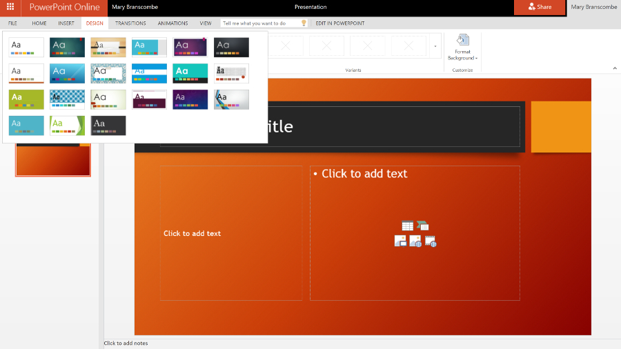
PowerPoint has gained several new transitions, a Designer tool that comes up with new looks for your presentation (very much like Sway) and a way to summarise your presentation with Zoom. Excel has new functions and charts and shape recognition when you draw on-screen, plus many more connectors for getting data into Power Query, while Outlook lets you '@ mention' people in email the way you would on Facebook or Twitter.

Office Online

But the changes also include removing some useful features. Changing the Save As options in Office 2016 has been particularly painful, and Office 365 no longer allows you to temporarily stream Office 2016 to a PC that you want to work on, if the Office Online versions don't have the features you need. Desktop Outlook is going to get the Focused Inbox that's so popular in Outlook for iOS and Android – but it will replace the Clutter feature in Exchange Online that files emails you're not likely to be interested in. Clutter worked in every client that you can read Exchange email in, including on older devices (especially Windows Phone 8.1), whereas Focused Inbox will only work in the latest versions of Outlook.

The enterprise Office 365 service is also where Microsoft tries out new features that will appear in the on-premise server products, like the new SharePoint 2016. Exchange Server 2016 is based on the latest version of Exchange Online, which has been available on Office 365 for some time (and you can buy some Exchange Online features to use with your own Exchange Server, like Exchange Online Protection spam and malware filtering).

Service health

SharePoint 2016 catches up with existing Office 365 features like chatting while you're collaborating on documents stored in OneDrive for Business, and will get newer features gradually. Improvements like the new document library experience, and the suggestions in the new iOS SharePoint app of what sites you should look at, are already showing up in SharePoint Online and will appear on premises once they've been tested in the cloud.

In the past, Skype for Business hasn't had the full unified communications features of the on-premise version because PABX integration is harder in the cloud, but Microsoft has been signing up partners like BT to offer voice services for Office 365, as well as creating cloud-only features like Skype for Business broadcast meetings for very large numbers of users (which will soon include real-time live translation and captions).

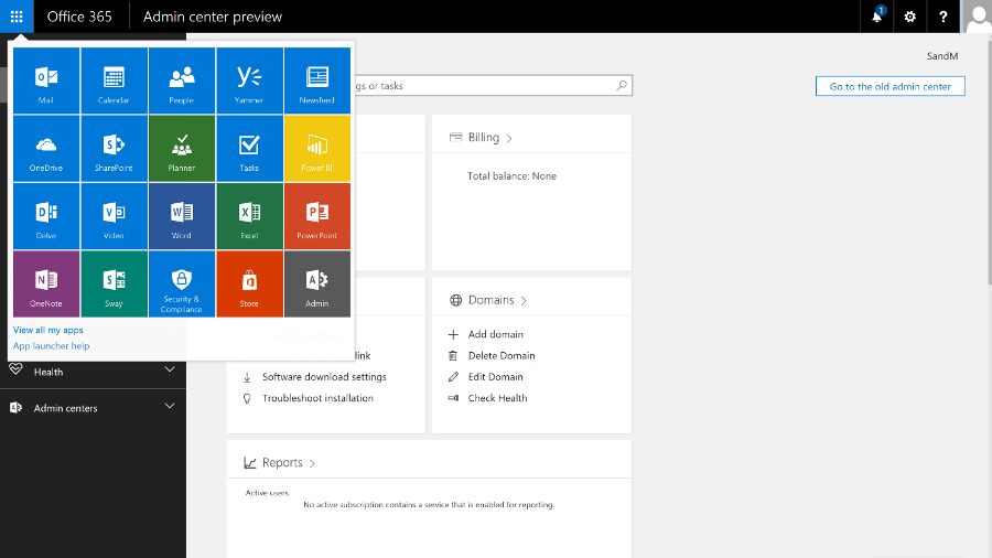
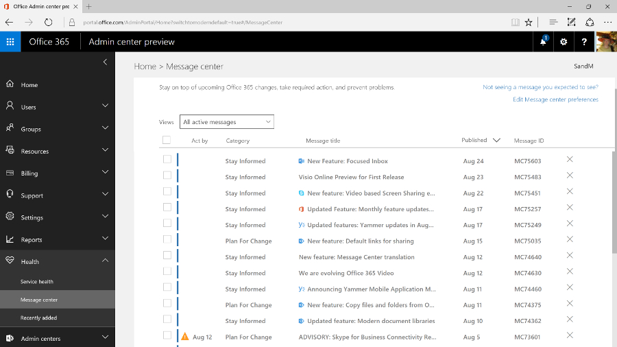
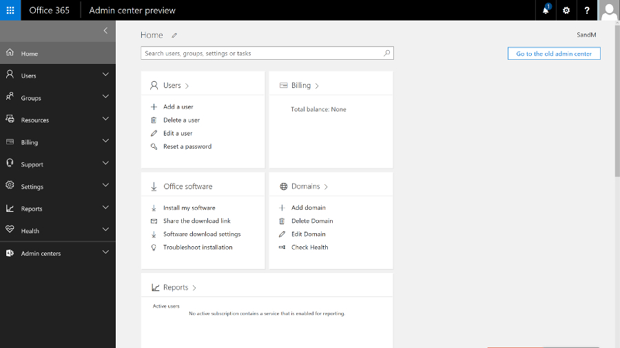
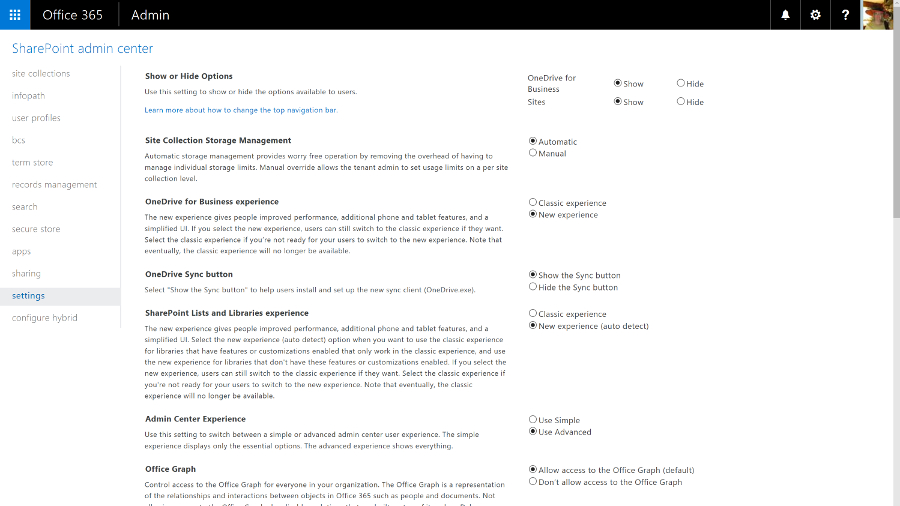
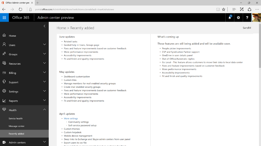
As you'd expect, you manage Office 365 mainly through the browser (although you can use PowerShell commands if you need to change settings in bulk). The admin portal is getting a major redesign that will soon become the standard way to manage the service.

Admin Centre

The previous interface had a minimalist, low-contrast, 'Metro' style that wasn't particularly efficient, with key tools relegated to a list of links at the side of the page and a dashboard that always showed the setup features even when you'd been running the service for years.

Extras

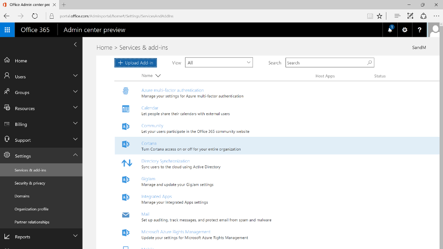
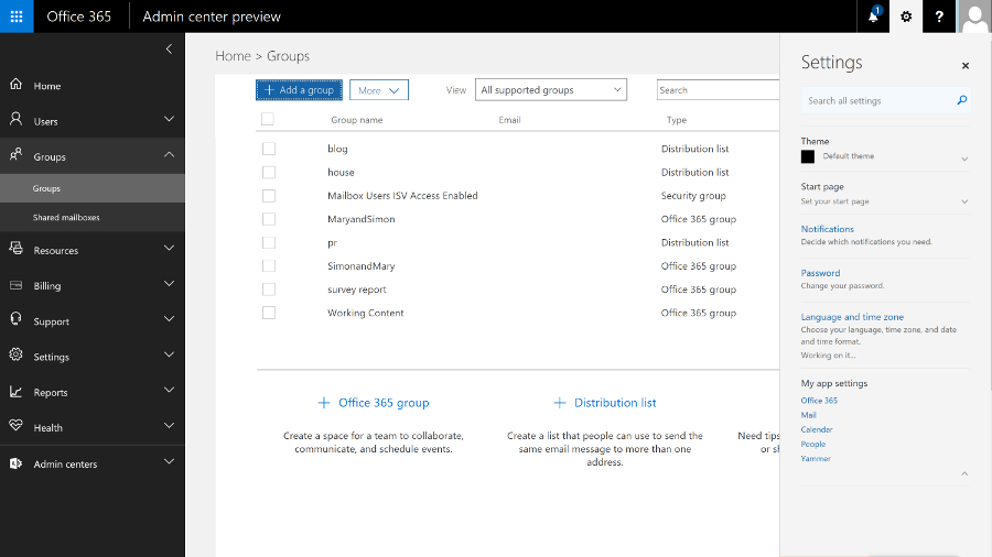
Now there's an expanding menu on the left with ten sections for managing and monitoring the Office 365 service, each of which expands to let you click straight into the specific area you need. This also makes room for features like Groups that have been added to the service over the years, which show up in their logical place (along with the traditional role-based groups).

As you navigate through the different sections, the tools are also grouped logically, and when you click on the details for a user or a group, all the information pops up in a window, with the most common commands (like resetting a password or deleting the user) at the top.
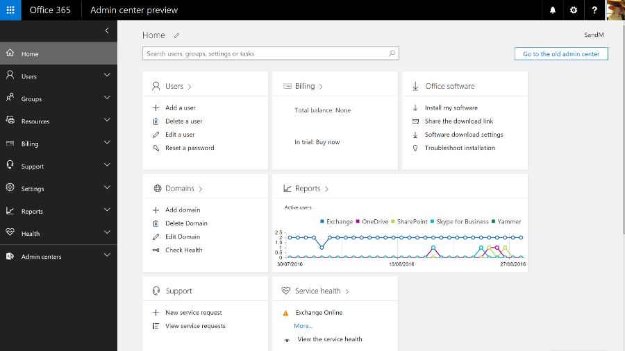
Dashboard

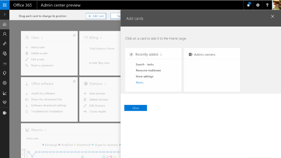
The home screen that replaces the former dashboard is far more useful – and you can even customise it. There are 'cards' for common tasks, from managing users to downloading the Office clients, and you can rearrange them, delete any you don't need quick access to, and add others.

Edit admin centre

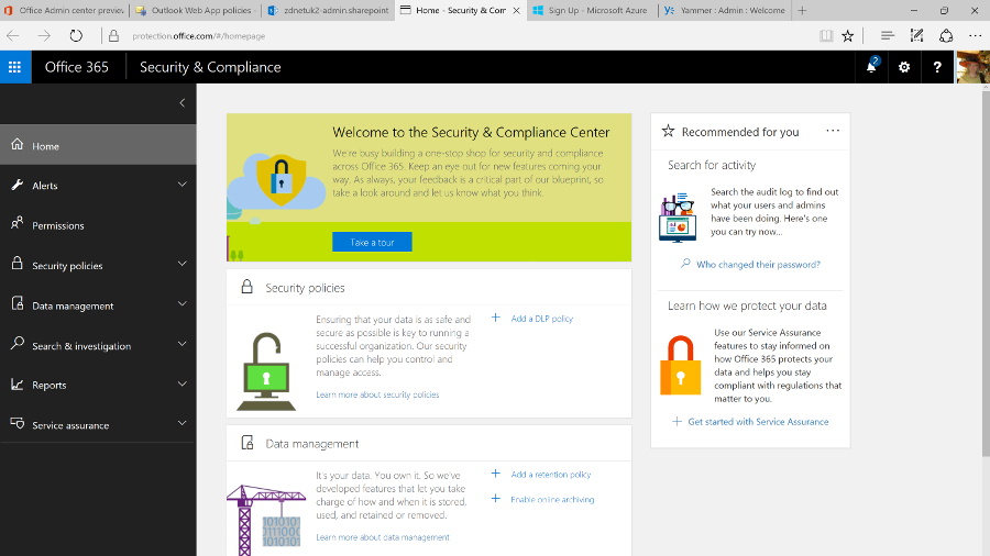
The admin interfaces for Exchange Online, SharePoint Online, Skype for Business and Yammer are now much easier to find as well; they have their own section on the menu, which also links to the new Security and Compliance centre, and to Azure Active Directory (even if you don't buy any of the premium AAD services, using Office 365 automatically creates an Azure AD for your business, but in the past it hasn't been obvious how to get to it in order to carry out any management).

You'd expect Azure AD to open as a separate site, because it's a separate service. It's slightly more confusing that the Security and Compliance centre opens in its own browser tab, but has the same design as the Office 365 admin centre.

Security and compliance

This new portal brings together all the security tools for the service, from assigning permissions to admin users, to managing devices, setting up alerts for user and admin behaviour and choosing how spam and malware in email are handled. All that sits alongside the tools for setting retention policies, running ediscovery searches and archiving content, and details of how Microsoft secures the different Office 365 services.

And it's downright annoying that all the admin portals for the Office 365 services still open in different tabs. Plus they still have the white-space-heavy, hard to navigate interfaces that are basic rather than simple, in which it can be hard to find the tools you need quickly (and Yammer has its own design again). We'd like to see them move to the new portal design too; the current mix of interfaces feels fragmented and confusing.

Yammer

It might even make sense for more of the settings to move to themed admin portals the way the security and compliance options have, rather than matching the admin options for the separate on-premise Office servers. Key settings from the Exchange, Skype for Business and SharePoint services are already duplicated in the new admin portal; if they're all you need, you'll never need to use the full service portals at all.
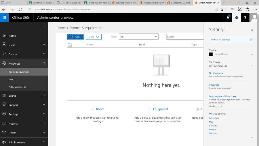
Rooms and equipment

Getting started

Setting up Office 365 is fast – provisioning an E3 or E5 tenant takes only a few minutes – and it's straightforward for a small company, especially if you're migrating from Exchange Online. You can start the wizard to walk you through setup – including connecting to the domain you're using for email addresses, or buying one if you don't already have one – straight from the purchase screen, or you can come back and work through the individual steps later.

You can set up users by connecting to your on-premise Active Directory by importing details (from a CSV file, for example) or by creating users one at a time (that's most suited to a small business); and when you create individual users you can assign licences as you go. If you want to pick and choose who gets which features, you can allocate licences individually for Office 2016, Office Web Apps, SharePoint, Skype for Business, Exchange and any other services.

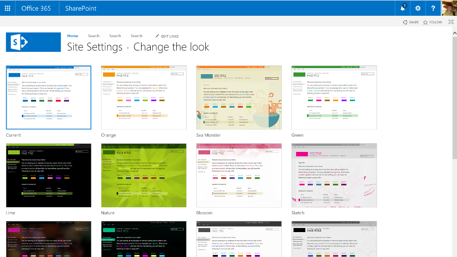
There are other settings that you can change if you want, but not so many that things get confusing. You can customise the Office 365 theme, set the password expiry policy, choose whether you get new features when they're generally released or try them as soon as they're in preview (and that can apply to all users or just the more advanced users that you pick individually), turn on multi-factor authentication, set the policies for Azure Rights Management if your plan includes this document encryption service, and choose whether users can search Office 365 content using Cortana, or use Office Online to work with files in other cloud storage services like Box.

Groups

There's more work to do if you have email accounts on other services that you need to import data from (there's an import option where you can upload data or even ship drives to Microsoft if that would take too long), and if you're a large business that needs to mix on-premise servers with Office 365 you'll need to plan which users have accounts where and how you sync between your AD and the cloud service. But you don't have to be an expert to get a small business online with Office 365.

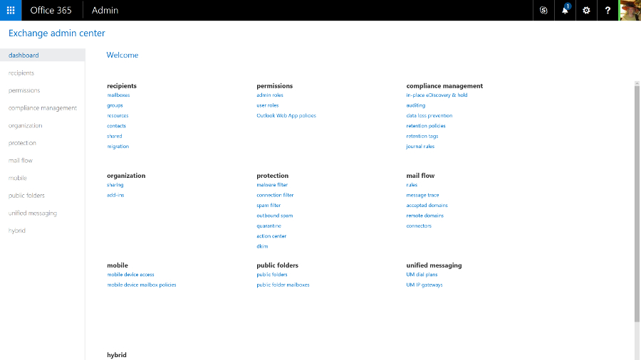
Ever since Exchange 2013, the web version of Outlook has had the same features and interface as the Outlook client – it's also what the Exchange Online admin centre is built on, and you can just mark a user as an administrator. This removes the need for an Exchange mailbox to administer Exchange, so you don't have to waste a mail licence and storage quota on a shared mail admin account. You can also give different administrators limited permissions; if someone only needs to use the compliance or discovery tools, they won't get access to mail flow and user settings.

The admin centre is crammed with features, organised into around a dozen categories. Previously complex tasks, like setting up a federation trust to make free/busy times in user calendars visible or setting up shared mailboxes for call centres, are far simpler and you are guided through important steps (like giving users the right permissions to access the shared mailbox).

Exchange admin

Public folders are still available, by popular demand. Like everything else in the new Exchange Online, they're simple to set up with helpful error messages that make clear what you've done wrong and how to fix it.

There's also a helpful balance between enforcing policy and users getting work done. The data loss prevention tools in the Enterprise version of Exchange Online let you set up rules to stop people emailing personal information like credit card numbers (with a smart check that employs the same algorithm used to issue credit card numbers, rather than just looking for any 16 numbers in a row).

But users can also override most of these policy warnings by filling in an explanation and confirming they know the message will be logged. The information can be encrypted to keep it safe until the manager approves the explanation.

The tips reminding users of the policy show up in Outlook clients, and Outlook webmail. But if you send a message from your smartphone that breaks a policy, the rule can forward the message to your manager or mail you to confirm that you meant to break the policy.
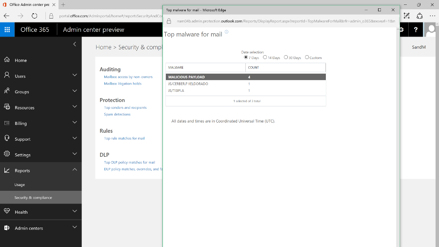
Malware report

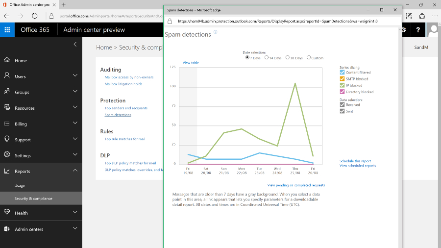
But while the ultra-minimalist, white-space design is well organised, and will be familiar to Exchange Server admins, it doesn't match the style of the new Office 365 portal. There is also quite a lot of overlap – many tools from the Exchange Online portal also show up as links in the main portal to the auditing, mail flow and information protection tools (spam and malware protection and data leakage policies that block or warn users who are trying to send details like credit card numbers in email). These open the tools in either the Exchange Online or Security and Compliance portals.

Spam report

There are also some settings you might expect to find in Exchange that are in the main Office 365 portal, like choosing whether users can share their calendars with people outside your organisation.

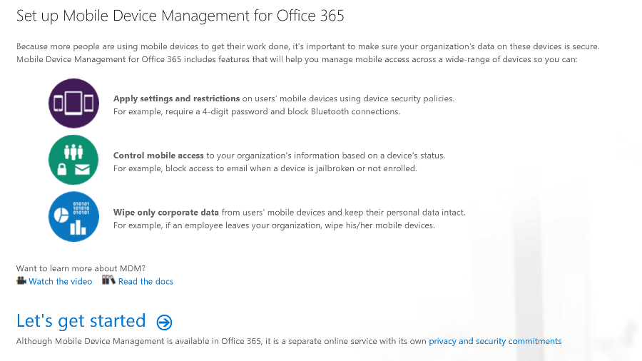
Like Exchange Server, you can use Exchange Online for mobile device management by setting policies that will apply to any smartphone, like forcing the user to turn on encryption and set a PIN, and even setting how often they have to re-enter it.

Office 365 also includes Microsoft's Intune MDM service which adds extra features like detecting whether devices are jailbroken, and letting you mark emails and documents that can only be opened in approved mobile apps, like Office, and only saved in specific locations. You can also selectively wipe devices, removing business data but not personal photos and information.

MDM

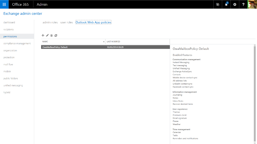
The Exchange tools for managing mobile device access are still in the Exchange Online admin portal, which is where admins who are used to Exchange Server will expect to find them. The Intune MDM features are in the Security and Compliance centre – and yet again, that opens a new browser tab, because it has its own interface.

OAW for device admin

This is the kind of duplication we expect Microsoft to clean up as it continues to improve the Office 365 admin UI, and the disparate interfaces shouldn't distract from the fact that you're getting a powerful mail system with all the options you need. And if you don't need to delve into those options, you can be up and running quickly with a rock solid mail system. Exchange Online remains one of the crown jewels of Office 365.

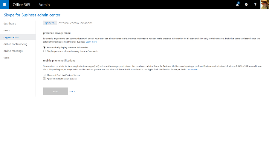
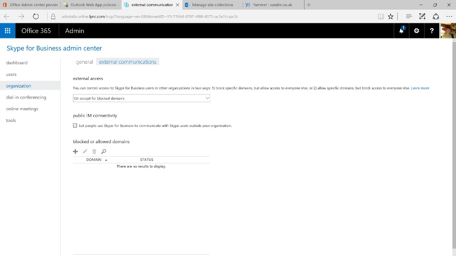
If you've used Office 365 before, you'll remember the admin portal for the unified communications service formerly known as Lync was distinctly minimal, with very few settings you could change. As Skype for Business gains more features, there are correspondingly more options and controls, but it's a far cry from the complexity of the on-premise version; this is one of the services where being in the cloud makes unified communications dramatically simpler.

Now that Skype for Business can connect to Skype, you can control that integration, as well as allowing or blocking calls and chats with Skype for Business users outside your company, and choosing whether the Skype Broadcast service is available for creating large public online meetings. Again, the controls for external connections are duplicated in the main Office 365 admin portal – for many businesses, they're the only settings you might want to change, so you might never need the full admin centre.

Manage skype

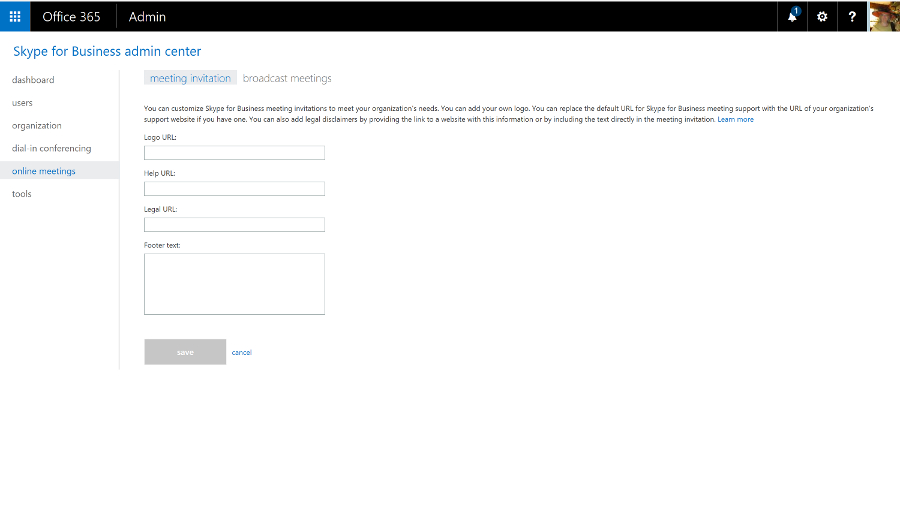
You can also set the defaults for notifications and privacy mode and add your own boilerplate to meeting invitations. You can include your company logo, links to support, any legal terms and conditions that apply to meetings, or a few lines of text you wish to be included in all invitations.

Skype for business custom

You can use Skype for Business for dial-in conferencing, with or without toll-free numbers, so your users can phone in rather than using the Skype for Business client – that's included in the E5 Office 365 plan, or you can buy it as an add-on. You can also use PSTN Calling to call standard phone numbers and receive calls from anyone, not just other Skype for Business users (again, that's included in some plans but not in others – confusingly, there's a version of the E5 plan that has it, and another that doesn't).

Skype IM

You can even use Skype for Business as your PBX – as well as making and receiving calls, you get PBX features like transferring calls, having several phones ring when a call arrives, putting your phone on 'do not disturb' except for a few key contacts, playing hold music and handling voicemail. Again, you need the right licences.

The admin centre also includes a handy list of tools for troubleshooting, and a very minimal set of reports.

Lync Online was already an impressive HD videoconferencing system with excellent tools for online meetings. The Skype integration makes it a great choice for letting your customers and partners reach you without the cost of a phone call, and if you add the dial-in conferencing, PSTN calling and PBX tools, it's close to being a cloud service that offers a full unified communications system. But buying all those options as separate add-ons, some from third-party communications providers, does make everything more complicated than we'd like.

For a while, SharePoint Online was the red-headed stepchild of Office 365. The name didn't even appear in the list of apps – users just saw links to OneDrive and Sites – and the ribbon-based interface felt dated and out of step with the rest of Office 365.

But cloud competition like Box and Dropbox hasn't killed off SharePoint, and even though the personal cloud storage of OneDrive for Business is still part of Office 365, Microsoft has just given SharePoint itself a major refresh that updates the key features for document sharing and collaboration, and adds far better mobile support.

SharePoint Online also connects to the new services Microsoft has been adding to Office 365 like Groups and Planner, making the collaboration options feel more coherent.

SharePoint new

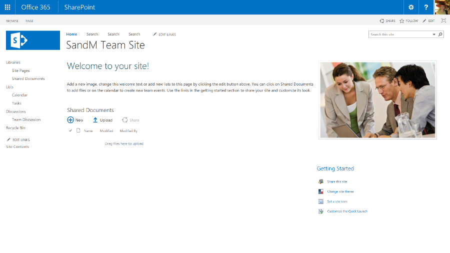
Sites for personal and shared team use and document libraries are still at the heart of SharePoint – document collections can now be as large as 25TB, and there's a new document library experience that looks much more like OneDrive, or a blog.

Team Site

Team sites automatically show popular documents and details of who in the team has been working on what, and there are new tools for creating pages on the site as if you were writing and publishing a blog – so you don't need to create HTML or use a separate publishing tool any more. Just pick web parts – images, events, links, videos, Yammer feeds – and drag them into place.

SharePoint Team Sites

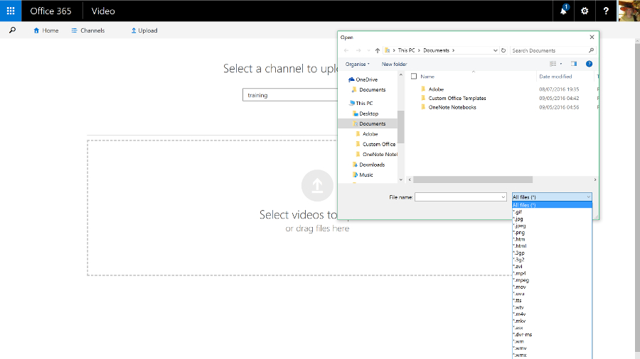
Some Office 365 plans include the SharePoint Video service, for uploading and streaming videos. This is going to be replaced by the Azure Streams video service, though not until the new service has all the same features as the existing one.

Office video formats

All the existing options for customising SharePoint are still available. You can include language translation services for sites and documents, and for structured tasks you can add workflows designed in Visual Studio and have them hosted on Azure, or you can create a Flow or a PowerApp on Azure that lets you configure workflows that connect other services – like Salesforce or Dynamics – to SharePoint.

If you need the same kind of full-trust managed .NET code that lets you customise SharePoint on your own server, you can put that on Azure. As a multi-tenant cloud service, SharePoint Online has to protect users from each other's potentially performance-hogging code, so this is a sensible approach. But many of the features you'd once have built that way are available as apps written in HTML and CSS that run on SharePoint: you can get blogging tools, mapping tools, address checking tools and more – and admins can choose which apps are available in the SharePoint Store and who is allowed to buy more.

Plus SharePoint 2016 adds a new extension framework based on common JavaScript frameworks like React and Angular, where the code runs on the client device, not on the server. That's still in development, but it brings SharePoint up to date with the latest web development technologies.

SharePoint Home

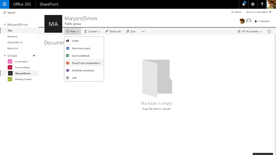
SharePoint also has a new way of controlling access. Admins can still grant and block access to SharePoint sites, but team sites work with the new, self-service Groups feature in Office 365. Anyone can create a group of colleagues and the group automatically gets a team site with a document library, a shared calendar and inbox, a Skype for Business chat room that you can also get as email, along with a OneNote notebook, an always-on Skype conversation you can drop in and out of, and the new Planner task management tool.

It works the other way round, as well; make a team site or add colleagues to Planner and you create a group.

Planner is like a simple version of Trello – you create a card for each task, assign it to someone and save it into different 'buckets' that you use to organise your plan. It doesn't have much in the way of notifications yet, but Microsoft is adding features quickly.

Groups 2

Groups also have the kind of connectors you might have seen in Slack. You can connect a Twitter feed or a variety of services like GitHub, Trello and ZenDesk to a group to get alerts – so you could follow the hashtag for the product your team works on, or see customer support issues in the group.

You can search across all the sites you have access to and when you find a useful document, you can follow it as if it was a friend on Facebook. Results include automatic recommendations based on what the people you're connected to are working on, and your previous behaviour. That's based on the Delve feature, which analyses what documents your colleagues are working on that are relevant to you – you can see that in the Delve service but the information will now show up in SharePoint too.

Search is smart: search for 'marketing deck' and results will include PowerPoint presentations (that don't have the word 'deck' anywhere in the contents), with particularly relevant slides highlighted in the results.

The SharePoint newsfeed is still available if you want to use that to keep track of what's going on. This looks very much like Facebook or Twitter – you can follow people, sites, projects, hashtags, documents and events, and you'll see in the activity stream when someone does something new or makes a change (you can filter the stream to make it more manageable). You can also preview documents and videos straight from the Newsfeed, or turn any item into an action that becomes part of your task list.

Customise SharePoint portal

You use Twitter-style @ names to mention people and you can see when other people have mentioned you (you get an email as well as seeing it on the Newsfeed, so you don't have to update feverishly to stay on top of work). Also, you can post your own updates to everyone or just the team you're working with.

Customise SharePoint portal 2

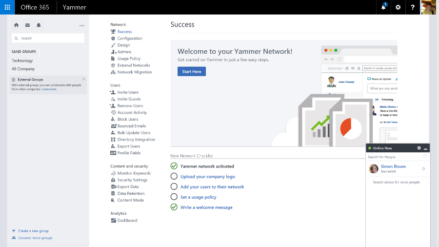
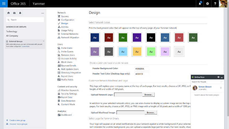
But now that the Yammer social network service is available to all Office 365 customers, you can switch to using that instead. It's a much more powerful tool for collaboration that's getting regular updates – and again, it's going to integrate with Groups soon, so a team can choose to collaborate through Yammer or the other Groups tools.

Yammer design

You can view and edit documents in the Office Online web apps, and you can preview file types you can't edit, like Visio. Sharing documents – with colleagues or up to 10,000 external partners and customers who don't need to have SharePoint themselves – is also much simpler. Click on the sharing icon and type in names or email addresses, choose whether they can view or edit – or copy an obfuscated URL you can send in an instant message or put in a blog post.

Shared documents are marked by an icon you can click to see who you're sharing with (and you can stop sharing a document when you're done collaborating). Many Office 365 plans include Azure Rights Management Services, so you can control not just who can see a document but what they can do with it, turning off the printing and copying functions for confidential information.

SharePoint started out as a way to share document libraries and create workflows. It's now a flexible collaboration tool for ad hoc groups as well as a formal, centralised information store, with mobile apps as well as simple web publishing.

The SharePoint Online admin centre reflects that. There's a long list of settings that lets you control apps, connections, rights management, collaboration and whether users get new features and the new OneDrive for Business interface.

For many smaller businesses, that's all you need and you can hide the other controls. But if you need them, there's a full set of configuration options for everything from InfoPath to the taxonomy for how documents are indexed, in an interface that SharePoint Server administrators will find familiar (although it's going to confuse anyone starting with the new Office 365 admin centre).

OneDrive and OneDrive for Business

Microsoft uses the same name for its business and consumer cloud storage services: OneDrive and OneDrive for Business are now more similar than they used to be – in particular they use the same sync client, which fixes a lot of problems with OneDrive for Business – but they're still different services.

OneDrive is Microsoft's consumer cloud storage service, which gives users 5GB of free storage with the option to purchase 50GB for $1.99 a month (£1.99, AU$2), plus Office Web Apps. If you buy Office 365 Home, Personal, or University, you get 1TB of OneDrive space.

OneDrive for Business is the cloud storage service that's part of the business Office 365 plans (and also available as part of on-premise SharePoint Server), with either 1TB or 5TB of storage per user, depending on which plan you choose.

Office 365 tenants also get SharePoint Online, which includes 10GB of secure cloud storage with an extra 500MB per user, and the option of paying for up to 25TB of storage in total. You can choose how the SharePoint space storage is allocated between users and control how they use it, like limiting who they can share documents with or forcing them to encrypt confidential documents using rights management software.

OneDrive for Business, which is confusingly labelled OneDrive in the Office 365 portal to fit on the ribbon, lets users store their own working documents privately. If you're familiar with SharePoint, you can think of it as like the storage in My Site – and documents can still have workflows or be checked in and out.

OneDrive in office 2016

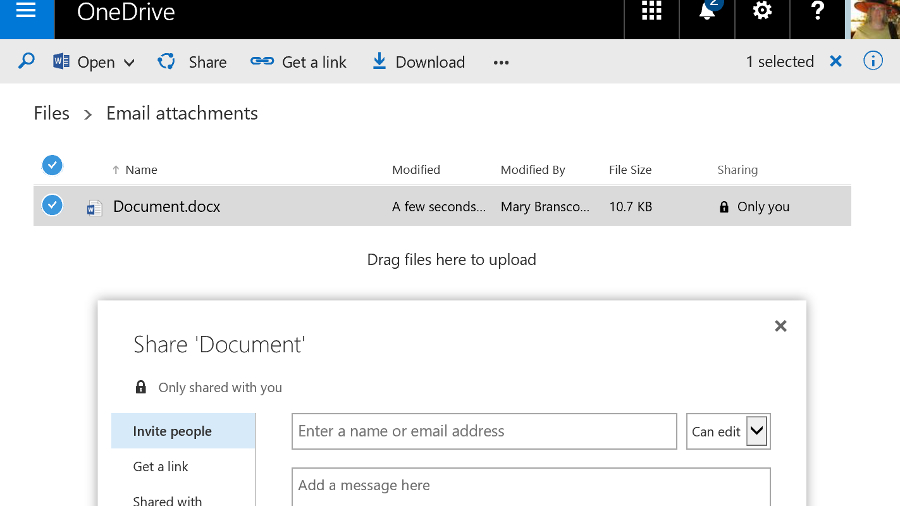
Users can also share documents with specific people – inside or outside the company – by clicking the three dots next to the file name and choosing Share, or from the properties and preview pane for the file. This interface has been updated a couple of times but it's still easy to share documents and see who has access.

Users can choose whether each person they invite can edit or just view the document and whether or not they need to sign in (it's possible to choose whether to enforce sign in globally). It's very clear if a document is shared and with whom, and you can stop sharing a document at any point. OneDrive for Business storage is part of SharePoint and you can apply policies to it in the same way.

OneDrive share

If you want to share a document in OneDrive for Business with everyone (including those to whom you give the URL of your OneDrive for Business), you can move it into the Shared with Everyone folder by default.

If you want to make it available only to a specific group of people, you can put a document into the library for a Team Site instead. That uses the SharePoint tenant storage and you can get those files onto a PC by opening them from SharePoint Online, opening the document library in Explorer (from the ribbon on the SharePoint site) or syncing the document library as a list in Outlook. Team mailboxes also save information into the SharePoint library.

Although the range of storage and sharing options in Office 365 sound confusing, in practice they make a lot of sense. Users get the option to stick to SharePoint shared document libraries or use something that looks like popular free cloud storage services – but which gives you control and security.

Sharing documents is simple and users can easily collaborate (they can even edit the same document simultaneously, in the Office desktop applications or the Office Web Apps) but again, you have tools to control this.

When it first came out, Office 2016 had excellent integration with OneDrive, on both Mac and Windows, letting you browse your online folders and see the folders you'd used recently right on the Backstage menu. A recent update stripped that out on Office 2016 for Windows, replacing it with a very slow dialog that doesn't show any recent folders at all – and doesn't even show you what the file name will be. It's a definite step backwards.

All apps

What else is in Office 365?

Depending on which Office 365 plan you choose, you'll get a range of new apps and services. All the plans include Sway, a new authoring tool that uses machine learning to do a lot of the layout work for you, creating responsive layouts that work on smartphones as well as desktop web browsers.

Business plans include the Planner service, as well as GigJam, a collaboration service that lets you share specific pages inside a document – you can just cross out pages and paragraphs you don't want colleagues to see. It's an interesting idea that needs a lot more work to be really useful.

Delve Analytics

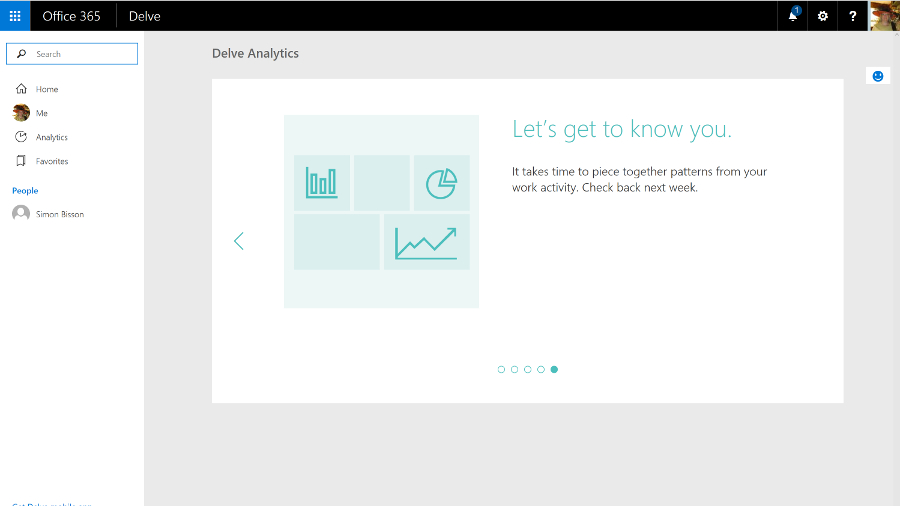
The E5 plan includes the Power BI cloud service that lets you visualise information in charts and dashboards, and an extra tool in Delve called Analytics that analyses your working habits to tell you how much time you spend in meetings and email compared to your colleagues, to help you make the most of your time.

There are also related Office services you can add to Office 365, like Project Online, which is a full-fledged portfolio project management system.

Office recent changes

Expect Microsoft to keep adding new services to Office 365 – like the ones it plans to create from LinkedIn.

Office 365 is hands-down the best way to buy Office, whether you're a consumer user wanting the Office desktop apps with all the latest features, or a business that needs email and collaboration tools without the hassle of running your own servers. Yes, you pay a monthly fee, but you keep getting new features as well as useful cloud services.

We liked

The new Office 365 admin centre is a real improvement, making it easy to find features that used to be tucked away inside specific services

Exchange Online is one of the best business email systems around, and no-one knows how to run it better than Microsoft. Skype for Business has gone from VoIP meetings in the cloud to something that can be a full unified communications service – if you're prepared to pay for all the conferencing and telephony services you need to make it work. And SharePoint is getting a much needed refresh, plus the formerly infuriating OneDrive for Business is now both usable and reliable, and Groups give teams a simple way of working together on projects.

We disliked

Overall, the Office 365 admin interface remains disparate and disjointed; Microsoft needs to do more work here. In part, that's due to the overlapping tools, from the formal systems that replicate the server options larger businesses want – especially if they're migrating to the cloud – to the simpler, ad hoc tools based on Groups that are more approachable but also sometimes lack features. Whatever you need, you can probably do it with Office 365 – if you can find out where and how.

If you want the latest features and improvements, you need to opt-in to try previews – but that can mean losing useful options as well, like the confusing changes that make the Save As dialog slow and unwieldy in Office 2016. If you don't get features in preview, it can still take a long time for them to reach all the Office 365 tenants once they're supposed to be available.

Final verdict

Office 365 is a reliable service that integrates email, document sharing and conferencing almost seamlessly with the latest desktop versions of the Office software – which now get regular updates and extra features – and is evolving new cloud tools and services like Sway and Planner.

It's simple enough for small businesses and also has powerful options for larger companies, who will find that the savings from putting commodity IT in the cloud, while still being able to integrate with on-premise servers through Active Directory and hybrid Exchange deployments, make the combined subscriptions for server and desktop products very attractive.

You do need to pick the right plan though – there's a confusing number of them, all with slightly different features. This means you don't have to pay for services you don't need, but it also makes it hard to point at Office 365 and know exactly what you'll get.

Microsoft has officially released Office 2016 for Windows and it is available for consumer customers (Office 365 Home and Personal) immediately for download. Mac users have already been able to download Office 2016 for a few weeks already.

Office 365 will likely keep its name and could be joined by Windows 365 as Microsoft will apparently add a subscription option to Windows 10, and it has trademarked that name. Amongst the flurry of features added to Office 365 in recent times, the ones worth highlighting are:

Microsoft acquired Sunrise, a popular calendaring app for touch devices, which is likely to be incorporated into Office 365. Calendaring has been one of the areas where Microsoft hasn't devoted as much resources as many would have expected especially with the rise of mobility.

Microsoft also bought Acompli (which it almost immediately turned to Outlook), LiveLoop for to prep ip PowerPoint and 6Wunderkinder for its popular to-do-list application.

The company also announced that it was giving away 100GB of free storage for a year to existing Dropbox users to lure them away from the popular cloud storage provider – which incidentally is a close Microsoft ally.

That bonus is on top of a 100GB giveaway of OneDrive storage for two years if you subscribe to its Bing Rewards scheme. Your files will be read only after the subscription ends unless you buy a top-up and if you want to get a cheap one, Ebay seems to be the place to go with plenty of deals available for Microsoft Office 365 Personal available for less than £40.

Okay, let's move on to the most recent developments over the past couple of months. Microsoft recently announced that it has updated Office 365 for Exchange Online, so that users will no longer have their emails automatically deleted after a period of 30 days. Previously, deleted items were shifted into the Deleted folder before disappearing from there after 30 days, but the new update allows the system admin to change this period to a different length, or simply to set all emails to be kept indefinitely.

Also on the email front, Microsoft has just updated Office 365 to allow users to send email attachments which are far, far bigger than was previously possible. In fact, attachments can now be six times as large, with the new size limit being 150MB (whereas Office 365 users were limited to 25MB before – that said, note that the 25MB limit will remain in place unless the administrator actually changes things).

Video content is an arena Redmond is moving to cover with its subscription Office suite, as well, with the creation of the Office 365 Video portal that allows businesses to distribute videos internally. This is a free additional service which is currently in the process of rolling out globally for Office 365 enterprise users, in order to provide a fully integrated solution for video sharing within an organisation with security in mind. Office 365 Video employs an HTML5 player so it can work across all devices from mobiles to desktop computers, although Microsoft is also producing an app for iPhone users.

Furthermore, Redmond has bolstered Office 365 with the addition of mobile device management (MDM) again free of charge, at least for those on commercial plans. System admins will be able to use these features to manage access to data over a range of devices and platforms, from smartphones upwards and on Windows Phone, Android and iOS.

This will put in place measures such as the detection of jailbroken devices, and will allow for security policies to be set up to ensure that certain business emails or documents can only be accessed on approved devices. A selective wipe feature will strip corporate data off a device running Office 365, without touching any personal data on said piece of hardware.

Another major move on the security front which has only just happened is Microsoft and Samsung's announcement of an agreement, following settling their legal arguments over Android, whereby a version of the Office 365 suite will come to Samsung's Knox. In other words, Excel, Word, PowerPoint, OneNote and OneDrive for Business will be included wrapped up in the Knox container.

Redmond has also just changed things with Office 365 so that documents can now be exported in the Open Document Format (ODF), to bring the suite in line with UK government guidelines on document sharing.

OneDrive

Recent news

The following is a list of updates to the Office 365 suite going back from August to the beginning of 2016:

August 2016

  • Microsoft is going to more tightly integrate Office 365 and Windows 10 by implementing an 'Office Hub'that offers easy access to your documents from within Windows.
  • Office 365 saw the introduction of a Service Assurance Dashboard which provides a range of details on privacy, security and compliance controls, including third-party auditing.
  • Microsoft said that the rollout of the overhaul of Outlook.com, which brings fresh Office 365 features to users of the webmail service, has been further delayed.
  • Office 365 Education introduced a raft of new features including Microsoft Classroom, School Data Sync, Microsoft Forms, and Learning Tools.
  • Microsoft brought some new ink effects to OneNote, and also the ability for the app not just to convert a handwritten equation to text, but also to teach you how to solve it.
  • Two new Visio apps popped up: Visio Online Preview which allows users to view and share Visio diagrams with only a browser, and the Visio for iPad app.
  • Various accessibility updates were applied across Office 365, including tweaks to make Narrator (the screen reader) a better experience in Word, Outlook and SharePoint.

July 2016

  • Microsoft highlighted two major new features coming to Word – Editor and Researcher, which help with proofing/editing, and citing sources respectively.
  • A new service arrived in the form of Microsoft Bookings, which gives Office 365 business users a hub web page that allows customers to schedule appointments.
  • Microsoft announced that Office 365 now has 23.1 million subscribers.
  • The free preview version of Microsoft Stream was launched, a YouTube-style service for businesses which will eventually become the de facto video experience in Office 365.
  • The Secure Productive Enterprise offering was revealed, bundling Office 365, Windows 10 Enterprise (in its new E3/E5 cloud-based form) and Enterprise Mobility + Security suite.
  • Redmond released a free videoconferencing tool for SMBs, noting that Office 365 business subscribers get similar facilities on a much grander scale via Skype for Business.
  • Microsoft revealed that later in 2016, Office 365 users will get a preview of an automatic live translation caption service for Skype Meeting Broadcast supporting 40 languages.

June 2016

  • Microsoft Planner was rolled out to Office 365 users worldwide, an app which lets you tackle project management in a fresh and user-friendly fashion.
  • Microsoft made a number of tweaks to Sway, its 'digital storytelling' app, including upping content limits so you can use more photos, videos and so forth in your Sways.
  • Outlook received some new features to help users better manage their travel plans and track the status of package deliveries.
  • Excel got a new set of Power Query features designed to make working with and getting the most out of your data easier.
  • A new Office 365 admin app was pushed out with a more slickly designed interface that makes important information easy to spot at a glance.
  • A new SharePoint mobile app was also launched for iOS offering quick and easy access to your company's portals, sites and resources when you're on the go.
  • The preview version of GigJam – a collaboration app inbound for Office 365 that allows users to easily share all manner of content – was made available to all comers.
  • Office 365 was struck by a major ransomware attack that exposed some 57% of its 18.2 million subscribers to phishing attempts.

May 2016

  • Office 365 Business was enhanced to allow co-editors to chat in real-time when collaborating on documents stored in OneDrive for Business or SharePoint Online.
  • Accessibility improvements, including a new high contrast theme, were applied to Office 365 to make it easier for the visually impaired to work with the apps.
  • Microsoft tweaked security for Office 365, with Exchange Online Protection getting safety tips that give warnings about suspicious emails.

April 2016

  • Office 365 received a front-end facelift with a new welcome page designed to be more helpful and intuitive.
  • Redmond bolstered the capabilities of Microsoft Graph, meaning that going forward developers can build better and smarter apps powered by data drawn from Office 365.

March 2016

  • A new admin centre arrived on Office 365 boasting powerful search functionality and enabling easy access to in-depth reports.
  • Office 365 Connectors were introduced, allowing apps and services to be hooked up to Office 365 Groups, so notifications from said apps automatically get sent to the Groups shared inbox.
  • Office 365 became the only non-Apple accessory offered to those purchasing iPads online.
  • Google expanded its Identity Platform, which is made up of a number of solutions including Google Sign-In, to cover Office 365.
  • And as March ended, we discovered that according to one study, Office 365 is the king of all business web apps.

February 2016

  • A ton of improvements were applied to Excel including new functions to make building common calculations an easier process, and deeper integration with Power BI.
  • Outlook also got some attention with a new system that lets users easily archive messages, and a new Groups section was added to the ribbon.
  • We saw a leaked pilot web page that indicated Redmond's incoming premium email service, Outlook.com Premium, will be free for Office 365 users.

January 2016

  • Microsoft extended its Office Insider preview program, which allows the curious to test early builds, to include Mac users.
  • Redmond introduced new inking features for the Office for iPad apps, allowing for scribbling on documents with a stylus or your finger.

Psiphon

$
0
0

Psiphon is a specialist open source tool for bypassing web censorship, dealing with everything from simple business network restrictions to the industrial-strength firewalls of repressive regimes.

This VPN service supports thousands of servers across 20 countries, and offers additional proxy and protocol options to maximize the chance of successfully accessing your chosen sites.

Psiphon is available for Windows, Android and iOS. It's not always easy to find – the Android app isn't available in all countries, for instance, and the website may be blocked in others – but the company offers several workarounds, including downloading the Android app directly or emailing the firm for download links.

The service can be used for free, with no bandwidth limits and no registration required, but there's a catch, and it's a big one: your speeds are limited to 2Mbps.

The commercial Psiphon Pro plan offers unlimited speed on Android devices, but it's expensive at £9.99 ($14) a month. Still, if you're interested, a 30-day trial allows you to test the service before handing over the cash.

This isn't the best choice of service for performance, then, but it's just about enough for simple browsing, and Psiphon's underlying technologies may give you a chance of accessing sites that other VPNs can't unblock.

Privacy

While many VPNs invest a great deal of time and effort in boasting about their privacy credentials, Psiphon is a little more honest. Point your browser at the service’s privacy policy and this is what you'll read at the top of the page:

"Psiphon is designed to provide you with open access to online content. Psiphon does not increase your online privacy, and should not be considered or used as an online security tool."

Well, that's good to know. Scan down the page, just a little, and it gets even worse:

"We sometimes use advertisements to support our service, which may use technology such as cookies and web beacons. Our advertising partners' use of cookies enable them and their partners to serve ads based on your usage data."

In other words, Psiphon may include ads which allow unknown third parties to record at least some of your service usage.

The company goes on to explain that it may sometimes log downloads of server discovery lists as they're accessed by software clients. These record source IP addresses, timestamps and (possibly) user agents. In theory – given a lot of work – this might allow a snooper to build up a history of when you logged on to Psiphon.

This doesn't mean Psiphon has no privacy value at all. The service encrypts your connection (though via SSH, by default, rather than OpenVPN), offering some protection from snoopers on insecure Wi-Fi hotspots. And it may allow you to access blocked websites without your attempts being logged locally.

It's also worth remembering that Psiphon doesn't require registration. You don't have an account, the company doesn't know your email address or have any idea who you are. Some information about your activities may be logged, somewhere, but even nation states might not always be able to connect it back to you.

Psiphon

Performance

Trying out Psiphon on our test laptop was just about as easy as it could possibly be: click Download, click 'Psiphon for Windows', click the downloaded file and it launches and connects to the service immediately.

Once active, Psiphon opens a browser tab to display your new IP address. It's important that this kind of tool keeps you abreast of what it's doing, but that shouldn't require launching a browser process to do it. We would prefer the client to display a desktop notification itself, or users should at least have the option to turn notifications off.

By default Psiphon connects to the server in the country closest to you, and this worked correctly for us. If that's not what you need, a simple client allows connecting to your choice of 20 destinations: Austria, Belgium, Bulgaria, Canada, Czech Republic, France, Germany, Hungary, India, Italy, Japan, Netherlands, Poland, Romania, Singapore, Spain, Sweden, Switzerland, United Kingdom and United States.

Switching locations is easy, too. There's no need to manually disconnect from one server before you can choose another – just select a country in the list and Psiphon connects to it within a couple of seconds. (Okay, it then opens yet another browser tab to display your new IP address, but you can't have everything.)

Our performance tests delivered some odd results. Most Psiphon locations were limited to download speeds of around 2Mbps, but a few gave us significantly more, with Singapore consistently reaching 8Mbps. We're unsure whether that was a temporary issue or perhaps a flaw in our speed tests, but keep it in mind, if you test the service – the nearest location won't necessarily be the fastest.

Although these speeds are far lower than you would expect from a decent VPN, real world testing showed they were adequate for basic browsing. We were also able to watch standard definition video clips without difficulty, and 720p movies were just about viewable, though with occasional pauses for buffering.

Psiphon's unblocking abilities proved reasonable in our simple checks, with the service giving us access to BBC iPlayer and protected YouTube videos, but not Netflix.

Our final leak tests showed Psiphon correctly allocated IP addresses in our chosen locations, and replaced our ISP’s DNS servers with a local equivalent.

Psiphon's Windows client performed reasonably well for us, but if you have any problems, there are some interesting settings which might help. A split tunnelling feature ensures traffic to servers in your country won't be routed through the tunnel, probably improving its speeds. And although Psiphon's obfuscated SSH should give better results when bypassing firewalls, you can optionally switch the service to use the regular L2TP/IPSec VPN protocol, instead.

Psiphon Pro is an Android app based around the same site unblocking technology. It's also available in a basic form for free, although with some ads. These are large enough to be annoying, although not too intrusive – we didn't notice any popups or autoplaying videos.

Connect for the first time and Psiphon Pro allows you to hook up to the fastest server, or choose from the same 20 countries as offered by the Windows client.

You can opt to route all app traffic through the tunnel, but it might make more sense to use Psiphon Pro's custom browser only. That allows you to access blocked sites as required, while your regular apps use your standard connection for the best possible speeds.

Whatever you're doing, we found the service worked much the same as under Windows. Our virtual IPs always matched our chosen countries and performance was mostly poor, although it was still just about enough to manage some very basic streaming.

Upgrading to the Maximum Speed plan saw us achieve up to 35Mbps via Wi-Fi. That's not bad, but we're not sure that it justifies the £9.99 ($14) a month price. Still, if the app unblocks the sites you need, you might feel differently, and a 30-day trial gives you a risk-free way to find out.

Final verdict

Psiphon's free service is slow, but worked reliably for us, and it could be worth keeping the client around as a backup service. The commercial Psiphon Pro product is fast but expensive, and most users will get better value from a standard VPN.

Amazfit Cor

$
0
0

Anyone looking to improve their fitness has probably considered a smartwatch or fitness tracker. More often these days, the two are one and the same, and there are plenty of options, with the slickest rarely being cheap. But, Amazfit is aiming to offer an appealing experience at a budget price, and the Amazfit Core is one of its more affordable options.

We recently reviewed the $99 (£68, around AU$99) Amazfit Bip and like what it has to offer at the price, especially thanks to its Apple Watch-like styling. Amazfit seems to still be figuring things out though, because the slightly cheaper Cor doesn’t live up to its big brother.

Though the price is palatable for a tracker with smartwatch-like abilities, the Amazfit Cor suffers from unwieldy software and questionable tracking. Worst of all, it doesn’t seem like a lot of consideration went into the ergonomics and how that can negatively impact functionality. 

Price and release date

The Amazfit Cor starts at $79 and is available on the company website and elsewhere, such as Amazon. The Amazfit online store offers free shipping within the US on the Cor. 

The Cor only comes in black, and though the bands are removable, Amazfit doesn’t appear to offer alternate bands. 

Availability outside the U.S. is also unclear. We are unable to find the Cor on Amazon in the UK, but we’ll update this review with any details we retrieve. 

Design

The Amazfit Cor has a simple design largely reminiscent of the Microsoft Band. It makes for a simple look, with a long, thin rectangular main watch section that transitions into the band. In form, it’s as much like a bracelet as it is a watch. 

The front of the Cor is a mix of marine-grade stainless steel frame and 2.5D Corning Gorilla Glass over a 1.23-inch color touchscreen display. That steel doesn’t wrap all the way around the watch body though, as the back of the watch is a hard plastic. A raised section on the back houses the heart rate sensor, and the charging contacts are nearby. 

The Cor is water resistance up to five atmospheres (or 50m / 164 feet) of pressure, so swimming and showering with it on is totally acceptable. And, at 32 grams, it’s light. Amazfit states, “You’ll barely notice wearing it.” But, we noticed it, and usually for all of the wrong reasons.

Its likeness to the Microsoft Band isn’t a good thing. The flat, hard portion of the watch doesn’t feel good pressed hard against the wrist, and it needs to be snug for the heart rate sensor to work. Worse still, the watch piece and the band force the start of the straps curve. In other words, though the strap can accommodate wrists plenty larger than ours, wide wrist bones make for an unpleasant fit as hard bone and hard watch piece butt heads. For comfort, this is a small-wrists only type of watch.

The band is also somewhat tricky to put on tightly. One side slips through a loop on the other end, just like any other watch. But, a nub at the end of the first side handles the locking, and it’s hard to press the nub into a slot, and while trying, the other side of the band has a proclivity for loosening itself.

The screen layout isn’t ideal for notifications. Reading text messages is abysmal. So many words split because of the large font and vertical display. Reading multiple multi-page notifications just makes the nightmare worse. It was hard to pick one good example, but this one should do the job:

The screen itself isn’t too pretty either. It’s a visibly low-resolution display that succeeds at showing info, but doesn’t please the eyes. The UI, though responsive, is equally mundane, with no transition animations between pages or opening up tools.

The Amazfit Cor’s performance is murky. As a smartwatch it is wholly basic. As a fitness tracker, it is hindered by its design. In fairness, “smart” isn’t written anywhere on the Cor product page, but the Cor doesn’t have much of an excuse for falling this far short of the Bip, which is smarter, more comfortable and isn’t much more expensive.

The Cor offers a few tools: Status, Notifications, Exercise, Weather, Alarm and Timer. One handy tool is hidden away in settings: a “Find Phone” feature that will chime your connected smartphone if it’s in range. 

Multi-tasking is sadly not an option on the Cor. We set a timer so we could know when our Chinese carryout would be ready, and then we couldn’t check the main clock. We were tracking an exercise, and during a break, we couldn’t see if we had any notifications. 

The menus are semi-intuitive, and Cor is quick to respond while navigating. It’s a tad irksome that the screen goes off quickly, and when it does, it returns to the homescreen immediately, so any progress searching through menus is backtracked. 

That quick sleeping screen surely helps the Cor get its advertised 12 days of battery life. The battery lives up to expectations, as we only charged it once to get our review started, and haven’t since. And, we put extra load on the watch by having it measure our pulse every minute, all day, every day.

One handy (at least on paper) feature that’s annoyingly off by default is the ability to turn the screen on by flicking our wrist. Perhaps it’s off by default because it works poorly, as half the time it didn’t work, and a quarter of the time is responds so slowly that we assume it didn’t work and try again. 

The Mi Fit app that pairs with the Cor and other Amazfit devices is decent. It offers interesting information, like how our steps each day compare to those of other users, or explaining things with tangible measurements like how many pints of gasoline we’ve saved by walking or how many ounces of fat we’ve burned. Data visualizations are also eye-catching.

The app has some downsides though. Navigation is confusing, and it can be hard to find a setting you know is there. Plus, not everything is clearly explained. A page called “Behavior tagging” comes with no explanation, and presents a large grid of different activities. Selecting one prompts us to wear the watch and perform the activity. We thought this may be a way of training the watch to detect different motions, like brushing our teeth, but it seems this may just be a way to counting how many times you did an activity and how long you spent. 

The app also struggled with updates for the Amazfit Cor. We were all ready to do an workout at the gym, and after having waited for roughly a half hour for the app to finish an update on the watch, the update failed, then began again. And, as with other things on the Cor, there was no multitasking. The update could not be cancelled on the app or the Cor, and it tried and retried several times that day. Needless to say, our workout wasn’t recorded.

The exercise tracking tool even shocked us with the way it counts time. While averaged out, it does keep fine track of time, but it’s disturbing to see a timer tick slow then fast and then skip numbers altogether. This just further contributes to the difficulty trusting the Cor to track activities accurately. 

Fitness

For Fitness, the Cor seems to accurately track steps. We counted our own steps for a couple blocks, and the step counter was within a few steps of our count. Beyond this simple capability, we’re not too confident in its performance. 

Sometimes, the heart rate sensor appeared to be doing a good job of keeping track of our pulse. Walking down the block, slightly elevated. Middle of a run, pumping. Yet at other times it was transparently incorrect. At the end of a workout, when we could readily feel our pulse in our throat, the Cor claimed we had a cool 70BPM. We tightened it a bit to see if it would correct itself, but it didn’t. 

After a run, the Cor again thought we had a relaxed pulse while we showered off, yet we measured our own pulse at easily over 120BPM. Perhaps in this case the water was interfering with the measurements, but that doesn’t bode well for the Amazfit Cor’s ability to track exercise for swimmers. It doesn’t get much better for swimmers since the screen is non-responsive when wet.

Part of the the Amazfit Cor’s difficulty measuring heart rates may come down to fit, but plenty of times we wore it uncomfortably snug, and still measurements were iffy. It seemed accurate during our run, but we weren’t happy to have it jammed into our wrist. And for workouts that include arms, the lack of flex in the band will be at odds with swelling muscles. We took it for a couple climbs, but couldn’t wear it tight enough to measure our heart rate without also digging into our muscles.

For sleep tracking, the Cor seems to get a good idea of when we go to bed and when we get up. And, since it’s motion tracking is fairly effective, we can trust that it knows when we’re tossing and turning. But, since the Cor struggled to get an accurate heart rate reading without being uncomfortably tight, we can’t say much about how well it factors our pulse into its measurements of deep and light sleep.

The Amazfit Cor should not be thought of as a smartwatch. On the one hand it’s a digital watch with a fancier touchscreen display, and a couple of more advanced tools. On the other hand, it’s a simple fitness tracker. It blends the features from each side, but sadly doesn’t do either terribly well, and is uncomfortable to boot.

In the ever-expanding market of fitness trackers and wearables, Amazfit has plenty of work to do to make a name for itself, and the Cor is not the device to make that happen.

Who’s it for?

The Amazfit Cor is for a budget shopper with small wrists who wants a pedometer, occasional heart rate tracking, and a touch screen. The water resistance and Gorilla Glass also make it a better pick for someone worried about ruining other watches.

Should you buy it?

There are watches that can do more, that are comfortable and that have better prices. While the Amazfit Cor isn’t an unmitigated disaster, we have a hard time looking on it favorably as little more than an uncomfortable pedometer with a few bonus features that don’t greatly improve our lives. For $20 more, the Amazfit Bip is a far better option in almost every way. 

Foxtel Now

$
0
0

UPDATE:With the release of the Foxtel Now Box, it's now gotten easier than ever to use Foxtel's streaming service. Find out more about Foxtel's streaming box in our in depth Foxtel Now Box review

Updated review below.

Foxtel, Australia's premier pay TV service, has launched a number of streaming apps in recent years. First, it arrived on Xbox as a way for people to tune in aside from their primary set-top box. Eventually, that same functionality made its way over to the Telstra TV. Next came Foxtel Go, an app for iOS and Android devices that allowed existing customers to catch-up with their favourite shows on the go. Foxtel Play launched soon after, offering Foxtel subscribers their first delivery of the full TV service via the internet.

For the most part, customers would need to have an existing Foxtel cable subscription (unless they were on a separate Foxtel Play subscription). That meant getting Foxtel service guys out to your house to install a Foxtel box (installation and hardware fee included), paying a costly monthly subscription fee, and in the case of all but the most expensive Foxtel package (which goes for $99 per month), being on at least a 12-month contract. That's a lot of money and effort on your part if all you want to do is watch Game of Thrones in Australia legally. 

Thankfully, that isn't the case with Foxtel Now – a simple streaming service that does not require a traditional pay TV subscription or additional hoop jumping. The new service provides a Netflix-style, streaming-only Foxtel package that lets you watch all of the service's catch-up content, as well as its live TV streams. All you have to do is sign up online, download the app, login, and away you go. So now that Now is here, is this the Foxtel streaming service we've all been waiting for?

From cheap to quite expensive

Just like on its existing cable TV service, Foxtel wants its customers to tailor their Foxtel Now experience around what they're actually interested in watching, and it offers a variety of packages (split into Starter Packs and Premium Packs) that include content from a number of different channels. These are subscribed to on a month-to-month basis, so you can cancel at any time, and there's also a free two-week trial period on offer.

While the Starter packs sound cheap, kicking off at $10 per month, you're going to have to sign up to at least a couple of them if you want to get a decent selection of shows going. 

The Lifestyle, Doco and Kids packages are are the least-expensive options at $10 each per month, followed by the $15 Drama and Pop options, both of which offer Game of Thrones but which otherwise have completely differently lineups. 

Netflix 1

Next are the Premium packs. The Movies pack will set you back $20 a month, while the Sports package carries an even higher $29 monthly fee. Both of these packs can only be obtained in addition to a Starter package. This means that if all you're after is Sports, the minimum cost per month is still going to be $39. 

Having to sign up for specific packages for certain shows (some of which appear in multiple packages) is bound to cause some confusion for Foxtel newbies, especially those accustomed to paying a flat monthly fee for everything that Netflix or Stan have to offer. 

However, Foxtel could be onto something with this approach. For instance, the way the packages are set out suggests that there are two types of Game of Thrones fans – those that want to compliment their time in Westeros with hard hitting dramas like The Sopranos and Wentworth, and other that love geeky favourites like Supergirl and Fear the Walking Dead. It actually makes a fair amount of sense, although it does mean customers with more eclectic tastes will be forced to sign up for both the Drama and Pop packages. 

Compatible devices

With the service having only just launched, the number of devices that can stream Foxtel Now is understandably limited at present. It's actually in a similar position to the streaming service Stan when it first launched, although Foxtel Now does thankfully have a few more devices in its arsenal. 

As you'd expect, Foxtel has focused on iOS and Android device compatibility to start with, allowing users to cast shows or movies to their televisions using a Chromecast or Chromecast Ultra. PC and Mac users can also stream Foxtel Now in a Google Chrome browser window, though the only way to currently get a Netflix-equivalent native Foxtel Now experience on your television, including the ability to browse shows on your TV screen with a TV remote, is on the Telstra TV box or via the new PlayStation 4 app. 

Foxtel has promised to expand device compatibility to support more game consoles and smart TVs in the near future, but for the time being, your only other option for streaming to your TV is via the Foxtel Play app. You're probably better off going with Foxtel Now and finding a cheap Chromecast deal.

Perhaps the easiest way to get Foxtel Now up and running, is to purchase a Foxtel Now Box. This Android TV-based streaming box will boot directly into the service, allowing you to stream all of your favourite shows within seconds of booting it up. 

All you have to do is hook it up to your television via HDMI, connect it to your home network, login, and you're ready to go. 

User experience

Netflix 3

Now that we're all quite accustomed to streaming shows and movies on a daily basis, there are things that we've come to expect from a streaming service's user interface. 

The app is spread across four tabs: Home, Live TV, On Demand and Kids. Like Netflix, titled are listed horizontally in themed rows, only here, the rows include things like Best of HBO, Foxtel Originals, Best of Lifestyle and Trending TV. Towards the bottom of the Home page, you'll find an On Now row that's made up of live TV shows that happen to be on at that moment, complete with a progress bar. For a more complete look at the titles offered by Foxtel Now, the On Demand tab splits TV Shows, Movies, Sports and channels into a number of subgenres. 

While Foxtel has a done a decent job of approximating the typical streaming experience with the Foxtel Now app, it does lack some really basic things that give Netflix and Stan the edge in terms of usability. 

For starters, you can't create a list of favourites like you can on competing services. If you're browsing Foxtel Now's offerings and spot something you might want to watch later, you'd better make a mental note of it (or a physical one with a pen and paper), because there are no queues to add it to here. 

There's also so much going on in the app, with its multiple tabs, genres, channels and Live TV sections, that the act of navigating around it can be a little confusing (and perhaps somewhat intimidating for less tech-savvy people). 

Netflix 5

Which leads us to our next issue: the act of casting from a smart device just isn't ideal for binge-watching. On the iOS and Android app, the show you're watching will not automatically continue onto the next episode once it's finished. Instead, the app will kick you back out to the Foxtel Now 'Home' menu. From here, you'll have to make your way back to the show's page and find the next episode, which is somewhat clumsy, to say the least.

Thankfully, this is not the case with the Telstra TV and PS4 versions of the app. Here, a countdown to the next episode will appear at the end of the episode you've just watched – just like with Netflix and Stan. We really hope this makes its way to the iOS and Android versions of Foxtel Now. 

It's also worth noting that the app does not feature an option to only allow streaming on a Wi-Fi connection. Under 'Data Usage Settings', you're only given the option to select Auto or Low quality settings. 

Subtitle options were nowhere to be seen at launch, but you can now activate them in Google Chrome and Safari browsers, iOS devices and tablets (they'll work via AirPlay) and on the Foxtel Now Box. At present, we haven't found any subtitle or closed caption options on the Android version of the Foxtel Now app.

We would've also liked for offline viewing to be included, though its omission is a little more understandable, given that the app is relatively new.

Streaming quality

In terms of video quality, Foxtel Now is a mixed bag. Streams generally start out fuzzy and clear up as they go along, however, not every show is available at the service's HD resolution. Even new shows, like The Comedy Channel's @midnight, stream in what appears to be standard definition, despite being shot in HD. Thankfully, high-profile dramas like Game of Thrones and Westworld do at least stream in high definition. 

Resolution is not the only issue with Foxtel Now's video quality, however. There are times where the colours appear incredibly over-saturated, taking on an almost fluorescent appearance. 

While viewing a recent Barcelona soccer match, the colours managed to reach eye-scorching levels of vibrancy – the pitch was so bright, this reviewer's entire living room turned green (and this was during daylight hours). Barça's red and blue jerseys also showed significant colour bleeding, losing all sense of colour definition in the process. A viewing of the Jason Statham action flick Mechanic: Resurrection yielded similar results, with one sun-kissed scene looking bright red and completely blown-out. 

On top of this, streams also exhibited some choppiness during panning shots, something that was most noticeable while watching sports.

While there are certainly some issues with video quality, we're pleased to say that streams always started very quickly and not a single instance of buffering was ever experienced during our testing period. 

Are you content with its content?

If you're willing to pay for all of the packages on offer, then Foxtel Now's library becomes vast and magnificent, with a lineup of shows and movies that wipes the floor with the competition. On top of that, you also have the option of watching live sporting events – something that neither Stan or Netflix has dared to partake in. 

Australian HBO fans finally have a service that offers the channel's premium shows like Game of Thrones, Westworld, Silicon Valley, Last Week Tonight with John Oliver, Veep, Girls, The Night Of, Sex and the City, The Wire, Curb Your Enthusiasm, True Blood and much more. 

Undoubtedly one of Foxtel Now's biggest selling points is that current HBO shows will be fast-tracked to the service, allowing Aussie viewers a way to legally stream them shortly after they've aired. Sounds great, right? Unfortunately, shows didn't arrive quite fast enough for our liking. Not only that, but the hugely-anticipated arrival of Game of Thrones season 7 managed to crash the entire system, leaving many customers unable to watch the premiere at all – not quite the smooth launch Foxtel was hoping for. 

On a Monday evening, we patiently waited for the latest episode of Silicon Valley to arrive on the service. By 11pm that evening, the app was still showing the previous week's episode as the latest, despite the show having already aired on Foxtel a few hours earlier. 

While we can only speculate as to how promptly new Game of Thrones episodes will arrive on the service (given that the show is currently in-between seasons), if it's as late as it was for Silicon Valley, we think many subscribers will be up in arms. 

Netflix 6

When it comes to movies, Foxtel Now's selection is enormous, with a number of big and fairly recent releases available to stream. Films like Suicide Squad, Star Trek Beyond, The Legend of Tarzan, Bridget Jones's Baby and Jason Bourne are only a few taps away, while the service also offers a number of classics and fan favourites, such as Heat, Aladdin, Apocalypse Now, Starship Troopers and much, much more. 

Kids also have a dedicated section, with a number of family-friendly movies and TV shows available to stream, including a Disney Movies live-TV channel that plays wall-to-wall Disney and Pixar classics. 

Sports fans will be more than happy with the huge selection of shows and matches available to stream... well, so long as they're into NRL, AFL, racing, Union, soccer, boxing and/or wrestling. Of course, the joy of watching sports is not in streaming old games but witnessing them as they happen, and thankfully, Foxtel Now's Live TV section has you amply covered in that regard. 

Verdict

After what felt like an eternity, an online-only version of Foxtel has finally arrived with Foxtel Now. It's undoubtedly the easiest way to get access to Foxtel's enormous library of TV shows, movies and sports channels. While it should satisfy a large chunk of its target audience, there's still a long way to go before Foxtel Now catches up to the likes of Netflix and Stan in terms of polish and functionality.

We liked
Foxtel Now's huge library of TV shows and movies puts the other streaming services to shame. 

We also love that the app offers live-TV and sports coverage, something that its competitors have yet to even consider in any meaningful way. 

Streams were always exceptionally fast to start and never once showed signs of buffering. 

Best of all, we love that we no longer have to go through the whole pay TV installation or contract-signing process. 

We disliked
Streams varied in quality during our testing period, with some shows looking low-res and others looking incredibly over-saturated. We also noticed some choppiness during streams.

We also don't understand why certain content (even stuff shot in HD) doesn't display in HD on the app — though we'd have to put that down to the quality of the materials provided to Foxtel from certain broadcasters.  

The app also feels light on features and options, with a complete lack of subtitles for the hearing impaired, no way to create lists or mark shows and movies as favourites, no individual user profiles and no offline viewing. Also, the app settings themselves are underdeveloped, with no option to restrict playback to Wi-Fi networks only, for example.

Finally, it was disappointing to see that certain fast-tracked shows didn't appear on the service as promptly as we'd have liked. That can be seen as a deal-breaker for some, given how eager many Aussie fans are to immediately pirate and watch their favourite TV shows. 

Final verdict
There's plenty that Foxtel Now does very well, and there are some things it definitely needs to work on. As a starting point, the app is quite impressive, given the complexity of what it's trying to achieve. However, there are number of improvements that we'd like to see it implement in order to bring it up to the standard of its competitors. But if you've always wanted Foxtel but felt that signing up would be too much of a hassle, Foxtel Now should alleviate that worry entirely. 

MSI GT75 Titan

$
0
0

Intel Core i9 has brought some of the highest core counts we’ve seen in desktop processors, and now the series of chips is doing the same thing onlaptops. For the first time, we’ll have hexa-core processors on laptops for even more impressive gaming, silkier virtual reality experiences and even more mega-tasking potential.

The MSI GT75 Titan is just one of threegaming laptops to feature Intel’s new killer processor. What’s more, it’s a brute of a 17-inch gaming laptop equipped with a low-profile mechanical keyboard, high-end Nvidia graphics and Full HD 120Hz G-Sync displays as standard features. 

Price and availability

The MSI GT75 Titan will be up for pre-orders starting on April 3rd for $2,399 (about £1,710, AU$3,120) with units beginning to ship April 16th. At this price point, the 17-inch gaming laptop comes equipped with an Intel Core i7-8850 and Nvidia GTX 1070, 16GB of RAM and a 1TB hard drive. For about 400 more bucks, you can move on up to a Nvidia GTX 1080 with the $2,799 (about £1,990, AU$3,640) model.

The Intel Core i9 SKUs start at $3,299 (about £2,350, AU$3,640) equipped with the Intel Core i9-8950 and the same specs as lower-end models. Spending $3,999 (about £2,850, AU$5,200) nets you an additional 512GB of solid-state storage, bumps up the RAM to 32GB and an OS upgrade to Windows 10 Pro. Lastly, the highest-end $4,499 (about £3,200, AU$5,850) model comes with a 4K display alongside an 1TB SSD.

Design

Aside from packing an Intel Core i9 on high-end configurations, the MSI GT75 Titan’s headlining feature remains to be its low-profile mechanical keyboard.

Although it’s almost been a year since it debuted last May, no other hardware manufacturer seems to have matched its tactile feel. Every key press responds with a distinct click and a discernible amount of physical feedback. We dare to say it feels even better than Razer’s implementation seen in the Blade Pro.

One unique thing you’ll find on this 17-inch gaming laptop is the LED bar slipped right above the trackpad buttons. As with the keyboard and other RGB lights on this machine, users will be able to customize their illumination through the SteelSeries Engine software.

Game Profiles, where in which lighting ties directly to ability cooldowns and other gameplay notifications, has been a big feature on MSI’s latest hardware including gaming monitors, so the trackpad offers just another way to serve up that information to gamers on top of adding even more RGB.

Most of the MSI GT75 Titan design seems unchangedsince last year. It’s still a big gaming laptop in the most classical sense, measuring up to 2.28-inches (5.79cm) at its thickest point and weighing 10.05 pounds (4.56kg).

Performance

We only had a short time to play with the new MSI GT75 Titan, but it was an impressive experience nonetheless. Intel setup to run Fortnite and encode a video at the same time.

If you were to take on the same workload with mid-range processor, the two tasks would end up slowing down the either for an overall bad experience. Meanwhile, with six-cores on hand, the MSI GT75 Titan runs both tasks at the same time as if they were the only thing we were working on.

This same high-level of processing power should also help with mega-tasking – think multitasking times two or four – and generally gamers that stream while they play.

On top of adding more cores to the mix, Intel’s mobile Core i9 chip adds a little more performance through what the company is calling Thermal Velocity Boost. In this mode, users can expect 200 extra megahertz of performance to help them get through taxing workloads.

Intel stresses that this mode is only meant for burst operations. Unfortunately, you just can’t keep this laptop at a sustained maximum overclock – not that you would really need that much power for gaming in most cases.

Early verdict

The MSI GT75 Titan seems like a worthy platform for Intel’s first Core i9 processors. With ample cooling to support Thermal Velocity Boost, it should be the ultimate portable production machine. Paired up with the Nvidia GTX 1080 graphics card, it should also deliver unparalleled gaming performance.

Though $3,299 (about £2,350, AU$3,640) is a fortune to spending on a gaming laptop, it’s not totally unheard of before. Previously, we’ve seen enthusiast notebooks, like theOrigin EON17-X, go for the same 3K price because they packed an actual desktop processor. Only now Intel Core i9 will be less of a ramshackled solution for squeezing desktop-grade processors into a gaming laptop.

Based on what Intel tells us and what we’ve experienced so far, the MSI GT75 Titan should deliver the highest level of performance. Naturally, we can’t wait to do a full review on this monster gaming laptops.


MSI GS65 Stealth

$
0
0

MSI has at last elevated its leading line of laptops to elite status with the MSI GS65 Stealth for 2018, making the absolute best of the technology afforded it. Earning our Editor’s Choice award, MSI’s gaming laptop brings immense power to a subtle and attractive package unlike any attempt before.

The result is a sleek, portable 15-inch laptop within a 14-inch device that’s capable of high-end gaming as well as intense productivity work for a decent price – cheaper than key competitors. If you’re looking for the ultimate crowd pleaser laptop, you’ve just found it.

MSI GS65 Stealth

Price and availability

When it launches later this year, MSI will ask for $1,799 (about £1,289, AU$2,349) to start for its GS65 Stealth. That price includes everything you see on the right save for a lower-tier GTX 1060 and half as much solid-state storage (SSD) capacity in the NVMe format.

For the configuration you see to the right in full, that will cost you $1,999 (about £1,429, AU$2,609), meanwhile the highest-end model simply doubles the memory to 32GB and maxes out the storage to two 512GB NVMe SSDs for $2,999 (about £2,139, AU$3,919). This puts the GS65 Stealth pretty close to its main competitors, like the Asus ROG GX501 Zephyrus and Gigabyte Aero 15X.

Asus’s laptop calls for $2,299 (about £1,639, AU$3,000) when not on sale for similar hardware inside, albeit a somewhat slower, 120Hz 1080p display that to its merit is an Nvidia G-Sync panel. It also brings half as much storage to the table and doesn’t yet feature Intel’s latest H-series processor.

Meanwhile Gigabyte’s Aero 15X requires $2,199 (£1,999, AU$3,199) for nearly identical hardware inside, save for an older Kaby Lake Intel processor.

For all intents and purposes, the GS65 Stealth handily outclasses its closest competitors from a value standpoint. This laptop delivers the same or more within its admittedly gorgeous chassis for less money than the rest – plain and simple. Speaking of which, let’s talk about that design.

Design

MSI has thankfully gone in a different direction regarding the look and feel of its flagship thin-and-light gaming laptop, focusing on a device with far wider appeal. You won’t find stark angles or red LEDs all over this laptop – rather, you’ll find a sleek, all-black device with subtle gold accents on its lid, within its dual hinges and surrounding its touchpad.

Those gold accents are also found highlighting the laptop’s heat vents, but nowhere else on the brushed, black aluminum frame. The result is one of the most understated gaming laptops we’ve seen to date – one that we would have no problem whipping out in a coffee shop much less at a eSports tournament.

As for how the laptop feels, the GS65 Stealth weighs just 4.14 pounds (1.88kg) and measures a measly 0.69 inches (17.53mm) thin. The laptop fits just fine in our backpack and doesn’t weigh us down, which is impressive considering MSI tells us it could have gone even thinner and lighter but opted for an Ethernet port and the goal of eight hours of battery life.

That said, while MSI clearly made an effort to improve the size of its charging brick, its size negates a bit of that hard work. Regardless, this is still one of the most portable gaming laptops around.

MSI GS65 Stealth

Being just thin enough has afforded the laptop not only room for plenty of ports, but also a SteelSeries keyboard with plenty of travel and forceful feedback. Plus, the keyboard is RGB backlit with 16.7 million color options and SteelSeries’s GameSense, which changes the lighting behavior to sync with gameplay in supported games.

The glass-coated touchpad feels just fine, and doesn’t trigger movements when typing, telling us it has strong palm rejection.

Now, another reason we suspect MSI went a little thicker with the GS65 Stealth’s frame and heavier with its weight was to make room for its three-fan Cooler Boost Trinity thermal system. More on that in a bit. However, with that extra room, MSI didn’t loan much of it to the tiny and tinny speakers, which fire down from beneath its base. Just bring a headset and you’ll be fine – especially considering the amount of tuning MSI has done to improve that experience.

MSI GS65 Stealth

Display

On the other hand, we have little to no complaints about the brilliant, nearly bezel-free display MSI has embedded into the lid of this laptop. Specifically, the display achieves an 82% screen-to-body ratio with bezels just 4.9mm wide, cramming a 15.6-inch display into a 14-inch frame.

Even still, MSI managed to maintain a normal webcam position with a decent resolution of 720p, but back to that screen. Sadly there’s no Windows Hello facial recognition technology built into the webcam, there is a fingerprint reader built into the power button, and MSI tells us that its functionality will be unlocked in a future update.

Refreshing at 144Hz and with a 7ms response time and in-plane switching (IPS), this screen makes games like Warhammer: Vermintide 2 look simply sublime, producing little to no screen tearing when whipping around corners.

The screen is awfully bright as well, revealing the contents of dark corridors in games just fine at even 50% brightness. Plus, MSI’s True Color 2.0 produces color gamuts that meet 100% of Adobe RGB and close to 100% of sRGB standard, and also supports game-specific color modes as well as anti-blue light modes.

Another neat addition is the ability to turn the display contents upside down when the screen is bent 180 degrees. This should come in plenty handy for screen sharing during meetings or other collaborative endeavors.

Ultimately, this is the brightest, fastest and most color-rich display we’ve seen on an Nvidia Max-Q laptop yet. However, the lack of Nvidia G-Sync is a miss, as we’d love for the guarantee of silky smooth motion in games, though that is rarely – if ever – a problem we’ve found with the rig.

Of course, the main driver behind the purchase of a gaming laptop is how it performs when the going gets rough. The H-series Intel Core i7 processor, paired with that Nvidia Max-Q GTX 1070, make quick work of everything we throw at the GS65 Stealth.

As you can see by our benchmark results, the GS65 Stealth absolutely tore through every intense test we could throw at it, putting up general performance numbers that either crush, or maintain parity with, its closest rivals. Clearly, this is a rig that’s equally ready to churn out massive spreadsheets or render video files as it is to deliver your next epic game session.

The same has been the case when it comes to gaming, with the GTX 1070 pushing the laptop through the aforementioned benchmark games and the latest games, like Warhammer: Vermintide 2, like a hot knife through butter. However, this is the only area in which we expect the Asus laptop mentioned here to outperform the MSI machine on account of the former’s GTX 1080 graphics chip.

By all rights for what this laptop costs, you should expect to simply glide through the latest games at all but the absolute highest settings of detail and polish. With it quickly refreshing display with supreme coloration, this gaming laptop is ideal for all types of games, from twitch shooters to vibrant, story-driven adventures.

MSI GS65 Stealth

That said, watch out for how hot this laptop can get on your lap while under load. While MSI’s latest Cooler Boost Trinity system – with three, 0.2mm fans each with 47 blades and five heat pipes – keeps all of the heat away from our fingers while playing, we definitely cannot say the same for the bottom of the base. We guess the heat has to go somewhere, right?

Battery life

Unless this is your first time looking for a gaming laptop, you should know that almost none of these devices bring decent battery life to the table. That said, these thin and light models have turned the corner on that assumption, but there’s still room to grow.

For instance, while MSI promises up to eight hours on a charge from this laptop, our tests don’t come very close to that figure. However, the times we’ve recorded are far better than, say, 90% of gaming laptops out there, with almost four hours of juice in the PCMark 8 test and nearly 5 hours in our own battery rundown test. That’s not too bad for a gaming laptop – and one this thin.

MSI GS65 Stealth

Meanwhile, the Asus laptop doesn’t even come close to either number in the same tests – though, the Gigabyte machine far outclasses them both by a few hours.

Still, you can, at the very least, expect to survive for a few hours away from an outlet with this laptop, and see it survive on flights between several major cities in the US, Europe and Australia.

MSI GS65 Stealth

Software and features

MSI has admittedly packed the GS65 Stealth with lots of pre-loaded software, but it artfully avoids ‘bloatware’ status by providing functionality that’s actually useful. (Well, except for the antivirus.)

Particularly, MSI’s Dragon Center 2.0 brings with it lots of system diagnostic and performance improvement tools, like component load levels and the ability to free up memory space. Plus, with supported games, you can use MSI’s new Gaming Mode to automatically tune up system components to perform best within said game.

Finally, this software can boost your voice output in games at the software level to improve output when chatting, so that you no longer have to shout to compensate for poor mic gain.

As for connectivity, the Killer Network radio and software within the laptop accounts for up to 50% more stable connections and lower ping rates when gaming. However, the difference is tough to witness or measure between our home and office Wi-Fi connections.

MSI GS65 Stealth review

Final verdict

The MSI GS65 Stealth is officially the most impressive Nvidia Max-Q gaming laptop that we’ve tested to date. The laptop meets or outclasses its most performant rivals and arguably trounces them all in terms of design and style.

That said, we wish for a few more niceties given the price, like Nvidia G-Sync and better native audio, and the laptop tends to get a little hotter than we’d like on our laps while under load.

All told, for the price, the GS65 Stealth is one of the best gaming laptops you can buy today. While you’ll have to make some compromises in audio, and there’s no biometric login available yet, those are small conceits to make for a laptop you can confidently both take into work and into your next gaming session.

Sonim XP8

$
0
0
The XP8 has the price of a flagship, but it's got the hardware of a mid-range phone, which means you'll mostly be paying for its rugged features rather than specs. According to Sonim, the XP8 has been designed to perform in the harshest environments. The smartphone has been military tested and rated to meet or exceed MIL-STD-810G standards for ruggedness. Sonim XP8 runs Android 7.0 Nougat and is powered by a 2.2GHz octa-core Qualcomm Snapdragon 630 processor, paired with 4GB RAM and 64GB expandable storage.

Samsung Galaxy S9 Plus

$
0
0

It's the “tick” year for smartphone makers, meaning changes will be subtle and possibly inconsequential. But amongst the many “small” features Samsung has made to its flagship, one stands out. The Galaxy S9 Plus is of course about the variable aperture camera, because without it, this is at best a minor update to the Galaxy S8. So, let's begin with what matters.

Samsung Galaxy S9 release date and price

  • Samsung Galaxy S9 Plus release date: March 16
  • Price starts at Rs 64,900 for 64GB variant
  • It’s still cheaper than an iPhone X

The Galaxy S9 and S9 Plus are priced at Rs 57,900 and Rs 65,900 respectively for the 64GB variants, and the 256GB variants are priced at Rs 64,900 and Rs 72,900. Vodafone users buying the phones will get free one year Netflix subscription. The sale kicks off from 16 March. The phones will be available to purchase from Samsung India Store, Flipkart, and Airtel Store.

Camera

F/1.5 is the widest aperture we've seen on a smartphone yet. The Galaxy S9 compliments that by allowing a toggle for smaller F/2.4 aperture. On the auto mode, the camera will switch between 1.5 and 2.4 on its own volition. If you want to actually see the aperture change, you can switch to the Pro mode and hit the aperture toggle. You will see the blades close in on the primary lens when shifting to the narrower aperture. What the Galaxy S9 Plus can't do is manage transitions across these apertures. You either have f/1.5 or f/2.4, which theoretically speaking, is still a big deal.

You'll probably (and rightly) marvel at the technology here. However, its impact may not be evident to you right off the bat. Samsung's phones always shoot bright photos, compromising details for colour vibrancy. 

Don't get me wrong, this is still a great camera, but long time Samsung users will notice a definite change in the company's imaging philosophy here. Where Samsung has focused on making colours as vibrant as possible in the past, the S9 Plus tilts towards a more natural shade.

However, in doing so, many images appear washed out (on auto mode), especially when put next to the same image shot from a Pixel 2. In bright light, the Galaxy S9 Plus takes some of the best photos you can get, with punchy colours. In low light, wide aperture and tried-and-tested algorithms work together to produce very bright photos. Yet, if you compare to a Pixel, you'll notice that the Galaxy S9 Plus is still inferior to Google's Pixel 2. Details are lost due to aggressive noise removal, and colours are often washed out, which is specific to the S9 Plus. Personally speaking, this is the only Samsung flagship that has disappointed me in any way, when it comes to the camera.

That said, if you're sharing photos on social media only, this camera is more than enough. Despite its shortcomings, the Galaxy S9 Plus can certainly rank amongst the best, but I personally would switch this with the Note 8 any day.

Camera samples

AR Emoji

Samsung admits that this new feature is all about having "fun" with the Galaxy S9 Plus. Switching to AR Emoji mode on the camera app allows you to take a selfie and convert it into a cartoonish character. The character the phone creates will almost never look like you, which is where the fun element comes in.

What AR Emoji seems to do is create a more exaggerated version of the expression on your face. It can come off as creepy but indeed makes for some fun times with friends. That is, till the novelty wears off.

Super Slo-Mo video

Taking a page out of Sony's book, the Galaxy S9 Plus can shoot 960fps slow motion video. And just as it was with the Xperias, it's a feature I almost never used. In fact, the only reason I even tried it because I had to write this review.

That said, super slow motion video might find use in certain niche use-cases. What you must know is that the Galaxy S9 Plus has to be quite stable for this to work, so a tripod is recommended. A moving car, low light, while walking etc. are not the perfect situations for shooting super slow motion videos. In essence, depending on the type of user, super slow motion can either be a gimmick, a novelty or absolutely useless.

Summing up the Galaxy S9 Plus' camera

Samsung impressed the world by putting variable aperture on a phone. However, it also has the first mover's disadvantage here. It seems to me that the company's algorithms aren't perfectly tuned to changing aperture yet, causing the washed out images. What's more noteworthy though is that when it does shoot right, the S9 Plus isn't a huge upgrade over the S8 or Note 8. If anything, the Note 8 can trump this one at times.

Design

With the camera covered, I feel like there's nothing more I can tell you about the Galaxy S9. It has a more rectangular design than last year and feels wider than the S8 Plus. But it's still a mighty compact smartphone when you consider the large screen size. Other than that, this is just the same design as the Galaxy S8 Plus, at least on first glance.

Samsung used Gorilla Glass 5 for the body this time and the S9 Plus is heavier than both the S8 Plus and Note 8. The extra weight is possibly a result of a heavier aluminium chassis on this device. It's just enough to be reassuring, but not enough for the phone to feel unwieldy.

Samsung is following the "if it ain't broke, don't fix it" philosophy here, and it's hard to argue against. Yet, the enthusiast in me says I want newer designs on smartphones every year. It's funny how fast a "new" design gets old.

Display

And just like the design, the Galaxy S9 Plus' display is a repeat of 2017 too. You get a 6.2-inch Super AMOLED display that impresses no matter what you use it for. It feels premium, colours pop and refresh rate is high. There's really nothing to complain about. It can take on any of the top-end flagships today, and barring the iPhone X, there's nothing out there that could compete against the S9 Plus.

Performance

The performance difference between 2017 and 2018 Exynos chipsets is essentially the same as that between Qualcomm's offerings during this time. The Exynos 9810 that runs on the Galaxy S9 Plus is as capable as any flagship-class chipset should be.

I turned off all animations on the phone, just to see apps opening as fast as they could. At least in these initial days, the Galaxy S9 Plus is smooth and lag-free. It is sure to slow down over time, just like any Android phone will, including the Pixel 2 XL. 

Speaking from experience though, Samsung has improved its software over the years and its phones don't start lagging as fast as they did. I've used the Galaxy Note 8 for over six months before this, and though it's slower now, I only realised that after using a fresh out of the box Pixel.

Biometrics

Apple may be trying to kill fingerprint sensors, but Samsung's not buying it. The fingerprint placement here has changed too, thankfully. It's easier to get used to, though it's still tough to discern sometimes. The sensor lies below the dual-camera module on the back, aligned vertically. Medium sized and large hands should reach it easily, but it might take you a few days to adjust to it. When you have adjusted, the sensor never missed a beat.

Samsung also improved the iris scanner this year, using both the IR sensors and an RGB photo of your face to unlock. Given how much Google's built-in face recognition software has improved though, this isn't surprising. The Iris scanner is more usable now, but it's far from being perfect. It still stutters in low light and is slow and unintuitive.

Battery life

When using the S9 Plus without playing games or other heavy use cases (like shooting long videos), it lasts for 10-12 hours quite easily. However, with the screen turned to auto and heavy gaming during the day, the battery life fell to between 12-14 hours. That's up to flagship standards and makes the Galaxy S9 Plus dependable enough. You will get by with a single charge at the end of the day.

The Galaxy S9 Plus does support fast charging, but Samsung's solution feels more like...umm...charging once you've seen OnePlus' Dash Charge in action. That said, we'll be updating our thoughts on fast charging once the phone has been used a bit longer. The Galaxy S9 Plus' battery might need some time to actually settle down. On the upside, it does support fast charging on both wireless and wired connections.

Update: The Galaxy S9 Plus needs a mid-day charge almost every day. The battery life isn't what we would call dependable, but we're still getting about 10 hours a day, on daily use. That is average at best, given that competing flagships like the LG V30+ can do better. This is after spending just under a month on the device. It has about 32GB of data inside (on a 64GB unit) and apps were never intentionally closed when running in the background. 

Overall, this is significantly lower battery life than we witnesses on the Galaxy S8 Plus last year.

Our Verdict

The Galaxy S9 Plus is a great phone, but personally, I'm not very impressed. The changing aperture is very cool to look at, but it doesn't make a big difference. The camera can't beat our current favourite, the Pixel 2 and other aspects of the phone are the same as last year. The Galaxy S9 Plus is a good phone, but it's more like a Galaxy S8 2 than a whole new flagship. And that, is disappointing.

Dell XPS 15 (2018)

$
0
0

The latest Dell XPS 15 is all about bringing the power of Intel H series and Core i9 processors to a laptop thin as an Ultrabook. In that regard, Dell absolutely delivers, enabling specifications with serious power available in a thin and light, 14-inch laptop frame.

Naturally, that frame houses a 15.6-inch InfinityEdge touch display with barely-there bezels – this and more going for a price that ought to give Apple pause. While we’re holding full judgment until a full review, things are looking up for Dell’s supersized XPS laptop of 2018.

Dell XPS 15

Price and availability

Dell will start selling the new XPS 15 this May at a decent price of $999 (about £949, AU$1,299). That starting price includes an 8th-generation Intel Kaby Lake Core i5-8300H processor that runs up to 4.0GHz, paired with an Nvidia GeForce GTX 1050 graphics card with 4GB of GDDR5 video memory. 

Those both power a 15.6-inch FHD (1,920 x 1,080) InfinityEdge display that’s just around 14 inches wide. The anti-glare screen meets 100% sRGB, sports a 1,200:1 contrast ratio, shines at 400 nits, has IPS for 178-degree wide viewing angles. This display can be upgraded to a 4K Ultra HD (3,840 x 2,160) InfinityEdge touch display with a juiced up contrast ratio.

Likewise, the graphics can be upgraded to GTX 1050 Ti, and the processor to an Intel Core i7-8750H at 4.1GHz or even an Intel Core i9 CPU, to keep pace with that sharper display.

As for memory and storage, the XPS 15 comes with 8GB of DDR4 RAM to start and can be upgraded to 32GB, meanwhile starting storage comes in at a 128GB SSD + 1TB HDD. From there, you have 256GB PCIe NMVe SSD, 1TB solid state hybrid drive, 512GB PCIe NMVe SSD and 1TB PCIe NMVe SSD options.

Of course, prices for all of these upgrades are unknown at this time. However, all models will feature widescreen HD (720p) webcams with dual array digital microphones, as well as the following connectivity options: one Thunderbolt 3 (USB-C), two USB 3.1 Gen 1, one HDMI 2.0, an SD card reader (SD, SDHC, SDXC), a headset jack, Killer 1535 802.11ac (2 x 2 MIMO) Wi-Fi and Bluetooth 4.1 radios.

Design

By design, the XPS 15 looks simply like a blown-up version of the 2017 Dell XPS 13, ‘Chin Cam’ and all. Of course, that includes a brushed aluminum lid and base that surround a soft-touch carbon fiber keyboard deck.

That keyboard deck feels as plush as usual and houses the same Dell keyboard you’ve come to love, so expect deep enough travel and strong feedback.

The display, whether in 1080p or 4K, looks fantastically sharp and bright and is nearly bezel-less. Of course, this has driven the webcam into Dell’s now-classic ‘Chin Cam’ position – not that rivals like Huawei MateBook X Pro have done much better.

All told, the XPS 15 accomplishes quite a lot for a laptop that’s just 0.66 inches (17mm) thick and weighs just 4 pounds (1.8kg).

Dell XPS 15

Performance

We anticipate that the available processor options will allow this laptop to gobble all basic computing tasks up for breakfast. That said, we don’t expect Core i9 to entice the XPS 15 core audience. Rather data crunchers and extreme Excel users might find the most use out of the hexa-core CPU. 

Given the high-premium the Intel Core i9 chip places on other laptops like the MSI GT75 Titan, we can expect the highest end version of the Dell XPS 15 to be as equally as expensive.

That said, Dell promises a battery life goal of 21 and a half hours with the XPS 15. Perhaps that’s possible with the 1080p model, but we’ll believe it when we see it.

At any rate, it’s easy to expect some pretty impressive performance even from the entry-level XPS 15, especially for the price to start.

Dell XPS 15

Early verdict

The new-and-improved Dell XPS 15 really takes the performance factor to the next level with Intel’s latest H series processors and Core i9 mega-tasking capability paired with strong Nvidia graphics. Even at its starting price, you’re looking at quite the rival to Apple’s 15-inch MacBook Pro.

For the money, the XPS 15 looks like it’s going to turn quite a few heads when it lands this May in stores and online. Stay tuned for our review to see whether those parts hold up, especially regarding that massive claim to battery life.

VPN Private

$
0
0

VPN Private is one of the most popular free VPN apps for Android, with Google Play reporting an amazing 5-10 million installs so far.

A quick look at the app's store page gives us plenty of clues to help explain this success. VPN Private claims to support more than 20 countries, all servers are P2P friendly, there are no bandwidth limits, and the app is entirely free.

There are issues, too. The developer proudly boasts "this app is 100% free!!!!", for instance, but look closely and you'll notice the standard Google Play warning that it contains ads.

The developer doesn't mention any limits or restrictions, either, but the Play store's mention of in-app purchases suggests there's something important you're not being told. (And there is – more on that below.)

A commercial Premium VPN plan drops the ads, claims to offer a better network and more speed, but is priced at a ridiculously expensive £11.49 ($16) a month dropping to £5.42 ($7.60) if you subscribe for a year. 

To put that in perspective, signing up for Private Internet Access currently costs $6.95 (£4.70) a month, $3.33 (£2.40) on the annual plan or $2.91 (£2.10) if you pay for two years upfront, and that gets you a far better and more complete service which supports up to five devices rather than one. VPN Private may work as a free app, but it's very hard to see why anyone would pay for the commercial plan.

Privacy

Most VPNs do their best to reassure you that your online activities aren't being logged, and VPN Private is no different. There are "no logs" the Google Play blurb proudly states.

Experience tells us these headline claims are often misleading, though, and VPN Private doesn't provide any further information to prove its no-logging case. There is no website, no privacy policy, and no indication of who is behind the service other than a single email contact and an address in the Ukraine.

While none of this is evidence that the developer is doing anything wrong, it also means we have no way to assess potential risks, and no reason to trust the firm.

Even if the developer is entirely honest, there's still scope for problems. Will the developer own and manage all VPN Private's servers, for instance? We suspect not, in which case how can the company be sure what information might be logged on those servers, and how those logs are managed?

We moved on to check out the app's permissions, often a handy indicator of a service which is overstepping the privacy boundaries. In this case, VPN Private only asked for permissions we would expect: 'receive data from Internet', 'view network connections', 'full network access', 'run at startup', 'control vibration' and 'prevent device from sleeping'.

A quick look at the app code revealed that much of it was taken from an OpenVPN for Android project. There's no problem with that – it's open source, that's what it's for – and, if anything, it reassures us that the app will correctly establish and manage your VPN connections.

VPN Private also contains code to display Google ads, which could result in you leaving traces in logs elsewhere. It's unlikely these would reveal very much, though, even if an attacker were to find them, and there's no more risk here than you face when using any ad-sponsored app.

Performance

VPN Private installs much like any other Android app, and the simple interface is almost as familiar: a list of locations, a Connect/ Disconnect button and a menu with a few useful options. If you've ever used another VPN you'll immediately feel at home.

Tapping the Location list revealed only three options: France, United Kingdom and United States. What about the 20+ locations we were promised?

A link offers the chance to 'Add more locations', but then prompts the user to give the app a 5-star rating on Google Play. It's easy to see how a newcomer could rush off to give VPN Private full marks before they've even used it, just to get access to all the servers.

That isn't necessary, though, and once you've rated the app – whatever the score – you get to choose from the full list of locations: Bulgaria, Canada, Czech Republic, France, Germany, Hong Kong, Ireland, Italy, Lithuania, Luxembourg, Latvia, Netherlands, Romania, Russian Federation, Singapore, South Africa, Sweden, Switzerland, Ukraine, United Kingdom and United States.

Select a country, tap Connect and you're ready to go within seconds. The app doesn't display your new IP by default, but tapping an IP Address link opens a browser window which details your virtual identity in full.

Once you're connected, VPN Private displays a 60-minute countdown timer. Leave this alone and the connection will automatically close when it hits zero. This isn't quite as bad as it sounds, because you can tap Reset at any time to reset the timer to 60 minutes. It's a hassle, though, and also potentially a privacy issue if your traffic is routed through your regular connection, giving away your real IP address, because the VPN has closed.

By this stage you'll have noticed the ads, too. A small area on the main console displays a new ad every minute or two. A full screen ad pops up when you click Connect. There's also a small ad in the 'Are you sure?' prompt when you disconnect, and another full-screen ad after that. It's enough to be annoying, but we've seen worse (video ads, pop-ups that appear over other app screens), and overall it's nothing you won’t have seen before.

Our website unblocking tests found VPN Private was only moderately successful. We were able to watch BBC iPlayer while connected to the UK server, but Netflix and protected YouTube content remained stubbornly locked.

Our performance checks gave similarly mixed results. UK to UK download speeds averaged a disappointing 10Mbps, and moving out into Europe saw speeds drop further, sometimes dramatically (9Mbps to France, 2Mbps when connected to the Netherlands). But UK to US connections managed 15 to 20Mbps, good news if you're planning some heavy duty torrenting, streaming or other big download task.

We had more success with the leak tests where VPN Private always assigned us a new IP in our requested country, while also blocking all DNS and WebRTC leaks.

The good news continued to the end of the review, as we explored VPN Private's various settings. There are options to change the UI to one of 17 languages, and it’s possible to set your protocol to OpenVPN or IPSec, a choice you don't often get with other free VPN apps. You can also be warned to use the VPN when connecting to insecure wireless networks.

Final verdict

VPN Private offers more locations than many free VPN apps, and P2P support is unusual, too. Speeds are below par, though, and with no details on the provider or the network, we wouldn't trust the app with anything important.

New iPad (2018) review

$
0
0

The new iPad for 2018 is designed to achieve one thing: deliver the best of Apple’s tablet efforts at a more affordable price.

Note that we say moreaffordable, rather than cheap – because the cost is still higher than many other tablets out there – but the new upgrades bring a lot to the iPad, bridging the gap between a ‘standard’ slate and the more impressive iPad Pro range.

Support for the Apple Pencil adds another dimension to the tablet, enabling a new method of interaction and bringing with it a slew of new apps to interact with, and the upgraded chipset inside – the same one that powered the iPhone 7– offers more power than many will know what to do with.

New iPad 2018 review

The upshot? You’ve now got a hugely capable tablet, one with more power and offering more possibilities, at a fairly reasonable price point. 

You may be thinking that this is a ‘student’s iPad’, as Apple has made a big deal about the new tablet's classroom credentials, but in reality most of the people who buy it will be those who want something to use on the commute and around the house – and as you’ll see, it fares pretty well in those respects.

While this might all sound impressive, it’s still not the full picture, as all these features are combined with the best tablet platform out there, iOS – there’s a reason the iPad has sat atop our best tablet rankings for so long.

New iPad (2018) price and release date

The new iPad was launched in March 2018, and comes with a range of storage and connectivity options.

The new iPad 2018 price starts at $329 (£319, AU$469), but schools will get a discount in the UK and US of around 10%.

At $329 (AU$469) the new iPad price is exactly the same as the starting price of the new iPad (2017) – and both come with 32GB of storage – in the US and Australia, while in the UK it looks like consumers are being treated to a discount, as currency fluctuations mean the basic 32GB version is actually £20 cheaper than last year's iPad.

That's for the Wi-Fi only model, with the 32GB slate with cellular connectivity setting you back $459 (£449, AU$669).

The 128GB version begins at $429 / £409 / AU$599 for those who want more storage, with an extra premium to pay if you want some bytes of data floating in on the go.

Apple Pencil

  • Useful addition for artists
  • Costs extra to buy

New iPad 2018 review

The Apple Pencil… it’s tough to work out whether it’s a genuinely innovative tool or not. We’ve been using it for a few years now, and have found that it’s great for some things, but useless for others.

Also, let’s not forget that it costs £99 / $99 / AU$145, which means you need to pay around 33% of the price of the new iPad, on top of the cost of the slate itself, in order to access the key new feature.

It’s cheaper for those in education, and there is the Logitech Crayon available in the US for half the price (and less functionality), but it’s worth bearing in mind when buying the new iPad.

If you’re looking for something to replace a notepad, we wouldn’t recommend the new iPad – or any iPad for that matter, as it’s really difficult to write legibly on them, thanks to the way the tip of the Pencil glides across the surface. 

Apple could make the glass more matte and ridged to help, but that would make the display harder to see, so it’s not an easily solved conundrum.

The Notepad app is fine, and allows you to write and sketch, and now the iWork Suite from Apple is collaborative, and you can mark-up documents on it (it took Apple far too long to enable this feature, with Microsoft inexplicably adding in mark-up functionality first to its iPad apps.

New iPad 2018 review

This would be a lovely feature if, as referenced, writing on it was easy; but notes can't simply be jotted, they require concentrated efforts of penmanship… and most of the people we work with are on Google Docs, so sharing a marked-up Pages document was useless.

In a classroom environment it will be more useful if a teacher and the students are all on the same platform… as long as the teacher has immaculate handwriting and patience to write a little slower.

If you’re just underlining sections or pointing to things then the finger is just as good – so maybe make sure you really need the Pencil before forking out all that cash.

New iPad 2018 review

However, where the stylus does become worth the outlay is when you want to be artistic – there are a few good apps out there for the Apple Pencil that let you color, change the shading of a photo or get pretty deep into some photo / video manipulation.

We had a great time coloring and sketching during our review, and even if you’re bereft of any kind of talent there’s a lot you can do.

The multi-level pressure of the Pencil comes into its own here, and if you’re in any way artistic then you’ve got loads – and loads, and loads – of different styles of brush, pen and other drawing implements you can work with.

New iPad 2018 review

Just note that most of the time you’ll be charging the Pencil by plugging it into the bottom of the iPad… it doesn’t look good.

A10 Fusion chip

  • Impressive power
  • Comes with 2GB of RAM

We were all expecting Apple to stick with the same ‘good enough’ A9 chipset from 2017’s iPad and drop the price, but it’s gone up and shoved in the A10 Fusion chip that powered the iPhone 7 and 7 Plus, and which is close to the A10X chip in the new iPad Pro range.

That's combined with 2GB of RAM, so there's more than enough power here for nearly any task that most users will want to do with the new iPad, and certainly for emailing, web browsing or watching video.

We noticed some slowdown with heavier apps, for example when processing and opening multiple photos, but we never had to wait too long, and rendering times were still pretty impressive.

New iPad 2018 review

That said, if you’re going to do a lot of more demanding work, that’s why Apple has the iPad Pro 10.5, with the extra power in the CPU and double the RAM.

In our tests, the new iPad (2018) returned a similar single-core benchmarking score to the more powerful iPad Pro 10.5, showing that if you’re not going to be using the cheaper iPad intensively then there’s no reason to spend the extra cash.

It might seem hard to fathom why Apple has thrown in the extra power here, but users will hang onto their iPads for a long, long time (much longer than they would an iPhone), and having more power means they’ll keep running smoothly, and remain upgradeable, for longer.

You’ll be unlikely to use most of the power in the new iPad, to be honest, but the upshot it that it runs incredibly smoothly, and apps open and close with ease… and it’s likely to keep doing that for longer, so you won’t need to upgrade as soon.

Design

  • Standard iPad design
  • Still very well made

New iPad 2018 review

If you're wondering what the new iPad looks like (and assuming you've somehow failed to take in all the photos we've lovingly taken for you here) it’s just like any other iPad you've ever seen.

The metal back, the well-machined buttons, the home button at the base of the tablet with TouchID integration... all there, present and correct. The display is flanked by a rather large black bezel, which doesn't hugely detract from the experience and gives your fingers somewhere to sit when using the device.

Sadly, as it's made of metal we would suggest that you get a case for this thing, or at the very least a cover that allows you to prop it up, as the new iPad comes into its own when used as a standing screen for watching films or checking recipes.

New iPad 2018 review

We say sadly simply because it's really nice to hold the new iPad 'naked' as it were. The thickness of 7.5mm is actually 1.1mm thicker than the iPad Air 2’s that emerged a couple of years ago, but since then Apple has improved the speed and performance of its tablets no end. 

So if you've had that older tablet you may not notice a difference visually, but you will enjoy the extra raw grunt the new model gives you.

New iPad 2018 review

The two speakers at the bottom fire downwards (or sidewards, depending on orientation) rather than booming out of all four corners as on the iPad Pro range. If you've never used one of Apple's high-end tablets this won't matter to you too much – but in comparison, it's rather a bummer. 

That said, the iPad Pro does cost nearly twice as much as the new iPad, so you probably won't mind too much with that much of a saving.

Screen

  • Not the best Apple has made
  • Fine for the money

The screen on the new iPad is bright, legible in most lighting, and usable in nearly any situation. The resolution of 1536 x 2048 pixels, which brings a pixel density of 264ppi, hasn't changed in a number of years, but that's not an issue – there's no need to keep cramming in the pixels on a device that you're going to be using further away from your face than you would a phone.

You could argue that it's a shame not to see HDR supported here, as it is on the iPad Pro – those with premium subscriptions to the top streaming services do benefit from that technology – but Apple is trying to keep the costs down here, and it's presence isn't hugely missed.

New iPad 2018 review

The same reasoning applies to OLED technology – Samsung uses this in its tablets, and it's eye-meltingly lovely to gawp at. Apple's display here is just fine, however, although it doesn’t have the same zero-gap display that makes everything look impressive on the iPad Pro range; everything still looks crisp and sharp, with colors well reproduced.

It's also good to see low screen reflectance, as if you're trying to watch a movie or use an app with a strong backlight behind you, it can be tough to make out what you're looking at.

While a fluorescent light overhead will get seen pretty easily on the glass, you'll still be able to follow the action on screen thanks to the high contrast and brightness. Again, it’s not as good as some iPads out there (including the iPad Air 2, bizarrely) but it’s fine for the price.

New iPad 2018 review

In fact, we struggle to see a huge difference between the the higher quality display of the iPad Pro and the more basic new iPad side-by-side… whether that’s due to improvements by Apple or the lack of obvious difference, we doubt many will feel the new iPad has a poor quality display.

Would we like to see a screen with less bezel around the side? Of course, and that's why the iPad Pro 10.5 was created... to offer a better bezel-to-screen ratio. But it's hard to criticize the display used for the new iPad, especially as it can now work with the Apple Pencil.

Apps and education

  • Many apps for education
  • Still too expensive for the classroom?

One of the main ideas Apple is pushing with the new iPad is that it deserves a place in the classroom. This isn’t going to matter to most people looking to buy the new tablet, but if you’re considering it as a purchase for your child, for use either at home or in school, then there are some advantages to the new device.

The Pencil and note-taking we’ve already covered, but it’s worth remembering that the new iPad doesn’t come with a keyboard in the box, so you’ll either need to spend extra money on a Bluetooth keyboard or go for the Logitech option (if you’re in the US).

The latter is really just for schools, as it’s chunky as hell and rugged to prevent drops; it’ll cost $99 in the US, but it doesn’t look like it’s going to be sold more widely.

According to Apple, there are 200,000 apps on the App Store for educators and students, and teachers are also getting access to Schoolwork and iTunes U, for course materials and the ability to set assignments and see how students are progressing.

Here’s the key part of the Apple play in the scholastic space though: given that it’s not competing on price with the likes of Google and its Chromebooks, it needs to convince those who buy the hardware for schools that the extra things you can do with the iPad are far more exciting than just being able to type in words and browse the web.

To be fair, the apps we’ve tried were both fun and educational – things like Froggypedia, where you dissect a frog virtually to understand biology, are nice touches. 

New iPad 2018 review

You’ve also got Swift Playgrounds to help with coding, history apps that use AR to bring ancient events to life, and artistic apps that rewards students for just trying to be a bit more creative.

The key thing for Apple is helping teachers to understand what these apps can do, how they can help with lesson planning, and what pupils will actually gain from using them over a traditional approach.

There’s also the danger that, if apps are too fun, then more rudimentary lessons without an iPad will seem boring, causing children to become disengaged.

But back to the matter at hand: the new iPad is a great tool for education, leaving aside the price (which isn’t easily overlooked, of course). 

New iPad 2018 review

Apple’s making a big pitch to say that the touchscreen is so ubiquitous and intuitive that it’s far more effective than a keyboard and mouse – although for the foreseeable future kids are still going to need to learn to use those tools.

Apple has put enough power and the right specs into the new iPad to make it technologically great for students, with 32GB of onboard storage probably enough to store most of the apps they'll need. 

Making the iWork suite collaborative and Pencil-friendly will help, as will having the stalwarts of iMovie and GarageBand pre-installed, and 200GB of online iCloud storage for students (but not for everyone else).

The suite of tools available on the iPad is impressive, but the question is whether educators can be convinced that the sheen and polish these bring are worth the extra cash.

What's it like to use?

  • iOS still the best tablet platform
  • Speedy under the finger
  • Heavier apps can slow down 

New iPad 2018 review

Two major strengths that the iPad brings to consumers are access to the App Store, still easily the slickest platform for getting quality apps, and iOS itself (and the new iPad is the first to land with iOS 11.3). 

Not everyone likes how locked down Apple's interface is, and the fact that it's a bit simplistic, but overall it's the best for a tablet, as it now packs little features like the dock to house your favorite apps, the fact that you can now split-screen with ease and just the speed that comes from under the finger when gliding around. 

New iPad 2018 review

It's not without its foibles, but the fact is that a swipe in nearly any direction from the home screen will bring up a useful tool or information, whether that's controlling the screen brightness, seeing the latest news or searching your 'Pad. 

Apple has made its platform a little more powerful in recent years to answer criticism that its operating system doesn't do enough, but it’s made sure each option is useful and adds something to the experience.

There are still a few areas where things are a little harder to do than on an Android or Windows tablet, though. For instance, the Files app, in itself a recent addition, lets you search certain parts of the iPad and cloud drives, but doesn't let you root around too hard.

That irks some users of the other platforms, who dismiss the iPad as a 'child's toy', but Apple has been smart in not allowing users to go in and tinker with the key files that could mess up the performance of the new iPad, instead letting them download specific apps to satisfy their needs and open up said files when needed in the right environment.

New iPad 2018 review

Thanks to the mix of the speedy chipset and decent amount of RAM we didn't notice much in the way of slowdown with the new iPad, although when trying to manipulate some photos we saw a little lag, and a crash at one point.

We've seen this sort of thing before, and it usually gets fixed with newer versions of the apps or software, but it's worth keeping an eye on your work when you're aware this tablet is under heavier loads.

Battery

  • Perfectly acceptable battery life
  • Equivalent to more expensive iPad Pro

New iPad 2018 review

We've not had an issue with battery life on a tablet for a number of years, simply because they're not something you use as much as a phone, and therefore you can easily go 3-4 days between charges.

In our general testing we found that the new iPad lasted just as well as the iPad Pro 10.5, which you'd imagine would do better due to the more powerful, but also more efficient, components inside.

For instance, running the Geekbench 4 battery rundown test on the iPad Pro 10.5 and the new iPad yielded an almost identical score – 2620 for the new iPad, compared to 2690 for the more powerful tablet. The battery was toast in around four and a half hours for each tablet, and that's running at full power (bright screen, heavy lifting going on under the hood and so on).

We also ran our 90-minute video test on the new iPad, where a Full HD video is looped at max brightness and we see how much battery is lost from a full charge. The new iPad dropped to 77%, a loss of 23%, which is comparable to previous Apple tablets such as the iPad Pro 9.7, but not as impressive as the iPad Pro 10.5, which only lost 18% in the same test.

New iPad 2018 review

The claim of 10-hour battery life for web browsing or watching video seems to bear out, as we found that even after five hours of Wi-Fi-streamed YouTube gazing we still had plenty of gas in the tank.

Apple does need the new iPad to last the day if it’s going to be used in schools, and we think that should be more than possible. It may need a boost if, like us, you spend about an hour making a timelapse video, which causes the iPad heat up a little (without getting anywhere near too hot) as the CPU kicks into gear and the battery life takes a hit.

For anyone using the new iPad extensively as a laptop replacement, you're probably going to want to look at the iPad Pro 10.5, but for day-to-day tasks like watching the odd movie on the train, this tablet will last a decent time between charges.

Camera

  • Good enough for basic snaps
  • Low-light performance predictably poor

New iPad 2018 review

It's hard to rate the camera on an iPad, as it's not really that much use in modern society. However, the 8MP sensor on the rear of the new iPad tells a pretty good story in brighter lights, capturing sufficient detail – only when zoomed in does the lack of detail really show.

It’s the same sensor as on the previous two cheapest iPads, so Apple hasn't done much to improve the camera performance on its slates for a while now.

There are an impressive number of modes on offer to play with too, showing that the A10 chipset inside looks like a good move from Apple, enabling as it does the capture of super-slow-motion footage (although it's not in the same league as Samsung with its Galaxy S9). 

It also allows for things like panoramic scenes, timelapse video and high-res movies, while the bigger screen means that framing your snap is much easier than on a phone.

The timelapse mode is pretty good, allowing businesses and fans to create small movies that explain everything visually, from a sunrise to the amount of cars flowing past a window, because your ex left and you just can't bring yourself to count those blasted cars manually and WHY DID SHE LEAVE ME?

The low-light capability is poor – although in fairness that's compared to the top-end iPhone X. With the phone you're getting one of the more impressive snappers on the market, but the tablet doesn't have a lot of refinement in the sensor.

However, for AR purposes, or for shooting a video and taking pictures for school, the sensor on the back of the new iPad is just fine.

The 1.2MP front-facing camera is also just fine, allowing you to have clear enough, not overly-exposed video conversations with friends or classmates, depending on what you fancy doing in that specific moment.

Verdict

New iPad 2018 review

It's hard to decide how to score this tablet, simply because Apple hasn't done much to last year's design. The package is largely (depending on which country you're in) the same price as 2017's iPad, and the only upgrades are Apple Pencil support and the faster A10 Fusion chipset at the core.

The rest of the features, like the slick operating system or colorful screen, won't impress instantly because they've been seen multiple times before on an iPad, but they’re still a crucial part of the Apple tablet experience that appeals to so many.

If you’re not bothered about Apple Pencil support and more power, you could get an older iPad, but those stocks are selling out now, and you'll not be saving a huge amount anyway by the looks of things.

We do like the Apple Pencil support on this device, as it turns your iPad into a rather nice sketchbook. We just wish the Pencil came free with the iPad, as that would be a massive reason to go for this cheaper device – right now, you need to spend a lot more to just unlock one of its key features.

Who's it for?

New iPad 2018 review

Apple knows its tablets aren't going to become laggy and unusable soon, and as such it needs to create a tablet that anyone using an iPad Air or older will instantly want to try it out.

Those tablet owners will love the new iPad for the improved screen and the extra power under the hood, and – if they're willing to dig out the cash for the Apple Pencil – as a great digital sketchbook they want to get a bit more creative here and there.

Should I buy it?

Well, that depends entirely on whether you want a new iPad, or you really need one. And whether you're willing to pay the $329 (£319, AU$469) base price that it commands – because while that's reasonable for an iPad, it's still a lot of money.

It sounds obvious, but you'll need to know what you want the new iPad for before you can decide if it's for you. 

If you're someone who's never owned an iPad before, or you're buying it for a relative who's always wanted a tablet, then you've come to the right place, and you should buy this one without question. You'll / they'll love it to pieces.

However, if you've got an iPad Air 2, iPad Pro 9.7 or last year's iPad, you already know that this isn't going to be something for you. 

There's not enough of an upgrade to make it worth purchasing... it's more of a hygiene upgrade for Apple to keep its latest offering at the sharp end of the tablet game, and a chance to get more people using the Apple Pencil (and bring more money into its coffers).

Hopefully Pencil support will mean more app developers start coding their wares to make use of the digital stylus – as a raft of Pencil-enabled apps will make the new iPad a lot more attractive to those still unsure about a purchase.

In our eyes, the new iPad might not be that much of an exciting upgrade, and we'd question how many people would get excited about the Pencil, but for anyone who's looking to enter the world of the tablet, or who just wants something that slips nicely into a bag for entertainment on the go, the new iPad is the perfect solution.

  • First reviewed: April 2018

Not convinced? Take a look at these alternatives instead

iPad Mini 4

New iPad 2018 review

The little brother to the new iPad is older, but it’s actually more expensive due to the fact that the diminutive tablet only comes in the 128GB flavor. It’s also a lot less powerful and obviously smaller, but if you’re okay with that it’s still pretty impressive.

We’ll always be fans of the smaller tablet, but it seems the form factor’s days are numbered… this is probably the last teeny model we’ll ever see from Apple.

iPad (2017)

New iPad 2018 review

If you can still find the older iPad from 2017, then it’s worth checking out. But there are few caveats here: you might not be able to buy it for much longer, and it doesn’t appear that the price has dropped hugely.

It's a good option if remaining stock is sold off in any forthcoming sales – but the new, improved iPad is a good jump in functionality, and a better upgrade.

iPad Pro 10.5

New iPad 2018 review

The iPad Pro is obviously better in a number of ways than the cheaper iPad: it has a much, much better screen, a Smart Connector for a keyboard, and more power than pretty much any other tablet around (depending on your metric).

However, both tablets are compatible with the Apple Pencil, so if that’s all you care about then the newer, cheaper tablet and a Bluetooth keyboard will do you just fine.

Samsung Galaxy Tab S3

New iPad 2018 review

Let’s say you’re just after a tablet – any tablet – and you’re not wedded to the iPad. The Galaxy Tab S3 has a great HDR screen, a decent amount of power, and isn’t that much more expensive… it’s the best Android tablet out there, and has some useful accessories too if you want to do more.

Trendnet TEW-817DTR

$
0
0

Anyone who travels extensively will be well aware of the vagaries of hotel Wi-Fi. The latter can be a frustrating experience for those who need to remain connected while travelling, and refuse to pay excessive premiums for enhanced performance.

Ironically, many hotels provide a wired connection in rooms, if you only have the means to make good use of it.

The snappily named Trendnet TEW-817DTR is a very portable device designed to do exactly that, providing the functionality of an AC750 wireless router in a pocket-sized enclosure. It retails at $35 or £38 online.

Trendnet TEW-817DTR

Design

When the firm built this router, Trendnet couldn’t decide if it liked textured or gloss white plastic. Therefore the outside of this small 58 x 47 x 89mm box uses both of these finishes in various places, oddly.

On the front face are some indicator LEDs, underneath is a single RJ45 10/100 Ethernet port plus mode selector, and on the right side is a WPS button and a reset hole.

The rear has that label you always forget to read before plugging the thing in, and a button that releases the power socket pins.

Trendnet TEW-817DTR

To make the TEW-817DTR of full use to the international traveller, Trendnet included power pins for the three most common standards that should work throughout the US, Europe and the UK.

Our only disappointment with these modules is that Trendnet didn’t include any pouch to hold them, and indeed the TEW-817DTR itself, which could help avoid these things getting lost or damaged.

On the plus side, the company did include drivers on a CD. That’s an option that has become increasingly rare these days, and could well save you from the ‘to-get-online-I-need-to-be-online’ conundrum.

The Wi-Fi connectivity on offer is basic but serviceable, providing AC760 spec services on both 2.4GHz and 5GHz bands without MIMO or any of the derivative acronyms.

Trendnet TEW-817DTR

In use

There are two basic ways that this device can be used, and they’re selectable with a switch. In one mode it is a basic wireless access point that requires a wired network connection that it can then connect Wi-Fi users to.

The alternative, mostly of interest to US customers, is AP-WISP mode, where the device can be used to provide a connection point between local Wi-Fi users and a Wireless Internet Service Provider (WISP). These services are increasingly common across America, with more than 50% of locations covered by at least one provider.

Obviously, using this facility would assume that you have a contract with a local WISP provider. The only caveat is that this hardware isn’t compatible with captive portal wireless login pages, should the WISP service use those.

That could be an issue for some, as some hotel chains do use captive portals to control guest access to their networks.

The WISP mode also doubles as a standard access point and repeater, so you can use it to extend an existing wired or wireless network.

Trendnet TEW-817DTR

Should all those boxes be ticked, or you have a wired network you can access, then wireless clients that use 802.11a/b/g/n/ac can all connect via the TEW-817DTR with appropriate WPA2 encryption.

The limits of this solution are that this is a single antenna for both 2.4GHz and 5GHz frequency ranges that provides a maximum of 300Mbps on 802.11n and 433Mbps on 802.11ac.

That might be enough bandwidth for a couple of HD video streams, depending on the downstream bandwidth, but it won’t satisfy a room full of conference delegates.

What’s great about this sort of hardware is that when you’ve used it once, and all your devices are familiar with the SSID and password, it can be rapidly deployed.

WISP users need a suitable power outlet, and Ethernet users only require an outlet within cabling distance of the LAN port.

This design could also distribute a network from a laptop that has both a LAN connector and SIM-based internet connection, in a pinch.

So, the flexibility of this solution is excellent; but what about the performance?

Trendnet TEW-817DTR

Performance

There is a fine balance to be struck with travel routers like the TEW-817DTR, because most users are looking for a Wi-Fi service that works in a single hotel room or room cluster, not global coverage.

Given the size of the device, and by definition the antenna contained within, we were pleasantly surprised by the range and quality of the connection it offered.

We created a simple performance profile on the ground floor of a modest property using the Netspot site survey tool. The signal remained strong between rooms divided by solid block walls, and over the whole test location.

Trendnet TEW-817DTR

At short range the 5GHz spectrum is superior, but both it and 2.4GHz are strong within a series of adjoining rooms, as you might experience in a hotel. Should a group of team members have adjacent rooms, all should be able to access the router, especially if they choose 2.4GHz over 5GHz. But that might only be needed if the building is exceptionally sturdily constructed.

The fastest connection is via 5GHz, with a theoretical bandwidth pool of 433Mbps or 54MB/s. But realistically the quickest speeds you can get from any source through Ethernet are in the 8-10MB/s range, as dictated by the 10/100 Mbit downlink port.

Ironically, transfers between wireless users can be faster, especially if one is connected via 2.4GHz and the other by 5GHz. In that configuration, it is possible to move more than 25MB/s between devices.

As a dual-band router this is not going to break any speed records, but depending on the broadband bandwidth downstream, it seems more than adequate for a typical use case.

Security

Most travel routers we’ve covered have a very simple feature set, and one that isn’t remotely as extensive as what you’d see in a standard home/office router. That said, the TEW-817DTR has many more features than we reasonably expected, especially in respect of security and client management.

The ability to tier users using guest access, multiple SIDs and parental controls is more granularity than is characteristic with travel routers. There is also PPTP/L2TP/IPsec VPN pass-through, Virtual Server and DMZ definitions, and QoS.

One highlight was that while the documentation only states that the device has WPA2 encryption, once inside the security interface we discovered that this router support WEP, WPA, WPA2 and critically WPA2-Enterprise mode.

Lots of on-campus student accommodation uses Enterprise mode, and therefore this would be the perfect device to distribute Wi-Fi locally in a residential room.

Final verdict

There is little to criticize here, as the TEW-817DTR does pretty much what Trendnet claims on the box. It’s a flexible and affordable solution that can smooth out the bumps associated with remaining connected while away from the office.

If the manufacturer could only address the captive portals restriction, this device would be almost perfect.


Gigabyte Aero 15 (2018)

$
0
0

Gigabyte’s Aero range has always attempted to bring premium gaming components to the Ultrabook form factor, and this newly-refreshed Aero 15 is no different. Bringing together a 15.6-inch Pantone color certified screen, full-sized keyboard with number pad, dedicated Nvidia GPU and a generous 94Wh Li-Ion battery and squeezing it all into a tiny 14 x 9.8 x 0.7-inch (35.6 x 25 x 1.9 cm) form factor is an impressive feat of engineering. Combine this with one of Intel’s new high-end 8th-generation mobile CPUs, 16GB o f DDR4 RAM and a 512GB SSD and you have a cutting edge gaming PC that slyly takes the shape of a professional Ultrabook – and when it comes to performance, this machine is far more than just hot Aero. 

Pushing the envelope this far has invariably lead to some design choices that will be divisive – like dropping the web camera to the bottom of the screen, and giving the keyboard a fractionally off-center and crowded feel. On the whole though, these compromises seem to have been carefully considered and ultimately end up as minor grievances rather than major caveats.

Price and Availability

While it might look like a lightweight Ultrabook that’s intended for lighter workloads, the Aero 15 actually packs a number of powerful components into its small chassis that mean it can tackle more than most 14-inchers. Squeezing these expensive parts into such a small form factor adds additional spatial and thermal engineering costs to an already expensive spec sheet. 

While this combination can often lead to a lofty price point at retail, fortunately the Aero manages to keep it’s price reasonable, with options starting at $1,999 (£1,999, AU$2,899). That price will get you the Nvidia GeForce GTX 1060 GPU configuration, but you can optionally step up to a significantly more efficient GTX 1070 Max-Q GPU for only a few hundred dollars extra at $2,299 (£2,199, AU$3299). Then, you’ve also got the option to give the screen a 4K facelift and reinstate the NVMe SSD for a total of $2,399 (£2,199 AU$3699). 

These new 8th-gen devices will be available from stores and online retailers on the 16th of April. Some retailers will reportedly be offering pre-orders before then.

Design

The design aesthetic of the Aero 15 is largely governed by the fact that its 15.6-inch screen has been packed into a 14-inch laptop body. While that’ll make it appealing to anyone for a small and portable laptop, it does create some hurdles that you’ll have to be willing to overlook. Take the display for example: on the one hand, it’s amazing that you can have a screen almost without borders, but those 5mm bezels force the rest of the computer to have comparatively sharper and squarer corners than the friendlier, rounder corners that are generally in vogue these days. 

The reduced bezel size also means there's no space for the webcam at the top of the screen, forcing it to drop to bottom near the the hinge, something that isn’t ideal in terms of function (we’ll discuss this more later), but also makes the bottom bezel bulkier than it arguably needs to be, and which throws off the balance of the screen design overall. It’s good to see a gaming laptop range experimenting with screen layout and there will be plenty willing to sacrifice an unused webcam for thinner bezels and a smaller overall footprint, but it’s an element that will undoubtedly turn some users away as well.

While we’re pleased that the Aero 15’s keyboard includes a number pad – it’s a feature that’s critical for certain professionals – it does suffer from some of the same space constraints as the screen, with the keys filling the frame and sitting just a hairline away from the body edge. Obviously, with that limited space there’s no gap between the keyboard proper and the number pad and the two have been melded together in a way that abbreviates the right Shift key, and gives you little room for error on the Backspace and Enter keys. It’s not a big enough grievance to be a deal breaker, you’ll adapt to the altered layout soon enough, but is is something that’ll likely irk initially.  

It’s worth looking at the Aero 15 design from a broader perspective, however, as there aren’t any other laptop vendors that’ll give you a gaming-grade machine with a 15-inch screen and a full number pad in a 0.7 inch (1.8cm) thick chassis – something that allows it to fit into many 13-inch laptop backpacks or shoulder bags. 

And while the unit is on the heavy side at a little over 4.4 pounds (2kg), for something with this much power and battery life, it’s actually exceptionally lightweight. It doesn’t skimp on materials either, reintroducing the carbon fibre envelope-shaped embellishment to the top of the Aero 15’s premium metallic shell. That appeal flows into the silky smooth trackpad that’s one of the most responsive we’ve tested in recent memory.  Moreover, although the keyboard is a little constrained on the right hand side, it is otherwise comprised of pleasant feeling keys with powdery matte keycaps and deep travel distances for a painless typing experience. 

Turning to the internal design, the Aero 15 uses an integrated dual fan cooling system with two heat pipes thermally servicing both the CPU and GPU to distribute heat effectively when one is hotter than the other. The inlet fan grills have been placed on the undercarriage, allowing the unit to save precious edge space for additional ports. The output vents are hidden under the hinge and throw heat up onto and behind the screen of the device, which seems to keep the underside cool enough to use on your lap if you wanted to – something that’s not always the case in gaming-capable laptops. This thermal design is effective at keeping both the CPU and GPU under 91ºC and 83ºC (196ºF and 182ºF) respectively, even when pushed hard in gaming and CPU heavy benchmarks. 

Screen and ports

Taking prime position at the top of the Aero 15, the screen looks good in it’s near bezel-less frame. While the entry-level configuration we tested for this review was only an IPS LCD at 1920 x 1080-pixel resolution, it’s upped the refresh rate from 60Hz to 144Hz and it still has that unique Pantone color calibration. That 144Hz refresh rate means this is a super speedy screen that’ll appeal to anyone playing first person shooters (especially online) and delivers smooth motion and better responsiveness, and for the more professional-minded the color calibration means it’ll work well as a design tool.

You could argue that a 4K screen would be more useful to the latter group than having the faster refresh rate, but you can upgrade this screen to 4K if you’re willing to spend a bit extra and if you’re equally interested in gaming, 1080p is a good middle-ground option. In other words, 4K seems like a sensible optional extra. From a gamer’s perspective, the only other thing you’re really missing on both the FHD and the 4K displays is G-Sync compatibility. Gigabyte told us that’s a conscious design decision in favour of better battery life – the Aero’s ability to completely switch off the Nvidia GPU when its not in use means that the latter’s video signal must always be passed through the integrated Intel HD 620 GPU and that, sadly, means no G-Sync capabilities. This is as much a laptop for designers as gamers though, so that’s a trade-off we feel is worth the cost – especially when you see how good this one’s real-world battery life actually is.

Adding to that the long list of positives is one of the most comprehensive sets of input and output ports we’ve seen on an ultraportable in a long time, meaning you can basically knock 50 - $150 off the price for the dongle or dock you now need to build with many Ultrabooks. Not only do you get full-sized HDMI 2.0, two Type-A USB 3.1 Gen 1, a Type-A USB 3.1 Gen 2, Ethernet and 3.5mm Audio Combo connection, but you also get a high speed UHS-II 500MB/s SD Card slot (great for transferring or working on 4K video), a Thunderbolt 3 USB Type-C port and an additional mini-DisplayPort 1.4. 

Performance

Packing the first six-core mobile CPU from Intel – one of the company’s new high-end 8th-gen Core i chips – the Gigabyte Aero 15 cut a swathe through our CPU-intensive benchmarks. Take the raw CPU scores from Cinebench’s R15 benchmark and you’ll see that, on single-core tests, this laptop’s new Core i7-8750H CPU scores only a little better than its i7-7700HQ predecessor on the ASUS ROG Zephyrus, with Gigabyte getting 156 to the ASUS’s score of 149. This 5% per-core boost translates into a 17.4% overall boost in multi-threaded CPU benchmarks when using Windows’ ‘Balanced’ power mode. 

What’s more interesting is that this can be pushed considerably further by putting the Aero 15 into Performance mode, which pushes that multi-threaded score from 861 all the way up to 1125 – a considerable boost that puts it 53.5% ahead of the ASUS and fairly close to desktop performance levels. Backing this up is a GeekBench multi-core score of 17,171 which puts it 12.6% ahead of TechRadar’s leading Ultrabook, the Dell XPS 13

In general work and home tasks, the Aero achieves similarly impressive results in getting 4460 and 5635 in the respective Home (accelerated) and Work (accelerated) PCMark 8 benchmarks, which means it powers through tasks better than any previous laptop we’ve tested with 16GB of RAM to date. 

While the Aero 15 has generous GPU power for a professional ultra-portable, the mid-level Nvidia GeForce GTX 1060 model is middle of the road when it comes to performance against today’s gaming laptops. It’ll get close to, if not more than 60fps, on most early-2017 games using Ultra settings at 1080p resolution. There are exceptions: it manages to only get an average of 35 fps on Ghost Recon Wildlands at 1080p/Ultra, for example. Turn down those graphical settings a little however, or play slightly older titles, and you’ll be able to really put that 144Hz screen to use, with less-demanding titles often pumping out 100-plus frames per second. The Aero’s GTX 1060 more than holds its own as a genuine gaming GPU that’ll handle anything you throw at it, as long as you don’t need to have every graphical bell and whistle turned up to the max.  If you’re looking to really push the gaming side of things, then upgrading to the GTX 1070 model is an appealing proposition. Moving up to a 4K display will require a sacrifice in graphical settings (or slower frame rates) if you want to run games at the screen’s native resolution. We didn’t get a chance to test the higher-end model this time around, but for a bit of context, last year’s Max-Q GTX 1070 Aero 15X did score 33% higher than this GTX 1060 model on 3DMark’s Firestrike Extreme benchmark. 3DMark tests don’t always translate perfectly into real world game boosts – the difference can at times be much bigger or much smaller depending on the game – but it’s not a bad indication of the general performance boost you’ll get when you average them all out.

Conclusion 

Gigabyte’s initial Aero 15 broke a lot of new ground in its pursuit of squeezing a full-featured 15-inch professional laptop into a 14-inch thin-and-light form factor, and this year’s upgrade has managed to improve on the original design in a few key areas. Packing one of Intel’s new 8th-gen high-end mobile CPUs means the Areo 15  is able to harness considerable performance boosts, making this a beast of a machine for anyone who’s encoding video, working with big images or otherwise doing intensive multimedia work. Add to this a jump from a 60Hz screen to the faster 144Hz spec and incorporating a speedier UHS-II SD Card reader – features which’ll appeal to the gaming and creative professional camps respectively – and you have a very-respectable annual upgrade. But Gigabyte has also done some work optimising the battery life, allowing it to get over 7 hours of movie playback when in Performance mode, a result that should translate to nearly a full working day of general usage, even when you mix in some time with the aforementioned multimedia tasks. 

Gigabyte has toned down the chassis design on this year’s Areo 15 by culling the zesty orange and green color offerings, and while we’re a little sorry to see those louder variations go, it’s a decision that makes sense for the professional market tier. However, there’s one omission from the new entry-level unit that is a genuine trade-off from the previous models, and that’s the switch from an NVMe SSD capable of speedy 3000 and 1500MB/s read/write speeds (respectively) to a SATA 3 SSD in the current model, which only gets around 500MB/s for read and writes. While this doesn’t affect the more expensive models (which still have those NVMe SSDs) and perhaps isn’t a deal breaker on it’s own, if you are doing particularly disk-intensive activities you may want to consider passing on the cheapest Aero 15 model.  

All up then, there’s a lot to like about this updated Gigabyte Aero 15 and if you don’t mind the unusual webcam placement and square design then there’s really nothing that should bother you about this laptop in the long term. The six-core mobile Core i7 CPU, 16GB RAM allocation and dedicated GeForce GTX 1060 GPU all make the Aero 15 a powerful professional offering in an exceptionally compact package. With generous battery life and a more-than-adequate capacity for gaming, this is a solid laptop choice for the performance focused professional, or anyone looking for a slim and light that also packs a decent punch.

Duda

$
0
0

Launched in 2010, Duda is a popular website builder which allows users to create fast, modern and mobile-friendly websites.

Pay particular attention to that mobile-friendly aspect. Unlike some of the competition, that doesn't just mean 'we have a few mobile-oriented templates' – Duda was designed from the very beginning with full support for building quality responsive websites.

No need to take our word for it, or even Duda's: the company is confident enough in its service to offer a free plan. This has some of the typical issues of a free website builder – there are ads, and you can only use a mysite.dudaone.com address – but there are some surprises, too.

There are no limits on the number of sites you can build, for instance, or how many pages they can include, or even any bandwidth limits. And each of the sites includes a 10-product web store, supports PayPal, Stripe and Global Gateway payment providers, and comes with order and customer management tools to help run your business.

Duda's Business + plan drops the ads, enables using your own domain, and throws in an SSL certificate to reassure your visitors. Extras include multi-language website support, site backups, full analytics and tracking, and there's email support when you need it. The plan is priced at $19.25 (£13.75) for monthly payments, $14.25 (£10.20) a month on the annual plan, or you can make a one-off payment of $299 (£215) which covers you for life.

The Business + Ecommerce ramps up the web store to support hundreds or even thousands of products, gives access to 30+ payment providers, and supports product reviews integrated with Facebook. A 100-product store is priced at $29 (£21) for monthly billing, an equivalent $22.50 (£16) on the annual plan, which is reasonable value for an ecommerce plan.

A separate Mobile-Only plan enables building a custom mobile site for your existing domain (m.mysite.com). There's no ecommerce functionality, but you do get extras like click-to-call, and the price is low at just $9.99 (£7.15) a month, dropping to $7.20 (£5.15) if you pay for a year upfront.

Duda

Getting started

The Duda website includes plenty of information about the service and does a good job of helping you understand its features before you sign up. You don't just get a few thumbnails of templates, for instance. Viewers can browse everything the service has to offer and preview each template in desktop, tablet or mobile views.

If you're tempted, choose your preferred site design (be careful, you can't switch templates later) and Duda prompts for your name, email, company website and phone number. Pick the free plan for an initial look and you won't be asked for credit card details.

There are no other setup hassles, surprisingly. You're not told to wait while Duda 'activates' your account, or forced to verify your email address, or left to log into your Duda web account and figure out what to do next. The site simply opens your chosen template in the editor, while displaying a short and simple tutorial covering the basics.

A lightweight toolbar with handy tooltips makes it easy to find your way around the system. Clicking the Home icon takes you to Duda's web dashboard, for instance, where it displays your initial site. There are handy options to duplicate the existing site, or save it as a template for reuse later.

Alternatively, you can tap a Create button to start a second site, and a third, and as many others as you need. It's a very valuable feature, even if you don't actually need to manage multiple sites, as it makes it easy to experiment and play around without affecting your main project.

Duda

Editor

Duda's editor looks a little plain, but it's also simple and lightweight, ensuring that even total website builder novices will quickly feel at home.

A left-hand toolbar has buttons to add content elements, add and manage pages, change site-wide settings (backgrounds, text styles, content which appears on all pages), add a web store, blog and more. Click any of these and a palette expands with more options.

A toolbar at the top of the window enables undoing or redoing an action, switching between pages and previewing the current site.

Clicking the Widgets button displays a surprisingly short list of objects you can add to your page. You get the basic elements (text, images, buttons), a few media controls, social media buttons, maps and so on, but there's not a lot of depth here. The bundled controls are sometimes basic (the forms widget provides a content form only), there's very little integration with third-party services, and no Wix-like visual previews to help you see what Duda is offering.

Experienced users may be able to get around this, to a degree at least, by adding custom HTML. Interestingly, you're also able to customize individual widgets by editing their HTML and CSS. That could be a handy feature for experts, but most other users will be left wishing they had more page elements to choose from.

Once you do find a widget you need, it's added to your page by dragging and dropping. Formatting is quite strict – you can only drag and drop widgets into certain row and column positions – but the editor gives clear visual feedback about this as you drag your mouse cursor around the page, even offering to add a new row or column if you move outside the current range.

Duda

While most widgets seem relatively underpowered, there are some unusual plus points. Right-clicking a Paragraph control displays a Pull Content option which imports text from a specified URL, for instance. Using some of all of the imported text is as easy as selecting it and clicking Use This.

A thoughtfully designed editing interface keeps most operations simple and intuitive. Hover your mouse over any control and handles and buttons appear to resize it, delete it, add a new section and more. Right clicking any page element displays a detailed menu of actions you can take, including changing alignment and applying various animations. Many elements are active in the editor, too, so for instance you can switch pages simply by clicking the appropriate item in your navigation menu. It's all very natural and comfortable to use.

Duda creates responsive websites by automatically maintaining separate desktop, tablet and mobile versions of your project. You can switch the editor between any of these views with a click, either to take a quick look, or to do most of your editing in whatever view is most important. Right clicking any page widget displays an option to hide that item on a particular device, helping ensure users only see the most important content.

Browse the interface and you'll find a few surprising extras. A Personalize feature can modify site behavior depending on the visitor's device, location, time, the number of times they've visited you, and more. You could set up promotions to run at specific times of year, display a notification bar for specific users, maybe even add a Click to Call button for visitors in your city (there are more examples on the Duda website). This kind of power is often a premium extra, but Duda makes it available to everyone – even free users.

Once your website design is complete, an excellent Settings dialog helps prepare it for the outside world and maintain it afterwards. Options include defining your site URL (something.dudaone.com on the free plan), adding custom HTML and JavaScript to the headers of all pages, translating your site text to support multiple languages, integrating with Google Analytics, and setting up URL redirects and a custom 404 page, low-level but welcome extras you won't always see with the competition.

Duda

Media

Duda's media handling abilities are basic, with widgets covering little more than the core essentials: images, image sliders, photo galleries, icons and videos. Perhaps there were some third-party controls to add extras like video walls or a Spotify player, we wondered? Nope – this really was it.

It may be a little lonely, but the image widget is smartly designed. One click and you're able to upload files or choose from a huge and searchable library of free or premium stock images, textures or Giphy-sourced animated GIFs.

If you're not happy, a built-in editor (Adobe's Aviary) allows for cropping, rotating or resizing the image, tweaking brightness and contrast, applying effects, fixing red-eye, removing blemishes, inserting stickers, text captions and more. You can then set the image border size, add rounded corners, give the image a shadow or choose an eye-catching hover effect (zoom, opacity, float, blur, grayscale and more).

The photo gallery looks more basic, producing a simple strip of thumbnails when we first added it to a test site. There are lots of configuration options – rows, columns, image size and spacing, hover effects and shadows, text position and style, frames and more – but it takes some time to explore these and figure out how they all work. Novice users or anyone in a hurry might prefer the more visual approach of builders like Wix and Weebly, where you're able to see upfront previews of different gallery styles, helping you find the best choice at a glance.

Duda's video player is also relatively limited. Add a YouTube or Vimeo URL, set the control size and spacing, and you're almost done, although there are one or two welcome options. By default the player will show YouTube's Related Videos list when your movie ends, for instance, but you can turn this off with a click.

A Content Library enables uploading and managing your images from one central location. Upload content to the Library and you can reuse it across multiple pages – even multiple Duda websites – without uploading it again.

An Import option can import images from existing web pages or Facebook URLs, at least in theory. In practice we found Facebook importing to be unreliable, not always retrieving everything we expected, and sometimes not working at all.

If you're designing the site for (or with) someone else, the surprise highlight might be Duda's Collect Content feature. In a couple of clicks this generates a URL you can share with a customer or colleague. When they visit a form enables them to upload images and files and add a host of business-related details you might want to use on the site: email address, phone numbers, business location, social media URLs, even basic text content for the site ('About Us', 'Overview', 'Services'). This all becomes accessible to you as soon as they're done.

Collect Content is an unusual feature which saves time and makes it easier for others to provide the content you need. It's aimed at business users, but anyone could benefit from it. Keep in mind that even the free Duda account allows building multiple websites, so if you want to create something for a friend or family member, the Collect Content tool could help speed up and simplify the process.

Duda

Blogging

Duda offers a capable blogging system, but it's not as well integrated with the main editor as you'll sometimes see elsewhere. You can't add a blog widget, for instance, or use the main Add Page system to include a blog. Instead you must create and manage your blog from an entirely separate screen.

This isn't difficult. A Welcome screen enables importing existing blog posts from an RSS feed, or you can allow the system to create a couple of test posts for you. You can delete these whenever you like, but they're handy as a quick way to figure out how the blog works.

The blog editor doesn't use the regular Duda page editor, and offers far fewer features. You can add text, images, video and custom HTML, but there are no widgets, which means no photo galleries, image sliders, maps or any other extras you might want to use.

Post settings cover the basics – title, description, tags, author, URL and a post thumbnail – but no more. You can't schedule articles to be posted at some point in the future, for instance.

An overall blog management screen enables setting the blog name, title and description. The highlight is probably a backup system which allows creating multiple blog backups on demand, and restoring any previous version whenever you like.

This is all fairly straightforward, but the blog is a little short on features, and the disconnect between the blog and the main page editor can lead to some issues.

For example, during the review we decided to remove a test blog. There was no obvious way to do this, so we assumed that simply deleting the blog page would be enough. Makes sense, right? Except it effectively broke the system, because when we clicked the Blog button again, it didn't recognize the blog as deleted – it still showed our test posts, but provided no way to restore the blog page if we changed our mind.

We asked customer support for advice on what we should have done, and received a surprising reply:

"The blog page being deleted will essentially delete the blog. The content will remain in the editor, but if you unpublish all the blog articles nobody will be able to access the blog or its content."

In other words, the service doesn't support a feature we would expect to be available (remove a blog and start again). The issue isn't mentioned in the interface or documentation, as far as we can see. There are potentially significant side effects (deleting the page removes the Blog link from the menu, but it's still available on the site if users go to domain.com/blog). And if a user realizes all of this, they're forced to find ugly manual workarounds to address the problem (unpublishing articles individually.)

None of this will make the slightest practical difference to most users, but it’s a worrying sign of what Duda is willing to accept in its service design, and it makes us wonder whether there might be similar thorny issues elsewhere.

Duda

Ecommerce

Setting up a web store can be complicated, especially for beginners, but Duda does its best to help out with a starting tutorial to explain the interface, and a setup wizard to walk you through creating an account, adding products, defining local settings (country, currency, weight details), setting up shipping and sorting out payment providers.

Individual steps are designed to keep initial options to a minimum. For instance, you can build a product catalogue simply by providing product names, prices and images. But there's much more functionality lurking in the background. Each product can be assigned a description, SKU, weight and options (color, size), and you're able to define shipping rules and rates, taxes, and set up related products which a customer might also want to buy.

This doesn't always run smoothly. We found a couple of forms insisted we hadn't entered a name in a text box, no matter how many times we typed and retyped it. There's no automated saving of changes, either, so we regularly found ourselves clicking a link to perform some setup task, only to be warned that there were unsaved changes. The warning dialog didn't include an option to save our project, so we were forced to click 'Stay on this page', then Save, then click our original link again.

Payment options start with PayPal integration, while choosing Square enables accepting Visa, Mastercard and American Express payments for 2.9% plus $0.30 per transaction (with no setup or monthly fees).

Overall, it's a very capable setup, especially for a free plan. If you're tempted, but not sure whether it's the system for you, sign up for Duda and try it out. Adding a store gets you some sample products by default, allowing you to check out Duda's abilities without having to spend more than a minute or two in setting it up.

Duda

Support

Wherever you are in Duda, a Help icon on the ever-present toolbar is on hand to get you instant support.

Type a keyword in the knowledgebase search box and the site instantly displays any matches. It's a good idea, but it would be even better if the search engine made the tiniest effort to sort its hits into a sensible order.

When we typed Video, for instance, the top article was described as 'All Videos - Sales Collateral - Resource Centre - Duda', article number five was 'Manage Pages Non-Branded Video' (which makes no sense at first glance), while the content most users will want to see, 'Add a video from YouTube or Vimeo', languished at number eight.

The articles had some problems, too. They're well laid out, with short sections and screenshots where necessary, but often they just describe what you can see already. For example, the Video dialog has a box titled 'YouTube or Vimeo URL'; the support page has a screenshot with the box highlighted in red, explaining that you need to 'Enter the YouTube or Vimeo video URL into the Editor.'

Some articles try to go a little further by adding troubleshooting tips at the end, but these often contained only very basic advice, and in a few cases didn't give the best solutions.

The Video page recommended adding '?rel=o' to the end of your YouTube URL to stop the site displaying related videos, for instance, but failed to mention that the Video dialog now has a checkbox to add this for you. There's probably a simple explanation – the page hasn't been updated for a long time, most likely – but that hardly fills us with confidence about the other articles.

If you find you need more help, Duda offers email support Monday to Friday, 12am to 6pm PST. The website suggests a typical response time of two to six hours, but when we sent a question an email told us we could be waiting up to a business day. In reality it took an hour longer to receive our reply, but the good news is it was a friendly and helpful response to our question.

Final verdict

Duda is a little short on features, but there are still plenty of professional tools here, plus it’s user-friendly, and has more than enough power to build top quality responsive websites. Check out the free plan to explore what the service has to offer.

Moleskine Pen+ Ellipse

$
0
0

Italian firm Moleskine is keen to keep our connection with writing alive in a digital era where we've become separated from the tactile wonder of ink and papyrus; this noble venture has gained the company a legion of fans who won't go anywhere without their fashionable Moleskine journal in tow. However, it also knows that you can't fight progress, and has made attempts in the past to bridge the gap between the humble pen and the smart device – the latter being perhaps the biggest threat to paper-based notebooks yet seen, especially with stylus-packing iPad Pro tablets grabbing headlines. 

Moleskine jumped onboard the E-Pen revolution with the Smart Writing Set in 2016, but now the company has returned with a stand-alone device which is more flexible and versatile. 

Price and availability

The Pen+ Ellipse doesn't come cheap – it's $179 (approximately £130) just for the pen itself, and you'll need one of Moleskine's $30 (approximately £20) "Paper Tablet" notebooks as they're the only ones which feature the Ncode smart paper required. You can order both direct from Moleskine itself.

Design

The Pen+ Ellipse certainly feels like a premium product; the body is constructed from metal, and it's only the cap and the end which are made from plastic; the latter contains the Micro-USB charging port, power button and LED power indicator. The Pen+ Ellipse feels quite chunky in the hand, primarily because the nib houses not just the actual pen itself (you get a refill in the box), but also a small camera which tracks the Ncode paper, recording your scribblings. 

Because of its rectangular body shape, the pen takes some getting used to; it has to be held in precisely the correct way for the camera to properly trace your movements, so there's little room for adjustment. Having said that, once you become accustomed to holding it in the desired manner, it's quite comfortable to use for prolonged periods.

The cap features a metal clip which is designed to slide onto the cover of your notebook – naturally, it's a perfect fit for Moleskine's own products, but it will clip onto any reasonably thick cover.

Performance and battery life

While you can use the Pen+ Ellipse as a "normal" pen right out of the box, it's reliant on two other elements if you want to fully harness its "smart" abilities – and let's face it, you're unlikely to have dropped this much money on something you're going to use in the same fashion as a pen that costs pocket change. 

First up is the aforementioned Paper Tablet, which is Moleskine's fancy name for a notebook featuring specialised Ncode paper. This has small dots running across its surface which the Pen+ Ellipse tracks; it commits your doodles to memory and then, once connected to the M+ Notes smart device app, regurgitates them onto the screen. The pen is capable of recognising what page you've written on and even which book you've used, thanks to Ncode – Moleskine clearly expects you to buy into this ecosystem fully and fill tens of these journals with your handiwork.

Unlike Moleskine's previous attempts at smart writing sets, you don't need to have your pen connected to the M+ Notes app all the time for this magic to work. Instead, you can jot down some notes in your Paper Tablet and then sync the pen with the app later on the in day; this is incredibly handy for those moments when connecting to your phone simply isn't convenient, such as when you're in a meeting or on a busy train. 

Your work is even recorded in real-time, so you can get the app to 'playback' what you've written or drawn. It's even possible to edit your notes and add audio, and there's a transcription option which does a moderately acceptable job of turning your notes into text which can then be copied and pasted into other documents. Finally, a small email symbol in the top-right corner of each page of the Paper Tablet allows you to quickly and effortlessly send your notes to other people – just point the pen's camera at it and M+ Notes app will automatically open your phone's desired email app, leaving you to fill in the address.

As a bridge between the paper and digital worlds, the whole thing works brilliantly – the only issue is that we're not entirely sure how much anyone would use such a system. If you're taking notes during a meeting then it's unlikely you'd want to send your rushed, near-illegible scribbles to co-workers, especially if you have particularly poor handwriting or write in shorthand. The transcribe feature obviously helps here, but it's not perfect and it might even be easier for you to simply use your notes to create an entirely fresh email, rather than trying to salvage what had been recorded by the Pen+ Ellipse.

The pen makes a lot more sense if you're an artist, and is an easy way of turning rough sketches and diagrams into high-quality digital files you can send. However, even then you'd have a hard time arguing that it's worth dropping so much cash on this – plus the cost of the Paper Tablets – when smartphone cameras are so good these days that a simple photograph of the page would suffice (assuming you don't want to edit the image afterwards, which is something you can do with the Pen+ Ellipse).

Another issue is battery life; the power cell inside the Pen+ Ellipse lasts for around 4 to 5 hours, which doesn't give you a lot of time in-between charges. If you're looking to take notes for an entire day, then you'll most likely find that the pen has run out of juice before you've finished. Charging time isn't excessive though, so you can always plug the pen into your laptop when you're not working to keep it topped-up.

We liked

Because you don't need to have the companion app running during use, taking notes with the Pen+ Ellipse soon becomes second nature. You don't really have to think about it; you use the pen as you would any other, writing and sketching on the Paper Tablet notebook the old-fashioned way – which, if you've become totally disconnected from the analogue world, is quite appealing in itself. Once your pen connects to the M+ Notes app all of your work is uploaded instantly and can be edited and shared in digital form. There's a real elegance to this setup, and you're able to turn roughly-taken jottings into informative notes using the built-in transcription system.

We disliked

The battery life is really disappointing; during one day-long meeting we discovered that the Pen+ Ellipse simply couldn't stay the distance, even on a full charge. It's also very awkward to hold when you initially begin using it, due to its unorthodox shape – something that can't be helped as the pen has to make room for that all-important Ncode camera. Speaking of which, the Pen+ Ellipse comes with an added cost: it can only be used with Moleskine's Paper Tablet notebook, so don't expect to get jotting straight out of the box unless you have one of those.

Verdict

Using a computer and phone on a daily basis does mean we're less likely to pick up a pen and just write, so a product which seeks to bridge this gap is a welcome one. However, as nice as it is to reacquaint yourself with pen-and-paper note-taking, it does sometimes feel like the Pen+ Ellipse is a solution in search of a problem. If you want to send notes to a work colleague then you can use apps which turn documents into PDFs and are entirely free to use, making this expense seem a little extravagant. It's arguably a much better option for artists who want to quickly turn their sketches into digital files they can share with clients – but even then, this is a purchase which requires some serious consideration, given the high cost involved.

Nokia 6 (2018)

$
0
0

The very first phone from the revived Nokia brand - the Nokia 6 had got an upgrade this year at Mobile World Congress (MWC). The new Nokia 6 (2018) comes more prepared and brings new upgrades that were missing in the original version. 

The highlight of the new Nokia 6 is a more powerful chipset, a better design and a fast charging, which also means that it comes with a slight bump in the price. Since we already have some really alluring options in the mid-range segment, it would be interesting to see how Nokia 6 (2018) makes its place in the market. 

The smartphone made its India entry today, and I got to spend some time with the phone soon after the release. And here's how it went - 

Nokia 6 (2018) release date and price

The new Nokia 6 (2018) will be up for grabs from 6 April. Available in Black/Copper and White/Copper, it will cost Rs 16,999, and can be purchased from the Nokia Mobile Shop (company's online shop) and select mobile retailers.

Customers on Airtel can enjoy a cashback of Rs 2,000 on Nokia 6 and own the smartphone at an effective price of Rs 14, 999. Airtel customers can also enjoy an extended free subscription to the Airtel TV app till 31 December. Additionally, consumers will get 25% instant discount on domestic hotels on MakeMyTrip. 

All new Nokia 6 consumers will also be eligible for a complimentary 12-month Accidental Damage Insurance by Servify on opening the Kotak 811 savings account and activating it. 

The new Nokia 6 will be available at zero cost EMI on credit cards and through Bajaj FinServ and Home Credit. ICICI bank will be offering a 5% cashback till 31 May.

New Nokia 6 (2018)

The new Nokia 6 is a smart, solid smartphone

Design

Nokia has been following the strategy of taking a single block of Aluminum and carving it out the insides to place the parts and components of the phone. The phone looks pretty good for its price and it easily outshines Redmi Note 5 Pro in terms of looks. 

While holding the phone, I could feel its solid, dense unibody right away. The only plastic parts used is at the top and the bottom in form of antennae bands.

The 'double anodisation' process helps it to achieve dual tone trims, which looks good aesthetically. Unlike the old Nokia Lumia phones, the Nokia 6 doesn't have bright colour accents and instead has glints of copper and silver that subtly merge in the body.

Other design changes include repositioning of the fingerprint sensor to the back, the camera design is also slightly elongated, which makes the back look more filled up. 

The front has also got a cleaner look as the physical navigation keys are now replaced with on-screen ones.  But it retains thick bezels on the top and bottom, which isn't very 2018. Competing phones have trimmed down bezels by a huge margin.

Measuring 148.8 x 75.8 x 8.15mm, the Nokia 6 (2018) fits reasonably well in the palm, but due to the blocky design and edgy corners, you might not want to hold it very tight. 

But all in all, it justifies its price and feels very durable.

Display

The new Nokia 6 comes with a conventional 5.5-inch full HD IPS LCD display. It is sharp, the colours look punchy. 

What I didn't like is the missing 18:9 aspect ratio, which has become a norm and customers actually expect it. This is the only reason why this phone looks a little dated.

The display has good sunlight legibility and can be seen from odd angles too. Also, the touch feel of the display was pretty buttery, so it scores there. 

New Nokia 6 (2018) hands on gallery

Power, performance and interface

One area where we've seen major change is the chipset, where Nokia has upgraded it from the entry-level Snapdragon 430 to Snapdragon 630 this time. While the previous Nokia 6 used to struggle when pushed for intensive tasks, this shouldn't be the case with the new one. 

I've only taken the Nokia 6 (2018) for a quick spin at the launch, but the first impressions were good. Considering our experience with other phones running Snapdragon 630, this one should be able to handle demanding tasks. Also, the pure layer of Android on top should aid performance as well. 

It is a part of the Android One program by Google, that means there is no bloatware and it will be among the first phones to receive the latest software updates.

There's just one variant of the phone available in India, which comes with 4GB of RAM and 64GB of storage with microSD card support. 

We'll be testing the phone extensively for a week before we pass our final judgement about the phone's performance.

New Nokia 6 (2018)

You get the stock version of Android 8 Oreo on the new Nokia 6

Camera

While OEMs are leaning towards dual cameras even on mid-range phones, HMD Global has stuck to the single lens. It has a 16MP sensor on the back which is powered by Zeiss this time. 

I got to try the camera at the event venue, which isn't the best way to judge it. But the short encounter was enough to know that it's not the best camera I've seen in this at this price. Like the older Nokia 6, it also suffers stability issues and the pictures weren't crisp.

On the front, there's an 8MP selfie camera, that also features the 'Bothie' mode, where you can use both cameras at the same time. 

New Nokia 6 (2018)

On the back there's a 16MP camera

Battery

This is another area where I cannot judge the phone quite yet. It gets a 3000mAh battery just like the previous Nokia 6, but we have reasons to think that it will be better than what it was the last time. 

The Snapdragon 630 chipset is more power efficient and uses a 14nm process. Although Nokia promises two days' worth of battery life, I doubt it would be able to do so with the way I use my phones.

The highlight here is the inclusion of fast charging support. It's not that the previous Nokia didn't support it but Nokia is bundling a fast charger with the box this time.

Although this may not sound like a big deal to some, but note that there's hardly any manufacturer that gives you a fast charger at this price.

The 2018 Nokia 6 will get you from 0% to 50% charge in 30 minutes. While it is not the fastest around, we'll take that as sort of improvement.

New Nokia 6 (2018)

The new Nokia 6 supports fast charging, giving you 50% in 30 minutes

Early verdict

The Nokia 6 (2018) does bring some noticeable improvements that address our complaints with the last year's model. The core appeal remains the solid design and a fluid OS experience is topped by a more powerful chipset. 

At Rs 16,999, the phone sits above its competition in terms of price, but the missing 18:9 display could sway away some eyeballs. 

Sony Xperia XZ2 review

$
0
0

The Sony Xperia XZ2 is the Japanese firm's most recent flagship handset, but it refuses to follow in the footsteps of many of this year's top-tier smartphones. 

Sure, it has the high-end power under the hood, and a well-specced camera with a slow-mo party piece, but in comparison to its peers it has a resolution commonly found on phones half its price, and it isn't afraid of showing us some bezel. 

The Xperia XZ2 is slightly confusing then. Is this a true flagship phone that's ready to take on the likes of the iPhone X, Samsung Galaxy S9 and Huawei P20, or is it, rather, going up against young upstarts such as Honor and OnePlus?

After extensive time spent reviewing the Xperia XZ2, we're still not sure. 

Sony Xperia XZ2 price and availability

The Sony Xperia XZ2 is available in most major markets worldwide, so it shouldn't be too hard to find. 

In terms of the Sony Xperia XZ2 price, you're looking at $800, (£699, around $AU1,000) SIM-free. 

That makes it slightly cheaper than the Samsung Galaxy S9 in the UK, but almost $100 more expensive than the S9 in the US. It's comfortably cheaper than the iPhone X, and sits in between the Huawei P20 and P20 Pro, while it’s more expensive than the LG V30 and Google Pixel 2 XL.

To sweeten the deal in the UK, you can bag yourself a free PS4 (or a PSVR if you already have the console) if you order early. 

Key features

4K HDR video recording and HDR display

The Sony Xperia XZ2 is the world's first smartphone that's capable of recording 4K HDR footage, allowing you to capture more impressive-looking videos.

It's great news for budding videographers, providing an easy way of capturing high-quality footage which looks great on 4K HDR TVs and monitors.

However, for many the more likely use of the video camera on the Xperia XZ2 will be to feed their social media addiction, in which case the quality offered on the phone is moot.

That said, the HDR playback quality can be enjoyed on the Xperia XZ2's HDR-enabled screen. This isn't the first time Sony has built HDR technology into a smartphone display, but the technology works well here to deliver a crisp, bright and visually enticing viewing experience.

Dynamic Vibration System

The Xperia XZ2 also features something new called Dynamic Vibration System, which aims to give you an enhanced haptic feedback experience when watching video, playing games or listening to music.

It's fine for gaming, but when it comes to movies it feels entirely like a gimmick. We get how it's an enhancement on a PS4 controller to have this DualShock-type functionality, but when watching a movie on a phone it just irks.

Watching episodes of Scrubs on Amazon Prime Video, the Dynamic Vibration System only features when there are off-screen sound effects. At no other times are there vibrations, even if there's a collision on screen – a situation where we'd expect to feel something from the Xperia XZ2.

We found it similarly bizarre for music playback, with the phone buzzing along in our hand to the beat. It's certainly different, but we wouldn't say it necessarily enhances the playback experience.

Lock the handset during playback, though, and it'll stop vibrating, which means it won't be constantly making irritating sounds if you pop the Xperia XZ2 on your desk.

You can adjust the vibration level of the system, with 'mild', 'normal' and 'powerful' options to choose from. 

You adjust these as you would the volume: just click the volume rocker during playback or gameplay and you'll notice an additional segment in the notification bar giving you control. You can also opt to turn the feature off completely, which we did after a while.

The Dynamic Vibration System is a fun addition best suited to gaming, but it's a feature we could live without – and the additional battery drain, although minimal, isn't worth the limited experience it provides.

Full HD slow-motion video

Sony first unveiled its 960fps slow-motion video skills in 2017 on the Sony Xperia XZ Premium, and now it has competition from the Samsung Galaxy S9 and S9 Plus.

To ensure it stays one step ahead of the slow-mo competition, Sony has upped the recording quality to 1080p (Full HD), while Samsung offers just 720p at the same super-slow 960fps.

It means better slow -motion shots all round, although the Xperia XZ2 – like its predecessors – still favors natural daylight for the best results.

Design

  • Premium design, but it's still large, heavy and offers little grip
  • Poorly placed fingerprint scanner and no headphone jack

The Sony Xperia XZ2 has been given a relatively major design overhaul compared to the previous few generations. 

The rear and sides of the handset are now more curved, allowing it to sit in the palm more nicely, with the camera, flash and sensors moved into a central, vertical column on the back. 

It looks and feels premium, with the metal frame running around the circumference of the device providing a classy-looking and strong framework. 

The sizable bezels that we've chastised Sony for over the years have also been reduced on the front of the handset, giving a cleaner, more modern look to the device.

Measuring 153 x 72 x 11.1mm, the Xperia XZ2 is still bigger than the Galaxy S9 and iPhone X– both of which have 5.8-inch displays versus the 5.7-inch offering here – and it's also heavier at 198g. 

Sony Xperia XZ2 hands on gallery

The additional thickness does make it feel a little like a flagship phone from a few years ago, too – while it's great to see Sony pushing new design boundaries, the Xperia XZ2 still doesn’t boast the refinement of its key rivals.

Oh, and another thing, this phone offers zero grip. 

Even when we plugged it in at night and popped it on our bedside table, the ever-so-slightly taught charging cable generated enough force to drag the phone along the surface and ultimately onto the floor – less than ideal as you're about to drop off to sleep. 

The fingerprint scanner has been relocated to the vertical stack on the rear after spending several generations on the side of Sony's flagship handsets. There's good news for those in the US too, as Sony has finally seen fit to include the biometric feature on its North American handsets after years of inexplicably omitting it for that market.

While the move to the back may be a welcome one for some users, Sony has made quite a major mistake when it comes to the placement of the scanner – it's far too low down on the rear of the phone.

You'll find when you come to use the scanner that your forefinger lands naturally on the camera above it instead.

We lost count of the number of times we tapped the camera thinking it was the digit reader; even when we made a conscious effort to bend our finger to hit the scanner, we'd still hit the camera on occasion. 

The two feel very similar to the touch, so it's not easy to realize that you're tapping in the wrong place. 

As the days passed we did get better at landing on the fingerprint scanner, but we were still smudging the camera on multiple occasions after more than a week of using the phone. 

The power/lock key is conveniently located on the right of the Xperia XZ2, with the volume rocker above it and a dedicated camera key below. 

The SIM tray can be found on the top of the phone, while there’s a USB-C port on the bottom. What's missing? Yep, you've guessed it: a headphone jack. 

Sony has decided that now is the time to ditch the port, opting instead to provide an adaptor in the box to allow you to plug in your wired headphones via the USB-C port. 

It's not a surprise that Sony has done this, as more and more manufacturers are following the trend, but it is disappointing considering the emphasis it usually puts on the gaming, video and music prowess of its smartphones.

The Xperia XZ2 does come with an IP65/68 rating, ensuring that it’s both dust-proof and water-resistant, which means it’ll survive being caught in the rain or an accidental drop into the bath.

Display

  • 5.7-inch HDR display
  • 'Only' Full HD resolution

The 5.7-inch Full HD display on the Sony Xperia XZ2 feels a little out of place on a top-end handset, where QHD resolutions are the norm.

It does, however, feature the now-popular 18:9 aspect ratio, giving you a wider display in landscape orientation which is better suited to movie playback, as well as more vertical space for scrolling apps.

This means the height of the handset has grown compared to the Xperia XZ1 and its 5.2-inch, 16:9 display, although Sony has reduced the size of the bezels to stop it getting too gargantuan.

That said, Sony has always been a bezel-loving brand, and somehow it’s managed to stick with a fair amount of bezel above and below the screen. It doesn’t look as attractive as the iPhone X or Galaxy S9 – it's not terrible, but it's not the flowing, glossy screen/chassis meld we could have had.

Sony’s screen technology is often underrated, losing out in the popularity stakes to the eye-popping imagery delivered by the Samsung Galaxy range or iPhone X. But Sony's efforts are far from second-rate.

The debate over whether 2K / QHD screens are worth the extra power required to drive them rages on, but there is a definite difference in clarity, and we’re a little disappointed that Sony has continued to stick with a Full HD resolution.

Given that Sony is striving to make its flagship phones the very best, it’s an odd choice to not plump for that spec here.

What the screen does do is upscale from standard-definition content to HDR (High Dynamic Range), which is the new buzzword on mobile phones. What this means is that you get an improved color range and ‘blacker blacks’ for a more realistic visual experience.

This support also unlocks HDR content on services such as Netflix, Amazon Prime Video and YouTube, and these videos look fantastic on the Xperia XZ2.

Generally the screen is very good – it’s bright and clear – but slide it alongside QHD rivals with AMOLED panels and there’s an obvious different in quality, with the XZ2 not faring as well.

However, in isolation it still looks great for day-to-day tasks – it’s really just intense gaming and high-quality video where it doesn’t quite hit the very top flagship marks.

Battery life

  • Lasts a day on a single charge, but not much more
  • Wireless charging enabled for easy top-ups (if you have a pad)

The 3,180mAh battery inside the Sony Xperia XZ2 will last you a whole day on a single charge with a moderate-to-high amount of use.

Taking the handset off charge at around 7am each morning, we generally found that it had gone into Stamina mode (which it does when the battery drops below 15%) by the time we got into bed at around 11pm.

Our day usually consisted of a couple of hours of Prime Video, a couple more hours of Spotify streaming, an hour or so of gaming, a few snaps from the camera and a healthy dose of social media, emails and phone calls.

One day we used the XZ2 as a sat nav, and did a two-hour round-trip with the phone, with some gaming, messaging and social media activity in between, and it still managed to make it to bedtime.

There was never enough left in the tank to give us a second day of usage, or even half a day, but we felt confident about taking the Xperia XZ2 out for the day, and even late into the night, in the knowledge that it wouldn’t require a top-up.

We ran our 90-minute HD video test on the XZ2, with screen brightness at max and accounts syncing over Wi-Fi in the background. The result wasn’t great, with the phone losing 27% of its battery during the playback.

That’s significantly worse than the likes of the Samsung Galaxy S9 (lost 17%) and iPhone X (10%), but you shouldn’t worry too much, as in normal day-to-day usage (with the screen set to auto brightness) we were getting a day of use from the phone.

If you’re going to really push this phone, with graphically intensive gameplay, a lot of 4K HDR video recording or HDR movie playback, then the battery will drain quicker, so make sure you keep a charger close by.

The USB-C port on the base of the handset allows for charging via a cable, but that’s not your only option here. The Sony Xperia XZ2 also supports wireless charging, although you’ll have to purchase a charging pad separately.

It does make charging the phone easier – but only if you line the handset up just right on your pad. The charging area on the XZ2 is located just below center on the rear of the device, which means if you sit the phone centrally on a charging pad it won’t pick up.

Instead you’ll need to carefully position it so that it’s sitting in the correct place – and it’s not always easy to get right first time. You’ll also want to invest in a few pads to make full use of the feature.

Sony offers a couple of power-saving modes on the Xperia XZ2 to help the battery last longer. There’s the standard Stamina Mode, which switches on automatically when you drop below 15%, although you can set it to kick in earlier if you want. This reduces background app activity, wireless connections and screen brightness to help preserve charge.

Depending on when you switch it on, this may give you an extra couple of hours or so, but for times when the going gets really tough you can turn to Ultra Stamina Mode.

When enabled, this mode strips down the interface to just basic apps: calls, messaging, web browser and the like, and defaults to a black and white color scheme. This can greatly extend the life of the handset, although of course you’ll only be able to do very little with it.

Camera

  • Solid daylight snapper, but not as good as rivals in low light
  • 4K HDR recording is nice, but niche

The Sony Xperia XZ2 features a new 19MP Motion Eye camera, focused on top-notch photography and 4K video recording – and it’s got its work cut out, with the iPhone X, Samsung Galaxy S9 and Huawei P20 Pro significantly raising the smartphone photography bar in recent months.

Sony has once again employed smarts from its photography division, with the Xperia XZ2 boasting a Sony G Lens , Exmor RS sensor for mobile and Bionz mobile image processor.

It also inherits features such as predictive capture and autofocus burst from the XZ1 range, improving low-light shots, keeping moving targets in focus and making sure you don’t miss a smile.

The Sony Xperia XZ2 has some serious camera credentials then, and it also adds 4K HDR video and Full HD super-slow-motion (960fps) recording to its arsenal.

The 4K video recording option is now found in a more logical place in the camera app – slide across to video mode and then hit the settings icon to change the resolution (the default is Full HD).

Previously, you had to slide across to the ‘camera apps’ section to get to 4K video recording, which was rather counter-intuitive, so it’s good to see Sony learning from its mistakes here.

Select 4K video recording, however, and you get a message on screen warning you that the performance of the handset may be affected by shooting at this high resolution, and that the camera app may close if the handset becomes too hot.

This is an issue that has plagued 4K recording on Sony phones for years, and it appears the gremlins aren’t fully worked out. The handset does get rather warm after a couple of minutes of recording in 4K, and the on-screen image doesn’t manage to hit the same framerate, making for a less than smooth experience.

The good news is the final video won’t experience any of this lag, it’s simply the Xperia XZ2 struggling to keep up with the high-quality stream.

To fully appreciate your handiwork you’ll need a 4K HDR screen to watch it on – something the XZ2 doesn’t have. As the screen does support HDR, playback still looks great on the handset – it looks even better on a big screen though.

Moving to the stills photography side of things, and the intelligent auto mode on the Xperia XZ2 provides a great camera experience for point-and-shoot enthusiasts who just want to take good pictures at the touch of a button without having to tinker.

The 19MP rear camera is capable of capturing a high level of detail and color in good light, although move indoors or into darker scenes and it can be found wanting, with some images lacking clarity and appearing noisy.

Something else we encountered was a noticeable lag between taking a snap and it being saved to the camera roll – we were left waiting for half a second or so before the thumbnail of our last shot updated in the app.

Considering the power under the hood of the Xperia XZ2 the delay is surprising, especially when compared to its flagship counterparts, which boast more responsive apps.

Like most top-end phones these days, the Sony Xperia XZ2 also offers a Bokeh mode, allowing you to capture images with a pleasantly blurred background. It’s not immediately clear how to enable this mode though. 

You need to swipe across to the camera apps section and then tap Bokeh. As the XZ2 only has a single camera with a fixed aperture it relies on software to create the blur, and this means that after taking a photo you can adjust the level of blur applied to it.

It’s nice to have this granular control over your image, although we found that the Xperia XZ2 wasn’t always great at distinguishing our foreground subject from the background, which led to some less than perfect blurs at times.

For those wanting more control over the whole photography experience on the Xperia XZ2, the camera app offers a manual mode as well. Here you can adjust ISO, exposure, focus, shutter speed and white balance, while also toggling HDR on and off.

A word of warning: the XZ2 camera app is set to shoot at 16:9 (17MP) as default. If you want to make the most of the 19MP camera you’ll need to adjust the resolution to 4:3 (19MP).

Something the Xperia XZ2 has in its favor is a dedicated physical shutter key, which can make taking photos a lot easier than trying to tap the on-screen button. Selfie-lovers will especially like this option, and Sony is really the only mainstream smartphone manufacturer that continues to offer this level of dedication.

With other manufacturers incorporating triggers to launch the camera app and take photos into the volume and power keys it might seem a little redundant these days, but it’s something we found ourselves using a lot.

Another area where the Sony Xperia XZ2 trumps the competition is super-slow-motion video. It’s no longer the only phone offering 960fps (frames per second) recording – Samsung introduced it on the Galaxy S9 and S9 Plus– but it is the only one to offer it in Full HD.

We’ve been impressed with Sony’s slow-mo chops in the past, and while they’re just as impressive here the interface is still a little clunky.

Unlike Samsung’s smart capture, which can detect motion and automatically start recording, it’s a completely manual setup on the Xperia XZ2, and you’ll need to have cat-like reactions to capture the right moment in time to slow down. It only really works well in daylight too, with indoor slow-mo shots struggling for clarity..

Time it right and you can get a super super-slow-mo shot – but it’ll take some practice.

Camera samples

Interface and reliability

The Sony Xperia XZ2 runs Android 8 Oreo, the latest version of Google’s mobile operating system, ensuring the phone is bang up to date out of the box.

Sony applies its own interface to Android, but it’s not as heavy here as previous iterations, giving you a slightly more stock-Android feel. If you’ve used the software before though, you’ll have no trouble getting to grips with the Xperia XZ2.

A few differences you will find include the horizontally scrolling app drawer (Google prefers to vertically scroll these days) and an additional panel to the left (of the app drawer) which offers up recommended apps based on your usage.

It’s not a feature we ever really felt the need to use, but it’s unobtrusive, so its presence isn’t an issue.

What’s slightly more frustrating are the additional apps Sony has preinstalled on the Xperia XZ2. As well as Google’s accomplished suite of apps, Sony includes its own email, gallery, music and video applications, resulting in unnecessary duplication, plus a number of Amazon apps including Kindle, Prime Video and Prime Shopping.

None of these can be uninstalled, although most can be disabled and so hidden from view. Again it’s not a big issue, but it’s annoying to have so many applications that you haven’t chosen cluttering up the phone when you first switch it on.

Music, movies and gaming

Sony smartphones are always well equipped when it comes to multimedia, and the Xperia XZ2 is no exception.

The Full HD, HDR-enabled display makes watching TV shows and films a pleasing experience, while the front-facing speakers are excellent when it comes to projecting stereo sound directly into your ears.

If your location is a little too public to utilize the loud built-in speakers, however, then there is a possible slight stumbling block: this is the first flagship Sony smartphone not to boast a headphone jack. It’s a significant step for a brand which always emphasizes the audio quality of its devices, with the Xperia XZ2 boasting Hi-Res Audio, Clear Bass and Clear Audio+ to that end.

All this adds to the audio quality, but you can’t directly plug your 3.5mm headphones into the handset. Instead, you’ll need to remember to keep with you the audio converter that comes in the box and slots into the USB-C port on the phone.

These converters are becoming increasingly common, but the absence of a headphone socket on any phone is a frustration, as the 3.5mm connection is still common in today’s market.

Once you’ve dug the connector out and plugged in your headphones, the sound output on the Xperia XZ2 is very good. From immersive movie soundtracks to party-starting tunes, there’s a lot to like about the audio output here.

Gaming is also a great experience on the Xperia XZ2, with plenty of power under the hood ensuring that the handset is capable of playing the latest and greatest titles from the app store.

Sony’s Dynamic Vibration System is available for gaming, videos and music playback, allowing the Xperia XZ2 to buzz in your hands in time with the music, or in response to what’s happening on screen.

As we mentioned earlier it doesn’t add much to the overall experience, and it can become a little irritating over time, but thankfully there is the option to switch it off if you’re not a fan.

Performance and specs

There’s plenty of power packed into the Sony Xperia XZ2, with Qualcomm’s latest top-of-the-line Snapdragon 845 chipset running the show, assisted by 4GB of RAM.

That’s more than enough to run any app you can throw at the phone, although, as we’ve mentioned, we did encounter some lag in the camera app.

Running Geekbench 4 on the XZ2, the phone achieved an average multi-core score of 8225, which places it right in the middle of the flagship mix. 

While the score alone doesn’t give you a definitive answer as to where it stands in the pantheon, what we do know is that the Xperia XZ2 has plenty of grunt under the hood for handling complex tasks such as 4K, HDR and more.

You get a sizable 64GB of storage inside the Xperia XZ2, plus there’s a microSD slot allowing you to build on that by up to 256GB. In short, there’s plenty of space if you need it – and you may well do, as 4K HDR video files take up a lot of room.

Verdict

The Sony Xperia XZ2 is an accomplished flagship smartphone, with a much-needed redesign breathing new life into the firm’s mobile line.

It’s not the major overhaul we were hoping for though, and the new features Sony has added to the Xperia XZ2 aren’t anything we’re inclined to really shout about.

We were hoping for a more radical redesign, even slimmer bezels and some new features that would help to set the phone apart from the competition.

Instead, Sony has given us a well-rounded smartphone that does everything well, but it doesn’t really excite. For the price we’d expect something showstopping – and while it does nothing badly, when you’re paying top dollar you want something you can show off to your friends.

It’s a funk that Sony’s flagship smartphones seem to have been stuck in for a while, and while the Xperia XZ2 makes positive steps it still feels a little behind the times.

Who’s it for?

Sony fans will no doubt love the new look, the increased screen ratio and the improved camera round the back. If you want the best Sony phone around, look no further.

If, however, you’re in the market for a top-end smartphone and you’re not swayed by a particular brand, then the likes of the Samsung Galaxy S9 and Huawei P20 Pro make for more attractive propositions.

Its price puts the Xperia XZ2 in a slightly uncomfortable position too, as it’s more expensive than the likes of the OnePlus 5T, LG V30 and Google Pixel 2 XL, without offering a huge amount more.

Should I buy it?

You’re unlikely to be disappointed by the Sony Xperia XZ2 (as long as you’re not someone who likes to compare their latest smartphone purchase with competitive friends), as it’s a great all-round smartphone that can tackle any task you throw at it.

It may not be the most eye-catching, but it is functional. If shooting 4K HDR video or Hi-Res audio (albeit via a slightly clunky adapter) is your thing then the XZ2 will be a winner – but if you’re looking for the best bang for your many bucks then it’s worth shopping around.

The Sony Xperia XZ2 has some tough competition, and we’ve pulled together some of its biggest rivals for you to consider before pulling the purchase trigger.

Samsung Galaxy S9

The Samsung Galaxy S9 is the Sony Xperia XZ2’s big rival, with a similar price tag and an equally expansive spec sheet.

The Galaxy S9 offers a bigger screen, higher resolution, a smaller and lighter form factor, and more capable dual cameras on the rear, all of which give it an edge over the Xperia XZ2.

Taking everything into account the Galaxy S9 is the better all-rounder, and the fact that it’s cheaper than the Sony in some markets makes it an even more attractive proposition.

iPhone X

The likelihood is that if you’re thinking about buying the Sony Xperia XZ2 you’re not interested in what Apple has to offer – but the iPhone X is always worth mentioning.

It is more expensive than the XZ2, but it features a striking design with a whole lot of screen upfront, which is only broken up by the now infamous ‘notch’.

You get Apple’s own iOS operating system on screen, a dual-camera setup round the back, and Face ID biometrics rather than a fingerprint scanner.

OnePlus 5T

If the Sony, Samsung and iPhone are all a little rich for your blood, you can still pick yourself up a flagship phone for less.

The OnePlus 5T boasts a premium metal body, dual rear cameras and a huge amount of power under the hood to keep Android running smoothly.

A couple of corners have been cut, chiefly in the display department – like the XZ2 it’s ‘only’ Full HD – but it comes in significantly cheaper than the Sony. It is about to be replaced by the OnePlus 6 though, so you might want to keep an eye out for that phone.

Google Pixel 2 XL

The Google Pixel 2 XL may have launched towards the end of 2017, but it’s still a top buy and its price has since been reduced, making it cheaper than the Xperia XZ2.

It has one of the best smartphone snappers we’ve used, and a large 6-inch display with a QHD resolution. 

The Xperia XZ2 does have more up-to-date power under the hood though, giving it a slightly longer lifespan than the Pixel, plus it offers 4K HDR recording and a HDR-enabled display.

First reviewed: April 2018

Viewing all 18947 articles
Browse latest View live