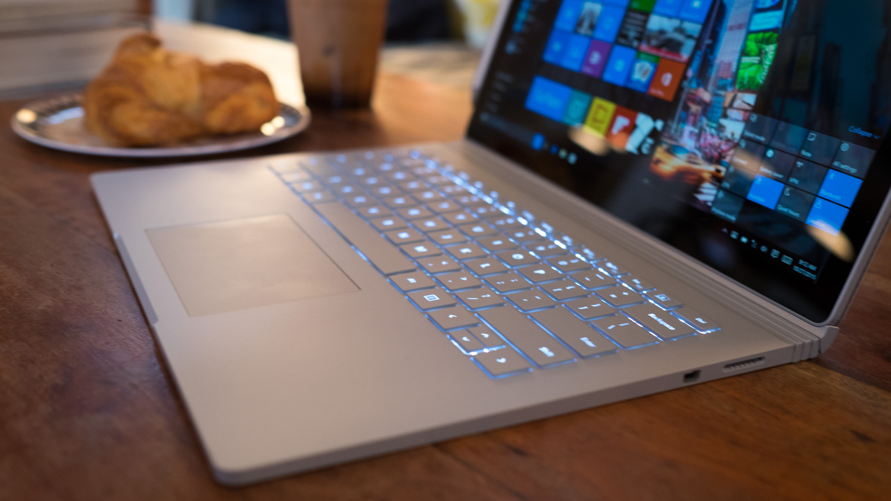
Once upon a time, a new version of Windows would release about as often as the US switches presidents. It was exciting to see updates because of how infrequent and dramatic they would be. That all changed when Microsoft unveiled Windows 10 to the public almost four years ago, in September 2014.
After that initial unveiling, Windows 10 would take over not only as Microsoft’s only operating system, but as an ongoing project that would receive three major overhauls in the following years. These include the celebratory Anniversary Update in July 2016 as well as the creative-centered Creators Update of April 2017 and Fall Creators Update of October 2017 – that’s not to mention Redstone 4, rumored to be the Spring Creators Update scheduled for next month.
The next major overhaul to Windows 10 is likely going to be the ‘Spring Creators Update’ (even if Microsoft won’t admit it), which is referred to internally as ‘Redstone 4,’ and will likely include a major update that will see Windows 10 S Mode replace the seperate Windows 10 S OS. At the time of this writing, Redstone 4 is being publicly tested alongside Redstone 5, the anticipated follow up. Windows 10 Redstone 4 will likely release on April 10, if reports are to be believed.
Meanwhile, Windows 10 is becoming a more versatile operating system, with features and platform support that extends well beyond the traditional PC and its users. Windows 10 on ARM, for instance, is gaining a lot of traction. On the hardware compatibility front, we could see a plethora of modes integrated into Windows 10 that adapts the OS based on whether you’re a gamer or child or another type of person altogether.
In the meantime, if you’re upgrading from an older operating system, Windows 10 Home will currently set you back a cool $119 (£119, AU$199), while Windows 10 Pro costs $199 (£219, AU$339).
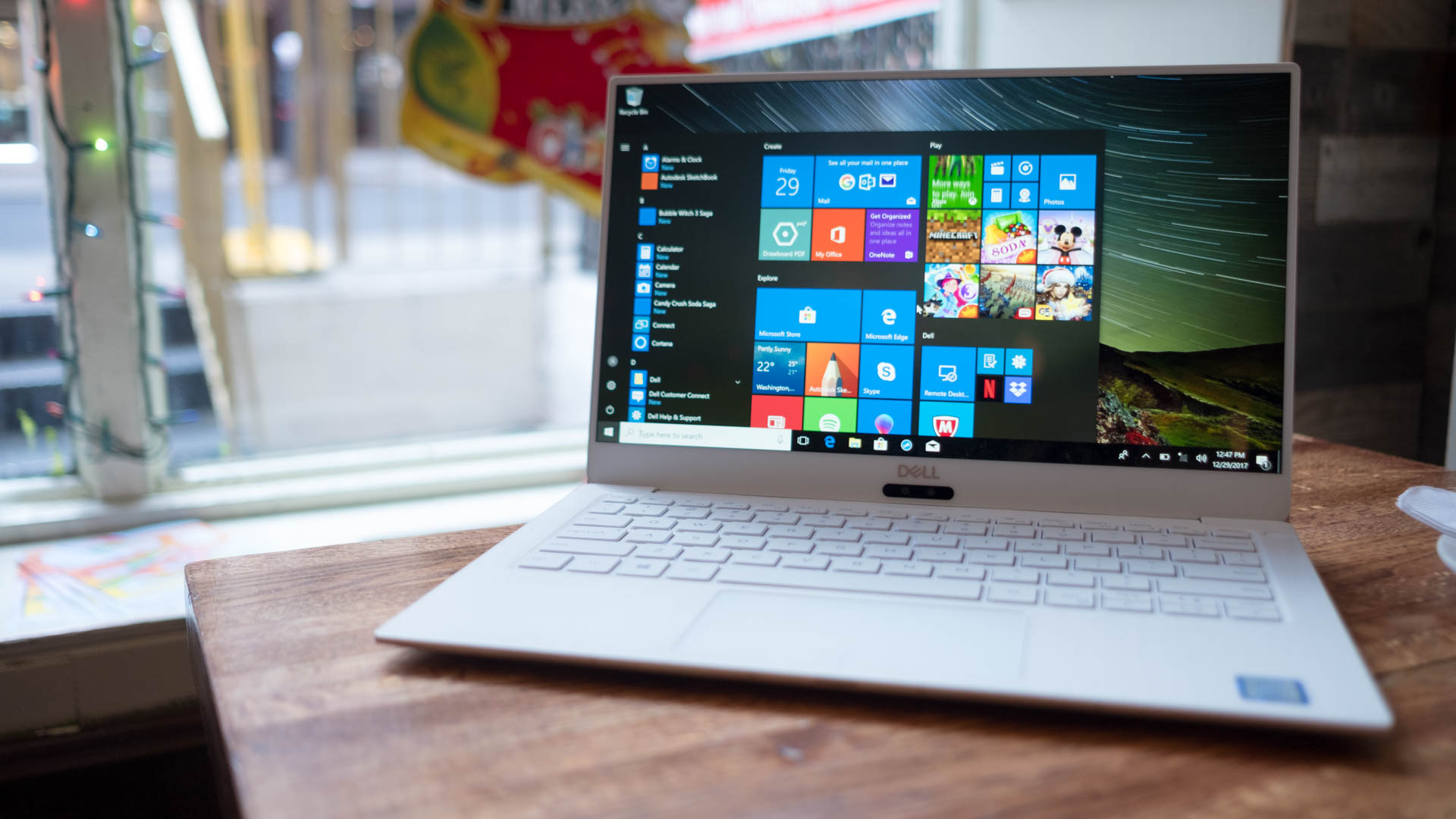
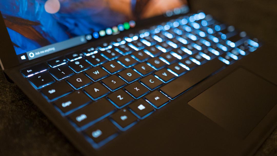
After first diving deeper into the major beats of the Windows 10 Fall Creators Update, now let’s determine for ourselves if it’s worth the price.
![]()
What’s new in the Fall Creators Update?
To be frank, anyone with fear of missing out should have already updated to the Windows 10 Fall Creators Update.
Yet, in spite of that belief, Intel might suggest otherwise, at least for the time being. With the Meltdown and Spectre processor vulnerabilities overtaking much of the conversation in consumer technology, the Santa Clara chipmaker has warned against opting into automatic Windows 10 updates because of the risk it currently poses to everyday users.
What you stand to gain from the latest major version update of Windows 10 starts with ‘Quiet Hours,’ a do-not-disturb feature that was recently revamped to allow for more in-depth personalization of when notifications should be turned off. The feature also turns on automatically for users sporting build 17074 or newer playing full-screen games or duplicating their displays.
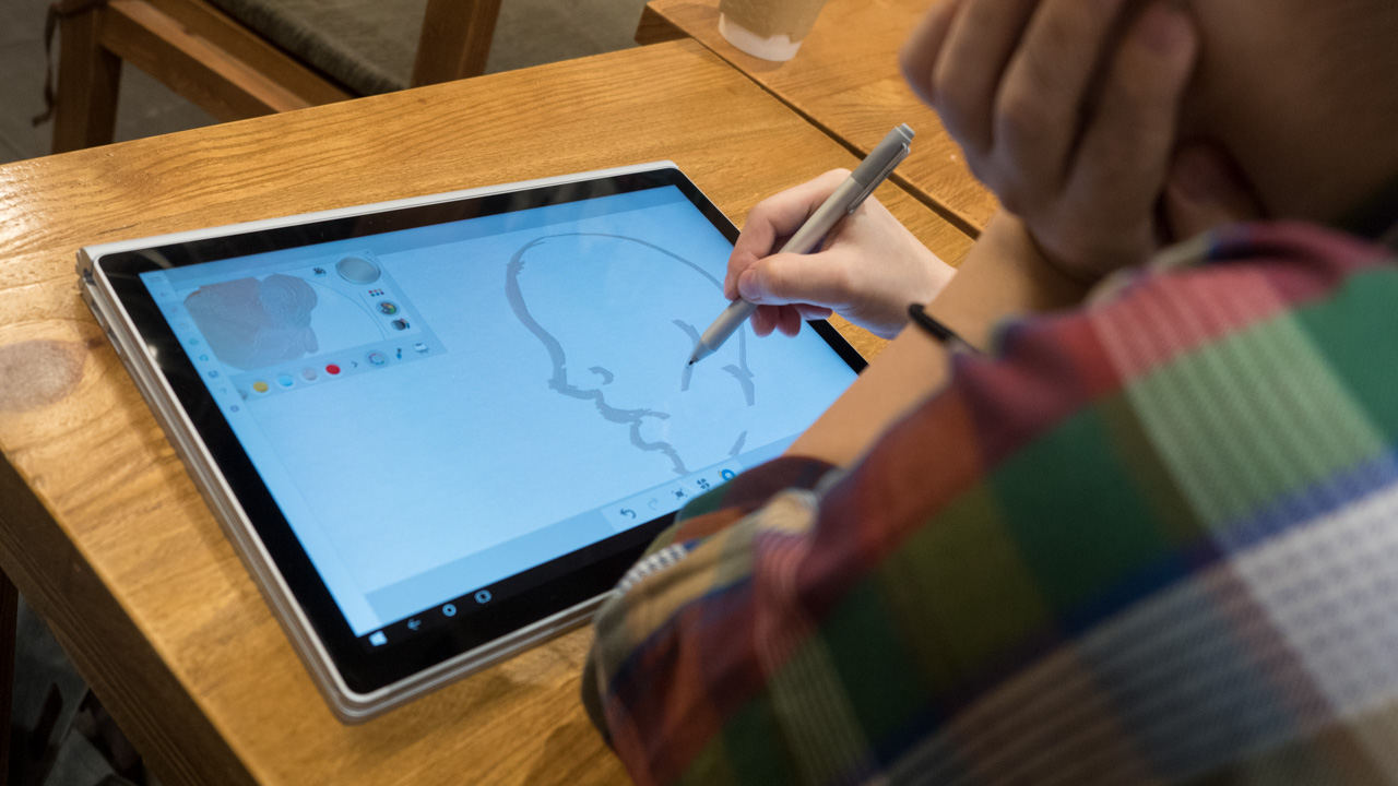
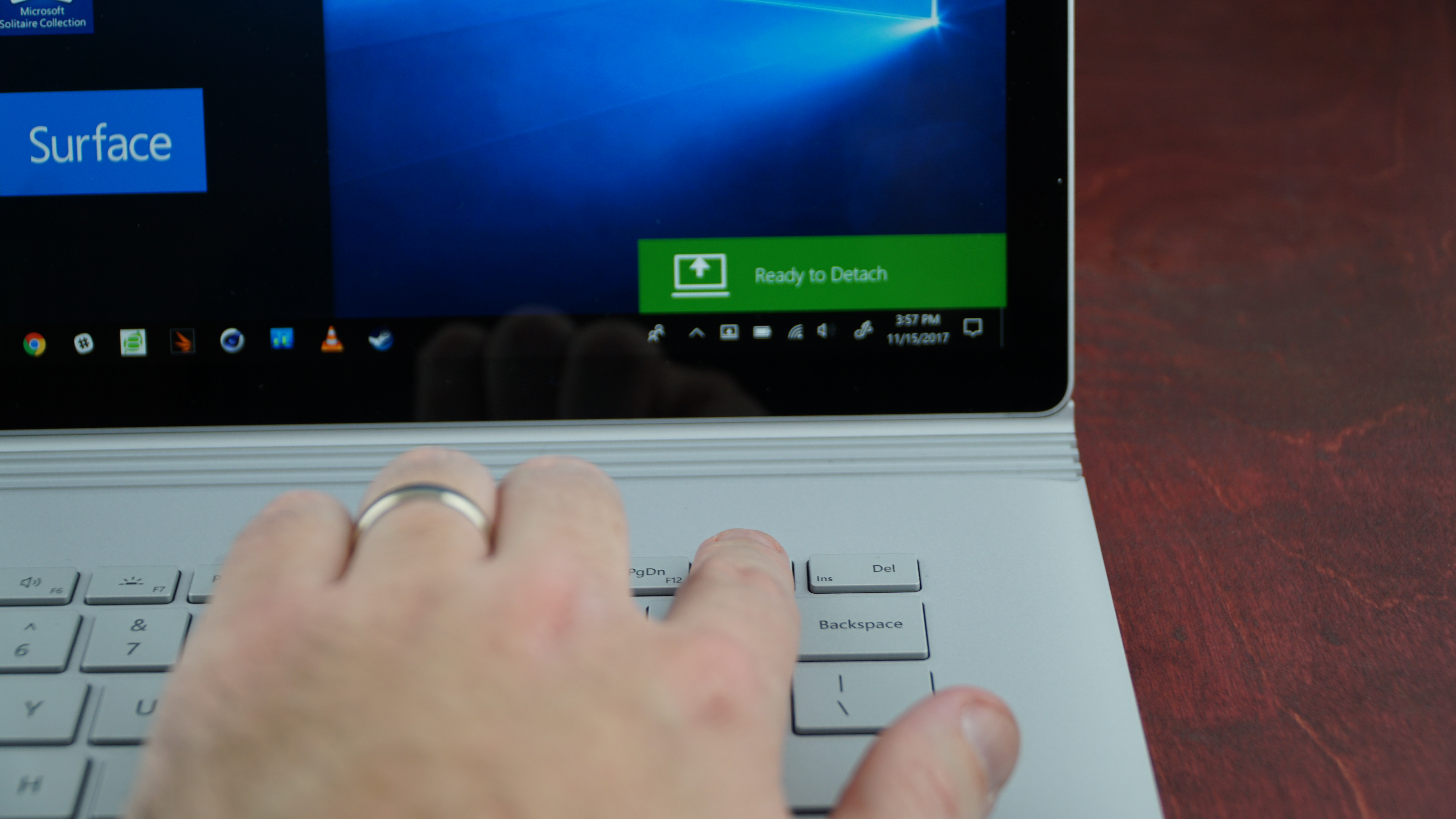
Also highlighted in the Windows 10 Fall Creators Update are a slew of enhancements for tablet and 2-in-1 laptop users wielding styluses. You can now, for instance, doodle from directly within PDF files or Word docs themselves, complemented by a new ‘Find My Pen’ feature that tracks where your stylus last touched the screen. That’s made better (looking) by visual improvements made possible by the Fluent Design system, which aims to modernize select facets of the UI.
However, more meaningful changes, like a more combative approach to ransomware, are appreciated as well. Specifically, the Fall Creators Update makes room for a ‘Controlled Folder Access’ toggle, letting you preclude unauthorized apps from getting their hands on your files.
Eye Control, too, has made its way into the Windows 10 Fall Creators Update, as has a Mixed Reality Viewer. Without the necessity to purchase one of the company’s affordable Windows Mixed Reality headsets – also compatible with the OS – you can now integrate 3D objects virtually into your home or workspace using your webcam or USB camera.
And, iterating on the Paint 3D software introduced in the spring Creators Update, Fall Creators Update users can take the 3D models they’ve created and integrate them into outside applications, such as the suite of Office 365 programs. Thanks to AirDrop-inspired Near Share, you can also go as far as to share them with other PCs in your area.
On a less productive note, the Windows 10 Fall Creators Update hones in on the fact that, according to Redmond’s sources, more people now watch games than actually play them, though 200 million people are still playing them on Windows 10. In the Fall Creators Update, Mixer, Microsoft’s answer to Twitch and YouTube Gaming, will be even faster.
There are plenty of non-gamers that will certainly enjoy the new ‘Memories’ and ‘Stories’ portion of the Windows 10 Photos app. With these new features in tow, you can modify images like never before by adding to them 3D effects, transitions, Ink and even video.
So what’s next for Windows 10? Well, for starters, Windows 10 S– the lightweight alternative to Windows 10 Home and Pro announced last year alongside the student-focused Surface Laptop– may soon be getting a name change. That’s according to Microsoft watchdogs at Neowin and Thurrott whose sources claim that Windows 10 S will soon be known as Windows 10 S Mode.
In turn, being a ‘mode’ rather than a full and separate release, Windows 10 Home and Pro users will have to unlock access to the x86 and x64 programs excluded from Windows 10 S Mode. While it will allegedly cost nothing to unlock a Windows 10 Home license moving from Windows 10 S Mode, those looking to get the most out of Windows 10 Pro will have to shell out $49.
Night Light
Getting the smallest – but perhaps most welcome – change out of the way, Microsoft’s answer to Night Shift on macOS Sierra is an effective and welcome feature for people that tend to use computers at all hours of the night.
What’s even better than competing solutions is how you can adjust the tone of the color change in addition to the standard setting of whether the mode kicks in at sunset local time or activates within set hours.
![]()
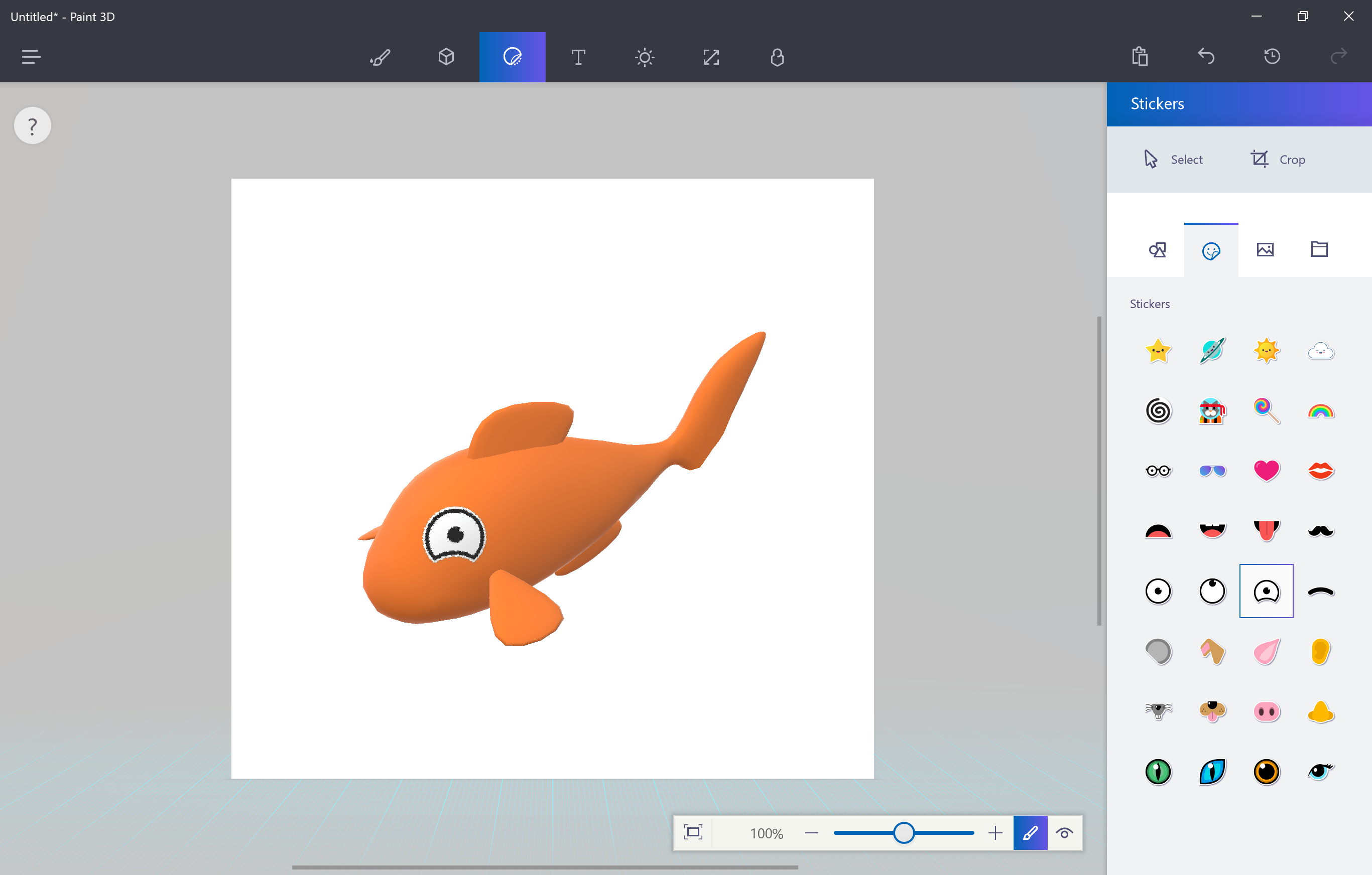
Paint 3D
The coolest-sounding feature of the major Windows 10 changes in the Creators Update doesn’t disappoint. When seeing it firsthand, creating three dimensional pieces of art truly is as simple as Microsoft demonstrated it on stage at the update’s reveal event.
Then again, it’s clear that this app has the capacity to allow for quite a bit of complexity in what can be created, too. Most of that simplicity comes down to how intuitively the app communicates three dimensions in a two-dimensional space. Clever, minimalist use of sliders and other toggles allow you to shift your creation’s position(s) on either axis.
Of course, a wide selection of pre-loaded creation templates – like goldfish – will help newcomers out immensely. Naturally, it wouldn’t be Paint without the ability to freehand in 3D, and thus comes the desire to share those custom creations. That’s where Remix.com, Microsoft’s online portal for sharing these Paint 3D projects, comes into play.
The way in which Paint 3D communicates how to create in a new dimension so easily for the average user, yet offers the depth to please them as they increase in skill, could do a lot of good for the 3D printing scene, as well as VR and so many other fields further down the road.
Granted, this is by no means a professional-grade 3D modeling app – this is purely meant for the vast majority of Windows 10 users. (Though, you can export anything created in Paint 3D as 3D-ready FBX or 3MF files for 3D printers.)
Regardless, we’re already impressed with what Paint 3D can do, and only hope it grows from here. Oh, and don’t worry, the old Paint remains untouched.
![]()
Gaming
Microsoft has been beating the drum of the PC gaming renaissance since the debut of Windows 10, but has ramped up the tempo with the past few major updates. In keeping with the crescendo, the Creators Update will likely have the biggest impact on gamers of any gaming-focused Windows 10 improvements to date.
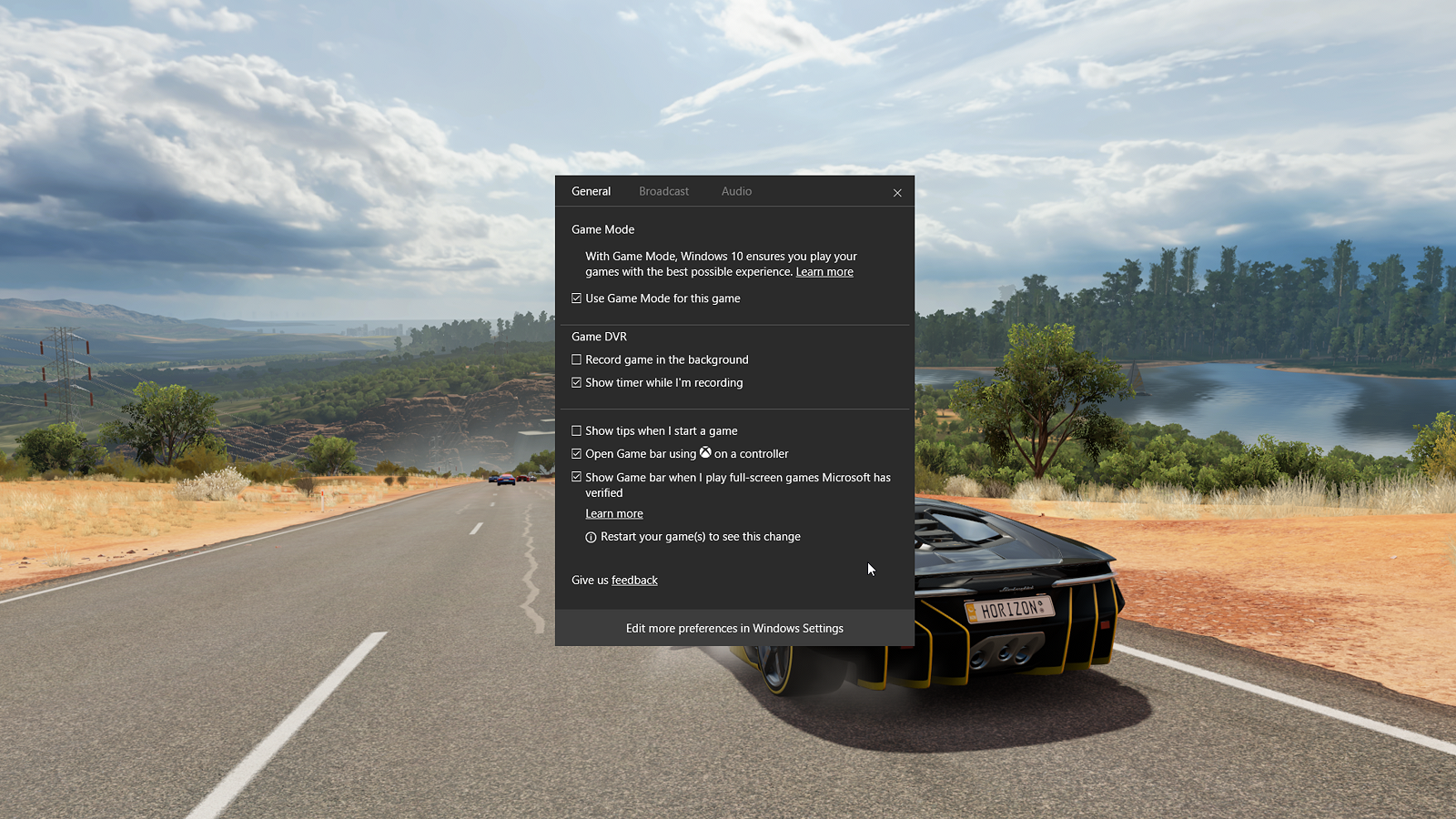
The most exciting, but least proven, feature to come in this update is Game Mode, a new toggle that’s now part of the Windows 10 Game Bar (which too has seen some upgrades, but more on that in a moment). Game Mode tells your system to re-allocate CPU and GPU hardware resources to prioritize the gaming application at hand when it’s the active, full-screen application in use.
The results, as Microsoft claims, are steadier frame rates than before, notably with games that particularly tax a given system’s resources.
We’ve already covered how Windows 10 Game Mode works in great detail. Though, Microsoft already warns that Game Mode brings the most benefit to systems that aren’t absolutely optimized for gaming.
Microsoft is also looking to seriously up the reach of, and community around, games played on Windows 10 by purchasing a streaming platform: Beam. In reality an acquisition made by the firm recently, Beam was a PC game streaming and broadcasting platform similar to that of Twitch, replete with its own streaming network via web browser, converted into a baked-in Game Bar feature. Microsoft has since renamed this streaming platform as Mixer.
Mixer’s major claim to fame here, though, is that it maintains sub-second latency from the broadcaster’s executions in-game to those moments being displayed to your PC screen via stream. In other words, for broadcasters, this reduction in the time between what you’re doing in-game and your viewers seeing it makes interacting either way that much more interesting.
And that’s not to mention how dead simple Microsoft has made it to stream to Mixer from Windows 10.
Like Game Mode, Mixer is, again, a function of the Game Bar. Upon pressing that dedicated broadcasting button on the Game Bar, and then just a few clicks and toggles after that, you’re broadcasting to Mixer viewers worldwide. That’s after creating a Mixer account, as well as an Xbox Live account if you haven’t already, of course.
However, there’s an issue with this. While we’ve seen firsthand how simple it is to get streaming using Mixer, and broadcasters know how complex this can be, you can only broadcast to Mixer. Of course, this makes sense, but aren’t the type of people that would benefit most from super-simple streaming more interested in broadcasting to Facebook or somewhere else their friends are more likely to be?
A Microsoft engineer seemed to think this was a good point when we made it to him just after demonstrating Mixer for us recently – so, hey, maybe that dream will come true.
Ultimately, Microsoft has just made gaming a much bigger consideration of the Windows 10 environment. It even has its own section in the Windows 10 Settings pane: ‘Gaming’.
The new set of, well, settings allows you to tweak how the Game Bar is summoned or whether it’s on at all, as well as customize keyboard shortcuts to activate its various functions. There are also toggles for Game DVR, like changing save location, enabling background recording, and setting frame rate and video quality among others.
Rounding out the Gaming settings are broadcasting controls like audio quality, volumes, which camera to use and more – the Game Mode setting is just an activation toggle.
First reviewed: July 2015
Gabe Carey has also contributed to this review
While making things in 3D or blowing them up is a jolly good time. There’s so much more going on in Windows 10, especially with what Edge has become in the Creators Update in tandem with Microsoft’s release of a Books section to the Windows Store. But, let’s start with some minor improvements to Microsoft’s voice assistant.
Cortana
The new changes to Cortana are less about using the service directly and more about how it can simplify how you use your PC. If you’re using Outlook or Office 365 as your email client, Cortana can read those messages and create reminders for you based on the language of your emails that contain commitments to deadlines and other promises.
Apparently, Cortana is also key in holding onto whatever apps and documents you had open, and where you were in those apps and documents, if you return to your PC within 30 minutes of locking it. But, that’s not really all that exciting, as your computer generally already does this, unless you have it set to sign you out every time the device locks.
However, Cortana’s ability to do this even after rebooting is far more impressive (at least on paper), since any caching is generally wiped upon reboot. In this early version of the Creators Update, we weren’t able to to reproduce this feature, so hopefully it will be ready come the update’s April 11 roll out.
![]()
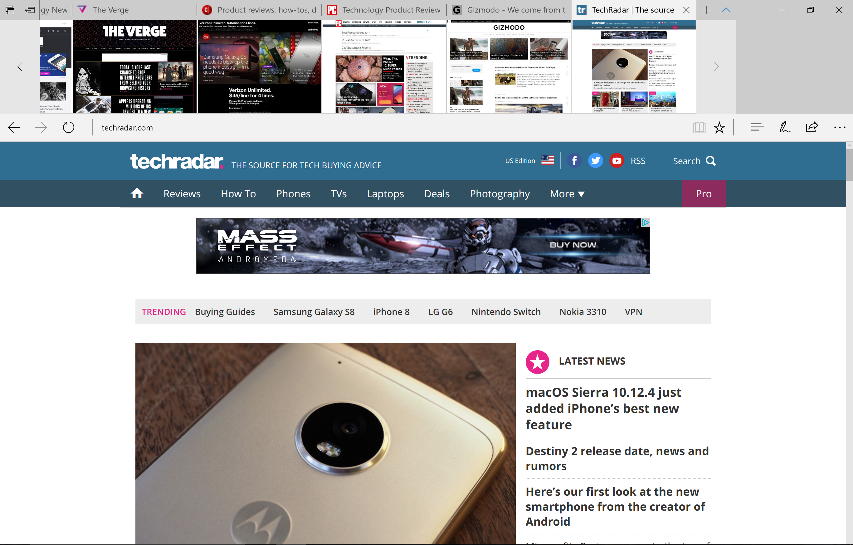
Edge
There’s no denying that Microsoft is funneling a lot of energy into making its new Edge browser competitive with that of today’s king, Google Chrome. Most of the changes this time around focus on things that Microsoft has noticed its competitors lack. For starters, the way tabs are handled in Edge has been vastly improved.
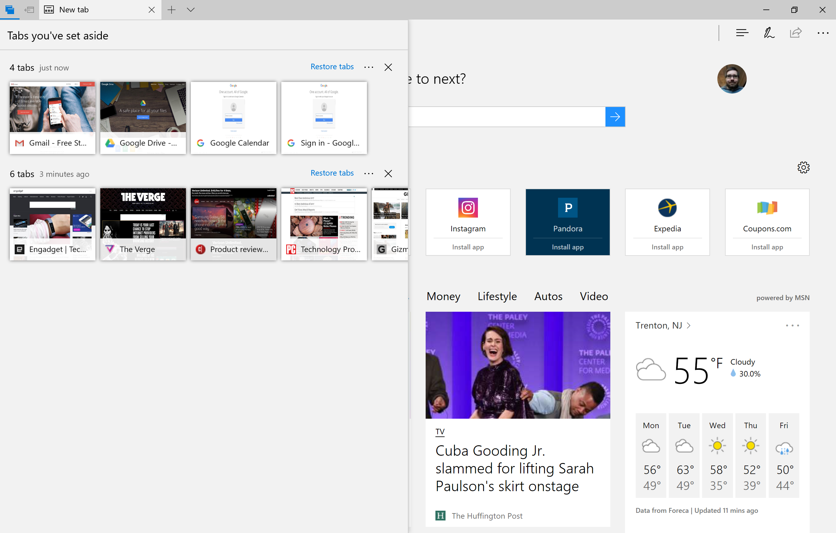
Tab preview has existed in Edge for a long time, but in a singular fashion. Now, a downward arrow next to the “new tab” button produces a preview of every open tab. Of course, these are just tiny thumbnails captured when you first accessed the web page – they’re not dynamic and do not update.
Even better, you can now take a set of tabs and stow them away for later access with a new, dedicated button. Once you do that, you can view those tabs in addition to any other sets you’ve “set aside,” with the option to restore those sets of tabs, add them to your Favorites or share them via email or OneNote. You can also delete sets of saved tabs or individual ones.
![]()
However, mind that restoring them brings back the cached version of those tabs from when you last accessed them, so you’ll need to refresh the pages. If you’re going to do this anyway, this is a step Microsoft should eliminate.
Another bummer is that you cannot name your saved sets of tabs. While you see them in the same preview format that’s available above the navigation bar, it would make sense to be able to name them according to web workflow, like “Work” and, say, “Gaming Broadcast Setup.” If organization is what you’re going for, you gotta’ have a label maker, so to speak.
At any rate, the new tab management tools are certainly helpful, especially for people who browse tabs with their mouse, rather than with keyboard shortcuts, but we’re dubious of whether they’re compelling enough to pull folks away from Chrome. That said, it all works fluidly. Plus, those tabs are saved even after closing Edge.
Also, the new sharing design language is a welcome change that makes as much sense in the desktop environment as it does on mobile. In other words, it’s basically the Windows 10 Mobile, window-based sharing format come to Windows 10 proper.
![]()
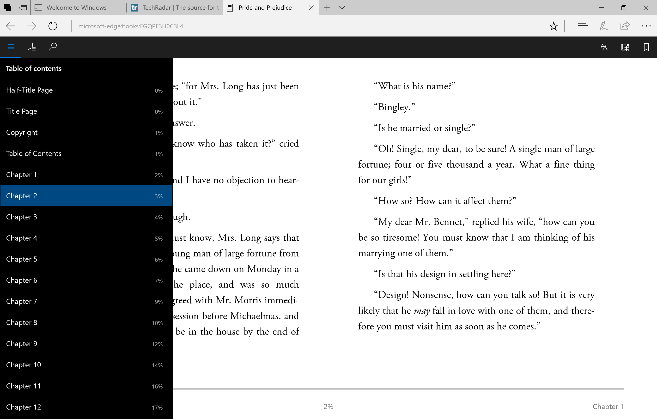
Books
As you may already know, the Creators Update turns Edge into a full-fledged e-reader, supporting the EPUB file format. This update comes in conjunction with Microsoft launching a Books section in the Windows Store. The pricing and selection for which is comparable to rivals, replete with a collection of free literary classics as well as staff recommendations.
And, the link between buying them and having them available for reading in Edge is practically instant, with Edge even offering a link back to the Windows Store to buy more books. The reader itself is quite robust, with tables of contents, bookmarking, search, text controls and even a text-to-speech read aloud function. And, the controls are silky smooth to boot.
Having turned Edge into a fully-fledged e-reader tool is admirable, but you have to wonder how many users will benefit from or take advantage of this feature. If people aren’t using e-readers like Kindles, aren’t they using tablets like an iPad or Android tablet? Since there are so few Windows tablets around, we doubt many will see this as a useful addition, it being a niche that’s long been filled.
Now, if Microsoft were to expand PDF support for Edge to enable file editing and more, we’d be much more excited about Edge’s expanding file compatibility.
While the changes to Edge and an all-new Books store in Windows 10 are pretty huge, almost equally as massive is how Microsoft have vastly broadened how Windows Ink can be used within the OS, primarily via the Photos app. Less massive are the other changes to its Photos and Movies & TV apps.
Windows Ink
Being able to ink over web pages in Microsoft Edge isn’t anything new, but being able to do so across other file types, like images in Photos, documents in Word, and even videos (with the Photos app, oddly), is a welcome addition. Of course, you can share these doodled-up files with friends using Windows 10, too. The Snapchat crowd ought to get a load out of this.
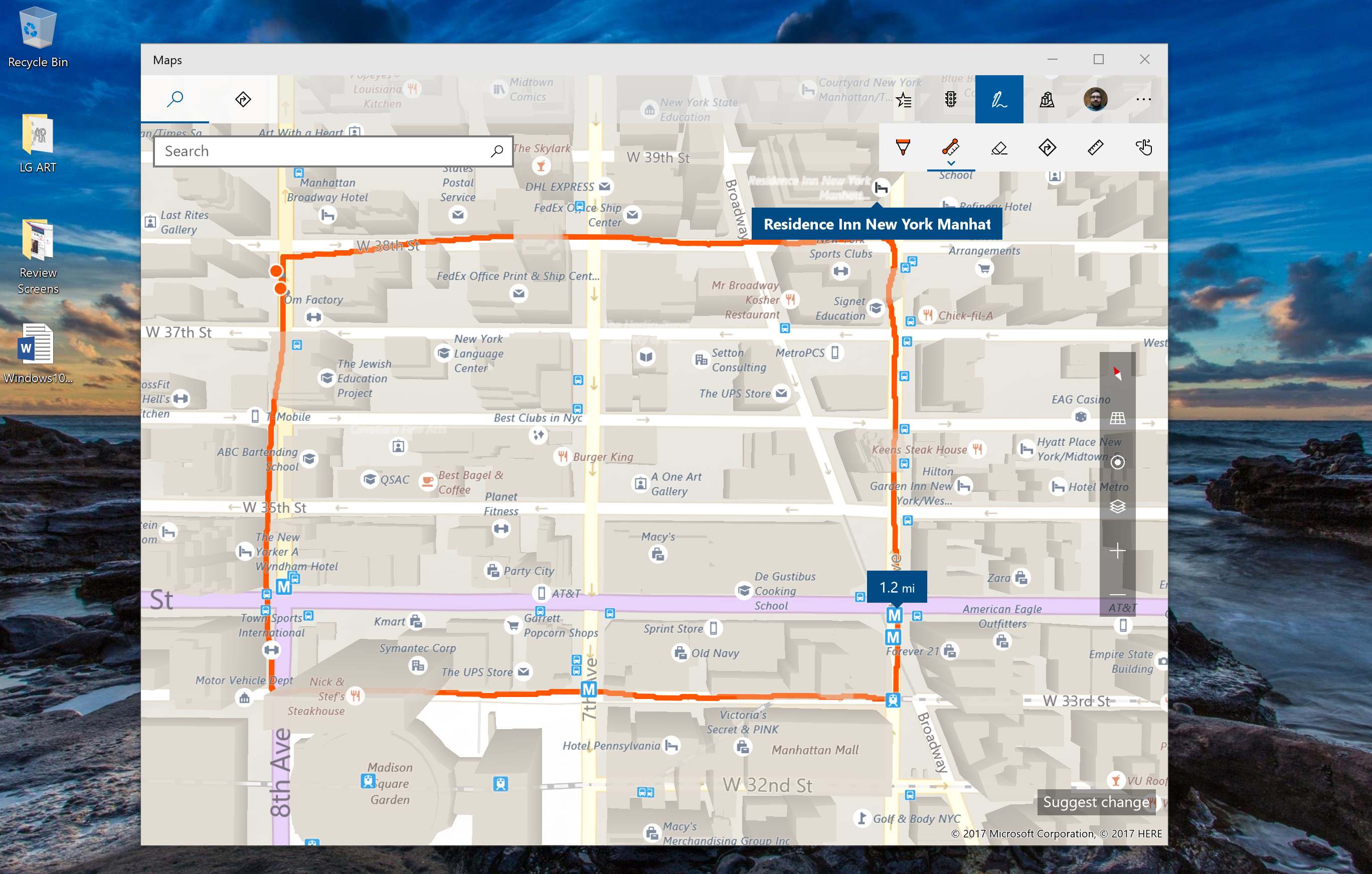
Microsoft has even expanded Windows Ink to its Maps tool. Now, you can doodle on maps and share them with friends to draw out plans. More interestingly, Windows Ink and Maps work in tandem to let you draw out either a straight line or contiguous path, producing the real-world distance of that line, no matter how long. Neat, but also useful for folks that actually enjoy the outdoors and exercise.
![]()
Scribbling all over, well, practically anything, feels unsurprisingly natural and responsive, and frankly feels like Windows Ink starting to realize its potential. However, we’re still left wondering whether these tools will meaningfully change how we, say, share photos and videos with friends or inked-up documents with coworkers.
At the moment, each iteration of Windows Ink controls in these basic apps – Photos, Movies & TV, Maps, etc – is simply littered with basic drawing, pointer and color controls; save for Maps. Perhaps that’s enough to get more people using their touch PCs to their full capacity.
Photos and Movies & TV
In addition to what Windows Ink allows you to do with images opened in this app, Photos now automatically attaches searchable tags to all of your photos according to when and where they were shot, as well as the people within them and notable landmarks or items you’ve got on film. While no less a welcome feature, does that sound familiar at all?
The Movies & TV app has been upgraded to support 360-degree video, but more importantly now supports picture-in-picture mode for Windows 10. Finally adopting one of the most exciting additions to macOS Sierra, Microsoft calls this “mini mode,” with a dedicated button to jump between orientations. The switching is super snappy in our brief testing, but a little janky as it repositions the video, with pixelation and exposed splotches of gray.
While not the most riveting of changes in any OS update, those found in the Creators Update are surprisingly substantial and are actually relevant to your use of the software. That’s particularly the case for the new “Fresh start” function, but more on that in a moment.
Security and privacy
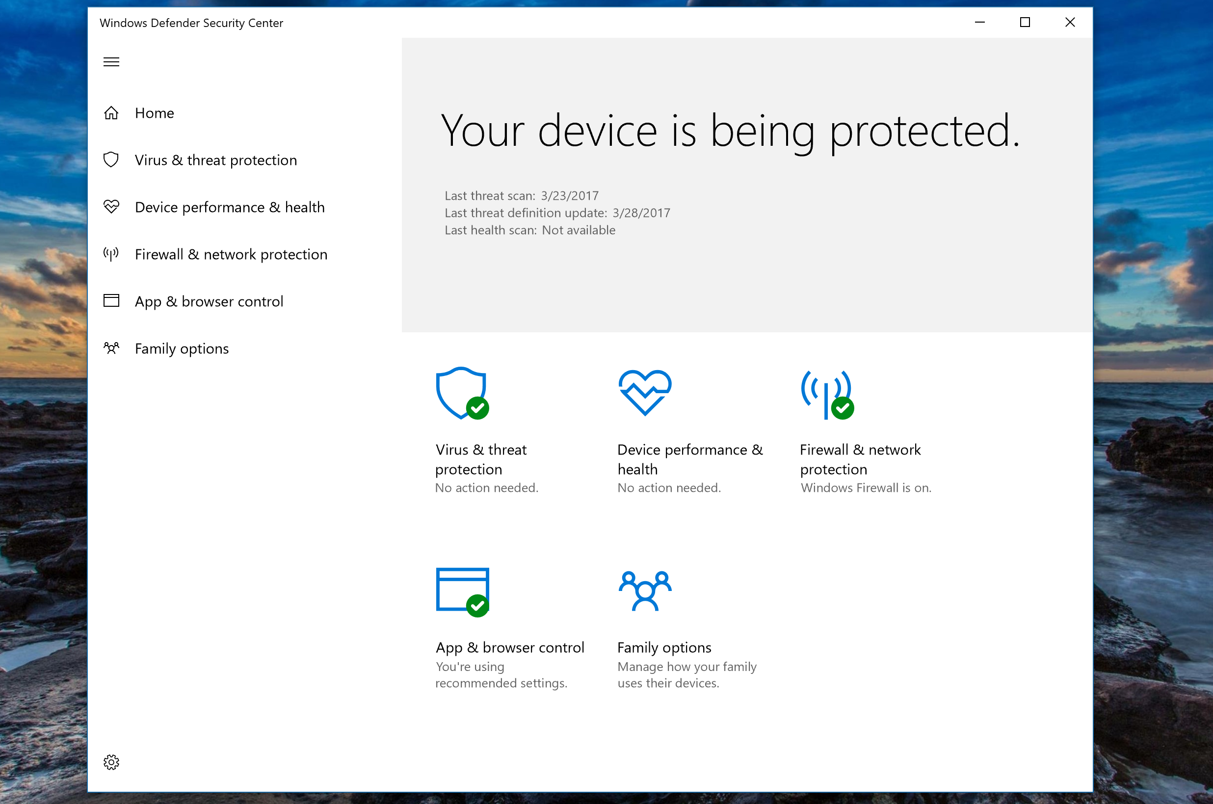
Microsoft has vastly improved its security and privacy measures for Windows 10 in the Creators Update, namely with a new Windows Defender Security Center. This new app takes in all of the functions of the original Windows Defender -- virus scanning and the like -- and couples them with new features.
One of the most interesting of which is the Device Health Advisor, which, while not yet entirely functional in our early test software, is expected to provide information on key system functions and their status through a scanning tool not dissimilar from Windows Defender itself.
All this considered, probably the most useful tool in the new suite is “Fresh start.” This tool allows you to reinstall a clean version of Windows 10 on your PC, maintaining your personal files but deleting any third party apps that came pre-installed on your device or installed thereafter. If you just bought a Windows 10 PC from a big name vendor that’s loaded with bloatware, this is the tool for you, and something Microsoft should be commended for finally taking a stand on.
![]()
Another oft-teased feature is “Dynamic lock,” which allows the PC to automatically lock when the webcam detects that the user has walked away from the device. However, this feature was too not available for testing with this early software, so we’ll have to test it out in full come April 11.
For the IT folks, Windows Defender Advanced Threat Protection (ATP) portal will now link to Office 365 ATP, so that IT managers can follow threats all the way from the source (for example, an email) to the problems it’s caused on a system or worse.
As for privacy, Microsoft wasn’t joking about the lengths it went to for improving transparency. For a start, the new setup experience is far friendlier and fully voice-acted for clarity. The voice-over clearly describes the purpose of each function as it relates to privacy, and the design no longer buries options with loads of jargon-filled text.
However, don’t expect Microsoft’s stance on the data that Windows 10 collects to change much, although it claims to have reduced the amount of basic, anonymized information that it gathers. For now, at least Microsoft has simplified its messaging on what data it collects (and at times shares) in two categories, not three: “Basic” and “Full”.
[Editor's Note:the following pages between here and our verdict are largely for readers that have not yet used Windows 10. Welcome, potential newbies!]
In basic use, Windows 10 is not a million miles from Windows 7. You've still got the Start menu, even though it's fundamentally changed (more on that shortly). Key functions are all accessed from the task bar, which has a flat, functional feel. The design language feels refined – window borders are smaller, for example. Anniversary Update adds a new dark mode that switches the interface and all your Store apps to a darker interface, if you prefer that in a dimly lit (or indeed unlit) room.
The key controls that Windows 8 put on the short-lived charms bar and the familiar pop-up notifications are combined in a new Action Center pane that you open by swiping in from the right or clicking a notification icon. In Anniversary Update, this moves to the right of the clock and shows the number of unread alerts.
Key settings are at the bottom of the Action Pane: Wi-Fi, Bluetooth, Airplane Mode, Tablet mode, a new Note feature for opening the built-in version of OneNote, and a link to the full Settings app. If you have a tablet you'll see the option to lock rotation. There's also a version of the Windows Phone Quiet Hours for blocking notifications, although you have to turn it on by hand rather than setting the times.
In the Settings app you can select which of these Quick Actions appear in the Action Center, as well as which apps can send you notifications. When notifications appear, you can swipe them away with touch, flick them with the mouse or just click the X to close, one at a time or for the whole group. Tap or click the down arrow to see more detail. There's a Clear All option, too.
In Anniversary Update, the number of notifications from a single app is capped – that includes Edge, which can give you alerts from websites you have open; instead of being able to send unlimited updates, each app is limited to the three most recent ones. If you connect an Android or Windows 10 Mobile phone to your PC you'll also get notifications from your phone apps here.
![Phone notifications]()
Right click on a notification group and you can make it high priority or turn it off (this isn't available for all notification groups, but you can always open the notification area in Settings to tweak things there). Notifications get richer; apps can use images, add buttons or let you reply to a message directly – messages from the new Skype app have notifications in the Action Center that let you reply, as do text messages that are synced from your phone.
The task bar
Microsoft keeps tweaking the look of the task bar slightly. The Windows button is always there (and you can still right click on it for the power user menu of shortcuts from Windows 8), plus you can shrink or hide the Search box next to it. Pinned icons get a subtle coloured bar beneath them when the app is open that shows a second bar at the side if the app has multiple windows (with a shaded overlay for the current app that also shows multiple windows).
The notification area (which you might still know as the system tray) still expands into a pop-up window if there are more icons that will fit on the task bar, and you can still drag most – but not all – of the icons into the order you want. The icons for the touch keyboard and the new Ink Workspace are fixed next to the clock (although you can turn them off, you can't move them). You can still hover your mouse in the far right corner for a quick look at the empty desktop (Aero Peek), or click in the far right corner to minimize all your windows, but that's now to the right of the Action Center button.
![Touch emoji]()
The touch keyboard has new emoji. Six of those celebrate the Windows Insider ninja cat character, many of them are redesigned to match emoji on other platforms more closely and there's a new skin color button that lets you change the skin tone for many of the icons with faces – so you can pick from six shades including Simpsons yellow. You still have to hunt for the emoji you want though – we'd like to see the Windows Mobile keyboard show up here, which suggests emoji along with other auto-correct suggestions.
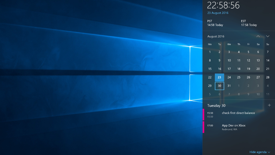
Clicking the clock opens the new clock and calendar pane with any alternate clocks you have set, and a monthly calendar. In anniversary update the latter shows your agenda for each day as you click through (taken from the Calendar app, so it's worth connecting that to your accounts even if you don't use the app itself).
![Clock agenda]()
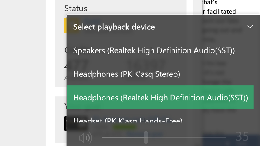
Also new in Anniversary Update is a handy extra on the volume control – plug in headphones or speakers or connect a Bluetooth audio device and you get a pop-up menu for choosing which audio output you want. Annoyingly, Microsoft is still blocking Store apps from showing up in the Volume Mixer, so you can choose different volumes for IE and Windows Media Player, but not for Groove and Edge.
![Swap audio]()
The Start menu
Windows 10 combines the live tiles of Windows 8 and the familiar Start menu into a new, re-sizable menu. You can pin tiles for your favorite apps to see at-a-glance information like upcoming meetings, weather forecasts, news stories, sports results and messages from Twitter, Facebook and email. Tiles animate to show new content and you can group and name them the way you could in Windows 8. How useful you find them depends on which apps you like enough to pin.
![Start hamburger]()
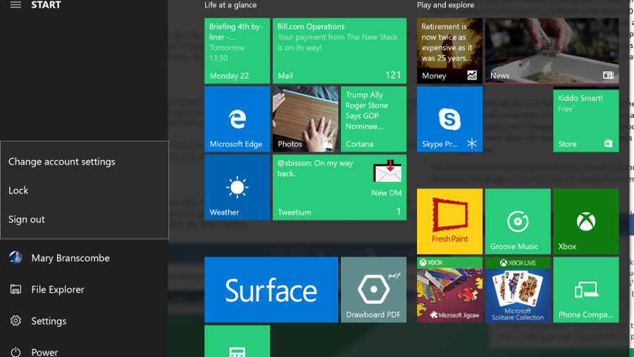
The rest of the Start menu is a scrolling list of apps and controls. Anniversary Update divides this into two: on the left is the increasingly ubiquitous hamburger menu that you can expand for a reminder that the tiny icons are (in turn) a fly-out menu letting you change your account settings, lock the PC or sign out, along with icons for File Explorer and Settings and another menu with the power options. Annoyingly, expanding this section hides the rest of the apps list, so you can't leave it expanded.
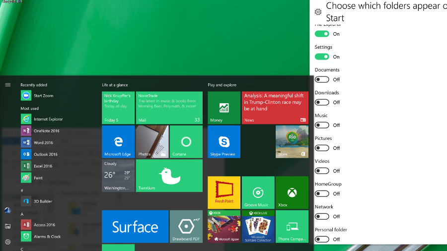
Right click on the Explorer icon for a jump-list with pinned and frequently used folders. If you dig into Settings, you can add extra folders, but only from a standard list.
![Add to start]()
The scrolling lists of apps have been slightly rearranged in Anniversary Update; at the top is a Recently Added section that appears when you have new apps. Below that is a list of Most Used apps, followed by a Suggested apps section that you can turn off (but that also hides the tips on the mobile-style Lock screen). All of that pushes down the alphabetical list of what you have installed so you may not see many of them without scrolling.
You can search from the Start menu by starting to type – that gives you the same result as tapping in Cortana's search box next to it.
Cortana
Microsoft's virtual assistant, Cortana, still powers the search box on the Windows 10 task bar – where you can type or speak – and in Anniversary Update you can no longer turn her off (though you can turn off personalization if you don't want her to remember things for you). But Cortana goes a long way beyond search, so you probably want to keep her around.
Searching with Cortana is fast and accurate. It finds your files, it finds your folders. It has become quite brilliant. Say, for example, that you type LinkedIn into the menu: you'll be given the option to open the site in your default browser (even if it's Chrome), or you can search for LinkedIn in Bing.
![Cortana]()
Depending on what you search for, different types of results are prioritized – so the first result might be a setting, an app, a document or a web search. You can also pick the category to search: apps, documents (including OneNote and files on OneDrive that you're not syncing), folders, music, videos, photos or settings.
Type in a sum or a currency conversion and Cortana does the maths for you. Type in the name of a city or a celebrity and you get a nib of relevant information – that all comes from the answers you get for those kind of searches on Bing, but if there's a match in your documents for the same term you'll see that first. The only annoyance is that you can't pin the search results open – if you need to open a couple of documents from the results, you have to run the search twice.
Type in commands like 'remind me' to set quick alarms and appointments. And in Anniversary Update, you can use that to remember useful information like your passport number, or anything else you want to jot down. Ask Cortana 'what is my passport number' later and you'll see it pop up. Type 'send a text' to write an SMS on your PC and send it from a phone you have the Cortana app installed on. You can also ask her to sing you a song or tell you a joke (they're usually terrible jokes).
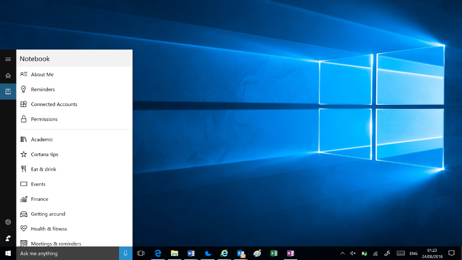
Cortana uses the news interests you set up on Bing as well as your search history to show you news stories and refine search suggestions – these, your reminders, accounts Cortana can get information from (ranging from Xbox Live and Office 365 to Uber and LinkedIn) and other information about your interests are stored in the Cortana Notebook.
![Cortana notebook]()
You can customize settings for different areas of interest, from Academic Topics to Getting Around, Music, Food and Drink or Weather, or turn off topics you don't want. Reminders and interests sync across every device you use Cortana with, so you can set a reminder on your phone and see it on your PC, or vice versa.
You can also change Cortana's settings to turn voice control on or off, choose what Cortana can index to learn more about you, and clear the history that makes searches more accurate.
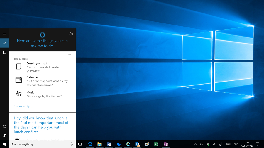
If you just tap or click without typing anything, Cortana shows you upcoming appointments, Windows tips, news, weather, how many steps you've walked (courtesy of Microsoft Health), along with any activities from your email that look like trips and flights Cortana could track for you. You also get suggestions for other things Cortana can do like keeping a note of when you usually have lunch and warning you if a meeting would clash with that.
With Anniversary Update, Cortana also makes an appearance on the Lock screen, showing upcoming appointments. Initially, that might sound like more of a mobile or tablet feature, giving you a quick overview of your day when you first pick up your device. But if you often leave your PC on and let it lock, seeing a quick glimpse of your calendar from across the room is very handy, and you can use Cortana on the Lock screen to ask questions, set reminders and control the music you're playing.
Annoyingly though, if you turn off Suggested apps in the Start screen, where they take up a lot of space, you also lose Cortana suggestions on the Lock screen, and you can't use the frequently updated Windows Spotlight images – you have to pick one or more images on your PC to be your Lock screen background.
We'd like to see Cortana do a lot more – there are apps like a network speed test built into Bing that it would be great to see inside Cortana – but this is evolving to be a really useful tool that gives you a quick way to do things you'd normally open an app for. Get into the habit and you'll find you keep turning to Cortana – Microsoft's digital assistant could evolve into a whole new way to use your computer. And if you don't like any of that, it's still a great way to search your PC.
![File Explorer]()
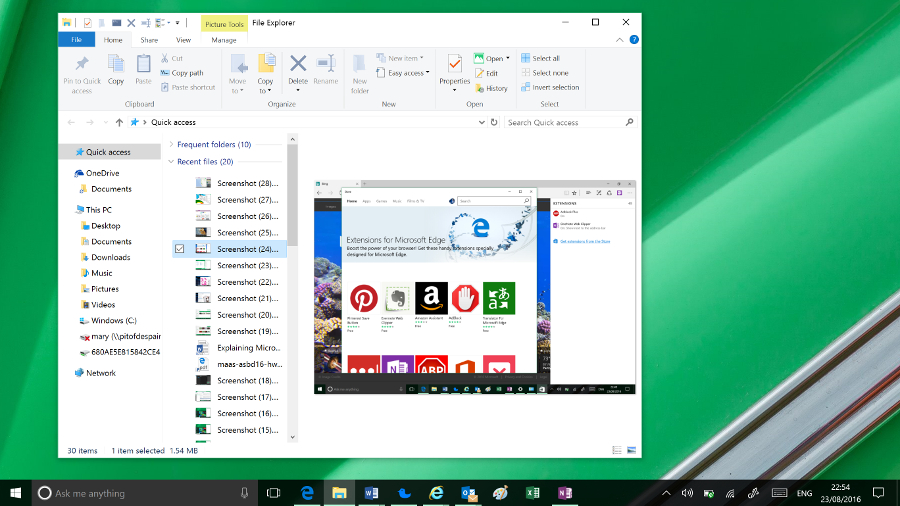
File Explorer enhancements
File Explorer has been given a little bit of a makeover, and in Anniversary Update it gets a new icon. You now have a Quick Access area to which you can pin and unpin any folders you want to regularly access. In the 'home' screen of File Explorer you can also see Frequent Folders and Recent Files. It's much more helpful now.
You can pin things permanently to Quick Access by right clicking them and selecting Add to Quick access.
There are a lot more file operations that you can access on the ribbon at the top of the window without the need to use the right click menu.
The old Windows 8 Share logo is now used for file sharing from all apps. You can choose to email a file straight from the File Explorer window or add it to a ZIP file.
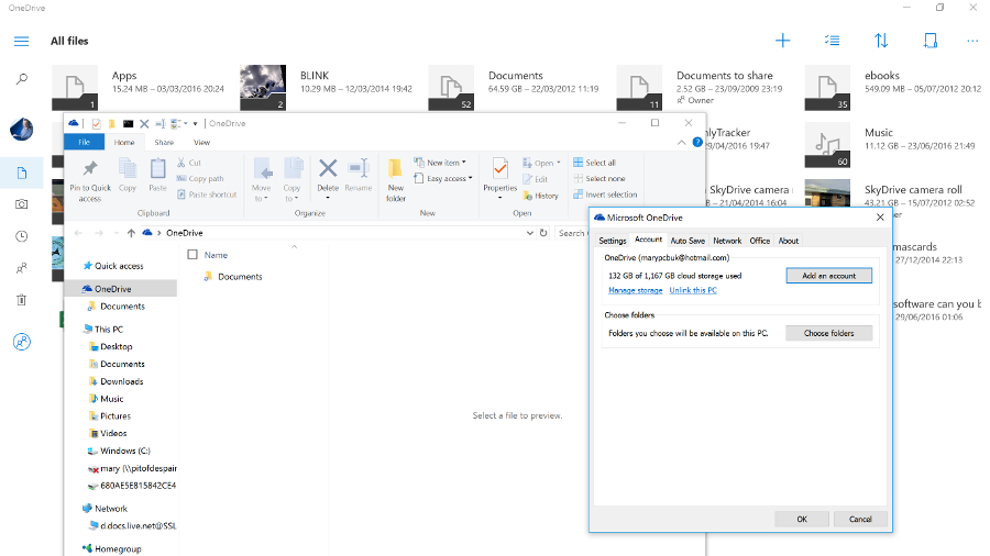
![OneDrive not integrated]()
Microsoft OneDrive gets a section in File Explorer, but that's only a shortcut to files and folders you've chosen to sync. You no longer see placeholders for files that are only in the cloud – a feature that confused some users but also made your whole cloud drive available at any time. To see your files in the cloud now, you have to go online and use the OneDrive Store app.
Settings
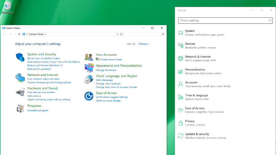
In Windows 8, this was annoyingly basic and many options were still in the Control Panel. Control Panel is still there in Windows 10, and if you're a technical user, you will come across it from time to time. But the majority of users will never see it.
![Settings]()
Settings is now a far more comprehensive solution and is much more logically arranged. There are still a few things you'll need the Control Panel for – to reset a network adapter, for example – but they're few and far between.
You've been able to search the Control Panel from the Start menu since Windows Vista – with the Settings app in Windows 10, what you get from that search is a clean, clear interface where you can easily see what it is you need to change.
Microsoft is still keen to get developers to build new mobile-style apps for Windows 10 that are more secure, don't get to do things that affect performance and battery life, can be uninstalled with a single click, and can potentially run on multiple devices. The hope is that developers will write their apps for the Universal Windows Platform and they'll work across PC, Windows 10 on smartphones, and Xbox, too – essentially on every screen size.
There are tools to help developers convert Android and iOS apps, and even desktop PC apps. Businesses can deploy apps from their own versions of the Windows Store. This is all handled from the Business Store Portal, which will manage software licences, centralized payment info and more.
Universal Apps and the new Windows Store
Universal apps are the latest version of what Microsoft was calling Metro, Modern and Store apps in Windows 8. Apps written for Windows 8 will still run, but with the Charms bar and the touch gestures for opening app controls gone, Microsoft has crammed in a rather awkward menu bar of app commands for any apps that haven't been rewritten for Windows 10. Apps that have been rewritten tend to use the hamburger menu, which gets annoying on a desktop PC where there is plenty of space on-screen for navigation but the hamburger menu keeps hiding the options.
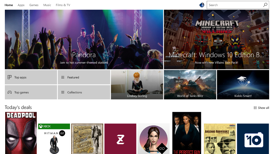
Windows 10 is slowly getting more apps: there's a new Amazon app, there's a good VLC app and if you buy a wireless security camera like the Ring you'll find an app here for it. But the Store is still smaller than the iOS and Android equivalents.
![Windows Store]()
In Anniversary Update, the Store gets yet another redesign, full of top picks, featured apps, lists and collections. It feels like there are almost as many ways to look through the apps as there are interesting apps to look for.
![Photos OneDrive]()
Built-in Windows 10 apps
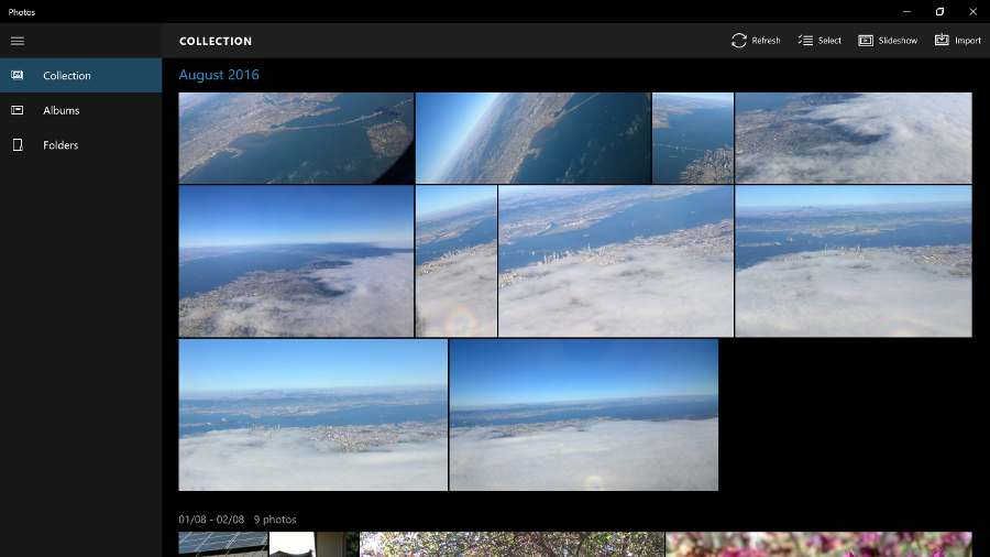
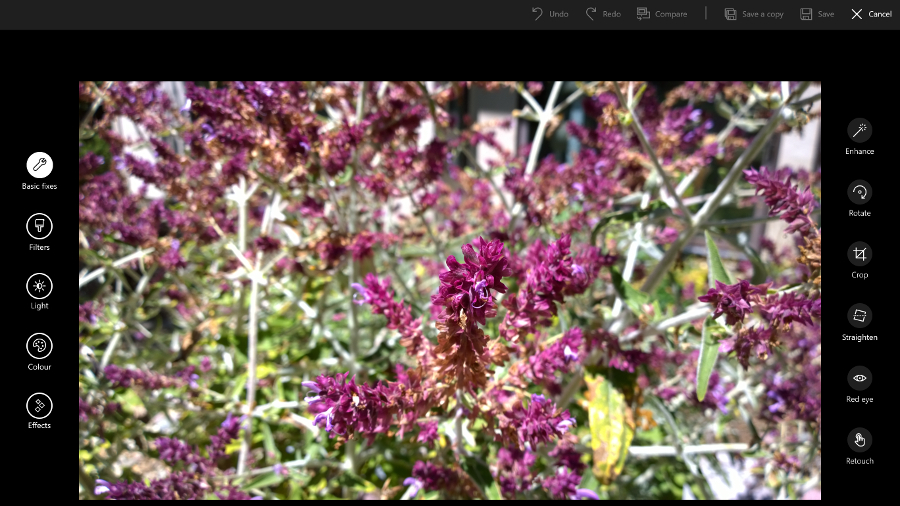
However, the operating system's built-in apps are still improving, and Anniversary Update adds some extras. The new Photos app shows you all the pictures on your PC and in your OneDrive account, with some handy editing tools. It's fast, responsive and easy to use.
![Photos edit]()
The Mail and Calendar apps don't match Outlook – either the desktop or the smartphone versions – but they're perfectly functional and competent apps.
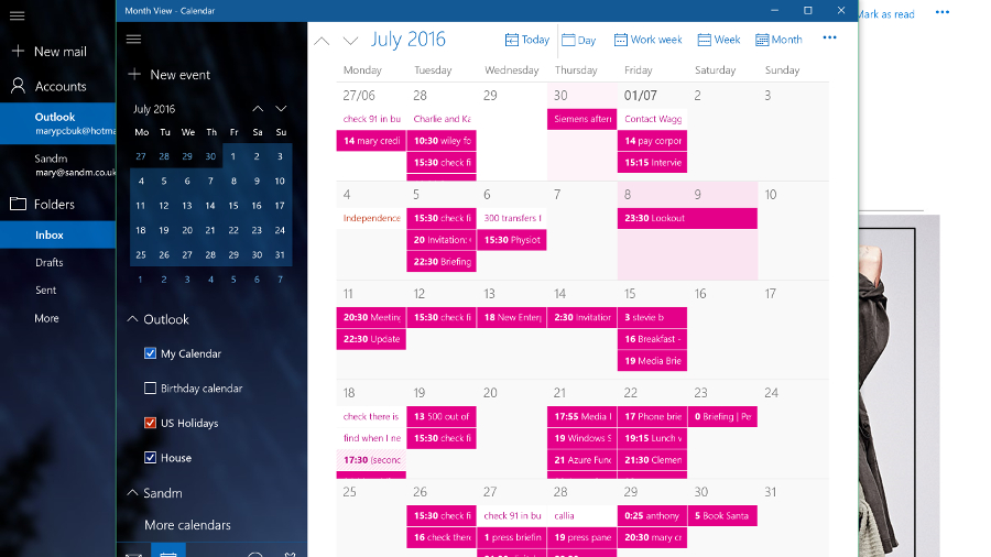
![Calendar]()
With social media integration gone (Twitter and Facebook wouldn't play along and other social networks don't seem interested), the People app is reduced to a basic address book. You can't even select multiple contacts to delete or link them together (you can only link contacts one by one).
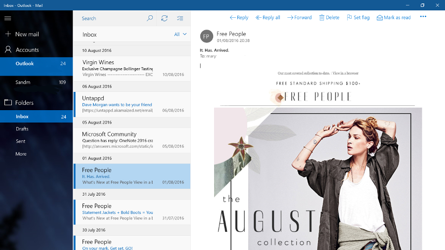
![Mail]()
Sport and News stay useful, even if they still feel a little superfluous. They start quickly but you may use them most as live tiles in the Start menu. While diehard sports fans may not get enough information from the Sport app, News is a decent aggregator of stories (the page covering local news sources is especially good). The Money app is handy if you track shares or want to follow the market. You can still get the Reader app from the Store, but it's no longer installed by default.
Maps continues to improve. In Anniversary Update you can see multiple maps and locations on different tabs, view traffic, accidents and traffic cameras – and even draw routes on a map with your finger or a pen, then measure the distance or get directions (which is far easier than right clicking and dragging pushpins to get the route you want).
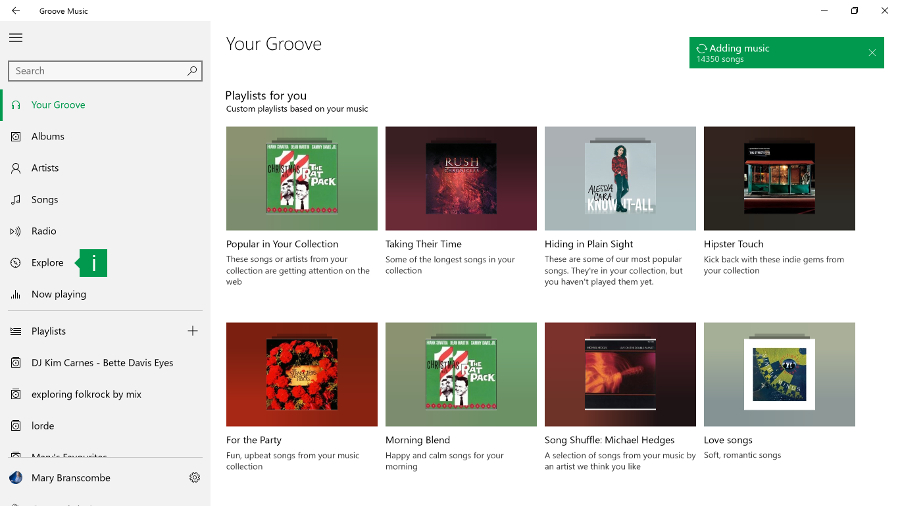
![Groove]()
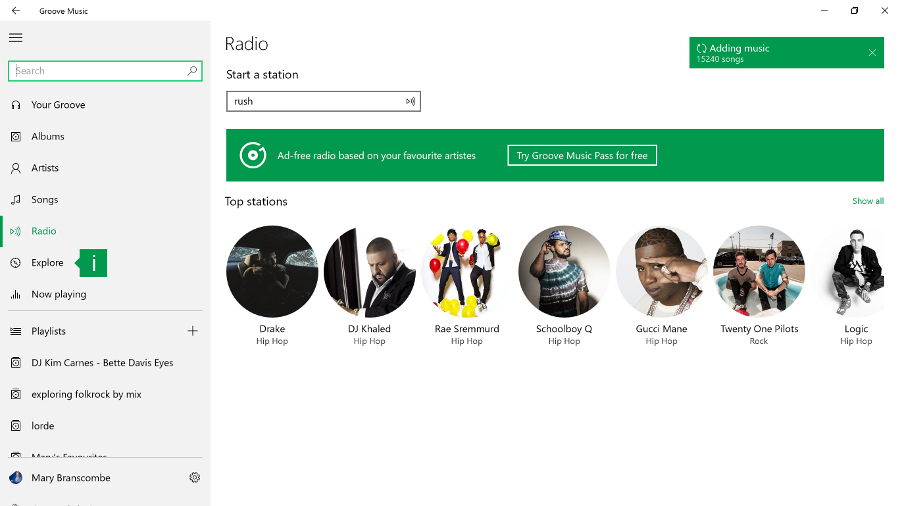
The Groove Music app (named for the music subscription service you might once have known as Xbox Music) certainly pushes the Groove Music Pass subscription in the new Explore section – but it also works well with music on your PC or OneDrive (it can be slow to index music on a network drive).
Groove has come on leaps and bounds since earlier versions of the app. It finally has a thumbnail media player control that pops up when you hover over the Groove icon in the task bar when there's music playing. In Anniversary Update we particularly like the Your Groove playlists that automatically create various playlists of your tracks – long tracks, tracks that are getting played a lot on the Groove service, tracks you haven't listened to in a while, tracks to help you cope with Monday mornings… they change frequently but you can save them for later.
![Groove 2]()
You can't create your own smart playlists though – something even the Zune Player had and Windows Media Player can do (let alone iTunes) – and if you want to use a favorite artist as the seed for a playlist that streams as a 'radio channel' you need a Groove Pass. Even so, Groove is definitely worth trying for playing your music, if not for managing it.
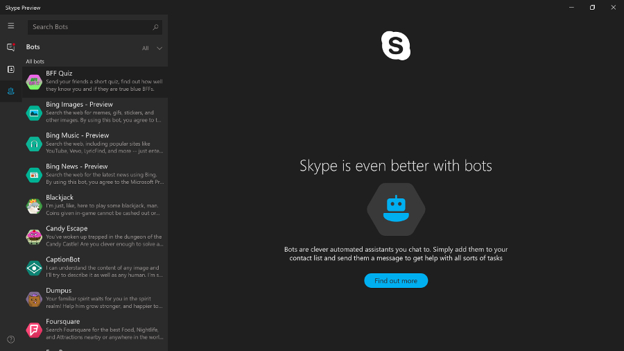
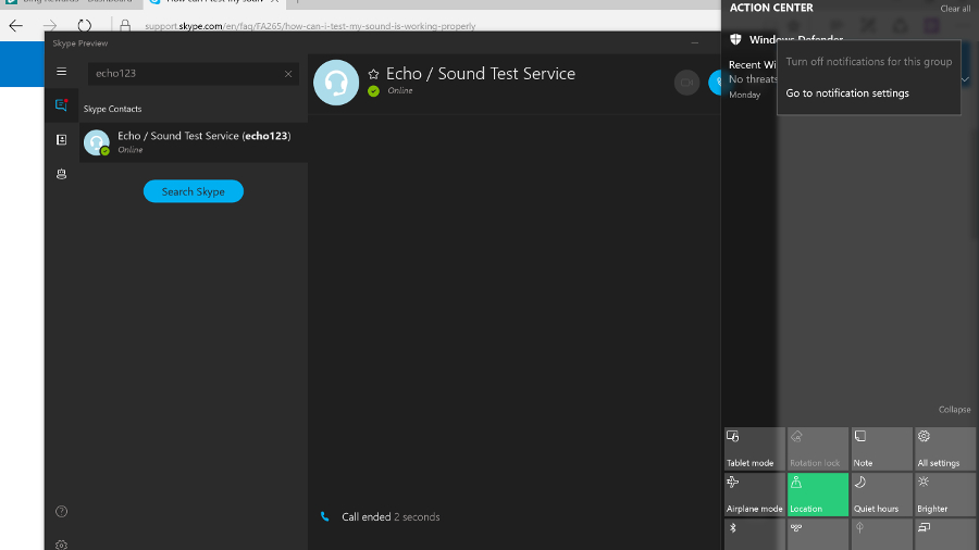
Another app that's dramatically improved is Skype Preview, which is automatically installed in Anniversary Update and replaces the separate Skype Video and Messaging apps (but you can keep the desktop Skype app too).
![Skype Preview]()
If you tried an earlier version of this, don't despair; it now has an excellent set of features and is fast and responsive. It also has the dialler that was missing in early versions, along with video calls and chat (both of which can be one to one or group conversations).
It's very well integrated into Windows 10 – you can reply to chat messages straight from the Action Center notification and you don't need to have the app running to receive calls. You can also try out Skype bots; the Foursquare and IFTTT bots look interesting but these are all still fairly basic.
Windows 7 was such a great version of Windows. Aside from the fact that it trumped Vista with its resource efficiency, general robustness and modest system requirements, it also brought us something else: Aero Snap.
Snap and virtual desktops
The ability to snap windows to the sides of your screen might seem a minor thing, but it's something many Windows users do every day. Apple has obviously realised that Mac users employ third-party extensions to get the same effect; the company introduced window snapping in OS X El Capitan.
![Aero Snap]()
Windows 8 added the option to resize both snapped windows at once, but coupled it with modern apps that had to stay in a separate window entirely. Windows 10 put modern apps on the desktop along with everything else but originally dropped the linked resizing. That's now back in the finger-friendly Tablet Mode that only shows two windows, and on the desktop as well, so if you want to snap windows to be a third and two-thirds of the screen, it's easy.
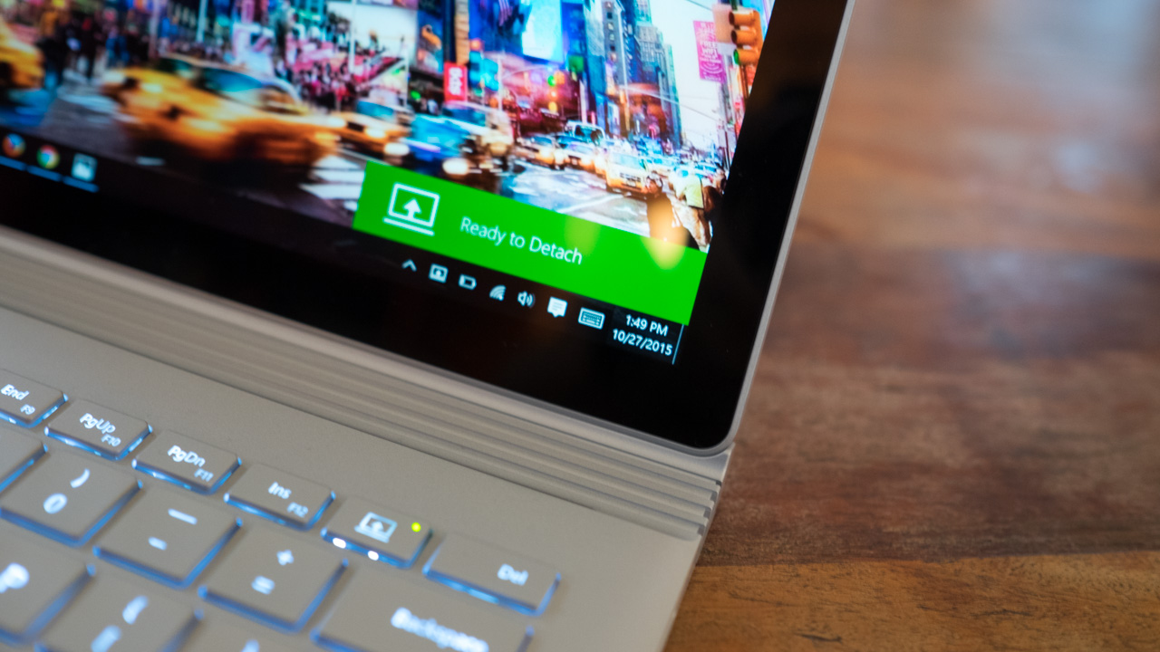
Tablet Mode is Microsoft's nod to Windows 8, and to people who buy the many tablet PCs it believes will be sold over the coming years. As does Intel – it's putting a lot of weight behind 2-in-1 PCs with detachable keyboards.
Originally named Continuum (although that moniker now covers a range of features including the way Windows Mobile phones can use a big screen and keyboard), Windows 10's Tablet Mode is clever because it's automatic. Detach the keyboard and the desktop prepares itself for touch – the Start menu becomes the Start screen and apps appear full-screen. That was one thing Windows 8 got right; a screen of apps is a better launcher for touch-enabled devices when you don't have a keyboard.
The Taskbar has also changed to be more touch-friendly – the icons are more spaced out, while the pinned app icons don't appear at all, you just cycle through them in Task View. You can choose what icons to show in the system tray. The Start icon is now joined by a back button, so you can cycle back to previous apps – even if you were in the Start menu before.
If you want, you can toggle between Tablet Mode and non-Tablet yourself via the settings at the bottom of the Action Center. This could be useful if, say, you have a touchscreen laptop and want to put it into Tablet Mode for a presentation.
![Aero Snap four-way]()
Windows 10 also added four-way Aero Snap, so you can have four applications in each corner of your desktop. Now, if you've got a laptop screen this is about the most inefficient way you could use your desktop, but if you've got a whopping 27+-inch display it might be just the ticket.
The alternative is the virtual desktops in Windows 10, where you can spread apps out over multiple, separate desktops and swap between them.
Task View
Alt-Tab has been the way to see what apps are running for decades, but few users are familiar with it. Over the years Microsoft has added other ways to switch between open apps, like the 3D Windows Flip view in Windows Vista and the left swipe in Windows 8.1.
Windows 10 uses both Alt-Tab and Windows-Tab for a thumbnail view of running apps, but there's also a new full-screen Task View, and a permanent icon on the taskbar for it, next to the Cortana search bar (although you can turn it off).
It takes you to an app overview where you can use the mouse to select the app you want. It's pretty clever, and in any mode of Windows 10 there is always an icon for it on the taskbar.
But there is something else Task View can do – multiple desktops. Go into Task View and there's an icon in the bottom-right that enables you to add another desktop, so you can have one screen for your email, perhaps, and another for your Photoshop work. This is a nice new feature for Windows, although it has been on the Mac for years – since OS X 10.5 Leopard introduced 'Spaces' in 2009.
Apps can be open in more than one desktop, but you can't switch into windows that are on another desktop; things are kept nicely separate. Alt-Tab only works within the desktop you're in. The only way to switch desktops is to go into Task View and select another open desktop. From here you can also close desktops using the X icon that appears when you hover over each desktop icon.
In Anniversary Update, you can have an app you need all the time show up on all your desktops – either the whole app, or just a window from it (like the chat you're in, for example).
Other enhancements
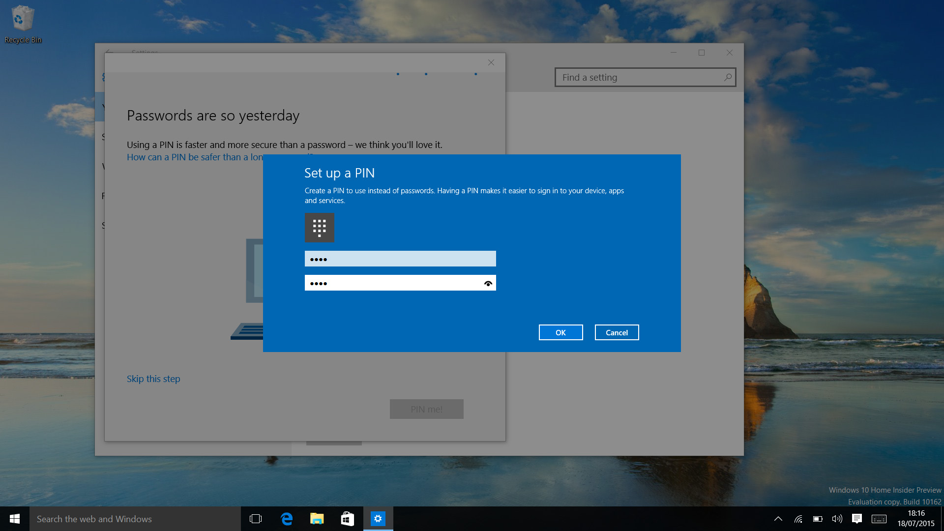
More and more PCs that come with Windows 10 include biometric security hardware that enables you to use a fingerprint, face scan or iris scan to log into Windows and apps, websites and networks. This is called Windows Hello (the secure storage of your credentials used to have a different name, Windows Passport, but in Anniversary Update, it all has the same name).
Windows also asks you to set up a PIN to use instead of your password. This makes it easier to log into Windows when you don't have a keyboard – it's all part of making Windows a more phone-like experience – but it also means your credentials are stored more securely in the TPM (PINs go into this secure hardware, passwords don't).
![Windows PIN]()
Surprisingly, it turns out Windows Hello wasn't already using the same hardware-protected secure area that the business security features like Credential Guard use in the release version of Windows 10 – but with Anniversary Update, your biometric data is stored in there too.
In Anniversary Update, Hello supports the latest standard, FIDO 2. This is what lets you use Hello biometrics instead of passwords in apps and in the Edge browser, but it only works for apps and sites that explicitly support it – and so far that's just the Store app, where you can buy apps with your face quite happily.
If you don't have biometrics on your PC, Anniversary Update will let you use a phone with a fingerprint or iris scanner, or a USB device, or even a wearable like a smartwatch to sign in securely, but there aren't many devices that support FIDO 2 yet to make that work.
Windows Defender will now automatically run quick scans even if you have other antivirus software, which is good, but it comes with an annoying new notification in the Action Center to tell you that it has run and not found any problems. You can't turn that off without turning off a lot of other notifications as well.
![Windows Defender notify]()
The useful but controversial Wi-Fi Sense feature for sharing wireless connections with your friends is gone – not because of the controversy (it doesn't leak your Wi-Fi passwords) but because it wasn't used enough to be worth continuing.
The long-promised enterprise data protection to let admins control what apps and documents you can use, and where you can save files, has finally showed up as Windows Information Protection – and the businesses who want it will already have the management tools like Intune that it needs. Similarly, Anniversary Update includes the agent for the new Windows Defender Advanced Threat Protection, but businesses will need to subscribe to the service to use it.
We still like the updated Snipping Tool which lets you set a delay so that you can screenshot those pesky menus you couldn't keep open before.
Power users appreciated the way Windows 10 updated the Command Prompt window – small beer, you might say, but you're now able to properly select text, and copy and paste in and out. Ctrl-V really will work. Text also re-flows as the window is resized.
And in Anniversary Update, the Windows Subsystem for Linux means you can run real Linux applications, in particular the Bash shell; handy for developers and web admins. If you use Hyper-V to run virtual machines, you can now run Hyper-V inside a virtual machine, so you can run another virtual machine inside that one (and so on, until you run out of resources).
High DPI PCs with multiple screens get some improvements in Anniversary Update, with the promise of a more comprehensive overhaul in future. Especially if you dock a high DPI device like a Surface Pro 4, you can find some applications displaying at the wrong resolution on different screens.
Windows can't fix all the problems for older apps, and we still found that some apps display icons that are too tiny to be easy to use, but there are definite improvements in Anniversary Update – applications that use WPF will scale properly and updates are coming for PowerPoint and Skype for Business (that only fix the problem on Anniversary Update).
Notepad getting high DPI support is nice for Notepad users, but more importantly it means the improvements are in this release ready for other app developers to use.
Unlike Windows 8, it's been easy to follow along with the Windows 10 journey and see how the OS has developed, from an early work in progress, through the release version and the major updates. With the latest Creators Update, Windows 10 sees more new features at once than ever and improvements to several existing tools. There are few situations in which we wouldn't unequivocally recommend Windows 10 – but remember that you now have to pay to upgrade.
Another key idea behind Windows 10 is also sound: that it should be available on as many devices as possible. That's why there's Xbox One and HoloLens and the Internet of Things version that works on a Raspberry Pi come in; Microsoft is embracing the way PCs have moved away from the traditional idea of what a PC is.
We liked
Windows 10 performance continues to impress, as does its reliability, and Microsoft has carried on evolving the interface, which now satisfies both the Windows 7 faithful and the few Windows 8.1 fans.
Core features like search (through Cortana) are absolutely rock solid. The Settings app (a disappointment even in Windows 8.1) remains a worthy replacement for the Control Panel. It's testament to the newfound strength of Settings that, while the Control Panel is still present, you'll hardly ever go to it.
Under the covers, security is improved even more now with Creators Update, and with Windows Hello and biometric support, we're on the verge of ditching passwords (if more websites and apps join in). Transparency has also seen a huge boost here, with a brand new out-of-the-box experience.
The Windows Ink and gaming improvements this year are perhaps the most important to those respective ends of Windows 10 yet, and Paint 3D brings a whole new kind of creation tool to the masses.
We disliked
Even in introducing some new features, Microsoft has done so in an incomplete way, as mentioned in our impressions of Edge. We’re still not sold on switching over. The new tab management experience is welcome, but feels a little incomplete. Meanwhile, the e-reader upgrades are massive, but feel as if they’re serving a niche that’s long been filled.
Also, while we appreciate the improvements to transparency, it still doesn’t change the fact that Microsoft is collecting lots of data about your use of its software.
Finally, we’re bummed that some key upgrades, like the major Cortana improvements, aren’t functional in time for this review.
Final verdict
Ultimately, something for everyone in Windows 10 Creators Update, from Night Light to improvements to gaming and Windows Ink, as well as a new e-reader in Edge and a Paint 3D app.
That said, it still has its share of irritations, and there are some people who are so comfortable on Windows 7 (or even 8.1) that they won't want to upgrade until those OS’s get long in the tooth (or they replace the older peripherals for which hardware makers haven't put out device drivers).
Microsoft remains committed to the idea of universal apps, which now run on Xbox One (and HoloLens, for the few people who have access to it) as well as on Windows Mobile, and Store apps in general (which, confusingly, might not).
The quality of these remains mixed: Mail and Calendar are competent but a long way behind the versions on Windows Mobile with Outlook, Groove is shaping up to be an excellent media player (although you need to pay for a Groove Pass or put your music on OneDrive to make the most of it) and the Skype is at last fully usable. Edge has also graduated into a viable state. And not only have desktop apps not been pushed aside, Microsoft is working on making them look better on high DPI, multi-screen systems.
But mostly, the Creators Update solidifies the success Windows 10 has shown itself to be over the last year. Installation is simple, performance is generally excellent, security is improved (with more options for businesses) – and the most compelling thing about Windows 10 is that it just works. There's not really a learning curve as there was with Windows 8 or 8.1. Even if people don't get to grips with features like the taskbar search or Task View, it won't actually take anything away from their core experience of the OS. Pretty much everything that most people will need is in the Start menu or Action Center.
Plus, knowing that there’s even more to come after the Creators Update instills some good faith that Windows 10 will continue to improve.
![]()